
Recommended
More Related Content
What's hot
What's hot (15)
Similar to Magazine analysis
Similar to Magazine analysis (20)
Magazine analysis
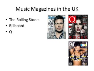
- 1. Music Magazines in the UK • The Rolling Stone • Billboard • Q
- 2. • Publisher: Bauer Media Group • Bauer Media Group: • Owns Box Television 50%: British Television company, music • Owns Bauer Radio • Publishes: Bella, Take a break, that’s life (women’s magazines), Q, Kerrang! (music magazines) • Monthly magazine • Music magazine
- 3. Layout: The main colours are black, Masterhead: A white Q, printed on a red squared Selling line: Using the line „the white and red. These colours are background. It reminds of cheap gossip magazines UK‟s biggest music magazine‟ normal to use at a rock magazine. like C, and the gossip channel E!. makes it sound popular and The magazine is busy with text and makes the audience want to the main image. It looks like a cheaper read it. magazine because of the title of the Main image: The image contains magazine. the celebrity „Cheryl Cole‟. Her Sub heading: All the sub hair is wet because she is headings are names of different standing in the rain, this makes bands and artists. On the right her look tough. She has a lot of side it first says „the 10 best new eyeliner around her eyes, and acts‟ and then the artists. This red lipstick. She is wearing a makes the magazine seem a bit leather jacket and a big silver exclusive, because you can only ring, which she is licking. She is read it once in this magazine. using a direct address by looking Makes the audience want to read straight into the camera. All this it. Many different artists are listed creates a sexual tension. This on the cover, something for supports the „male gaze‟, everybody. because she is presented as a object to men. The colour Plug: Is a round, grey sticker which scheme of the picture are black, says John Lennon and “the untold white and red, which matches the story & the unseen pics”, again this rest of the layout of the cover. makes the magazine exclusive, people want to read the story and Main heading: „3 Words… Cheryl see the picture because they think Cole Rocks‟. There are few words, this is the only place you can. but they are catching. It tells the audience what and who the main There are no barcode on the article is about. The word „rock‟ cover, which means it is on the stands out both when it comes to back page. Or it is supposed to the use of colours, size and font. It be in the white box under the is very dominant and catches the date. eyes.
- 4. Layout: The layout is busy, but still lucid. It has the same Shows the front cover of the magazine colours, red, white and black, as the cover. And Cheryl Cole, who fronted the cover, again catches the eyes of the audience. Tell the audience what number the The stories in the magazine are listed on both sides, and there issue is, it is written in the same Images: There are are lots of different images in the middle and all around. font as the main heading, but in many different images white placed on the content Main heading: The page. The images main heading is written makes it a bit “easier” black on red in Serif, to find what you want. next to a white Q, which If you are interested in is the name of the Cheryl Cole, you see magazine. a big picture of her Sub headings: The sub with the page number headings are written in next to her. The way white on a red line. she is represented in There are three sub this photo is the same headings, to separate as on the front cover, the magazine into in a sexual way as a different topics. object to men (male gaze). The rest of the Cover lines: The cover images is decent, lines are written in black, apart from the one in and has a red line the bottom left corner underneath. This makes with the guy with no it look more tidy and shirt on. All the nice. Just before the text images give an there is a number to tell impression of a what page the audience The webpage of the magazine is on the popular and average can read about this. bottom of the page. priced magazine. The page number, magazine logo and date is in the bottom corner of the page.
- 5. Layout: The layout on this double spread is very clean and tidy. The left page is filled with Main image: the main image text and one picture. The right page one has a picture of Cheryl Cole. The colours used are covers the entire right page. She the same as the rest of the magazine; red, white and black. Black and red are showing is wearing all black clothes, and danger, which Cheryl Cole‟s clothes also does. On the left side, there is a big, red C, over her top has spikes on it. This the text, this C dominates, both because it is really big, and because it is red. In the text, makes her dangerous and there is a smaller C in black. The big C in red, and the small C in black, are the initials of mysterious. Her hair is dark Cheryl Cole. brown and she is Main heading: The wearing dark eye- main heading says makeup and has red „Cheryl Cole‟, who the lips, her nails are article is about. The dark. All over she is font is black and Serif. very dark. She is It is very simple and showing much skin neutral, the audience and chest, which do not get any makes her a sexual impression what is object, and this is going to be in the supporting the „male article, other than gaze‟. Cheryl Cole. In the bottom of the page there is a quote, most likely from Cheryl Cole. „I The images might don‟t know what I be reflecting what look like anymore. Do the text is all about. you know what I All the pictures are mean?‟. It sounds like dark, and this might she does not know mean that she is who she is anymore, depressed or sad. Sub image/secondary image: This image, as the others, is like she has changed. It can also mean very dark. The background is skyscrapers, might be New The font is red and in that she is tough York, and she is wearing black clothes. She has a black Serif. The red colour and a strong shorts, and a grey/black top. She is also wearing a top hat, makes it easy to see. person. which shadow covers the top of her face. Her skin is very If it was black, it pale, it looks a bit unrealistic. would become a bit invisible.
- 6. • Producer: Jann Wenner • Publishes: Men’s Journal (men’s lifestyle), Us weekly (celebrity) • Bi-weekly magazine • Music Magazine
- 7. Date and price: It is a common Selling line: The line „Bush‟s final f#@! You!‟ uses a very strong and appealing convention expected in all language. Using the word „you‟, they talk directly to the audience. The audience might magazines. It is displayed just want to know why this is, because it affects „you‟. Also this line is probably used above the masterhead in a smaller because this issue was published in January, 2009, at the same point as Obama started font. This might be to hide it, or not as president. to draw any attention from the rest Colour scheme: The colours of the cover. have a natural tone, such as Masterhead: The masterhead is brown and black. The main title is written in Serif, the font is the blue, as is one word and a line, same at all the Rolling Stone and Brad Pitt‟s eyes. The natural magazines. It is written in blue, tones of the rest of the magazine symbolizes wisdom and stability, makes Brad Pitt‟s eyes stand out. and gives a calming effect. In His eyes have a unnatural blue this context the colour blue may colour, which mean he is either be used to reflect how Brad Pitt using contacts or they have edited is; stabile and wise, and the look them. If he had green eyes for at his face; calm. example, they would probably have used green instead of blue. Main image: The image contains the celebrity „Brad Pitt‟. He is Buzz word: the word „plus‟ draws using a direct address, where he attention, because in this looks straight into the camera. He magazine you get not only the „50 has a kind and calm face, but best albums of the year‟, but also does not show any facial the „100 best singles‟. expressions. The clothes he is wearing are clothes a older person Layout: The cover is very clean would use, he has a shirt, a brown and tidy. All the sub headings are coat and a loose tie. The fact that listed on the left side, and it is easy his tie is loose makes him more to read. Because of the colours relaxed. The background behind used, which are natural life colours him is shadowed, to put him more and blue, it looks like a magazine in the front. Main heading: The main heading is „Brad Pitt‟ aimed for adults in the 40s. The who is in the main image. The font is white and The barcode is in the right corner, colours and the layout also make it Serif. It is the only text on the page in white, which and a common convention used in look sophisticated and expensive. shows that it might be a bit different from the rest. order for the costumer to purchase And Brad Pitt is, since he does not have anything the magazine. to do with music really, he is an actor.
- 8. Layout: The layout is clean Tells the audience that this is Rolling Stone magazine Main image: the image is in black and and tidy. There are two number 968. white, and of two men dancing and images and the rest is text. singing on a stage. It is probably taken The colours used are in the 50-60s, and is of Johnny Carson mainly black and white and and another man, since the text most numbers are written in underneath is about Johnny Carson. purple. The fonts used are They are wearing suits, which makes it Serif. Purple symbolizes seem like they are important and power and ambition, among wealthy, might be in the upper class. other things. Purple might have been used to represent the artist in the Main heading: „Johnny be good‟, images. written in black Serif. It is almost the same as the song „Johnny B.Goode‟ Sub image: the image is of by Chuck Berry. The text is very Beyoncé singing. This image simple, and you get an impression contrast the rest of the page that the text is about the 50s or 60s. because it is all colourful, and it is very „wild‟ compared to the The text underneath the main rest. Her hair is all over, and heading, is written in the same font she has a „wild‟ look. as the main heading, just smaller. It is about a man named „Johnny Carson‟. Under the text there is a Sub heading: „Money Honey‟. page number, this is probably the Written in black Serif. The introduction to the double spread heading indicates that the page, which is on page 32, like it story about Beyoncé is about says just under the text. her money and power. Cover lines: the cover lines tells the The date and name of the audience where you can find different magazine is placed on the bottom stories, and a little bit on what they are In the bottom left corner you get right corner. This is a common about. The page number is on the left of information about the cover. convention used in magazines. each „story‟.
- 9. Main Heading: The main heading is „Brad Pitt‟, which Sub heading: The sub heading is „The tells the audience that this article is about Brad Pitt, so Rolling Stone Interview‟. It is placed between is the image. It is written in Serif, and blue, which is the words „Brad‟ and „Pitt‟ in the main one of the main colours on the double There is text heading. This might be a way to show that written between and around the words in the main they go „inside‟ Brad Pitt, and gets all the heading. information. Layout: The layout if very clean, the only picture is the one at the whole left side. The picture is of Brad Pitt. The right page has a main heading which covers about 2/3 of the page. The rest of the page is covered by cover lines and the first part of the article. The main colours are blue, black and white. It looks like it aims for people aged 40+, both male and female. The interview is about his life, and if they were Image: the image is of the celebrity „Brad Pitt‟. He is not looking straight at the aiming for younger camera, but has a kind of worried or scared look at the side. He is wearing a people, they would black shit, rings and a necklace, which he drags with his hands. Again this probably have used makes him look a bit scared and worried. This might mean that he is going to lighter colours. be telling very personal things in the article. The picture has a black background, and parts of his face are shadowed. If the magazine were aiming this double spread for younger people, they would have used a more colourful and happier image. Young people are more interested to read about “happy things”.
- 10. • Producer: Prometheus Gobal Media • Entertainment publishing company • Former publishers of Vouge and GQ • Publishes: Adweek (global advertising), Back Stage (film), Billboard (music), Film Journal (Motion-picture industry), The Hollywood Reporter (entertainment) • Weekly magazine • Music magazine
- 11. Layout: the layout is clean, apart from the main heading, which is Masterhead: The masterhead is placed in the middle of the cover. written in San Serif, and is the same at The colours used are mainly all the Billboard magazines, with a blue white and yellow. Yellow is often colour inside the a, and a yellow colour associated with joy and energy, inside the d. which Rihanna is all about. The magazine is aiming for teenage girls. It looks like an average Main image: The main image is of the priced magazine. celebrity „Rihanna‟. It is a bit blurry, to make it more tense and sexual. She Sub heading: The sub headings has a short haircut, which separates are written in a small front and in her from the rest of girls‟ role models. white, the reason for this may be She is wearing a purple lipstick, purple not to take focus off the main is a frustrated colour, and it reflects image and main heading. The how she is. She is not wearing any sub headings are all about clothes except from a bra and a different artists and bands, which necklace, this is creates a sexual shows that this is just a music tension and supports the „male gaze‟. magazine. All the colours on her is dark, she is quite a rebellious girl, this shows Main heading: The main heading through the colours. is written in italic Serif. „The world is hers‟ indicates power, and over the text there are different achievements by Rihanna. She has done a lot of things, which Buzz: There are no buzz words at this may make the audience more cover, instead they have used a „plus‟ interested. sign, to show that in this magazine you The barcode, date and price is get something more. placed in the left corner, they are common conventions used in order for the costumer to purchase the magazine.
- 12. Layout: The layout is tidy and well structured. On the left you Reminder of the magazine‟s name Main heading: The word can see a chart over number 1 contents is written on the top, and albums and songs to keep tells the audience what they can people up to date. On the right read about in this magazine and you see what you can read in what page they can find it. It is the magazine. The colours written in a black San Serif. being used are basic; blue, black and white. The page is Images: Just under the main very bright. heading there are three Sub headings: Written in pictures, they are most likely black/grey Serif. They are just artists and bands. It does not big enough too be seen, and say anything about them to give a better overview on keep it simple, just the page different “topics” such as number, which are written in features and music. In the white in the left corners. In the bottom there is a heading middle of the page there is a written white on black, and on a picture of a girl who is laughing. line which goes over the whole She might be in the main article, page. It has the same font as because she is placed in the the main heading. It says home middle and is the first thing you front, and underneath it there see when you look at the page. are different things happening. On her tip of her shoe you can see what page you can find her on. Cover lines: They are written in a blue San Serif. They probably show important and big articles Page number, date and in the magazine. webpage is placed in the bottom corner of the page. This is the normal place to have it.
- 13. Layout: The layout is Main image: The image is of Rihanna, wearing a bra, a bit necklace and a army jacket. The army very simple and clean. jacket gives her a tough look. She is wearing a purple lipstick, which matches the colours on the rest On the left there is text, of the double spread.The flash lights up her face, and takes focus off her body. She is looking down on a main heading and an the ground, which could mean that she is sad, but thinking about the main heading; „unstoppable‟, it introduction to an article. might mean that she is ready to rise. The text says: „could it be the first no.1 album of her career?‟, if it The left side consist of a is, then she will rise her head. image of Rihanna. The main colours are black and purple, they are used both on the text and in the image. Main heading: The main heading is „unstoppable‟. The font is black and San Serif. This type of font matches the word „unstoppable‟. It takes up 1/3 of the double spread, which shows that it is really important. The text next to the main heading is written in black San Serif. There are some words written in purple, such as „Rihanna‟ and the last words. This text tells the audience what the article on Rihanna, which is most likely on the next page, is about. Under it you see the name of the author.