Contents page analysis
•Download as DOCX, PDF•
0 likes•71 views
The document analyzes and compares the contents pages of two magazines, Vibe and Q. It discusses the design elements used in each magazine, including their color schemes, imagery, text placement, and overall layout. Vibe splits the word "contents" into three parts and features a large color-coordinated image of Beyoncé. Q keeps the word "contents" together and places it above a centered masthead image. Both magazines effectively present information in the top or bottom third of the page around a central image, but differ in whether the image is placed at the top or bottom.
Report
Share
Report
Share
Recommended
Evalution question 1
1) The masthead, skyline, and sell lines on the magazine cover are similar in style and placement to Vibe magazine.
2) The center image on the cover features a single model with styling and posing comparable to Vibe.
3) The contents pages for both magazines have mastheads that are not straight lines, two-column text layouts, and featured images of stylish models.
How house style is established
The document discusses how music magazines use consistent house styles in their publications. It provides examples of how magazines like NME, Vibe, and Q consistently use fonts, logos, and layouts in their mastheads and content pages to create recognizable styles. The consistent placement of logos and use of framing and fonts helps link different parts of the magazines together and makes the publications more interesting and appealing to readers.
Use, develop and challenge
My magazine Vibe uses conventions from real magazines such as including a model on the cover, a contents page, and photo credits. It challenges conventions by using a busier background and layout that is less formal and more urban to appeal to its R&B audience. While other magazines have simpler designs that don't provide much information, my magazine uses various design elements and cover lines to engage readers. The layout and colors are tailored specifically for its target demographic rather than mimicking other magazines exactly.
Use, develop and challenge
My magazine Vibe uses conventions from real media products like Billboard magazine but also challenges some conventions. It uses a sticker on the cover, a menu, photo credits and column layout like Billboard. However, it has a busier background suited to R&B music, larger featured text, and mixes portrait and landscape page orientations. The contents page is simpler than Billboard's busy version to clearly show what's inside and appeal to its target audience.
Use, develop and challenge
My magazine uses and develops conventions from real media products like Vibe magazine. Specifically, it uses a top menu with artist names, a side barcode for phone scans, and cover lines like Vibe. However, it also challenges conventions by having a busier, less placed background that links more to R&B music. While Vibe keeps a simple, clean layout, my magazine aims to be more visually interesting for its target audience.
House style
The document discusses selecting a title and design for a new music magazine. Several potential titles like "Pulse", "Strike", and "Impulse" were considered but ultimately rejected for various reasons. "Unison" was preferred by questionnaire respondents and chosen as the title. For the font, the magazine team selected "Hotel CORAL Essex" which fits their theme of being bold and edgy. Their cover layout places the title on the right instead of left for a unique look. The contents page will be a double-page spread with scattered images and information to maintain an edgy, rough theme.
Researching and analysing magazines
The document provides an analysis of the layout, design elements, and stylistic choices in sample issues of the magazines Kerrang! and NME. For Kerrang!, key elements highlighted include the bold masthead, sell lines featuring quotes, and double page spreads cramming pictures over words. NME's design is described as resembling a newspaper with dull colors and randomly placed pictures. Both magazines utilize consistent house styles and subscription information on the contents pages to appeal to readers.
Evaluation Question One For AS Media 2014 Coursework
This document evaluates the ways in which the media product uses conventions of real magazines. It summarizes the key design elements of the front cover including a partly covered masthead to identify the magazine, skyline featuring an article, cover lines around the front image similar to Billboard magazine, barcode in the bottom right, and banner advertising additional content. It also discusses the contents page layout with columns, bold article titles, and quotes in the double page spread to break up the text like real music magazines.
Question1
The document discusses how the media product uses, develops, or challenges conventions of real media products. Specifically:
- The front cover uses conventions like a bold headline, focusing attention on the cover model, and encoding the rap genre through poses and clothing.
- The contents page similarly focuses on the cover model and encodes the rap genre, while cutting out images innovatively.
- The double-page spread develops conventions by placing text behind images to relate sections, uses techniques like drop caps and pull quotes, and signs the artist's name innovatively.
Color, formatting, and layout are used throughout to organize information and conform to magazine conventions. The style and some individual techniques challenge conventions by creating a unique house
In what ways does your media product use, develop or challenge forms and conv...
The document discusses how the media product uses, develops, or challenges conventions of real media products. Specifically:
- The front cover uses conventions like a bold headline, focusing attention on the cover model, and encoding the rap genre through poses and clothing.
- The contents page similarly focuses on the cover model and encodes the rap genre, while cutting out images innovatively.
- The double-page spread develops conventions by placing text behind images to relate sections, uses techniques like drop caps and pull quotes, and signs the artist's name innovatively.
Color, formatting, and layout are used throughout to organize information clearly and professionally like real magazines. Both conforming to and developing genre conventions.
Contents contrast
Both Vibe and Mixmag magazines display their contents pages differently, with Vibe writing "contents" across three lines and Mixmag placing it small in the top corner. Both order their contents down the right column and use a large main image, though Vibe uses a direct address image while Mixmag shows people partying. Both designs are simple and easy to understand, with Vibe featuring a large V in the background as its custom and Mixmag writing its name in the top left corner.
House style & mode of address
The document discusses magazine layout and design elements that could be used for a music magazine targeting 16-24 year olds. It analyzes magazines like Vibe, Q, Mojo, Billboard and NME to find effective design techniques. Some key elements that could be adopted include Vibe's faded letter in the background for brand recognition, Q's use of images and page numbers on the contents page for easy navigation, and NME's bold writing of featured artists on the cover. The document proposes using a simple, image-focused layout like Vibe that appeals to the target demographic. Colors like red, black and white would be used consistently across pages to create a recognizable style.
Magazine research
/r/streetwear magazine began as an online forum and focuses on niche streetwear fashion. It uses a simple white and grey color scheme with occasional black and white images to draw attention. Articles have a lot of text and information to satisfy readers interested in more than just images. As a small, new magazine, its website only sells the publication.
Mix Mag is a large electronic dance music magazine with a recognizable design across issues - a banner and central cover image. It uses consistent color schemes and layout, with double page spreads and multiple images per article. The website was the easiest to navigate of the three.
DJ Mag highlights influential DJs with bold text and a simple color scheme. Like MixMag,
Contents page
The document provides an analysis of the cover design of Vibe magazine. It notes that the word "contents" stands out in large black capital letters, representing the modern yet traditional nature of the magazine. The color scheme is simple, revolving around black but also using red, making the magazine seem powerful. The large V-shape in the background catches the eye as the logo, in a non-traditional font giving it modern style. The main image of Kanye West looking directly at the viewer is described as incredibly powerful, with his lack of expression and another arm reaching across his chest leaving the reader wondering.
Contents page overview
Vibe magazine maintains a consistent brand identity across its content pages through the repetitive use of layout, structure, main images and fonts. All of the content pages share similarities like placement of the main image, use of R&B artists for images (except one of Obama), and simple colored backgrounds without settings. The text is also consistently presented in a column/list format across pages to reinforce the simplistic design and help readers easily navigate content.
Contents page analysis
The contents page uses a black and white color scheme with only a red heart on the artist's body to make it stand out. It uses various fonts to make the page look more professional and unique. The basic background is used to make the artist the focus. The magazine includes both music and fashion sections to appeal to their target audience. Large images are included but the provocative nature of one image distracts from the purpose of informing readers about the magazine contents. While photos help showcase artists, the contents page itself lacks detail and effort despite taking up much of the page.
House style & mode of address
The document discusses the house style of the VIBE magazine and how it can be used as a template for a new music magazine. Some key aspects of the VIBE magazine's house style mentioned include a faded 'V' in the background on every page, separating the contents into three sections, wrapping text around images, and having a main image that takes up one page with the accompanying article on the facing page. The author intends to model their new magazine after VIBE's layout, using a simple design with bold images and less text that is appropriate for their target 16-24 year old audience. They will also employ consistent colors like red, grey, white and black throughout the magazine and feature the same artist across the
Contents Page Analysis
The document analyzes and compares the contents pages of two music magazines, Q and Kerrang. It finds that Q uses a formal serif font and black and white colors, appealing to an older audience. Kerrang uses an informal sans-serif font and colors like yellow, appealing to a younger audience. Both magazines effectively use large, relevant images and clear page listings to draw readers in and navigate the magazines.
Existing music magazine analysis
The document analyzes and compares the cover designs of three music magazines: Vibe, NME, and DIY. Vibe features a close-up photo of Kanye West with bold fonts and a pink/blue color scheme. NME shows Simon Cowell in a gray scale with key information in color. DIY uses a collage of Alt-J and unusual colors/fonts for an indie feel. Each magazine's design choices aim to attract different audiences and stand out on magazine shelves.
Evaluation powerpoint
The document compares the layout and design of the student's music magazine to the real music magazine VIBE. Some similarities between the magazines include using a black and white cover photo, capitalized sell lines, and applying the rule of thirds. Differences include font choices and photo cropping. The student's magazine contents page similarly lists articles but differs in background and additional details. The student's article layout mirrors VIBE's use of color themes and photo placement but varies in quotes, colors, and formatting of questions versus text.
Question 1 of 7
This document discusses how the author's media product, a hip-hop magazine, both uses conventions from real music magazines and challenges them. The author took elements like boxed lettering and cover photo styles from magazines like Fader and Paper but adapted them. Sell lines were placed like in XXL and contents pages followed Vibe's style but with extra photos and spacing. The double-page spread emulated XXL's black and white colors but with a different layout. Column writing and extra information on articles made the magazine more reader-friendly and distinct from competitors like XXL. Overall, the author drew from real magazines but modified elements and added their own touches to develop and challenge existing forms and conventions.
Evaluation powerpoint
The document compares the design elements and conventions used in the creator's music magazine to those used in the real magazine VIBE. Some similarities identified include using a similar color scheme of black, white and red. Both magazines use the rule of thirds and place the main contents on one side of the page. Differences include the creator using black for the masthead instead of red and making the cover image less bright. The creator also included a barcode that VIBE did not have.
Evaluation 1
The author believes their kpop magazine could be improved by making the layout brighter and including more photos and organized sections to encourage readership. This may increase the number of readers and interest in the magazine. The current conventions like fonts and colors conform to music magazine standards, but improvements could be made by adding mini descriptions to sell lines and credits to the contents page. Comparisons are made to another magazine, noting differences in mastheads, images, fonts, and use of sub-headings between spreads.
Content page powrpoint
1) The document discusses the creation of a content page for a magazine re-submission. Specific details include choosing a similar layout and main image as the front cover to maintain consistency.
2) The author selected the fourth posed image of the model for the content page to match the similar pose used on the front cover, aiding audience recognition.
3) Photoshop was used to edit the main image, applying pink and contrast adjustments to make it stand out more than the front cover images.
4) Additional elements like logos, cover stories, issue numbers and health tips were included to meet conventions of real-life magazines and make important information easily visible to readers.
House style & mode of address
The document discusses the magazine layout of VIBE magazine and how it will influence the layout of the author's own magazine. The author likes VIBE's simple yet bold layout that is easy to read and visually appealing to its target 16-24 year old audience. Some key aspects that will be replicated include a consistent color scheme, repeating cover images and logos, and informal language representative of teenagers. The goal is to create a magazine layout and style that matches VIBE's success at representing music and appealing to a similar youth audience.
Progression of Double Page Spread
The document discusses the design choices made for a music magazine inspired by VIBE magazine. Fonts, layout, photos, and written content were selected to emulate conventions of music magazines and appeal to the target audience. Photos were taken against plain backgrounds and edited in Photoshop to look more professional. Costumes and props were used to portray wealth as seen in other music magazines. The overall style aimed to represent the R&B music genre through seductive photography, fashion elements, and formal language while putting a unique spin through original camera work and column layouts.
Double page spread analysis
The double page spread makes good use of design principles like rule of thirds and the Gutenberg principle. The font, text size, and three column layout maintain a consistent house style. The large red "L" masthead relates the article to the Q magazine brand. Tight spacing fills the pages without wasted space, and neutral colors provide a sophisticated look befitting the magazine's style.
Ppt33
This document discusses jewelry scarves and pendants from the USA, including scarves that have jewelry attached or embedded and scarves decorated with beads, pendants, or other jewelry pieces with themes like peacocks. The scarves are available wholesale for the year 2013.
Los encuentros del maestro
Este documento resume dos encuentros que Jesús tuvo. El primero fue con Zaqueo, un recaudador de impuestos que se había enriquecido oprimiendo a los demás. El segundo fue con Pedro y Andrés, dos pescadores a los que Jesús llamó para que lo siguieran y se convirtieran en sus primeros discípulos.
Untitled Presentation
Haiku Deck is a presentation tool that allows users to create Haiku style slideshows. The tool encourages users to get started making their own Haiku Deck presentations which can be shared on SlideShare. In just a few sentences, it pitches the idea of using Haiku Deck to easily create visual presentations.
More Related Content
What's hot
Question1
The document discusses how the media product uses, develops, or challenges conventions of real media products. Specifically:
- The front cover uses conventions like a bold headline, focusing attention on the cover model, and encoding the rap genre through poses and clothing.
- The contents page similarly focuses on the cover model and encodes the rap genre, while cutting out images innovatively.
- The double-page spread develops conventions by placing text behind images to relate sections, uses techniques like drop caps and pull quotes, and signs the artist's name innovatively.
Color, formatting, and layout are used throughout to organize information and conform to magazine conventions. The style and some individual techniques challenge conventions by creating a unique house
In what ways does your media product use, develop or challenge forms and conv...
The document discusses how the media product uses, develops, or challenges conventions of real media products. Specifically:
- The front cover uses conventions like a bold headline, focusing attention on the cover model, and encoding the rap genre through poses and clothing.
- The contents page similarly focuses on the cover model and encodes the rap genre, while cutting out images innovatively.
- The double-page spread develops conventions by placing text behind images to relate sections, uses techniques like drop caps and pull quotes, and signs the artist's name innovatively.
Color, formatting, and layout are used throughout to organize information clearly and professionally like real magazines. Both conforming to and developing genre conventions.
Contents contrast
Both Vibe and Mixmag magazines display their contents pages differently, with Vibe writing "contents" across three lines and Mixmag placing it small in the top corner. Both order their contents down the right column and use a large main image, though Vibe uses a direct address image while Mixmag shows people partying. Both designs are simple and easy to understand, with Vibe featuring a large V in the background as its custom and Mixmag writing its name in the top left corner.
House style & mode of address
The document discusses magazine layout and design elements that could be used for a music magazine targeting 16-24 year olds. It analyzes magazines like Vibe, Q, Mojo, Billboard and NME to find effective design techniques. Some key elements that could be adopted include Vibe's faded letter in the background for brand recognition, Q's use of images and page numbers on the contents page for easy navigation, and NME's bold writing of featured artists on the cover. The document proposes using a simple, image-focused layout like Vibe that appeals to the target demographic. Colors like red, black and white would be used consistently across pages to create a recognizable style.
Magazine research
/r/streetwear magazine began as an online forum and focuses on niche streetwear fashion. It uses a simple white and grey color scheme with occasional black and white images to draw attention. Articles have a lot of text and information to satisfy readers interested in more than just images. As a small, new magazine, its website only sells the publication.
Mix Mag is a large electronic dance music magazine with a recognizable design across issues - a banner and central cover image. It uses consistent color schemes and layout, with double page spreads and multiple images per article. The website was the easiest to navigate of the three.
DJ Mag highlights influential DJs with bold text and a simple color scheme. Like MixMag,
Contents page
The document provides an analysis of the cover design of Vibe magazine. It notes that the word "contents" stands out in large black capital letters, representing the modern yet traditional nature of the magazine. The color scheme is simple, revolving around black but also using red, making the magazine seem powerful. The large V-shape in the background catches the eye as the logo, in a non-traditional font giving it modern style. The main image of Kanye West looking directly at the viewer is described as incredibly powerful, with his lack of expression and another arm reaching across his chest leaving the reader wondering.
Contents page overview
Vibe magazine maintains a consistent brand identity across its content pages through the repetitive use of layout, structure, main images and fonts. All of the content pages share similarities like placement of the main image, use of R&B artists for images (except one of Obama), and simple colored backgrounds without settings. The text is also consistently presented in a column/list format across pages to reinforce the simplistic design and help readers easily navigate content.
Contents page analysis
The contents page uses a black and white color scheme with only a red heart on the artist's body to make it stand out. It uses various fonts to make the page look more professional and unique. The basic background is used to make the artist the focus. The magazine includes both music and fashion sections to appeal to their target audience. Large images are included but the provocative nature of one image distracts from the purpose of informing readers about the magazine contents. While photos help showcase artists, the contents page itself lacks detail and effort despite taking up much of the page.
House style & mode of address
The document discusses the house style of the VIBE magazine and how it can be used as a template for a new music magazine. Some key aspects of the VIBE magazine's house style mentioned include a faded 'V' in the background on every page, separating the contents into three sections, wrapping text around images, and having a main image that takes up one page with the accompanying article on the facing page. The author intends to model their new magazine after VIBE's layout, using a simple design with bold images and less text that is appropriate for their target 16-24 year old audience. They will also employ consistent colors like red, grey, white and black throughout the magazine and feature the same artist across the
Contents Page Analysis
The document analyzes and compares the contents pages of two music magazines, Q and Kerrang. It finds that Q uses a formal serif font and black and white colors, appealing to an older audience. Kerrang uses an informal sans-serif font and colors like yellow, appealing to a younger audience. Both magazines effectively use large, relevant images and clear page listings to draw readers in and navigate the magazines.
Existing music magazine analysis
The document analyzes and compares the cover designs of three music magazines: Vibe, NME, and DIY. Vibe features a close-up photo of Kanye West with bold fonts and a pink/blue color scheme. NME shows Simon Cowell in a gray scale with key information in color. DIY uses a collage of Alt-J and unusual colors/fonts for an indie feel. Each magazine's design choices aim to attract different audiences and stand out on magazine shelves.
Evaluation powerpoint
The document compares the layout and design of the student's music magazine to the real music magazine VIBE. Some similarities between the magazines include using a black and white cover photo, capitalized sell lines, and applying the rule of thirds. Differences include font choices and photo cropping. The student's magazine contents page similarly lists articles but differs in background and additional details. The student's article layout mirrors VIBE's use of color themes and photo placement but varies in quotes, colors, and formatting of questions versus text.
Question 1 of 7
This document discusses how the author's media product, a hip-hop magazine, both uses conventions from real music magazines and challenges them. The author took elements like boxed lettering and cover photo styles from magazines like Fader and Paper but adapted them. Sell lines were placed like in XXL and contents pages followed Vibe's style but with extra photos and spacing. The double-page spread emulated XXL's black and white colors but with a different layout. Column writing and extra information on articles made the magazine more reader-friendly and distinct from competitors like XXL. Overall, the author drew from real magazines but modified elements and added their own touches to develop and challenge existing forms and conventions.
Evaluation powerpoint
The document compares the design elements and conventions used in the creator's music magazine to those used in the real magazine VIBE. Some similarities identified include using a similar color scheme of black, white and red. Both magazines use the rule of thirds and place the main contents on one side of the page. Differences include the creator using black for the masthead instead of red and making the cover image less bright. The creator also included a barcode that VIBE did not have.
Evaluation 1
The author believes their kpop magazine could be improved by making the layout brighter and including more photos and organized sections to encourage readership. This may increase the number of readers and interest in the magazine. The current conventions like fonts and colors conform to music magazine standards, but improvements could be made by adding mini descriptions to sell lines and credits to the contents page. Comparisons are made to another magazine, noting differences in mastheads, images, fonts, and use of sub-headings between spreads.
Content page powrpoint
1) The document discusses the creation of a content page for a magazine re-submission. Specific details include choosing a similar layout and main image as the front cover to maintain consistency.
2) The author selected the fourth posed image of the model for the content page to match the similar pose used on the front cover, aiding audience recognition.
3) Photoshop was used to edit the main image, applying pink and contrast adjustments to make it stand out more than the front cover images.
4) Additional elements like logos, cover stories, issue numbers and health tips were included to meet conventions of real-life magazines and make important information easily visible to readers.
House style & mode of address
The document discusses the magazine layout of VIBE magazine and how it will influence the layout of the author's own magazine. The author likes VIBE's simple yet bold layout that is easy to read and visually appealing to its target 16-24 year old audience. Some key aspects that will be replicated include a consistent color scheme, repeating cover images and logos, and informal language representative of teenagers. The goal is to create a magazine layout and style that matches VIBE's success at representing music and appealing to a similar youth audience.
Progression of Double Page Spread
The document discusses the design choices made for a music magazine inspired by VIBE magazine. Fonts, layout, photos, and written content were selected to emulate conventions of music magazines and appeal to the target audience. Photos were taken against plain backgrounds and edited in Photoshop to look more professional. Costumes and props were used to portray wealth as seen in other music magazines. The overall style aimed to represent the R&B music genre through seductive photography, fashion elements, and formal language while putting a unique spin through original camera work and column layouts.
What's hot (18)
In what ways does your media product use, develop or challenge forms and conv...
In what ways does your media product use, develop or challenge forms and conv...
Viewers also liked
Double page spread analysis
The double page spread makes good use of design principles like rule of thirds and the Gutenberg principle. The font, text size, and three column layout maintain a consistent house style. The large red "L" masthead relates the article to the Q magazine brand. Tight spacing fills the pages without wasted space, and neutral colors provide a sophisticated look befitting the magazine's style.
Ppt33
This document discusses jewelry scarves and pendants from the USA, including scarves that have jewelry attached or embedded and scarves decorated with beads, pendants, or other jewelry pieces with themes like peacocks. The scarves are available wholesale for the year 2013.
Los encuentros del maestro
Este documento resume dos encuentros que Jesús tuvo. El primero fue con Zaqueo, un recaudador de impuestos que se había enriquecido oprimiendo a los demás. El segundo fue con Pedro y Andrés, dos pescadores a los que Jesús llamó para que lo siguieran y se convirtieran en sus primeros discípulos.
Untitled Presentation
Haiku Deck is a presentation tool that allows users to create Haiku style slideshows. The tool encourages users to get started making their own Haiku Deck presentations which can be shared on SlideShare. In just a few sentences, it pitches the idea of using Haiku Deck to easily create visual presentations.
SF One Page Intro
Serre Financial provides specialized consulting services that save clients money through opportunities within the Income Tax Act. They offer customized plans to meet individual client needs. With over a decade of experience, Serre Financial helps clients increase tax savings, cash flow, retirement benefits, and business exit strategies through working with their existing team of advisors.
Anadamio1 h mc
El documento describe los componentes principales de una computadora, incluyendo el software de sistema, aplicaciones y mantenimiento, así como el hardware de entrada, almacenamiento y procesamiento.
Jordi sans 11 compromesos
Jordi Sans, 11 compromesos. La celebració del títol olímpic del 1996
amb una senyera li va costar la reprimenda del
govern espanyol.
Actividades 6 9
El robot gira 360 grados, luego describe un cuadrado y por último guarda el bloque de programación.
Sunshine Coast Futures Conference 2015
In November 2015, we will be launching Strategic Doing at the Sunshine Coast Futures Conference. One of the top three innovative regions in Australia, the Sunshine Coast includes civic leaders wiling to experiment with new approaches to getting things done. The University of the Sunshine Coast is partnering with Purdue University to move Strategic Doing to Australia.
10 year Logo
The document discusses the University of Iowa's distance and online education programs. It offers a Bachelor of Applied Studies degree that can be completed fully online or through a combination of online and on-campus courses over the span of several years. The BAS degree provides students flexibility to combine interests, experiences and skills into a personalized degree program.
Imagenes 11°B
La carta invita al empleado identificado con la cédula de ciudadanía a una reunión el 24 de febrero a las 11am en la sala de juntas de la sede principal para discutir los temas que se expondrán en la próxima portada de la revista, con el objetivo de hacer el trabajo más eficiente y agradable para el público, y el empleado es fundamental para lograr este objetivo. La carta también fue enviada al correo electrónico del empleado.
Contenido
Este documento presenta una introducción a la Web 2.0, incluyendo sus ventajas y desventajas. También analiza conclusiones sobre la Web 2.0 y proporciona una bibliografía y dos anexos relacionados con el tema.
A aprendizagem da tecnologia na escola
A aprendizagem da tecnologia na escola é essencial para evitar a ignorância digital de professores e alunos, e para sistematizar conceitos fundamentais de TIC que todos os cidadãos devem absorver. Ao melhorar a escola com novas abordagens de conhecimento, também se melhora a sociedade como um todo. O autor construiu um blog para compartilhar com os alunos conceitos matemáticos, vídeos e atividades diversificadas na esperança de promover participação e interação digital.
Jogo onde está
Jogo "Onde está?" para praticar oralmente a interrogativa e a afirmativa, as preposições e advérbios de lugar e o verbo estar.
Viewers also liked (17)
Similar to Contents page analysis
Magazine content analysi
This document summarizes the key stylistic elements of two music magazine contents pages:
VIBE magazine uses a black, white, and grey color scheme with consistent layout and masthead design. The main image features a model whose legs form the letter "V" relating to the magazine title. Sans serif font is used for the masthead in bold white letters.
Q magazine maintains a clean and simplistic house style using white, black, and red colors. It employs a formal design balance with designated sections. Larger images indicate main features while smaller, casual images showcase other content. A bold sans serif title contrasts a serif body font to connect with readers informally.
Contents Page Analysis
This document analyzes several magazine contents pages. It finds that effective contents pages establish the brand identity through logos. They attract audiences through multiple images of artists from different genres. Features are usually listed on the side with page numbers to help readers find content they like. Headlines stand out through size, color and font to catch readers' attention.
Contents page analysis
The contents page uses the same house style, font, and masthead as the rest of the magazine to provide familiarity and recognizability for the reader. A large central image is used to draw the eye in, with contents listed on either side in columns. Sections are made distinct through bold headings, and minimal descriptive text keeps the layout clean and easy to navigate.
Magazine Contents Page Analysis
This is my analysis of existing magazine contents pages for my media portfolio. Different magazines have been researched and their factors and elements looked into in a small amount of depth.
Magazine Contents Analysis
This contents page from V magazine uses a stylized layout with a bold "contents" heading to clearly present information in a consistent style. Only the heart by Kanye West's name is in color, drawing attention to that section. Though focused on music, V magazine also covers fashion shown through Kanye's clothing. Overall the page uses a greyscale tone with only that heart in color, and the layout and styling consider what will appeal to their audience.
How house style is established
This document discusses house styles used in various music magazines. It provides examples of how magazines like NME, Vibe, and Q maintain consistent house styles. Their mastheads are always placed in the same location in a consistent font and size. Color schemes, logo placement, and layouts are also kept consistent to create a cohesive brand identity across issues. Maintaining elements like consistent colors, fonts, and layouts in elements like the contents page and double page spreads helps tie the entire magazine together under a clear house style.
Powerpoint research
The document discusses and compares the effectiveness of the designs and layouts of several magazine covers and contents pages. It provides analysis of the use of colors, images, logos and how well they represent the topic and draw attention. Overall, the Vibe Magazine contents page is found to be most effective with its traditional layout and use of colors and images, though it could provide more insight into the magazine's topics. The Experience magazine and City magazine contents pages also receive positive reviews for their designs.
3 covers analysis power point
This document summarizes and compares three magazine covers: VIBE, Esquire, and a third unnamed magazine. VIBE uses a consistent color palette of bright pink and blue with black contrast to make the cover stand out. Esquire uses a simple black and white scheme with the model's formal attire to seem formal. The third magazine is colorful with a stenciled font and a photo of Pharrel Williams edited to look like a sketch, fitting its artistic theme. All three magazines effectively use color palettes, model poses, and layouts to attract readers.
Contetns research
The document discusses the layout and design elements of the contents page of a magazine called Vibe. It describes the large "V" masthead logo positioned at the top that identifies the magazine. It also discusses the use of sans serif fonts for headings, subheadings and captions, and a monochrome color scheme throughout that is part of the magazine's house style. The main image dominates the page and shows rapper Kanye West looking directly at the viewer.
Analysis of Second Magazine (VIBE)
Here is my second analysed magazine. Again I have analysed VIBE magazine because it is very similar to the style of magazine that I wish to create so I look to it for a lot of inspiration.
Evaluation powerpoint
The document compares the design elements and conventions used in the student's music magazine to the real music magazine VIBE. For the front cover, the student used a similar color scheme but made their image less bright. Their masthead and sell lines are also bolder. For the contents page, both magazines place the main contents on one side and use a box to highlight top stories. The layout of the article pages is also similar, with a picture on one page and text on the facing page. However, the student made some customizations like adding a quote on the picture page.
Evaluation question 1
My media product uses and challenges some conventions of real music magazines. It uses conventions like having a bold title at the top of the page and column layout for text. However, it also challenges conventions by having the title at an angle with a shadow and including contact information at the end of articles.
The front cover conforms to conventions by having the magazine name at the top and a central image but challenges them by having straplines on the side rather than middle.
The contents page title is at an angle rather than straight but includes page numbers and article information like real magazines. It challenges conventions by only including one large image rather than multiple small ones.
Contents page analysis
This document analyzes and summarizes the contents page of a music magazine. It notes the following key points:
- The text on the contents page is bold and stands out to make it more memorable compared to other music magazines.
- The main picture is very large and draws attention to the featured artist and main article.
- Sections and subheadings are organized into columns for easy reading and navigation without clicking through pages.
- Many images are included to make the page visually appealing and interesting to pull readers into the magazine.
- A mini article provides a preview of what's inside and the magazine's theme.
Research
This issue of V magazine has a clean and minimalistic design that creates a recognizable brand. The masthead is centered on the cover in a large, bold font that stands out from other magazines. The image on the cover features two models wearing contrasting outfits that appeal to the magazine's target fashion audience. V magazine maintains a consistent style across issues through its simple design and centered masthead, making it easily identifiable for readers.
Evaluation F – forms and conventions
Magazines use conventions and codes to appeal to audiences and build connections. While some magazines strictly follow conventions, others challenge conventions to be unique. The author created a rap magazine that uses some conventions to appeal to the target audience but also challenges conventions to distinguish itself. Specifically, the magazine uses intertextuality by drawing inspiration from the layout of another magazine but making it distinct through elements like the house style and additional features. This allows the magazine to feel familiar to audiences while still having its own identity.
Media contents page
This document summarizes and compares the contents pages of several magazines. It notes that NME uses large imagery to highlight topics, while VIBE focuses on a single large photo linked to the cover story. Q magazine takes a simpler approach with articles and page references listed on the left side. Overall, the document evaluates how each magazine conveys the importance of stories and ease of navigating the contents.
Evaluation question 1
The document analyzes how the media product, a music magazine, both follows and challenges conventions of real music magazines. It provides examples of layout elements and design features from the magazine's mock front cover, contents page, and double-page article spread that emulate conventions like central images, varying typography sizes, and floating quotes. It also notes some unconventional elements like fewer supporting images. Overall, the magazine aims to look realistic while including some unique qualities.
Exam q 1
The document discusses how the media product uses and challenges conventions of real magazines. It analyzes the front cover, contents page, and double page spread and how they employ or subvert typical magazine conventions. Some conventions used include mastheads, page numbers, cover lines, images, and columns for layout. Some conventions challenged include no header, unique house style colors, one large image instead of multiple, and advertising an album. Real magazines that informed the design, both in following and challenging conventions, include Clash, Mojo, NME, and Billboard.
Contents Page Research
This contents page for "Vibe" magazine uses an unusual split title design to draw attention. The background matches the model's outfit for a modern look. Her pose promotes the magazine title in an eye-catching way. Images take up most space to seem busy yet professional.
The Mojo magazine contents page stands out through contrasting black and white colors and bold text. While lacking a "Contents" title, the magazine name is clear.
For NME magazine, the familiar logo identifies the publication. A large central image prioritizes the featured band. Sections use recognizable colors to aid navigation.
Similar to Contents page analysis (20)
More from Louis1995
Q7
The document discusses the progression from the author's preliminary task to their final product. Specifically:
- Their skills in digital photography, Photoshop, design and layout have greatly improved. This includes techniques like using the rule of thirds and understanding how lighting affects images.
- Their knowledge of magazine design and layout has grown, such as how to design covers, contents pages, and double page spreads.
- Skills in Photoshop, like using the lasso tool to precisely crop images, have improved as shown by comparing preliminary and final work.
- The composition and quality of photographs has increased, incorporating techniques seen in professional magazines like having subjects engage the viewer.
Q6
The document discusses the technologies used to construct a product and what was learned from using them. It describes learning skills like resizing text, changing fonts and colors in Microsoft Word. It also discusses initially finding Photoshop confusing but becoming more proficient with tools like the lasso and layers. Other programs like blogs and slideshows were challenging at first but became easier after completing the product. Using a Nikon camera to take photos was difficult initially but skills with functions like the grid and zoom improved.
Q5
The author conducted market research to determine their target audience was 16-20 year old females. They addressed this audience by featuring a 17 year old female on the front cover making direct eye contact with the camera. The masthead was designed to resemble popular magazines Q and NME. Research also informed the use of the readable yet formal Californian FB font. Pictures of females wearing headphones and a guitar were used to attract the music-interested target audience, as suggested by the market research findings.
Q5
The author conducted market research to determine their target audience was 16-20 year old females. They addressed this audience by featuring a 17 year old female on the front cover making direct eye contact with the camera. The masthead was designed to resemble popular magazines Q and NME. Research also informed the use of the readable yet formal Californian FB font. Pictures of females wearing headphones and a guitar were used to attract the music-interested target audience, as suggested by their research.
Q2 evaluation
The magazine represents younger people aged 17-18 stereotypically by showing them wearing typical teenage clothes and often holding musical instruments. It also represents females positively by featuring them more than males. While mostly showing middle and upper class artists, reinforcing stereotypes about social class and music, the representation of the groups it does feature is overall positive as they appear happy and living their dreams.
Image manipulation
This document discusses editing an image for a front cover using Photoshop tools. The author used the brightness and contrast tools to lighten the image and emphasize facial features and headphones. The final edited image appeared brighter, showed more detail, and matched the house style color of the headphones.
Band Images Gathered
This document contains summaries of three music-related images:
1) An image of 50 Cent throwing bullets towards the camera, suggesting violence or pain in his music through props and composition.
2) An image of the Rolling Stones in greyscale with a fish-eye effect, making their faces appear exaggerated and conveying a fun atmosphere through proximity.
3) An image of Benny Benassi standing behind a brick wall, representing the rugged nature of dance music through mise-en-scene and composition.
Band Images Gathered
This image of pop singer Ellie Goulding makes use of lighting techniques like light coming from the left to enhance her features and give a professional style. It also follows the rule of thirds by placing her in the primary optical area so the face is the first thing seen. The empty spaces keep the focus on the artist. The simple, isolated mise en scene could emphasize her as a solo artist and connote power, while her slightly provocative costume may engage younger male audiences.
Content page analysis
The document discusses the style, imagery, and design balance used on a Kerrang magazine contents page. For house style, the contents page uses a color scheme of yellow, black, and white that is recognizable to fans of Kerrang magazines. It also features a classic smashed font used for subheadings that directly refers to the genre of music covered. For imagery, the main image is of a Guns N' Roses guitarist that relates to the magazine's genre, and a small picture of the editor gives readers a sense of personal connection.
Magazine Front Cover Analysis
The magazine cover uses design principles to draw attention to key elements. The masthead in red, black, and white is prominently displayed in the optical area. The main image of Cheryl Cole in the center draws the eye. Cover lines are placed around her in different sizes to highlight important articles. The color palette, fonts, and lighting create a formal, mature style appealing to Cheryl Cole fans and the magazine's target demographic.
Magazine Front Cover Analysis
This document provides an analysis of the cover of a Lady Gaga magazine. It summarizes key elements of the cover design including the bright colors, Lady Gaga's recognizable image, bold cover lines, and the younger target demographic appealed to through risque elements and rebellious language. Overall design principles like the masthead placement and left-to-right text flow follow conventions to maximize visibility and comprehension.
This pie chart shows the ages of the people that i surveyed with my questionn...
Louis Rutter conducted market research through questionnaires to understand how to design his music magazine. The results showed that the target demographic is 16-20 year olds, most of whom are students. Indie and rock music were the most popular genres. Interviews and information on gigs were the most desirable content. The magazine should cost between £2-4 and include small incentives to appeal to readers.
Music magazine questionnaire
This document contains a music magazine questionnaire that asks respondents about their age, gender, occupation, income, preferred music genres, interest in a free magazine, desired magazine release frequency, desired magazine content, interest in music event information, willingness to pay for the magazine, whether freebies make the magazine more appealing, and favorite music artist or band. It collects demographic and preference information to help design and target a new music magazine.
More from Louis1995 (15)
This pie chart shows the ages of the people that i surveyed with my questionn...
This pie chart shows the ages of the people that i surveyed with my questionn...
Contents page analysis
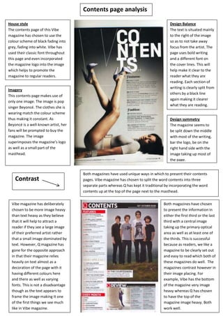
- 1. House style The contents page of this Vibe magazine has chosen to use the colour scheme of black fading into grey, fading into white. Vibe has used their classic font throughout this page and even incorporated the magazine logo into the image which helps to promote the magazine to regular readers. Design Balance The text is situated mainly to the right of the image so as to not take away focus from the artist. The page uses bold writing and a different font on the cover lines. This will help make it clear to the reader what they are reading. Each section of writing is clearly split from others by a black line again making it clearer what they are reading. Imagery This contents page makes use of only one image. The image is pop singer Beyoncé. The clothes she is wearing match the colour scheme thus making it constant. As Beyoncé is a well-known artist, her fans will be prompted to buy the magazine. The image superimposes the magazine’s logo as well as a small part of the masthead. Design symmetry The magazine seems to be split down the middle with most of the writing, bar the logo, be on the right hand side with the image taking up most of the page. Both magazines have used unique ways in which to present their contents pages. Vibe magazine has chosen to split the word contents into three separate parts whereas Q has kept it traditional by incorporating the word contents up at the top of the page next to the masthead. Both magazines have chosen to present the information in either the first third or the last third with a central image taking up the primary optical area as well as at least one of the thirds. This is successful because as readers, we like a magazine to be clearly set out and easy to read which both of these magazines do well. The magazines contrast however in their image placing. For example, Vibe has the bottom of the magazine very image heavy whereas Q has chosen to have the top of the magazine image heavy. Both work well. Vibe magazine has deliberately chosen to be more image heavy than text heavy as they believe that it will help to attract a reader if they see a large image of their preferred artist rather that a small image dominated by text. However, Q magazine has gone for the opposite approach in that their magazine relies heavily on text almost as a decoration of the page with it having different colours here and there as well as varying fonts. This is not a disadvantage though as the text appears to frame the image making It one of the first things we see much like in Vibe magazine. Contents page analysis Contrast