Question 5
How did you attract/address
your audience?
From my focus group I found
that the feedback was positive
therefore this may be evidence
that I would have successfully
attracted the right audience.
The focus group included only
people from my target audience
as defined in the previous
question. My target audience is
aged 16-25 who enjoy indie and
rock music. The focus group did
not mention any issues with the
content of the magazine. This
may mean it successfully appeals
to this target audience. For
instance the article is written in
a casual informal manner that will appeal to a younger audience and is appropriate
for a music magazine. Also the images used link to the indie genre which means the
content is appropriate for the target audience. This is also highlighted by the other
bands on the front cover and contents page.
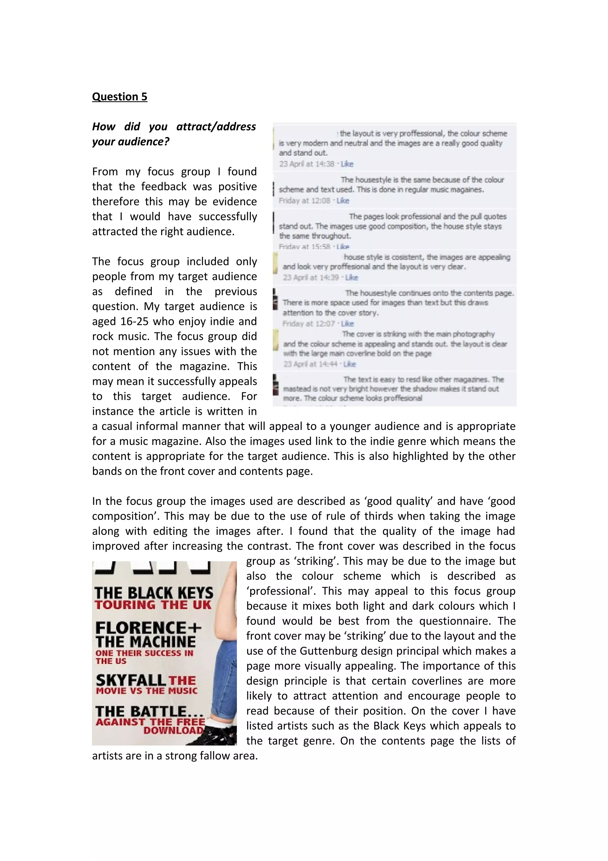
In the focus group the images used are described as ‘good quality’ and have ‘good
composition’. This may be due to the use of rule of thirds when taking the image
along with editing the images after. I found that the quality of the image had
improved after increasing the contrast. The front cover was described in the focus
group as ‘striking’. This may be due to the image but
also the colour scheme which is described as
‘professional’. This may appeal to this focus group
because it mixes both light and dark colours which I
found would be best from the questionnaire. The
front cover may be ‘striking’ due to the layout and the
use of the Guttenburg design principal which makes a
page more visually appealing. The importance of this
design principle is that certain coverlines are more
likely to attract attention and encourage people to
read because of their position. On the cover I have
listed artists such as the Black Keys which appeals to
the target genre. On the contents page the lists of
artists are in a strong fallow area.
The masthead is described as ‘not very bright’ however the shadow behind causes it
to be more prominent on the page and appear as a logo as mastheads do. The
importance of having a striking front cover is that it draws in the audience. The
positive comments suggest this was successful. From the focus group I found that
the consistent house style is noticeable and this links to other music magazines
which are consistent in font type and colours throughout.

Question 5 evaluation

  • 1.
    Question 5 How didyou attract/address your audience? From my focus group I found that the feedback was positive therefore this may be evidence that I would have successfully attracted the right audience. The focus group included only people from my target audience as defined in the previous question. My target audience is aged 16-25 who enjoy indie and rock music. The focus group did not mention any issues with the content of the magazine. This may mean it successfully appeals to this target audience. For instance the article is written in a casual informal manner that will appeal to a younger audience and is appropriate for a music magazine. Also the images used link to the indie genre which means the content is appropriate for the target audience. This is also highlighted by the other bands on the front cover and contents page. In the focus group the images used are described as ‘good quality’ and have ‘good composition’. This may be due to the use of rule of thirds when taking the image along with editing the images after. I found that the quality of the image had improved after increasing the contrast. The front cover was described in the focus group as ‘striking’. This may be due to the image but also the colour scheme which is described as ‘professional’. This may appeal to this focus group because it mixes both light and dark colours which I found would be best from the questionnaire. The front cover may be ‘striking’ due to the layout and the use of the Guttenburg design principal which makes a page more visually appealing. The importance of this design principle is that certain coverlines are more likely to attract attention and encourage people to read because of their position. On the cover I have listed artists such as the Black Keys which appeals to the target genre. On the contents page the lists of artists are in a strong fallow area.
  • 2.
    The masthead isdescribed as ‘not very bright’ however the shadow behind causes it to be more prominent on the page and appear as a logo as mastheads do. The importance of having a striking front cover is that it draws in the audience. The positive comments suggest this was successful. From the focus group I found that the consistent house style is noticeable and this links to other music magazines which are consistent in font type and colours throughout.