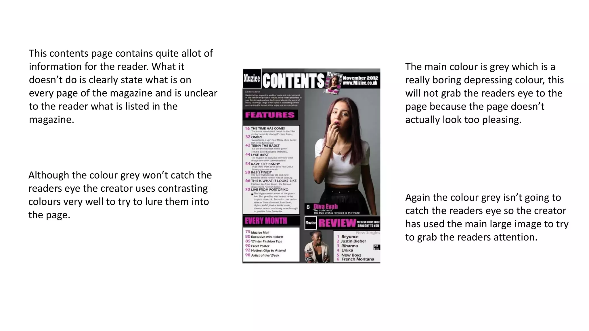
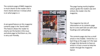
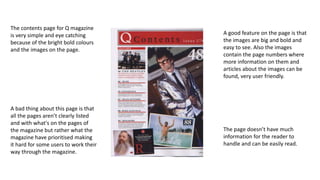
This contents page contains quite allot of 
information for the reader. What it 
doesn’t do is clearly state what is on 
every page of the magazine and is unclear 
to the reader what is listed in the 
magazine. 
The main colour is grey which is a 
really boring depressing colour, this 
will not grab the readers eye to the 
page because the page doesn’t 
actually look too pleasing. 
Although the colour grey won’t catch the 
readers eye the creator uses contrasting 
colours very well to try to lure them into 
the page. 
Again the colour grey isn’t going to 
catch the readers eye so the creator 
has used the main large image to try 
to grab the readers attention.
The contents page of NME magazine 
is much clearer to the reader and is 
more clearly laid out. It shows what 
is on what page e.c.t. 
The page having mainly brighter 
colours grabs the readers eye and 
entices the reader into the 
magazine. 
The magazine has lots of 
information on its contents page 
but it is very well laid out with clear 
headings and subheadings. 
A very good feature on this magazine 
contents page is the ‘band index’. 
This feature allows the reader to 
clearly see the bands in this issue 
and what page to find them on, this 
is very user friendly. 
The contents page also has a small 
article in the middle. I think this is a 
bad thing as this page isn’t the type 
of page that demands to have an 
article in it but is more to help the 
reader through the magazine 
layout.
The contents page for Q magazine 
is very simple and eye catching 
because of the bright bold colours 
and the images on the page. 
A good feature on the page is that 
the images are big and bold and 
easy to see. Also the images 
contain the page numbers where 
more information on them and 
articles about the images can be 
found, very user friendly. 
The page doesn’t have much 
information for the reader to 
handle and can be easily read. 
A bad thing about this page is that 
all the pages aren’t clearly listed 
and with what's on the pages of 
the magazine but rather what the 
magazine have prioritised making 
it hard for some users to work their 
way through the magazine.

Magazine contents

  • 1.
    This contents pagecontains quite allot of information for the reader. What it doesn’t do is clearly state what is on every page of the magazine and is unclear to the reader what is listed in the magazine. The main colour is grey which is a really boring depressing colour, this will not grab the readers eye to the page because the page doesn’t actually look too pleasing. Although the colour grey won’t catch the readers eye the creator uses contrasting colours very well to try to lure them into the page. Again the colour grey isn’t going to catch the readers eye so the creator has used the main large image to try to grab the readers attention.
  • 2.
    The contents pageof NME magazine is much clearer to the reader and is more clearly laid out. It shows what is on what page e.c.t. The page having mainly brighter colours grabs the readers eye and entices the reader into the magazine. The magazine has lots of information on its contents page but it is very well laid out with clear headings and subheadings. A very good feature on this magazine contents page is the ‘band index’. This feature allows the reader to clearly see the bands in this issue and what page to find them on, this is very user friendly. The contents page also has a small article in the middle. I think this is a bad thing as this page isn’t the type of page that demands to have an article in it but is more to help the reader through the magazine layout.
  • 3.
    The contents pagefor Q magazine is very simple and eye catching because of the bright bold colours and the images on the page. A good feature on the page is that the images are big and bold and easy to see. Also the images contain the page numbers where more information on them and articles about the images can be found, very user friendly. The page doesn’t have much information for the reader to handle and can be easily read. A bad thing about this page is that all the pages aren’t clearly listed and with what's on the pages of the magazine but rather what the magazine have prioritised making it hard for some users to work their way through the magazine.