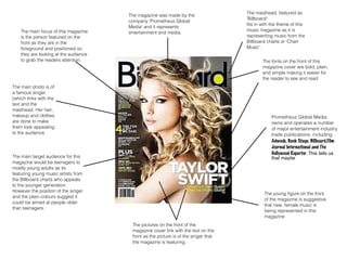
1. The masthead, featured as
'Billboard'
fits in with the theme of this
music magazine as it is
representing music from the
Billboard charts or 'Chart
Music'.
The main focus of this magazine
is the person featured on the
front as they are in the
foreground and positioned so
they are looking at the audience
to grab the readers attention.
The main photo is of
a famous singer
(which links with the
text and the
masthead. Her hair,
makeup and clothes
are done to make
them look appealing
to the audience
The magazine was made by the
company 'Prometheus Global
Media' and it represents
entertainment and media.
The pictures on the front of the
magazine cover link with the text on the
front as the picture is of the singer that
the magazine is featuring.
The fonts on the front of this
magazine cover are bold, plain,
and simple making it easier for
the reader to see and read
Prometheus Global Media
owns and operates a number
of major entertainment industry
trade publications, including
Adweek, Back Stage, Billboard,Film
Journal International and The
Hollywood Reporter. This tells us
The main target audience for this that maybe
magazine would be teenagers to
mostly young adults as its
featuring young music artists from
the Billboard charts who appeals
to the younger generation.
However the position of the singer
and the plain colours suggest it
could be aimed at people older
than teenagers.
The young figure on the front
of the magazine is suggestive
that new, female music is
being represented in this
magazine
2. The main focus of
this magazine is the
singer on the front
as they are in the
foreground (in front
of the text)
This magazine was made by
the company ‘Wenner Media
LLC’
The characters hair
and makeup are done
to make them
appealing to the
audience or to make
you pick it up
The text on the front of
the magazine links to
the images as the
biggest piece of text is
telling you who is on
the magazine
The colour scheme is good,
(colours don’t clash) and a
simple one of red, black and
white
The main target
audience for this
magazine would be for
slightly older people
e.g. 18+ as nothing
really appeals you
younger people. (colour
scheme and singers on
the front)
White background
makes the text and
images stand out
The fonts on the
magazine are basic to
make it easy for the
reader to read but this
front cover has a
variety of fonts
3. The masthead of this magazine is called 'Q'
which is suggestive that it will stand out more in
news stands, however it also means cueing a
record (ready to play) but the company
shortened it to ‘Q’
The main focus of this
magazine is the singer on
the front as they are in the
foreground against the
text and is the largest
graphic on the front
The main colours on this
magazine are red, white
and black which is
suggestive that the
magazine is aimed at a
slightly older generation
The fonts on this magazine
cover are plain, simple and
bold making it easy for the
reader to see and read,
however the colour of the
main text doesn't stand out
very much against the main
photo
The small slogan under the masthead is
designed to make you want to read the
magazine and to draw you in
The target audience for this magazine would
be slightly older people e.g. adults (18+) as
the magazine is featuring a slightly older artist
and the colours and graphics on the front
wouldn’t appeal to younger people
The main music being featured in
this magazine is new releases or
rock music however it represents all
types of music as seen on the front.
(Radiohead, Neil Young, etc.)
The photo used on the front is of a famous rock singer
showing you what's going to be featured inside the
magazine. The character on the front has a serious
facial expression while the caption underneath both
make the audience intrigued as to what’s inside
The images on the front link to the text as
they are relevant to each other, e.g.
In these photographs mainly men
and slightly older singers are
being represented.
Q Magazine is published by ‘The
Bauer Media Group’ who also
publish ‘Kerrang!’ who are based
on rock music.