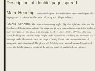
This document analyzes and summarizes the key elements of the covers and interior pages of two travel magazines: National Geographic Traveler and Lonely Planet.
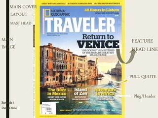
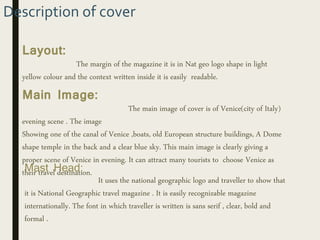
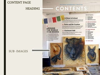
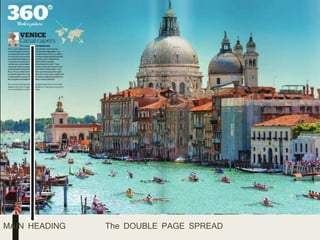
The National Geographic Traveler cover focuses on Venice, using an evening scene as the main image to attract tourists. The interior pages have sections for articles, with content divided into topics. A double page spread features Venice canals.
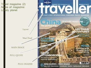
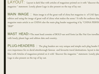
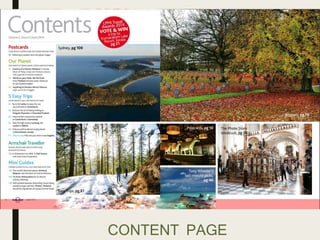
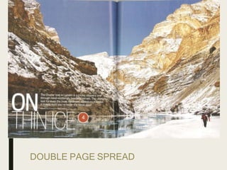
Lonely Planet's cover uses an image of the Great Wall of China, though the magazine is a United Arab Emirates edition. Interior pages contain landscape images and various article headings to appeal to readers. A double page spread profiles Ladakh, India, where the landscape matches the page's theme of being "On Thin Ice."