The document discusses how the media product challenges and develops conventions of real magazines and websites.
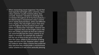
It challenges conventions such as using a monochrome color scheme rather than bright colors typically seen in travel magazines. Front covers usually have lots of text but the product uses a simple layout with just one main image.
It develops conventions such as including a dominant image on the front cover and contents page, and uses galleries and social media links on the website similar to real magazines and websites. Overall it strives for a modern and simple aesthetic while still including typical elements audiences expect.