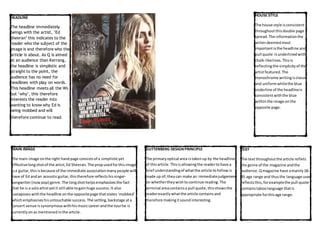
MAIN IMAGE
The main image onthe right handpage consistsof a simplisticyet
effectivelongshotof the artist,Ed Sheeran. The propusedforthisimage
isa guitar, thisisbecause of the immediate association many people will
have of Ed andan acousticguitar,thistherefore reflectshissinger-
songwriter(now pop) genre. The longshothelpsemphasisesthe fact
that he is a soloartistyetit still able togainhuge success. It also
juxtaposes withthe headline onthe oppositepage thatstates‘mobbed’
whichemphasiseshisuntouchable success. The setting, backstage ata
concert venue issynonymous withhismusiccareerandthe tourhe is
currently onas mentionedinthe article.
HOUSE STYLE
The house style isconsistent
throughoutthisdouble page
spread. The informationthe
writerdeemedmost
importantisthe headline and
pull quote isunderlinedwith
chalk-likelines. Thisis
reflectingthe simplicityof the
artistfeatured.The
monochrome writingisclassic
and uniformwhilethe blue
underline of the headlineis
consistentwiththe blue
withinthe image onthe
opposite page.
TEXT
The textthroughoutthe article reflets
the genre of the magazine andthe
audience. Qmagazine have amainly 18-
35 age range and thusthe language used
reflectsthis, forexamplethe pull quote
contains taboolanguage thatis
appropriate forthisage range.
GUTTENBERG DESIGNPRINCIPLE
The primaryoptical area istakenup by the headline
of thisarticle. Thisisallowingthe readertohave a
brief understandingof whatthe article tofollow is
made up of;theycan make an immediatejudgement
on whethertheywishtocontinue reading. The
terminal areacontainsa pull quote, thisshowsthe
readerexactlywhatthe article containsand
therefore makingitsoundinteresting.
HEADLINE
The headline immediately
beings with the artist, ’Ed
Sheeran’ this indicates to the
reader who the subject of the
image is and therefore who the
article is about. As Q is aimed
at an audience than Kerrang,
the headline is simplistic and
straight to the point, the
audience has no need for
headlines with play on words.
This headline meets all the Ws
but ‘why’, this therefore
interests the reader into
wanting to know why Ed is
being mobbed and will
therefore continue to read.
HOUSE STYLE
The house style consistsof White
and Redwriting. The redconnotes
blood;reflectingthe theme of
death. While the white isusedto
contrast againthe gloomy black
and greyof the background. Italso
suggestspurity reflectingTaylor’s
act of being‘reborn’.The redis
apparentinthe kickerto indicate
namesto highlightwhothe article
isabout. The house style helps
emphasise the mostimportant
aspectsof the interview thatthe
readermay wantto know
instantly.
HEADLINE
The headline ‘Grave new world’containsa
pun. The extraemphasisbuton‘Grave’with
the differentfont, sizeandcolourdraws
attentiontoit,and therefore highlightsthis
punas itusesthe double meaningof ‘grave’
suggestingbothaplace of burial andthe
dangersof a ‘new world’Ittherefore
reflectsthe mainimage withboth
definitions. The fontreflectsthe Victorian
gothictheme runningthroughthe article.
MAIN IMAGE
The main image containsthe propof a gravestone. Thishelps
representthe theme of deaththroughoutthe article. The main
subjectof the image, Taylor, takesupthe first2 thirdsof the page,
usinga mid-shot, leavingthe restof the mainbody of text.
Gravestone withthe text‘TaylorMomsenActress’suggestingthe
endof heractingcareer, whichmaypersuade the readertoread on
to findoutwhat thismeansandan explanationbehindit.Taylor’s
make up itverypale withdark eyes, givingherthe dead-like look.
The whole image isverydramaticwiththe dark woodedarea
encirclingherandherextremely highandlowlightedmake upas
she issurrounded bysoil.
TEXT
The pull quote showsa strongattitude reflectingthe
dramaticimagery that continues throughoutthe
article,thisshowsthatthe article isto entertainan
audience.The headline usesapunin the word‘Grave’
usingit’sdouble meaning. A redDrop cap is usedin
the beginningtwoparagraphs,carryingoverthe font
style fromthe headline. The article hasbeenwritten
to informas well asentertainthisisobviousthrough
the kickerwhere Taylor’sbackgroundislistedas
‘Actress. Model. Celebrity.’
GUTTENBERG DESIGNPRINCIPLE
The primaryoptical area showsthe
image of a gravestone withthe text
‘TaylorMomsenActress’suggeststhe
endof heractingcareer ina shocking
waythus enticingareaderto findout
more. While the terminal areahasthe
mainbody of textsothat the consumer
can beginto readthe article.
The lowerfallowareacontains apull
quote ina contrastingcolourwhichwill
attract a reader. While the upperfallow
area containsthe headline inabigand
boldtextto standout,it alsocontains
the band’sname, ‘The PrettyReckless’
to informa readerif they were unsure.
The Kerrang! and Q magazine double page spreads are both similar and different in many ways. Kerrang! magazine uses a consistent, common
layout while including many features. Both magazines do share some similar features. For example each one used an effective pull quote directly
from the article
Kerrang also replies on bright colours to draw attention to the most important information, whereas Q are much more simplistic, using
monochrome and instead subtly draw attention to information by underlining the key aspects (headline and pull quote) which have carefully
been selected.
The target audience has a huge affect on the features that appear in the magazine. Kerrang magazine use more consistent, identifiable features
such as a dropkick and kicker so the young 13-18 audience can purchase or subscribe to something they are familiar with and be comfortable
with a consistent magazine every week. While Q magazine can have an article, such as this Ed Sheeran write up, that has an alternative layout as
their older audience can enjoy reading a more sophisticated style that isn’t repeated throughout the magazine.

Double page analysis

  • 1.
    MAIN IMAGE The mainimage onthe right handpage consistsof a simplisticyet effectivelongshotof the artist,Ed Sheeran. The propusedforthisimage isa guitar, thisisbecause of the immediate association many people will have of Ed andan acousticguitar,thistherefore reflectshissinger- songwriter(now pop) genre. The longshothelpsemphasisesthe fact that he is a soloartistyetit still able togainhuge success. It also juxtaposes withthe headline onthe oppositepage thatstates‘mobbed’ whichemphasiseshisuntouchable success. The setting, backstage ata concert venue issynonymous withhismusiccareerandthe tourhe is currently onas mentionedinthe article. HOUSE STYLE The house style isconsistent throughoutthisdouble page spread. The informationthe writerdeemedmost importantisthe headline and pull quote isunderlinedwith chalk-likelines. Thisis reflectingthe simplicityof the artistfeatured.The monochrome writingisclassic and uniformwhilethe blue underline of the headlineis consistentwiththe blue withinthe image onthe opposite page. TEXT The textthroughoutthe article reflets the genre of the magazine andthe audience. Qmagazine have amainly 18- 35 age range and thusthe language used reflectsthis, forexamplethe pull quote contains taboolanguage thatis appropriate forthisage range. GUTTENBERG DESIGNPRINCIPLE The primaryoptical area istakenup by the headline of thisarticle. Thisisallowingthe readertohave a brief understandingof whatthe article tofollow is made up of;theycan make an immediatejudgement on whethertheywishtocontinue reading. The terminal areacontainsa pull quote, thisshowsthe readerexactlywhatthe article containsand therefore makingitsoundinteresting. HEADLINE The headline immediately beings with the artist, ’Ed Sheeran’ this indicates to the reader who the subject of the image is and therefore who the article is about. As Q is aimed at an audience than Kerrang, the headline is simplistic and straight to the point, the audience has no need for headlines with play on words. This headline meets all the Ws but ‘why’, this therefore interests the reader into wanting to know why Ed is being mobbed and will therefore continue to read.
  • 2.
    HOUSE STYLE The housestyle consistsof White and Redwriting. The redconnotes blood;reflectingthe theme of death. While the white isusedto contrast againthe gloomy black and greyof the background. Italso suggestspurity reflectingTaylor’s act of being‘reborn’.The redis apparentinthe kickerto indicate namesto highlightwhothe article isabout. The house style helps emphasise the mostimportant aspectsof the interview thatthe readermay wantto know instantly. HEADLINE The headline ‘Grave new world’containsa pun. The extraemphasisbuton‘Grave’with the differentfont, sizeandcolourdraws attentiontoit,and therefore highlightsthis punas itusesthe double meaningof ‘grave’ suggestingbothaplace of burial andthe dangersof a ‘new world’Ittherefore reflectsthe mainimage withboth definitions. The fontreflectsthe Victorian gothictheme runningthroughthe article. MAIN IMAGE The main image containsthe propof a gravestone. Thishelps representthe theme of deaththroughoutthe article. The main subjectof the image, Taylor, takesupthe first2 thirdsof the page, usinga mid-shot, leavingthe restof the mainbody of text. Gravestone withthe text‘TaylorMomsenActress’suggestingthe endof heractingcareer, whichmaypersuade the readertoread on to findoutwhat thismeansandan explanationbehindit.Taylor’s make up itverypale withdark eyes, givingherthe dead-like look. The whole image isverydramaticwiththe dark woodedarea encirclingherandherextremely highandlowlightedmake upas she issurrounded bysoil. TEXT The pull quote showsa strongattitude reflectingthe dramaticimagery that continues throughoutthe article,thisshowsthatthe article isto entertainan audience.The headline usesapunin the word‘Grave’ usingit’sdouble meaning. A redDrop cap is usedin the beginningtwoparagraphs,carryingoverthe font style fromthe headline. The article hasbeenwritten to informas well asentertainthisisobviousthrough the kickerwhere Taylor’sbackgroundislistedas ‘Actress. Model. Celebrity.’ GUTTENBERG DESIGNPRINCIPLE The primaryoptical area showsthe image of a gravestone withthe text ‘TaylorMomsenActress’suggeststhe endof heractingcareer ina shocking waythus enticingareaderto findout more. While the terminal areahasthe mainbody of textsothat the consumer can beginto readthe article. The lowerfallowareacontains apull quote ina contrastingcolourwhichwill attract a reader. While the upperfallow area containsthe headline inabigand boldtextto standout,it alsocontains the band’sname, ‘The PrettyReckless’ to informa readerif they were unsure. The Kerrang! and Q magazine double page spreads are both similar and different in many ways. Kerrang! magazine uses a consistent, common layout while including many features. Both magazines do share some similar features. For example each one used an effective pull quote directly from the article Kerrang also replies on bright colours to draw attention to the most important information, whereas Q are much more simplistic, using monochrome and instead subtly draw attention to information by underlining the key aspects (headline and pull quote) which have carefully been selected. The target audience has a huge affect on the features that appear in the magazine. Kerrang magazine use more consistent, identifiable features such as a dropkick and kicker so the young 13-18 audience can purchase or subscribe to something they are familiar with and be comfortable with a consistent magazine every week. While Q magazine can have an article, such as this Ed Sheeran write up, that has an alternative layout as their older audience can enjoy reading a more sophisticated style that isn’t repeated throughout the magazine.