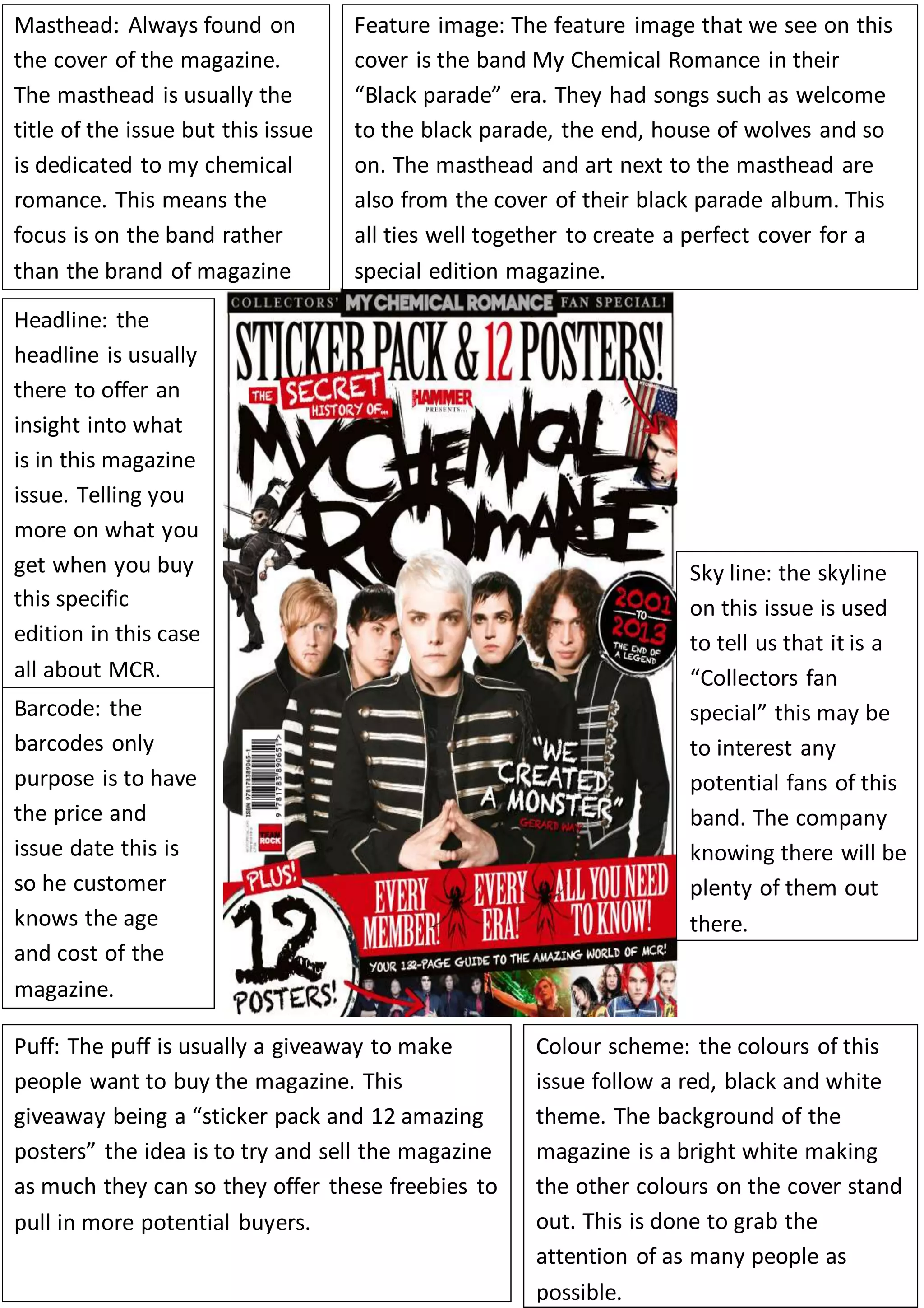
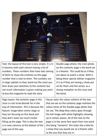
Masthead: Always found on 
the cover of the magazine. 
The masthead is usually the 
title of the issue but this issue 
is dedicated to my chemical 
romance. This means the 
focus is on the band rather 
than the brand of magazine 
Feature image: The feature image that we see on this 
cover is the band My Chemical Romance in their 
“Black parade” era. They had songs such as welcome 
to the black parade, the end, house of wolves and so 
on. The masthead and art next to the masthead are 
also from the cover of their black parade album. This 
all ties well together to create a perfect cover for a 
special edition magazine. 
Headline: the 
headline is usually 
there to offer an 
insight into what 
is in this magazine 
issue. Telling you 
more on what you 
get when you buy 
this specific 
edition in this case 
all about MCR. 
Sky line: the skyline 
on this issue is used 
to tell us that it is a 
“Collectors fan 
special” this may be 
to interest any 
potential fans of this 
band. The company 
knowing there will be 
plenty of them out 
there. 
Barcode: the 
barcodes only 
purpose is to have 
the price and 
issue date this is 
so he customer 
knows the age 
and cost of the 
magazine. 
Puff: The puff is usually a giveaway to make 
people want to buy the magazine. This 
giveaway being a “sticker pack and 12 amazing 
posters” the idea is to try and sell the magazine 
as much they can so they offer these freebies to 
pull in more potential buyers. 
Colour scheme: the colours of this 
issue follow a red, black and white 
theme. The background of the 
magazine is a bright white making 
the other colours on the cover stand 
out. This is done to grab the 
attention of as many people as 
possible.
Text: the layout of this text is very simple. It is in 
4 columns with each column having a list of 
numbers. These numbers then have text coming 
of them to show the contents on the page 
number that is next to them. The numbers are 
in large capitals so they stand out the most you 
then draw your attention to the contents but 
not much information is given making you want 
to buy the magazine to read the story. 
Double page photo: the main photo 
on this contents page is the band sat 
in a theatre. This could be as if they 
are about to watch a show. With it 
being there special edition magazine 
it is as if they are having a show put 
on for them and this serves as a 
strong metaphor to this issue and 
the band. 
Page layout: the contents page in this 
issue is a lot to be desired for in the 
way of information. This is because the 
feature image takes centre stage as 
they are focusing on this band and 
they don’t want too much clutter 
filling up the page. This is why the text 
is in neat columns at the bottom of the 
page out of the way 
House style: the colour scheme of the text 
that we see on the contents page matches the 
colour tones of the Double page photo that 
we see. The deep blue colour goes through 
the full image with white highlights showing 
up in certain places. All of the text on the 
page is in the same font apart from one word 
this being “contents” this looks like a title for 
a show that you would see at a theatre alike 
to the one that they are in.
Page layout: The image of the 
collection of albums is a deep grey 
with the image collection being a dull 
black and white. This could show that 
all of these are unimportant and the 
article that is on the right is the main 
attraction. 
Text: the text that we see uses a 
massive drop cap and then the text 
alongside it is a lot smaller. The drop 
cap would be used to draw the 
attention of the reader to the text that 
is written on this page. 
Website advertisement: in the bottom 
left corner we see a small amount of 
text which is the website. This is used to 
get more people to check online and 
then they will get a larger amount of 
online viewers also.

second assessment

  • 1.
    Masthead: Always foundon the cover of the magazine. The masthead is usually the title of the issue but this issue is dedicated to my chemical romance. This means the focus is on the band rather than the brand of magazine Feature image: The feature image that we see on this cover is the band My Chemical Romance in their “Black parade” era. They had songs such as welcome to the black parade, the end, house of wolves and so on. The masthead and art next to the masthead are also from the cover of their black parade album. This all ties well together to create a perfect cover for a special edition magazine. Headline: the headline is usually there to offer an insight into what is in this magazine issue. Telling you more on what you get when you buy this specific edition in this case all about MCR. Sky line: the skyline on this issue is used to tell us that it is a “Collectors fan special” this may be to interest any potential fans of this band. The company knowing there will be plenty of them out there. Barcode: the barcodes only purpose is to have the price and issue date this is so he customer knows the age and cost of the magazine. Puff: The puff is usually a giveaway to make people want to buy the magazine. This giveaway being a “sticker pack and 12 amazing posters” the idea is to try and sell the magazine as much they can so they offer these freebies to pull in more potential buyers. Colour scheme: the colours of this issue follow a red, black and white theme. The background of the magazine is a bright white making the other colours on the cover stand out. This is done to grab the attention of as many people as possible.
  • 2.
    Text: the layoutof this text is very simple. It is in 4 columns with each column having a list of numbers. These numbers then have text coming of them to show the contents on the page number that is next to them. The numbers are in large capitals so they stand out the most you then draw your attention to the contents but not much information is given making you want to buy the magazine to read the story. Double page photo: the main photo on this contents page is the band sat in a theatre. This could be as if they are about to watch a show. With it being there special edition magazine it is as if they are having a show put on for them and this serves as a strong metaphor to this issue and the band. Page layout: the contents page in this issue is a lot to be desired for in the way of information. This is because the feature image takes centre stage as they are focusing on this band and they don’t want too much clutter filling up the page. This is why the text is in neat columns at the bottom of the page out of the way House style: the colour scheme of the text that we see on the contents page matches the colour tones of the Double page photo that we see. The deep blue colour goes through the full image with white highlights showing up in certain places. All of the text on the page is in the same font apart from one word this being “contents” this looks like a title for a show that you would see at a theatre alike to the one that they are in.
  • 3.
    Page layout: Theimage of the collection of albums is a deep grey with the image collection being a dull black and white. This could show that all of these are unimportant and the article that is on the right is the main attraction. Text: the text that we see uses a massive drop cap and then the text alongside it is a lot smaller. The drop cap would be used to draw the attention of the reader to the text that is written on this page. Website advertisement: in the bottom left corner we see a small amount of text which is the website. This is used to get more people to check online and then they will get a larger amount of online viewers also.