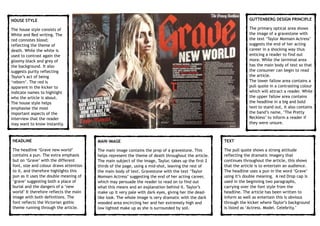
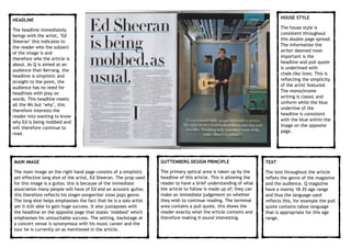
HOUSE STYLE
The house style consists of
White and Red writing. The
red connotes blood;
reflecting the theme of
death. While the white is
used to contrast again the
gloomy black and grey of
the background. It also
suggests purity reflecting
Taylor’s act of being
‘reborn’. The red is
apparent in the kicker to
indicate names to highlight
who the article is about.
The house style helps
emphasise the most
important aspects of the
interview that the reader
may want to know instantly.
HEADLINE
The headline ‘Grave new world’
contains a pun. The extra emphasis
but on ‘Grave’ with the different
font, size and colour draws attention
to it, and therefore highlights this
pun as it uses the double meaning of
‘grave’ suggesting both a place of
burial and the dangers of a ‘new
world’ It therefore reflects the main
image with both definitions. The
font reflects the Victorian gothic
theme running through the article.
MAIN IMAGE
The main image contains the prop of a gravestone. This
helps represent the theme of death throughout the article.
The main subject of the image, Taylor, takes up the first 2
thirds of the page, using a mid-shot, leaving the rest of
the main body of text. Gravestone with the text ‘Taylor
Momsen Actress’ suggesting the end of her acting career,
which may persuade the reader to read on to find out
what this means and an explanation behind it. Taylor’s
make up it very pale with dark eyes, giving her the dead-
like look. The whole image is very dramatic with the dark
wooded area encircling her and her extremely high and
low lighted make up as she is surrounded by soil.
TEXT
The pull quote shows a strong attitude
reflecting the dramatic imagery that
continues throughout the article, this shows
that the article is to entertain an audience.
The headline uses a pun in the word ‘Grave’
using it’s double meaning. A red Drop cap is
used in the beginning two paragraphs,
carrying over the font style from the
headline. The article has been written to
inform as well as entertain this is obvious
through the kicker where Taylor’s background
is listed as ‘Actress. Model. Celebrity.’
GUTTENBERG DESIGN PRINCIPLE
The primary optical area shows
the image of a gravestone with
the text ‘Taylor Momsen Actress’
suggests the end of her acting
career in a shocking way thus
enticing a reader to find out
more. While the terminal area
has the main body of text so that
the consumer can begin to read
the article.

The lower fallow area contains a
pull quote in a contrasting colour
which will attract a reader. While
the upper fallow area contains
the headline in a big and bold
text to stand out, it also contains
the band’s name, ‘The Pretty
Reckless’ to inform a reader if
they were unsure.
MAIN IMAGE
The main image on the right hand page consists of a simplistic
yet effective long shot of the artist, Ed Sheeran. The prop used
for this image is a guitar, this is because of the immediate
association many people will have of Ed and an acoustic guitar,
this therefore reflects his singer-songwriter (now pop) genre.
The long shot helps emphasises the fact that he is a solo artist
yet it still able to gain huge success. It also juxtaposes with
the headline on the opposite page that states ‘mobbed’ which
emphasises his untouchable success. The setting, backstage at
a concert venue is synonymous with his music career and the
tour he is currently on as mentioned in the article.
HOUSE STYLE
The house style is
consistent throughout
this double page spread.
The information the
writer deemed most
important is the
headline and pull quote
is underlined with
chalk-like lines. This is
reflecting the simplicity
of the artist featured.
The monochrome
writing is classic and
uniform while the blue
underline of the
headline is consistent
with the blue within the
image on the opposite
page.
TEXT
The text throughout the article
reflets the genre of the magazine
and the audience. Q magazine
have a mainly 18-35 age range
and thus the language used
reflects this, for example the pull
quote contains taboo language
that is appropriate for this age
range.
GUTTENBERG DESIGN PRINCIPLE
The primary optical area is taken up by the
headline of this article. This is allowing the
reader to have a brief understanding of what
the article to follow is made up of; they can
make an immediate judgement on whether
they wish to continue reading. The terminal
area contains a pull quote, this shows the
reader exactly what the article contains and
therefore making it sound interesting.
HEADLINE
The headline immediately
beings with the artist, ’Ed
Sheeran’ this indicates to
the reader who the subject
of the image is and
therefore who the article is
about. As Q is aimed at an
audience than Kerrang, the
headline is simplistic and
straight to the point, the
audience has no need for
headlines with play on
words. This headline meets
all the Ws but ‘why’, this
therefore interests the
reader into wanting to know
why Ed is being mobbed and
will therefore continue to
read.
The Kerrang! and Q magazine double page spreads are both similar and different in many ways. Kerrang! magazine uses a consistent, common
layout while including many features. Both magazines do share some similar features. For example each one used an effective pull quote
directly from the article
Kerrang also replies on bright colours to draw attention to the most important information, whereas Q are much more simplistic, using
monochrome and instead subtly draw attention to information by underlining the key aspects (headline and pull quote) which have carefully
been selected.
The target audience has a huge affect on the features that appear in the magazine. Kerrang magazine use more consistent, identifiable
features such as a dropkick and kicker so the young 13-18 audience can purchase or subscribe to something they are familiar with and be
comfortable with a consistent magazine every week. While Q magazine can have an article, such as this Ed Sheeran write up, that has an
alternative layout as their older audience can enjoy reading a more sophisticated style that isn’t repeated throughout the magazine.

Double Page Spread Analysis

  • 1.
    HOUSE STYLE The housestyle consists of White and Red writing. The red connotes blood; reflecting the theme of death. While the white is used to contrast again the gloomy black and grey of the background. It also suggests purity reflecting Taylor’s act of being ‘reborn’. The red is apparent in the kicker to indicate names to highlight who the article is about. The house style helps emphasise the most important aspects of the interview that the reader may want to know instantly. HEADLINE The headline ‘Grave new world’ contains a pun. The extra emphasis but on ‘Grave’ with the different font, size and colour draws attention to it, and therefore highlights this pun as it uses the double meaning of ‘grave’ suggesting both a place of burial and the dangers of a ‘new world’ It therefore reflects the main image with both definitions. The font reflects the Victorian gothic theme running through the article. MAIN IMAGE The main image contains the prop of a gravestone. This helps represent the theme of death throughout the article. The main subject of the image, Taylor, takes up the first 2 thirds of the page, using a mid-shot, leaving the rest of the main body of text. Gravestone with the text ‘Taylor Momsen Actress’ suggesting the end of her acting career, which may persuade the reader to read on to find out what this means and an explanation behind it. Taylor’s make up it very pale with dark eyes, giving her the dead- like look. The whole image is very dramatic with the dark wooded area encircling her and her extremely high and low lighted make up as she is surrounded by soil. TEXT The pull quote shows a strong attitude reflecting the dramatic imagery that continues throughout the article, this shows that the article is to entertain an audience. The headline uses a pun in the word ‘Grave’ using it’s double meaning. A red Drop cap is used in the beginning two paragraphs, carrying over the font style from the headline. The article has been written to inform as well as entertain this is obvious through the kicker where Taylor’s background is listed as ‘Actress. Model. Celebrity.’ GUTTENBERG DESIGN PRINCIPLE The primary optical area shows the image of a gravestone with the text ‘Taylor Momsen Actress’ suggests the end of her acting career in a shocking way thus enticing a reader to find out more. While the terminal area has the main body of text so that the consumer can begin to read the article.
 The lower fallow area contains a pull quote in a contrasting colour which will attract a reader. While the upper fallow area contains the headline in a big and bold text to stand out, it also contains the band’s name, ‘The Pretty Reckless’ to inform a reader if they were unsure.
  • 2.
    MAIN IMAGE The mainimage on the right hand page consists of a simplistic yet effective long shot of the artist, Ed Sheeran. The prop used for this image is a guitar, this is because of the immediate association many people will have of Ed and an acoustic guitar, this therefore reflects his singer-songwriter (now pop) genre. The long shot helps emphasises the fact that he is a solo artist yet it still able to gain huge success. It also juxtaposes with the headline on the opposite page that states ‘mobbed’ which emphasises his untouchable success. The setting, backstage at a concert venue is synonymous with his music career and the tour he is currently on as mentioned in the article. HOUSE STYLE The house style is consistent throughout this double page spread. The information the writer deemed most important is the headline and pull quote is underlined with chalk-like lines. This is reflecting the simplicity of the artist featured. The monochrome writing is classic and uniform while the blue underline of the headline is consistent with the blue within the image on the opposite page. TEXT The text throughout the article reflets the genre of the magazine and the audience. Q magazine have a mainly 18-35 age range and thus the language used reflects this, for example the pull quote contains taboo language that is appropriate for this age range. GUTTENBERG DESIGN PRINCIPLE The primary optical area is taken up by the headline of this article. This is allowing the reader to have a brief understanding of what the article to follow is made up of; they can make an immediate judgement on whether they wish to continue reading. The terminal area contains a pull quote, this shows the reader exactly what the article contains and therefore making it sound interesting. HEADLINE The headline immediately beings with the artist, ’Ed Sheeran’ this indicates to the reader who the subject of the image is and therefore who the article is about. As Q is aimed at an audience than Kerrang, the headline is simplistic and straight to the point, the audience has no need for headlines with play on words. This headline meets all the Ws but ‘why’, this therefore interests the reader into wanting to know why Ed is being mobbed and will therefore continue to read.
  • 3.
    The Kerrang! andQ magazine double page spreads are both similar and different in many ways. Kerrang! magazine uses a consistent, common layout while including many features. Both magazines do share some similar features. For example each one used an effective pull quote directly from the article Kerrang also replies on bright colours to draw attention to the most important information, whereas Q are much more simplistic, using monochrome and instead subtly draw attention to information by underlining the key aspects (headline and pull quote) which have carefully been selected. The target audience has a huge affect on the features that appear in the magazine. Kerrang magazine use more consistent, identifiable features such as a dropkick and kicker so the young 13-18 audience can purchase or subscribe to something they are familiar with and be comfortable with a consistent magazine every week. While Q magazine can have an article, such as this Ed Sheeran write up, that has an alternative layout as their older audience can enjoy reading a more sophisticated style that isn’t repeated throughout the magazine.