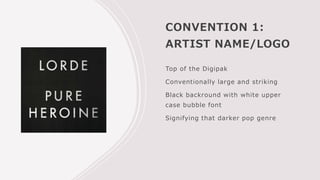
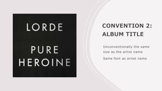
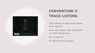
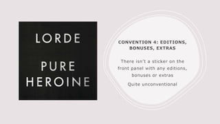
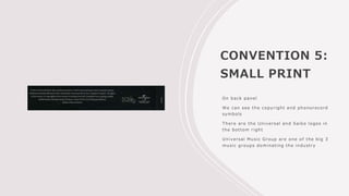
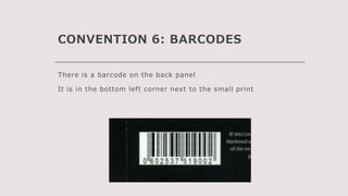
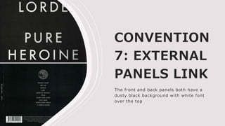
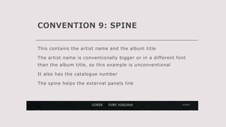
This document analyzes the conventions used in Lorde's digipak album packaging. It identifies 9 key conventions: 1) The artist name and logo are prominently displayed at the top of the front panel in a large white font on a black background. 2) The album title is the same size as the artist name, which is unconventional. 3) The track listing on the back panel is in uppercase white sans-serif font on black. 4) There are no stickers indicating bonuses or extras. 5) Copyright information is in small print on the back. 6) The barcode is in the bottom left corner of the back panel. 7) The front and back panels have a consistent black background with white font. 8