Downloaded 13 times

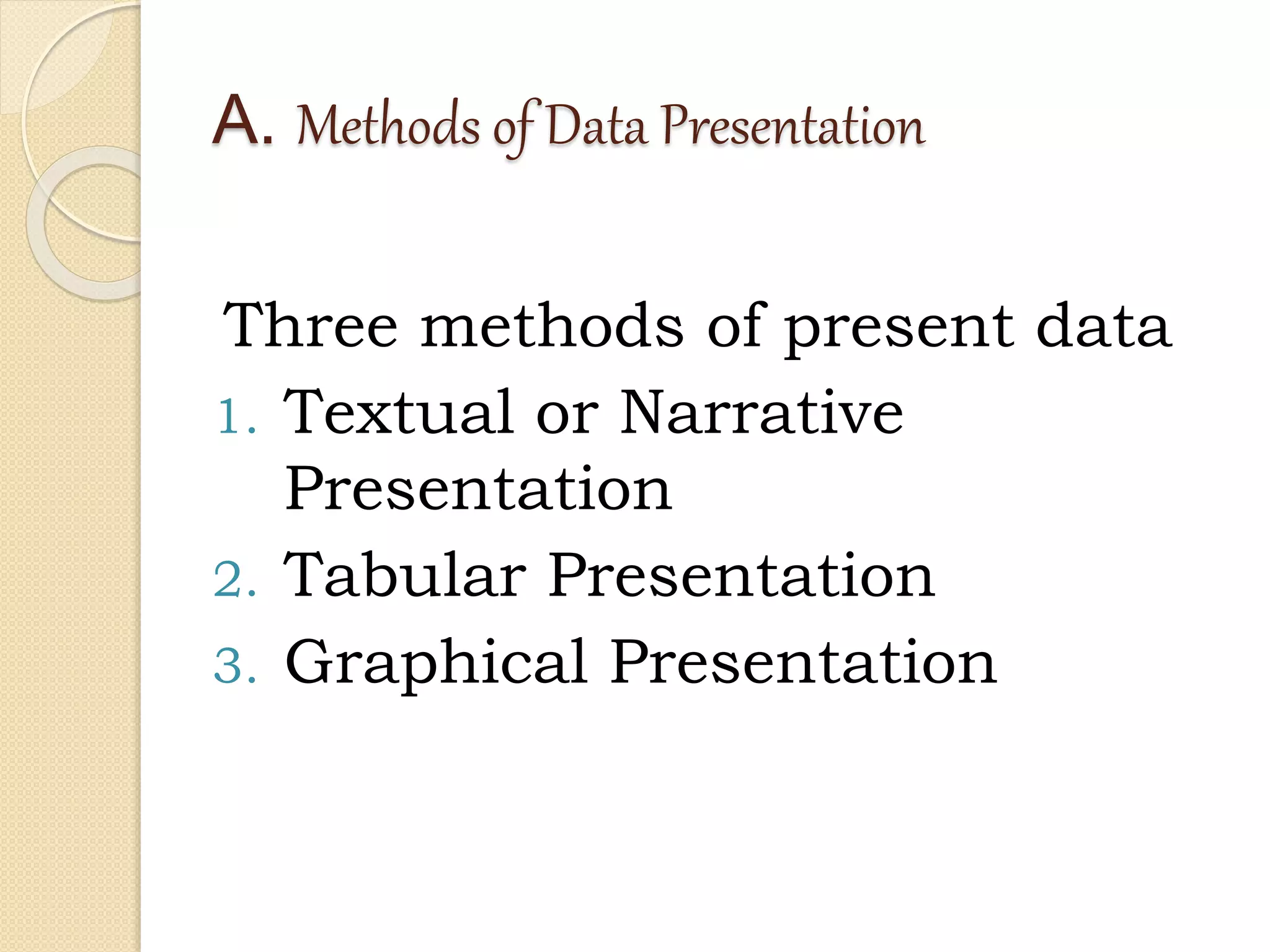
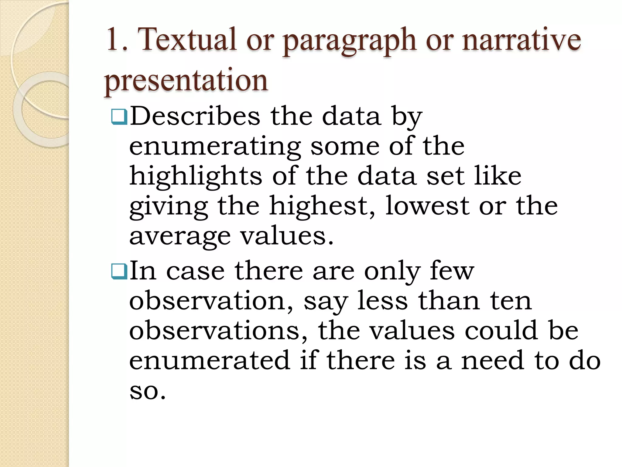


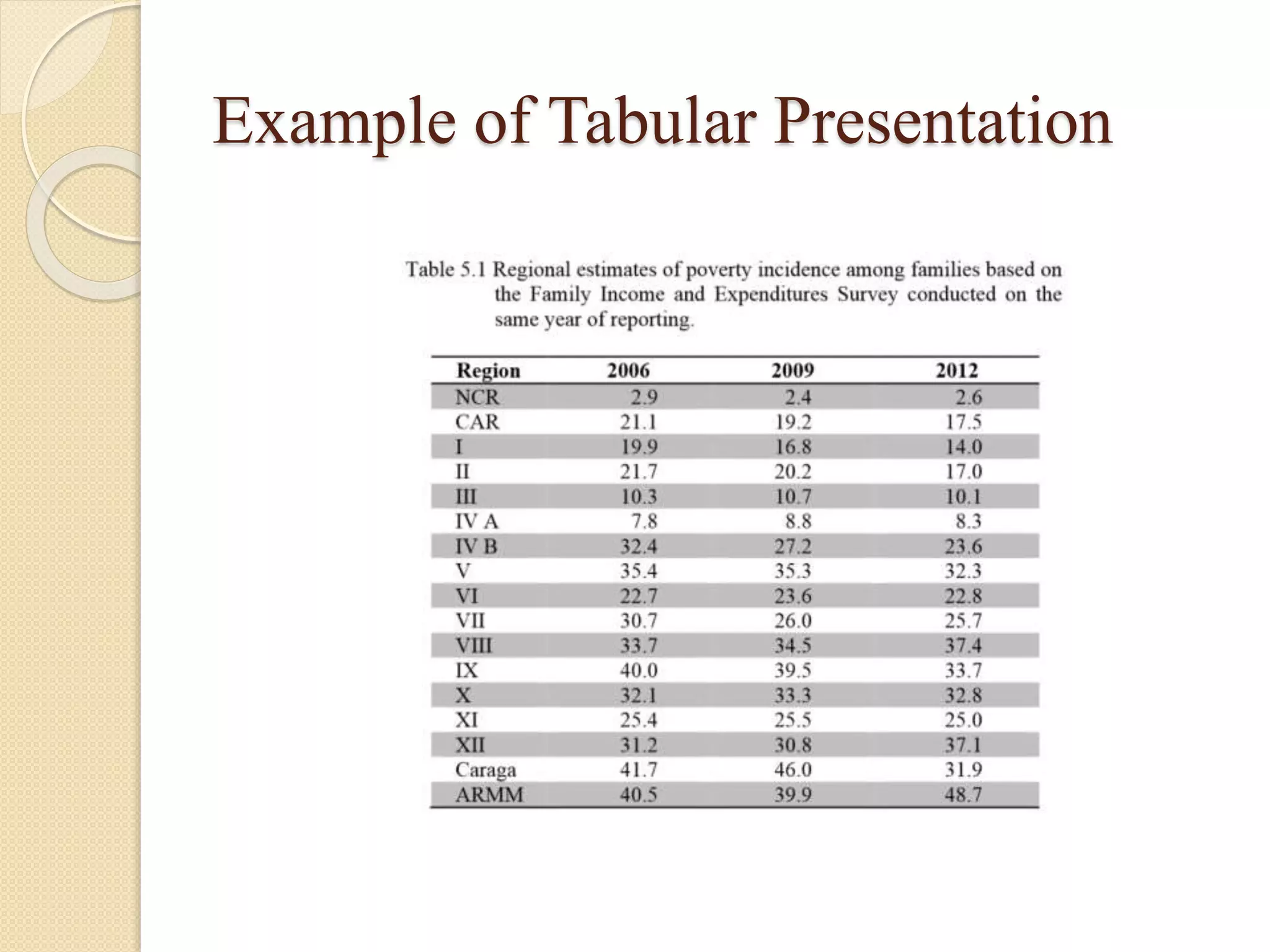
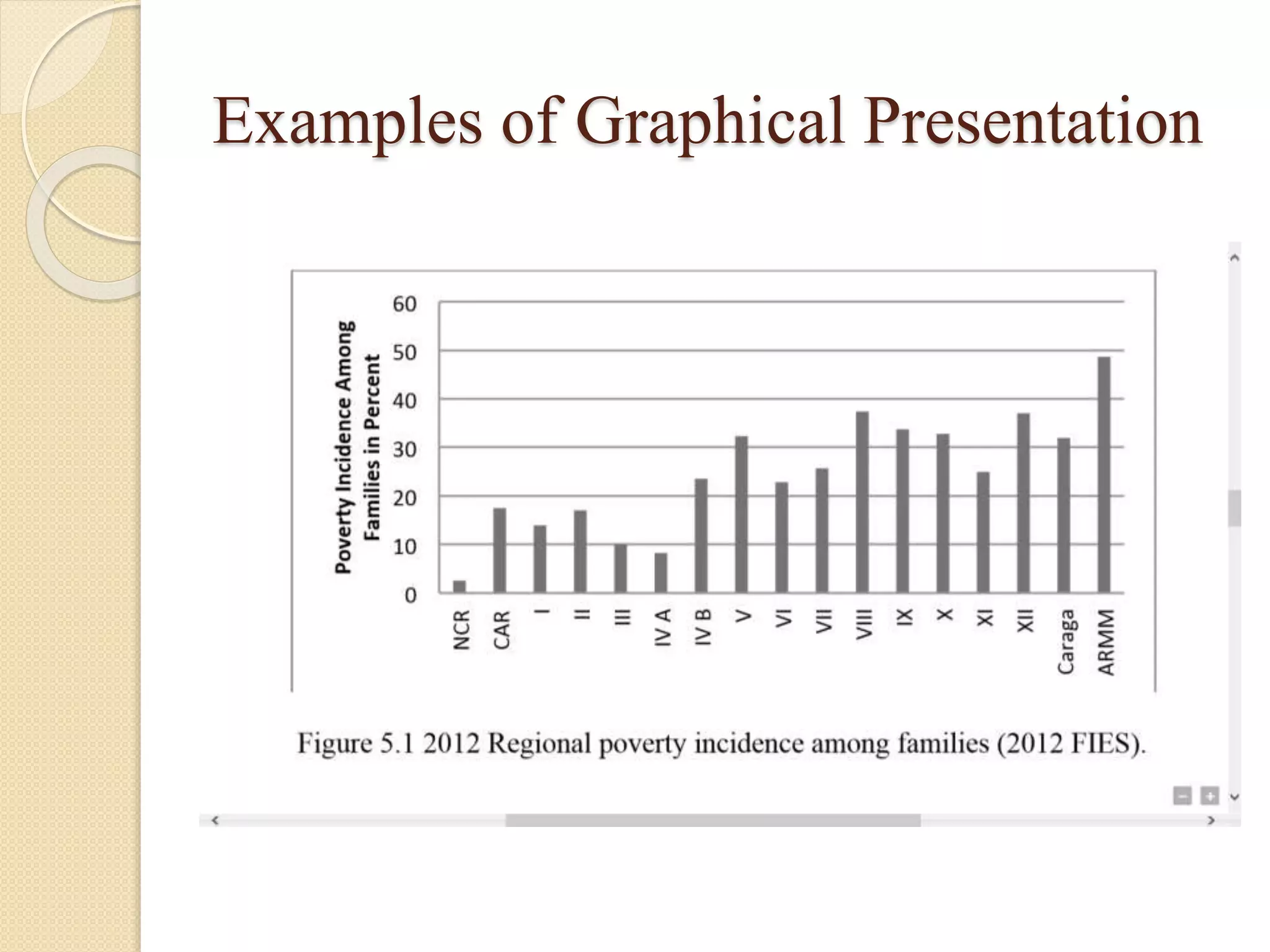
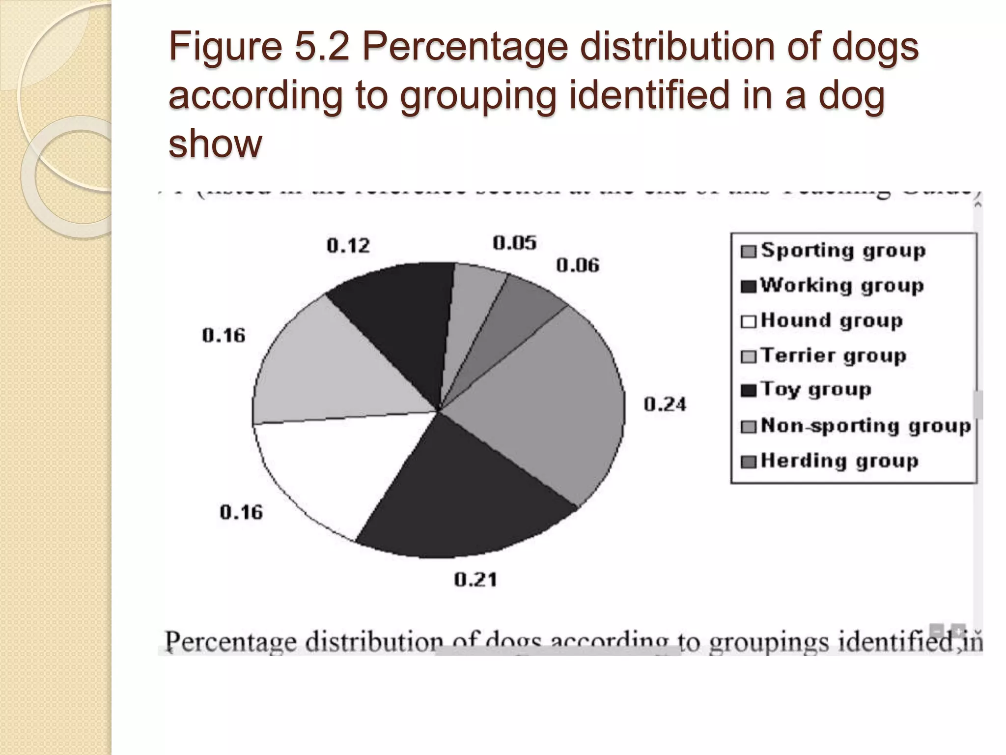
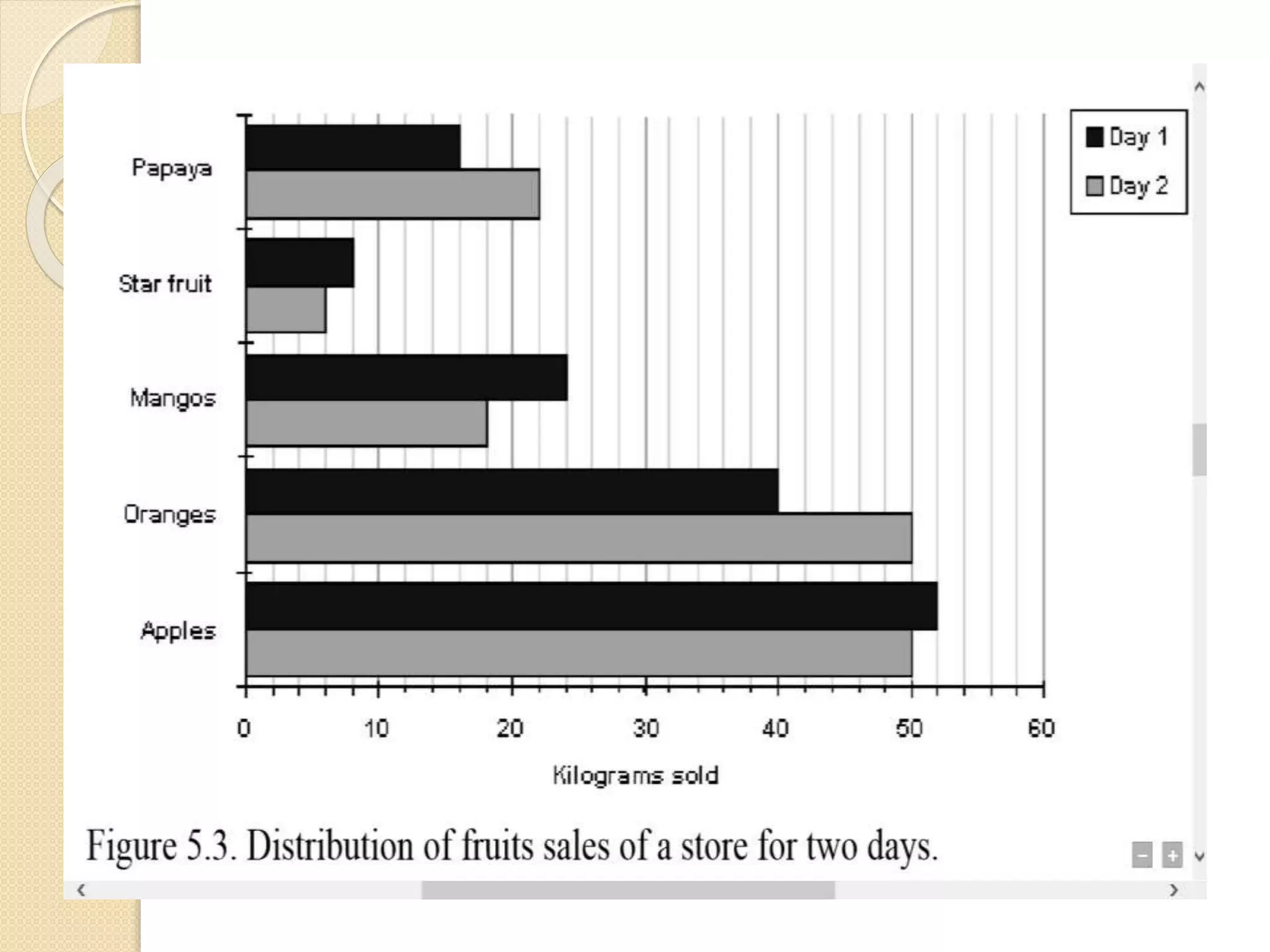
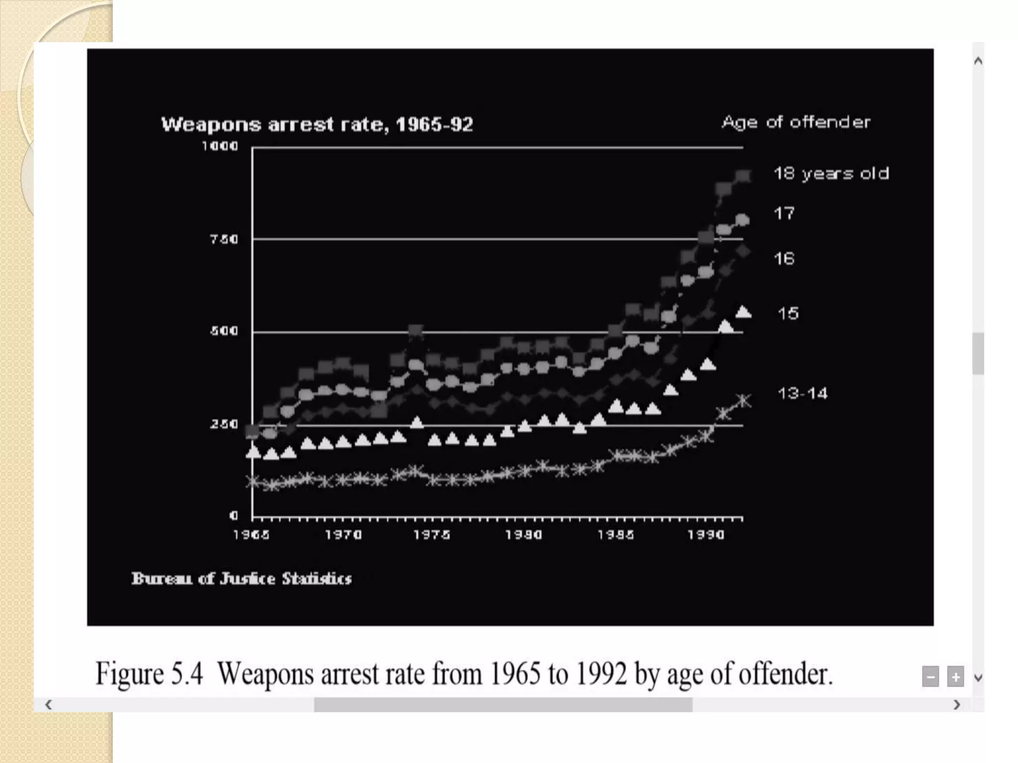
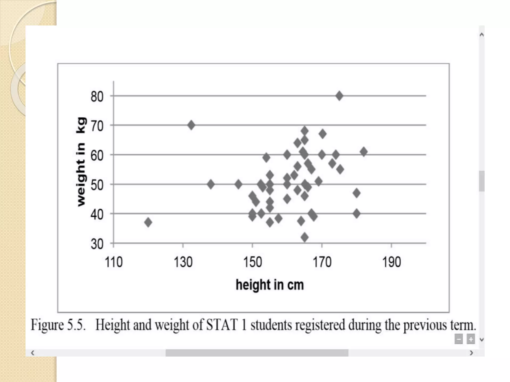

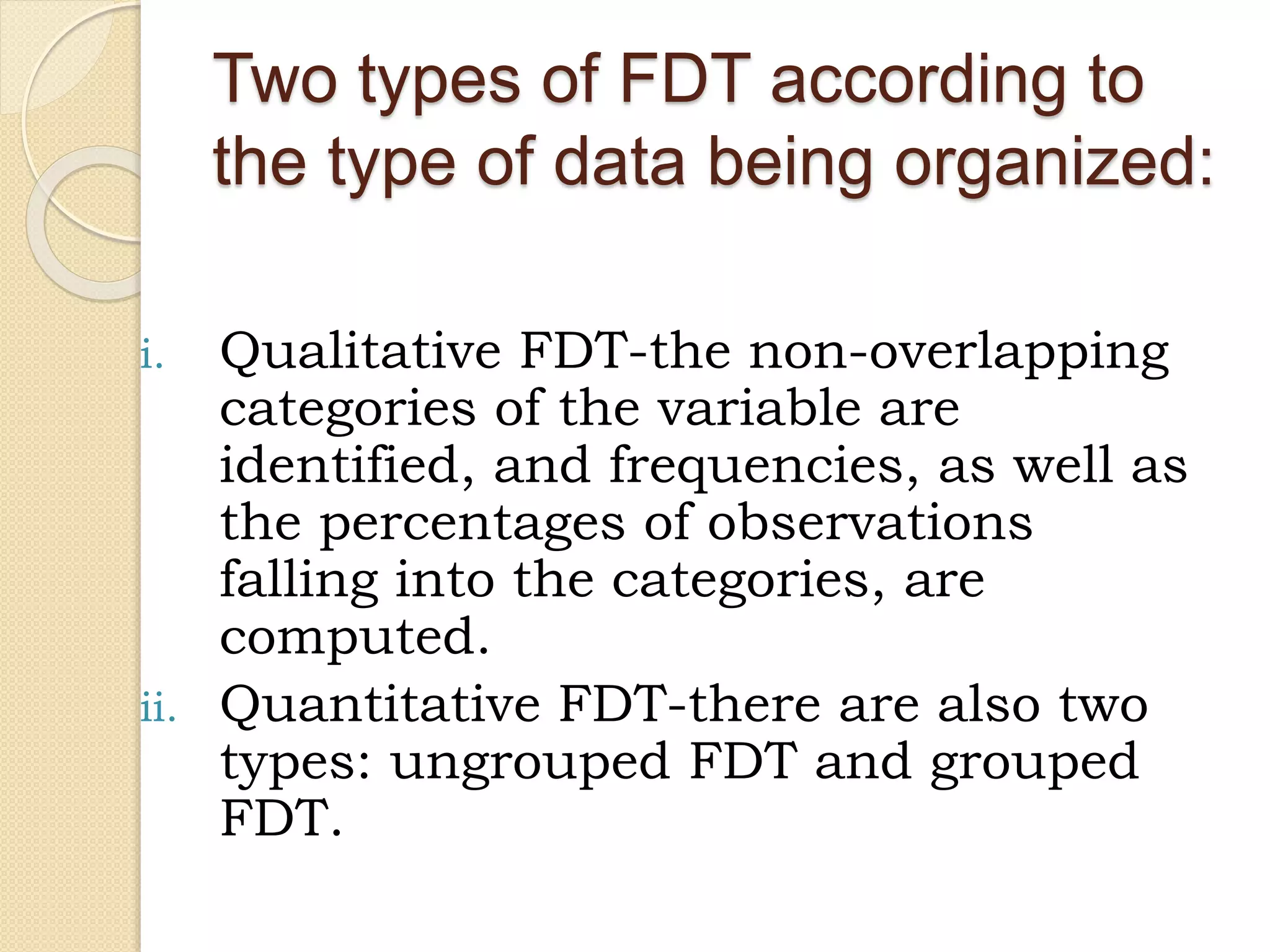


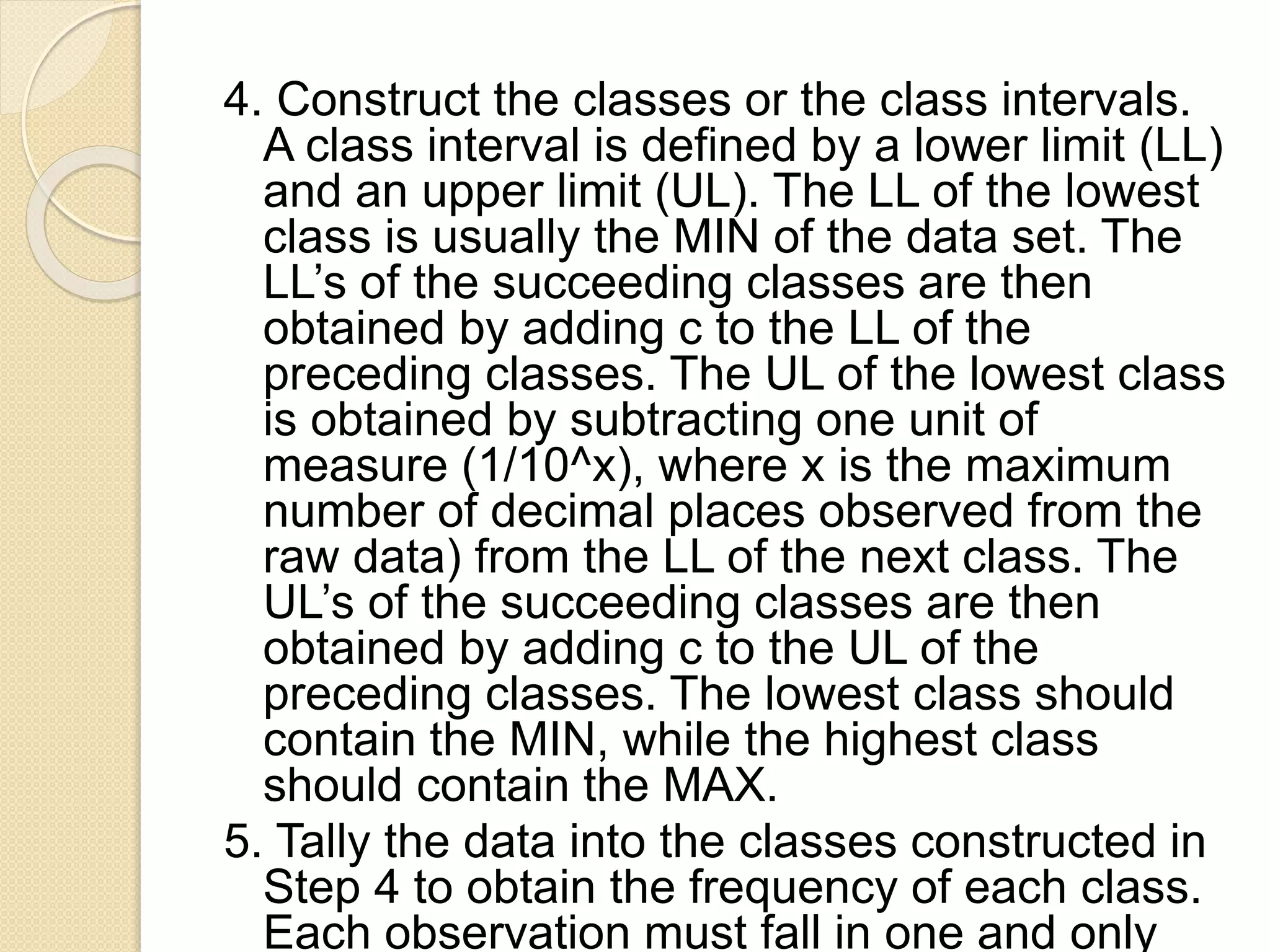
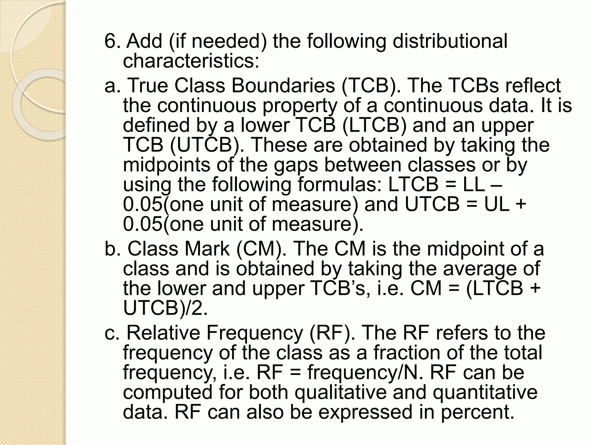
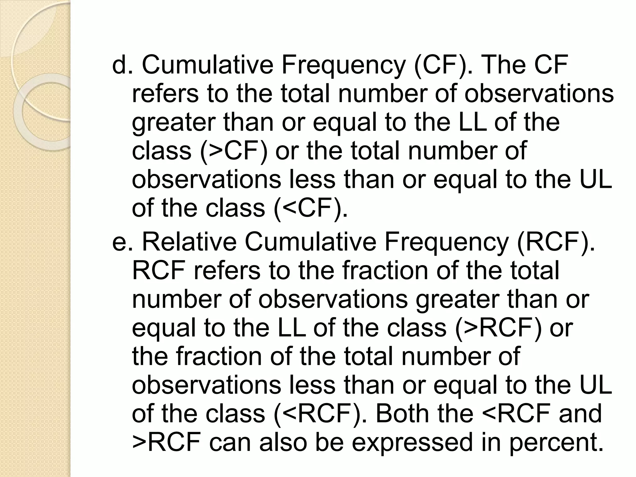

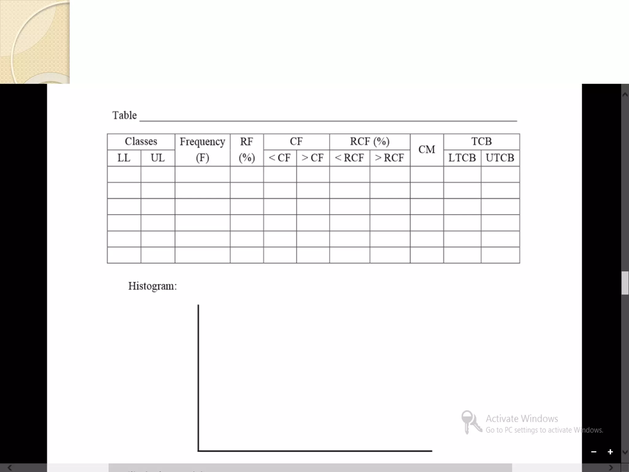

The document discusses different methods for presenting data, including textual, tabular, and graphical presentations. It provides examples and guidelines for each method, such as describing highlights in a paragraph, organizing values into a table with rows and columns, and using graphs like pie charts to visualize relationships. Frequency distribution tables and histograms are also covered as specialized forms of tabular and graphical presentation used to depict the distribution of quantitative data.


