The document discusses the use of Yellowbrick, a visualization tool designed for machine learning, focusing on model selection, feature analysis, hyperparameter tuning, and model evaluation techniques. It highlights various visualizers such as Radviz, parallel coordinates, and recursive feature elimination, as well as evaluation metrics like precision, recall, and confusion matrices. Additionally, it covers hyperparameter tuning, cross-validation, and the importance of understanding data relationships to enhance model performance.
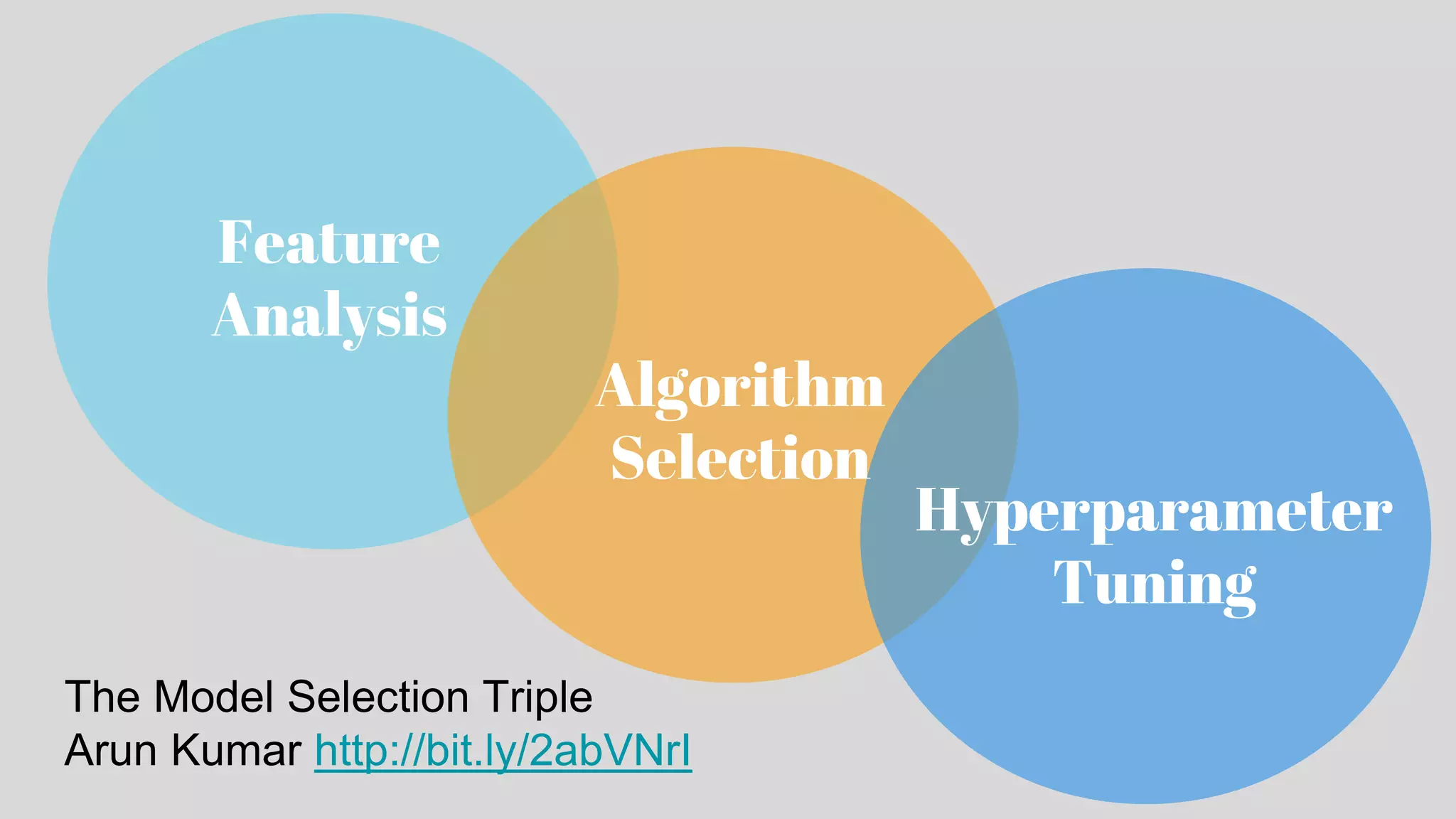
Overview of Yellowbrick framework for machine learning visualization, emphasizing Model Selection, Feature Analysis, Selection, and Hyperparameter Tuning.
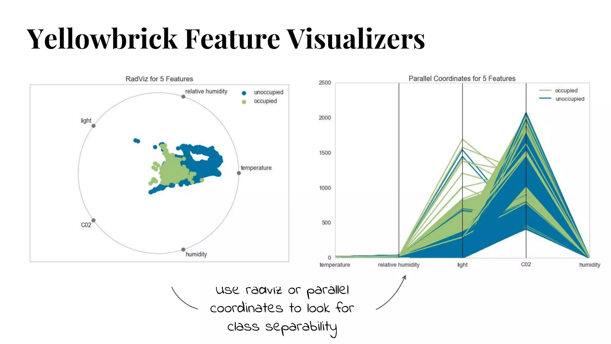
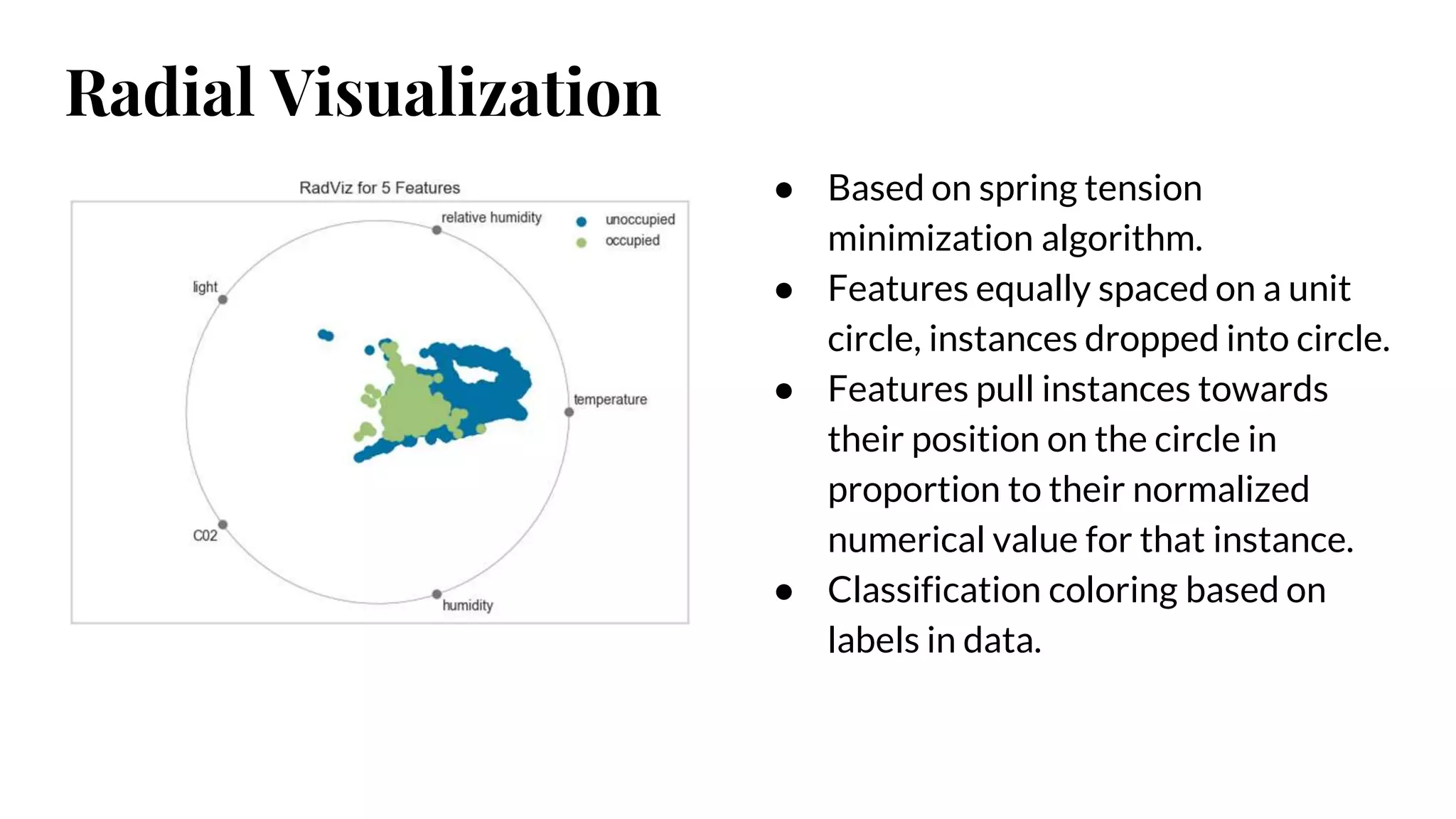
Discusses Feature Analysis methods using techniques like Radviz, Parallel Coordinates, and Rank2D to visualize relationships and separability in data.
Introduction to PCA Projection Plots for analyzing high-dimensional data by reducing it to 2 or 3 dimensions for better visualization.
Methods for selecting the right features using feature importance plots and recursive feature elimination to improve model performance.
Evaluating classifiers using various metrics such as precision, recall, F1 score, and confusion matrices to assess model performance.
ROC curves and AUC metrics for evaluating classifiers, including visualizing trade-offs between sensitivity and specificity.
Confusion matrices and class prediction error plots to analyze model performance across multiple classes.
Metrics for evaluating regressors, including prediction error plots and residual distributions to assess model fit.
Metrics for clustering and checking class imbalances in classification tasks, including learning and validation curves.
Techniques for tuning hyperparameters in models to optimize performance, including considerations for K-selection and manifold visualization.
Instructions for installing Yellowbrick, using Scikit-Learn estimators and visualizers to enhance machine learning workflows.
Call for contributions to the Yellowbrick open-source project and encouragement to engage with the community.
Use radviz orparallel
coordinates to look for
class separability
Yellowbrick Feature Visualizers
6.
● Based onspring tension
minimization algorithm.
● Features equally spaced on a unit
circle, instances dropped into circle.
● Features pull instances towards
their position on the circle in
proportion to their normalized
numerical value for that instance.
● Classification coloring based on
labels in data.
Radial Visualization
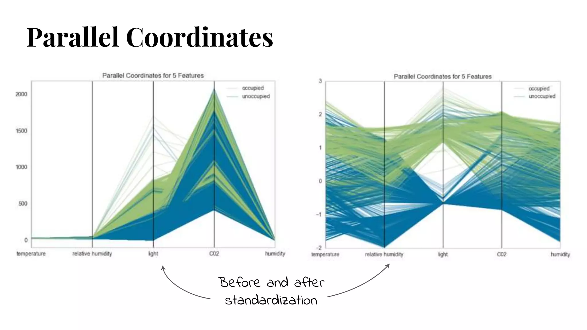
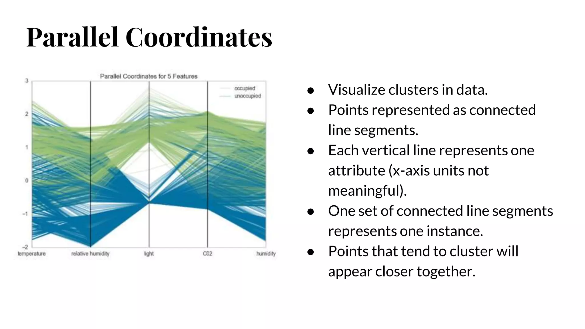
Parallel Coordinates
● Visualizeclusters in data.
● Points represented as connected
line segments.
● Each vertical line represents one
attribute (x-axis units not
meaningful).
● One set of connected line segments
represents one instance.
● Points that tend to cluster will
appear closer together.
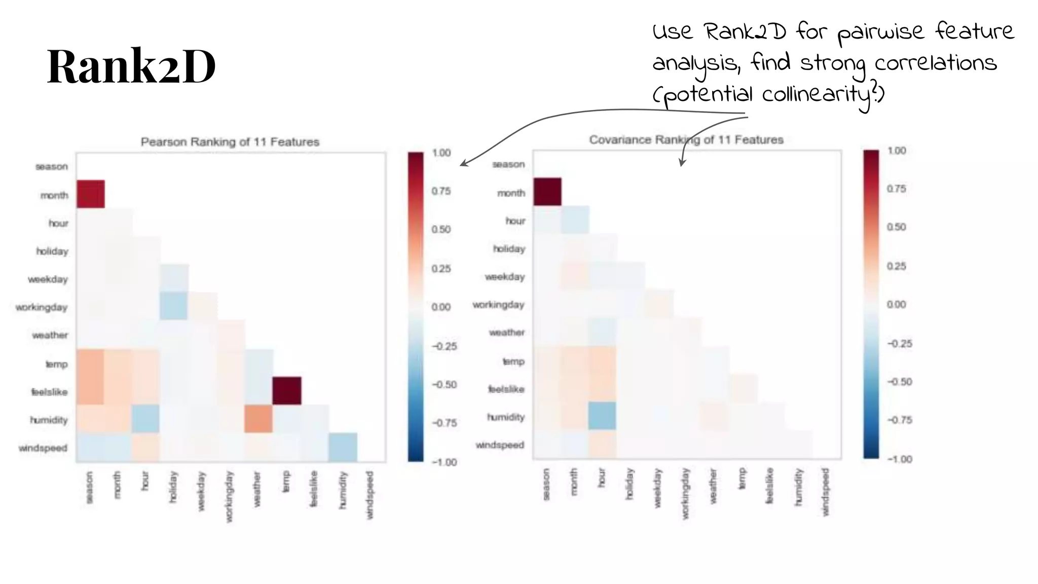
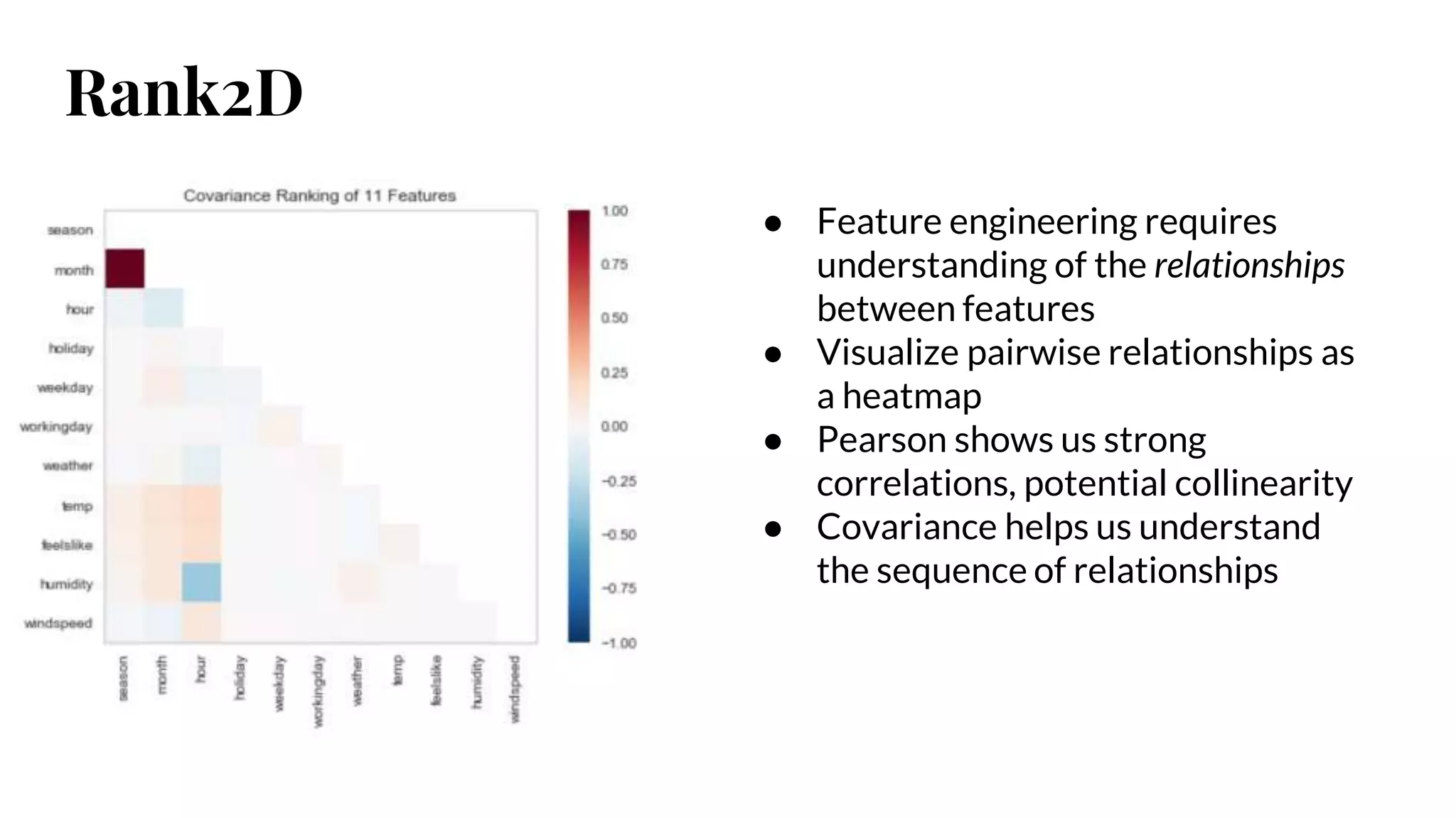
Rank2D
● Feature engineeringrequires
understanding of the relationships
between features
● Visualize pairwise relationships as
a heatmap
● Pearson shows us strong
correlations, potential collinearity
● Covariance helps us understand
the sequence of relationships
11.
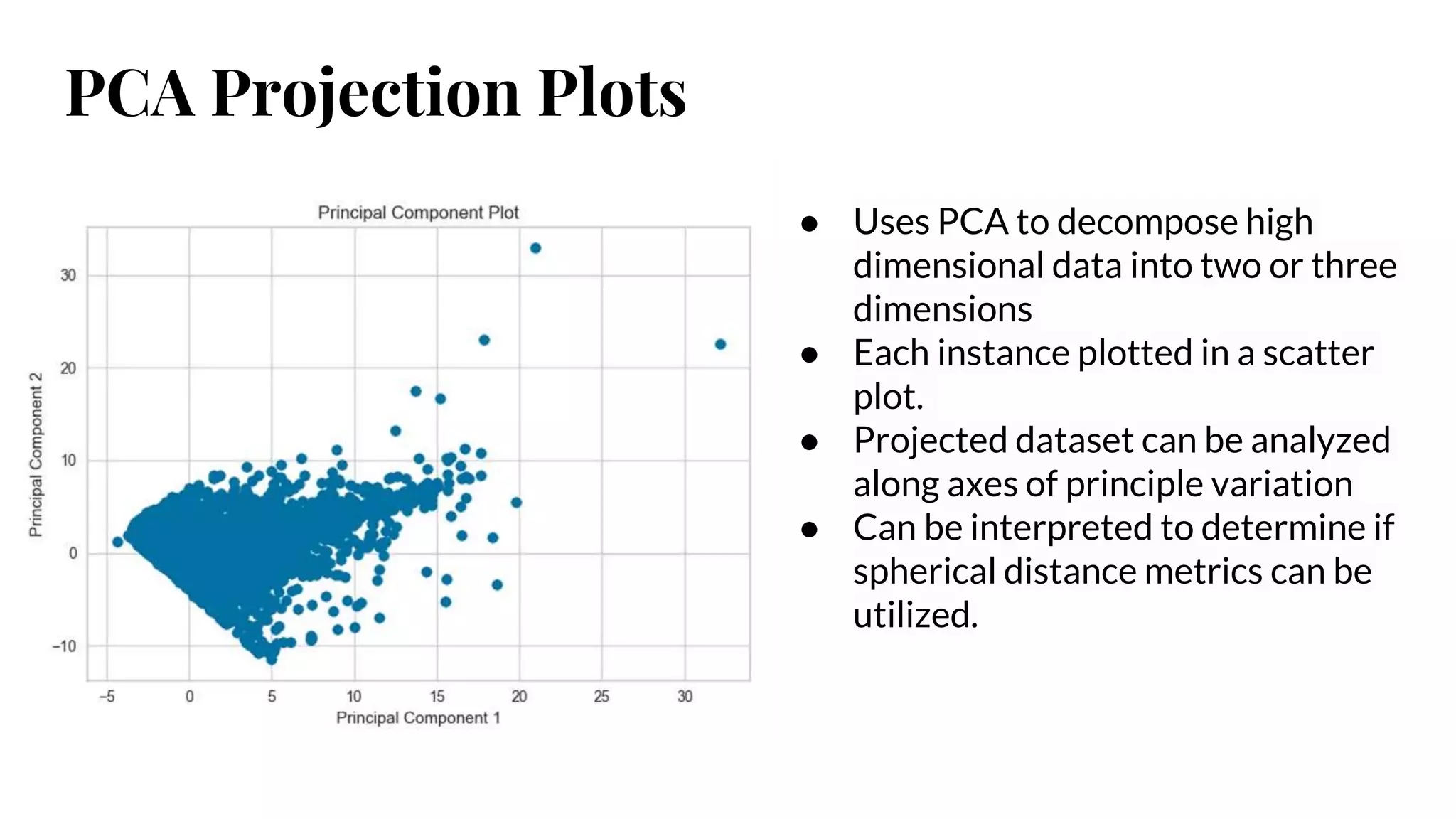
PCA Projection Plots
●Uses PCA to decompose high
dimensional data into two or three
dimensions
● Each instance plotted in a scatter
plot.
● Projected dataset can be analyzed
along axes of principle variation
● Can be interpreted to determine if
spherical distance metrics can be
utilized.
12.
PCA Projection Plots
Canalso plot in 3D to visualize more
components & get a better sense of
distribution in high dimensions
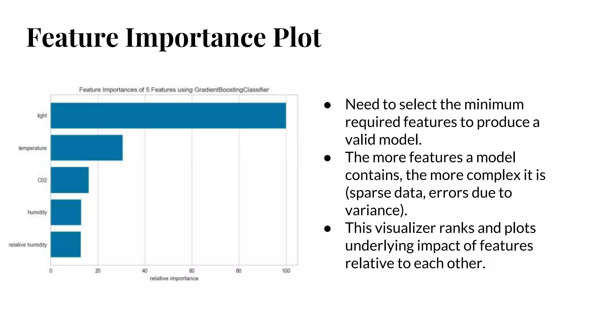
Feature Importance Plot
●Need to select the minimum
required features to produce a
valid model.
● The more features a model
contains, the more complex it is
(sparse data, errors due to
variance).
● This visualizer ranks and plots
underlying impact of features
relative to each other.
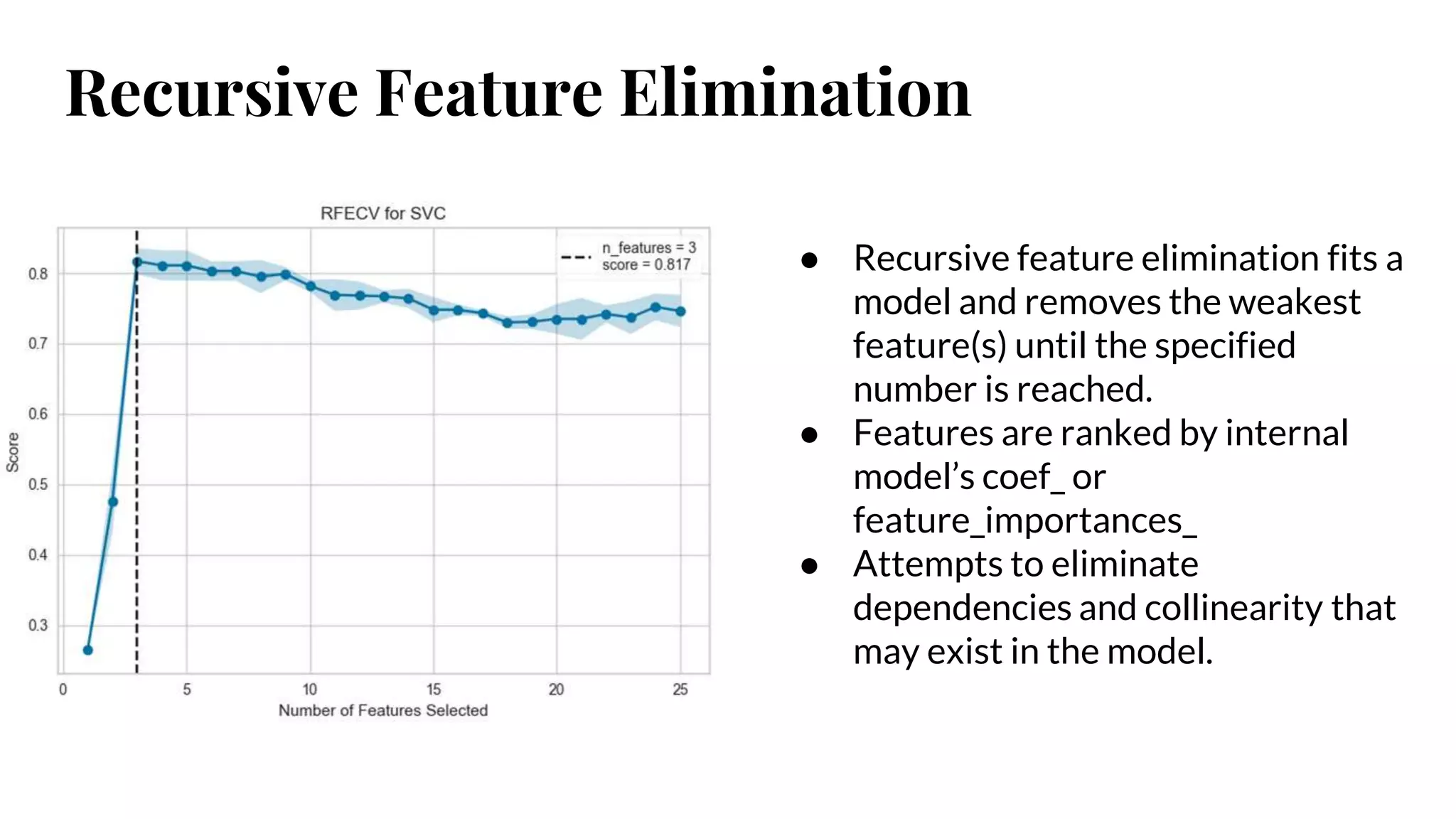
Recursive Feature Elimination
●Recursive feature elimination fits a
model and removes the weakest
feature(s) until the specified
number is reached.
● Features are ranked by internal
model’s coef_ or
feature_importances_
● Attempts to eliminate
dependencies and collinearity that
may exist in the model.
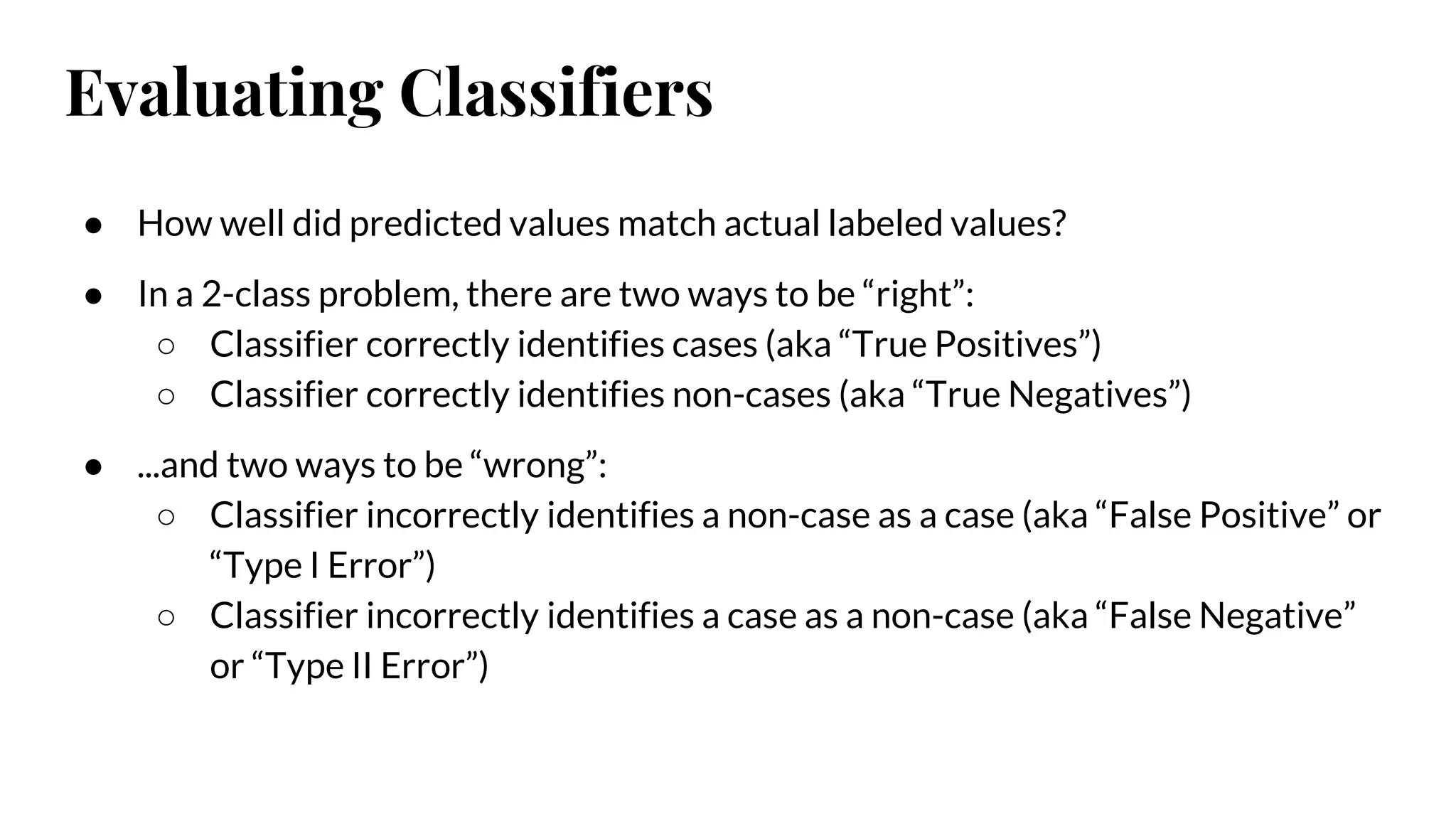
Evaluating Classifiers
● Howwell did predicted values match actual labeled values?
● In a 2-class problem, there are two ways to be “right”:
○ Classifier correctly identifies cases (aka “True Positives”)
○ Classifier correctly identifies non-cases (aka “True Negatives”)
● ...and two ways to be “wrong”:
○ Classifier incorrectly identifies a non-case as a case (aka “False Positive” or
“Type I Error”)
○ Classifier incorrectly identifies a case as a non-case (aka “False Negative”
or “Type II Error”)
20.
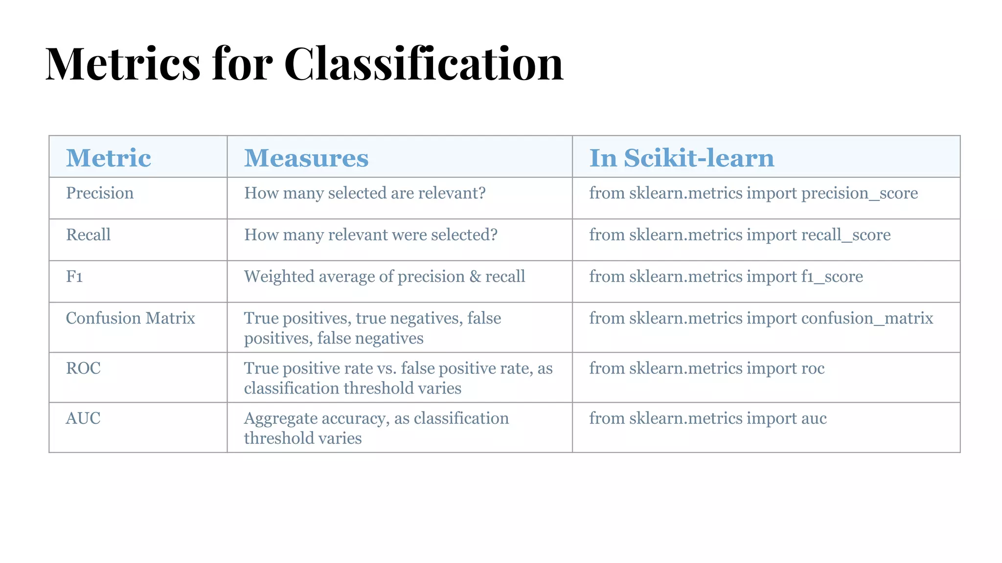
Metrics for Classification
MetricMeasures In Scikit-learn
Precision How many selected are relevant? from sklearn.metrics import precision_score
Recall How many relevant were selected? from sklearn.metrics import recall_score
F1 Weighted average of precision & recall from sklearn.metrics import f1_score
Confusion Matrix True positives, true negatives, false
positives, false negatives
from sklearn.metrics import confusion_matrix
ROC True positive rate vs. false positive rate, as
classification threshold varies
from sklearn.metrics import roc
AUC Aggregate accuracy, as classification
threshold varies
from sklearn.metrics import auc
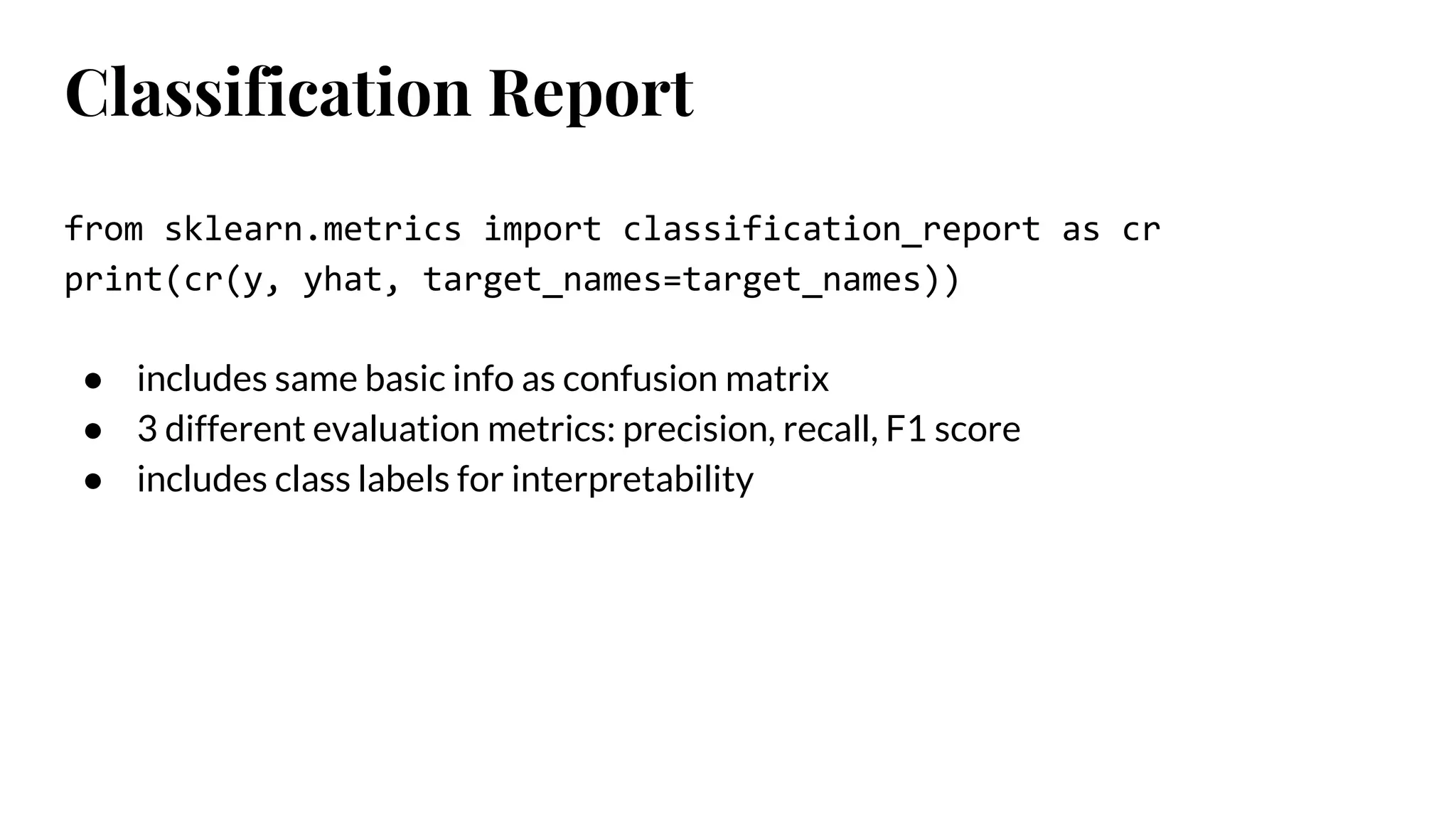
Classification Report
from sklearn.metricsimport classification_report as cr
print(cr(y, yhat, target_names=target_names))
● includes same basic info as confusion matrix
● 3 different evaluation metrics: precision, recall, F1 score
● includes class labels for interpretability
24.
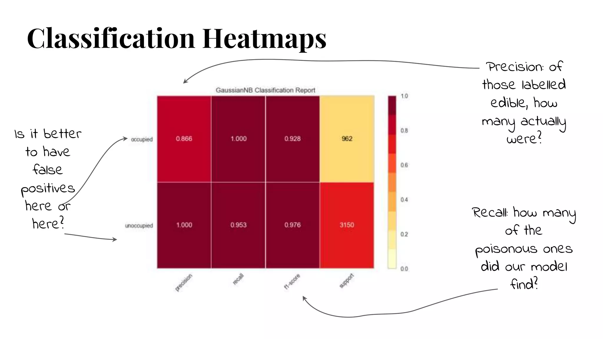
Classification Heatmaps
Precision: of
thoselabelled
edible, how
many actually
were?Is it better
to have
false
positives
here or
here?
Recall: how many
of the
poisonous ones
did our model
find?
25.
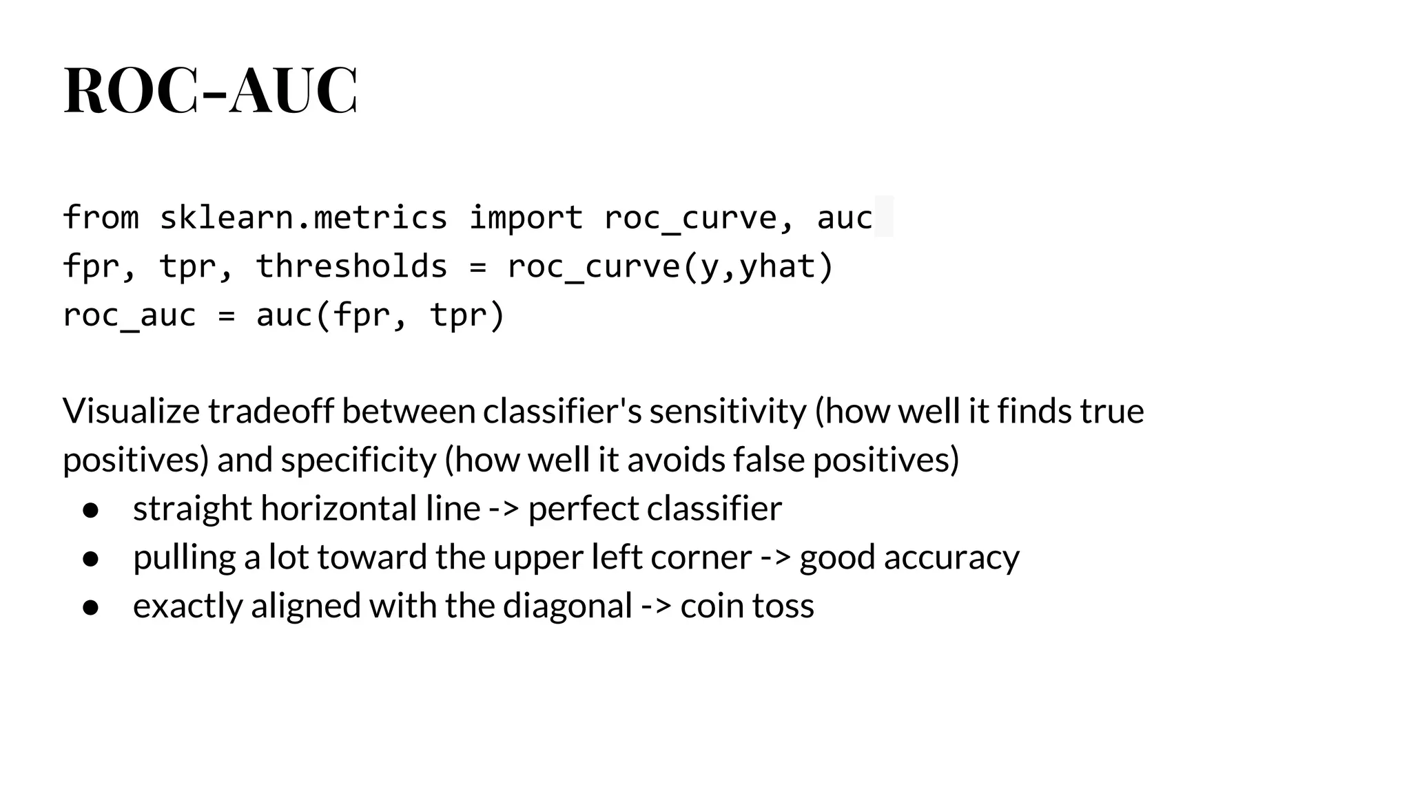
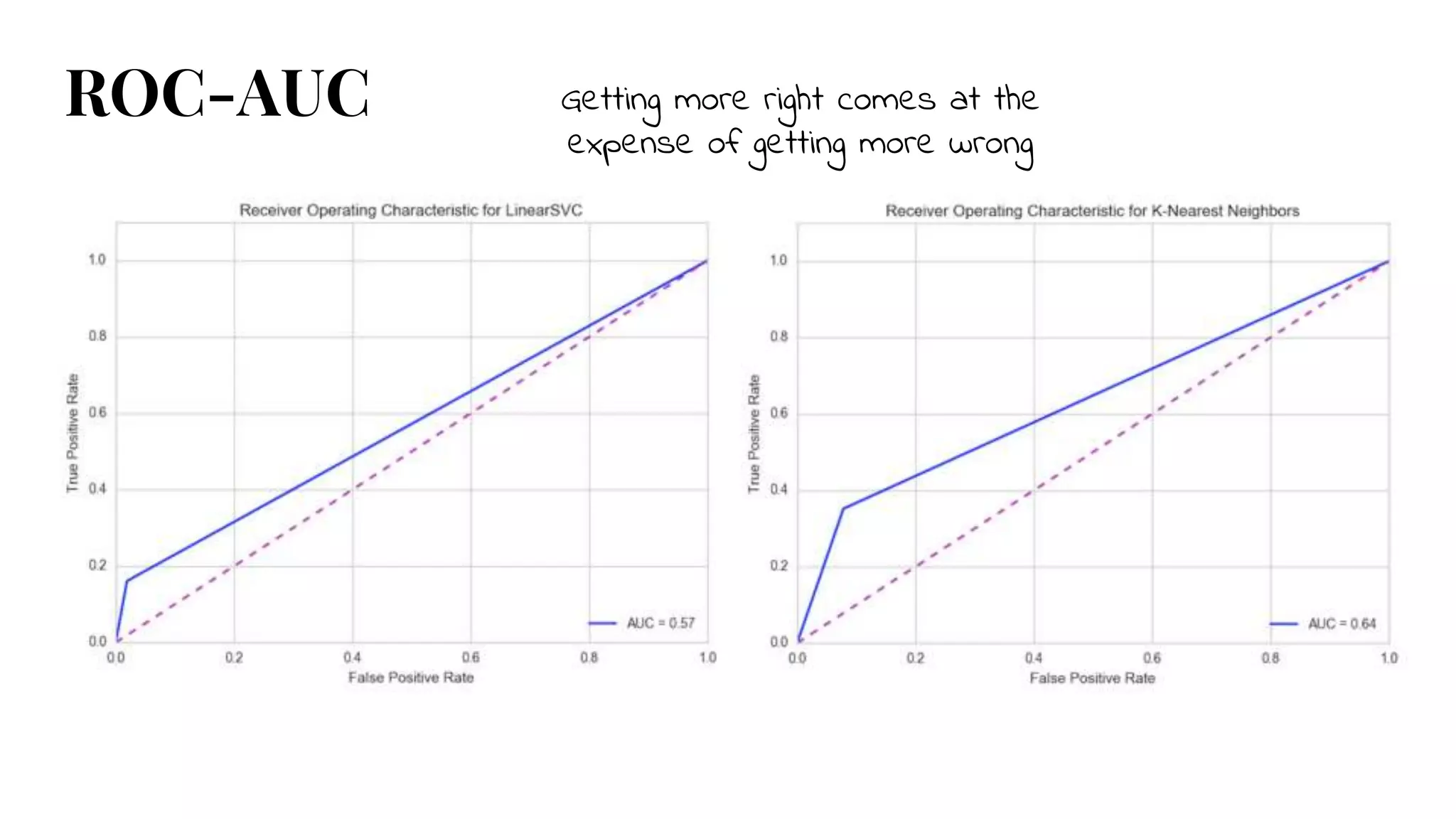
ROC-AUC
from sklearn.metrics importroc_curve, auc
fpr, tpr, thresholds = roc_curve(y,yhat)
roc_auc = auc(fpr, tpr)
Visualize tradeoff between classifier's sensitivity (how well it finds true
positives) and specificity (how well it avoids false positives)
● straight horizontal line -> perfect classifier
● pulling a lot toward the upper left corner -> good accuracy
● exactly aligned with the diagonal -> coin toss
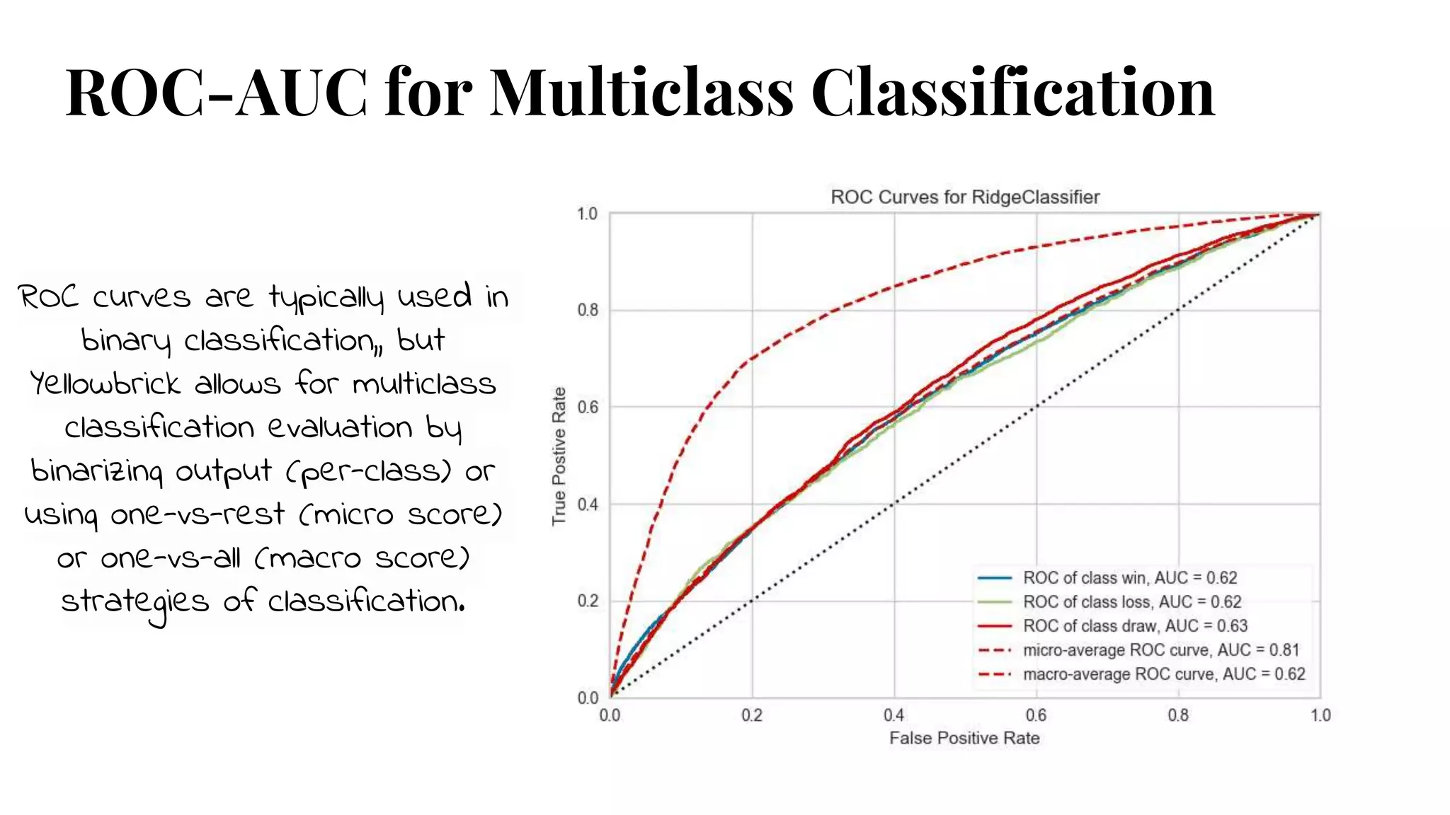
ROC-AUC for MulticlassClassification
ROC curves are typically used in
binary classification,, but
Yellowbrick allows for multiclass
classification evaluation by
binarizing output (per-class) or
using one-vs-rest (micro score)
or one-vs-all (macro score)
strategies of classification.
28.
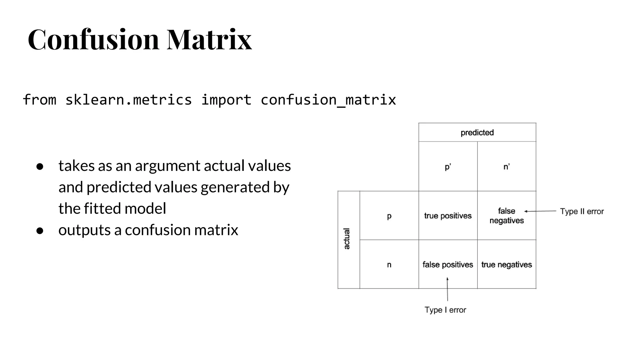
Confusion Matrix
● takesas an argument actual values
and predicted values generated by
the fitted model
● outputs a confusion matrix
from sklearn.metrics import confusion_matrix
29.
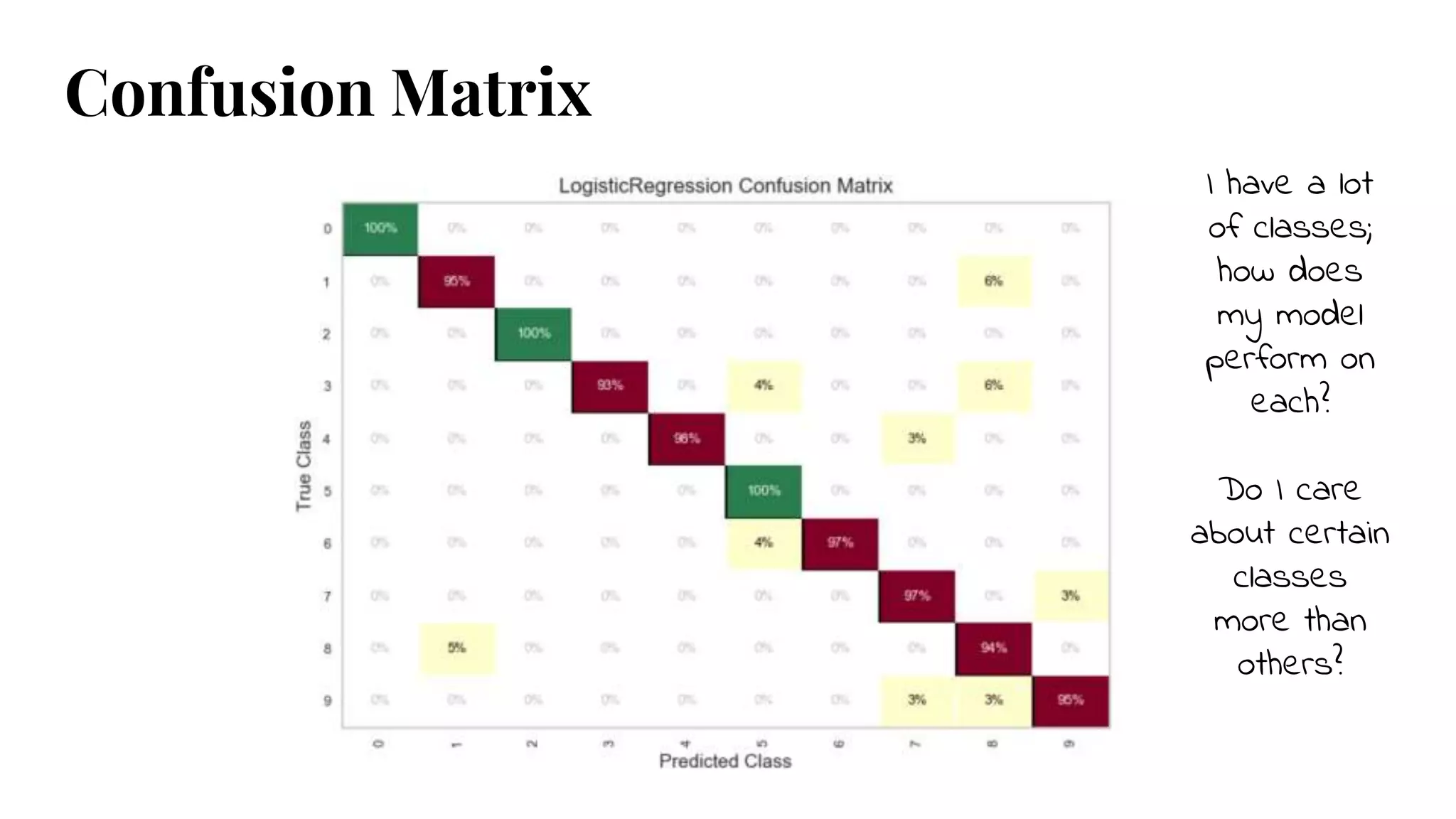
I have alot
of classes;
how does
my model
perform on
each?
Do I care
about certain
classes
more than
others?
Confusion Matrix
30.
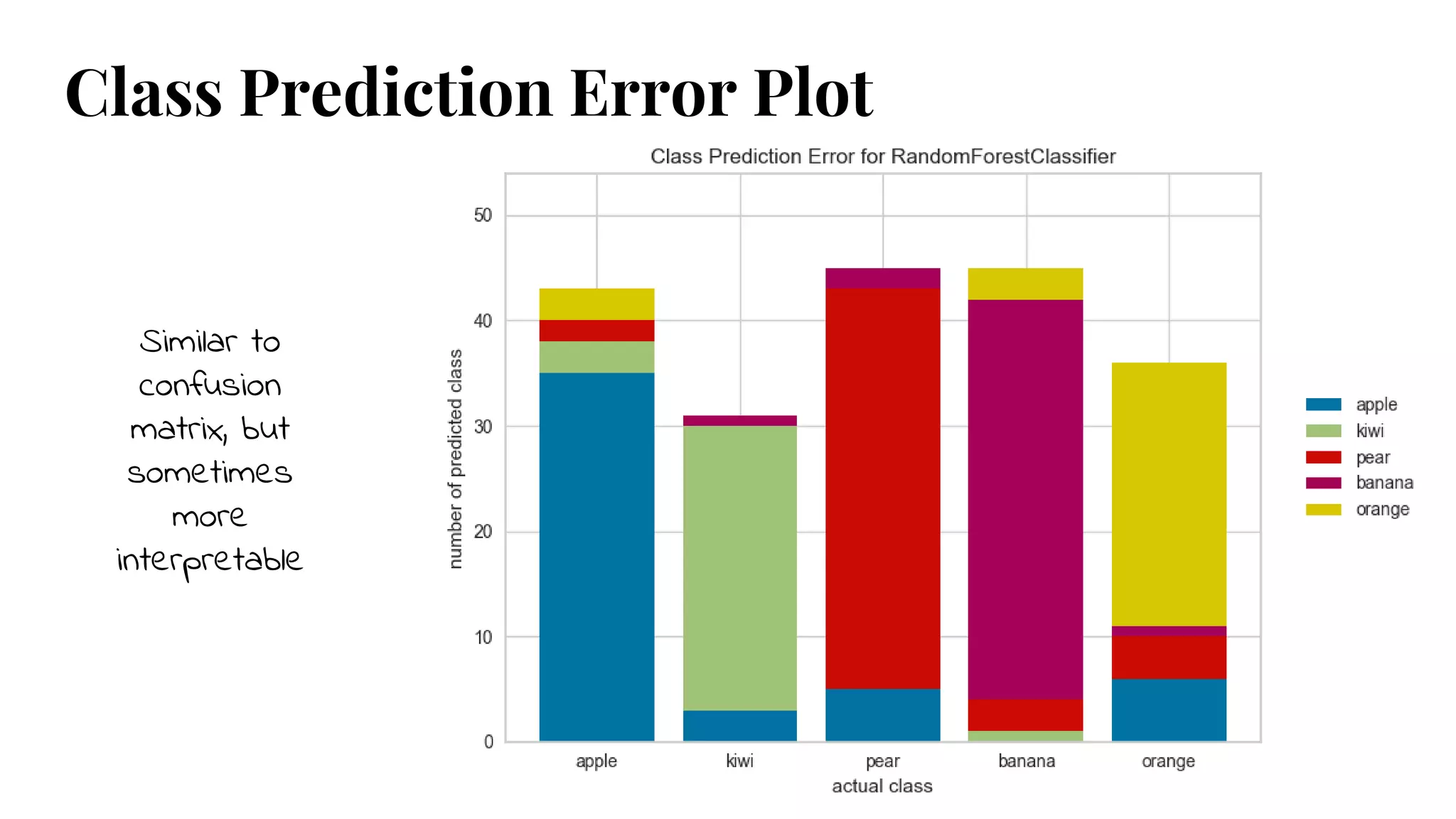
Class Prediction ErrorPlot
Similar to
confusion
matrix, but
sometimes
more
interpretable
31.
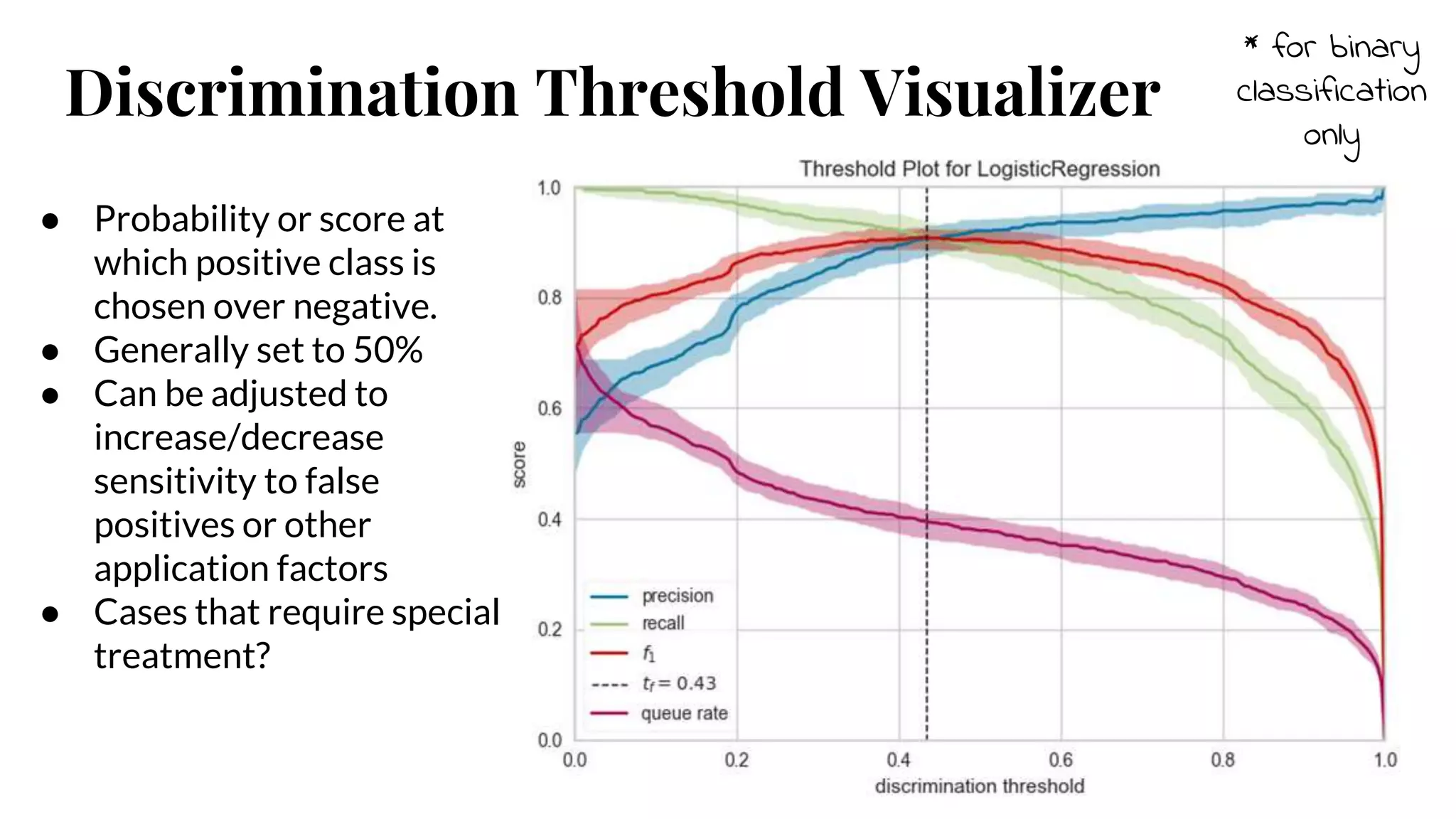
Discrimination Threshold Visualizer
*for binary
classification
only
● Probability or score at
which positive class is
chosen over negative.
● Generally set to 50%
● Can be adjusted to
increase/decrease
sensitivity to false
positives or other
application factors
● Cases that require special
treatment?
32.
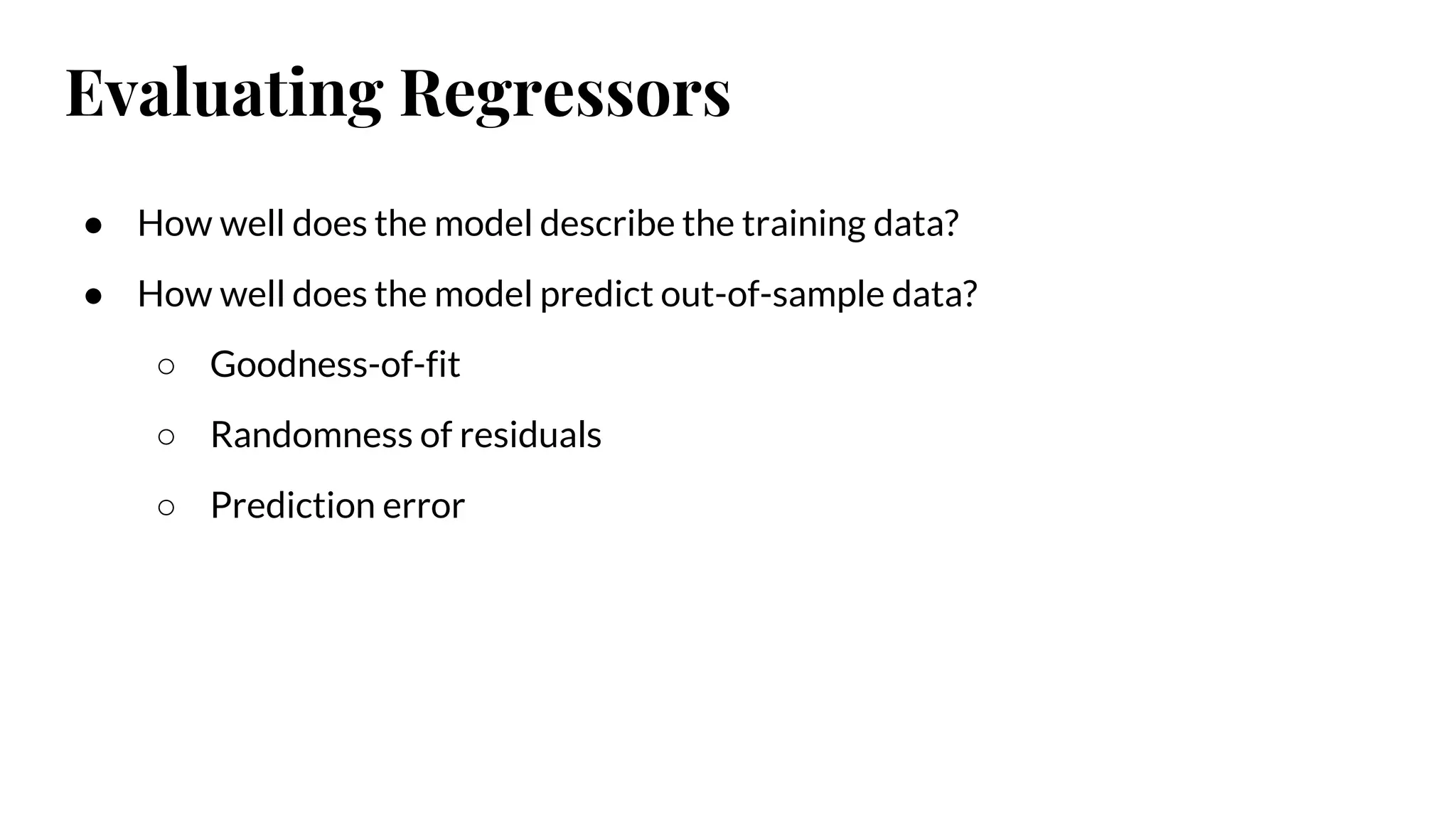
Evaluating Regressors
● Howwell does the model describe the training data?
● How well does the model predict out-of-sample data?
○ Goodness-of-fit
○ Randomness of residuals
○ Prediction error
33.
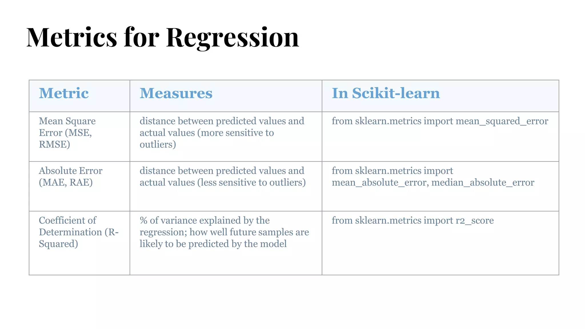
Metrics for Regression
MetricMeasures In Scikit-learn
Mean Square
Error (MSE,
RMSE)
distance between predicted values and
actual values (more sensitive to
outliers)
from sklearn.metrics import mean_squared_error
Absolute Error
(MAE, RAE)
distance between predicted values and
actual values (less sensitive to outliers)
from sklearn.metrics import
mean_absolute_error, median_absolute_error
Coefficient of
Determination (R-
Squared)
% of variance explained by the
regression; how well future samples are
likely to be predicted by the model
from sklearn.metrics import r2_score
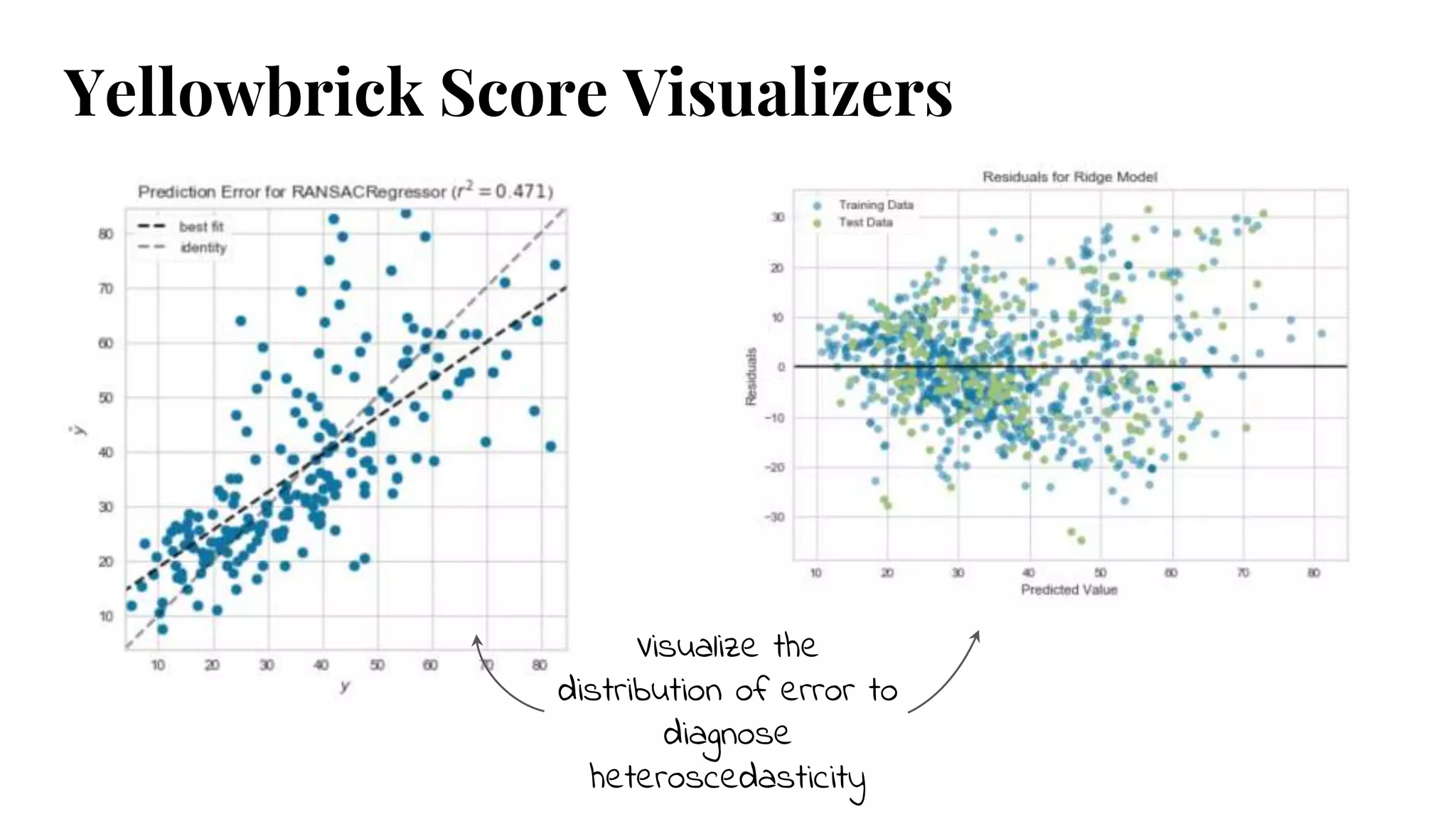
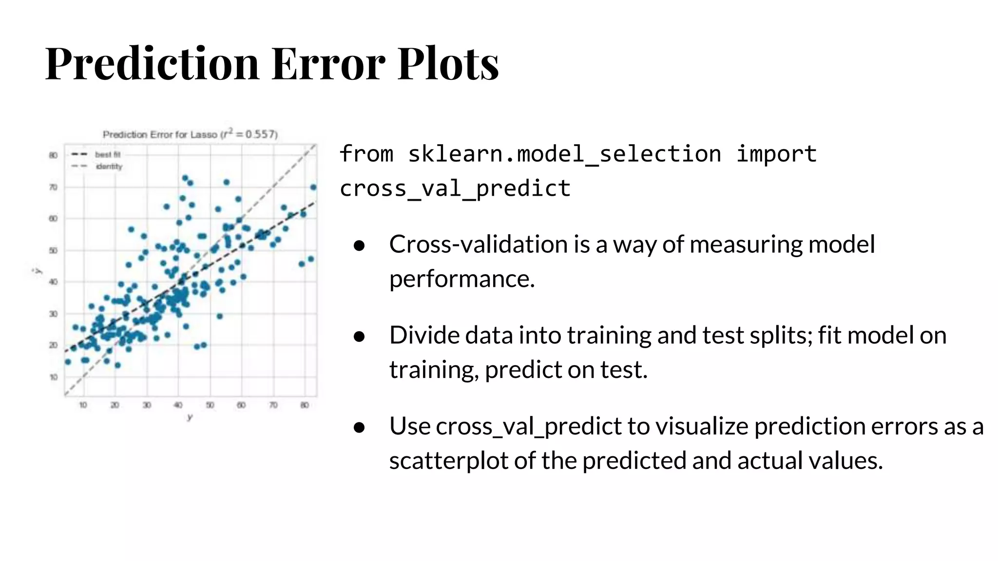
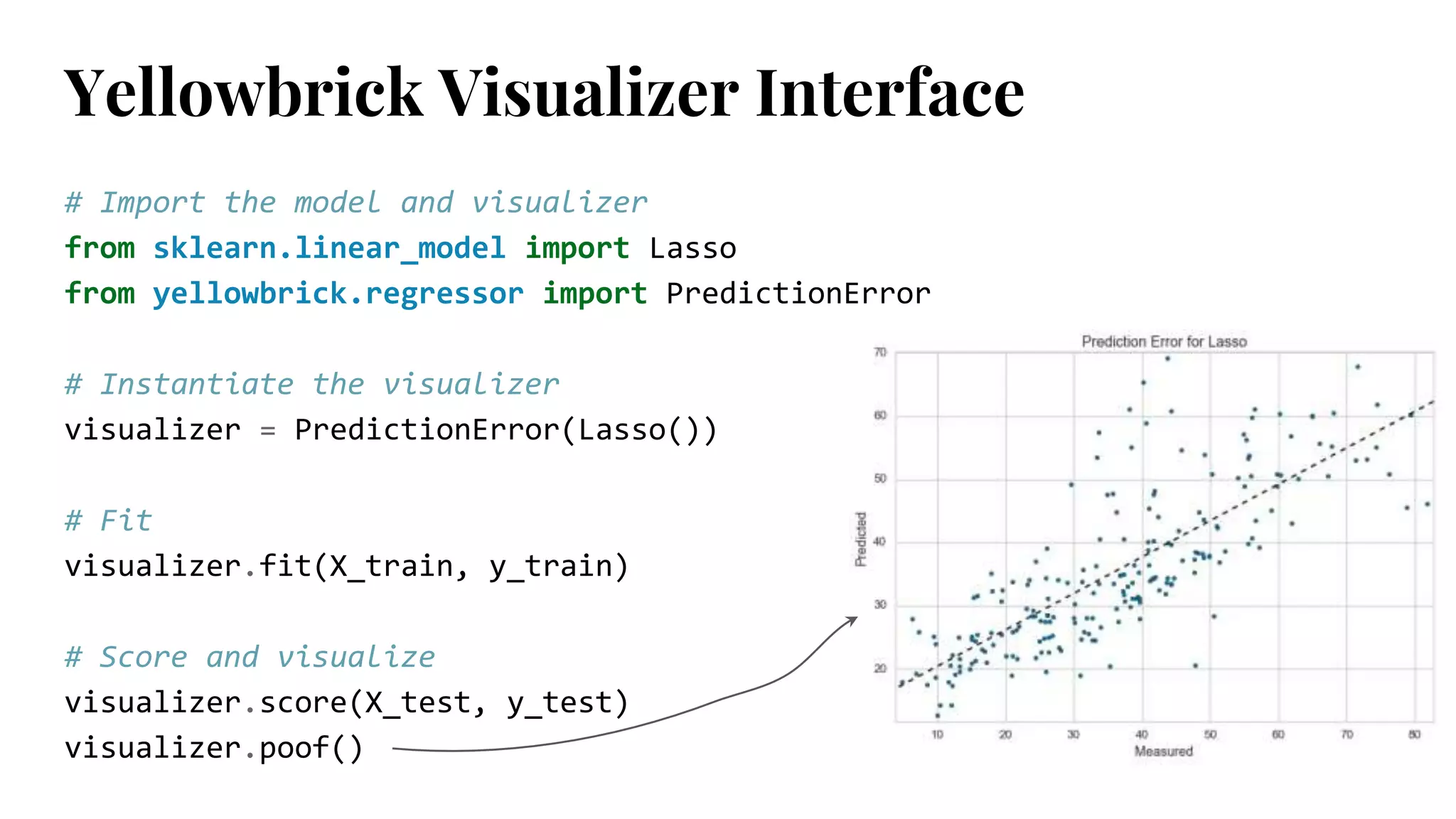
Prediction Error Plots
fromsklearn.model_selection import
cross_val_predict
● Cross-validation is a way of measuring model
performance.
● Divide data into training and test splits; fit model on
training, predict on test.
● Use cross_val_predict to visualize prediction errors as a
scatterplot of the predicted and actual values.
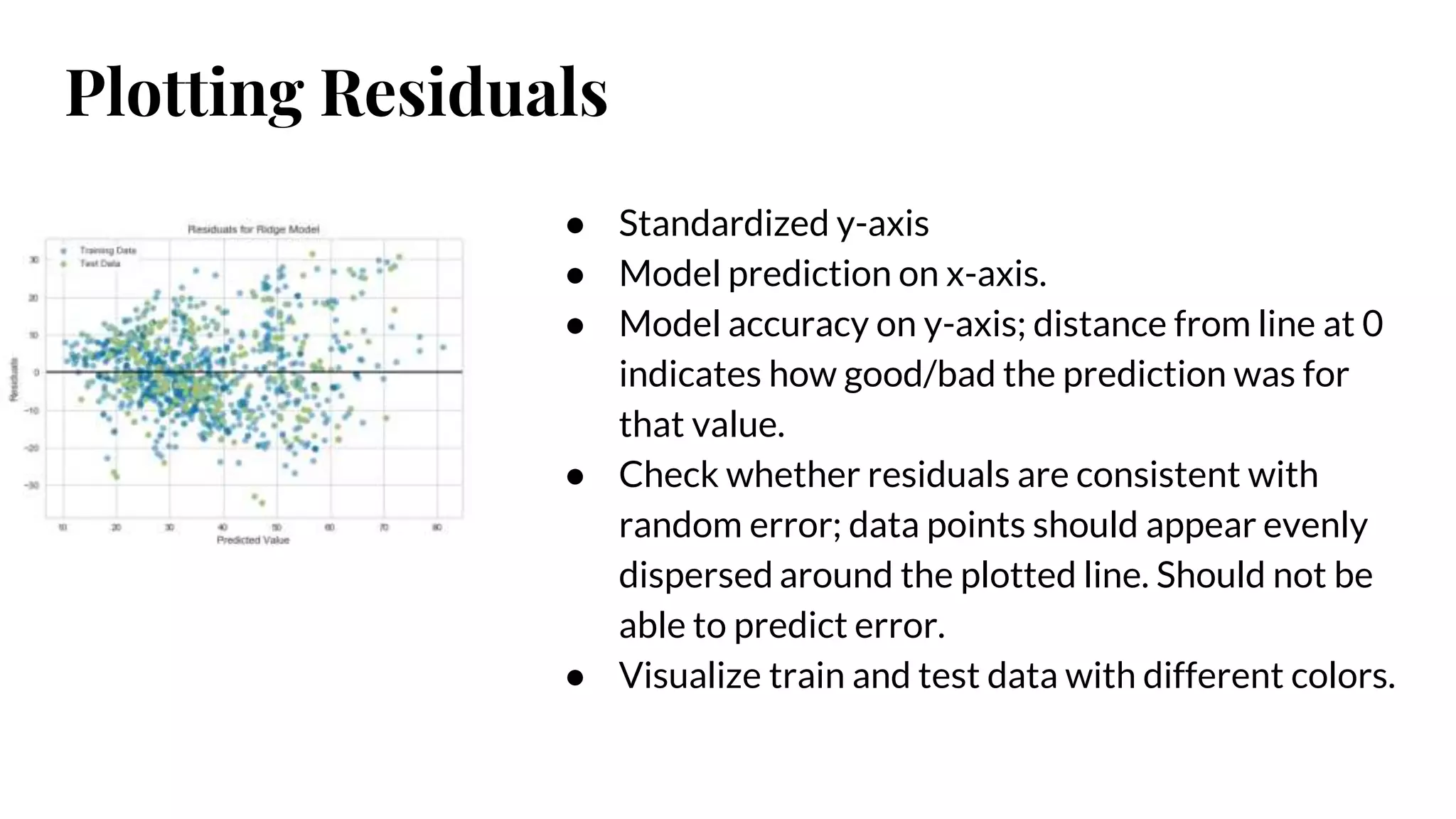
Plotting Residuals
● Standardizedy-axis
● Model prediction on x-axis.
● Model accuracy on y-axis; distance from line at 0
indicates how good/bad the prediction was for
that value.
● Check whether residuals are consistent with
random error; data points should appear evenly
dispersed around the plotted line. Should not be
able to predict error.
● Visualize train and test data with different colors.
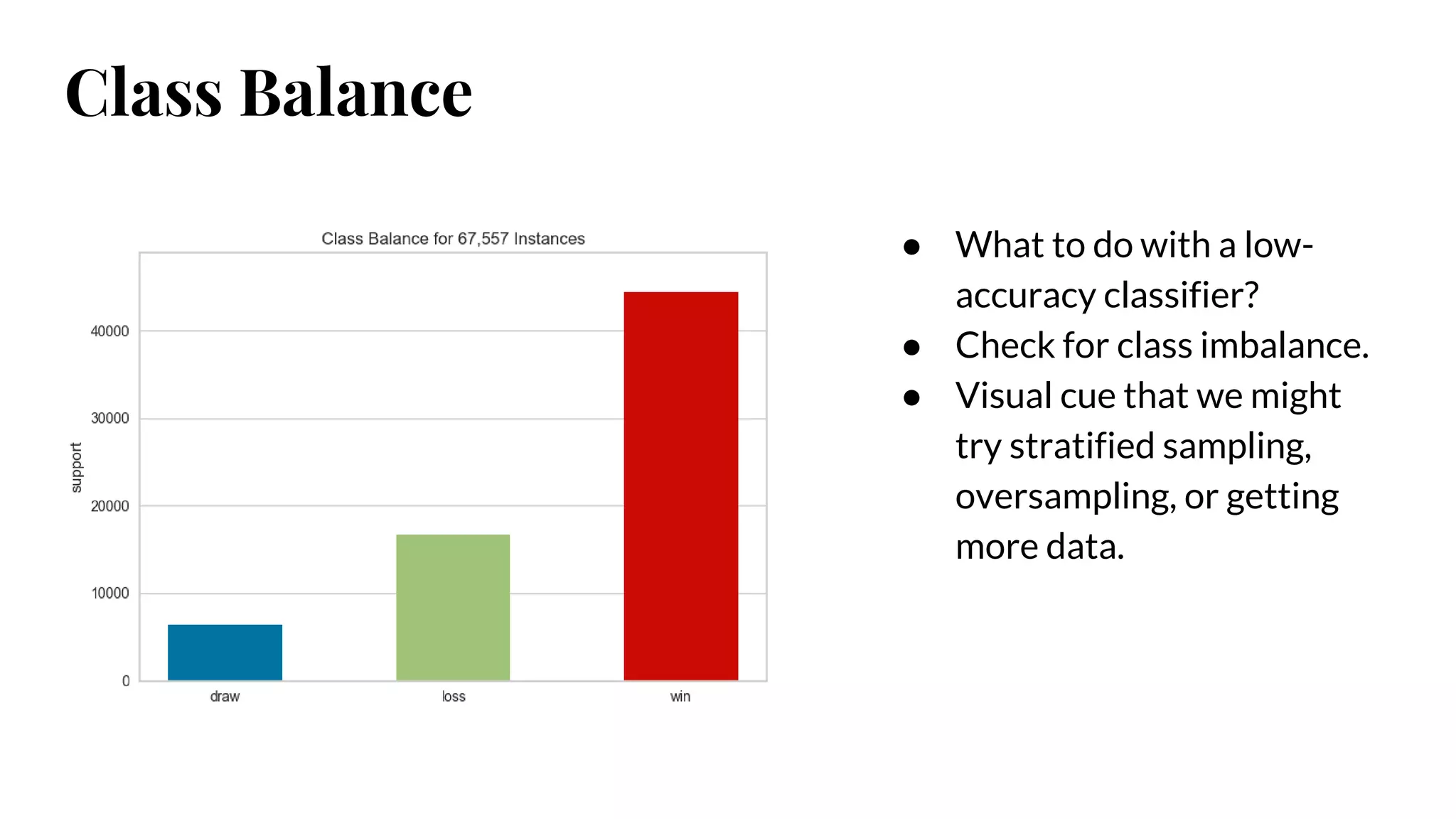
● What todo with a low-
accuracy classifier?
● Check for class imbalance.
● Visual cue that we might
try stratified sampling,
oversampling, or getting
more data.
Class Balance
43.
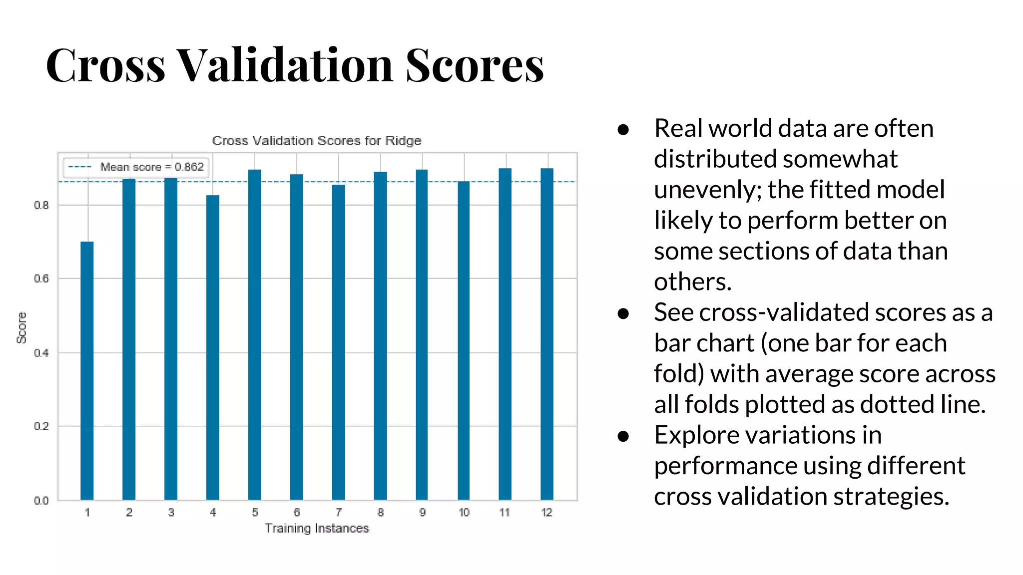
Cross Validation Scores
●Real world data are often
distributed somewhat
unevenly; the fitted model
likely to perform better on
some sections of data than
others.
● See cross-validated scores as a
bar chart (one bar for each
fold) with average score across
all folds plotted as dotted line.
● Explore variations in
performance using different
cross validation strategies.
44.
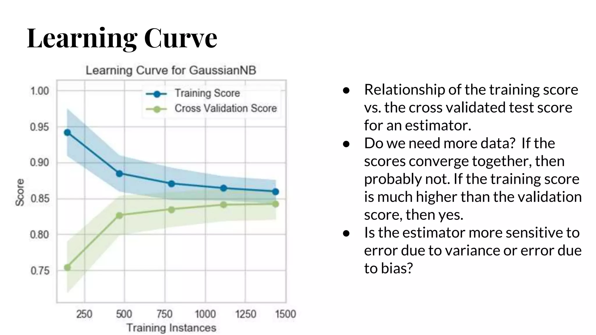
Learning Curve
● Relationshipof the training score
vs. the cross validated test score
for an estimator.
● Do we need more data? If the
scores converge together, then
probably not. If the training score
is much higher than the validation
score, then yes.
● Is the estimator more sensitive to
error due to variance or error due
to bias?
45.
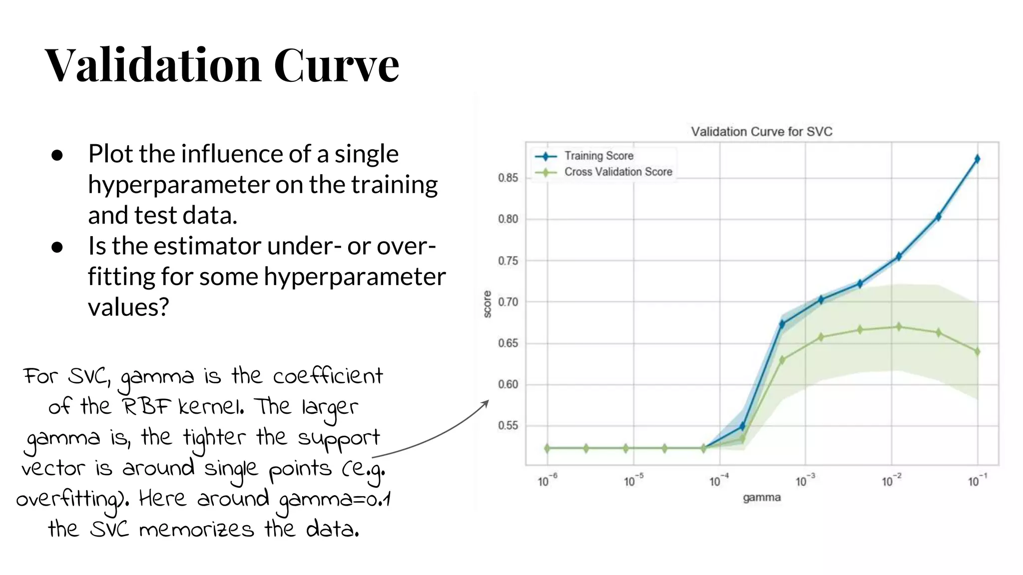
Validation Curve
● Plotthe influence of a single
hyperparameter on the training
and test data.
● Is the estimator under- or over-
fitting for some hyperparameter
values?
For SVC, gamma is the coefficient
of the RBF kernel. The larger
gamma is, the tighter the support
vector is around single points (e.g.
overfitting). Here around gamma=0.1
the SVC memorizes the data.
Hyperparameters
● When wecall fit() on an estimator, it learns the parameters of the algorithm
that make it fit the data best.
● However, some parameters are not directly learned within an estimator.
These are the ones we provide when we instantiate the estimator.
○ alpha for LASSO or Ridge
○ C, kernel, and gamma for SVC
● These parameters are often referred to as hyperparameters.
48.
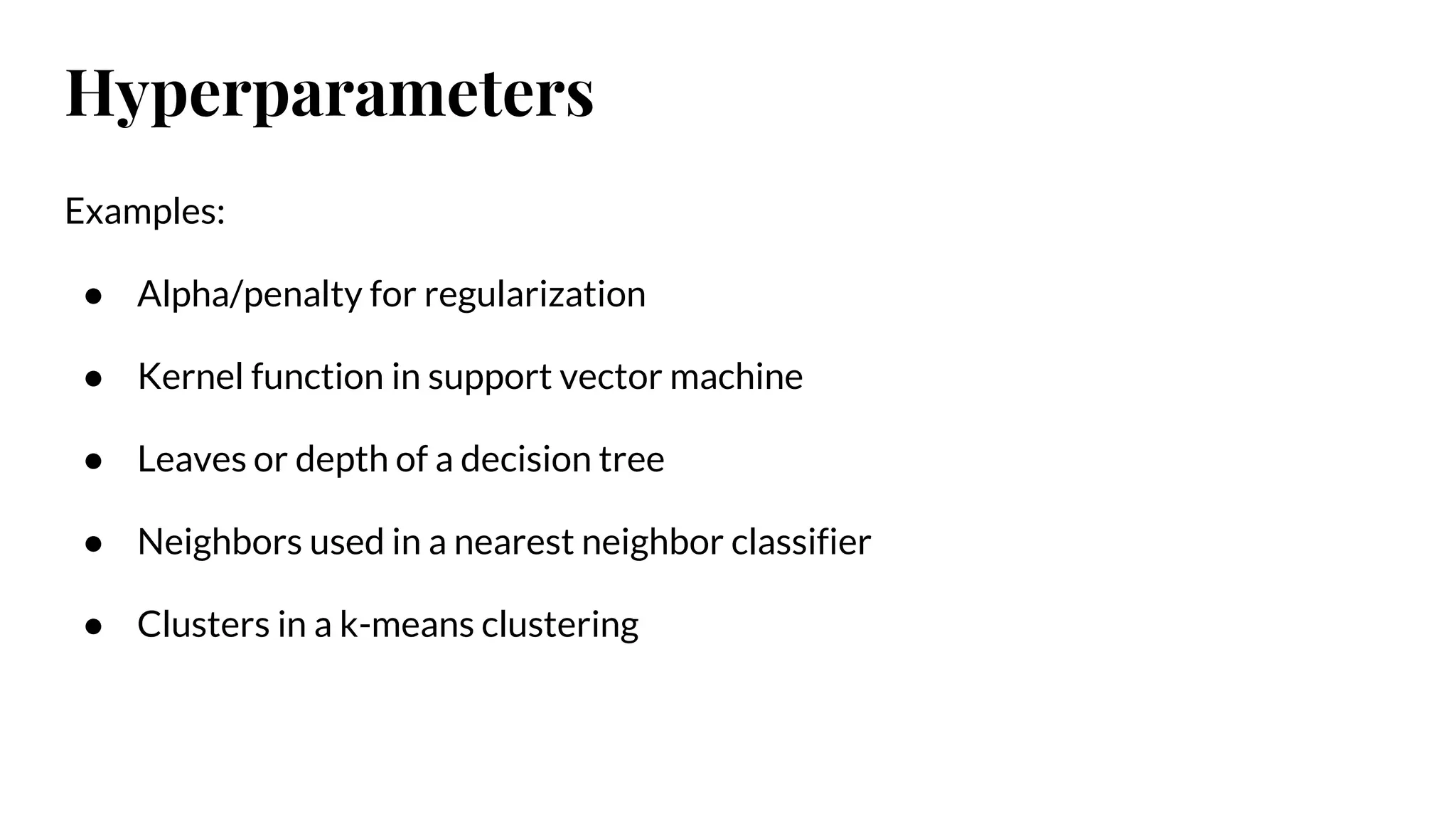
Examples:
● Alpha/penalty forregularization
● Kernel function in support vector machine
● Leaves or depth of a decision tree
● Neighbors used in a nearest neighbor classifier
● Clusters in a k-means clustering
Hyperparameters
49.
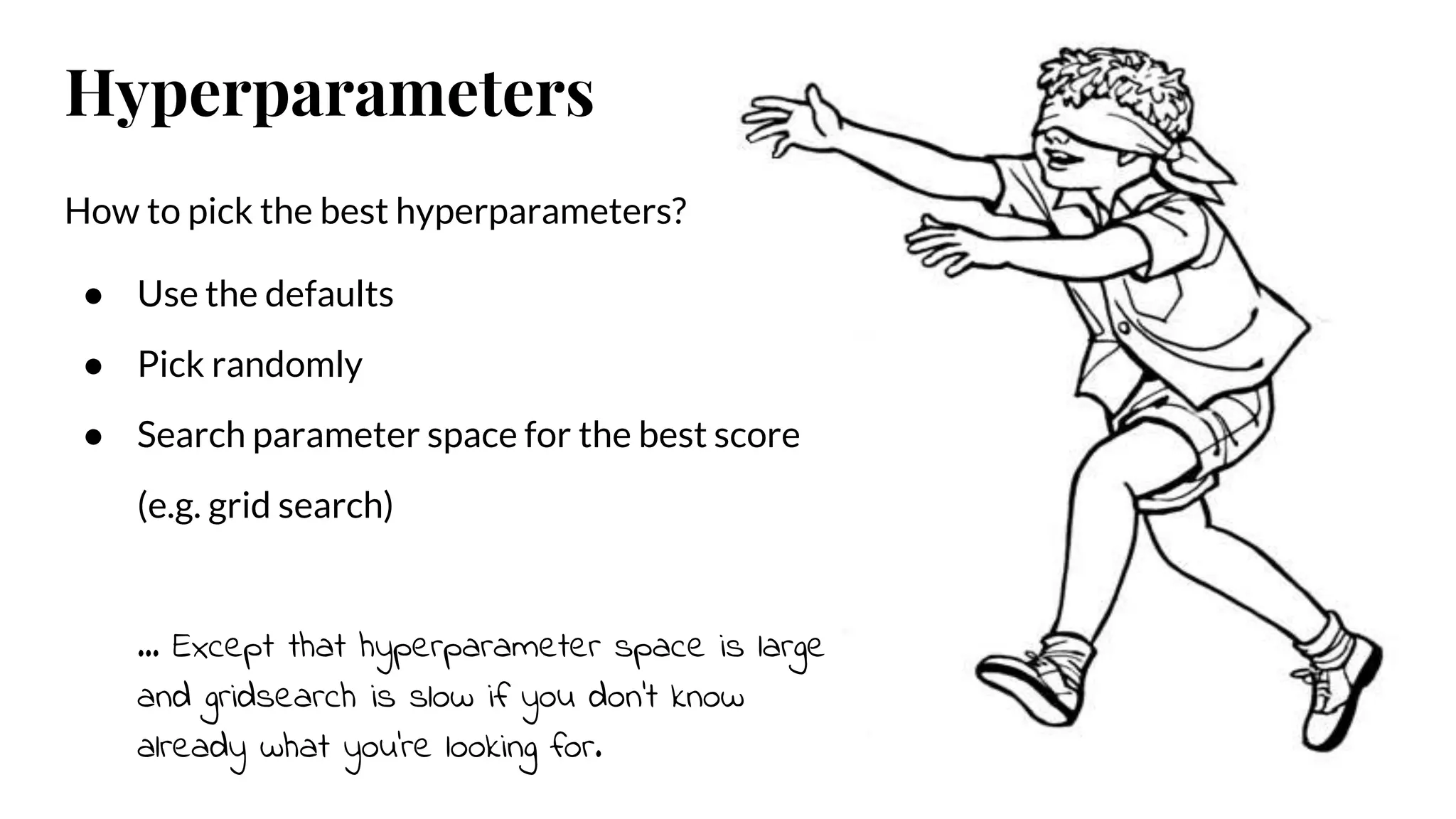
How to pickthe best hyperparameters?
● Use the defaults
● Pick randomly
● Search parameter space for the best score
(e.g. grid search)
… Except that hyperparameter space is large
and gridsearch is slow if you don’t know
already what you’re looking for.
Hyperparameters
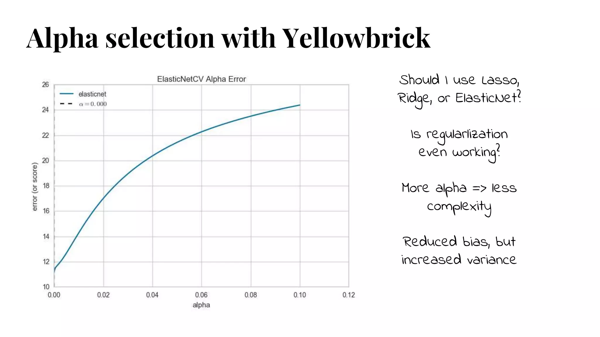
Should I useLasso,
Ridge, or ElasticNet?
Is regularlization
even working?
More alpha => less
complexity
Reduced bias, but
increased variance
Alpha selection with Yellowbrick
52.
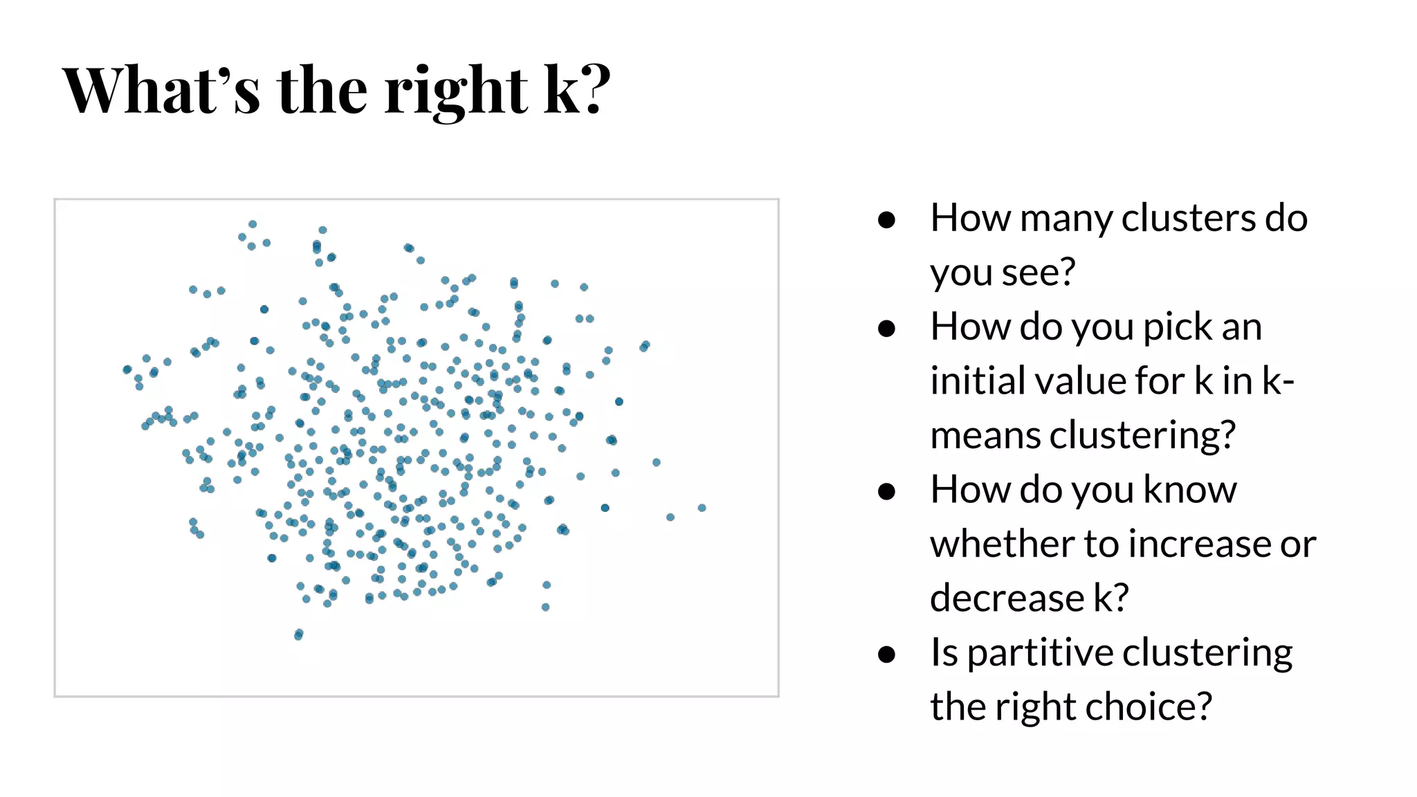
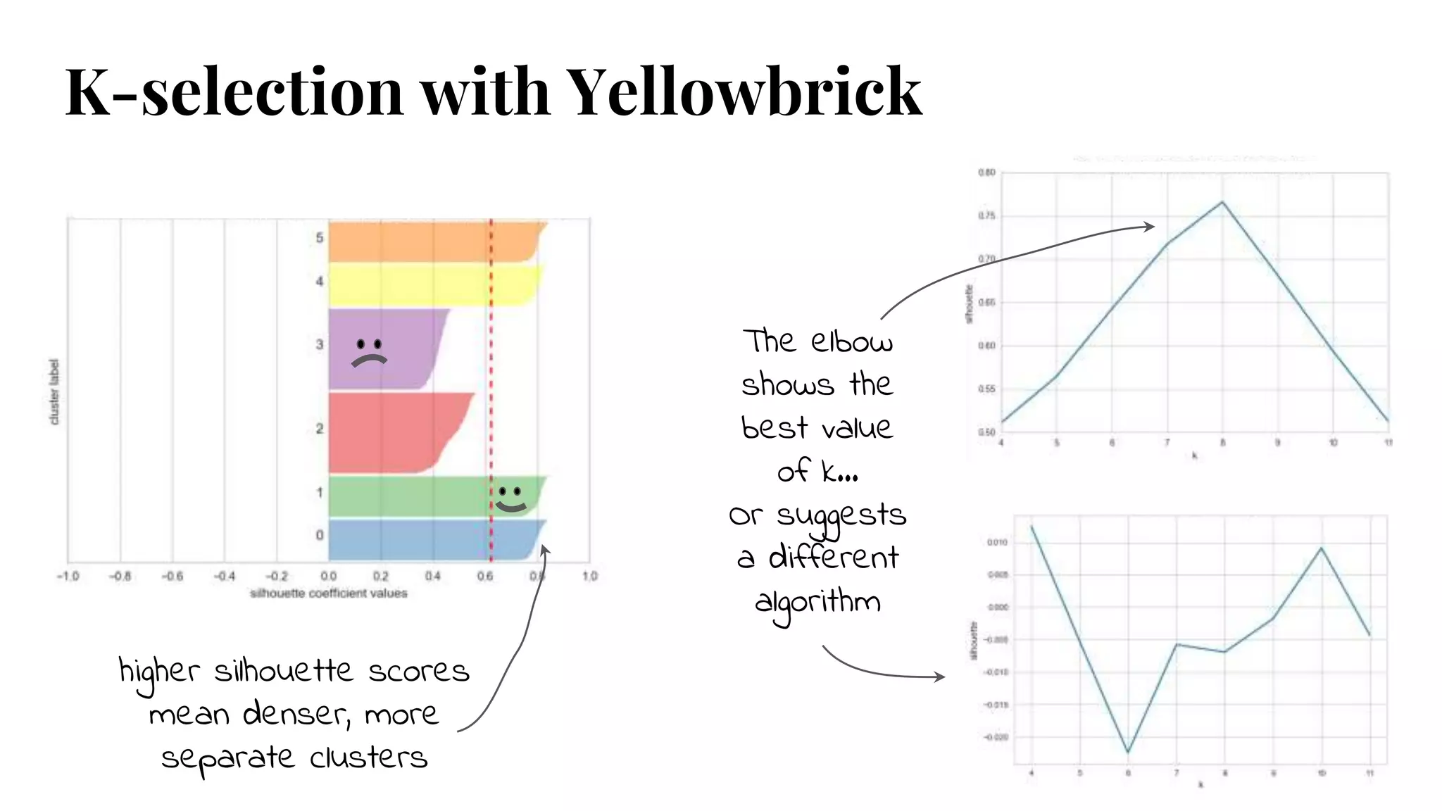
● How manyclusters do
you see?
● How do you pick an
initial value for k in k-
means clustering?
● How do you know
whether to increase or
decrease k?
● Is partitive clustering
the right choice?
What’s the right k?
53.
higher silhouette scores
meandenser, more
separate clusters
The elbow
shows the
best value
of k…
Or suggests
a different
algorithm
K-selection with Yellowbrick
54.
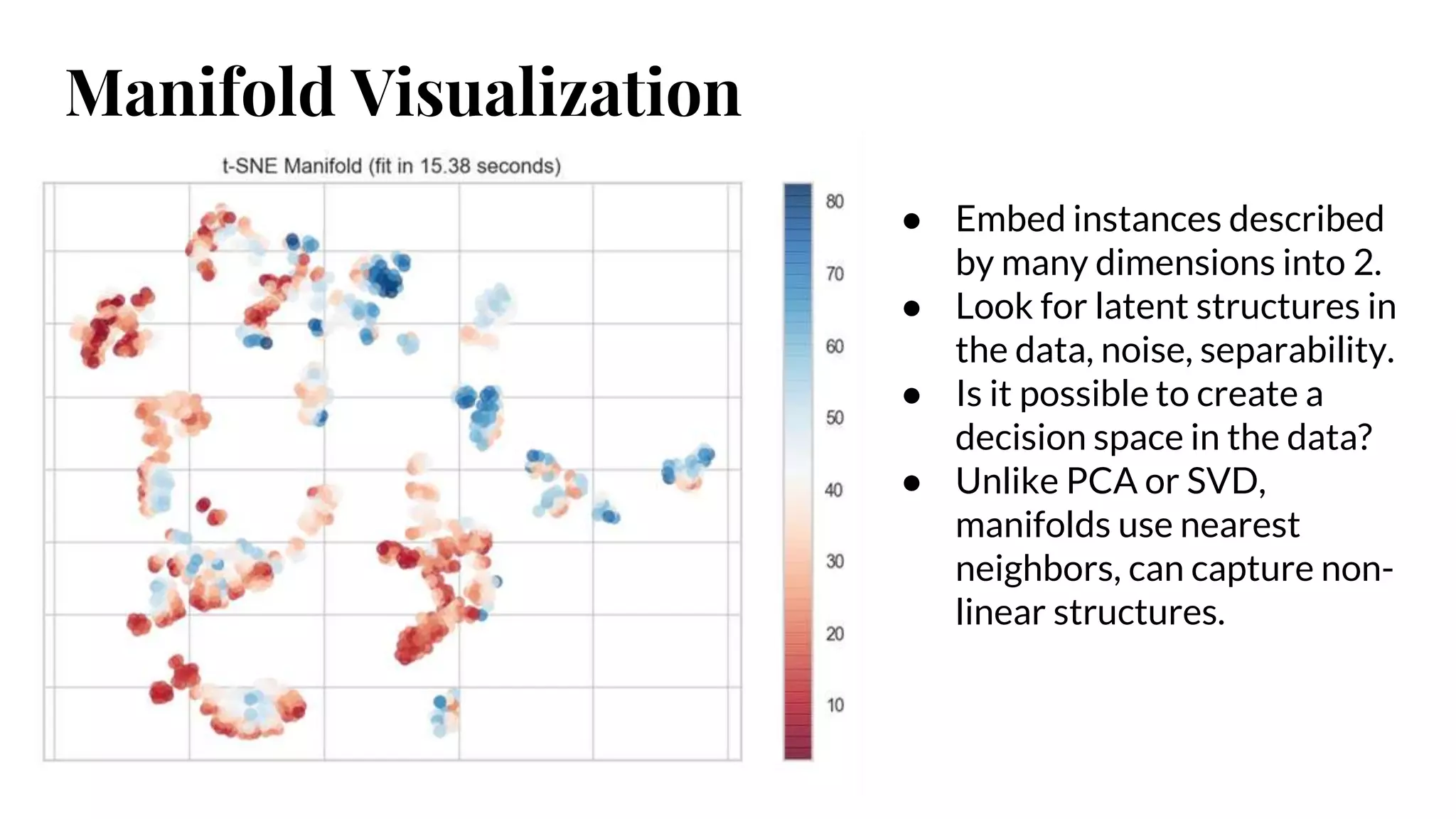
Manifold Visualization
● Embedinstances described
by many dimensions into 2.
● Look for latent structures in
the data, noise, separability.
● Is it possible to create a
decision space in the data?
● Unlike PCA or SVD,
manifolds use nearest
neighbors, can capture non-
linear structures.
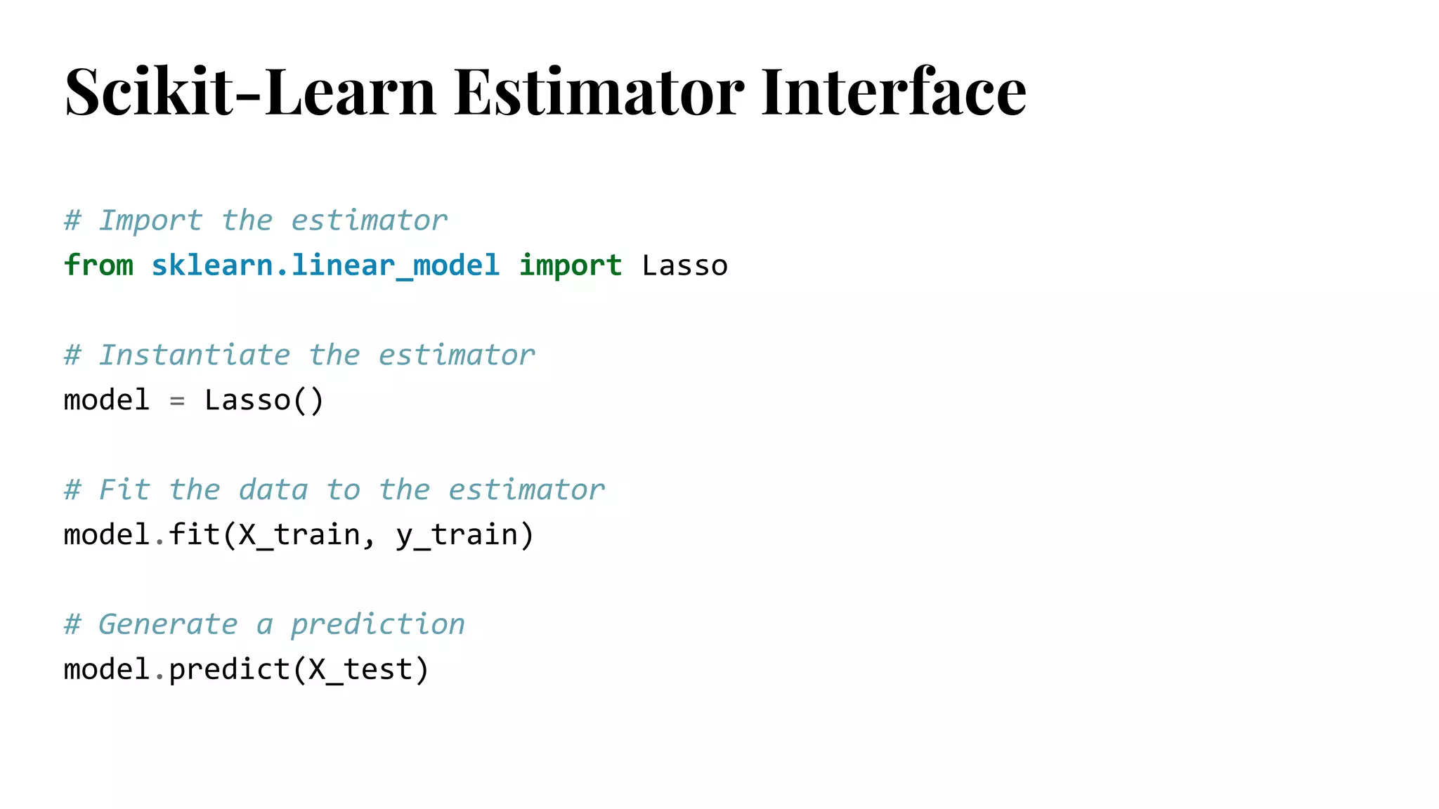
# Import theestimator
from sklearn.linear_model import Lasso
# Instantiate the estimator
model = Lasso()
# Fit the data to the estimator
model.fit(X_train, y_train)
# Generate a prediction
model.predict(X_test)
Scikit-Learn Estimator Interface
58.
# Import themodel and visualizer
from sklearn.linear_model import Lasso
from yellowbrick.regressor import PredictionError
# Instantiate the visualizer
visualizer = PredictionError(Lasso())
# Fit
visualizer.fit(X_train, y_train)
# Score and visualize
visualizer.score(X_test, y_test)
visualizer.poof()
Yellowbrick Visualizer Interface
59.
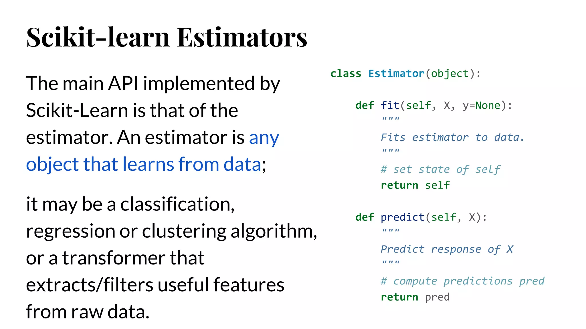
The main APIimplemented by
Scikit-Learn is that of the
estimator. An estimator is any
object that learns from data;
it may be a classification,
regression or clustering algorithm,
or a transformer that
extracts/filters useful features
from raw data.
class Estimator(object):
def fit(self, X, y=None):
"""
Fits estimator to data.
"""
# set state of self
return self
def predict(self, X):
"""
Predict response of X
"""
# compute predictions pred
return pred
Scikit-learn Estimators
60.
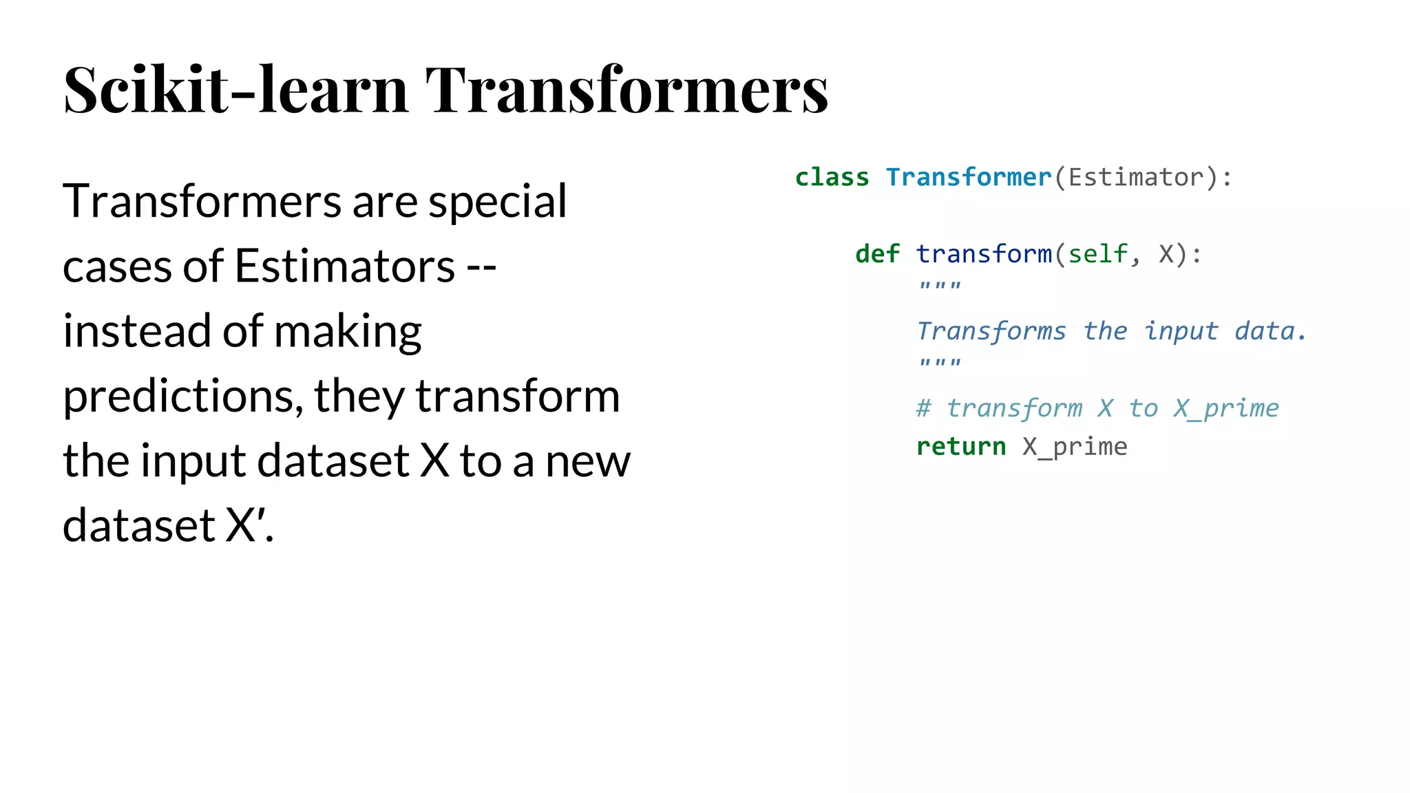
Transformers are special
casesof Estimators --
instead of making
predictions, they transform
the input dataset X to a new
dataset X′.
class Transformer(Estimator):
def transform(self, X):
"""
Transforms the input data.
"""
# transform X to X_prime
return X_prime
Scikit-learn Transformers
61.
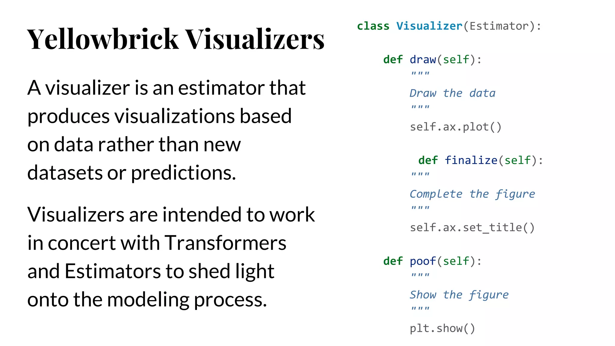
A visualizer isan estimator that
produces visualizations based
on data rather than new
datasets or predictions.
Visualizers are intended to work
in concert with Transformers
and Estimators to shed light
onto the modeling process.
class Visualizer(Estimator):
def draw(self):
"""
Draw the data
"""
self.ax.plot()
def finalize(self):
"""
Complete the figure
"""
self.ax.set_title()
def poof(self):
"""
Show the figure
"""
plt.show()
Yellowbrick Visualizers
Yellowbrick is anopen source project that is supported by
a community who will gratefully and humbly accept any
contributions you might make to the project.
Large or small, any contribution makes a big difference;
and if you’ve never contributed to an open source project
before, we hope you will start with Yellowbrick!
#3 The model selection triple.
Arun Kumar did a survey of the analytical process
He’s going to crop up in a bit in a more interesting way
This feels right to me; and hopefully you see something similar.
Machine learning is about learning from example
And works on instances (examples)
Cite: http://pages.cs.wisc.edu/~arun/vision/SIGMODRecord15.pdf
analysts typically use an iterative exploratory process
#4 Visit the docs! http://www.scikit-yb.org/en/develop/index.html
#6 For classification; potentially we want to see if there is good separability
Are some features more predictive than others?
#9 We can see that the co2 values for the two classes are intertwined. We get a sense that something like a decision tree will have a hard time with this. Perhaps Gaussian instead? It will be able to use probabilities to describe the spread of those co2 values.
#10 Feature engineering requires understanding of the relationships between features
Visualize pairwise relationships as a heatmap
Pearson shows us strong correlations => potential collinearity
Covariance helps us understand the sequence of relationships
#12 Uses PCA to decompose high dimensional data into two or three dimensions
Each instance plotted in a scatter plot.
Projected dataset can be analyzed along axes of principle variation
Can be interpreted to determine if spherical distance metrics can be utilized.
Can also be plotted in three dimensions to attempt to visualize more components and get a better sense of the distribution in high dimensions
#13 Uses PCA to decompose high dimensional data into two or three dimensions
Each instance plotted in a scatter plot.
Projected dataset can be analyzed along axes of principle variation
Can be interpreted to determine if spherical distance metrics can be utilized.
Can also be plotted in three dimensions to attempt to visualize more components and get a better sense of the distribution in high dimensions
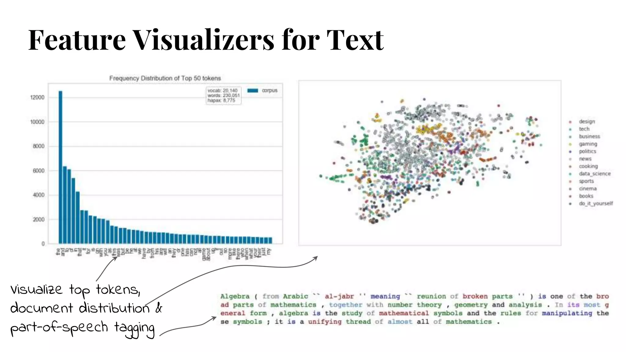
#14 Frequency distribution - top 50 tokens
Stochastic Neighbor Embedding, decomposition then projection into 2D scatterplot
Visual part-of-speech tagging
#16 The feature engineering process involves selecting the minimum required features to produce a valid model because the more features a model contains, the more complex it is (and the more sparse the data), therefore the more sensitive the model is to errors due to variance.
A common approach to eliminating features is to describe their relative importance to a model, then eliminate weak features or combinations of features and re-evalute to see if the model fairs better during cross-validation.
Many model forms describe the underlying impact of features relative to each other. This visualizer uses this attribute to rank and plot relative importances.
#17 Recursive feature elimination (RFE) is a feature selection method that fits a model and removes the weakest feature (or features) until the specified number of features is reached.
Features are ranked by the model’s coef_ or feature_importances_ attributes, and by recursively eliminating a small number of features per loop, RFE attempts to eliminate dependencies and collinearity that may exist in the model.
RFE requires a specified number of features to keep, however it is often not known in advance how many features are valid.
To find the optimal number of features cross-validation is used with RFE to score different feature subsets and select the best scoring collection of features.
The RFECVvisualizer plots the number of features in the model along with their cross-validated test score and variability and visualizes the selected number of features.
#18 Recursive feature elimination (RFE) is a feature selection method that fits a model and removes the weakest feature (or features) until the specified number of features is reached.
Features are ranked by the model’s coef_ or feature_importances_ attributes, and by recursively eliminating a small number of features per loop, RFE attempts to eliminate dependencies and collinearity that may exist in the model.
RFE requires a specified number of features to keep, however it is often not known in advance how many features are valid.
To find the optimal number of features cross-validation is used with RFE to score different feature subsets and select the best scoring collection of features.
The RFECVvisualizer plots the number of features in the model along with their cross-validated test score and variability and visualizes the selected number of features.
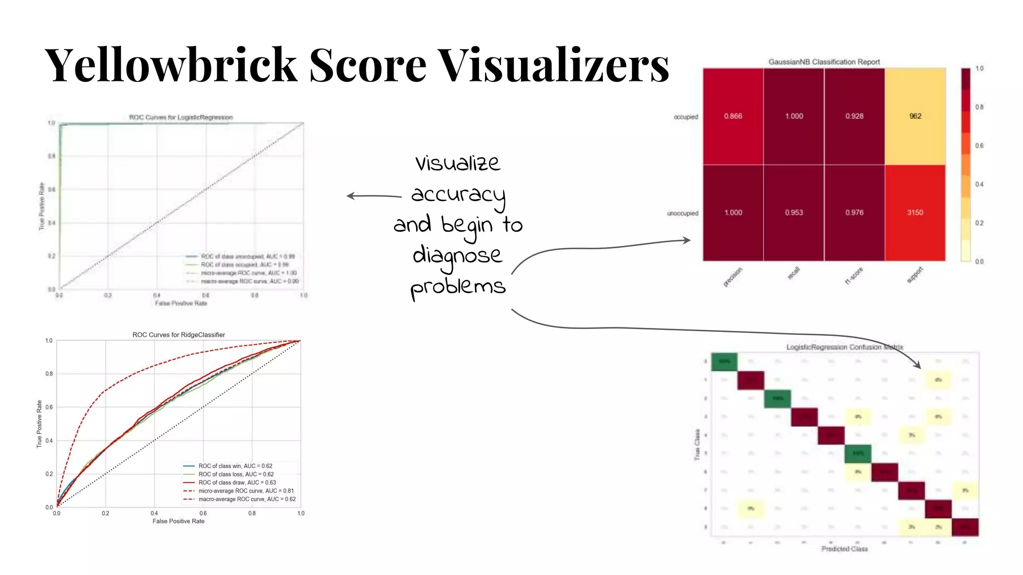
#23 Receiver operating characteristics/area under curve
Classification report heatmap - Quickly identify strengths & weaknesses of model - F1 vs Type I & Type II error
Visual confusion matrix - misclassification on a per-class basis
#31 The class prediction error chart provides a way to quickly understand how good your classifier is at predicting the right classes.
#32 A visualization of precision, recall, f1 score, and queue rate with respect to the discrimination threshold of a binary classifier.
The discrimination threshold is the probability or score at which the positive class is chosen over the negative class.
Generally, this is set to 50% but the threshold can be adjusted to increase or decrease the sensitivity to false positives or to other application factors.
One common use is to determine cases that require special treatment.
For example, a fraud prevention application might use a classification algorithm to determine if a transaction is likely fraudulent and needs to be investigated in detail.
Spam/not spam
Precision: An increase in precision is a reduction in the number of false positives; this metric should be optimized when the cost of special treatment is high (e.g. wasted time in fraud preventing or missing an important email).
Recall: An increase in recall decreases the likelihood that the positive class is missed; this metric should be optimized when it is vital to catch the case even at the cost of more false positives. (e.g. SPAM v. VIRUS)
F1 Score: The F1 score is the harmonic mean between precision and recall. The fbetaparameter determines the relative weight of precision and recall when computing this metric, by default set to 1 or F1. Optimizing this metric produces the best balance between precision and recall.
Queue Rate: The “queue” is the spam folder or the inbox of the fraud investigation desk. This metric describes the percentage of instances that must be reviewed. If review has a high cost (e.g. fraud prevention) then this must be minimized with respect to business requirements; if it doesn’t (e.g. spam filter), this could be optimized to ensure the inbox stays clean.
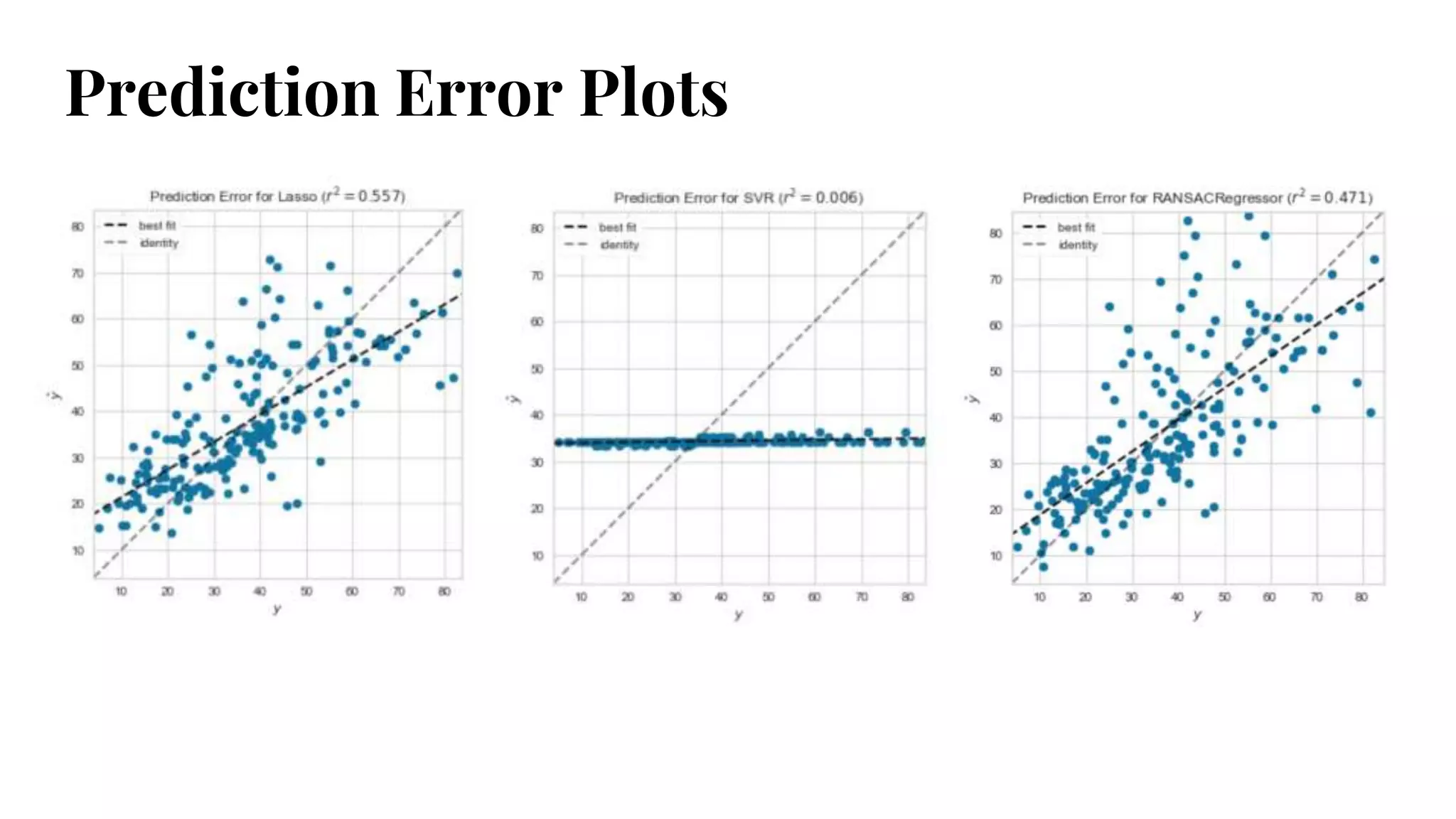
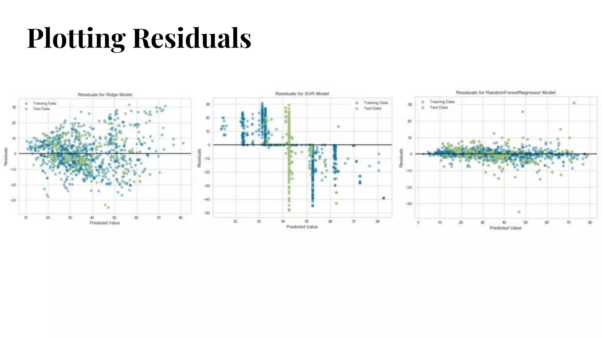
#35 Where/why/how is model performing good/bad
Prediction error plot - 45 degree line is theoretical perfect
Residuals plot - 0 line is no error
See change in amount of variance between x and y, or along x axis => heteroscedasticity
#43 Can we quickly detect class imbalance issues
Stratified sampling, oversampling, getting more data -- tricks will help us balance
But supervised methods can mask training data; simple graphs like these give us an at-a-glance reference
As this gets into multiclass problems, domination could be harder to see and really effect modeling
#45 A learning curve shows the relationship of the training score vs the cross validated test score for an estimator with a varying number of training samples. This visualization is typically used two show two things:
How much the estimator benefits from more data (e.g. do we have “enough data” or will the estimator get better if used in an online fashion).
If the estimator is more sensitive to error due to variance vs. error due to bias.
If the training and cross validation scores converge together as more data is added (shown in the left figure), then the model will probably not benefit from more data. If the training score is much greater than the validation score (as shown in the right figure) then the model probably requires more training examples in order to generalize more effectively.
#46 Plot the influence of a single hyperparameter on the training and test data to determine if the estimator is underfitting or overfitting for some hyperparameter values.
For a support vector classifier, gamma is the coefficient of the RBF kernel. It controls the influence of a single example. The larger gamma is, the tighter the support vector is around single points (overfitting the model).
In this visualization we see a definite inflection point around gamma=0.1. At this point the training score climbs rapidly as the SVC memorizes the data, while the cross-validation score begins to decrease as the model cannot generalize to unseen data.
#52 Which regularization technique to use? Lasso/L1, Ridge/L2, or ElasticNet L1+L2
Regularization uses a Norm to penalize complexity at a rate, alpha
The higher the alpha, the more the regularization.
Complexity minimization reduces bias in the model, but increases variance
Goal: select the smallest alpha such that error is minimized
Visualize the tradeoff
Surprising to see: higher alpha increasing error, alpha jumping around, etc.
Embed R2, MSE, etc into the graph - quick reference
#55 The Manifold visualizer provides high dimensional visualization using manifold learning to embed instances described by many dimensions into 2, thus allowing the creation of a scatter plot that shows latent structures in data.
Unlike decomposition methods such as PCA and SVD, manifolds generally use nearest-neighbors approaches to embedding, allowing them to capture non-linear structures that would be otherwise lost.
The projections that are produced can then be analyzed for noise or separability to determine if it is possible to create a decision space in the data.
#60 Estimators learn from data
Have a fit and predict method
#61 Transformers transform data
Have a transform method
#62 Visualizers can be estimators or transformers
Generally have a draw, finalize, and poof method