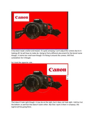
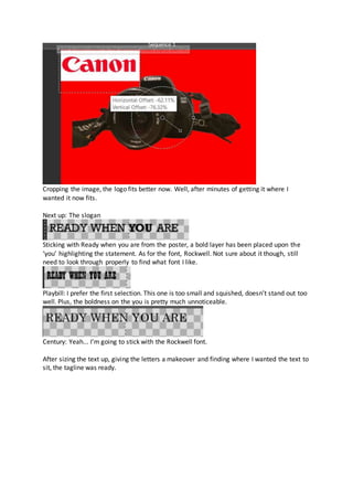
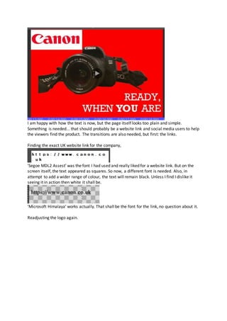
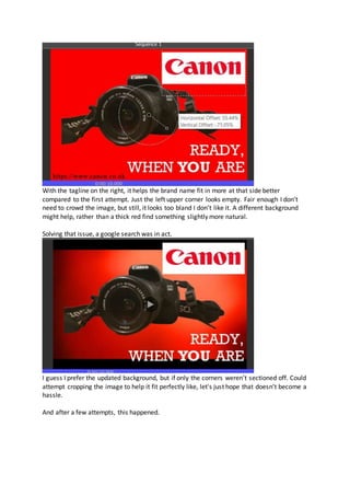
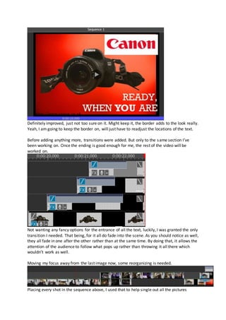
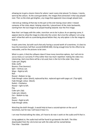
VIDEO DRAFT 4:
Going for a HIMYM inspired advertisement, only images will be used for this draft.
So I can get one of the videos out for the way, I have started working on this draft from
home considering I haven’t started it yet allowing zero issues from transferring different
software files.
Using VideoPad, surely it shouldn’t be too much of a hassle nor too different compared to
Premier Pro.
With the only usage being photographs...
In no particular order, I had gone through and selected all the images I believed would fit
well for this advertisement. That not being very many due to the results of some of them.
But to get a start, a good few have been added to soon be rearranged with fun transitions
being included.
At first, I though it would be best to insert two images per setting.
But due to lack of imagery, some numbers remain at two, but if any additional footage was
found that could fit then extra had been added. As for each picture's duration, I have
lowered each file to have only one second per appearance. That way they all have an even
amount of screen time and they do not linger on screen for too long making it boring to sit
through. Another pointer, being a full second it gives each picture a chance at a transition.
Adding every image to the sequence with their one second limit...
The video reaches 12 seconds. And that is without the ending. I don’t believe it is long
enough said might add a few more images and hope that resolves it as I don’t believe
expanding the limit would resolve the issue as then the images would be on too long.
Finding six additional pictures to include,
the duration should fly up to eighteen seconds now. Better I suppose. And that is still
without the ending so that should give finish somewhere between 20 seconds and 30
altogether which isn’t too short of a period.
Moving forward, I started to focus on the ending for the video before anything else. After a
PNG of the Canon camera, I needed it of an image I had already taken rather than a random
one off the internet. Finding a website that automatically removes the background from any
picture inserted, I went ahead and used it. This was the result...
With only a small section remaining, the site didn’t do so bad. Luckily, there was an option
to manually remove any sections the site left out. But that didn’t go so well either.
I did succeed in removing the rest of the background. But when the file had downloaded
blotches remained. So off to find a new website it is.
Coming across a new one, they actually did a much better job.
Still have small bits I’ll need to remove myself, but not too much with no part of the camera
itself missing either. Perfect to continue with.
Never mind, will have to carry the search on. There is an option to edit, just not as in to edit
help remove any excess or even bring back parts the computer removed. Annoying that,
especially as that seems to be the only one resulting the best.
Struggling, I have decided to find a different image to use instead.
As a result, I went with this image. One where the straps weren’t all over the place causing
gaps. Using the same site as before,
Yes, a tiny section hasn’t been cut out, but I see it as passable. Now, to actually create the
ending for the video now that the image is finally ready.
At first I did attempt to see if I could make the PNG move mid clip. But apparently not. So
then, I had a go at adding a bunch of the same files to create a mini stop motion to have the
camera slide along the screen with a backdrop falling into place. But that will have taken far
too long to get done.
Having a search around the tools, I found a blank clip that could be added. Having an idea
but not exactly sure as to what that could lead to, I had a go. Turning the backdrop red to
match the company, all is going well so far.
Placing on top, is the PNG file being made slightly smaller.
I now realise that wasn’t a very smart idea.
A wipe transition was added from the image before to the final slide. I had it in mind for the
red to drop down highlighting the product. Now to resize it again.
Being sneaky, I placed the PNG file right where the transition begins so it appears when the
red background slides down, it has taken the camera right out of the picture. Now for the
logo to be added.
I don’t know why right, but I was searching for the Canon logo as a PNG file. Even though I
know it’s red, hence the red background. How fun.
The logo has now been placed onto the sequence.
It has been made smaller and moved. It’s quite annoying I can't adjust the camera due to it
looking off, So will have to make do. Going to find a different placement for the brand name
though, it seems too small even though I’m fitting it around the camera. Will find
somewhere for it though.
So I tried the opposite side...
That doesn’t look right though. It may be on the right, but it does not look right. I did try it at
the bottom as well but that doesn’t work either. Not that I want it there in anyways, the
tagline will be going there.
Cropping the image, the logo fits better now. Well, after minutes of getting it where I
wanted it now fits.
Next up: The slogan
Sticking with Ready when you are from the poster, a bold layer has been placed upon the
‘you’ highlighting the statement. As for the font, Rockwell. Not sure about it though, still
need to look through properly to find what font I like.
Playbill: I prefer the first selection. This one is too small and squished, doesn’t stand out too
well. Plus, the boldness on the you is pretty much unnoticeable.
Century: Yeah... I’m going to stick with the Rockwell font.
After sizing the text up, giving the letters a makeover and finding where I wanted the text to
sit, the tagline was ready.
I am happy with how the text is now, but the page itself looks too plain and simple.
Something is needed... that should probably be a website link and social media users to help
the viewers find the product. The transitions are also needed, but first: the links.
Finding the exact UK website link for the company,
‘Segoe MDL2 Assest’ was the font I had used and really liked for a website link. But on the
screen itself, the text appeared as squares. So now, a different font is needed. Also, in
attempt to add a wider range of colour, the text will remain black. Unless I find I dislike it
seeing it in action then white it shall be.
‘Microsoft Himalaya’ works actually. That shall be the font for the link, no question about it.
Readjusting the logo again.
With the tagline on the right, it helps the brand name fit in more at that side better
compared to the first attempt. Just the left upper corner looks empty. Fair enough I don’t
need to crowd the image, but still, it looks too bland I don’t like it. A different background
might help, rather than a thick red find something slightly more natural.
Solving that issue, a google search was in act.
I guess I prefer the updated background, but if only the corners weren’t sectioned off. Could
attempt cropping the image to help it fit perfectly like, let's just hope that doesn’t become a
hassle.
And after a few attempts, this happened.
Definitely improved, just not too sure on it. Might keep it, the border adds to the look really.
Yeah, I am going to keep the border on, will just have to readjust the locations of the text.
Before adding anything more, transitions were added. But only to the same section I’ve
been working on. Once the ending is good enough for me, the rest of the video will be
worked on.
Not wanting any fancy options for the entrance of all the text, luckily, I was granted the only
transition I needed. That being, for it all do fade into the scene. As you should notice as well,
they all fade in one after the other rather than at the same time. By doing that, it allows the
attention of the audience to follow what pops up rather than throwing it all there which
wouldn’t work as well.
Moving my focus away from the last image now, some reorganizing is needed.
Placing every shot in the sequence above, I used that to help single out all the pictures
allowing me to get a clearer choice for where I want every shot placed. To choose, I mainly
went by the colours. As the scene got darker, the images that connected in that way played
next. Then as the shots got brighter, any image that appeared close enough played next.
I did end up redoing all that due to the part at the end moving closer when I moved
someone of the shots about. Helping solve this, I placed most of the shots backwards,
starting from the last image to be played heading towards near the first image.
Now that I am happy with the order, transition are to be in place. As an opening scene, it
appears best to allow the image to slide onto the screen. But since the software I am using
won't allow that with no scene being placed before that, my only option is for the image to
fade in.
It took some time, but with each shot only having a second worth of screentime, it is best to
have the transitions half that second (0:00:00.500). Giving enough time for the effect to be
noticeable, and for the pictures to be seen.
What is a pain, it that the software doesn’t have many transition options, but I will aim to
use as many as I can (only if it fits) rather than too much repetition making the video less
interesting. And since there will be a lot used, here is the list in the order they show:
Cube spin. (Right)
Slide. (Left)
Bounce. (Two bounces).
Split – Vertical, out.
Wipe – Right to left.
Roll.
Reveal – Bottom to top.
Fade through colour (black), replaced by blur, replaced again with page curl. (Top right).
Fade through colour. (black).
Radial – Clockwise.
Reveal – right to left.
Flip.
Cube spin. (Up).
Cube spin. (down).
Fan – Bottom to top.
Zoom.
Reveal – Right to left.
Fade through white.
Watching the draft through, it would help to have a second opinion on the use of
transitions, but for now I will leave it how it is.
I am now finished editing the video, all I have to do now is work on the audio and fit that in.
Using uppbeat.io, the audio track will be found to go towards the draft. The titles
downloaded from the site to test out with the video will be named below:
That Vibe – Soundroll
Big Beat – Bosnow
Plush Puppy – Moire
Happy with the three, I will remain with the small numbers for now rather than spending
too much time on the music when there's only so much time to work on this left.
That Vibe:
Very long audio. Handy really, but only if I go ahead with the selected audio.
The past few times I’ve gone through this experiment going through multiple sounds, but
this time I am going to move straight on with ‘That Vibe’. The beat connects with most of
the transitions perfectly, and it is quite upbeat. So rather than trying the other two now, I’m
not going to bother.
Moving on now, I am going to run through the clips, adding seconds onto a few so the music
fits perfectly. Then of course, the unnecessary part of the track will be removed.
Needing to export the file now, it turns out to do so I would have to purchase the software
as I was using a free trial which I didn’t realise until this moment. Overcoming this, the video
had been screen recorded. It did take a while as whilst the video played it would get glitchy,
especially near the end. By the last recording, the play through was doable. Using that
video, the file had finally been uploaded. Only in a more annoying way with the screen
having to be small.

Journeys draft four

  • 1.
    VIDEO DRAFT 4: Goingfor a HIMYM inspired advertisement, only images will be used for this draft. So I can get one of the videos out for the way, I have started working on this draft from home considering I haven’t started it yet allowing zero issues from transferring different software files. Using VideoPad, surely it shouldn’t be too much of a hassle nor too different compared to Premier Pro. With the only usage being photographs...
  • 2.
    In no particularorder, I had gone through and selected all the images I believed would fit well for this advertisement. That not being very many due to the results of some of them. But to get a start, a good few have been added to soon be rearranged with fun transitions being included. At first, I though it would be best to insert two images per setting. But due to lack of imagery, some numbers remain at two, but if any additional footage was found that could fit then extra had been added. As for each picture's duration, I have lowered each file to have only one second per appearance. That way they all have an even amount of screen time and they do not linger on screen for too long making it boring to sit through. Another pointer, being a full second it gives each picture a chance at a transition.
  • 3.
    Adding every imageto the sequence with their one second limit... The video reaches 12 seconds. And that is without the ending. I don’t believe it is long enough said might add a few more images and hope that resolves it as I don’t believe expanding the limit would resolve the issue as then the images would be on too long. Finding six additional pictures to include, the duration should fly up to eighteen seconds now. Better I suppose. And that is still without the ending so that should give finish somewhere between 20 seconds and 30 altogether which isn’t too short of a period. Moving forward, I started to focus on the ending for the video before anything else. After a PNG of the Canon camera, I needed it of an image I had already taken rather than a random one off the internet. Finding a website that automatically removes the background from any picture inserted, I went ahead and used it. This was the result...
  • 4.
    With only asmall section remaining, the site didn’t do so bad. Luckily, there was an option to manually remove any sections the site left out. But that didn’t go so well either. I did succeed in removing the rest of the background. But when the file had downloaded blotches remained. So off to find a new website it is. Coming across a new one, they actually did a much better job.
  • 5.
    Still have smallbits I’ll need to remove myself, but not too much with no part of the camera itself missing either. Perfect to continue with. Never mind, will have to carry the search on. There is an option to edit, just not as in to edit help remove any excess or even bring back parts the computer removed. Annoying that, especially as that seems to be the only one resulting the best. Struggling, I have decided to find a different image to use instead. As a result, I went with this image. One where the straps weren’t all over the place causing gaps. Using the same site as before, Yes, a tiny section hasn’t been cut out, but I see it as passable. Now, to actually create the ending for the video now that the image is finally ready. At first I did attempt to see if I could make the PNG move mid clip. But apparently not. So then, I had a go at adding a bunch of the same files to create a mini stop motion to have the camera slide along the screen with a backdrop falling into place. But that will have taken far too long to get done.
  • 6.
    Having a searcharound the tools, I found a blank clip that could be added. Having an idea but not exactly sure as to what that could lead to, I had a go. Turning the backdrop red to match the company, all is going well so far. Placing on top, is the PNG file being made slightly smaller. I now realise that wasn’t a very smart idea.
  • 7.
    A wipe transitionwas added from the image before to the final slide. I had it in mind for the red to drop down highlighting the product. Now to resize it again.
  • 8.
    Being sneaky, Iplaced the PNG file right where the transition begins so it appears when the red background slides down, it has taken the camera right out of the picture. Now for the logo to be added. I don’t know why right, but I was searching for the Canon logo as a PNG file. Even though I know it’s red, hence the red background. How fun. The logo has now been placed onto the sequence.
  • 9.
    It has beenmade smaller and moved. It’s quite annoying I can't adjust the camera due to it looking off, So will have to make do. Going to find a different placement for the brand name though, it seems too small even though I’m fitting it around the camera. Will find somewhere for it though. So I tried the opposite side... That doesn’t look right though. It may be on the right, but it does not look right. I did try it at the bottom as well but that doesn’t work either. Not that I want it there in anyways, the tagline will be going there.
  • 10.
    Cropping the image,the logo fits better now. Well, after minutes of getting it where I wanted it now fits. Next up: The slogan Sticking with Ready when you are from the poster, a bold layer has been placed upon the ‘you’ highlighting the statement. As for the font, Rockwell. Not sure about it though, still need to look through properly to find what font I like. Playbill: I prefer the first selection. This one is too small and squished, doesn’t stand out too well. Plus, the boldness on the you is pretty much unnoticeable. Century: Yeah... I’m going to stick with the Rockwell font. After sizing the text up, giving the letters a makeover and finding where I wanted the text to sit, the tagline was ready.
  • 11.
    I am happywith how the text is now, but the page itself looks too plain and simple. Something is needed... that should probably be a website link and social media users to help the viewers find the product. The transitions are also needed, but first: the links. Finding the exact UK website link for the company, ‘Segoe MDL2 Assest’ was the font I had used and really liked for a website link. But on the screen itself, the text appeared as squares. So now, a different font is needed. Also, in attempt to add a wider range of colour, the text will remain black. Unless I find I dislike it seeing it in action then white it shall be. ‘Microsoft Himalaya’ works actually. That shall be the font for the link, no question about it. Readjusting the logo again.
  • 12.
    With the taglineon the right, it helps the brand name fit in more at that side better compared to the first attempt. Just the left upper corner looks empty. Fair enough I don’t need to crowd the image, but still, it looks too bland I don’t like it. A different background might help, rather than a thick red find something slightly more natural. Solving that issue, a google search was in act. I guess I prefer the updated background, but if only the corners weren’t sectioned off. Could attempt cropping the image to help it fit perfectly like, let's just hope that doesn’t become a hassle. And after a few attempts, this happened.
  • 13.
    Definitely improved, justnot too sure on it. Might keep it, the border adds to the look really. Yeah, I am going to keep the border on, will just have to readjust the locations of the text. Before adding anything more, transitions were added. But only to the same section I’ve been working on. Once the ending is good enough for me, the rest of the video will be worked on. Not wanting any fancy options for the entrance of all the text, luckily, I was granted the only transition I needed. That being, for it all do fade into the scene. As you should notice as well, they all fade in one after the other rather than at the same time. By doing that, it allows the attention of the audience to follow what pops up rather than throwing it all there which wouldn’t work as well. Moving my focus away from the last image now, some reorganizing is needed. Placing every shot in the sequence above, I used that to help single out all the pictures
  • 14.
    allowing me toget a clearer choice for where I want every shot placed. To choose, I mainly went by the colours. As the scene got darker, the images that connected in that way played next. Then as the shots got brighter, any image that appeared close enough played next. I did end up redoing all that due to the part at the end moving closer when I moved someone of the shots about. Helping solve this, I placed most of the shots backwards, starting from the last image to be played heading towards near the first image. Now that I am happy with the order, transition are to be in place. As an opening scene, it appears best to allow the image to slide onto the screen. But since the software I am using won't allow that with no scene being placed before that, my only option is for the image to fade in. It took some time, but with each shot only having a second worth of screentime, it is best to have the transitions half that second (0:00:00.500). Giving enough time for the effect to be noticeable, and for the pictures to be seen. What is a pain, it that the software doesn’t have many transition options, but I will aim to use as many as I can (only if it fits) rather than too much repetition making the video less interesting. And since there will be a lot used, here is the list in the order they show: Cube spin. (Right) Slide. (Left) Bounce. (Two bounces). Split – Vertical, out. Wipe – Right to left. Roll. Reveal – Bottom to top. Fade through colour (black), replaced by blur, replaced again with page curl. (Top right). Fade through colour. (black). Radial – Clockwise. Reveal – right to left. Flip. Cube spin. (Up). Cube spin. (down). Fan – Bottom to top. Zoom. Reveal – Right to left. Fade through white. Watching the draft through, it would help to have a second opinion on the use of transitions, but for now I will leave it how it is. I am now finished editing the video, all I have to do now is work on the audio and fit that in. Using uppbeat.io, the audio track will be found to go towards the draft. The titles downloaded from the site to test out with the video will be named below: That Vibe – Soundroll
  • 15.
    Big Beat –Bosnow Plush Puppy – Moire Happy with the three, I will remain with the small numbers for now rather than spending too much time on the music when there's only so much time to work on this left. That Vibe: Very long audio. Handy really, but only if I go ahead with the selected audio. The past few times I’ve gone through this experiment going through multiple sounds, but this time I am going to move straight on with ‘That Vibe’. The beat connects with most of the transitions perfectly, and it is quite upbeat. So rather than trying the other two now, I’m not going to bother. Moving on now, I am going to run through the clips, adding seconds onto a few so the music fits perfectly. Then of course, the unnecessary part of the track will be removed. Needing to export the file now, it turns out to do so I would have to purchase the software as I was using a free trial which I didn’t realise until this moment. Overcoming this, the video had been screen recorded. It did take a while as whilst the video played it would get glitchy, especially near the end. By the last recording, the play through was doable. Using that video, the file had finally been uploaded. Only in a more annoying way with the screen having to be small.