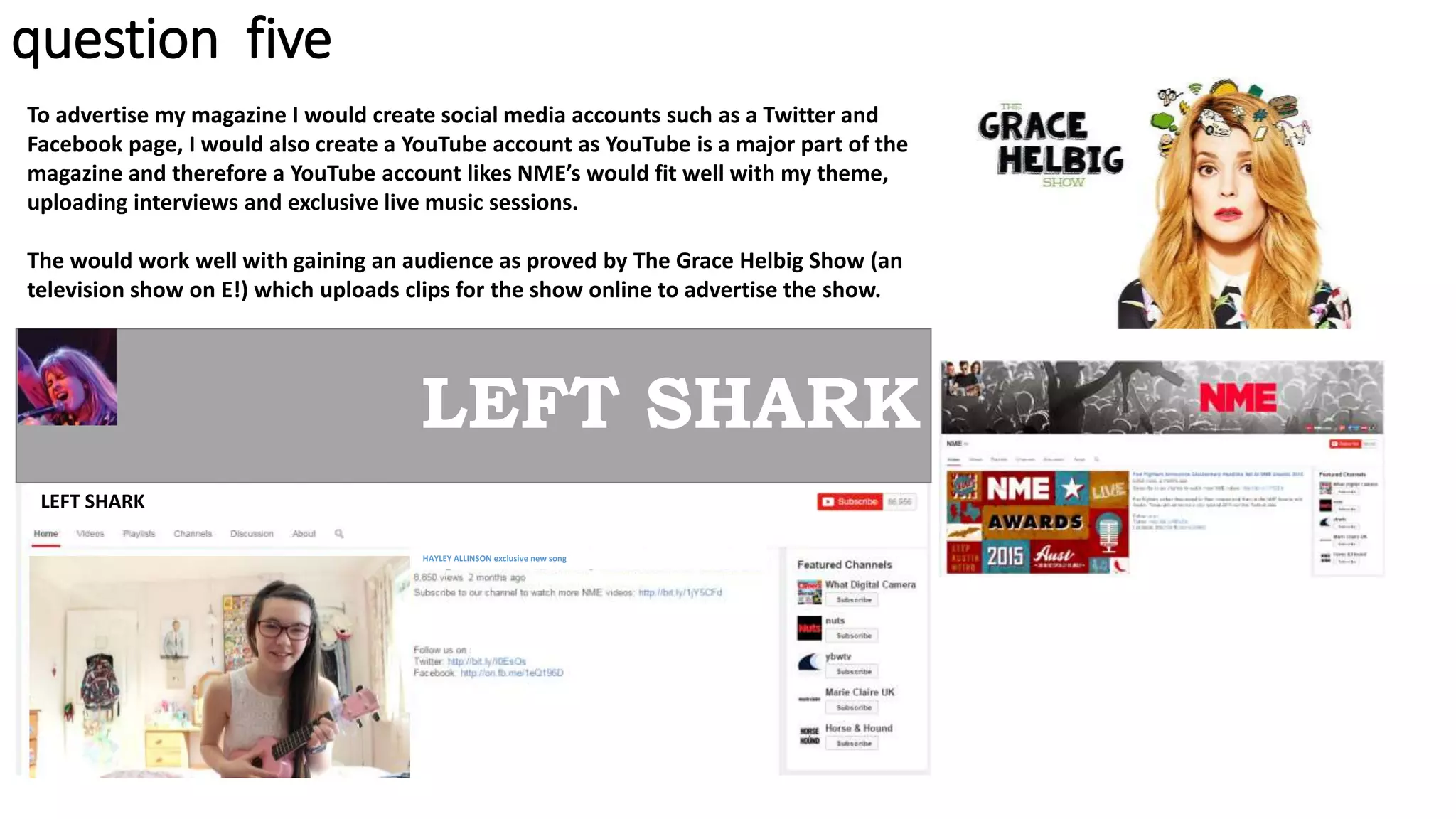
SlideShare a Scribd company logo
question one
who would be the audience for your
media product?
fans of a wide range of music
primarily independent music
aimed at both genders
primarily teenagers and young adults
aimed at British and American audiences
internet based interests
fans of already
established indie magazines
such as local wolves
featuring a mix of youtube
personalities and musicians
enjoy gigs and live music
interested in finding new artists
active on
social media
question one
My magazine is mostly based and in turn very similar to
Local Wolves, an independent magazine that focuses on
small artist, some coming from YouTube. It is the closest
magazine on the market to mine, however mine focuses
more strongly on the internet side of the music industry,
hence why it’s my unique selling point.
I used Local Wolves as an inspiration for my
magazine, using a similar simplistic style and
layout, having a main featured cover artist, with
the other artists featured in the magazine
displayed on the side.
Both magazines don't require bright colours or
large text to attract an audience and instead can
use their selling point to drawn entice it’s
audience. However, a well known artist can be
used as the main feature to bring in extra readers.
question one
In my research I found that the idea of YouTube based
magazine was popular among teenagers due to
YouTube’s rising popularity.
When I asked 30 people in the age range my magazine is
based at, 90% said they’d read a YouTube magazine,
with 10% not being interested in YouTube at all.
When I asked other ages in my research, most above the
age of 25 were unaware of the YouTube culture that my
magazine focuses on, which is why my magazine is
ideally aimed at teenagers and young adults.
I also found that no of the 30 people asked already
consumed any form of YouTube media, showing there is
a desperate need for this magazine in the market.
Would you be interested in
reading a YouTube based
magazine?
Yes
No
question one
My magazine is primarily aimed at teenagers and young adults
(those most likely to watch YouTube). I wanted to aim my
magazine at both genders but my research found overall girls
were mostly interested in YouTube, especially the music side of it.
I also found that due to the lack of female YouTuber’s, were in
need of role models and by showcasing up-and-coming female
artists I could attract a large female audience.
I wanted to make sure not to alienate male readers so I didn’t give
my magazine a typically female design that would usually appeal
and instead kept the look and feel of my magazine gender neutral.
My magazine would also hopefully appeal to a secondary
audience of friends and family due to it’s mysterious and unique
basis. This magazine could appeal to anyone who is interested in
live music and finding new artists.
question one
question two
how did you attract/address you
audience?
well known YouTube musician
featured as cover artist singing live
music (defining unique selling point)
masthead
other featured articles in
the magazine
(different text sizes to show
importance)
barcode, price and issue number
colour scheme of white text throughout
to stand out on the dark background
same fonts used throughout
question two
I wanted my magazine to break away from typical conventions and as it is the first
magazine of it’s kind I wanted it to stand out even more from the rest. I decided on a
simplistic and basic layout so that the audience would be attracted by the content of the
magazine rather than bright colours and flashy text.
Gender
My magazine is aimed at both genders, so I didn’t pander to either gender to make sure I
didn’t alienate the other. However, an aspect I did want to highlight was strong female role
models so by using a young female artist as my cover star I could attract teenager girls,
who I found through my research are most likely to read a YouTube focused magazine.
Age
The target audience for my magazine is teenagers and young adults, so by using a young
female artist on the cover, the teen girls who are more likely to read the magazine can look
up to her and aspire to be like her.
Genre
The genre for the magazine is mostly indie rock and pop, and features mostly acoustic and
live music. This is portrayed on my cover by the obvious live gig location of the image, as
well as the fact she’s talking about her sold out tour. Internet music could also be classed
as the genre of this magazine as all music featured is from artists that began on the internet without a record label, this is can by shown
from her talking about subscribers and the fact the magazine features a ‘Tumblr band’. However, I decided not to address the YouTube
aspect on this magazine in order not to alienate older readers who don’t yet understand the legitimacy of YouTube, hoping they would be
intrigued by the mysteriousness of the magazine, pick it up and discover YouTube as a legitimate media.
question two
I chose to use an image with out
eye contact, breaking away from
usual conventions, to show this is
a genuine live image, not posed
for the cover, legitimising the live
aspect of the magazine.
I showcased other artists
featured in the magazine on the
cover to attract more readers
who might read for those
featured, using a wide variety of
male and female artists and
bands to attract all types of
readers.
One typical magazine convention I did follow was the placing of the
masthead. I positioned my masthead at the top of my magazine as it is
the first place a reader looks and therefore important to establish the
brand first.
The masthead is only text keeping in theme with the simplistic look of
the magazine, which is focused on content rather than gimmicks to
attract an audience.
The colours on my magazine also very simplistic with the
cover image having a washed out appearance with a
purple glow from the stage lights. Along with the basic
white text, this mean the appearance isn’t very flashy like
most magazines. The white text stands out well from the
cover image, meaning people will be attracted to the
words and the content of the magazine.
The reason I didn’t want to use gimmicks, such as competitions, and
instead focus on the content was that I didn’t want to dilute my
magazine with flashy text that is only there to sell the magazine but
doesn’t have a purpose. Instead, I wanted my magazine to have some
integrity, as pretentious as that sounds.
My main feature is the second
largest text on my magazine, this
makes it stand out and catch the eye
of potential readers who might be
drawn in because of the cover star.
question two
By using images to show the reader
what’s in the magazine can entice
them to read on and see what the
images relate to.
I also used young female artists on my
contents page to continue to address
the female audience that will likely
follow this magazine.
The same font is used here as on the cover, creating a
brand identity meaning readers will associate this font
with the magazine, however the text is black on the
contents pages due to the light background image
compared to the covers white text on a dark
background image.
The contents page is split
into features and monthly,
with the bold text being
larger than the rest on the
contents page to
attraction attention.
The name of the article is the largest text of the
double page spread to catch the readers attention.
A large image of the artist to
show clearly who the article is
about.
The pull quote in the top left
hand corner is there to make
the reader question its
meaning and want to read the
article to know more.
Quotes are also highlighted and enlarged during the
article to get readers attention.
A plain simple design was used on the double page
spread to make it look as professional as possible.
My magazine’s colour scheme of white and black text
is continued here.
question two
On my double page spread I addressed my audience by
talking to them in a friendly-yet-informative manor. I
made sure that the article didn’t come across as
patronising so that the reader would enjoy reader it
and not feel as if they were being looked down on for
not knowing about the artist.
The rest of my magazine has a very relaxed feel to make the reader feel
relaxed. It isn’t heavy on text or images which makes it not visually jarring
or intimidating for the reader. I did this as I wanted my magazine to
appeal to younger teenage readers who perhaps weren’t as musically
aware, therefore they could easily read this magazine and learn without
being overwhelmed by information.
question two
question three
how does your media product
represent particular social groups?
Due to my target audience being mostly young
teenage girls the stars I chose to represent in my
magazine have been filtered in order for to
appear as role models for young girls.
This issue of the magazine is very female centric,
however if my magazine had more issues there
would be an equal focus on male artists, it just so
happens this issue was female artist heavy.
However that being said, as young girls are more
likely to read a YouTube magazine I wanted the
stars represented to be positive role models.
The use of intertextuality within my magazine, primarily its similarities to
other indie magazine Local Wolves, allowed my magazine to showcase
multiple successful new young artists, giving my audience no matter their
social group someone to aspire to be like.
This issue of the magazine features multiple successful female artists
giving the young girl who would read this magazine positive role models.
To appeal to this target audience my magazine features idealised versions
of the reader.
question three
Dodie Clark, a YouTube musician my double page
spread artist is partly based on is presented as
someone young girls can look up to.
She presents herself in a fun and not too serious
way which would easily appeal to young
audiences who see her more as a friend than idol
due to her active presence on social media and at
YouTube gatherings. She dresses simply yet in a
style that would appeal to most girls as they can
look like her easily due to its simplicity. Her
signature ukulele also allows young girls to take
up and interest in learning an instrument.
Helen Anderson (known as
Melonlady on the internet), my cover
star is a real life musician who would
appeal to a vastly different audience
than Dodie. Her vintage rock style
would appeal to an older more
adventurous audience, showing that
this magazine appeal to a anyone.
However, Dodie and Helen are both
alike in that they are both positive
role models to a young female
audience.
question three
My featured star was intentionally very similar to
Dodie. I presented her simply in the image on the
double page spread, girly clothing, a happy inviting
face and the use of the light colours, pink and blue,
in the photo suggest a happy inviting personality.
In the article she is presented in a bubbly down-to-
earth demeanour, making her easily likeable to the
audience. I presented her in a way that readers
could aspire to be like her, making her a similar age
to my target audience.
Due to her humble beginnings on YouTube this star
can also appeal to lose in lower classes who might
aspire to her success and follow her because of
that.
However, this is a star who could easily appeal to
anyone of any social group due to her likability.
question three
question four
in what ways does your media
product use, develop or challenge
forms and conventions of real media
products?
question four
other artists
featured in the
magazine
masthead
(partly hidden by image)
cover star
no eye contact
main feature
(cover story)
date/issue
The style of my magazine was based on Local
Wolves as it’s an indie magazine with similar
themes to mine. Both magazines feature
YouTubers and are targeted at a younger
audience.
Like this, my magazine breaks away from the
usual conventions of eye contact and a
heavily populated cover.
Both magazines follow a simplistic layout and
don’t overcrowd the cover with text. Unlike
mainstream magazines that advertise
competitions and give-aways on their cover,
neither magazine do this, instead they keep
their integrity and focus on the content of the
magazine.
question four
My cover breaks typical magazine conventions by being bare,
having minimal text and being free of most eye catching
aspects. I chose to do to not crowd my cover to allow my artist
to stand out.
My cover image majorly breaks conventions as it is not posed,
and instead taking at live concert (part of my unique selling
point), and therefore also doesn’t has eye contact. I decided to
do this to get across the live music aspect, and felt a posed
concert image with eye contact would seem fake and forced.
One convention I did follow was the placement of the
masthead at the top on the page. I followed most other
magazines on this due to it being the first place the reader
looks and it’s important to establish the brand first.
question five
what kind of media institution might
distribute your media product and
why?
question five
Instead of going to another company to distribute my magazine I would instead look into
self publishing. I decided this would be a better idea as my magazine wouldn’t be clouded
by an outside force that would most likely interfere. Instead I would go to companies that
are apart of Google (the owner of YouTube), that focus solely on YouTube business, to
distribute my magazine.
I also wanted to involve the audience in the making of this magazine due to YouTube
viewers being so active on social media. I decided, due to there being no publishing
company already at Google, funding could be acquired using the websites Kickstarter or
Indiegogo, and those interested in the magazine could back the project by donating money
and they would be rewarded with perks, such as a reduced subscription. This would allow
the audience to be involved with the creation of this magazine and become more invested
in as they feel like they contributed to it’s creation.
By working with Google I could also gain endorsement from YouTubers that work from
them, helping to convince backers to fund the magazine. This is a typically unconventional
way to distribute and fund a magazine, however projects like this have proved to be
successful when it comes to YouTube related media products (such as Hannah Harto’s Hello
Harto Tour and the film, Camp Takota).
My magazine will publish monthly, keeping with normal niche magazine conventions, thus
the price of £3.50. All of these decisions were influenced by the magazine my magazine was
based on, Local Wolves, which is also run independently and is successful because of no
outside opinion.
question five
To advertise my magazine I would create social media accounts such as a Twitter and
Facebook page, I would also create a YouTube account as YouTube is a major part of the
magazine and therefore a YouTube account likes NME’s would fit well with my theme,
uploading interviews and exclusive live music sessions.
The would work well with gaining an audience as proved by The Grace Helbig Show (an
television show on E!) which uploads clips for the show online to advertise the show.
LEFT SHARK
LEFT SHARK
HAYLEY ALLINSON exclusive new song
question six
what have you learnt about
technologies from the process of
constructing this product?
question six
Creating my magazine didn’t require the use of much technology due to its simplicity,
mainly Photoshop and InDesign. I used Photoshop when editing all my images and created
the magazine on InDesign. I chose to use these as I was most familiar with how to use them
and they were the best option for what I wanted to do.
InDesign was useful when creating my magazine as it allowed me to easily position text and
images which was important when experimenting with the layout of my magazine. InDesign
was integral in my experimentation as it allowed me to see what the magazine would
actually look like, instead of a draft on PowerPoint, so I could see what looked good and
what didn’t, and change it accordingly.
InDesign also allowed me to chose from a large variety of fonts, which was also important
in the experimenting stage of creating my magazine as I tested a lot of different fonts before
deciding.
I was more familiar using Photoshop than I was InDesign and therefore knew how I wanted
to edit my images beforehand. Keeping in theme with my magazines simple theme I didn’t
want to over edit images, I wanted to keep them basic and low key. However I did
experiment more with editing on my double page spread. On the following slides I will
show how I edited my cover image and my double page spread image.
question six
I began by cropping the image
to contain only the singer
ORIGINAL IMAGE
I then used the magic
want tool to separate the
model from the
background and created
a new layer
I edited the levels on the
image nextI then saved the layers separately, the
background as a jpeg and then model as png
(to keep the empty background instead it
filling white), ready to place them into
InDesign.
COVER
question six
When it came to my double page spread image
I edited it similarly to my cover. I separated the
foreground and the background with the magic
wand tool, and then deleted the background
leaving only the model on the bed.
I adjusted the levels of the image to make it
look clearer, and then placed this image on top
of a different image I’d already taken of stage
lights to give the impression the model is on
stage, linking to my article.
DOUBLE PAGE SPREAD
ORIGINAL IMAGE
question seven
looking back at your preliminary task,
what do you feel you have learnt in
the progression to the full product?
question seven
Front Cover Comparison
question seven
Comparing my school magazine and my music magazine, one big difference is technological improvements. My Photoshop skills improved
greatly, as well as I created the magazine on InDesign this time instead of PowerPoint, which allowed me much more creative options. I
was also able to experiment more the second time round as this time I had a better idea of what to do. My skills improved asI became
more comfortable with using Photoshop and had a better understanding of what I wanted to do.
My music magazine was also a lot more consistent than my school magazine, there was an obvious brand created on my music magazine,
whereas on my school magazine there wasn’t. My music magazine looked more professional as I had done more research in to actual
magazines and their conventions, and therefore was able to use these when making my magazine.
I’d say my photography and positioning of my photos on my magazine improved with my music magazine being easier to look at due to
following photography conventions. Overall my music magazine appeared to be more professional than my school magazine.

More Related Content

What's hot

As media evaluation
As media evaluationAs media evaluation
As media evaluationchloelav
 
Evaluation Presentation
Evaluation PresentationEvaluation Presentation
Evaluation Presentationkatrinaamorton
 
Music magazine analysis
Music magazine analysisMusic magazine analysis
Music magazine analysisdncA2media
 
Megan Howarth media AS evaluation
Megan Howarth  media AS evaluationMegan Howarth  media AS evaluation
Megan Howarth media AS evaluationablizz
 
evaluation
evaluationevaluation
evaluationhayley
 
magazine evaluation
magazine evaluation magazine evaluation
magazine evaluation
emzywmzy087
 
Media Evaluation 2
Media Evaluation 2Media Evaluation 2
Media Evaluation 2LaurenBC
 
Evaluation write up
Evaluation write upEvaluation write up
Evaluation write up
popk44
 
Media evaluation presentation
Media evaluation presentationMedia evaluation presentation
Media evaluation presentationmuminab
 
Question 1
Question 1Question 1
Question 1
Jacob Jones
 
Music magazine evaluation
Music magazine evaluationMusic magazine evaluation
Music magazine evaluation
Olivia Digger
 
Music magazine evaluation
Music magazine evaluation Music magazine evaluation
Music magazine evaluation oliviadigger1
 
Music magazine evaluation
Music magazine evaluation Music magazine evaluation
Music magazine evaluation oliviadigger1
 
Notorious Evaluation
Notorious EvaluationNotorious Evaluation
Notorious EvaluationEllieSwan
 

What's hot (14)

As media evaluation
As media evaluationAs media evaluation
As media evaluation
 
Evaluation Presentation
Evaluation PresentationEvaluation Presentation
Evaluation Presentation
 
Music magazine analysis
Music magazine analysisMusic magazine analysis
Music magazine analysis
 
Megan Howarth media AS evaluation
Megan Howarth  media AS evaluationMegan Howarth  media AS evaluation
Megan Howarth media AS evaluation
 
evaluation
evaluationevaluation
evaluation
 
magazine evaluation
magazine evaluation magazine evaluation
magazine evaluation
 
Media Evaluation 2
Media Evaluation 2Media Evaluation 2
Media Evaluation 2
 
Evaluation write up
Evaluation write upEvaluation write up
Evaluation write up
 
Media evaluation presentation
Media evaluation presentationMedia evaluation presentation
Media evaluation presentation
 
Question 1
Question 1Question 1
Question 1
 
Music magazine evaluation
Music magazine evaluationMusic magazine evaluation
Music magazine evaluation
 
Music magazine evaluation
Music magazine evaluation Music magazine evaluation
Music magazine evaluation
 
Music magazine evaluation
Music magazine evaluation Music magazine evaluation
Music magazine evaluation
 
Notorious Evaluation
Notorious EvaluationNotorious Evaluation
Notorious Evaluation
 

Viewers also liked

토토추천 《∼∼》 Too93.com 《∼∼》 토토추천 토토추천
토토추천 《∼∼》 Too93.com 《∼∼》 토토추천 토토추천토토추천 《∼∼》 Too93.com 《∼∼》 토토추천 토토추천
토토추천 《∼∼》 Too93.com 《∼∼》 토토추천 토토추천
dsvfgdgf
 
Virtual revolution montage
Virtual revolution montageVirtual revolution montage
Virtual revolution montage
James Lockton
 
Contenido de la jornada 15 dic
Contenido de la jornada 15 dicContenido de la jornada 15 dic
Contenido de la jornada 15 dic
talentosolidario
 
토토추천 =*=*=*= Too93.com =*=*=*= 토토추천 토토추천
토토추천 =*=*=*= Too93.com =*=*=*=  토토추천 토토추천토토추천 =*=*=*= Too93.com =*=*=*=  토토추천 토토추천
토토추천 =*=*=*= Too93.com =*=*=*= 토토추천 토토추천
dsvfgdgf
 
Portada
PortadaPortada
Portada
Danii Parra
 
토토추천 토토추천 《∼∼》Too93.com 《∼∼》 토토추천 토토추천
토토추천 토토추천 《∼∼》Too93.com 《∼∼》 토토추천 토토추천토토추천 토토추천 《∼∼》Too93.com 《∼∼》 토토추천 토토추천
토토추천 토토추천 《∼∼》Too93.com 《∼∼》 토토추천 토토추천
dsvfgdgf
 
토토추천 토토추천 《∼∼》 Too93.com 《∼∼》 토토추천 토토추천
토토추천 토토추천 《∼∼》 Too93.com 《∼∼》 토토추천 토토추천토토추천 토토추천 《∼∼》 Too93.com 《∼∼》 토토추천 토토추천
토토추천 토토추천 《∼∼》 Too93.com 《∼∼》 토토추천 토토추천
dsvfgdgf
 
Conventions
ConventionsConventions
Conventions
charliewhitmore
 
Portada daniel
Portada danielPortada daniel
Portada daniel
Danii Parra
 
Definicion de aprendizaje
Definicion de aprendizajeDefinicion de aprendizaje
Definicion de aprendizaje
Danii Parra
 
토토추천 《∼∼》 Too93.com 《∼∼》 토토추천 토토추천
토토추천 《∼∼》 Too93.com 《∼∼》 토토추천 토토추천토토추천 《∼∼》 Too93.com 《∼∼》 토토추천 토토추천
토토추천 《∼∼》 Too93.com 《∼∼》 토토추천 토토추천
dsvfgdgf
 
Aspectos preliminares
Aspectos preliminaresAspectos preliminares
Aspectos preliminares
Danii Parra
 
Manusia dan teknologi
Manusia dan teknologiManusia dan teknologi
Manusia dan teknologi
Rinaldi Sihombing
 
Презентация ООО "Кубаньэлектрощит"
Презентация ООО "Кубаньэлектрощит" Презентация ООО "Кубаньэлектрощит"
Презентация ООО "Кубаньэлектрощит"
Ivan Kudrenko
 
поцелуй тети клавы 29
поцелуй тети клавы 29поцелуй тети клавы 29
поцелуй тети клавы 29
Виталий Болатаев
 
Leaflet ispa akper pemkab muna dewasa
Leaflet  ispa akper pemkab muna dewasaLeaflet  ispa akper pemkab muna dewasa
Leaflet ispa akper pemkab muna dewasaSeptian Muna Barakati
 
Liberté d'inspiration professionnelle
Liberté d'inspiration professionnelleLiberté d'inspiration professionnelle
Liberté d'inspiration professionnelle
la voie des Hommes
 

Viewers also liked (20)

토토추천 《∼∼》 Too93.com 《∼∼》 토토추천 토토추천
토토추천 《∼∼》 Too93.com 《∼∼》 토토추천 토토추천토토추천 《∼∼》 Too93.com 《∼∼》 토토추천 토토추천
토토추천 《∼∼》 Too93.com 《∼∼》 토토추천 토토추천
 
JiafengLin
JiafengLinJiafengLin
JiafengLin
 
Virtual revolution montage
Virtual revolution montageVirtual revolution montage
Virtual revolution montage
 
Contenido de la jornada 15 dic
Contenido de la jornada 15 dicContenido de la jornada 15 dic
Contenido de la jornada 15 dic
 
토토추천 =*=*=*= Too93.com =*=*=*= 토토추천 토토추천
토토추천 =*=*=*= Too93.com =*=*=*=  토토추천 토토추천토토추천 =*=*=*= Too93.com =*=*=*=  토토추천 토토추천
토토추천 =*=*=*= Too93.com =*=*=*= 토토추천 토토추천
 
Portada
PortadaPortada
Portada
 
토토추천 토토추천 《∼∼》Too93.com 《∼∼》 토토추천 토토추천
토토추천 토토추천 《∼∼》Too93.com 《∼∼》 토토추천 토토추천토토추천 토토추천 《∼∼》Too93.com 《∼∼》 토토추천 토토추천
토토추천 토토추천 《∼∼》Too93.com 《∼∼》 토토추천 토토추천
 
토토추천 토토추천 《∼∼》 Too93.com 《∼∼》 토토추천 토토추천
토토추천 토토추천 《∼∼》 Too93.com 《∼∼》 토토추천 토토추천토토추천 토토추천 《∼∼》 Too93.com 《∼∼》 토토추천 토토추천
토토추천 토토추천 《∼∼》 Too93.com 《∼∼》 토토추천 토토추천
 
Conventions
ConventionsConventions
Conventions
 
Mohammad1
Mohammad1Mohammad1
Mohammad1
 
Portada daniel
Portada danielPortada daniel
Portada daniel
 
Definicion de aprendizaje
Definicion de aprendizajeDefinicion de aprendizaje
Definicion de aprendizaje
 
토토추천 《∼∼》 Too93.com 《∼∼》 토토추천 토토추천
토토추천 《∼∼》 Too93.com 《∼∼》 토토추천 토토추천토토추천 《∼∼》 Too93.com 《∼∼》 토토추천 토토추천
토토추천 《∼∼》 Too93.com 《∼∼》 토토추천 토토추천
 
Aspectos preliminares
Aspectos preliminaresAspectos preliminares
Aspectos preliminares
 
Manusia dan teknologi
Manusia dan teknologiManusia dan teknologi
Manusia dan teknologi
 
Презентация ООО "Кубаньэлектрощит"
Презентация ООО "Кубаньэлектрощит" Презентация ООО "Кубаньэлектрощит"
Презентация ООО "Кубаньэлектрощит"
 
поцелуй тети клавы 29
поцелуй тети клавы 29поцелуй тети клавы 29
поцелуй тети клавы 29
 
Leaflet ispa akper pemkab muna dewasa
Leaflet  ispa akper pemkab muna dewasaLeaflet  ispa akper pemkab muna dewasa
Leaflet ispa akper pemkab muna dewasa
 
Liberté d'inspiration professionnelle
Liberté d'inspiration professionnelleLiberté d'inspiration professionnelle
Liberté d'inspiration professionnelle
 
Eugenio aguirre
Eugenio aguirreEugenio aguirre
Eugenio aguirre
 

Similar to Evaluation

Evaluation
EvaluationEvaluation
Evaluation
olivia-crockford
 
Evaluation 2
Evaluation 2Evaluation 2
Evaluation 2chloegs
 
Question 2
Question 2Question 2
Question 2
TonishaMedia
 
Evaluation question 1
Evaluation question 1Evaluation question 1
Evaluation question 1jodiea
 
Evaluation
EvaluationEvaluation
EvaluationEirinnGM
 
Media presentation
Media presentationMedia presentation
Media presentationJessica
 
Media Presentation
Media PresentationMedia Presentation
Media PresentationJessica
 
Media presentation
Media presentationMedia presentation
Media presentationJessica
 
Media presentation
Media presentationMedia presentation
Media presentationa10939
 
Question One Final Draft
Question One Final DraftQuestion One Final Draft
Question One Final Draft
XxDreamerKixX
 
Evaluation pdf
Evaluation pdfEvaluation pdf
Evaluation pdfbhavzz03
 

Similar to Evaluation (20)

Evaluation
EvaluationEvaluation
Evaluation
 
Evaluation 2
Evaluation 2Evaluation 2
Evaluation 2
 
Evaluation
EvaluationEvaluation
Evaluation
 
Evaluation
EvaluationEvaluation
Evaluation
 
evaluation
 evaluation evaluation
evaluation
 
Question 2
Question 2Question 2
Question 2
 
Evaluation question 1
Evaluation question 1Evaluation question 1
Evaluation question 1
 
Evaluation
EvaluationEvaluation
Evaluation
 
Media presentation
Media presentationMedia presentation
Media presentation
 
Media Presentation
Media PresentationMedia Presentation
Media Presentation
 
Media presentation
Media presentationMedia presentation
Media presentation
 
Media presentation
Media presentationMedia presentation
Media presentation
 
Evaluation
EvaluationEvaluation
Evaluation
 
Evaluation
EvaluationEvaluation
Evaluation
 
Evaluation
EvaluationEvaluation
Evaluation
 
Evaluation
EvaluationEvaluation
Evaluation
 
Evaluation
EvaluationEvaluation
Evaluation
 
Question One Final Draft
Question One Final DraftQuestion One Final Draft
Question One Final Draft
 
Evaluation
EvaluationEvaluation
Evaluation
 
Evaluation pdf
Evaluation pdfEvaluation pdf
Evaluation pdf
 

Recently uploaded

Introduction to Quality Improvement Essentials
Introduction to Quality Improvement EssentialsIntroduction to Quality Improvement Essentials
Introduction to Quality Improvement Essentials
Excellence Foundation for South Sudan
 
How to Break the cycle of negative Thoughts
How to Break the cycle of negative ThoughtsHow to Break the cycle of negative Thoughts
How to Break the cycle of negative Thoughts
Col Mukteshwar Prasad
 
Mule 4.6 & Java 17 Upgrade | MuleSoft Mysore Meetup #46
Mule 4.6 & Java 17 Upgrade | MuleSoft Mysore Meetup #46Mule 4.6 & Java 17 Upgrade | MuleSoft Mysore Meetup #46
Mule 4.6 & Java 17 Upgrade | MuleSoft Mysore Meetup #46
MysoreMuleSoftMeetup
 
The Challenger.pdf DNHS Official Publication
The Challenger.pdf DNHS Official PublicationThe Challenger.pdf DNHS Official Publication
The Challenger.pdf DNHS Official Publication
Delapenabediema
 
The geography of Taylor Swift - some ideas
The geography of Taylor Swift - some ideasThe geography of Taylor Swift - some ideas
The geography of Taylor Swift - some ideas
GeoBlogs
 
1.4 modern child centered education - mahatma gandhi-2.pptx
1.4 modern child centered education - mahatma gandhi-2.pptx1.4 modern child centered education - mahatma gandhi-2.pptx
1.4 modern child centered education - mahatma gandhi-2.pptx
JosvitaDsouza2
 
MARUTI SUZUKI- A Successful Joint Venture in India.pptx
MARUTI SUZUKI- A Successful Joint Venture in India.pptxMARUTI SUZUKI- A Successful Joint Venture in India.pptx
MARUTI SUZUKI- A Successful Joint Venture in India.pptx
bennyroshan06
 
Palestine last event orientationfvgnh .pptx
Palestine last event orientationfvgnh .pptxPalestine last event orientationfvgnh .pptx
Palestine last event orientationfvgnh .pptx
RaedMohamed3
 
Supporting (UKRI) OA monographs at Salford.pptx
Supporting (UKRI) OA monographs at Salford.pptxSupporting (UKRI) OA monographs at Salford.pptx
Supporting (UKRI) OA monographs at Salford.pptx
Jisc
 
The Art Pastor's Guide to Sabbath | Steve Thomason
The Art Pastor's Guide to Sabbath | Steve ThomasonThe Art Pastor's Guide to Sabbath | Steve Thomason
The Art Pastor's Guide to Sabbath | Steve Thomason
Steve Thomason
 
How to Create Map Views in the Odoo 17 ERP
How to Create Map Views in the Odoo 17 ERPHow to Create Map Views in the Odoo 17 ERP
How to Create Map Views in the Odoo 17 ERP
Celine George
 
Instructions for Submissions thorugh G- Classroom.pptx
Instructions for Submissions thorugh G- Classroom.pptxInstructions for Submissions thorugh G- Classroom.pptx
Instructions for Submissions thorugh G- Classroom.pptx
Jheel Barad
 
How libraries can support authors with open access requirements for UKRI fund...
How libraries can support authors with open access requirements for UKRI fund...How libraries can support authors with open access requirements for UKRI fund...
How libraries can support authors with open access requirements for UKRI fund...
Jisc
 
Language Across the Curriculm LAC B.Ed.
Language Across the  Curriculm LAC B.Ed.Language Across the  Curriculm LAC B.Ed.
Language Across the Curriculm LAC B.Ed.
Atul Kumar Singh
 
Thesis Statement for students diagnonsed withADHD.ppt
Thesis Statement for students diagnonsed withADHD.pptThesis Statement for students diagnonsed withADHD.ppt
Thesis Statement for students diagnonsed withADHD.ppt
EverAndrsGuerraGuerr
 
Unit 8 - Information and Communication Technology (Paper I).pdf
Unit 8 - Information and Communication Technology (Paper I).pdfUnit 8 - Information and Communication Technology (Paper I).pdf
Unit 8 - Information and Communication Technology (Paper I).pdf
Thiyagu K
 
Operation Blue Star - Saka Neela Tara
Operation Blue Star   -  Saka Neela TaraOperation Blue Star   -  Saka Neela Tara
Operation Blue Star - Saka Neela Tara
Balvir Singh
 
ESC Beyond Borders _From EU to You_ InfoPack general.pdf
ESC Beyond Borders _From EU to You_ InfoPack general.pdfESC Beyond Borders _From EU to You_ InfoPack general.pdf
ESC Beyond Borders _From EU to You_ InfoPack general.pdf
Fundacja Rozwoju Społeczeństwa Przedsiębiorczego
 
Digital Tools and AI for Teaching Learning and Research
Digital Tools and AI for Teaching Learning and ResearchDigital Tools and AI for Teaching Learning and Research
Digital Tools and AI for Teaching Learning and Research
Vikramjit Singh
 
TESDA TM1 REVIEWER FOR NATIONAL ASSESSMENT WRITTEN AND ORAL QUESTIONS WITH A...
TESDA TM1 REVIEWER  FOR NATIONAL ASSESSMENT WRITTEN AND ORAL QUESTIONS WITH A...TESDA TM1 REVIEWER  FOR NATIONAL ASSESSMENT WRITTEN AND ORAL QUESTIONS WITH A...
TESDA TM1 REVIEWER FOR NATIONAL ASSESSMENT WRITTEN AND ORAL QUESTIONS WITH A...
EugeneSaldivar
 

Recently uploaded (20)

Introduction to Quality Improvement Essentials
Introduction to Quality Improvement EssentialsIntroduction to Quality Improvement Essentials
Introduction to Quality Improvement Essentials
 
How to Break the cycle of negative Thoughts
How to Break the cycle of negative ThoughtsHow to Break the cycle of negative Thoughts
How to Break the cycle of negative Thoughts
 
Mule 4.6 & Java 17 Upgrade | MuleSoft Mysore Meetup #46
Mule 4.6 & Java 17 Upgrade | MuleSoft Mysore Meetup #46Mule 4.6 & Java 17 Upgrade | MuleSoft Mysore Meetup #46
Mule 4.6 & Java 17 Upgrade | MuleSoft Mysore Meetup #46
 
The Challenger.pdf DNHS Official Publication
The Challenger.pdf DNHS Official PublicationThe Challenger.pdf DNHS Official Publication
The Challenger.pdf DNHS Official Publication
 
The geography of Taylor Swift - some ideas
The geography of Taylor Swift - some ideasThe geography of Taylor Swift - some ideas
The geography of Taylor Swift - some ideas
 
1.4 modern child centered education - mahatma gandhi-2.pptx
1.4 modern child centered education - mahatma gandhi-2.pptx1.4 modern child centered education - mahatma gandhi-2.pptx
1.4 modern child centered education - mahatma gandhi-2.pptx
 
MARUTI SUZUKI- A Successful Joint Venture in India.pptx
MARUTI SUZUKI- A Successful Joint Venture in India.pptxMARUTI SUZUKI- A Successful Joint Venture in India.pptx
MARUTI SUZUKI- A Successful Joint Venture in India.pptx
 
Palestine last event orientationfvgnh .pptx
Palestine last event orientationfvgnh .pptxPalestine last event orientationfvgnh .pptx
Palestine last event orientationfvgnh .pptx
 
Supporting (UKRI) OA monographs at Salford.pptx
Supporting (UKRI) OA monographs at Salford.pptxSupporting (UKRI) OA monographs at Salford.pptx
Supporting (UKRI) OA monographs at Salford.pptx
 
The Art Pastor's Guide to Sabbath | Steve Thomason
The Art Pastor's Guide to Sabbath | Steve ThomasonThe Art Pastor's Guide to Sabbath | Steve Thomason
The Art Pastor's Guide to Sabbath | Steve Thomason
 
How to Create Map Views in the Odoo 17 ERP
How to Create Map Views in the Odoo 17 ERPHow to Create Map Views in the Odoo 17 ERP
How to Create Map Views in the Odoo 17 ERP
 
Instructions for Submissions thorugh G- Classroom.pptx
Instructions for Submissions thorugh G- Classroom.pptxInstructions for Submissions thorugh G- Classroom.pptx
Instructions for Submissions thorugh G- Classroom.pptx
 
How libraries can support authors with open access requirements for UKRI fund...
How libraries can support authors with open access requirements for UKRI fund...How libraries can support authors with open access requirements for UKRI fund...
How libraries can support authors with open access requirements for UKRI fund...
 
Language Across the Curriculm LAC B.Ed.
Language Across the  Curriculm LAC B.Ed.Language Across the  Curriculm LAC B.Ed.
Language Across the Curriculm LAC B.Ed.
 
Thesis Statement for students diagnonsed withADHD.ppt
Thesis Statement for students diagnonsed withADHD.pptThesis Statement for students diagnonsed withADHD.ppt
Thesis Statement for students diagnonsed withADHD.ppt
 
Unit 8 - Information and Communication Technology (Paper I).pdf
Unit 8 - Information and Communication Technology (Paper I).pdfUnit 8 - Information and Communication Technology (Paper I).pdf
Unit 8 - Information and Communication Technology (Paper I).pdf
 
Operation Blue Star - Saka Neela Tara
Operation Blue Star   -  Saka Neela TaraOperation Blue Star   -  Saka Neela Tara
Operation Blue Star - Saka Neela Tara
 
ESC Beyond Borders _From EU to You_ InfoPack general.pdf
ESC Beyond Borders _From EU to You_ InfoPack general.pdfESC Beyond Borders _From EU to You_ InfoPack general.pdf
ESC Beyond Borders _From EU to You_ InfoPack general.pdf
 
Digital Tools and AI for Teaching Learning and Research
Digital Tools and AI for Teaching Learning and ResearchDigital Tools and AI for Teaching Learning and Research
Digital Tools and AI for Teaching Learning and Research
 
TESDA TM1 REVIEWER FOR NATIONAL ASSESSMENT WRITTEN AND ORAL QUESTIONS WITH A...
TESDA TM1 REVIEWER  FOR NATIONAL ASSESSMENT WRITTEN AND ORAL QUESTIONS WITH A...TESDA TM1 REVIEWER  FOR NATIONAL ASSESSMENT WRITTEN AND ORAL QUESTIONS WITH A...
TESDA TM1 REVIEWER FOR NATIONAL ASSESSMENT WRITTEN AND ORAL QUESTIONS WITH A...
 

Evaluation

  • 1. question one who would be the audience for your media product?
  • 2. fans of a wide range of music primarily independent music aimed at both genders primarily teenagers and young adults aimed at British and American audiences internet based interests fans of already established indie magazines such as local wolves featuring a mix of youtube personalities and musicians enjoy gigs and live music interested in finding new artists active on social media question one
  • 3. My magazine is mostly based and in turn very similar to Local Wolves, an independent magazine that focuses on small artist, some coming from YouTube. It is the closest magazine on the market to mine, however mine focuses more strongly on the internet side of the music industry, hence why it’s my unique selling point. I used Local Wolves as an inspiration for my magazine, using a similar simplistic style and layout, having a main featured cover artist, with the other artists featured in the magazine displayed on the side. Both magazines don't require bright colours or large text to attract an audience and instead can use their selling point to drawn entice it’s audience. However, a well known artist can be used as the main feature to bring in extra readers. question one
  • 4. In my research I found that the idea of YouTube based magazine was popular among teenagers due to YouTube’s rising popularity. When I asked 30 people in the age range my magazine is based at, 90% said they’d read a YouTube magazine, with 10% not being interested in YouTube at all. When I asked other ages in my research, most above the age of 25 were unaware of the YouTube culture that my magazine focuses on, which is why my magazine is ideally aimed at teenagers and young adults. I also found that no of the 30 people asked already consumed any form of YouTube media, showing there is a desperate need for this magazine in the market. Would you be interested in reading a YouTube based magazine? Yes No question one
  • 5. My magazine is primarily aimed at teenagers and young adults (those most likely to watch YouTube). I wanted to aim my magazine at both genders but my research found overall girls were mostly interested in YouTube, especially the music side of it. I also found that due to the lack of female YouTuber’s, were in need of role models and by showcasing up-and-coming female artists I could attract a large female audience. I wanted to make sure not to alienate male readers so I didn’t give my magazine a typically female design that would usually appeal and instead kept the look and feel of my magazine gender neutral. My magazine would also hopefully appeal to a secondary audience of friends and family due to it’s mysterious and unique basis. This magazine could appeal to anyone who is interested in live music and finding new artists. question one
  • 6. question two how did you attract/address you audience?
  • 7. well known YouTube musician featured as cover artist singing live music (defining unique selling point) masthead other featured articles in the magazine (different text sizes to show importance) barcode, price and issue number colour scheme of white text throughout to stand out on the dark background same fonts used throughout question two
  • 8. I wanted my magazine to break away from typical conventions and as it is the first magazine of it’s kind I wanted it to stand out even more from the rest. I decided on a simplistic and basic layout so that the audience would be attracted by the content of the magazine rather than bright colours and flashy text. Gender My magazine is aimed at both genders, so I didn’t pander to either gender to make sure I didn’t alienate the other. However, an aspect I did want to highlight was strong female role models so by using a young female artist as my cover star I could attract teenager girls, who I found through my research are most likely to read a YouTube focused magazine. Age The target audience for my magazine is teenagers and young adults, so by using a young female artist on the cover, the teen girls who are more likely to read the magazine can look up to her and aspire to be like her. Genre The genre for the magazine is mostly indie rock and pop, and features mostly acoustic and live music. This is portrayed on my cover by the obvious live gig location of the image, as well as the fact she’s talking about her sold out tour. Internet music could also be classed as the genre of this magazine as all music featured is from artists that began on the internet without a record label, this is can by shown from her talking about subscribers and the fact the magazine features a ‘Tumblr band’. However, I decided not to address the YouTube aspect on this magazine in order not to alienate older readers who don’t yet understand the legitimacy of YouTube, hoping they would be intrigued by the mysteriousness of the magazine, pick it up and discover YouTube as a legitimate media. question two
  • 9. I chose to use an image with out eye contact, breaking away from usual conventions, to show this is a genuine live image, not posed for the cover, legitimising the live aspect of the magazine. I showcased other artists featured in the magazine on the cover to attract more readers who might read for those featured, using a wide variety of male and female artists and bands to attract all types of readers. One typical magazine convention I did follow was the placing of the masthead. I positioned my masthead at the top of my magazine as it is the first place a reader looks and therefore important to establish the brand first. The masthead is only text keeping in theme with the simplistic look of the magazine, which is focused on content rather than gimmicks to attract an audience. The colours on my magazine also very simplistic with the cover image having a washed out appearance with a purple glow from the stage lights. Along with the basic white text, this mean the appearance isn’t very flashy like most magazines. The white text stands out well from the cover image, meaning people will be attracted to the words and the content of the magazine. The reason I didn’t want to use gimmicks, such as competitions, and instead focus on the content was that I didn’t want to dilute my magazine with flashy text that is only there to sell the magazine but doesn’t have a purpose. Instead, I wanted my magazine to have some integrity, as pretentious as that sounds. My main feature is the second largest text on my magazine, this makes it stand out and catch the eye of potential readers who might be drawn in because of the cover star. question two
  • 10. By using images to show the reader what’s in the magazine can entice them to read on and see what the images relate to. I also used young female artists on my contents page to continue to address the female audience that will likely follow this magazine. The same font is used here as on the cover, creating a brand identity meaning readers will associate this font with the magazine, however the text is black on the contents pages due to the light background image compared to the covers white text on a dark background image. The contents page is split into features and monthly, with the bold text being larger than the rest on the contents page to attraction attention. The name of the article is the largest text of the double page spread to catch the readers attention. A large image of the artist to show clearly who the article is about. The pull quote in the top left hand corner is there to make the reader question its meaning and want to read the article to know more. Quotes are also highlighted and enlarged during the article to get readers attention. A plain simple design was used on the double page spread to make it look as professional as possible. My magazine’s colour scheme of white and black text is continued here. question two
  • 11. On my double page spread I addressed my audience by talking to them in a friendly-yet-informative manor. I made sure that the article didn’t come across as patronising so that the reader would enjoy reader it and not feel as if they were being looked down on for not knowing about the artist. The rest of my magazine has a very relaxed feel to make the reader feel relaxed. It isn’t heavy on text or images which makes it not visually jarring or intimidating for the reader. I did this as I wanted my magazine to appeal to younger teenage readers who perhaps weren’t as musically aware, therefore they could easily read this magazine and learn without being overwhelmed by information. question two
  • 12. question three how does your media product represent particular social groups?
  • 13. Due to my target audience being mostly young teenage girls the stars I chose to represent in my magazine have been filtered in order for to appear as role models for young girls. This issue of the magazine is very female centric, however if my magazine had more issues there would be an equal focus on male artists, it just so happens this issue was female artist heavy. However that being said, as young girls are more likely to read a YouTube magazine I wanted the stars represented to be positive role models. The use of intertextuality within my magazine, primarily its similarities to other indie magazine Local Wolves, allowed my magazine to showcase multiple successful new young artists, giving my audience no matter their social group someone to aspire to be like. This issue of the magazine features multiple successful female artists giving the young girl who would read this magazine positive role models. To appeal to this target audience my magazine features idealised versions of the reader. question three
  • 14. Dodie Clark, a YouTube musician my double page spread artist is partly based on is presented as someone young girls can look up to. She presents herself in a fun and not too serious way which would easily appeal to young audiences who see her more as a friend than idol due to her active presence on social media and at YouTube gatherings. She dresses simply yet in a style that would appeal to most girls as they can look like her easily due to its simplicity. Her signature ukulele also allows young girls to take up and interest in learning an instrument. Helen Anderson (known as Melonlady on the internet), my cover star is a real life musician who would appeal to a vastly different audience than Dodie. Her vintage rock style would appeal to an older more adventurous audience, showing that this magazine appeal to a anyone. However, Dodie and Helen are both alike in that they are both positive role models to a young female audience. question three
  • 15. My featured star was intentionally very similar to Dodie. I presented her simply in the image on the double page spread, girly clothing, a happy inviting face and the use of the light colours, pink and blue, in the photo suggest a happy inviting personality. In the article she is presented in a bubbly down-to- earth demeanour, making her easily likeable to the audience. I presented her in a way that readers could aspire to be like her, making her a similar age to my target audience. Due to her humble beginnings on YouTube this star can also appeal to lose in lower classes who might aspire to her success and follow her because of that. However, this is a star who could easily appeal to anyone of any social group due to her likability. question three
  • 16. question four in what ways does your media product use, develop or challenge forms and conventions of real media products?
  • 17. question four other artists featured in the magazine masthead (partly hidden by image) cover star no eye contact main feature (cover story) date/issue The style of my magazine was based on Local Wolves as it’s an indie magazine with similar themes to mine. Both magazines feature YouTubers and are targeted at a younger audience. Like this, my magazine breaks away from the usual conventions of eye contact and a heavily populated cover. Both magazines follow a simplistic layout and don’t overcrowd the cover with text. Unlike mainstream magazines that advertise competitions and give-aways on their cover, neither magazine do this, instead they keep their integrity and focus on the content of the magazine.
  • 18. question four My cover breaks typical magazine conventions by being bare, having minimal text and being free of most eye catching aspects. I chose to do to not crowd my cover to allow my artist to stand out. My cover image majorly breaks conventions as it is not posed, and instead taking at live concert (part of my unique selling point), and therefore also doesn’t has eye contact. I decided to do this to get across the live music aspect, and felt a posed concert image with eye contact would seem fake and forced. One convention I did follow was the placement of the masthead at the top on the page. I followed most other magazines on this due to it being the first place the reader looks and it’s important to establish the brand first.
  • 19. question five what kind of media institution might distribute your media product and why?
  • 20. question five Instead of going to another company to distribute my magazine I would instead look into self publishing. I decided this would be a better idea as my magazine wouldn’t be clouded by an outside force that would most likely interfere. Instead I would go to companies that are apart of Google (the owner of YouTube), that focus solely on YouTube business, to distribute my magazine. I also wanted to involve the audience in the making of this magazine due to YouTube viewers being so active on social media. I decided, due to there being no publishing company already at Google, funding could be acquired using the websites Kickstarter or Indiegogo, and those interested in the magazine could back the project by donating money and they would be rewarded with perks, such as a reduced subscription. This would allow the audience to be involved with the creation of this magazine and become more invested in as they feel like they contributed to it’s creation. By working with Google I could also gain endorsement from YouTubers that work from them, helping to convince backers to fund the magazine. This is a typically unconventional way to distribute and fund a magazine, however projects like this have proved to be successful when it comes to YouTube related media products (such as Hannah Harto’s Hello Harto Tour and the film, Camp Takota). My magazine will publish monthly, keeping with normal niche magazine conventions, thus the price of £3.50. All of these decisions were influenced by the magazine my magazine was based on, Local Wolves, which is also run independently and is successful because of no outside opinion.
  • 21. question five To advertise my magazine I would create social media accounts such as a Twitter and Facebook page, I would also create a YouTube account as YouTube is a major part of the magazine and therefore a YouTube account likes NME’s would fit well with my theme, uploading interviews and exclusive live music sessions. The would work well with gaining an audience as proved by The Grace Helbig Show (an television show on E!) which uploads clips for the show online to advertise the show. LEFT SHARK LEFT SHARK HAYLEY ALLINSON exclusive new song
  • 22. question six what have you learnt about technologies from the process of constructing this product?
  • 23. question six Creating my magazine didn’t require the use of much technology due to its simplicity, mainly Photoshop and InDesign. I used Photoshop when editing all my images and created the magazine on InDesign. I chose to use these as I was most familiar with how to use them and they were the best option for what I wanted to do. InDesign was useful when creating my magazine as it allowed me to easily position text and images which was important when experimenting with the layout of my magazine. InDesign was integral in my experimentation as it allowed me to see what the magazine would actually look like, instead of a draft on PowerPoint, so I could see what looked good and what didn’t, and change it accordingly. InDesign also allowed me to chose from a large variety of fonts, which was also important in the experimenting stage of creating my magazine as I tested a lot of different fonts before deciding. I was more familiar using Photoshop than I was InDesign and therefore knew how I wanted to edit my images beforehand. Keeping in theme with my magazines simple theme I didn’t want to over edit images, I wanted to keep them basic and low key. However I did experiment more with editing on my double page spread. On the following slides I will show how I edited my cover image and my double page spread image.
  • 24. question six I began by cropping the image to contain only the singer ORIGINAL IMAGE I then used the magic want tool to separate the model from the background and created a new layer I edited the levels on the image nextI then saved the layers separately, the background as a jpeg and then model as png (to keep the empty background instead it filling white), ready to place them into InDesign. COVER
  • 25. question six When it came to my double page spread image I edited it similarly to my cover. I separated the foreground and the background with the magic wand tool, and then deleted the background leaving only the model on the bed. I adjusted the levels of the image to make it look clearer, and then placed this image on top of a different image I’d already taken of stage lights to give the impression the model is on stage, linking to my article. DOUBLE PAGE SPREAD ORIGINAL IMAGE
  • 26. question seven looking back at your preliminary task, what do you feel you have learnt in the progression to the full product?
  • 28. question seven Comparing my school magazine and my music magazine, one big difference is technological improvements. My Photoshop skills improved greatly, as well as I created the magazine on InDesign this time instead of PowerPoint, which allowed me much more creative options. I was also able to experiment more the second time round as this time I had a better idea of what to do. My skills improved asI became more comfortable with using Photoshop and had a better understanding of what I wanted to do. My music magazine was also a lot more consistent than my school magazine, there was an obvious brand created on my music magazine, whereas on my school magazine there wasn’t. My music magazine looked more professional as I had done more research in to actual magazines and their conventions, and therefore was able to use these when making my magazine. I’d say my photography and positioning of my photos on my magazine improved with my music magazine being easier to look at due to following photography conventions. Overall my music magazine appeared to be more professional than my school magazine.