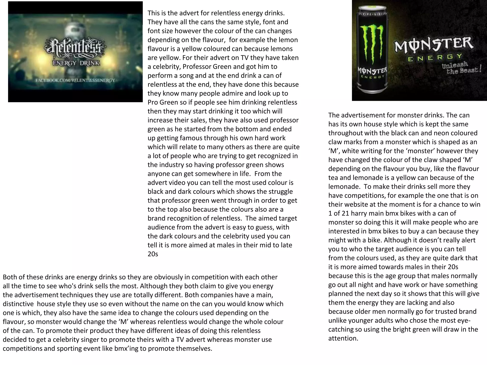
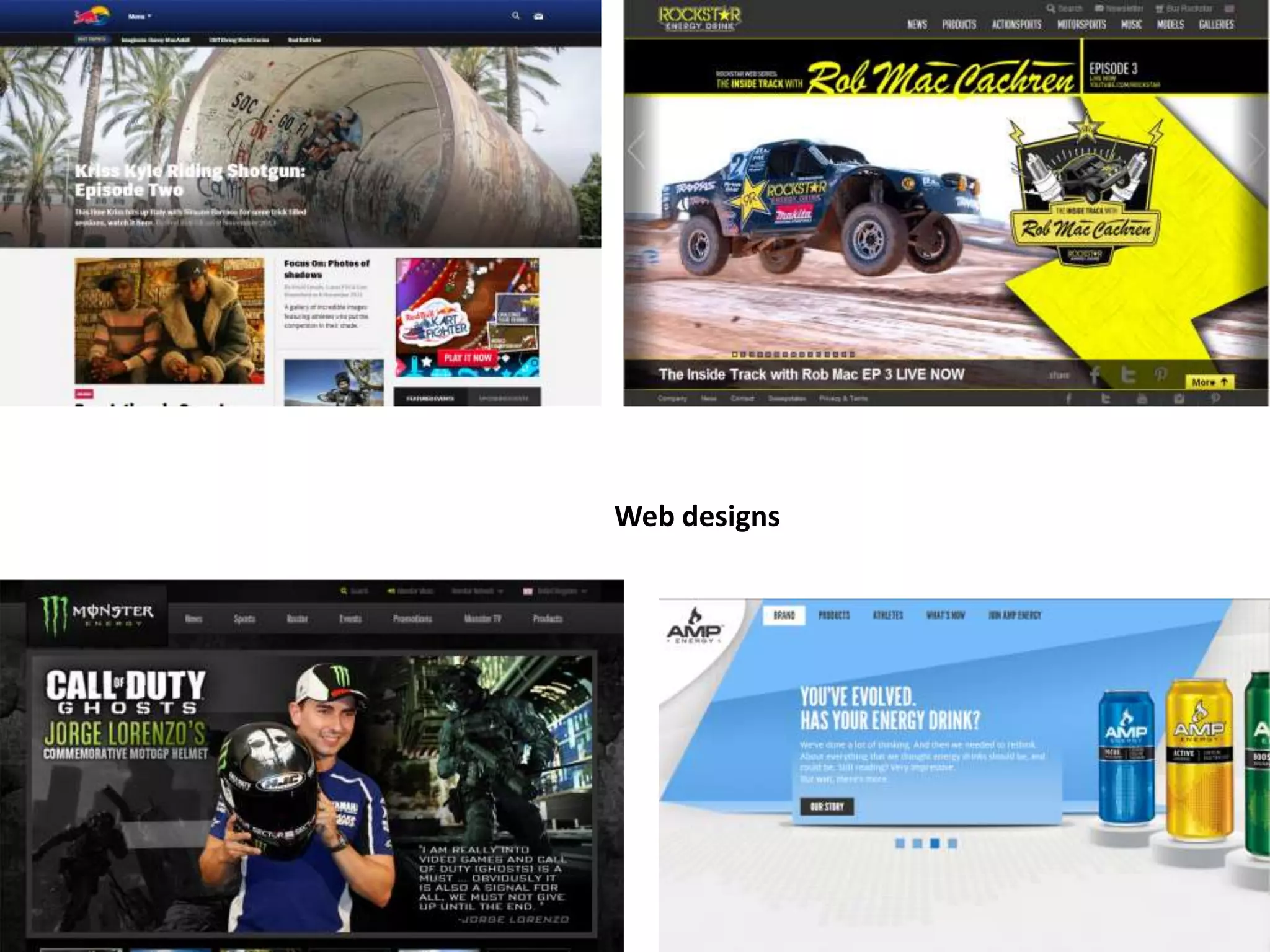
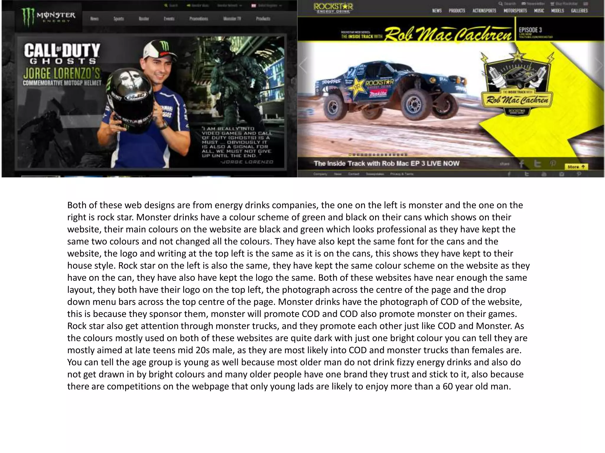
This document summarizes and compares advertisements and marketing strategies for several energy drink brands, including Irn Bru, Relentless, Monster, and Rockstar.
The summaries discuss the use of color schemes, imagery, slogans, and celebrity endorsements in print and television ads. Both Monster and Rockstar websites maintain the same colors and logos as their cans to maintain brand consistency. Monster sponsors video games and extreme sports to target younger male audiences. Relentless uses a rapper in a music video to appeal to those seeking recognition.
The analyses suggest the brands primarily aim their marketing at males ages 16-30, as this demographic is most likely to engage with bright colors, competitions, and celebrity endorsements when
2. Irn Bru adverts
Both of these adverts I found on the irn bru webpage under favourite ads, although when you
are looking at the ads even before you read the name on the can, you can tell from the colour
scheme that is related to irn bru, although the colours are not bright, I think if they had bright
colours it would make the posters look tacky and not professional as by having the black and
white photographs next to the colours work well and don’t clash but the orange and blue and
that shade were they are still eye catching and the blue stands out more against the dull shade
of orange which makes people want to read it. By having the writing all in capitals showing that
the text is important and almost shouted with the quotation marks around the text. The design
of the image is very simple, half image and half text, by having a simple advert means that
people are more focused of the text and image and not too focused on how its laid out, also by
having a picture of the can at the bottom shows people what to look out for if they want to buy
the product. You can tell these adverts are aimed at older people, not only because they have
adults as the models but also because they have innuendos that mainly adults would
understand however I do not think these are aimed to like people in their 60s as they may not
appreciate the sexual innuendos that have been used. As the text is the first thing you look at it
seems like they are meaning the sexual meaning in the innuendos however when you see the
image it makes you believe Irn Bru do not mean the sexual meaning at all.
3. Irn Bru adverts
For this advertisement irn bru have decided to use Goths as
the stereotype for Goths are sad, depressed and they are
rarely happy, however they have pictured them jumping and
looking really happy while holding a can of irn bru, so they are
giving off the Impression that irn bru makes you happy and
leaves you feeling ‘phenomenal’ . Although the overall advert
does not look like all the rest they are still similar, for example
they have still used the colours that are associated with Irn
Bru, so they have a blue sky in the background, the colour
blue also has the meaning of a good day and people feel
more happy when the sky is blue and clear than if It was
raining, they have then used the orange as a boarder which
contrasts with the blue well and also catches your eye and
also fits in with their whole colour scheme and house style.
The target audience for this specific advert I think would be
the younger audience from ages around 16 to about 25, I
believe this would be aimed at them as most fizzy energy
drinks are consumed by this age group rather than old
people. Also when looking at the Goths used in this advert
that do not look that old so it would not be right advertising
to older people if the people they have used in their advert
are much younger. As the style of this advert is very simple
and only states too words ‘feel phenomenal’ it sends out a
message of feeling good and phenomenal by the colours and
actions in this advert.
From this advert they have added the can next to the image
so you can tell what you are looking for, as it is a diet irn bru
they have used a new design for both the advert and the can,
but as you can tell they have used the same colour scheme of
orange and blue so that people taking a quick glance at the
drinks know just from the colours that the can is one of Irn
Bru’s. The message Irn Bru are sending out from this advert is
that although the Irn Bru is sugar free there is no different in
the taste just that without the sugar it is also better for you.
The images used in this advert is a funny image that no one
would expect, like why would a eskimo drink Irn Bru so
because the image they have used is intriguing and
entertaining people are more likely to stop and look at the
advert. Also by having the same image on both sides,
however the right one with a teddy bear saying ‘sugar free’
defiantly tells people there is no difference at all. As they
have produced a diet irn bru you can tell they are aiming this
product as body conscious people and also people who are
dieting or have been told they are not allowed too much
sugar, more people in their late teens and late 30s will be
more interested in this version of irn bru rather than the
original as they are more bothered about what they look like
and want their bodies to be as healthy as possible so they are
more aware of what they put in their body.
4. With the irn bru 32 packaging they have used the same colour scheme they
have done throughout the whole packages and adverts, using the blue and
orange colours, this is to make irn bru stand out with the other competitor
drinks like Lucozade or monster. They have the irn bru logo going vertically up
the can like they always do on their cans with the orange 32 at the bottom
with a light shining from behind, this symbolises the energy the can will give
you when you drink it. The font they have used for the irn bru 32 is very bold
and easy to read, by making it take up most of the can means you see the
brand name before anything else on the can. They also have a tagline at the
bottom of their can as they normally do on all their adverts and cans, the
writing look informal like all the irn bru adverts as the writing is in lower case.
As the can is new they have decided to make the can all blue with some orange
and silver, they have done this because the can is new and different and they
wanted to make people aware that they have a new can however they didn’t
want to change the whole colour scheme and logo so by making the can mainly
one it was different from the other irn bru cans but not completely different.
Also the blue and silver colour make the can seems cold which is a positive
thing as most people prefer cold drinks to warm drinks. Just like all the irn bru
adverts, they have kept this can simple with as much limited text as possible.
Irn Bru have most likely chose the name ‘Irn Bru 32’ as it rhymes and is catchy
also because Irn Bru has 32 ingredients in it so its not just some random
number it actually has a resemblance to Irn Bru. The main audience for this
drink I think would been teens to late 20s as this is the age most people will
stay up late, go out all night and also take part in sport related activates so may
need to boost of energy Irn Bru 32 states it gives.
5. This is the advert for relentless energy drinks.
They have all the cans the same style, font and
font size however the colour of the can changes
depending on the flavour, for example the lemon
flavour is a yellow coloured can because lemons
are yellow. For their advert on TV they have taken
a celebrity, Professor Green and got him to
perform a song and at the end drink a can of
relentless at the end, they have done this because
they know many people admire and look up to
Pro Green so if people see him drinking relentless
then they may start drinking it too which will
increase their sales, they have also used professor
green as he started from the bottom and ended
up getting famous through his own hard work
which will relate to many others as there are quite
a lot of people who are trying to get recognized in
the industry so having professor green shows
anyone can get somewhere in life. From the
advert video you can tell the most used colour is
black and dark colours which shows the struggle
that professor green went through in order to get
to the top also because the colours also are a
brand recognition of relentless. The aimed target
audience from the advert is easy to guess, with
the dark colours and the celebrity used you can
tell it is more aimed at males in their mid to late
20s
Both of these drinks are energy drinks so they are obviously in competition with each other
all the time to see who's drink sells the most. Although they both claim to give you energy
the advertisement techniques they use are totally different. Both companies have a main,
distinctive house style they use so even without the name on the can you would know which
one is which, they also have the same idea to change the colours used depending on the
flavour, so monster would change the ‘M’ whereas relentless would change the whole colour
of the can. To promote their product they have different ideas of doing this relentless
decided to get a celebrity singer to promote theirs with a TV advert whereas monster use
competitions and sporting event like bmx’ing to promote themselves.
The advertisement for monster drinks. The can
has its own house style which is kept the same
throughout with the black can and neon coloured
claw marks from a monster which is shaped as an
‘M’, white writing for the ‘monster’ however they
have changed the colour of the claw shaped ‘M’
depending on the flavour you buy, like the flavour
tea and lemonade is a yellow can because of the
lemonade. To make their drinks sell more they
have competitions, for example the one that is on
their website at the moment is for a chance to win
1 of 21 harry main bmx bikes with a can of
monster so doing this it will make people who are
interested in bmx bikes to buy a can because they
might with a bike. Although it doesn’t really alert
you to who the target audience is you can tell
from the colours used, as they are quite dark that
it is more aimed towards males in their 20s
because this is the age group that males normally
go out all night and have work or have something
planned the next day so it shows that this will give
them the energy they are lacking and also
because older men normally go for trusted brand
unlike younger adults who chose the most eyecatching so using the bright green will draw in the
attention.
7. Both of these web designs are from energy drinks companies, the one on the left is monster and the one on the
right is rock star. Monster drinks have a colour scheme of green and black on their cans which shows on their
website, their main colours on the website are black and green which looks professional as they have kept the
same two colours and not changed all the colours. They have also kept the same font for the cans and the
website, the logo and writing at the top left is the same as it is on the cans, this shows they have kept to their
house style. Rock star on the left is also the same, they have kept the same colour scheme on the website as they
have on the can, they have also have kept the logo the same. Both of these websites have near enough the same
layout, they both have their logo on the top left, the photograph across the centre of the page and the drop
down menu bars across the top centre of the page. Monster drinks have the photograph of COD of the website,
this is because they sponsor them, monster will promote COD and COD also promote monster on their games.
Rock star also get attention through monster trucks, and they promote each other just like COD and Monster. As
the colours mostly used on both of these websites are quite dark with just one bright colour you can tell they are
mostly aimed at late teens mid 20s male, as they are most likely into COD and monster trucks than females are.
You can tell the age group is young as well because most older man do not drink fizzy energy drinks and also do
not get drawn in by bright colours and many older people have one brand they trust and stick to it, also because
there are competitions on the webpage that only young lads are likely to enjoy more than a 60 year old man.