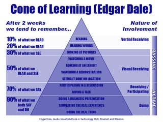
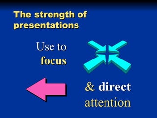
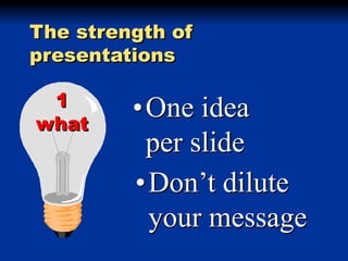
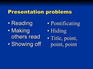
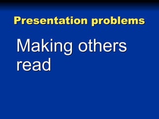
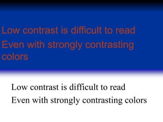
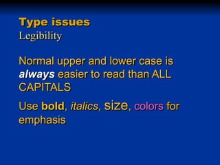
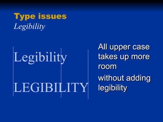
Presentation Zen
Inpsired by Garr Reynolds

Presented by Cynthia Chandler
cchandler@nu.edu

Original Slides by Nick Dvoracek
The strength of
presentations

Use to
focus

& direct
attention
The strength of
presentations
1
what

•One idea
per slide
•Don’t dilute
your message
or

Put as little as
you can on
each slide!
Nicholas Negroponte
Being digital

Atoms

Bits

Slides, overheads

.htm, .ppt, .jpg

Costly
Costly to copy
Costly to move

Cheap
-D or Ctrl-D
You’ve got mail!
Everything has the
same emphasis
Can’t tell what’s
important
Title

• Point
• Point
• point
Don’t
tell me!
Use
diagrams
models
maps
Appleburg
Winneburg

Oshburg
Pictures
Cool!
Charts
The
Basics
The idea is sequencing
Presentation problems

• Reading
• Making
others read
• Showing off

• Pontificating
• Hiding
• Title, point,
point, point
Presentation problems

• Reading
• Making
others read
• Showing off

• Pontificating
• Hiding
• Title, point,
point, point
Presentation problems

Reading
Presentation problems

Making others
read
Presentation problems

Showing off
The idea is sequencing

… not animation
Don’t let your
presentation
compete with
your message
• Movement effects are
attention getting
• if used sparingly

• The default effect is
Fly from left
Motion sickness
• Caused by difference between
• visual field
• inner ear perception
• Motion soon becomes repetitive
• Nobody notices anymore
• Until someone throws up
• Save flashy transitions and
emphasis
effects for

• Gives pacing and dynamics to
your presentations
• Stay low key
Dissolv Smooth and subtle
e
Wipe Revealing!
Presentations
with
PowerPoint
Background
issues
Background issues

Contrast

Use light objects on
a dark backgound
Background issues

Contrast

Or dark objects on a
light backgound
Low contrast is difficult to read
Even with strongly contrasting
colors
Low contrast is difficult to read
Even with strongly contrasting colors
(Darker than background)
What looks good on your monitor
(Lighter than background)
May not look good projected

High contrast has more
impact!
Type
issues
Type issues
Legibility

• Bigger type is easier to read
• If you need to use smaller
type, you probably have to
much on the slide.
• 36 pt minimum for all text.
• 24 pt. minimum for graphics
Type issues
Legibility
Type issues
Legibility
Normal upper and lower case is
easier to read than ALL CAPITALS
Type issues
Legibility
Normal upper and lower case is
always easier to read than ALL
CAPITALS
Type issues
Legibility
Normal upper and lower case is
always easier to read than ALL
CAPITALS
Use bold, italics, size, colors for
emphasis
Type issues
Legibility

Legibility
LEGIBILITY

• Upper and lower
case words form
unique shapes
• All upper case
words are all
rectangles
Type issues
Legibility

Legibility
LEGIBILITY

All upper case
takes up more
room
without adding
legibility
Type issues
Mixing type styles

Combine normal, bold, italic,
bold italic within a typeface
freely
Use to define function
For emphasis
Never underline
Type issues
Align

Group

Power

Layer

The power of

computer
graphics is at
your fingertips
Less is more
Appleburg
Winneburg

Oshburg

Intro to PPT with Presentation Zen