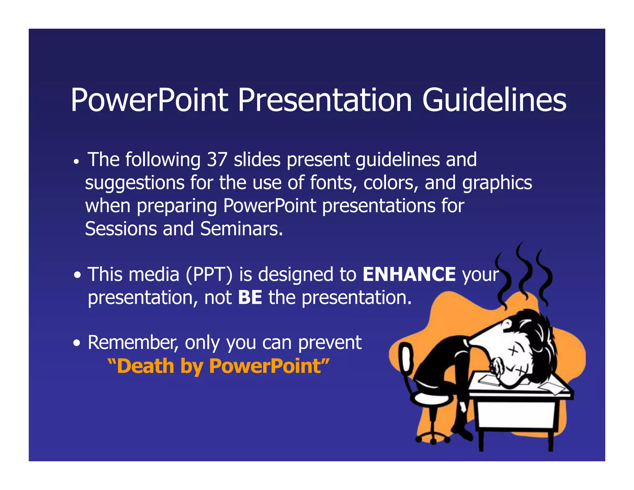
The document provides guidelines for creating effective PowerPoint presentations:
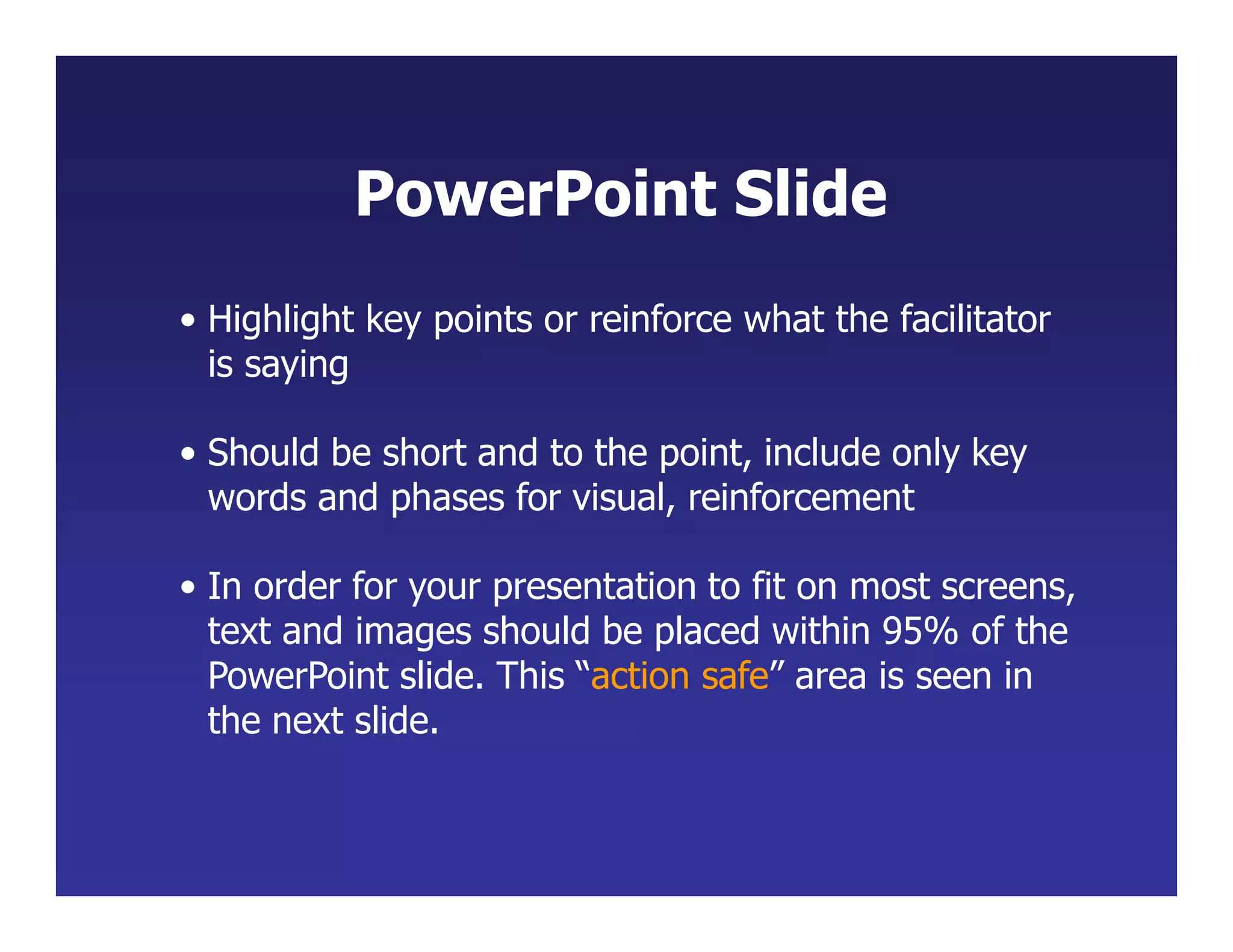
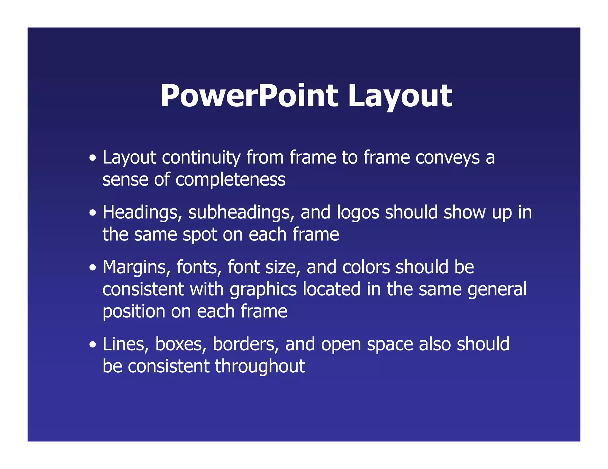
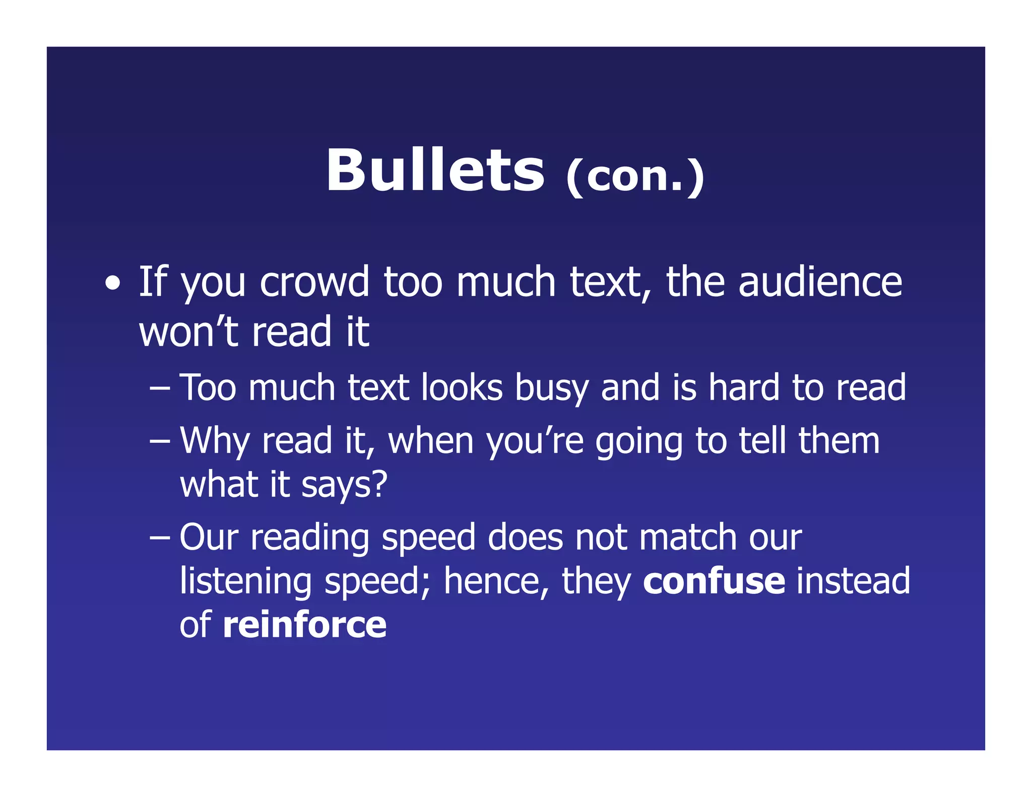
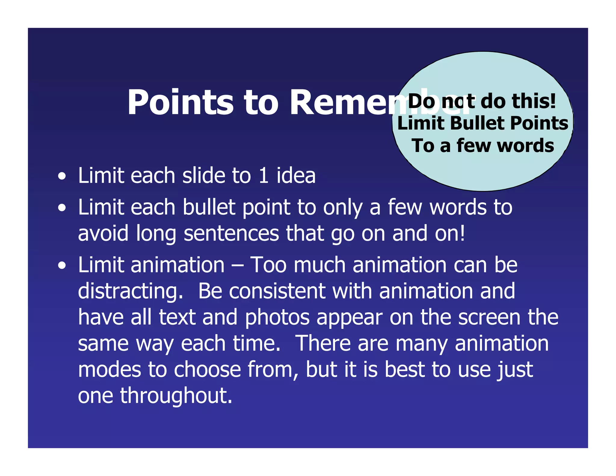
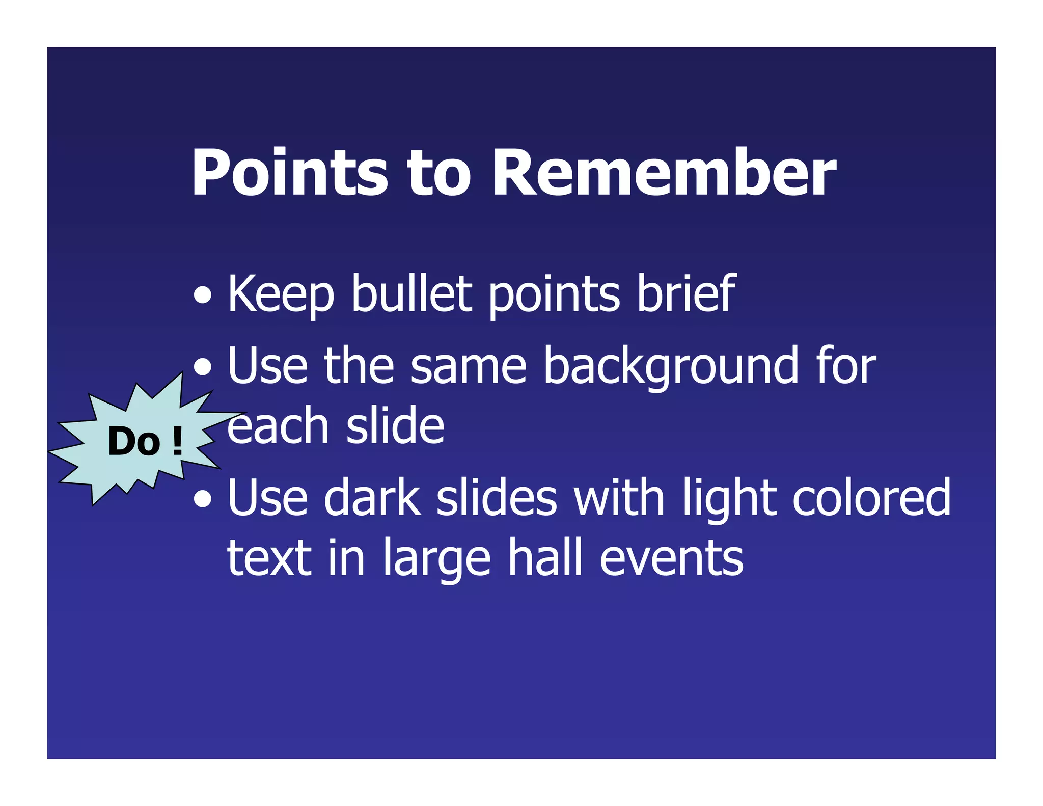
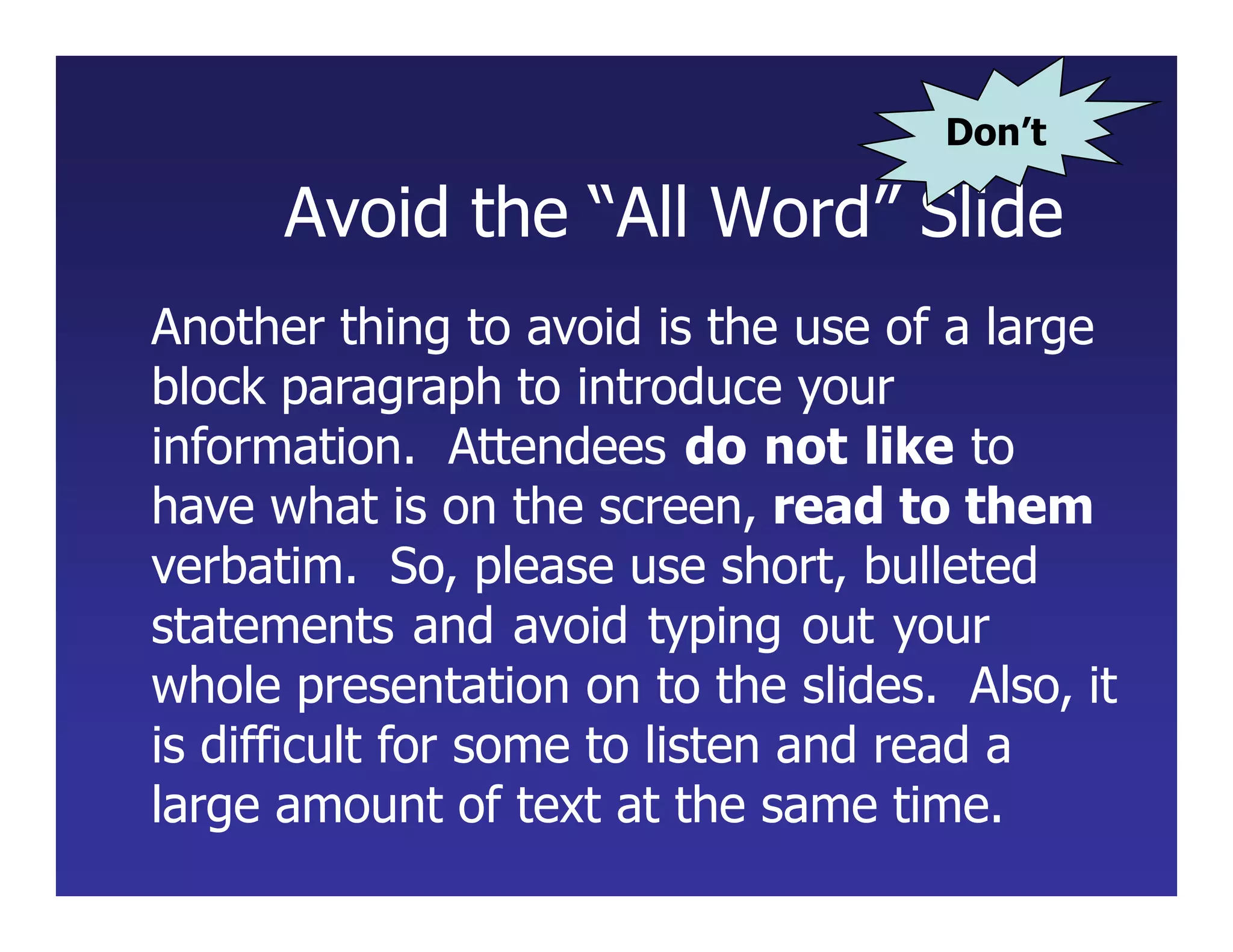
- Limit each slide to one main idea with bullet points to reinforce the speaker's message. Keep bullets brief and use consistent formatting.
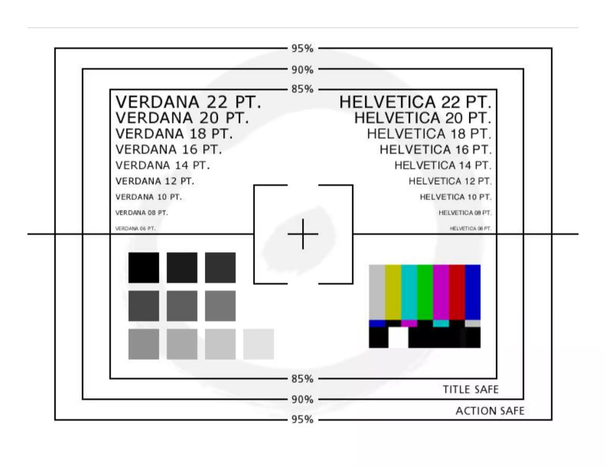
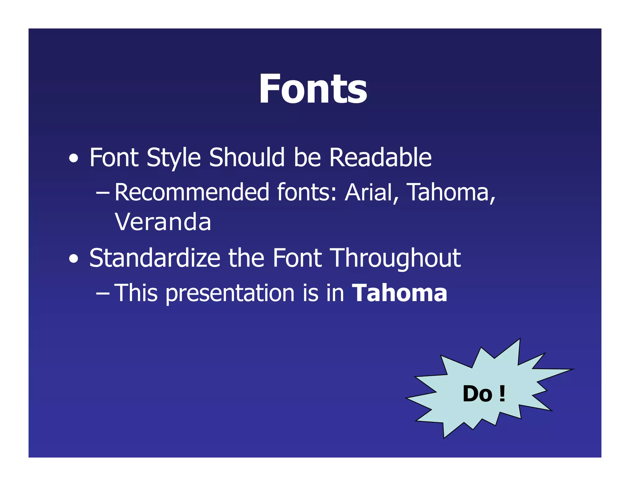
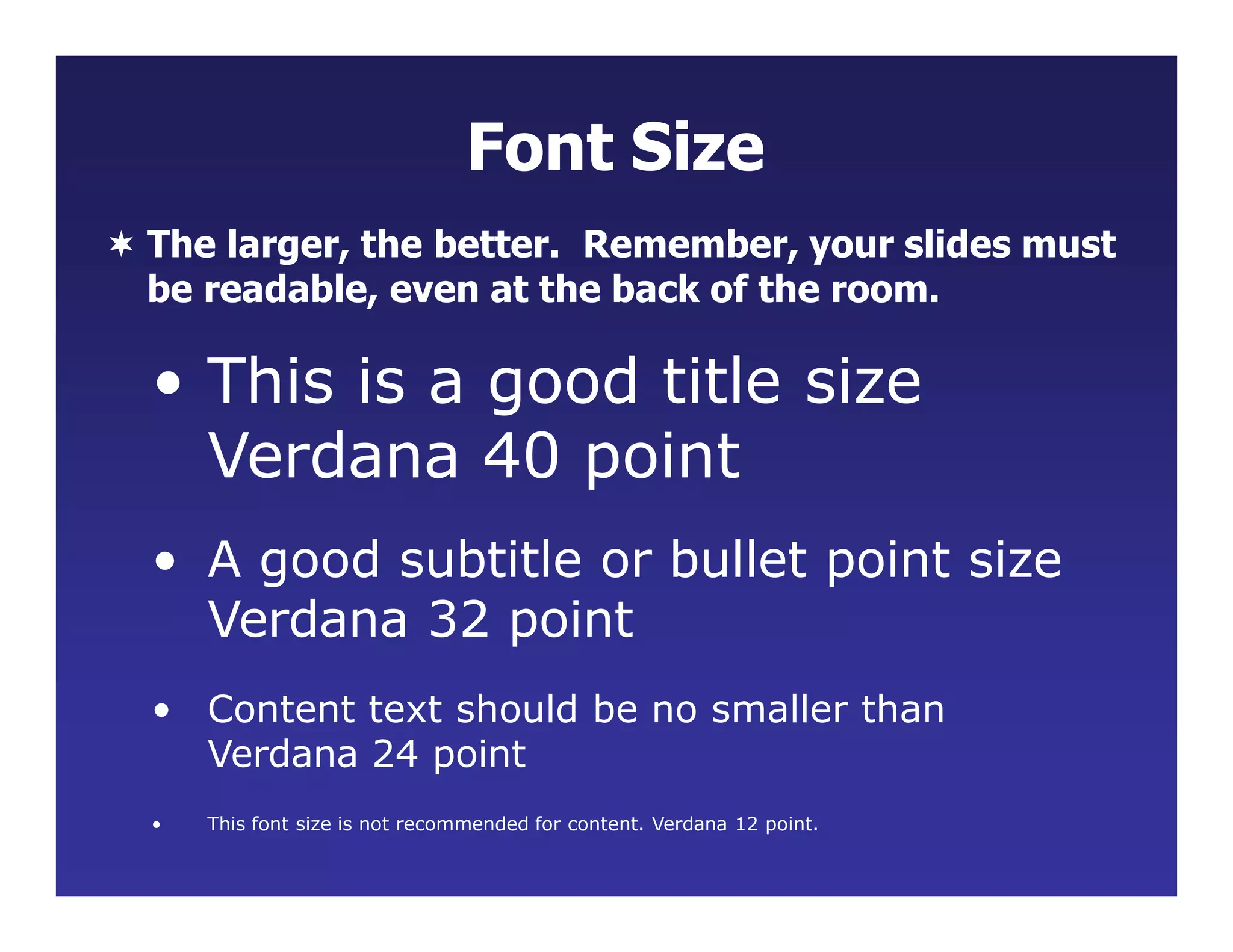
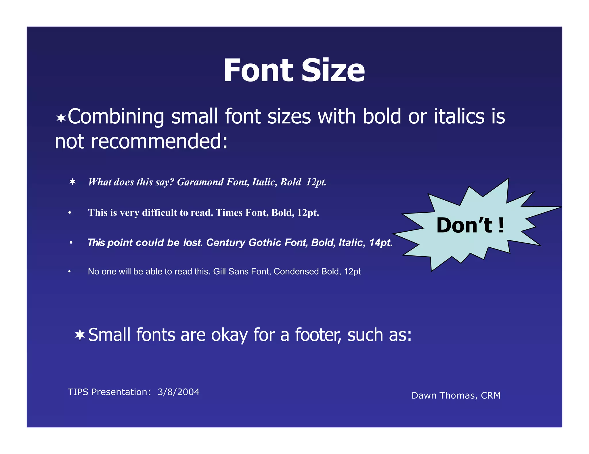
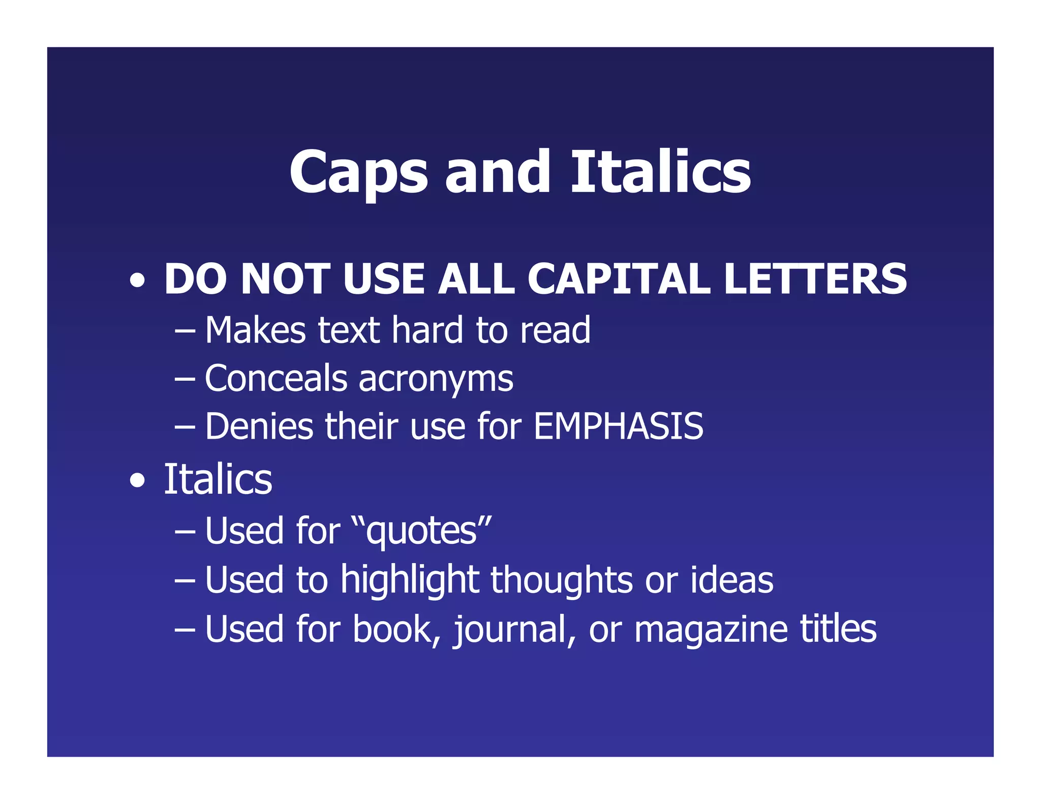
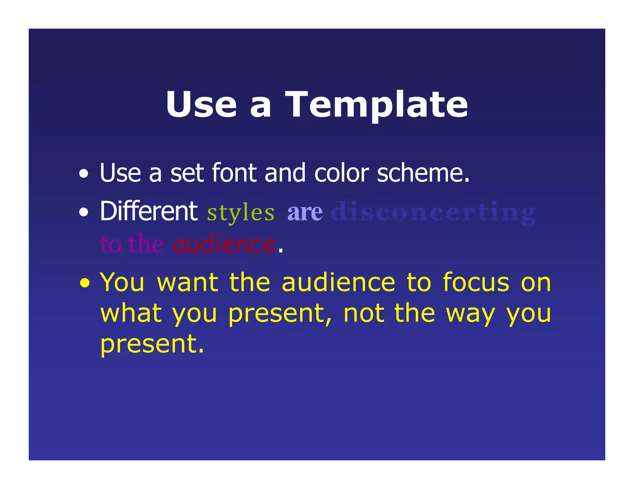
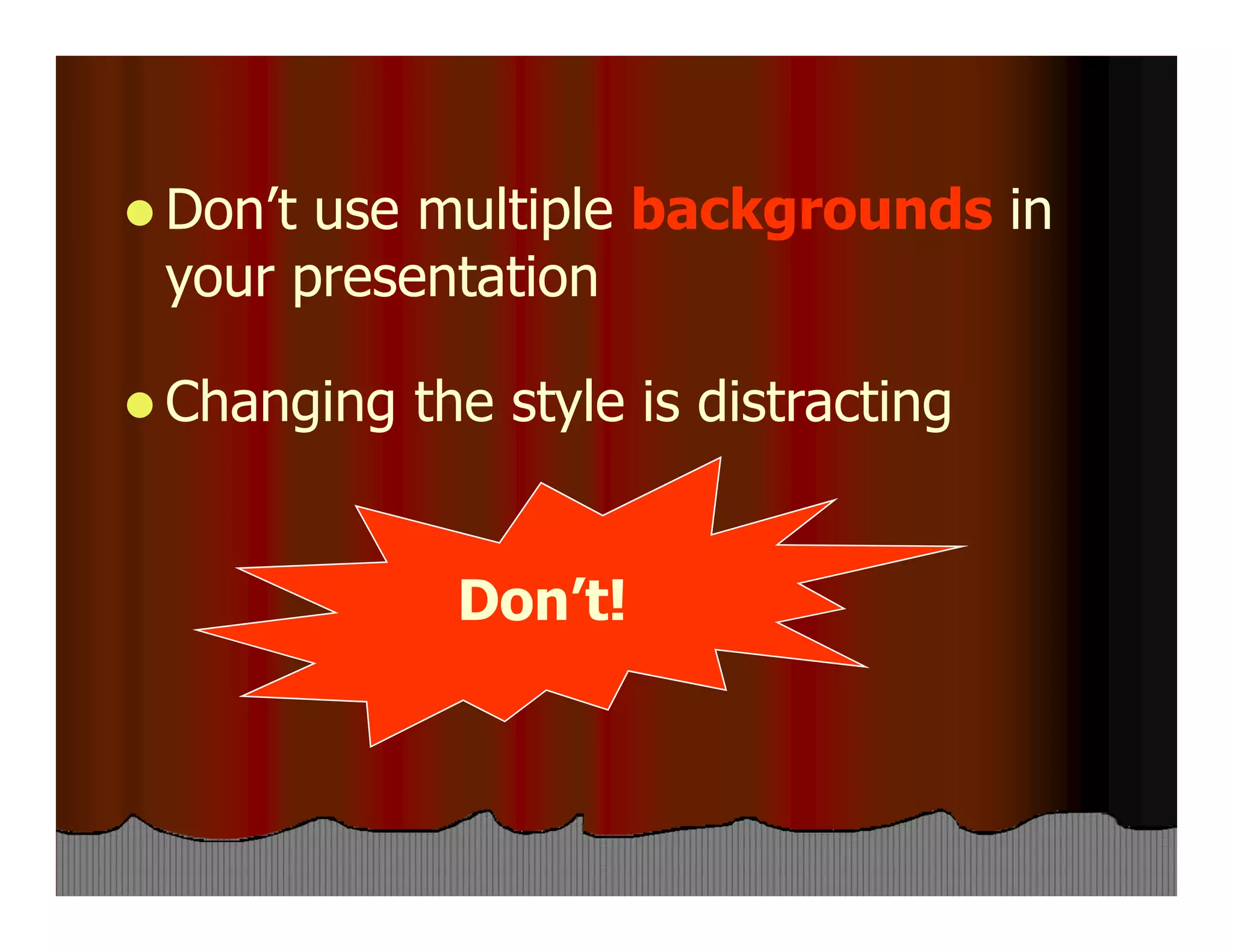
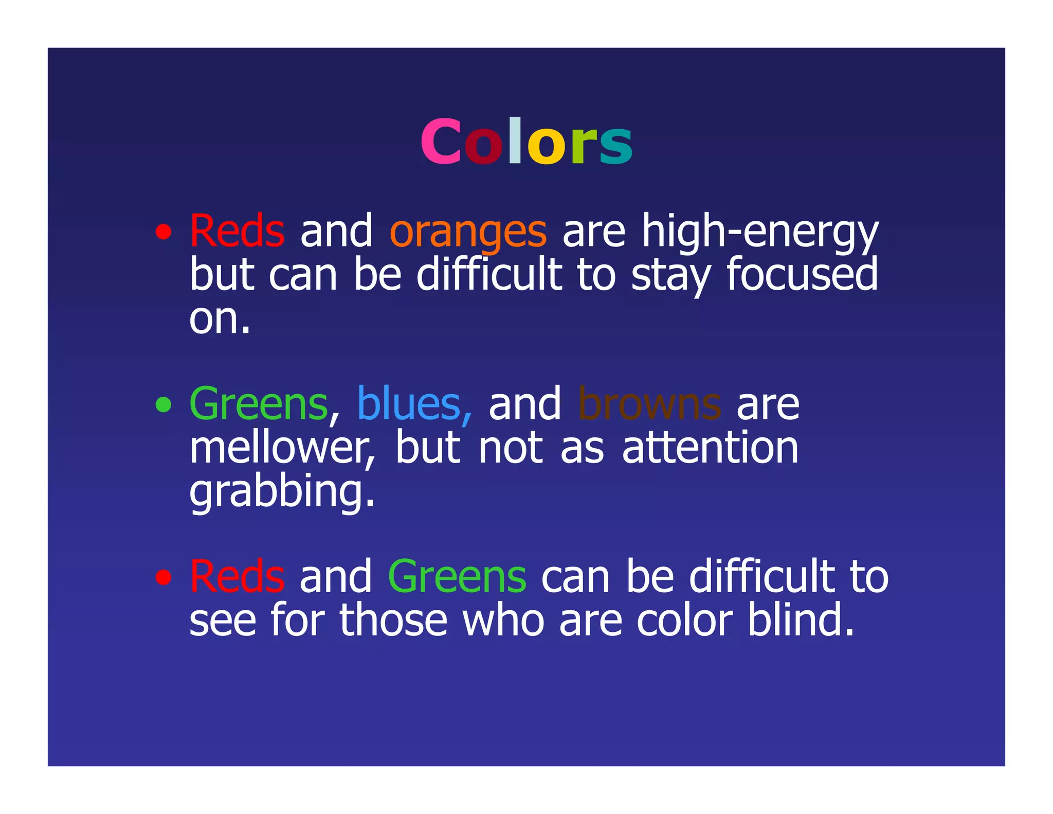
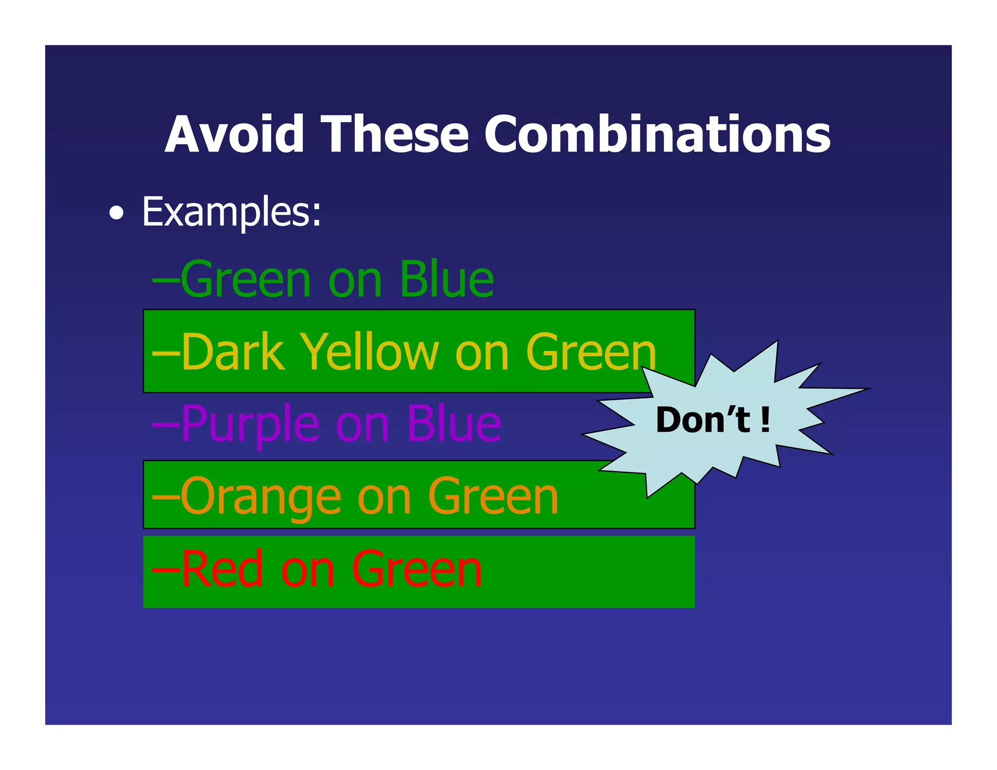
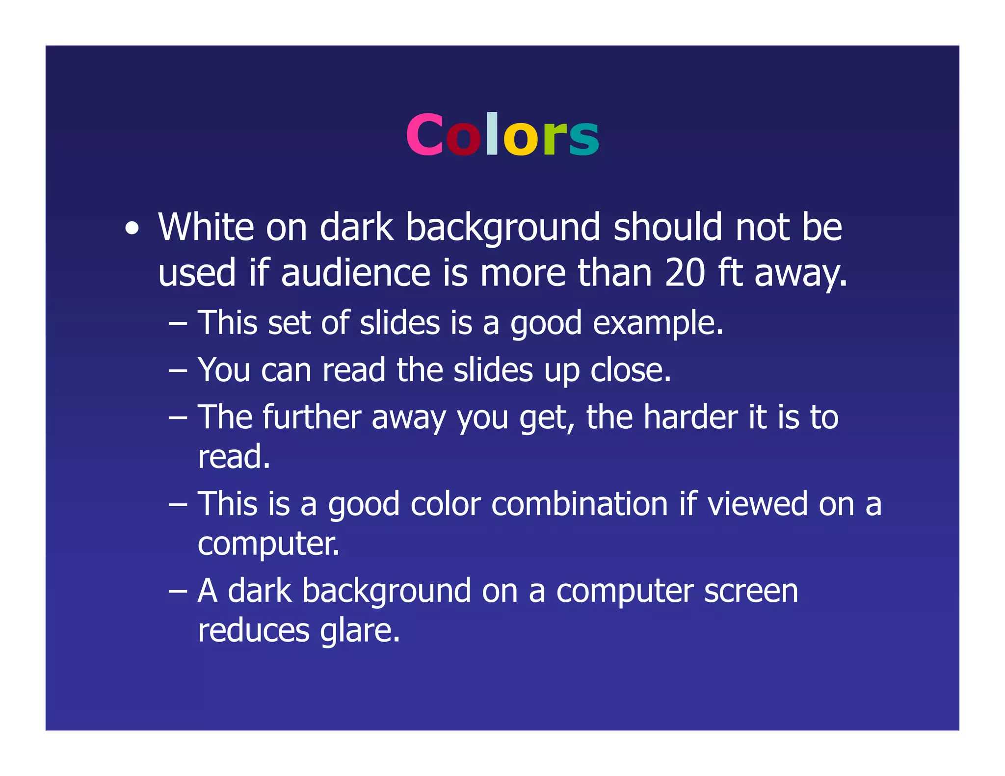
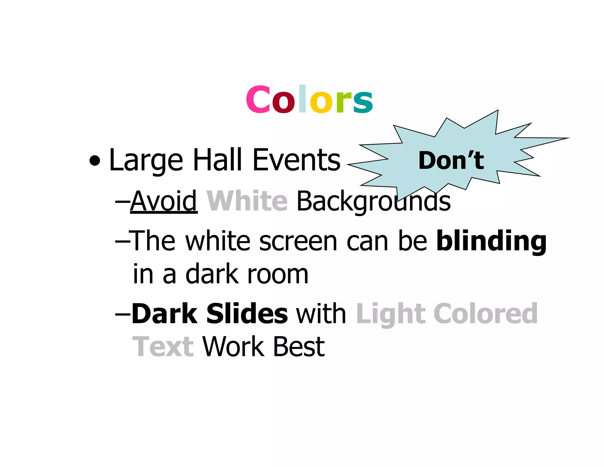
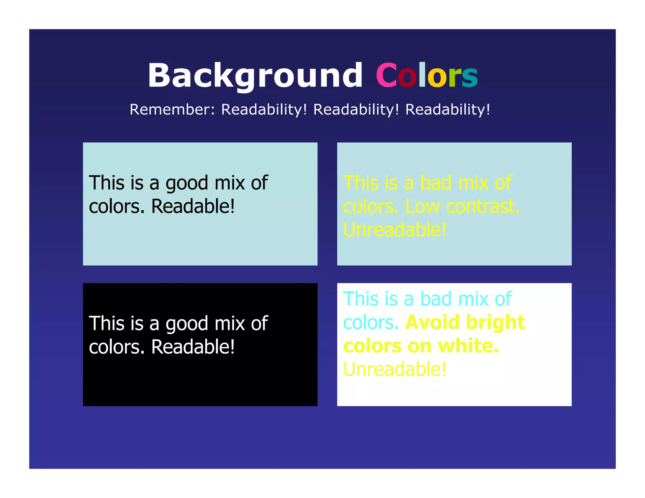
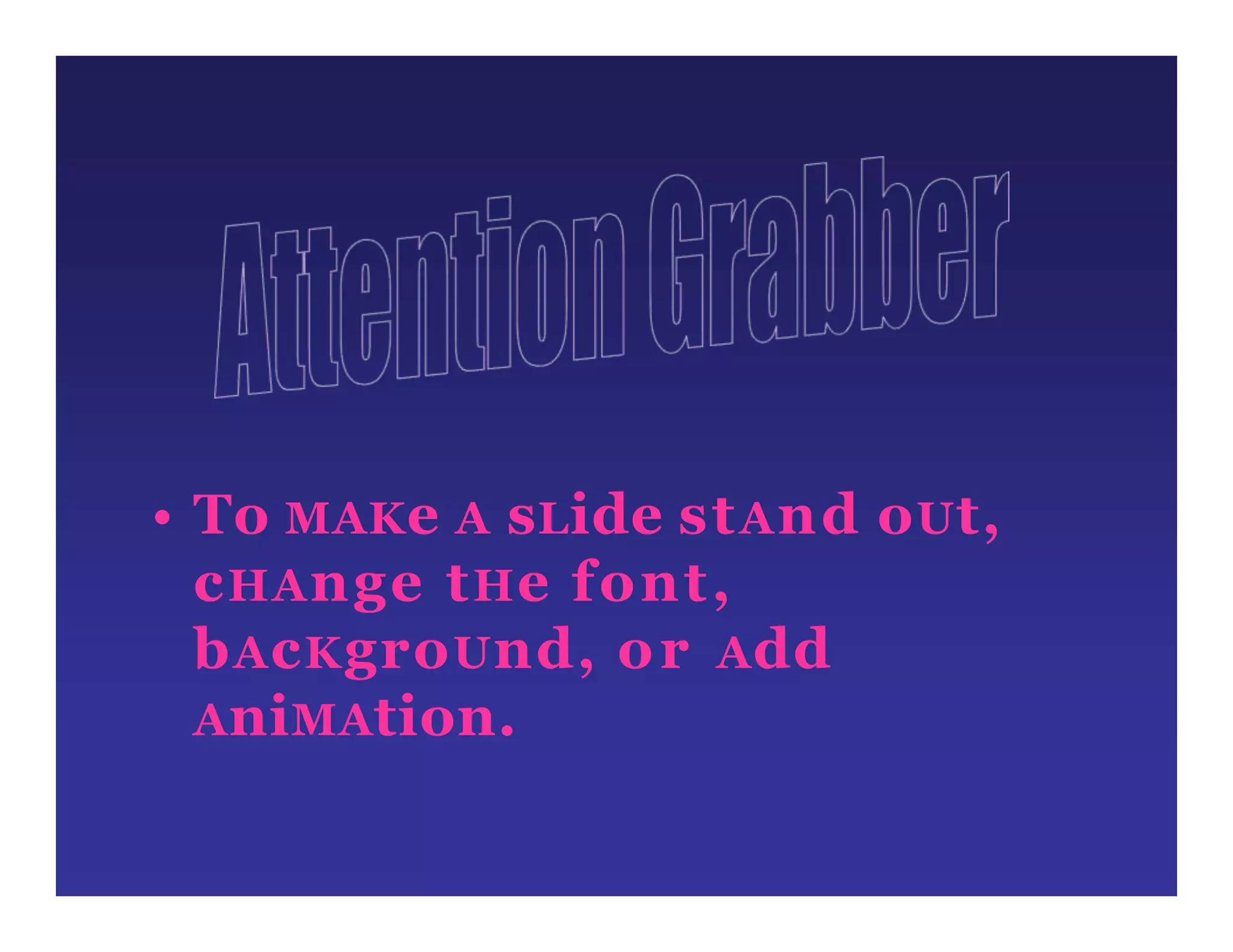
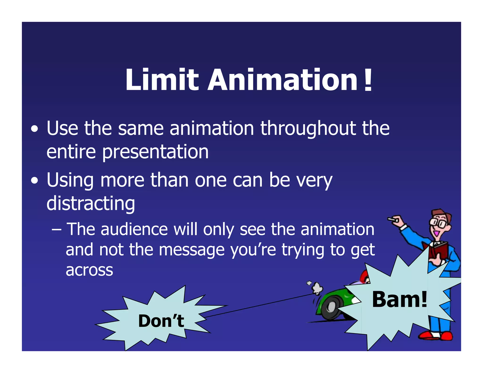
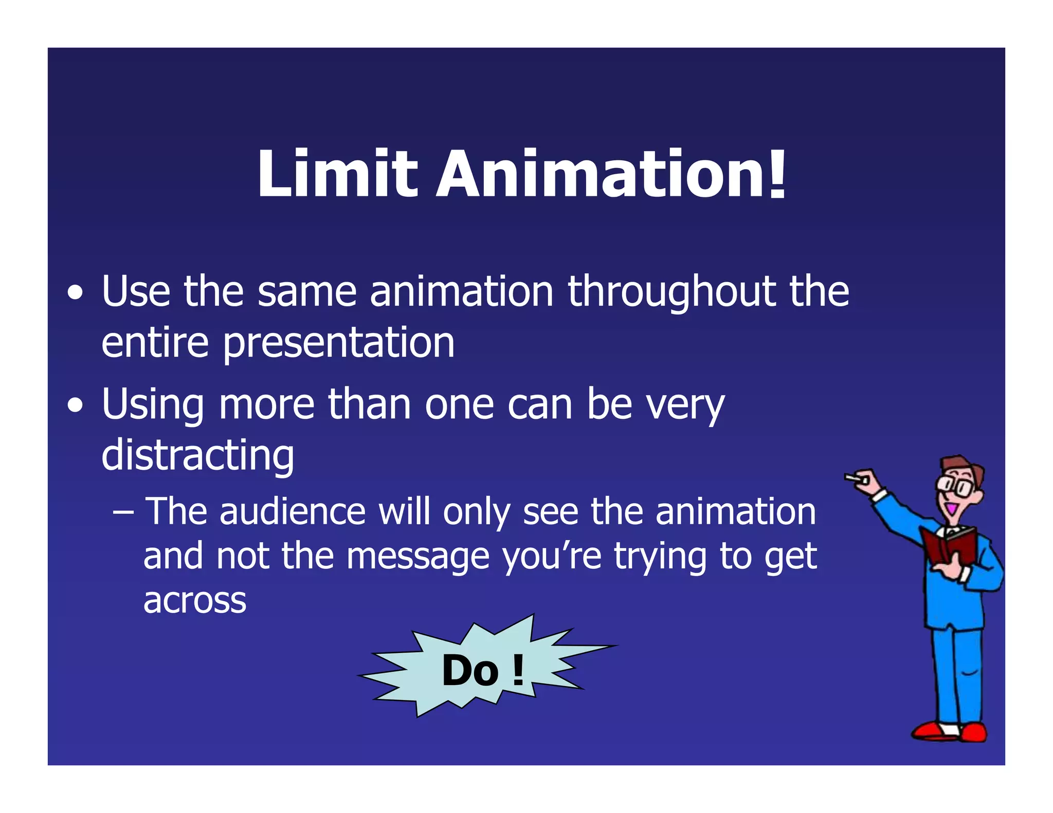
- Use readable fonts, font sizes, and high-contrast color combinations. Avoid small text, all caps, flashing animations or multiple backgrounds that distract from the content.
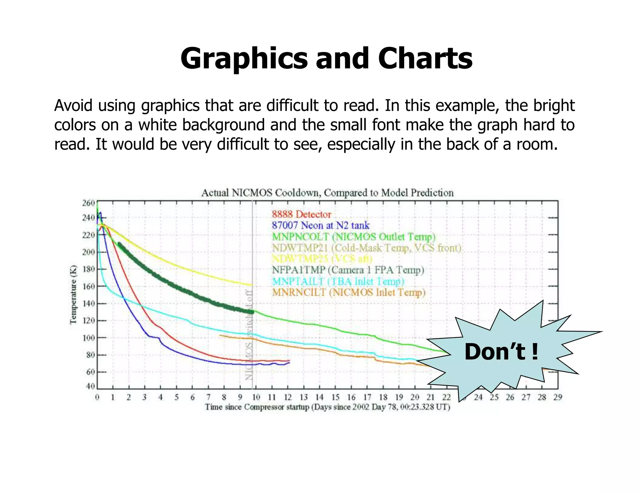
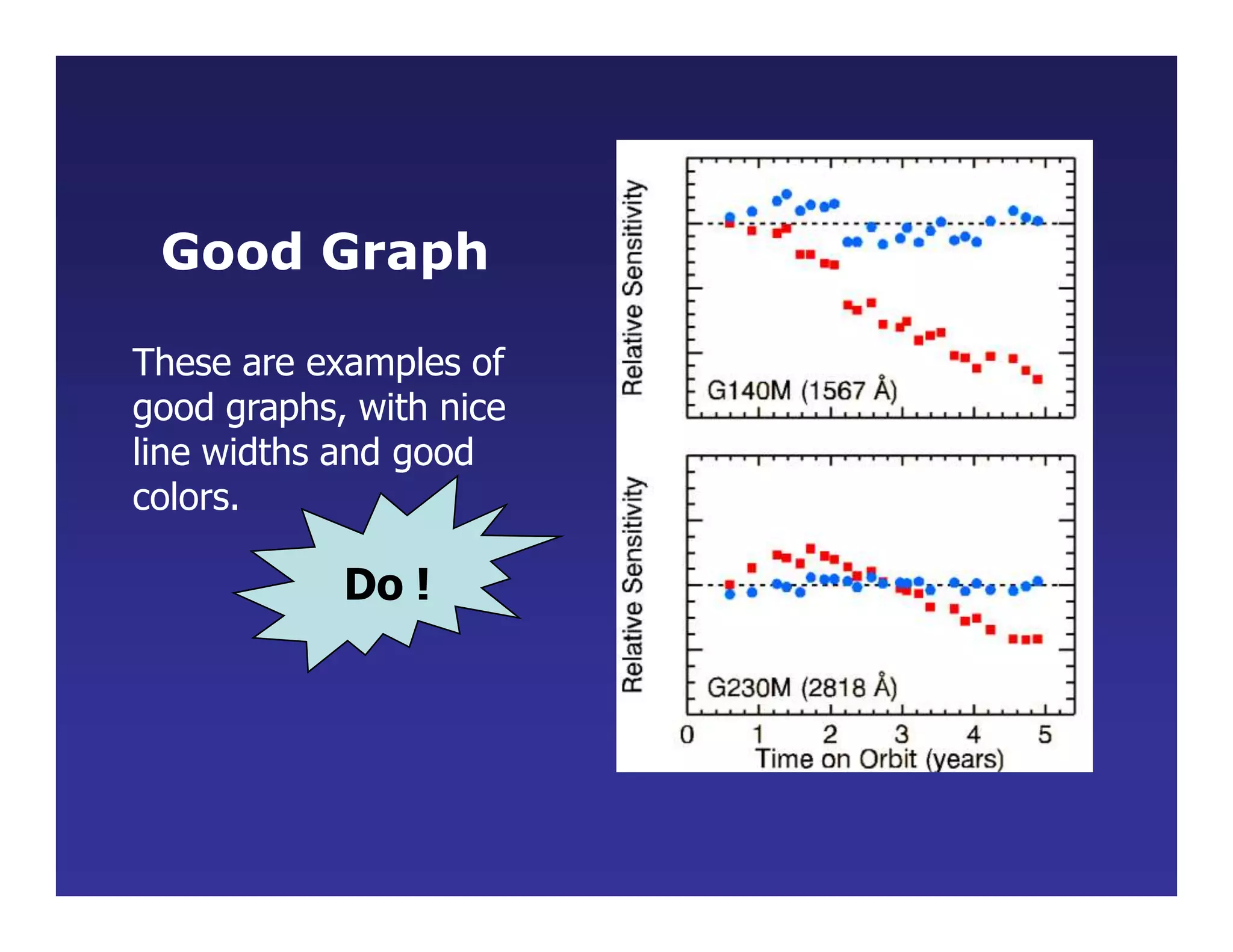
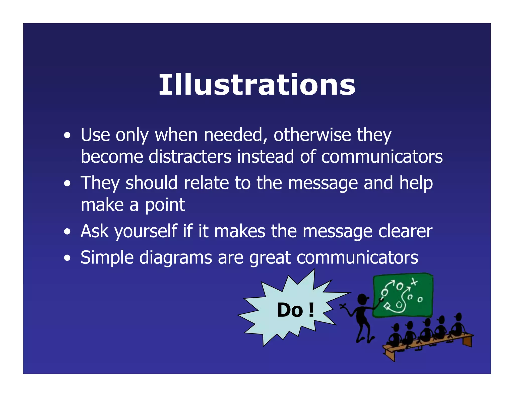
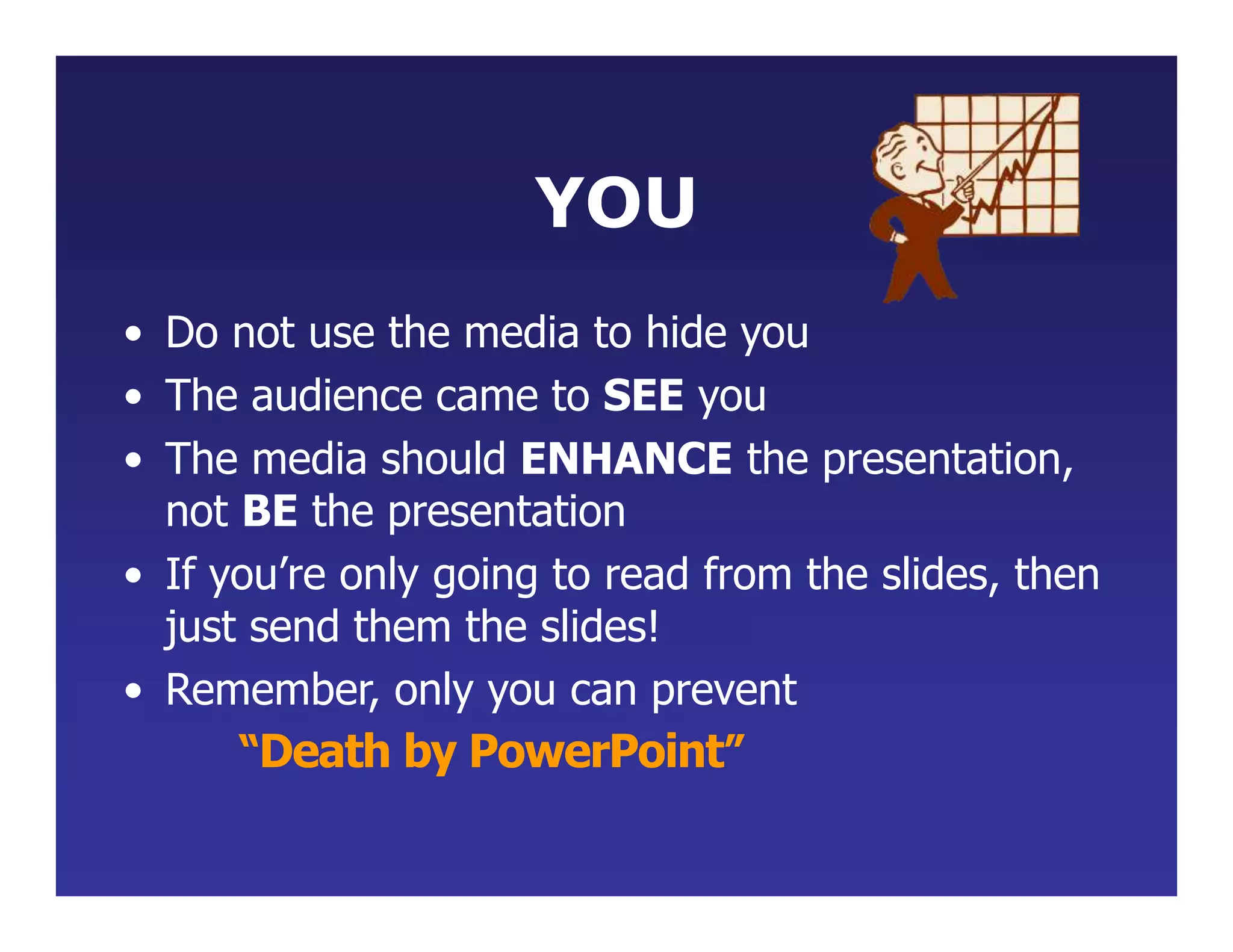
- Include charts and graphics only if they clearly support the topic in an easy-to-understand format. The presentation should enhance the speaker's message, not replace it.
Microsoft PowerPoint is a powerful slide show presentation program. It is a standard component of the company's Microsoft Office suite software, and is bundled together with Word, Excel, and other office productivity tools. The program uses slides to convey information rich in multimedia
This is a slideshow on using PPT that I downloaded a while ago, I have not been able to find it again but I thought I would reshare it. (I did not create it and I wish I know who did.)
The following 37 slides present guidelines and suggestions f.docxoreo10
The following 37 slides present guidelines and suggestions for the use of fonts, colors, and graphics when preparing PowerPoint presentations for
Sessions and Seminars.
This media (PPT) is designed to ENHANCE your presentation, not BE the presentation.
Remember, only you can prevent
“Death by PowerPoint”
PowerPoint Presentation Guidelines
Highlight key points or reinforce what the facilitator is saying
Should be short and to the point, include only key words and phases for visual, reinforcement
In order for your presentation to fit on most screens, text and images should be placed within 95% of the PowerPoint slide. This “action safe” area is seen in the next slide.
PowerPoint Slide
*
Layout continuity from frame to frame conveys a sense of completenessHeadings, subheadings, and logos should show up in the same spot on each frameMargins, fonts, font size, and colors should be consistent with graphics located in the same general position on each frameLines, boxes, borders, and open space also should be consistent throughout
PowerPoint Layout
Fonts Font Style Should be ReadableRecommended fonts: Arial, Tahoma, VerandaStandardize the Font ThroughoutThis presentation is in Tahoma
Do !
This is a good title size Verdana 40 point
A good subtitle or bullet point size Verdana 32 point
Content text should be no smaller than
Verdana 24 point
This font size is not recommended for content. Verdana 12 point.
Font SizeThe larger, the better. Remember, your slides must be readable, even at the back of the room.
TIPS Presentation: 3/8/2004
Dawn Thomas, CRM
Font Size
What does this say? Garamond Font, Italic, Bold 12pt.
This is very difficult to read. Times Font, Bold, 12pt.
This point could be lost. Century Gothic Font, Bold, Italic, 14pt.
No one will be able to read this. Gill Sans Font, Condensed Bold, 12pt Combining small font sizes with bold or italics is not recommended:Small fonts are okay for a footer, such as:
Don’t !
FontsDon’t Sacrifice Readability for StyleDon’t Sacrifice Readability for StyleDon’t Sacrifice Readability for StyleDon’t Sacrifice Readability for Style
Don’t !
Caps and ItalicsDO NOT USE ALL CAPITAL LETTERSMakes text hard to readConceals acronymsDenies their use for EMPHASISItalicsUsed for “quotes”Used to highlight thoughts or ideasUsed for book, journal, or magazine titles
Use a TemplateUse a set font and color scheme.Different styles are disconcerting to the audience.You want the audience to focus on what you present, not the way you present.
Use the Same Background
on Each Slide
Do !!
Don’t use multiple backgrounds in your presentation
Changing the style is distracting
Don’t!
ColorsReds and oranges are high-energy but can be difficult to stay focused on.
Greens, blues, and browns are mellower, but not as attention grabbing.
Reds and Greens can be difficult to see for those who are color blind.
Avoid These Combinations
Examples:Green on BlueDark Yellow on GreenPurple on ...
Dive into the innovative world of smart garages with our insightful presentation, "Exploring the Future of Smart Garages." This comprehensive guide covers the latest advancements in garage technology, including automated systems, smart security features, energy efficiency solutions, and seamless integration with smart home ecosystems. Learn how these technologies are transforming traditional garages into high-tech, efficient spaces that enhance convenience, safety, and sustainability.
Ideal for homeowners, tech enthusiasts, and industry professionals, this presentation provides valuable insights into the trends, benefits, and future developments in smart garage technology. Stay ahead of the curve with our expert analysis and practical tips on implementing smart garage solutions.
You could be a professional graphic designer and still make mistakes. There is always the possibility of human error. On the other hand if you’re not a designer, the chances of making some common graphic design mistakes are even higher. Because you don’t know what you don’t know. That’s where this blog comes in. To make your job easier and help you create better designs, we have put together a list of common graphic design mistakes that you need to avoid.
Hello everyone! I am thrilled to present my latest portfolio on LinkedIn, marking the culmination of my architectural journey thus far. Over the span of five years, I've been fortunate to acquire a wealth of knowledge under the guidance of esteemed professors and industry mentors. From rigorous academic pursuits to practical engagements, each experience has contributed to my growth and refinement as an architecture student. This portfolio not only showcases my projects but also underscores my attention to detail and to innovative architecture as a profession.
Can AI do good? at 'offtheCanvas' India HCI preludeAlan Dix
Invited talk at 'offtheCanvas' IndiaHCI prelude, 29th June 2024.
https://www.alandix.com/academic/talks/offtheCanvas-IndiaHCI2024/
The world is being changed fundamentally by AI and we are constantly faced with newspaper headlines about its harmful effects. However, there is also the potential to both ameliorate theses harms and use the new abilities of AI to transform society for the good. Can you make the difference?
1. • The following 37 slides present guidelines and
suggestions for the use of fonts, colors, and graphics
when preparing PowerPoint presentations for
Sessions and Seminars.
• This media (PPT) is designed to ENHANCE your
presentation, not BE the presentation.
• Remember, only you can prevent
“Death by PowerPoint”
PowerPoint Presentation Guidelines
2. • Highlight key points or reinforce what the facilitator
is saying
• Should be short and to the point, include only key
words and phases for visual, reinforcement
• In order for your presentation to fit on most screens,
text and images should be placed within 95% of the
PowerPoint slide. This “action safe” area is seen in
the next slide.
PowerPoint Slide
3.
4. • Layout continuity from frame to frame conveys a
sense of completeness
• Headings, subheadings, and logos should show up in
the same spot on each frame
• Margins, fonts, font size, and colors should be
consistent with graphics located in the same general
position on each frame
• Lines, boxes, borders, and open space also should
be consistent throughout
PowerPoint Layout
5. Fonts
• Font Style Should be Readable
– Recommended fonts: Arial, Tahoma,
Veranda
• Standardize the Font Throughout
– This presentation is in Tahoma
Do !
6. •
• Content text should be no smaller than
Verdana 24 point
This font size is not recommended for content. Verdana 12 point.
Font Size
The larger, the better. Remember, your slides must
be readable, even at the back of the room.
• This is a good title size
Verdana 40 point
• A good subtitle or bullet point size
Verdana 32 point
7. TIPS Presentation: 3/8/2004 Dawn Thomas, CRM
Don’t !
Font Size
• This is very difficult to read. Times Font, Bold, 12pt.
• This point could be lost. Century Gothic Font, Bold, Italic, 14pt.
• No one will be able to read this. Gill Sans Font, Condensed Bold, 12pt
Combining small font sizes with bold or italics is
not recommended:
What does this say? Garamond Font, Italic, Bold 12pt.
Small fonts are okay for a footer, such as:
8. Fonts
• Don’t SacrificeReadability forStyle
• DON’T SACRIFICE READABILITY
FOR STYLE
• Don’t Sacrifice Readability for Style
• D O N ’ T S A C R I F I C E
R E A D A B I L I T Y F O R
S T Y L E
Don’t !
9. Caps and Italics
• DO NOT USE ALL CAPITAL LETTERS
– Makes text hard to read
– Conceals acronyms
– Denies their use for EMPHASIS
• Italics
– Used for “quotes”
– Used to highlight thoughts or ideas
– Used for book, journal, or magazine titles
10. Use a Template
• Use a set font and color scheme.
• Different styles are disconcerting
to the audience.
• You want the audience to focus on
what you present, not the way you
present.
12. Don’t use multiple backgrounds in
your presentation
Changing the style is distracting
Don’t!
13. Colors
• Reds and oranges are high-energy
but can be difficult to stay focused
on.
• Greens, blues, and browns are
mellower, but not as attention
grabbing.
• Reds and Greens can be difficult to
see for those who are color blind.
14. Avoid These Combinations
• Examples:
–Green on Blue
–Dark Yellow on Green
–Purple on Blue
–Orange on Green
–Red on Green
Don’t !
15. Colors
• White on dark background should not be
used if audience is more than 20 ft away.
– This set of slides is a good example.
– You can read the slides up close.
– The further away you get, the harder it is to
read.
– This is a good color combination if viewed on a
computer.
– A dark background on a computer screen
reduces glare.
16. Colors
• Large Hall Events
–Avoid White Backgrounds
–The white screen can be blinding
in a dark room
–Dark Slides with Light Colored
Text Work Best
Don’t
17. The Color Wheel
• Colors separated by another
color are contrasting colors
(complementary)
• Adjacent colors harmonize
with one another (Green
and Yellow)
• Colors directly opposite one
another are said to CLASH
• Clashing colors provide
readability
– Orange on Blue
Do !
18. This is a good mix of
colors. Readable!
Background Colors
Remember: Readability! Readability! Readability!
This is a bad mix of
colors. Low contrast.
Unreadable!
This is a good mix of
colors. Readable!
This is a bad mix of
colors. Avoid bright
colors on white.
Unreadable!
20. Avoid using graphics that are difficult to read. In this example, the bright
colors on a white background and the small font make the graph hard to
read. It would be very difficult to see, especially in the back of a room.
Don’t !
Graphics and Charts
25. This is a good, readable table. Tables, especially large ones,
should be placed on a separate slide.
4/19 Fri 109 NICMOS restarted, Ne-loop control
continues
4/22 Mon 112 Change to mountingDcuop!control
4/23 Tue 134 Return to Ne control, Filter wheel test
begins
4/24 Wed 155 Increase control temperature to allow
for +2 K variations
4/25 Thur 165 Begin darks every 3rd orbit
4/26 Fri 174 DQE test visit 1; Control temp +0.5 K
26. Illustrations
• Use only when needed, otherwise they
become distracters instead of communicators
• They should relate to the message and help
make a point
• Ask yourself if it makes the message clearer
• Simple diagrams are great communicators
Do !
28. Limit Each Slide to One Idea
• Use Bullet Points to Cover
Components of Each Idea
29. Bullets
• Keep each bullet to 1 line, 2 at the most
• Limit the number of bullets in a screen to 6, 4
if there is a large title, logo, picture, etc.
– This is known as “cueing”
– You want to “cue” the audience on what
you’re going to say
• Cues are a a brief “preview”
• Gives the audience a “framework” to build upon
30. Bullets (con.)
• If you crowd too much text, the audience
won’t read it
– Too much text looks busy and is hard to read
– Why read it, when you’re going to tell them
what it says?
– Our reading speed does not match our
listening speed; hence, they confuse instead
of reinforce
31. Points to Remem
Db
o e
no
r
t do this!
Limit Bullet Points
To a few words
• Limit each slide to 1 idea
• Limit each bullet point to only a few words to
avoid long sentences that go on and on!
• Limit animation – Too much animation can be
distracting. Be consistent with animation and
have all text and photos appear on the screen the
same way each time. There are many animation
modes to choose from, but it is best to use just
one throughout.
32. Points to Remember
• Keep bullet points brief
• Use the same background for
each slide
• Use dark slides with light colored
text in large hall events
Do !
33. Avoid the “All Word” Slide
Another thing to avoid is the use of a large
block paragraph to introduce your
information. Attendees do not like to
have what is on the screen, read to them
verbatim. So, please use short, bulleted
statements and avoid typing out your
whole presentation on to the slides. Also, it
is difficult for some to listen and read a
large amount of text at the same time.
Don’t
34. • To MAKe A sLide stAnd oUt,
cHAnge tHe font,
bAcKgroUnd, or Add
AniMAtion.
35. Limit Animation !
• Use the same animation throughout the
entire presentation
• Using more than one can be very
distracting
– The audience will only see the animation
and not the message you’re trying to get
across
Bam!
Don’t
36. Limit Animation!
• Use the same animation throughout the
entire presentation
• Using more than one can be very
distracting
– The audience will only see the animation
and not the message you’re trying to get
across
Do !
37. YOU
• Do not use the media to hide you
• The audience came to SEE you
• The media should ENHANCE the presentation,
not BE the presentation
• If you’re only going to read from the slides, then
just send them the slides!
• Remember, only you can prevent
“Death by PowerPoint”