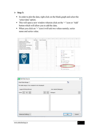
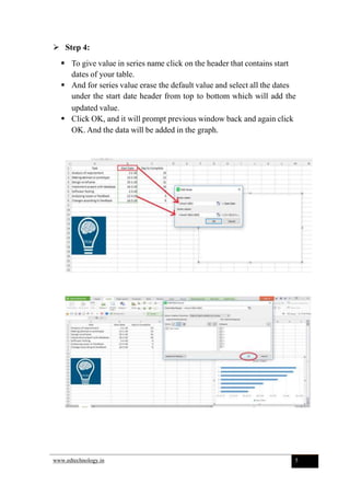
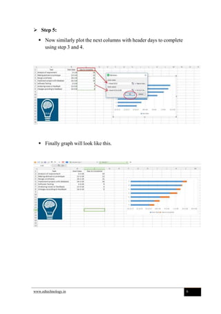
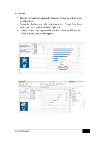
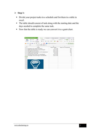
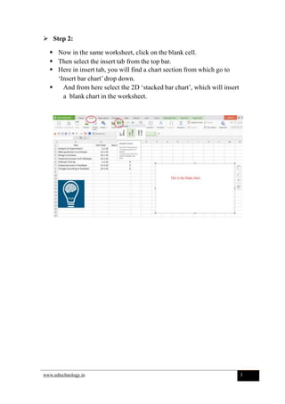
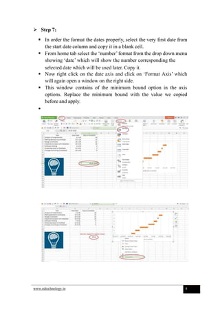
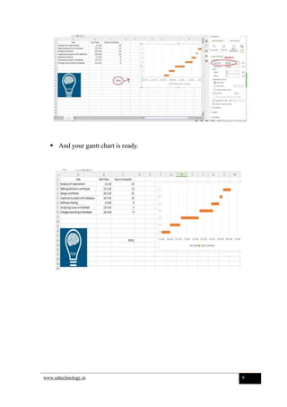
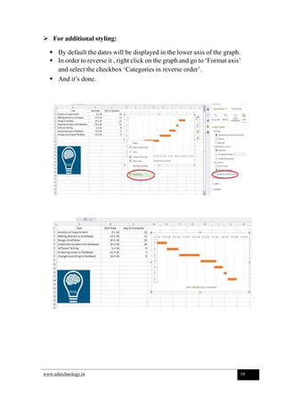
Creating a Gantt Chart
 Step 1:
 Divide your project tasks in a schedule and list them in a table in
excel.
 The table should consist of task along with the starting date and the
days needed to complete the same task.
 Now that the table is ready we can convert it to a gantt chart.
www.edtechnology.in 2
 Step 2:
 Now in the same worksheet, click on the blank cell.
 Then select the insert tab from the top bar.
 Here in insert tab, you will find a chart section from which go to
‘Insert bar chart’drop down.
 And from here select the 2D ‘stacked bar chart’, which will insert
a blank chart in the worksheet.
www.edtechnology.in 3
 Step 3:
 In order to plot the data, right click on the blank graph and select the
‘select data’option.
 This will open a new window wherein click on the ‘+’ icon or ‘Add’
button which will allow you to add the data.
 When you click on ‘+’ icon it will ask two values namely; series
name and series value.
www.edtechnology.in 4
 Step 4:
 To give value in series name click on the header that contains start
dates of your table.
 And for series value erase the default value and select all the dates
under the start date header from top to bottom which will add the
updated value.
 Click OK, and it will prompt previous window back and again click
OK. And the data will be added in the graph.
www.edtechnology.in 5
 Step 5:
 Now similarly plot the next columns with header days to complete
using step 3 and 4.
 Finally graph will look like this.
www.edtechnology.in 6
 Step 6:
 Now to convert it in better understandable format we will do some
modifications.
 Select the blue bars and right click, then select ‘Format Data Series’
which will open a window on the right side.
 Go to ‘Fill & Line’option and from ‘fill’, select ‘no fill’and the
blue coloured bars will disappear.
www.edtechnology.in 7
 Step 7:
 In order the format the dates properly, select the very first date from
the start date column and copy it in a blank cell.
 From home tab select the ‘number’ format from the drop down menu
showing ‘date’ which will show the number corresponding the
selected date which will be used later. Copy it.
 Now right click on the date axis and click on ‘Format Axis’ which
will again open a window on the right side.
 This window contains of the minimum bound option in the axis
options. Replace the minimum bound with the value we copied
before and apply.

www.edtechnology.in 8
 And your gantt chart is ready.
www.edtechnology.in 9
 For additional styling:
 By default the dates will be displayed in the lower axis of the graph.
 In order to reverse it , right click on the graph and go to ‘Format axis’
and select the checkbox ‘Categories in reverse order’.
 And it’s done.
www.edtechnology.in 10

How to make Gantt chart in Excel

  • 1.
  • 2.
     Step 1: Divide your project tasks in a schedule and list them in a table in excel.  The table should consist of task along with the starting date and the days needed to complete the same task.  Now that the table is ready we can convert it to a gantt chart. www.edtechnology.in 2
  • 3.
     Step 2: Now in the same worksheet, click on the blank cell.  Then select the insert tab from the top bar.  Here in insert tab, you will find a chart section from which go to ‘Insert bar chart’drop down.  And from here select the 2D ‘stacked bar chart’, which will insert a blank chart in the worksheet. www.edtechnology.in 3
  • 4.
     Step 3: In order to plot the data, right click on the blank graph and select the ‘select data’option.  This will open a new window wherein click on the ‘+’ icon or ‘Add’ button which will allow you to add the data.  When you click on ‘+’ icon it will ask two values namely; series name and series value. www.edtechnology.in 4
  • 5.
     Step 4: To give value in series name click on the header that contains start dates of your table.  And for series value erase the default value and select all the dates under the start date header from top to bottom which will add the updated value.  Click OK, and it will prompt previous window back and again click OK. And the data will be added in the graph. www.edtechnology.in 5
  • 6.
     Step 5: Now similarly plot the next columns with header days to complete using step 3 and 4.  Finally graph will look like this. www.edtechnology.in 6
  • 7.
     Step 6: Now to convert it in better understandable format we will do some modifications.  Select the blue bars and right click, then select ‘Format Data Series’ which will open a window on the right side.  Go to ‘Fill & Line’option and from ‘fill’, select ‘no fill’and the blue coloured bars will disappear. www.edtechnology.in 7
  • 8.
     Step 7: In order the format the dates properly, select the very first date from the start date column and copy it in a blank cell.  From home tab select the ‘number’ format from the drop down menu showing ‘date’ which will show the number corresponding the selected date which will be used later. Copy it.  Now right click on the date axis and click on ‘Format Axis’ which will again open a window on the right side.  This window contains of the minimum bound option in the axis options. Replace the minimum bound with the value we copied before and apply.  www.edtechnology.in 8
  • 9.
     And yourgantt chart is ready. www.edtechnology.in 9
  • 10.
     For additionalstyling:  By default the dates will be displayed in the lower axis of the graph.  In order to reverse it , right click on the graph and go to ‘Format axis’ and select the checkbox ‘Categories in reverse order’.  And it’s done. www.edtechnology.in 10