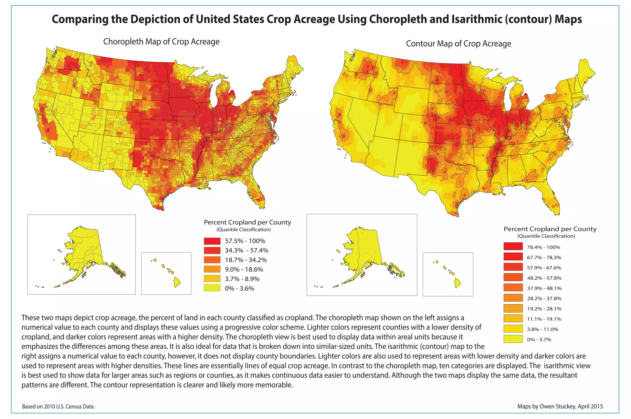
The document compares two maps that depict crop acreage percentages by county in the United States. A choropleth map on the left uses color-coded counties to show percentages, with darker colors representing higher densities. An isarithmic contour map on the right does not show county boundaries and instead uses contour lines to connect areas of equal crop density, represented by color. While both maps show the same data, the contour map provides a clearer and more memorable visualization by making the continuous data easier to understand across large areas like regions.