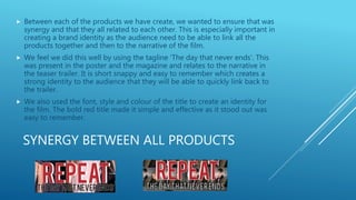
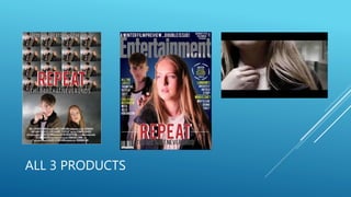
HOW EFFECTIVE IS THE
COMBINATION OF YOUR
MAIN PRODUCT AND
ANCILLARY TEXTS?
BRAND IDENTITY
 Brand identity is important in film marketing as it creates a USP for the
film and establishes it from other films.
 It creates a recognisable theme that the audience associate the film
with.
When researching Warm Bodies, I
looked at the brand identity they
created. They created an identity
from an already known book which
benefitted them further. Before
the release of the film, they
produced many posters that all
had the eye catching red
background and using catch
phrases related to death that were
recognisable.
BRAND IDENTITY
 I also researched the brand identity in Split. From my research I found a strong brand
identity and looked further into how they developed this:
 The poster is constructed cleverly so that it shows lots of different shadows linked to
different personalities of the different characters he presents himself as in the teaser.
 A common element is the emphasis on the split personalities and the horror and fear
of the characters. This is also portrayed by the larger shadowed figure in the poster
which appears to be towering over, even though seen upside down. This illusion
creates that sense of horror and fear. The idea of the split personalities is portrayed in
the teaser as he dresses himself different and changes his persona.
o In our final products we aimed to establish a clear brand identity.
o We aimed to do this by highlighting the USP of the day restarting.
This was made obvious in the teaser by the repetition of shots and in
the poster by the repetition of the picture.
o In the magazine we relied on the characters to establish the brand
identity as we were not able to follow the repeated image idea as
this would break the conventions of a magazine cover that we were
keen to follow.
TEASER TRAILER
o In our teaser trailer, we aimed to create a recognisable brand
identity due to our narrative of the day continually starting
again and repeating.
o We also focused on two main characters to create a brand
based upon characters as well. This is often seen in big
Hollywood movies – using a famous star to create an identity
for a film and attract an audience to watch.
o Although are film does not have well-known actors, we used
two teenagers who were the main focus and aimed this at a
similar target audience to attract attention and create an
identity.
o We had aimed for the narrative to be a key part of our brand
identity. We wanted it to be recognised as our USP and have
the narrative create the brand identity.
o As seen in the thumbnail of our
teaser trailer, there is also a large
identity built around the necklace
as the shot zooms in to recognise
that the necklace is the key to
restarting the day. We wanted to
have a large focus around this as
well.
POSTER
 In the poster, we created the brand identity through the use of
the same repeated image.
 This helped create a brand identity through the use of the
narrative. The repetition of the images helps the audience relate to
and remember the title 'Repeat'.
 The thriller genre is presented through the use of the grey coloured
background and the red title.
 It is also present as a thriller by the characters. Their
facial expressions are very serious and chilling which the audience can
associate with the thriller genre.
 The brand identity is majorly highlighted through the narrative and
the repetition of the images. There is also a large connection to the
identity of the film by the characters. There are only 2 main
characters that the teaser, the poster and the magazine focus on. This
recognition helps the audience create an identity of the film through
the actors.
 We also included the tag line 'The day that never ends'. This tag line is
short, snappy and easy to remember and associate with the narrative
and theme of the film.
MAGAZINE
 The magazine focuses less on the repeated image, so therefore does not follow the same brand identity of
the narrative theme.
 This was due to the fact that a repeated image would break the 'house style' of the magazine we were
replicating.
 The magazine focuses on the character recognition to establish a brand identity. The two main characters
make up the main image of the magazine cover.
 The necklace is also very central and in focus on the magazine. This is there to help link the magazine and
the teaser trailer to create the brand identity through the use of props. It is in perfect eyeline with the
reader and is therefore there to be recognised. -- GO INTO FURTHER DETAIL IN COMPARATIVE ANALYSIS –
ADD IMAGES
 The 'Repeat' title is in the same style, colour, and font as the poster. The boldness and colour red help it to
stand out and be easily identifiable.
 The characters facial expressions and serious and chilling to represent the confusion and highlight the thriller
theme by looking spooky.
 On the magazine we had the tagline 'The day that never ends' to also create the brand identity and use this
tagline to associate and like this to the film.
SYNERGY BETWEEN ALL PRODUCTS
 Between each of the products we have create, we wanted to ensure that was
synergy and that they all related to each other. This is especially important in
creating a brand identity as the audience need to be able to link all the
products together and then to the narrative of the film.
 We feel we did this well by using the tagline 'The day that never ends'. This
was present in the poster and the magazine and relates to the narrative in
the teaser trailer. It is short snappy and easy to remember which creates a
strong identity to the audience that they will be able to quickly link back to
the trailer.
 We also used the font, style and colour of the title to create an identity for
the film. The bold red title made it simple and effective as it stood out was
easy to remember.
SYNERGY BETWEEN ALL PRODUCTS
 The necklace is also a key part of the brand identity, it is most evident
in the magazine and the teaser trailer. This is a useful link to the
narrative of the film and a key prop that leaves a mystery of suspense
as the audience want to find out why this appears to be the key to
restarting the day.
ALL 3 PRODUCTS
SYNERGY BETWEEN PRODUCTS
• Within these 3 products, I feel there is a clear synergy. There is a strong
connection between each of the products due to, the importance of the two main
characters who are presented within every product.
• The title and tagline also present a strong synergy as they link to the narrative
and are bold and easy to remember.
• The necklace creates a synergy as is it presented in both the magazine and the
teaser trailer and has a highlighted key importance within the teaser trailer.
• There is also synergy will dark and grey colours and shadow. This fits the thriller
genre and creates a link between all products.

Question 2 evaluation media

  • 1.
    HOW EFFECTIVE ISTHE COMBINATION OF YOUR MAIN PRODUCT AND ANCILLARY TEXTS?
  • 2.
    BRAND IDENTITY  Brandidentity is important in film marketing as it creates a USP for the film and establishes it from other films.  It creates a recognisable theme that the audience associate the film with. When researching Warm Bodies, I looked at the brand identity they created. They created an identity from an already known book which benefitted them further. Before the release of the film, they produced many posters that all had the eye catching red background and using catch phrases related to death that were recognisable.
  • 3.
    BRAND IDENTITY  Ialso researched the brand identity in Split. From my research I found a strong brand identity and looked further into how they developed this:  The poster is constructed cleverly so that it shows lots of different shadows linked to different personalities of the different characters he presents himself as in the teaser.  A common element is the emphasis on the split personalities and the horror and fear of the characters. This is also portrayed by the larger shadowed figure in the poster which appears to be towering over, even though seen upside down. This illusion creates that sense of horror and fear. The idea of the split personalities is portrayed in the teaser as he dresses himself different and changes his persona. o In our final products we aimed to establish a clear brand identity. o We aimed to do this by highlighting the USP of the day restarting. This was made obvious in the teaser by the repetition of shots and in the poster by the repetition of the picture. o In the magazine we relied on the characters to establish the brand identity as we were not able to follow the repeated image idea as this would break the conventions of a magazine cover that we were keen to follow.
  • 4.
    TEASER TRAILER o Inour teaser trailer, we aimed to create a recognisable brand identity due to our narrative of the day continually starting again and repeating. o We also focused on two main characters to create a brand based upon characters as well. This is often seen in big Hollywood movies – using a famous star to create an identity for a film and attract an audience to watch. o Although are film does not have well-known actors, we used two teenagers who were the main focus and aimed this at a similar target audience to attract attention and create an identity. o We had aimed for the narrative to be a key part of our brand identity. We wanted it to be recognised as our USP and have the narrative create the brand identity. o As seen in the thumbnail of our teaser trailer, there is also a large identity built around the necklace as the shot zooms in to recognise that the necklace is the key to restarting the day. We wanted to have a large focus around this as well.
  • 5.
    POSTER  In theposter, we created the brand identity through the use of the same repeated image.  This helped create a brand identity through the use of the narrative. The repetition of the images helps the audience relate to and remember the title 'Repeat'.  The thriller genre is presented through the use of the grey coloured background and the red title.  It is also present as a thriller by the characters. Their facial expressions are very serious and chilling which the audience can associate with the thriller genre.  The brand identity is majorly highlighted through the narrative and the repetition of the images. There is also a large connection to the identity of the film by the characters. There are only 2 main characters that the teaser, the poster and the magazine focus on. This recognition helps the audience create an identity of the film through the actors.  We also included the tag line 'The day that never ends'. This tag line is short, snappy and easy to remember and associate with the narrative and theme of the film.
  • 6.
    MAGAZINE  The magazinefocuses less on the repeated image, so therefore does not follow the same brand identity of the narrative theme.  This was due to the fact that a repeated image would break the 'house style' of the magazine we were replicating.  The magazine focuses on the character recognition to establish a brand identity. The two main characters make up the main image of the magazine cover.  The necklace is also very central and in focus on the magazine. This is there to help link the magazine and the teaser trailer to create the brand identity through the use of props. It is in perfect eyeline with the reader and is therefore there to be recognised. -- GO INTO FURTHER DETAIL IN COMPARATIVE ANALYSIS – ADD IMAGES  The 'Repeat' title is in the same style, colour, and font as the poster. The boldness and colour red help it to stand out and be easily identifiable.  The characters facial expressions and serious and chilling to represent the confusion and highlight the thriller theme by looking spooky.  On the magazine we had the tagline 'The day that never ends' to also create the brand identity and use this tagline to associate and like this to the film.
  • 7.
    SYNERGY BETWEEN ALLPRODUCTS  Between each of the products we have create, we wanted to ensure that was synergy and that they all related to each other. This is especially important in creating a brand identity as the audience need to be able to link all the products together and then to the narrative of the film.  We feel we did this well by using the tagline 'The day that never ends'. This was present in the poster and the magazine and relates to the narrative in the teaser trailer. It is short snappy and easy to remember which creates a strong identity to the audience that they will be able to quickly link back to the trailer.  We also used the font, style and colour of the title to create an identity for the film. The bold red title made it simple and effective as it stood out was easy to remember.
  • 8.
    SYNERGY BETWEEN ALLPRODUCTS  The necklace is also a key part of the brand identity, it is most evident in the magazine and the teaser trailer. This is a useful link to the narrative of the film and a key prop that leaves a mystery of suspense as the audience want to find out why this appears to be the key to restarting the day.
  • 9.
  • 10.
    SYNERGY BETWEEN PRODUCTS •Within these 3 products, I feel there is a clear synergy. There is a strong connection between each of the products due to, the importance of the two main characters who are presented within every product. • The title and tagline also present a strong synergy as they link to the narrative and are bold and easy to remember. • The necklace creates a synergy as is it presented in both the magazine and the teaser trailer and has a highlighted key importance within the teaser trailer. • There is also synergy will dark and grey colours and shadow. This fits the thriller genre and creates a link between all products.