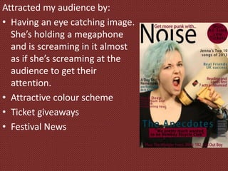
How did you attract/address
your audience?
Attracted my audience by:
• Having an eye catching image.
She’s holding a megaphone
and is screaming in it almost
as if she’s screaming at the
audience to get their
attention.
• Attractive colour scheme
• Ticket giveaways
• Festival News
I addressed my audience:
• Informally, using slang and keeping in any swear
words used during the interview.
• Having an article with a artist counting down their
top 10 songs of the year makes them feel more
connected to the artist.
• Had quite a few album and gig reviews as a lot of
people under 25 enjoy going to gigs and go to them
as often as possible.
• Double page spread addresses the reader casually
and feels like you're getting to know the band
because there are stories of times they've messed
up on stage and how the band formed.
Design:
• Have used a popular colour, red, for my colour
scheme. Gives the audience the feeling they’re
important as their feedback is used.
• Used pictures that aren’t serious.
• Contents page layout is simple but not boring.
• Girl on the front cover is dressed in black and has
bright coloured hair this would represent a large
portion of the audience.

How did you attract

  • 1.
    How did youattract/address your audience?
  • 2.
    Attracted my audienceby: • Having an eye catching image. She’s holding a megaphone and is screaming in it almost as if she’s screaming at the audience to get their attention. • Attractive colour scheme • Ticket giveaways • Festival News
  • 3.
    I addressed myaudience: • Informally, using slang and keeping in any swear words used during the interview. • Having an article with a artist counting down their top 10 songs of the year makes them feel more connected to the artist. • Had quite a few album and gig reviews as a lot of people under 25 enjoy going to gigs and go to them as often as possible. • Double page spread addresses the reader casually and feels like you're getting to know the band because there are stories of times they've messed up on stage and how the band formed.
  • 4.
    Design: • Have useda popular colour, red, for my colour scheme. Gives the audience the feeling they’re important as their feedback is used. • Used pictures that aren’t serious. • Contents page layout is simple but not boring. • Girl on the front cover is dressed in black and has bright coloured hair this would represent a large portion of the audience.