Downloaded 24 times


![William James on User Research?
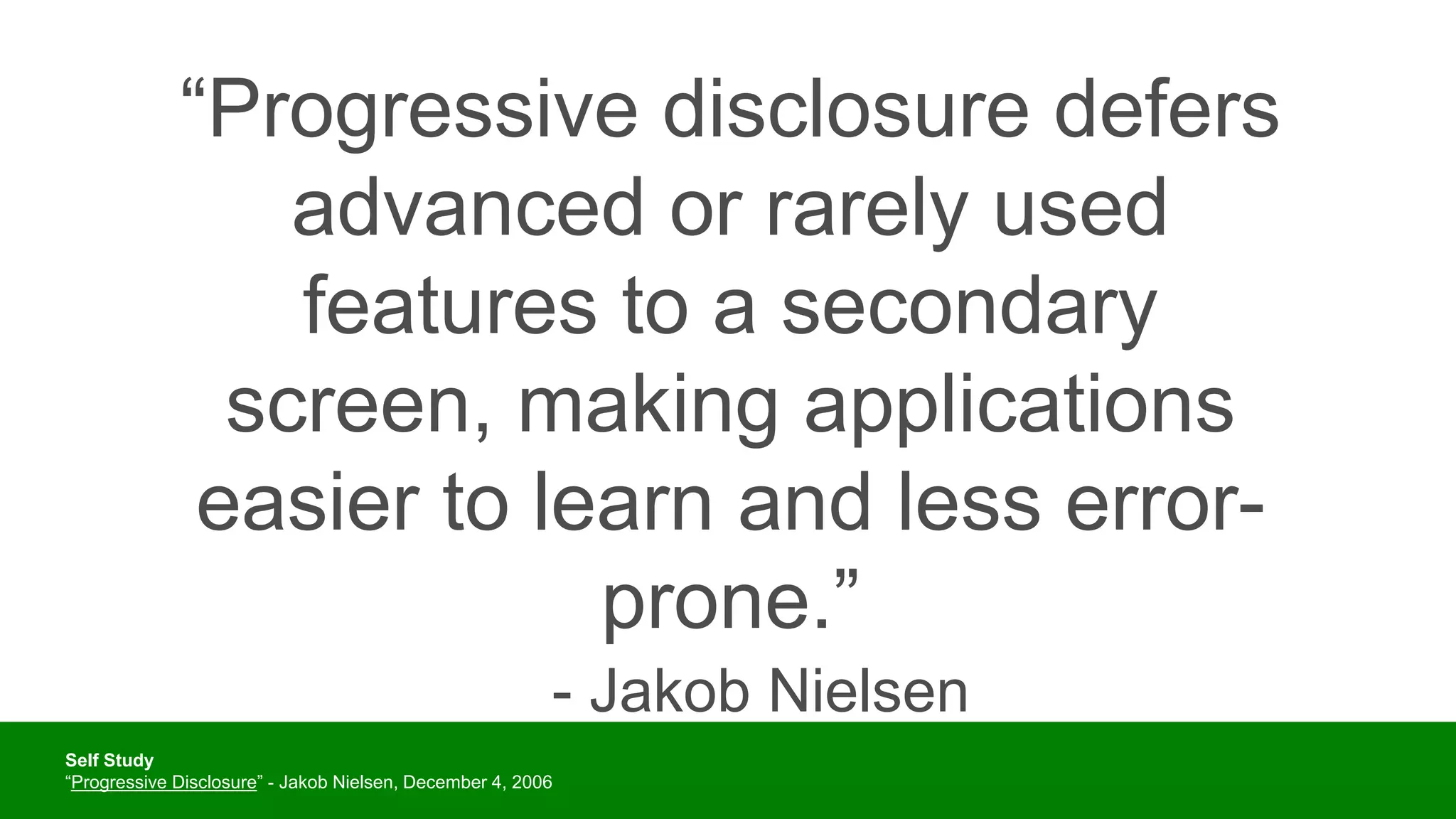
“[I]n a delicate inquiry like this, little is
to be gained by distributing circulars. A
single patient with the right sort of
lesion and a scientific mind, carefully
cross-examined, is more likely to
deepen our knowledge than a
thousand circulars answered as the
average patient answers them, even
though the answers be never so
thoroughly collated by the
investigator.”
– William James, “The Consciousness of Lost Limbs,”
1887
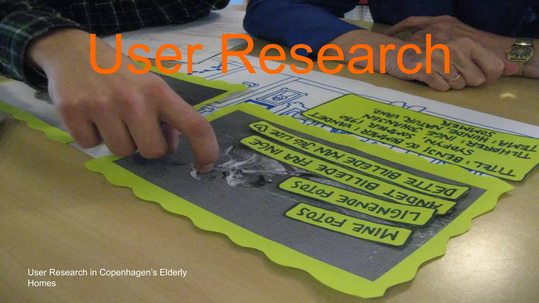
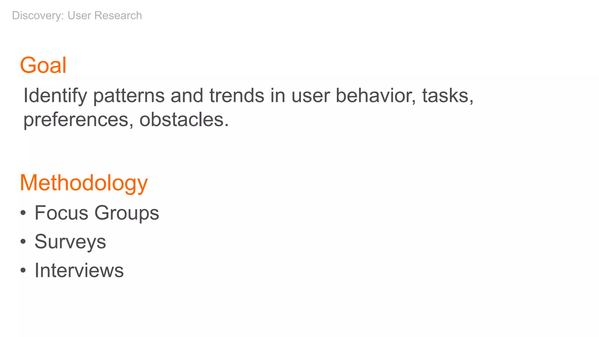
Discovery: User Research](https://image.slidesharecdn.com/introtouxdesign021520-200216201049/75/Introduction-to-User-Experience-Design-2-15-20-91-2048.jpg)
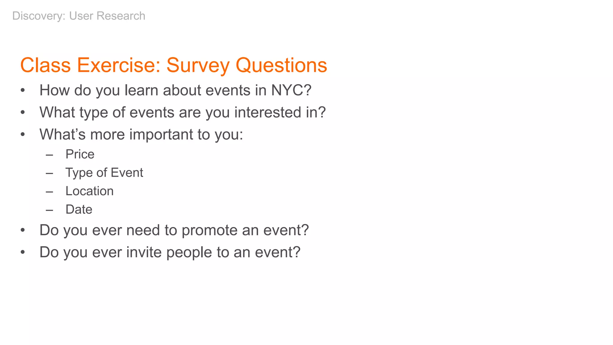


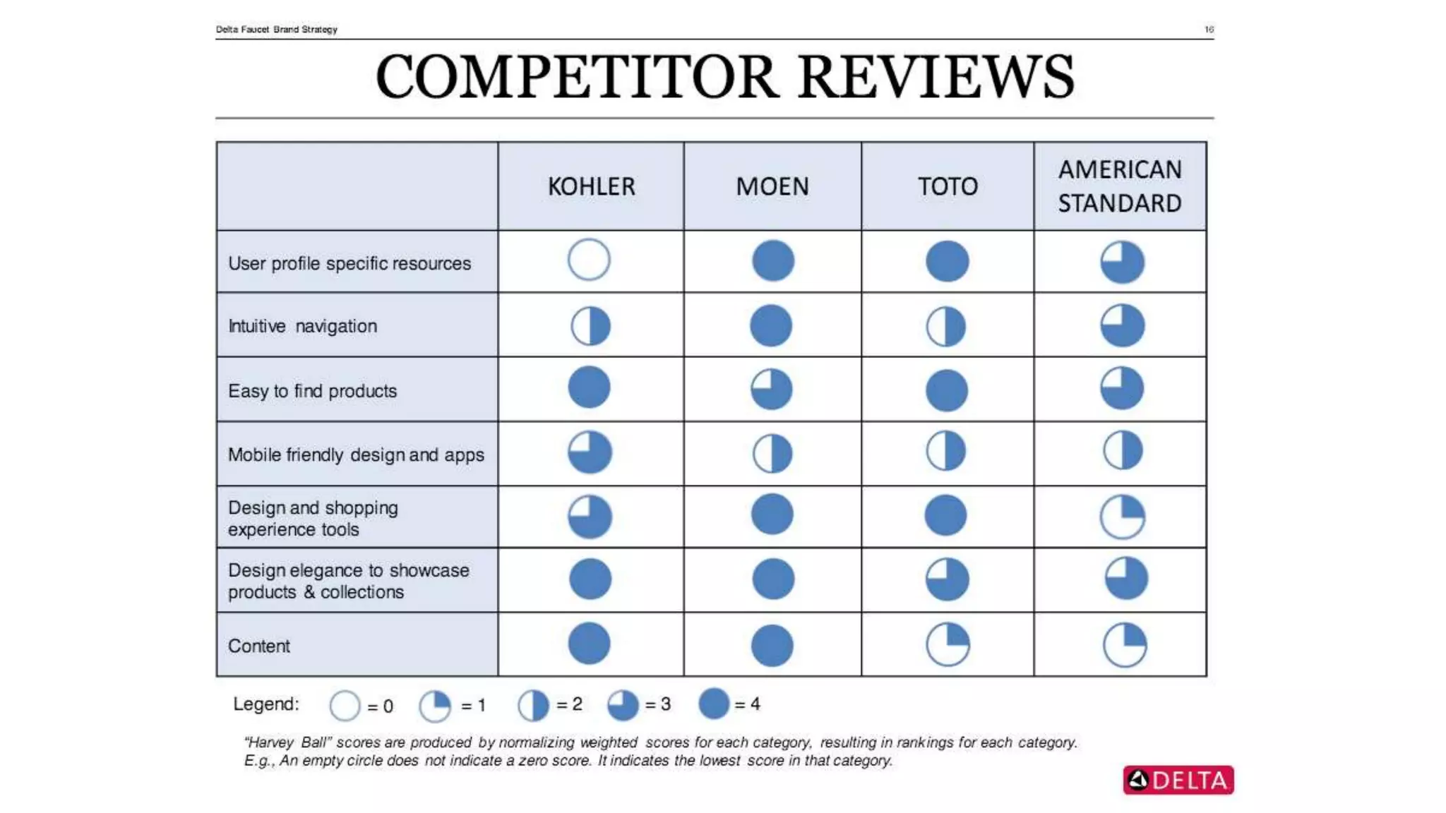


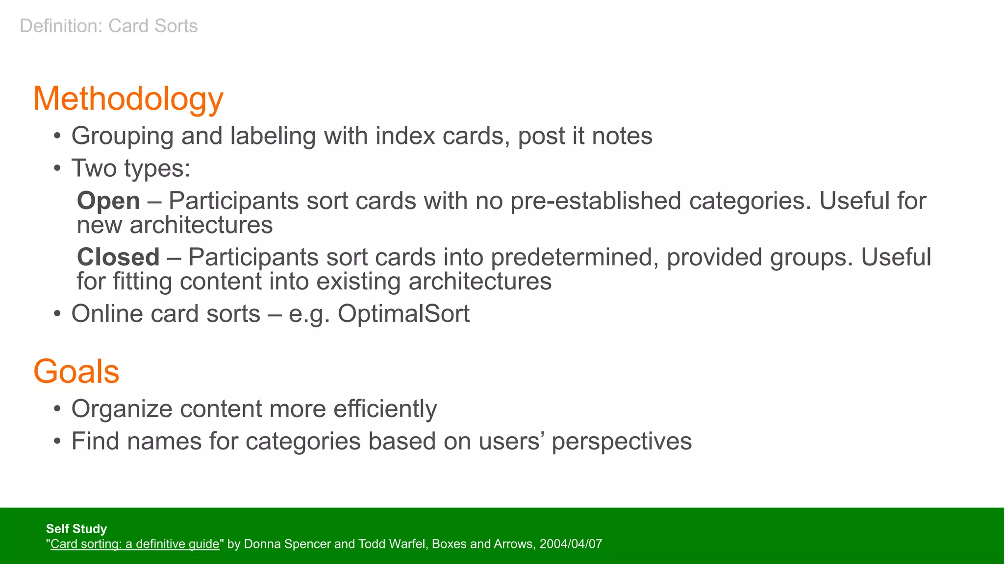

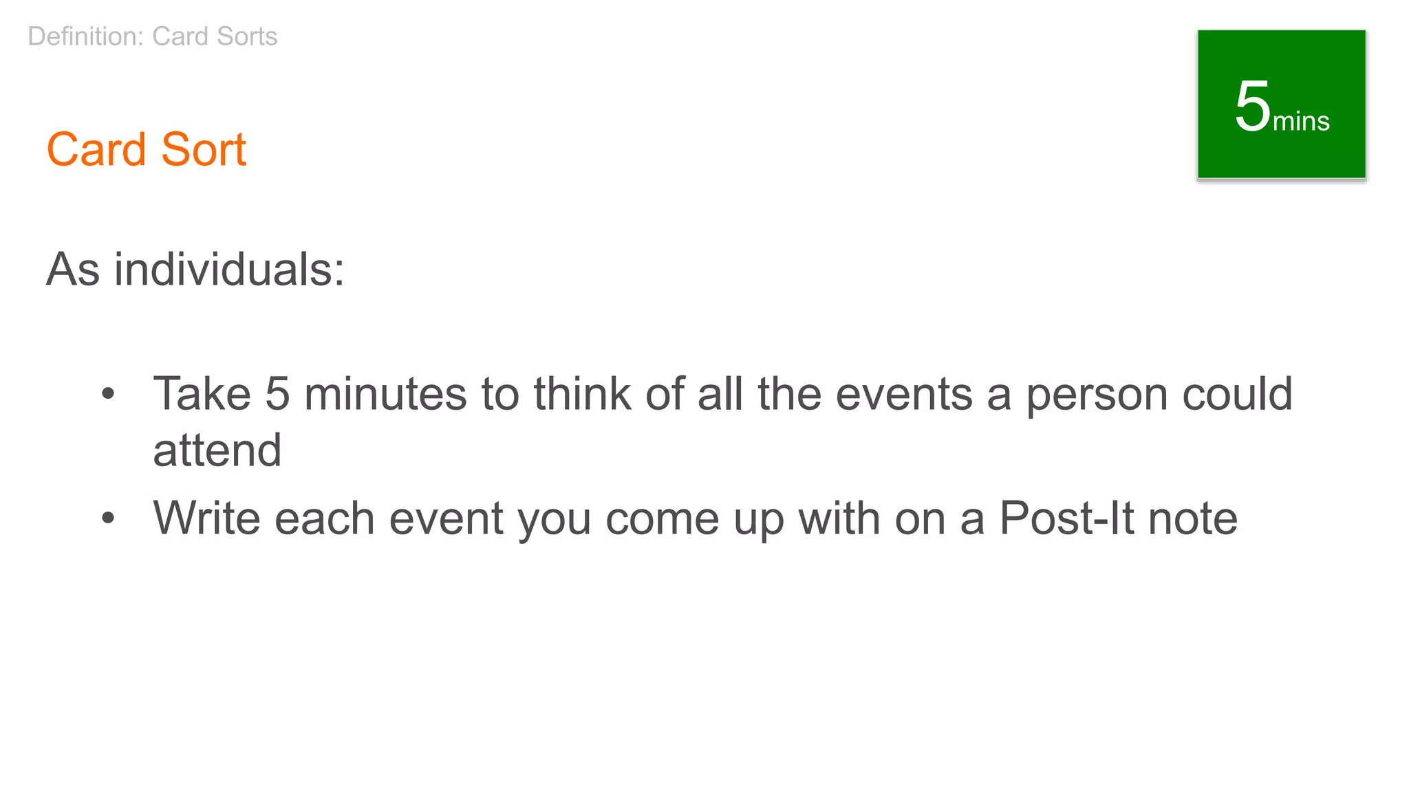
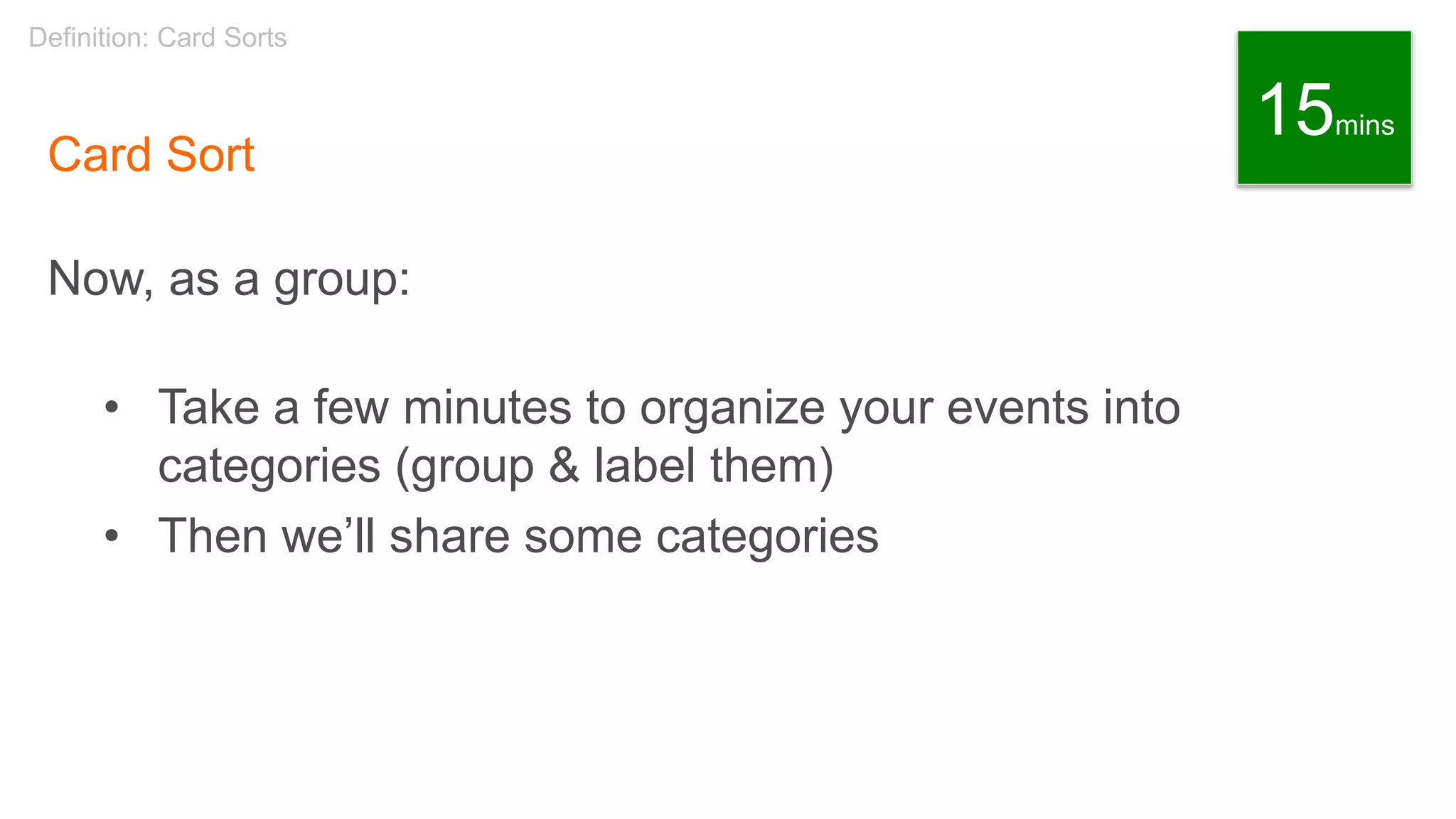
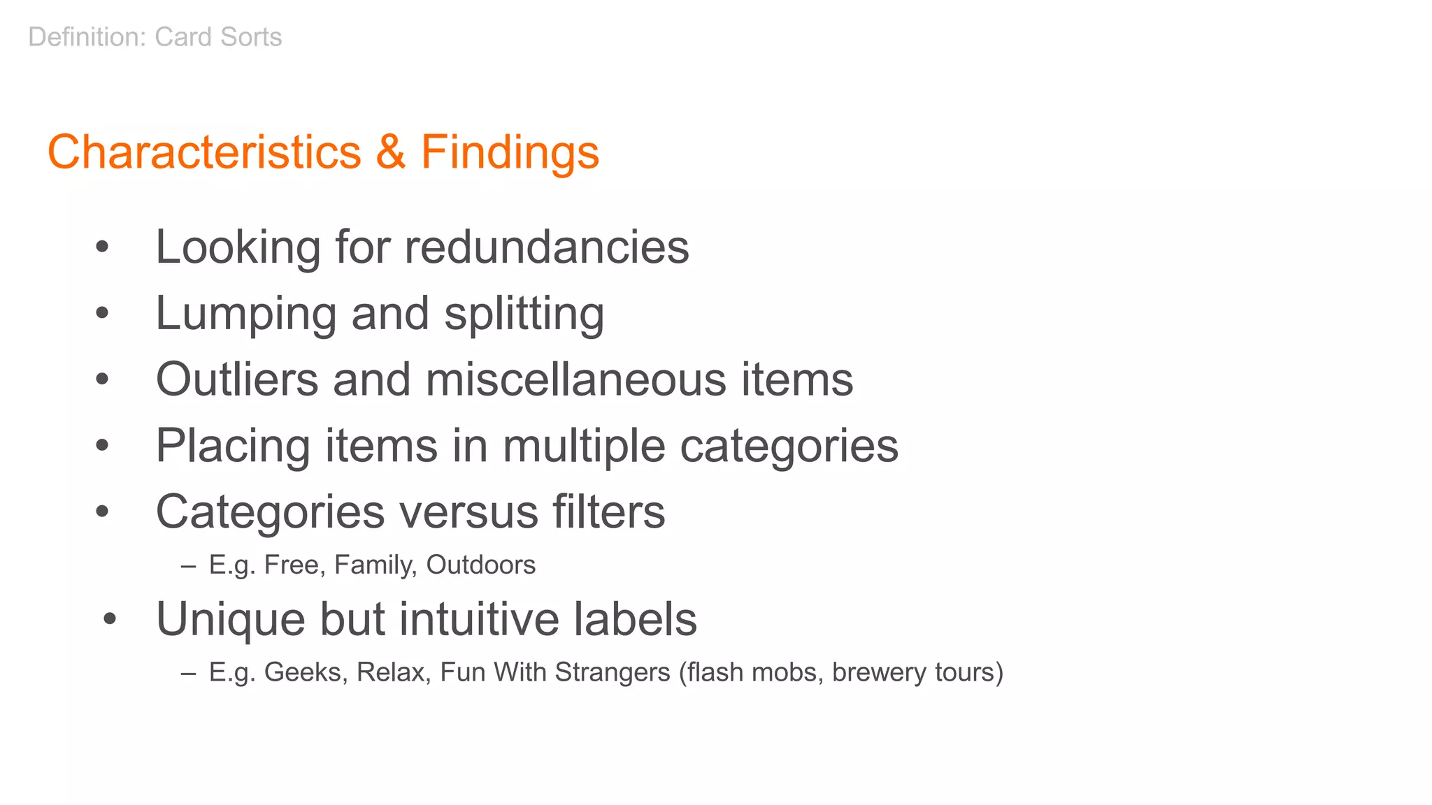

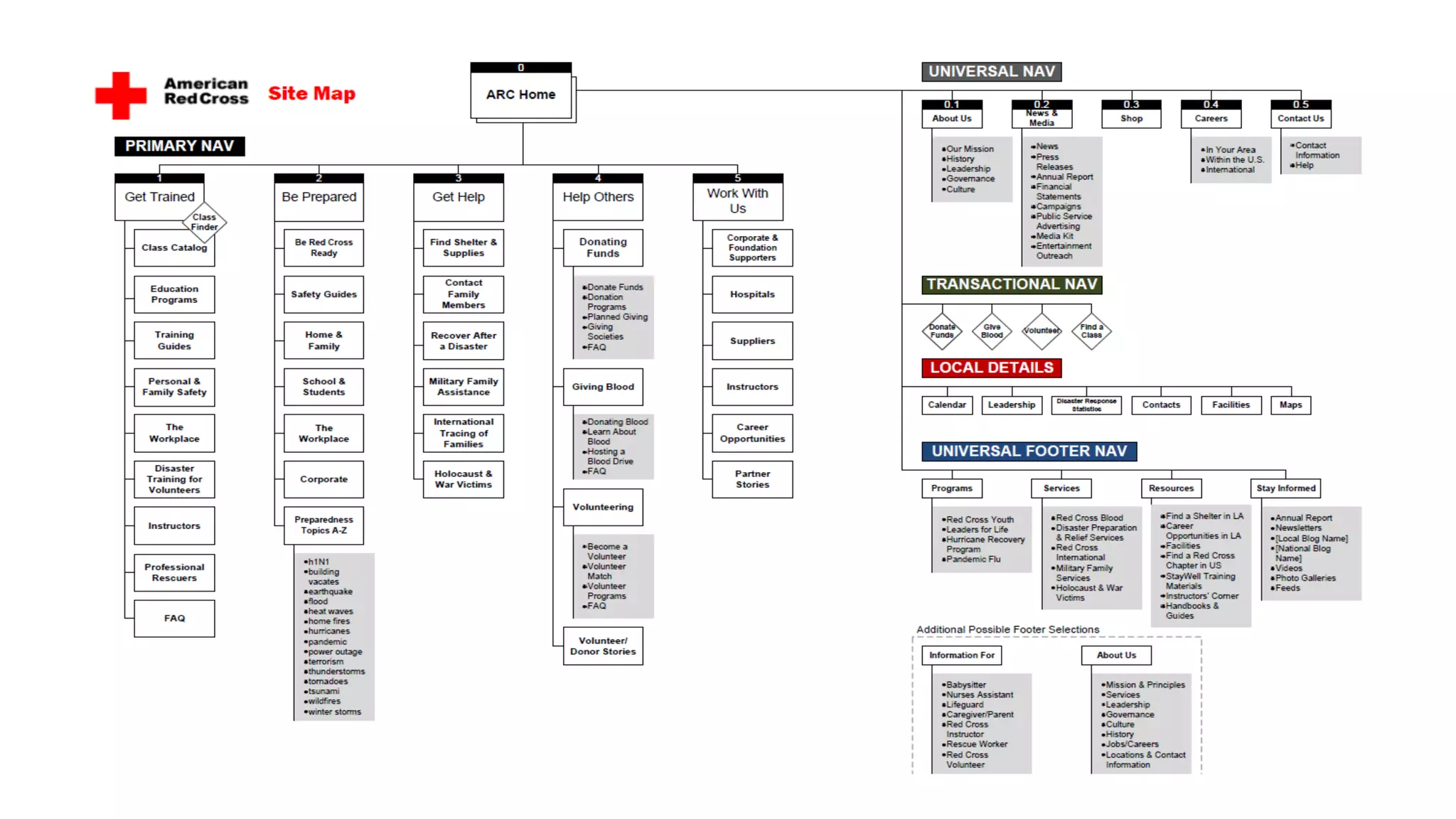
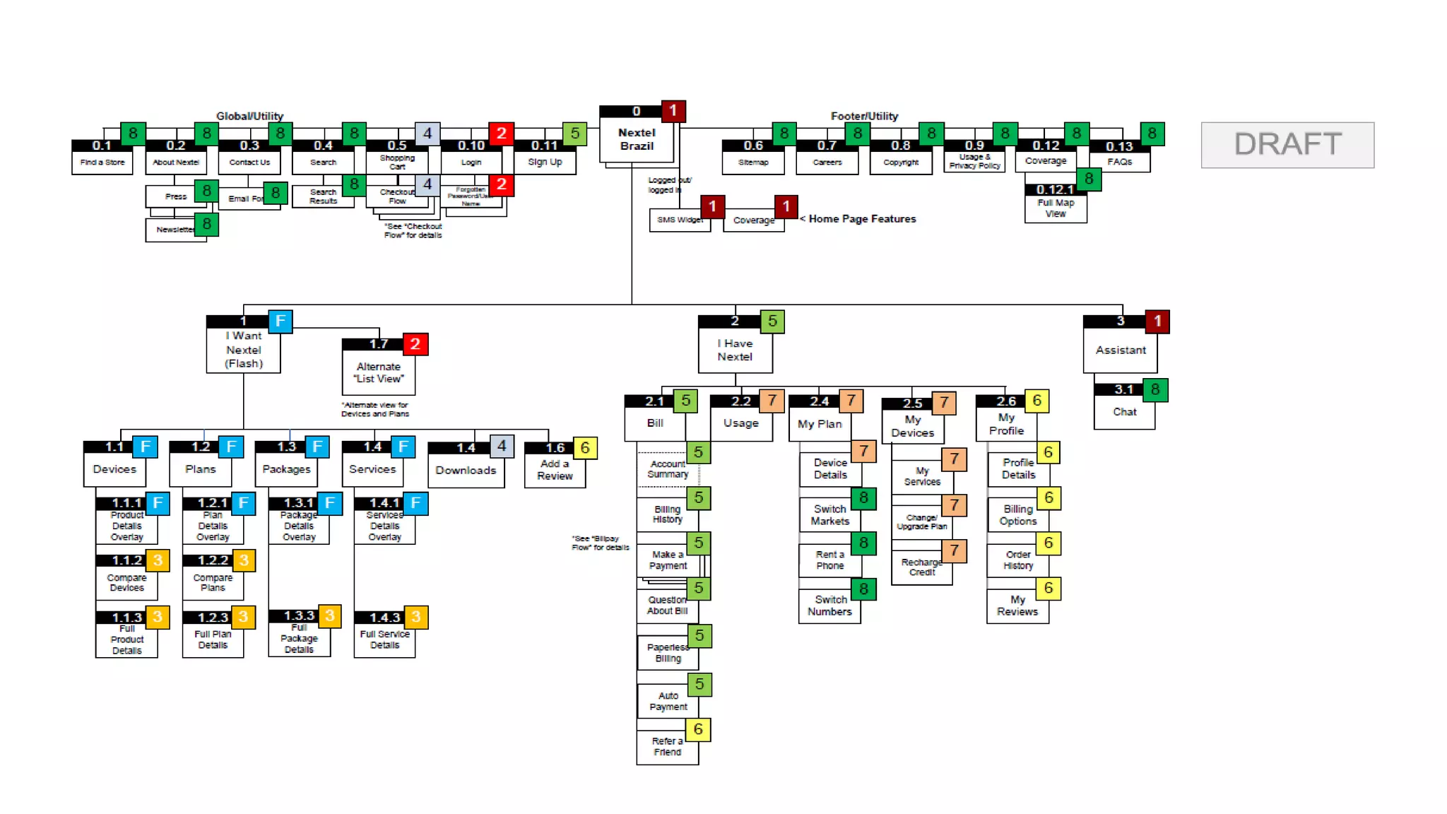
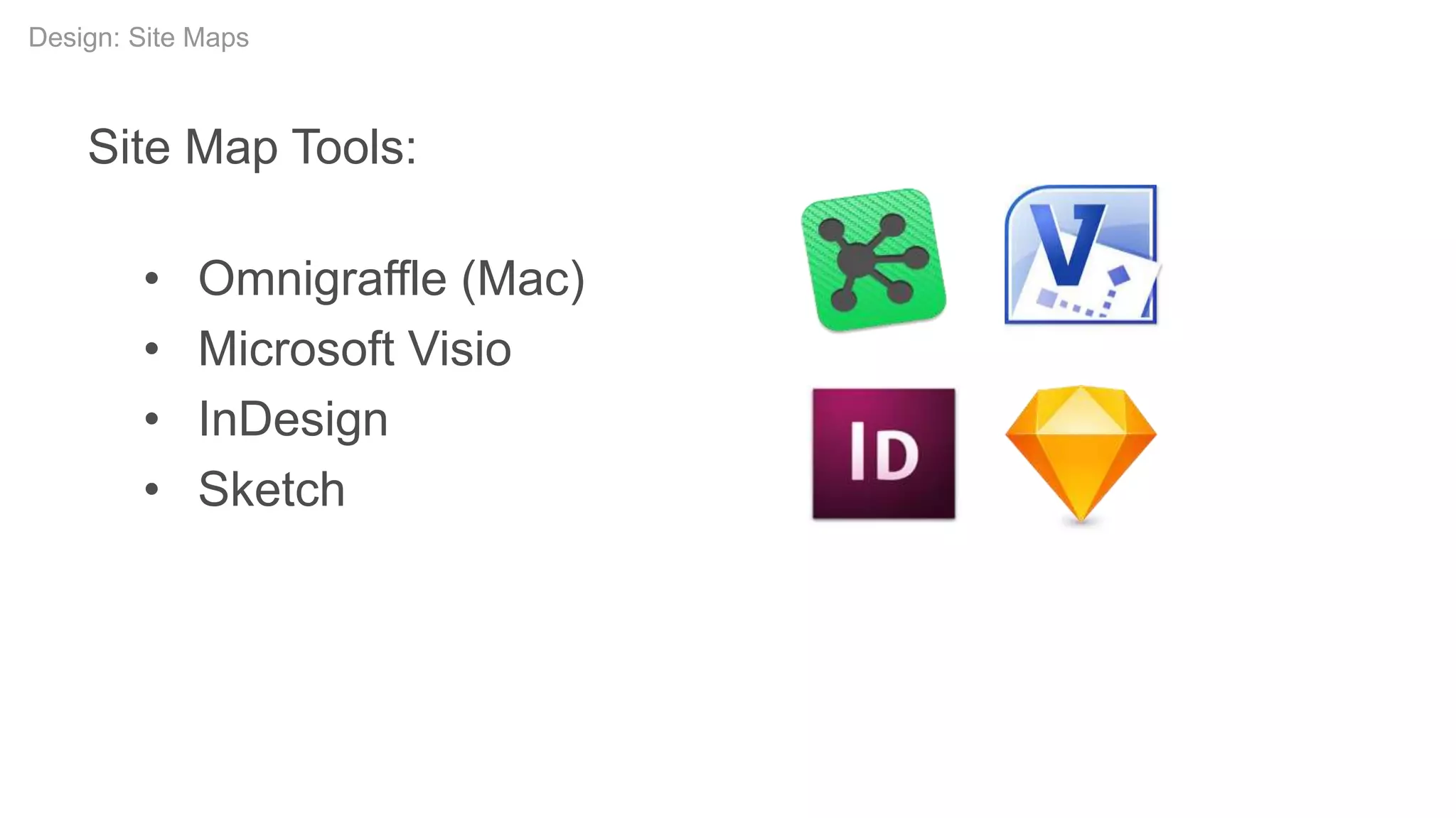

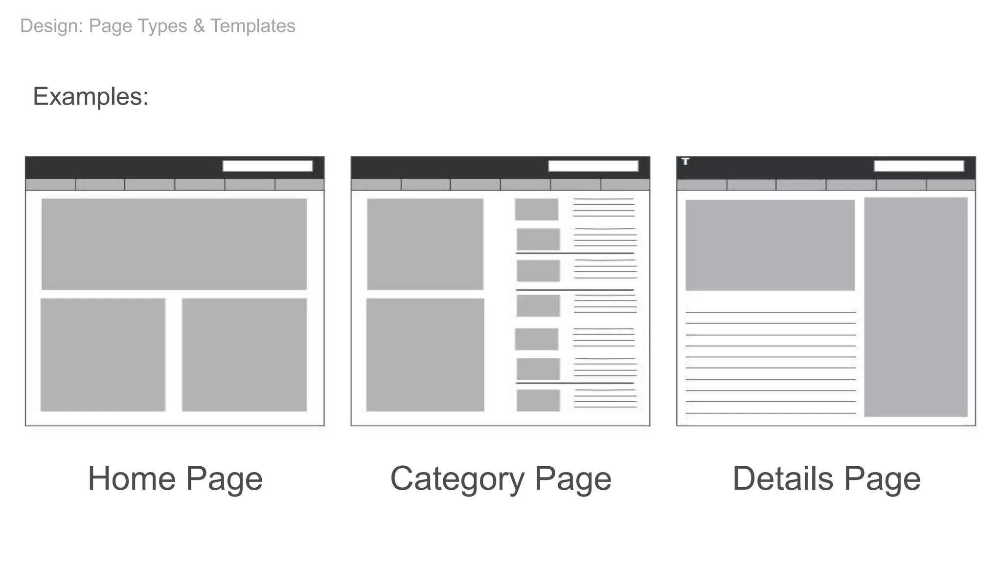


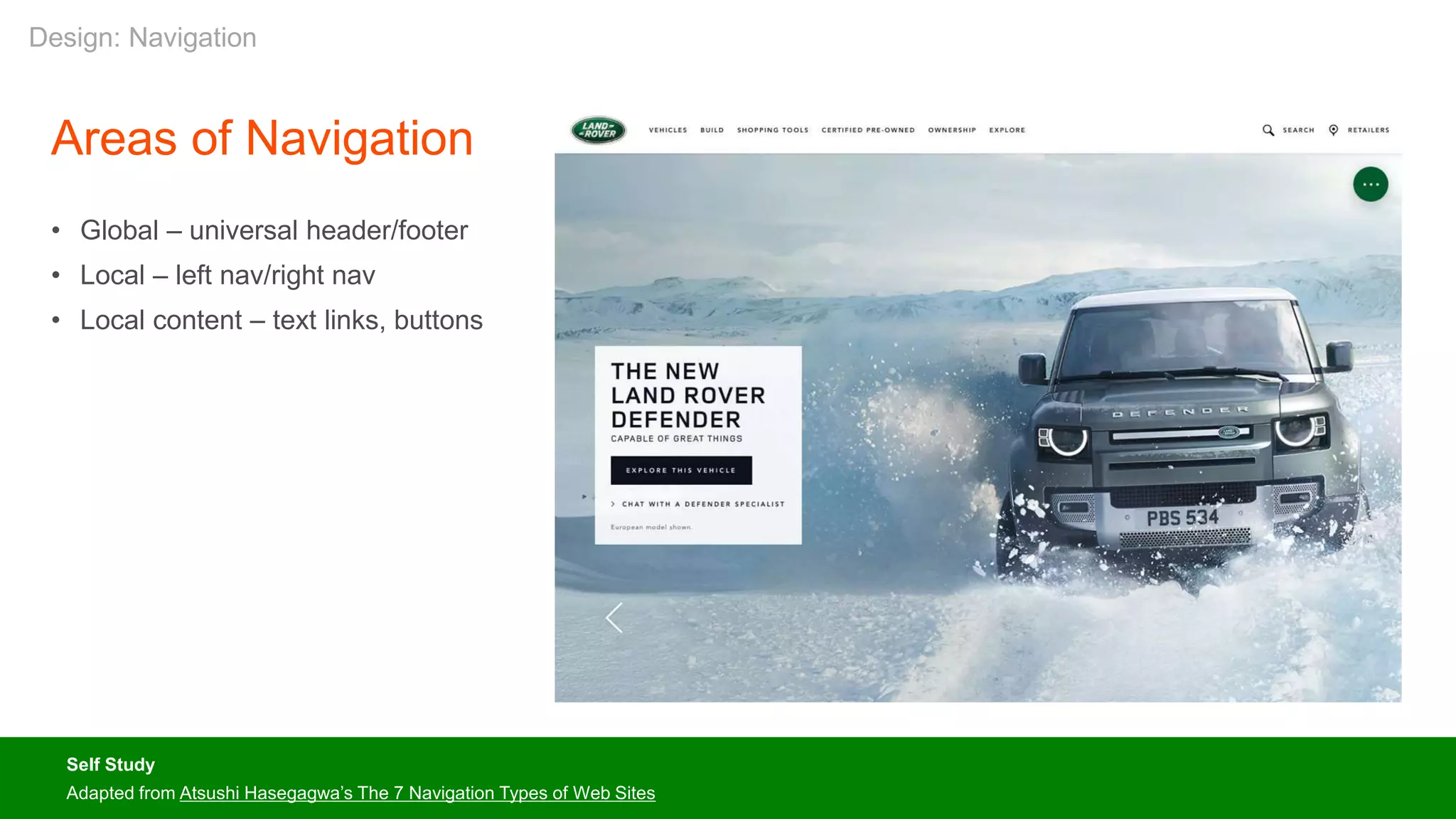
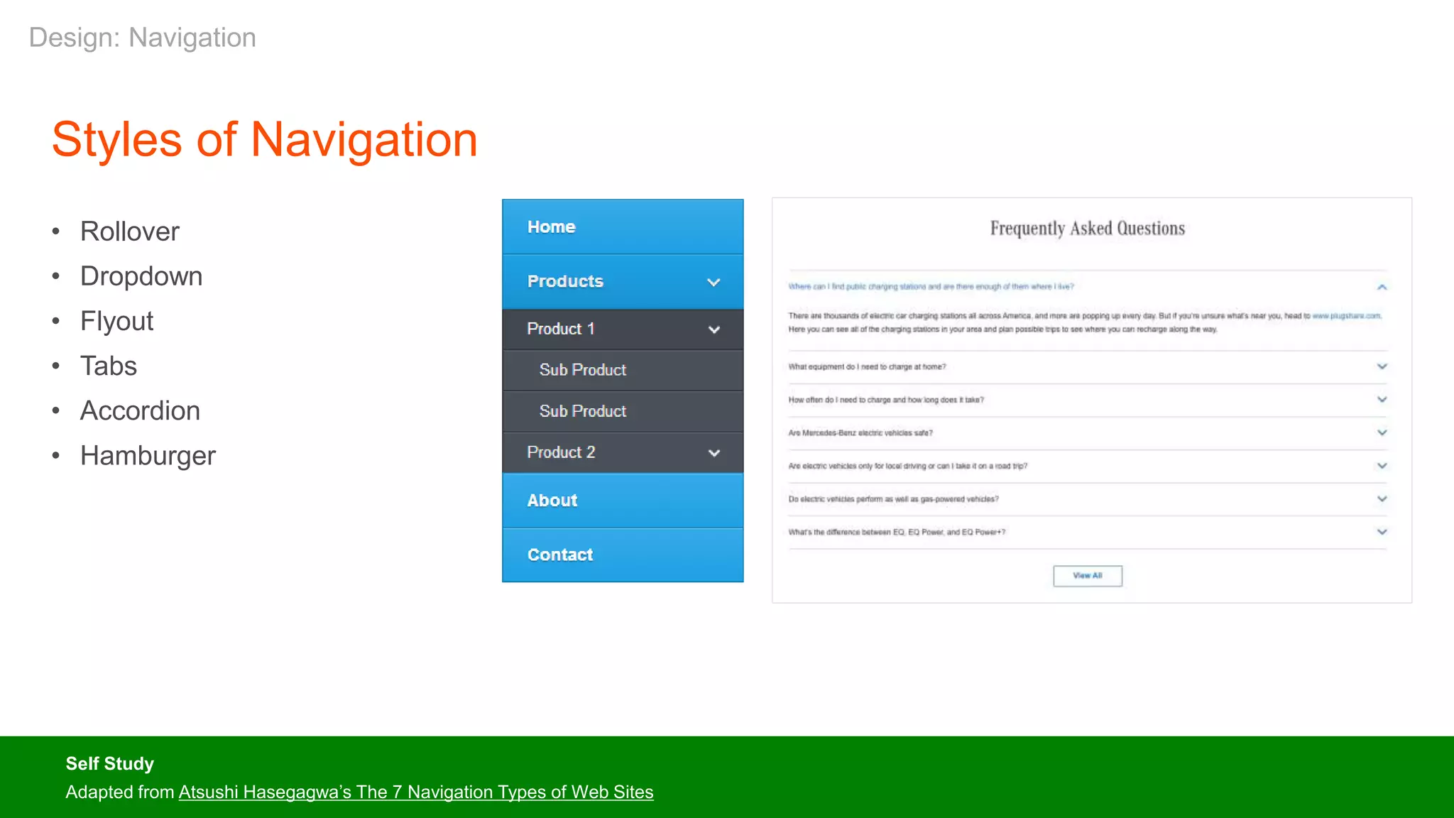
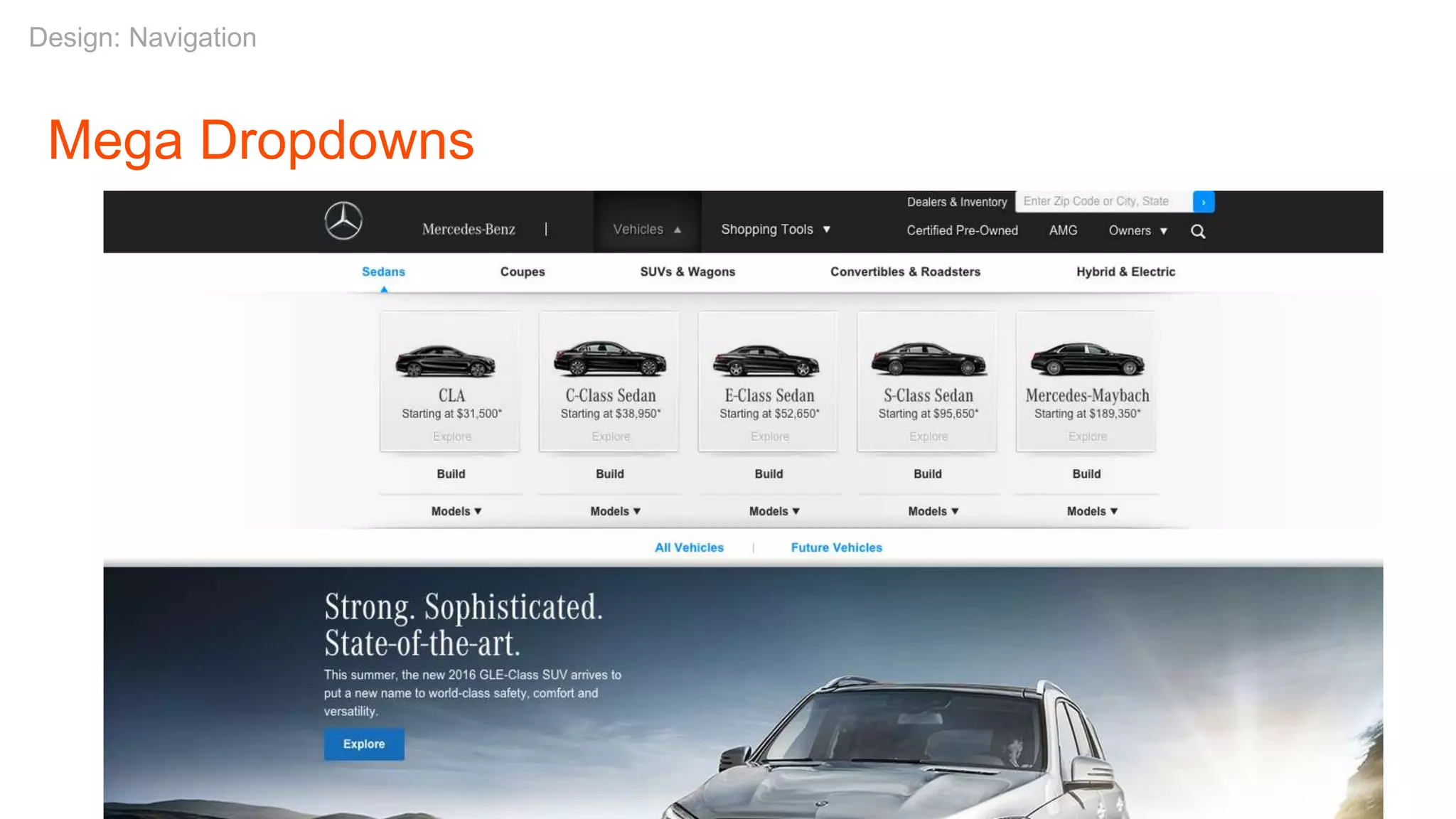
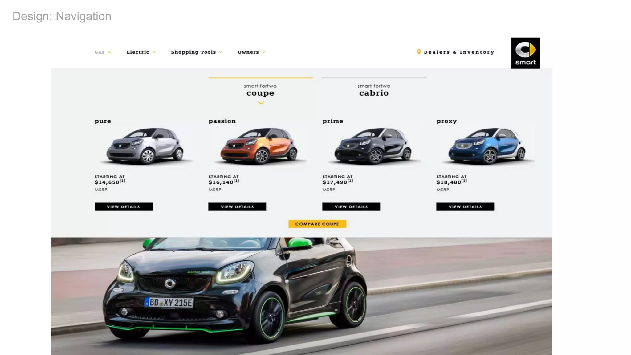


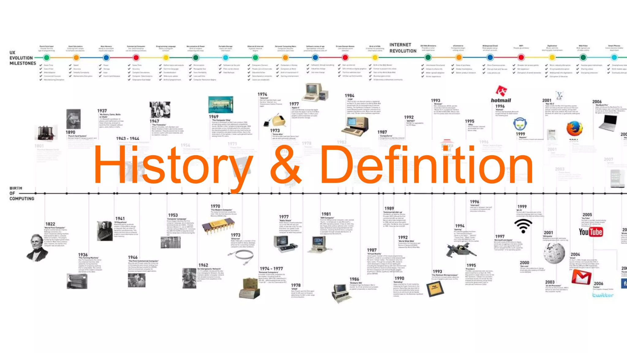
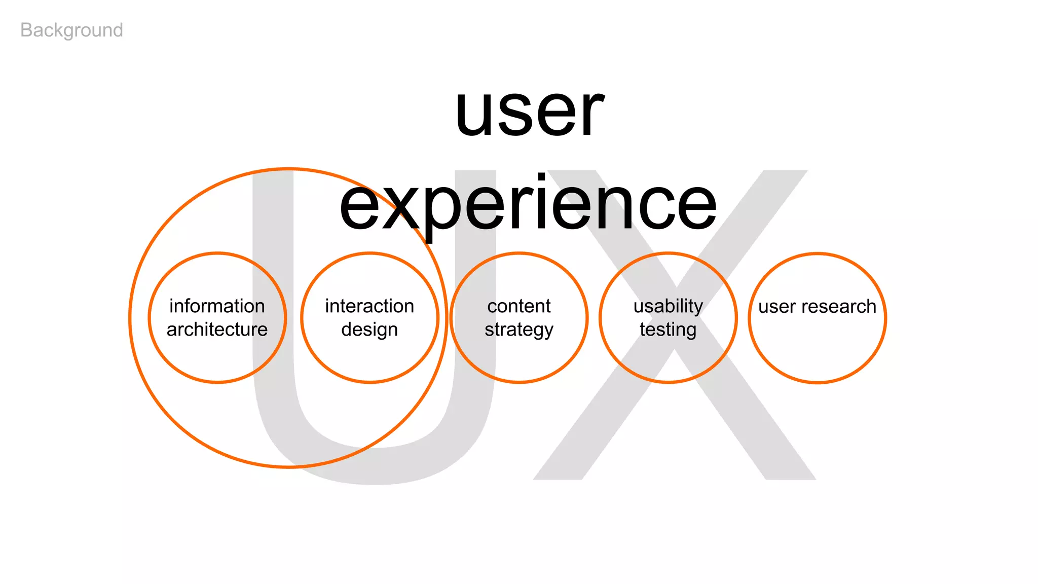
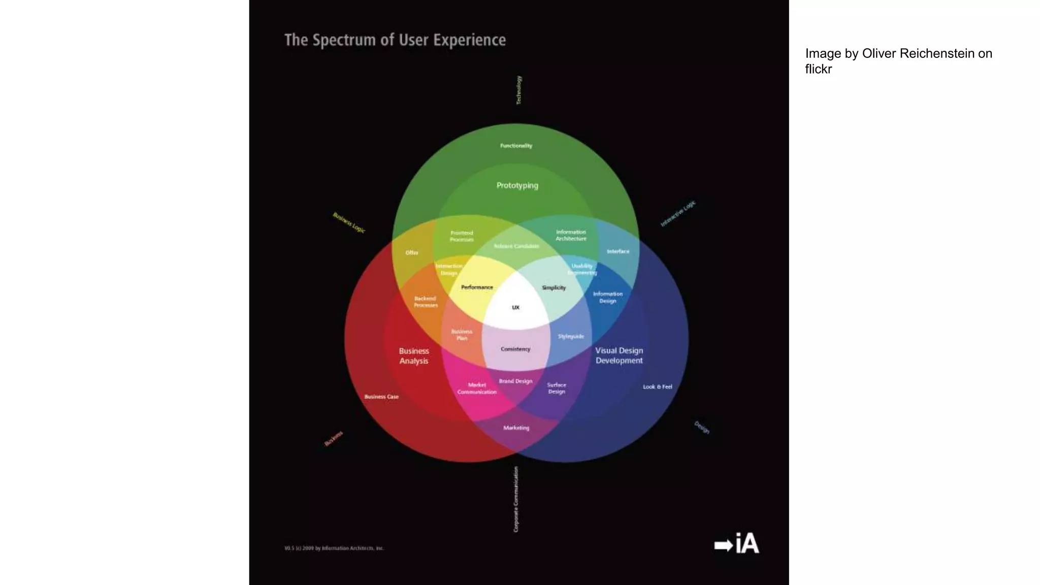
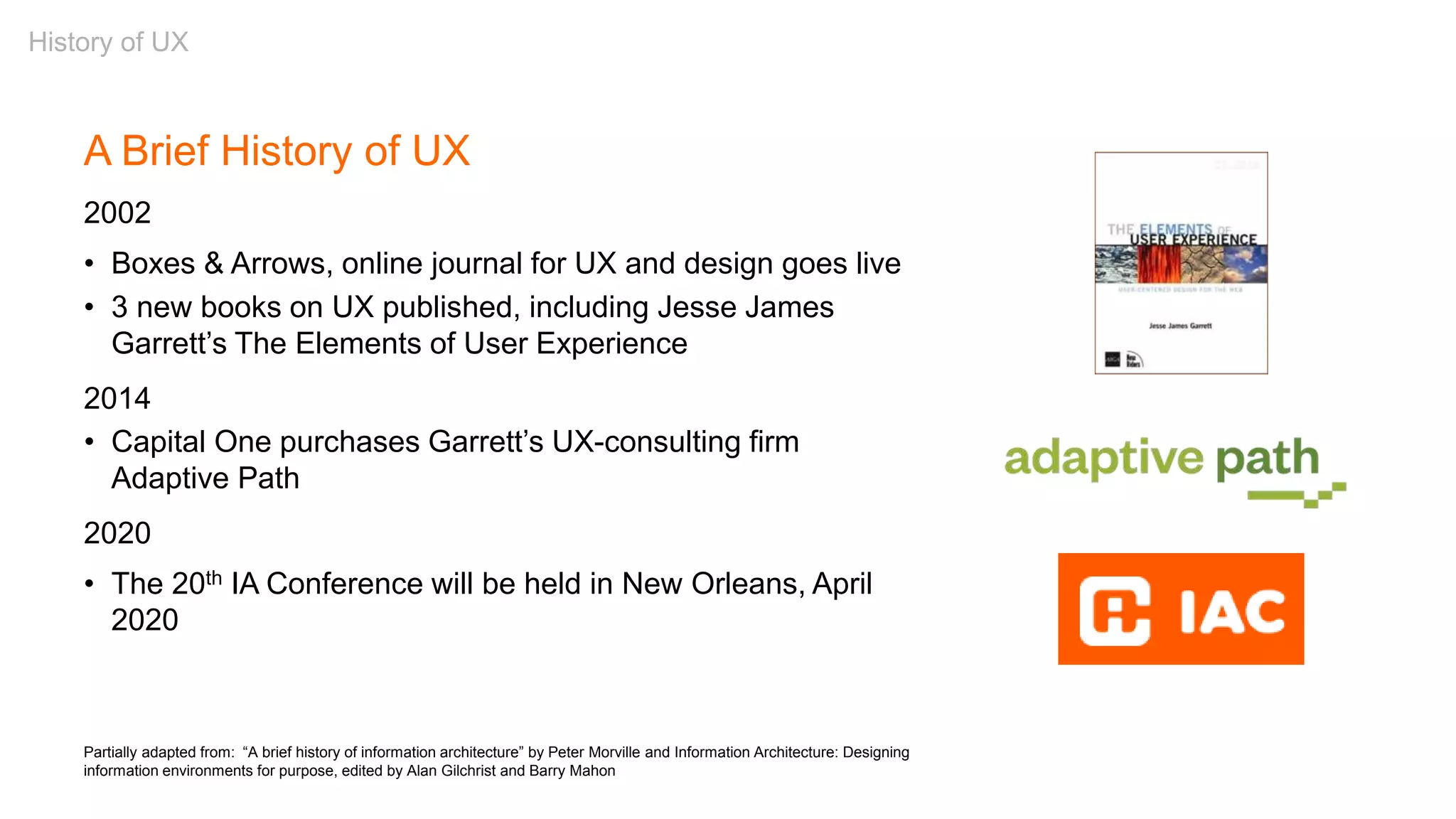
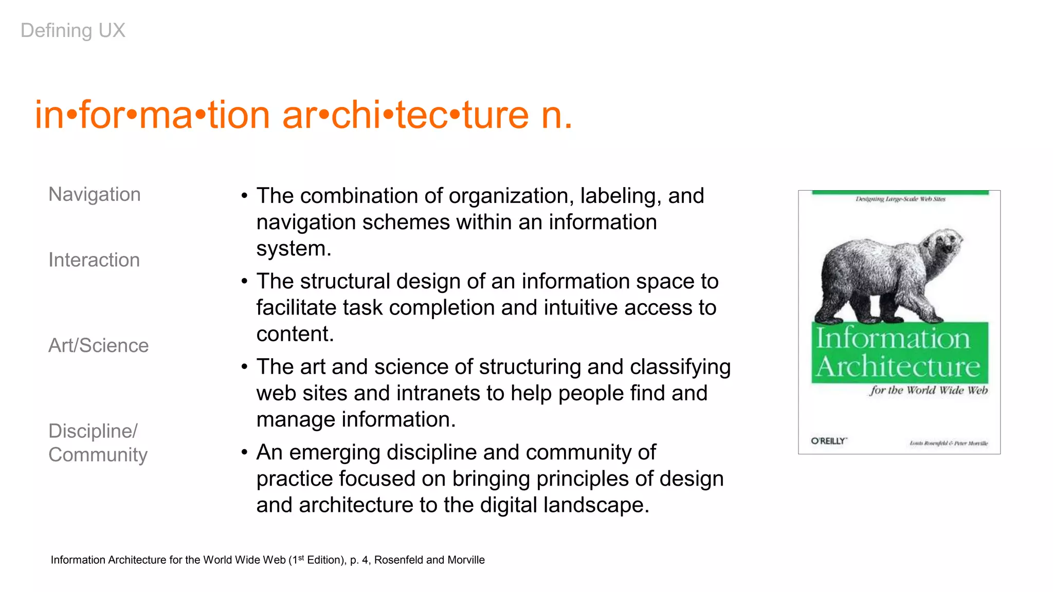
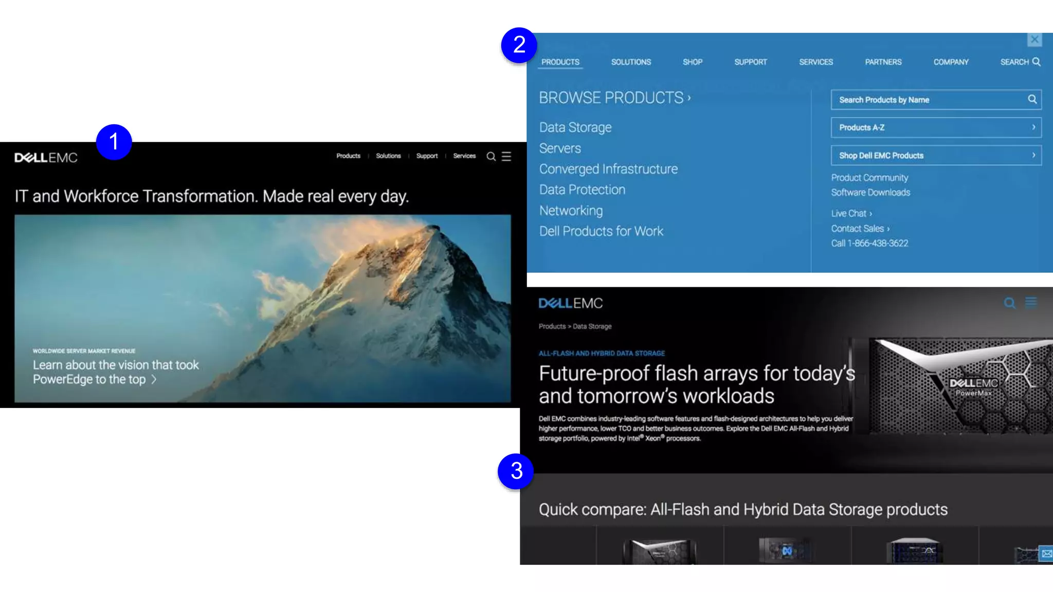
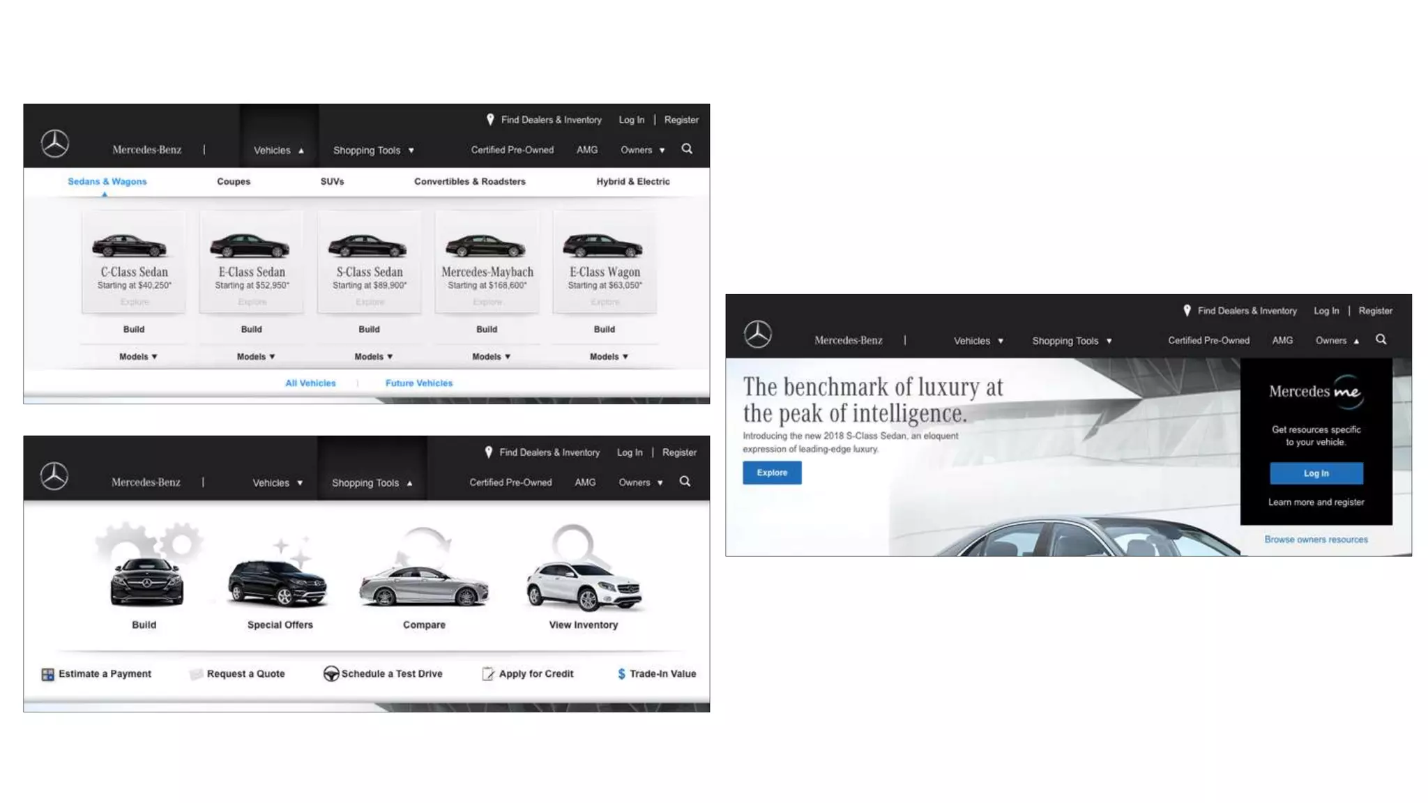
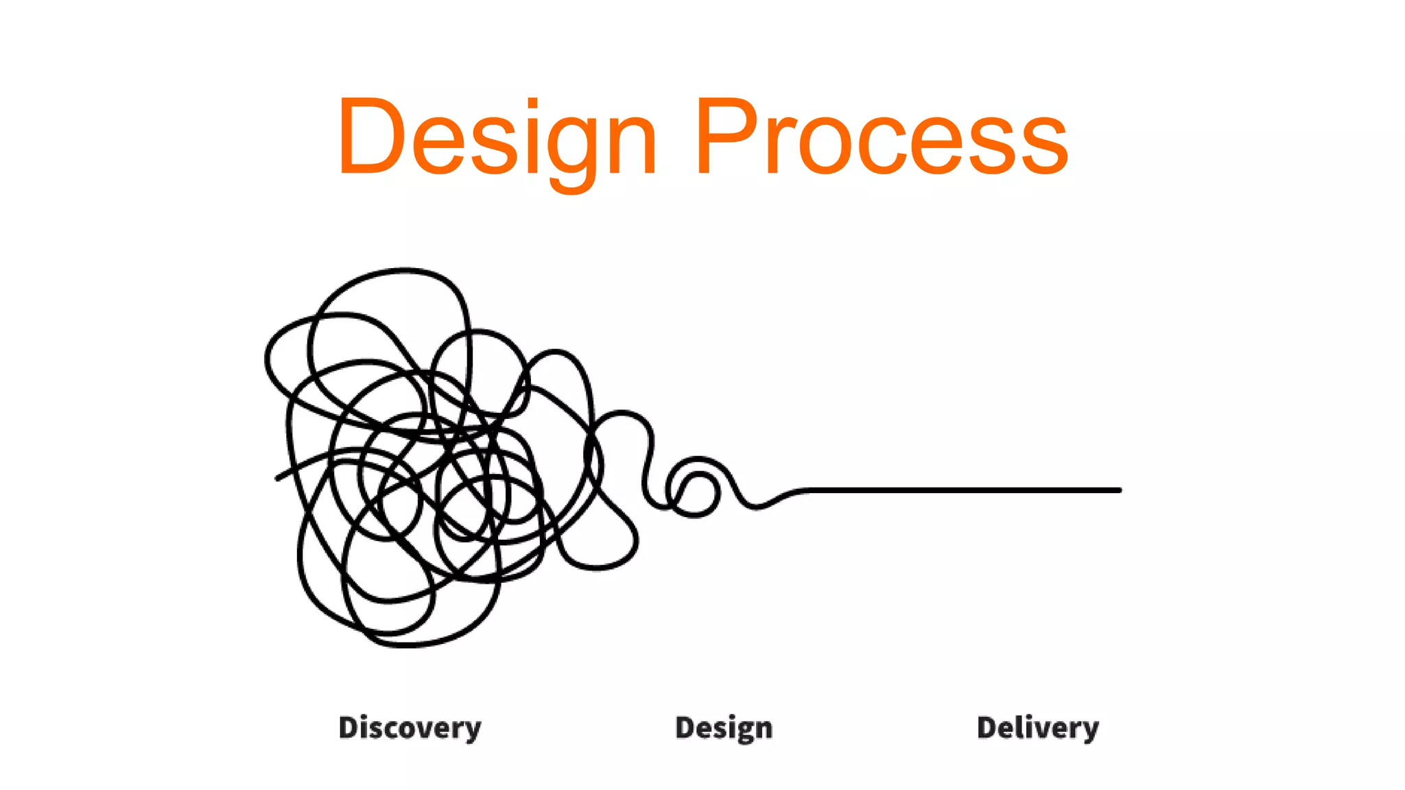
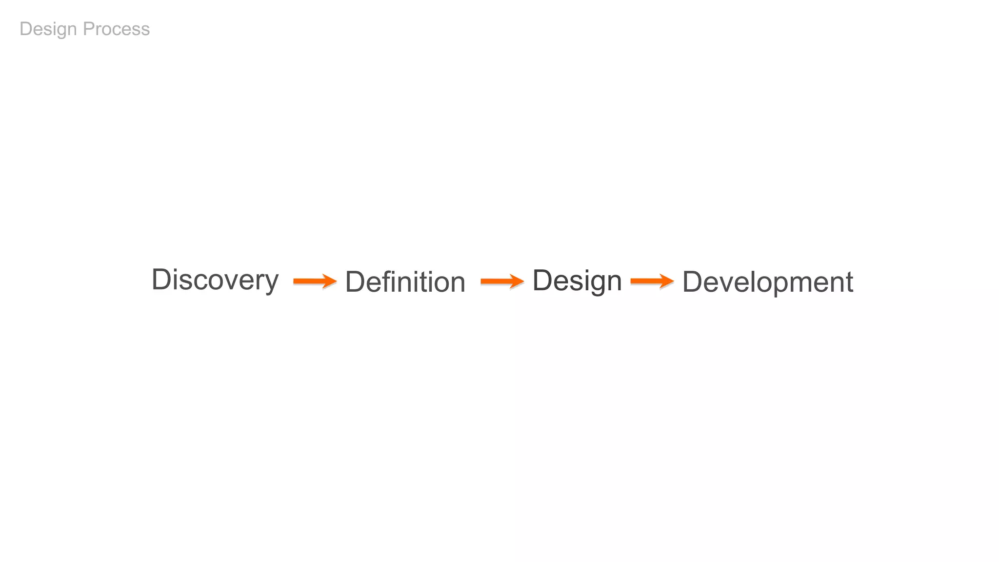
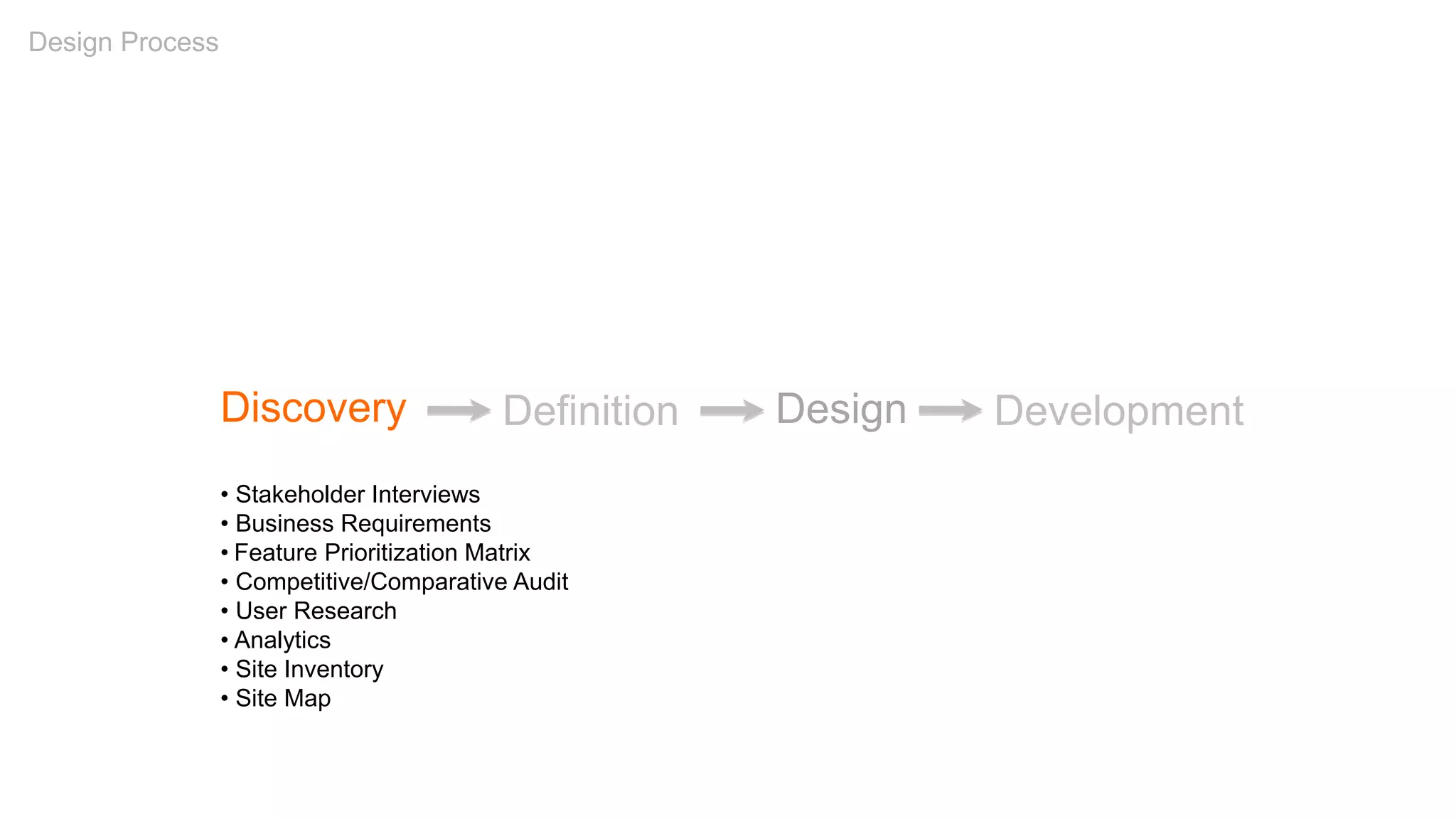
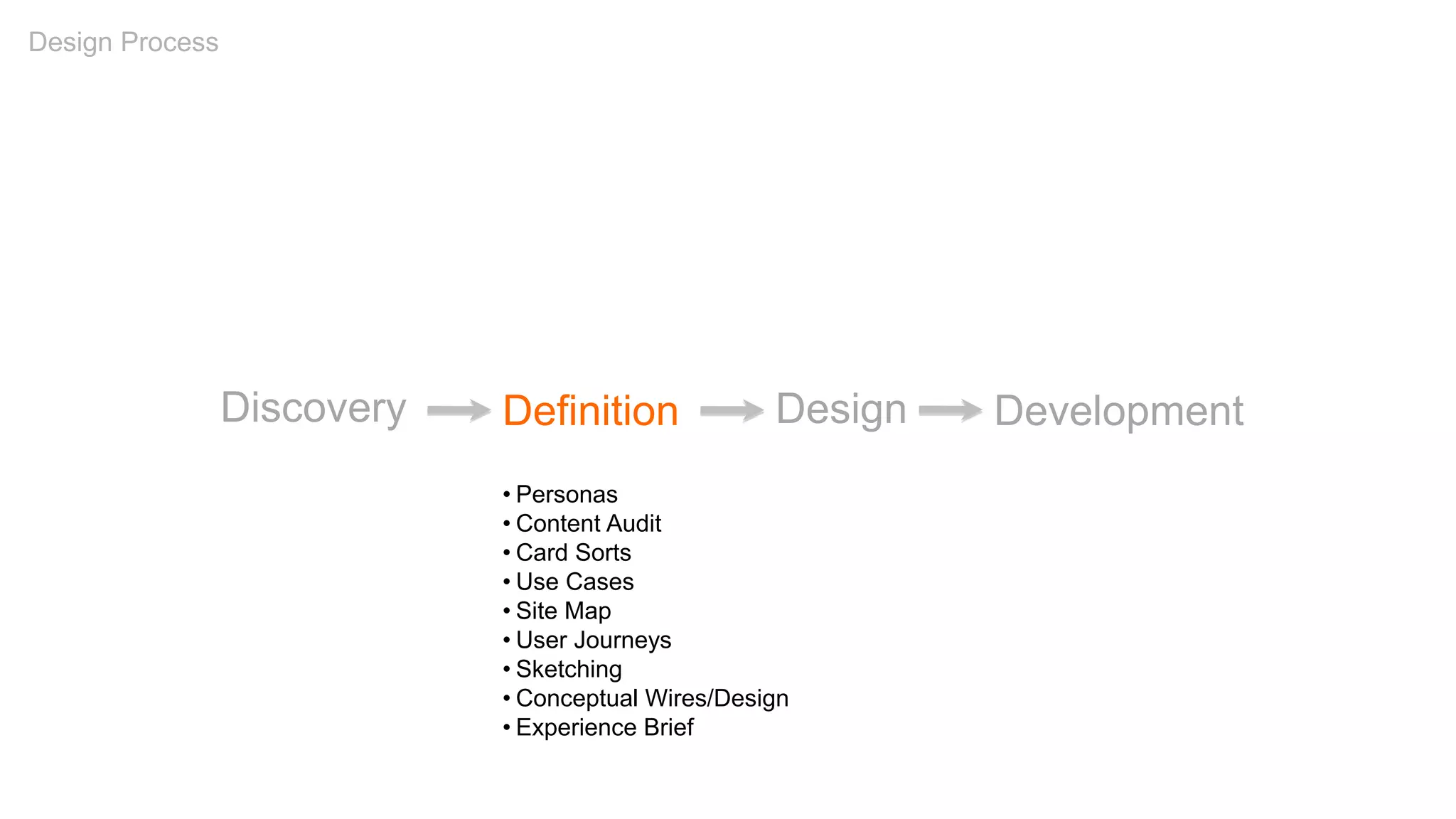
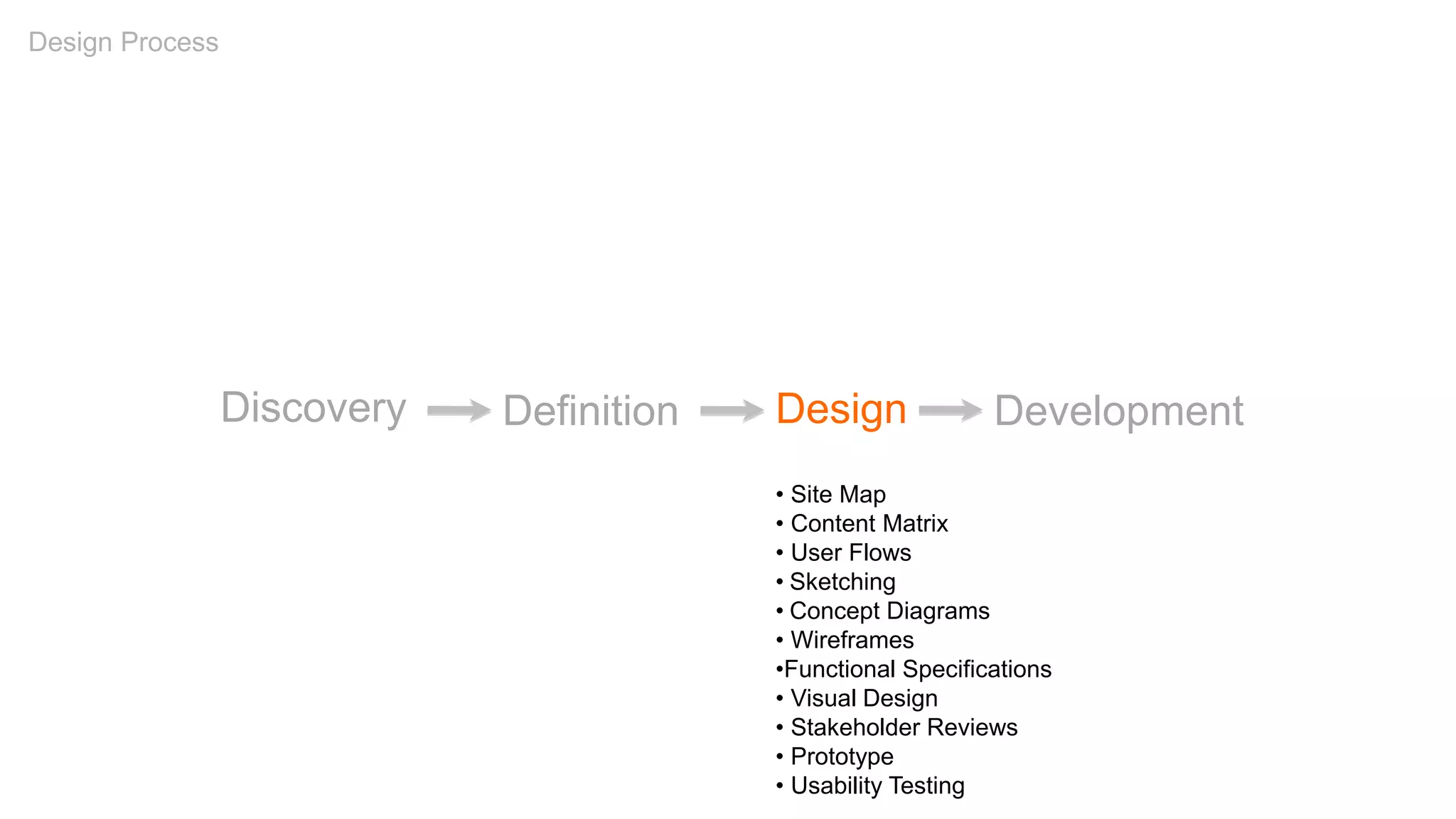
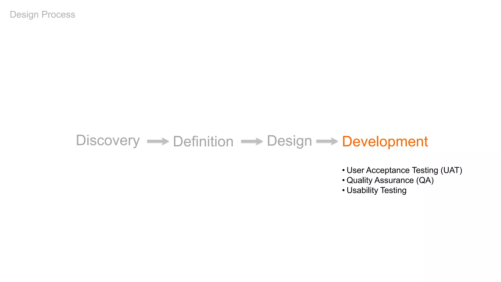
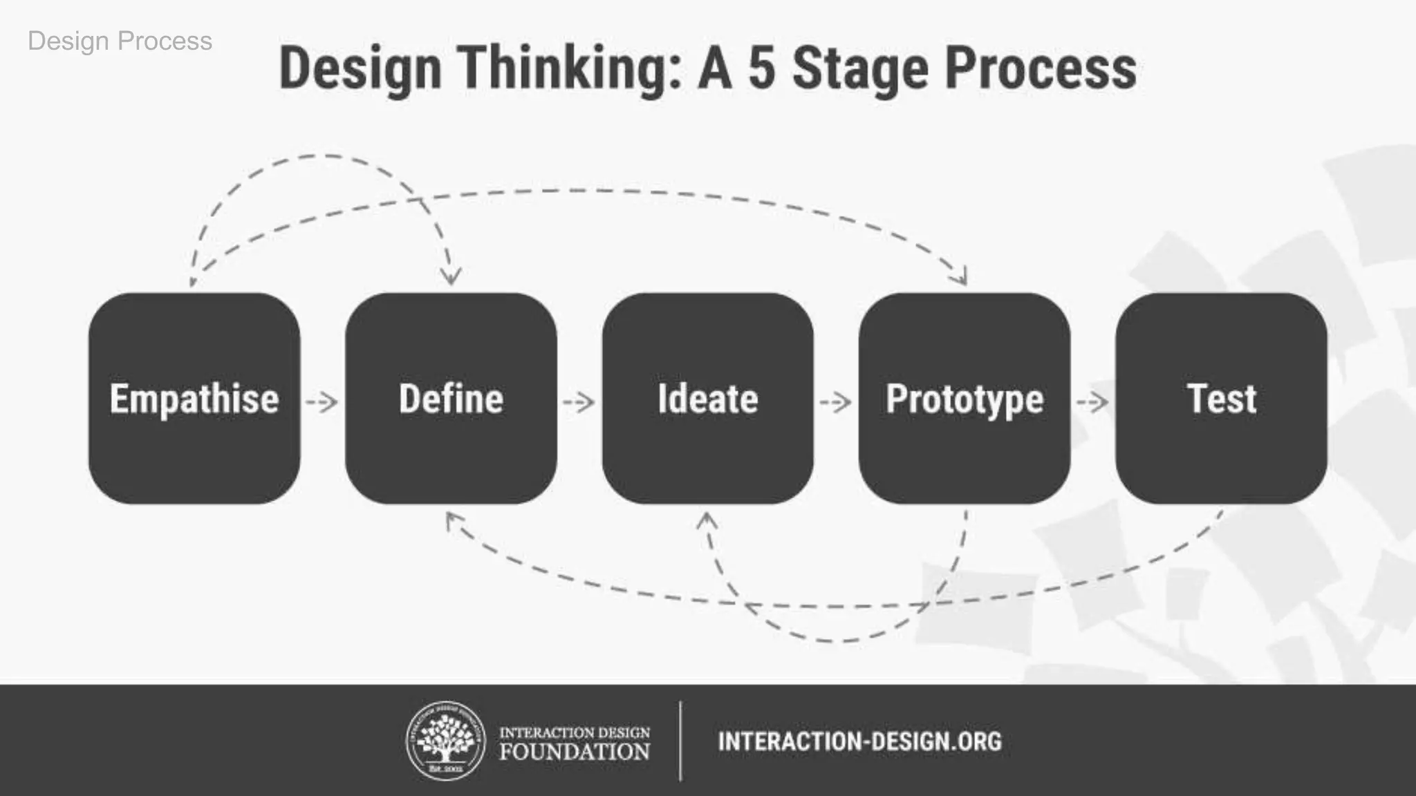
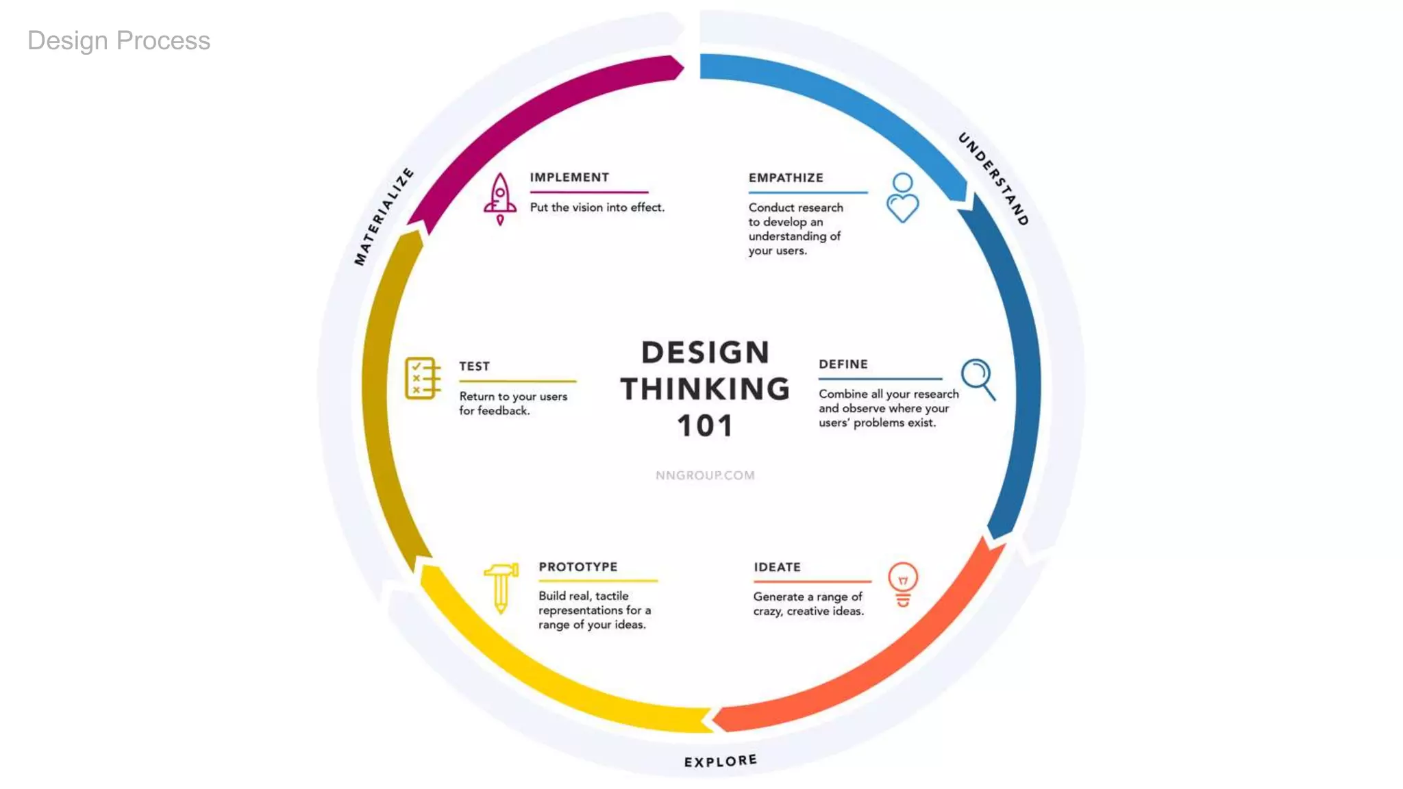
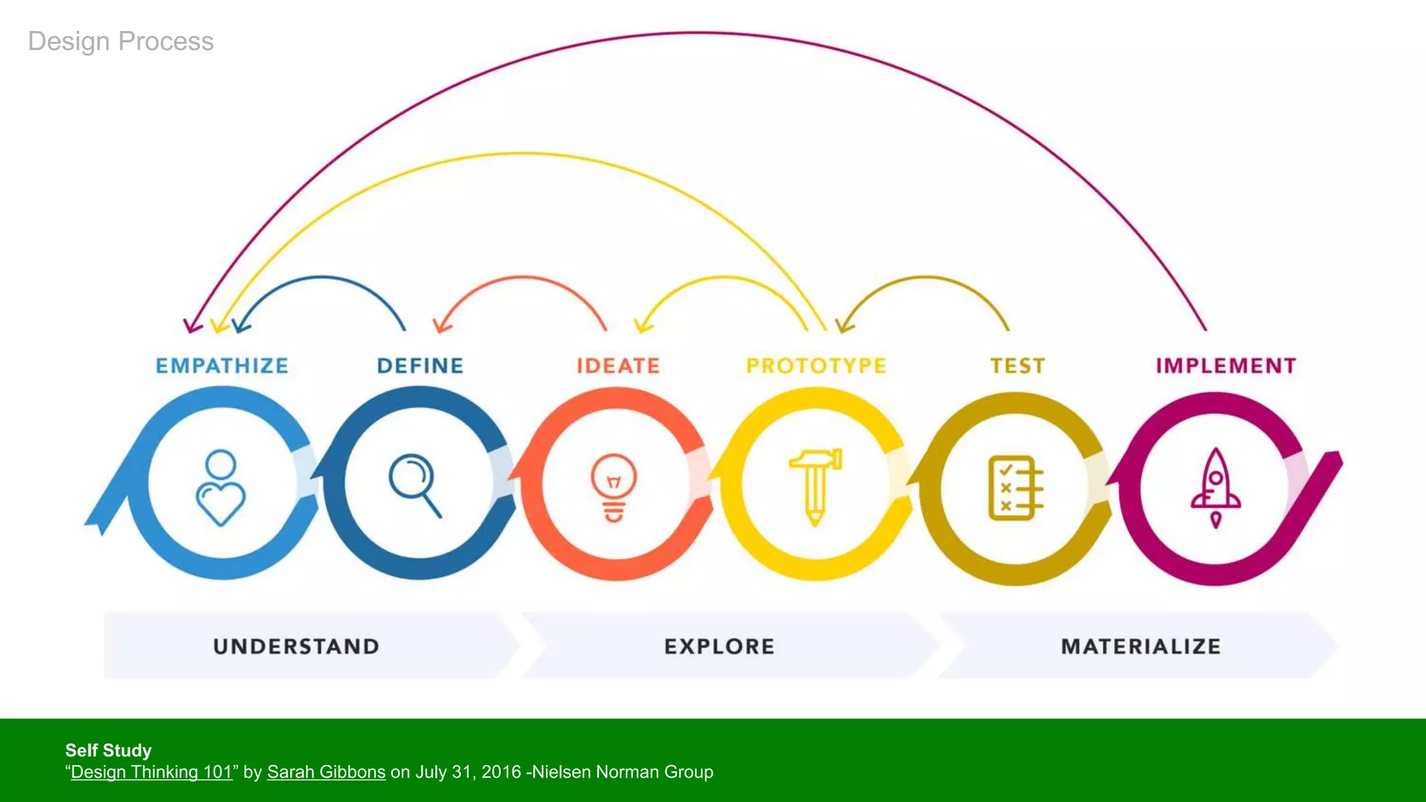
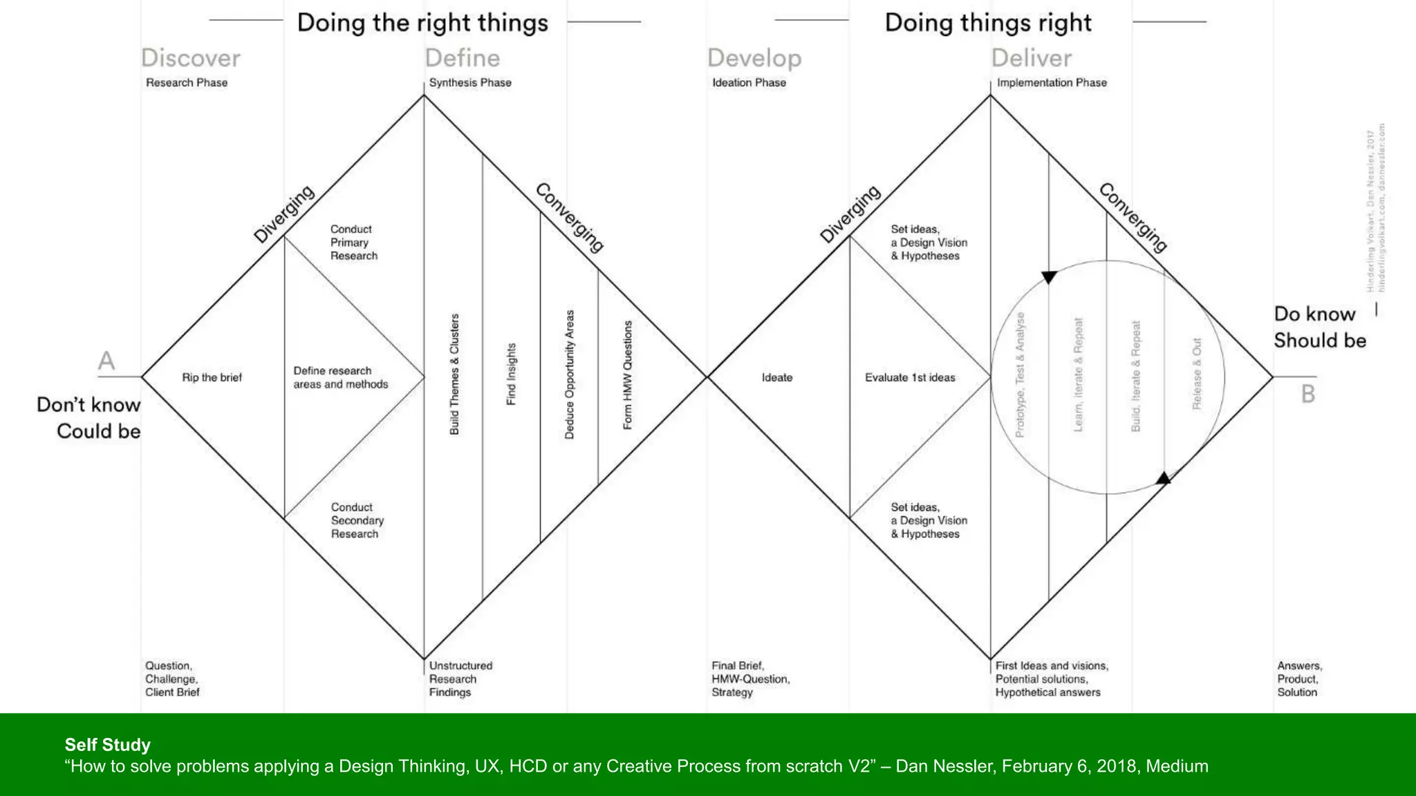
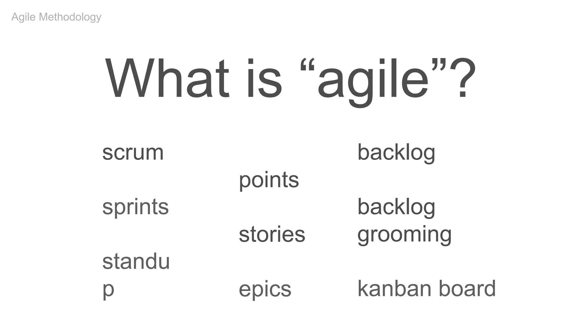
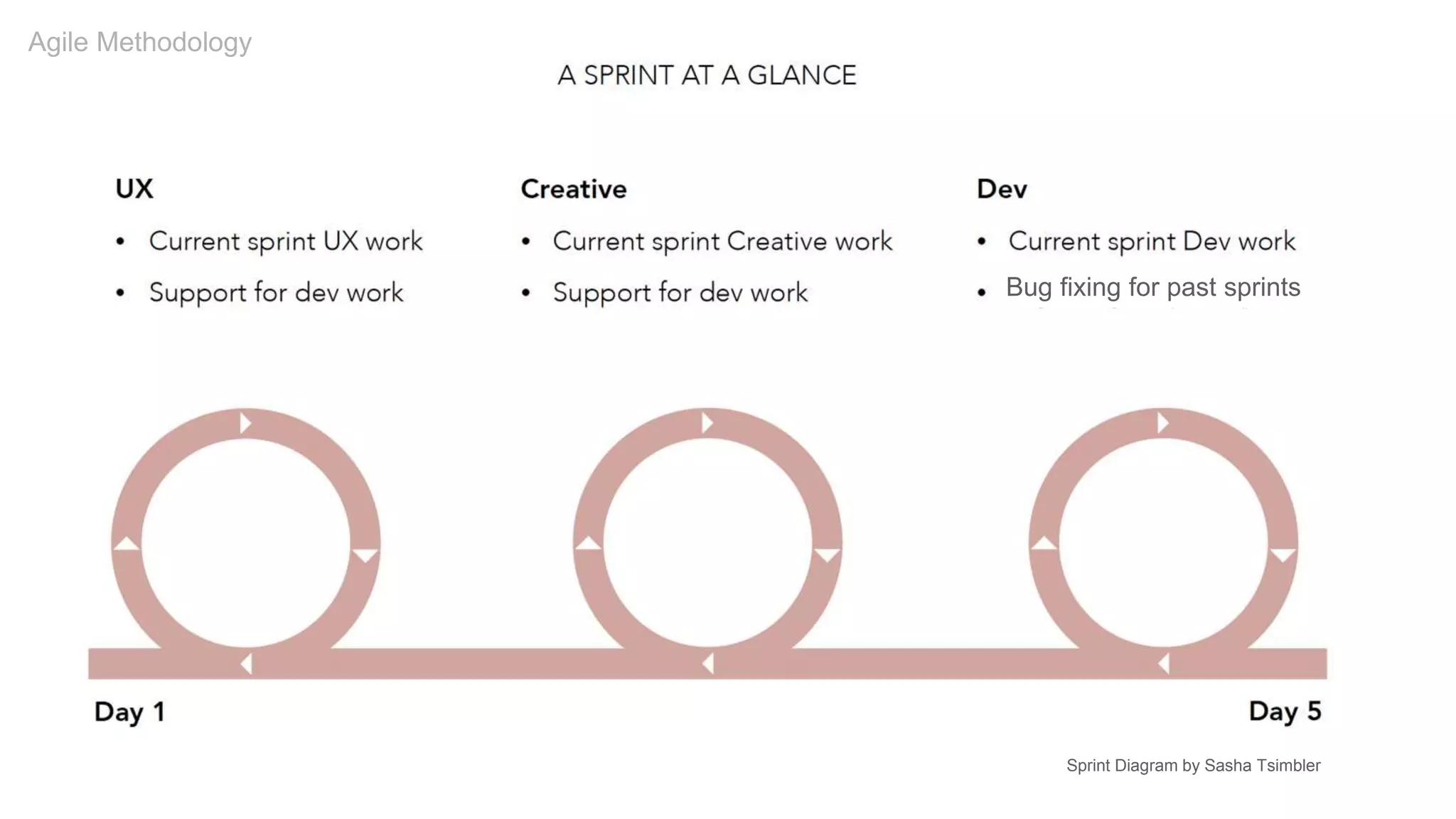
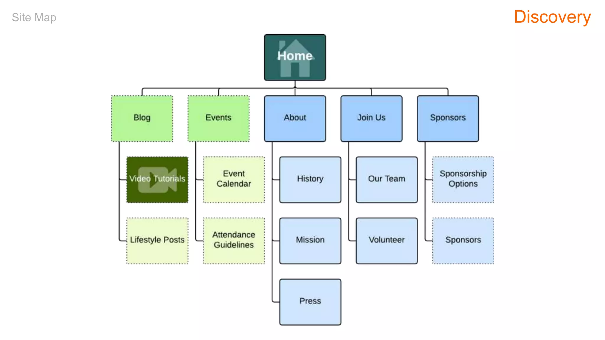
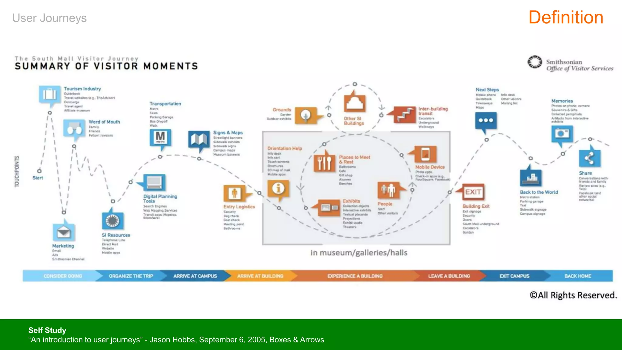
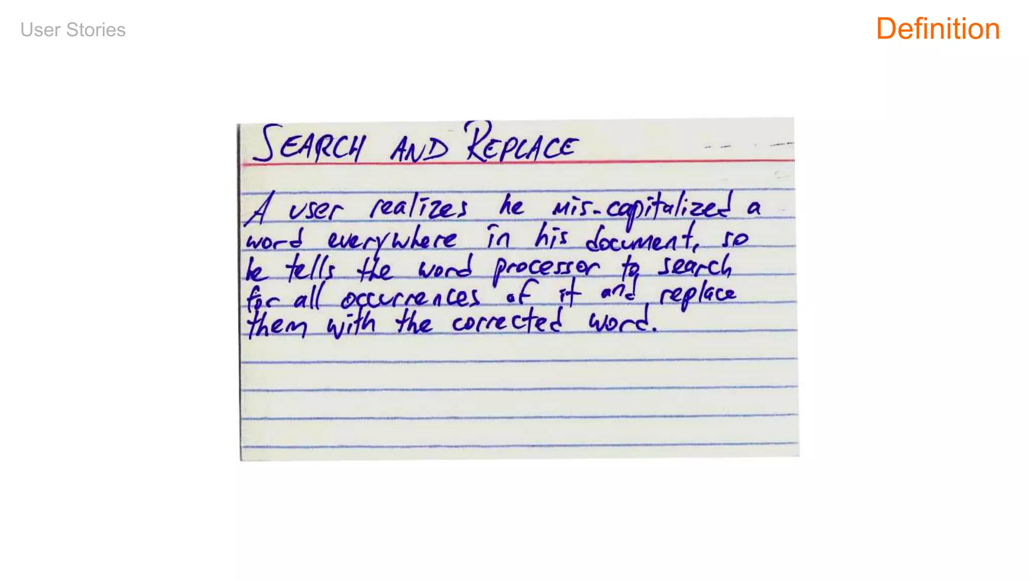
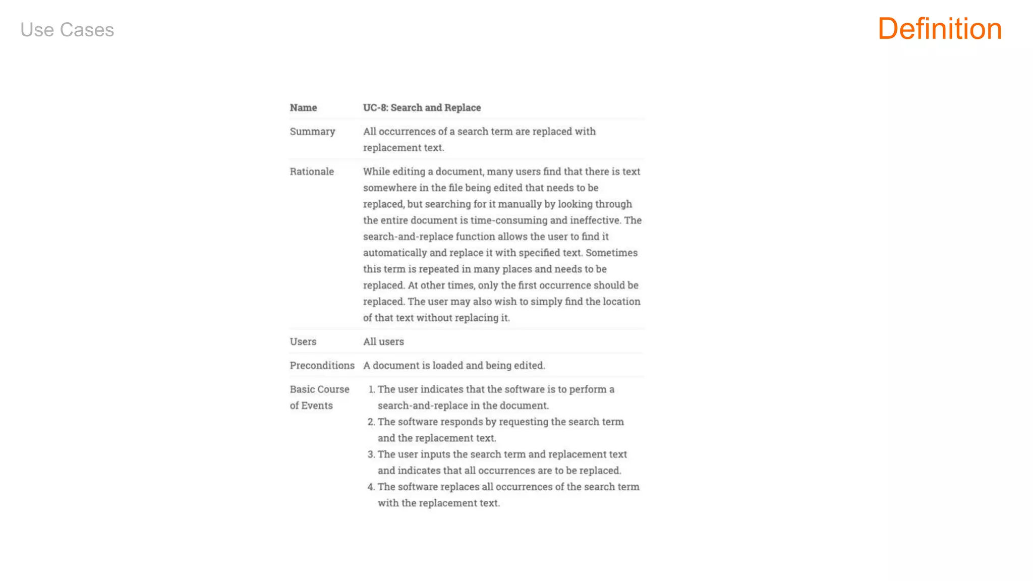
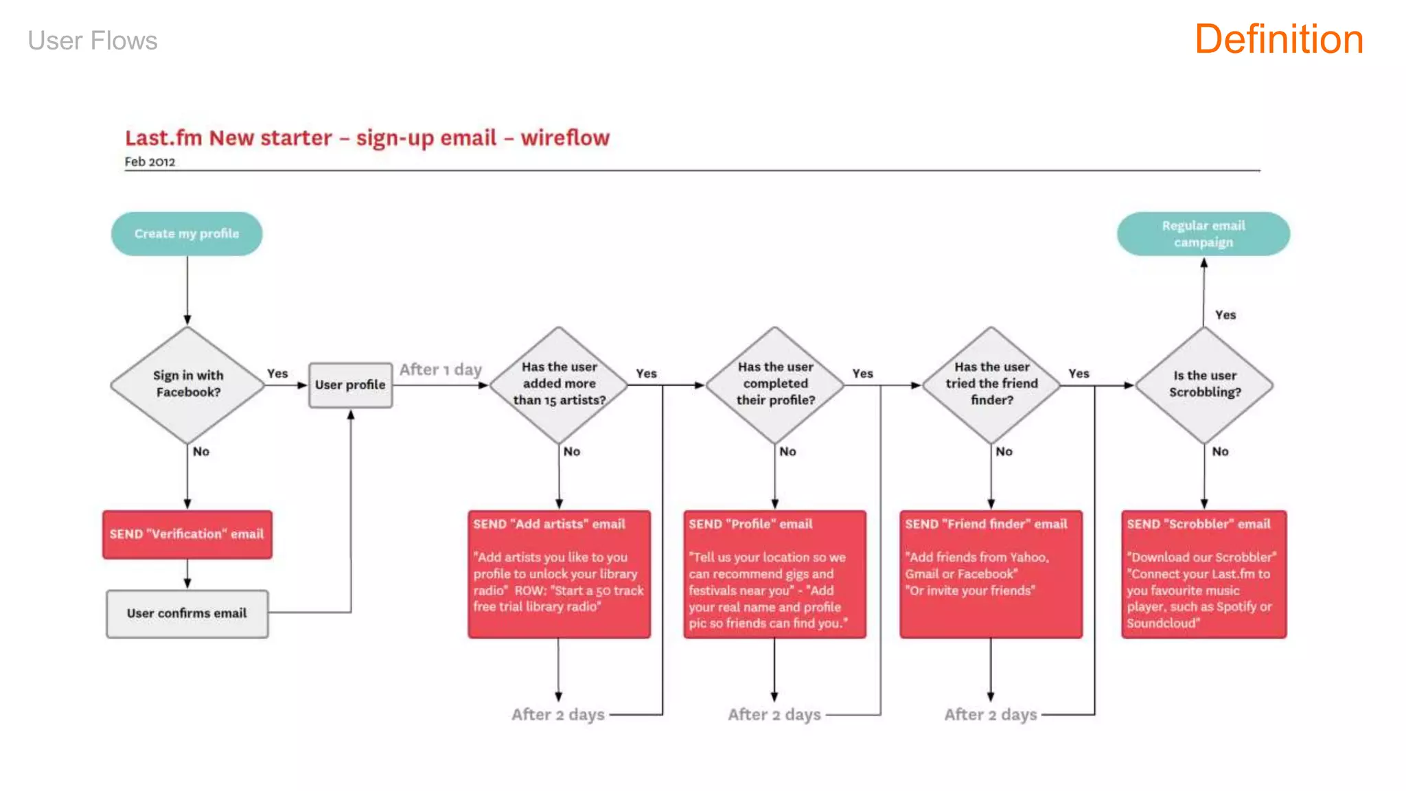
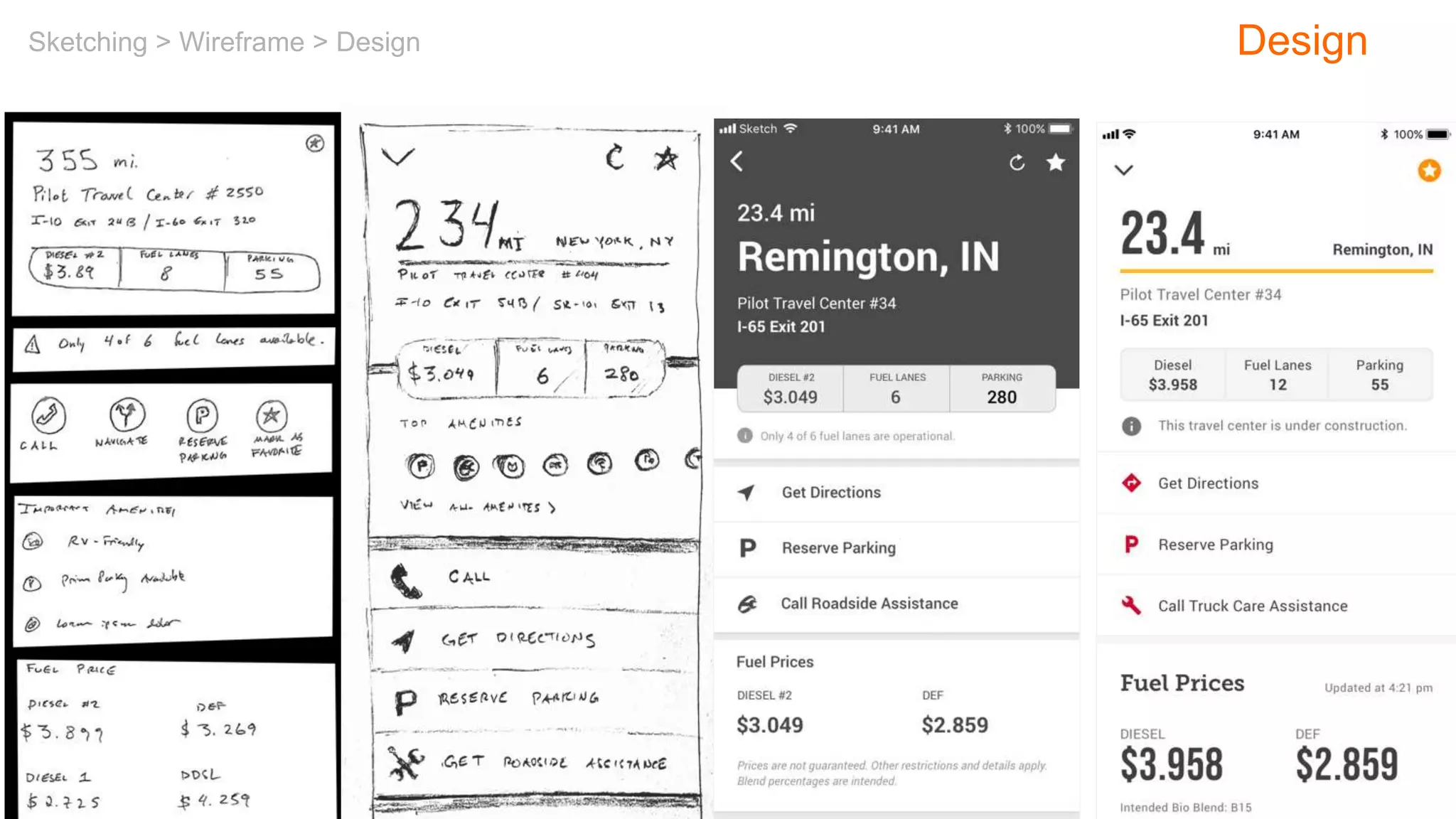
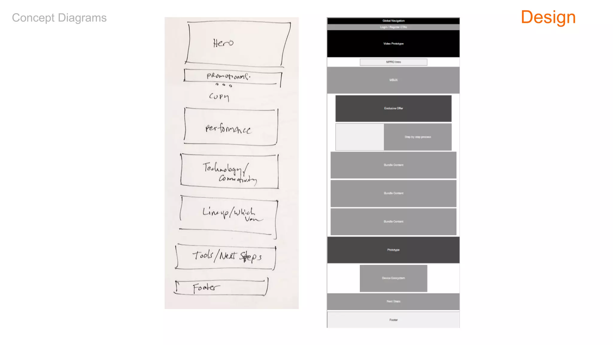
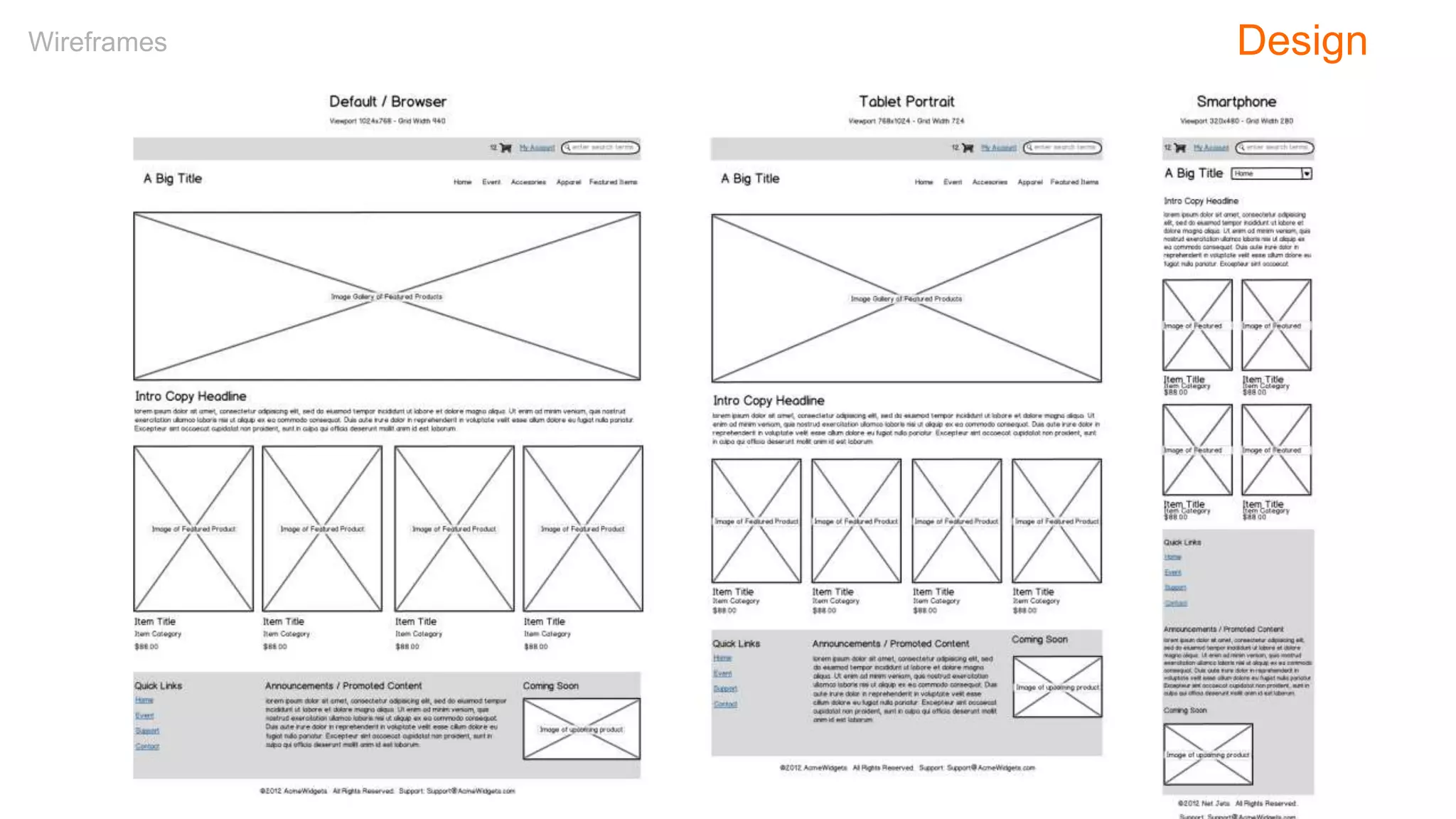
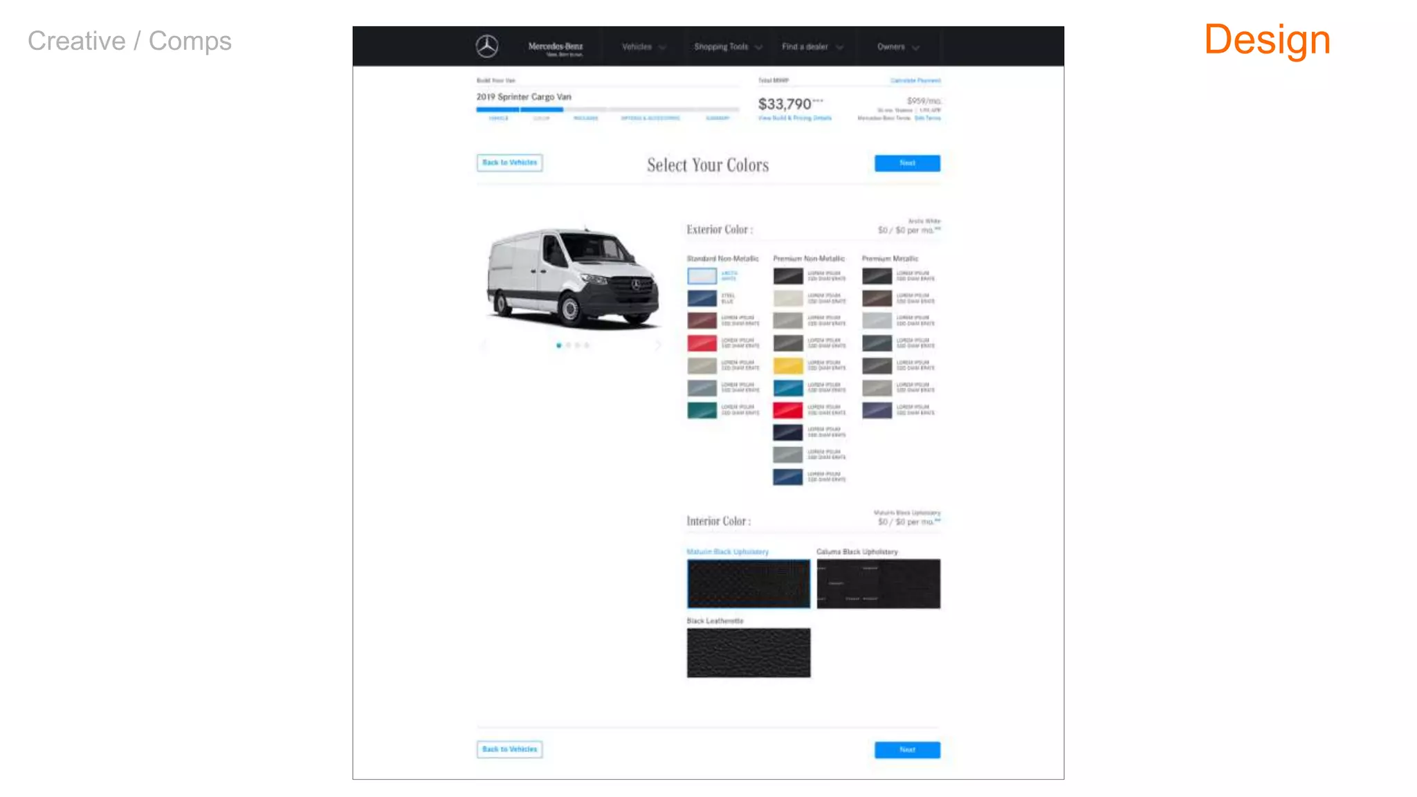
The document provides an overview of a workshop on user experience (UX) design, including its history, principles, and various methodologies such as agile and lean UX. It outlines an agenda covering topics like user research, competitive reviews, card sorting, wireframes, and usability testing. The session aims to equip participants with foundational knowledge and practical techniques essential for effective UX design.


![PowerISO 9.2 Mac Crack + Serial Key Free Download 2026 [Latest] Software.pptx](https://cdn.slidesharecdn.com/ss_thumbnails/software-251207185653-5d5700e6-thumbnail.jpg?width=640&height=640&fit=bounds)
![WinRAR Crack 7.13 Final Mac Keygen 2026 Download [Latest] Software.pptx](https://cdn.slidesharecdn.com/ss_thumbnails/software-251207185858-eb450678-thumbnail.jpg?width=640&height=640&fit=bounds)
![CleanMyMac X v5.2.8 Crack for MacOS Full Version [Latest] pptx](https://cdn.slidesharecdn.com/ss_thumbnails/softwareoverview-251207194121-a81f0142-thumbnail.jpg?width=640&height=640&fit=bounds)


![Chapter4_Initiation_of_Sediment_Motion_v2[1].pptx](https://cdn.slidesharecdn.com/ss_thumbnails/chapter4initiationofsedimentmotionv21-251208223747-f94ef163-thumbnail.jpg?width=640&height=640&fit=bounds)


