Download to read offline
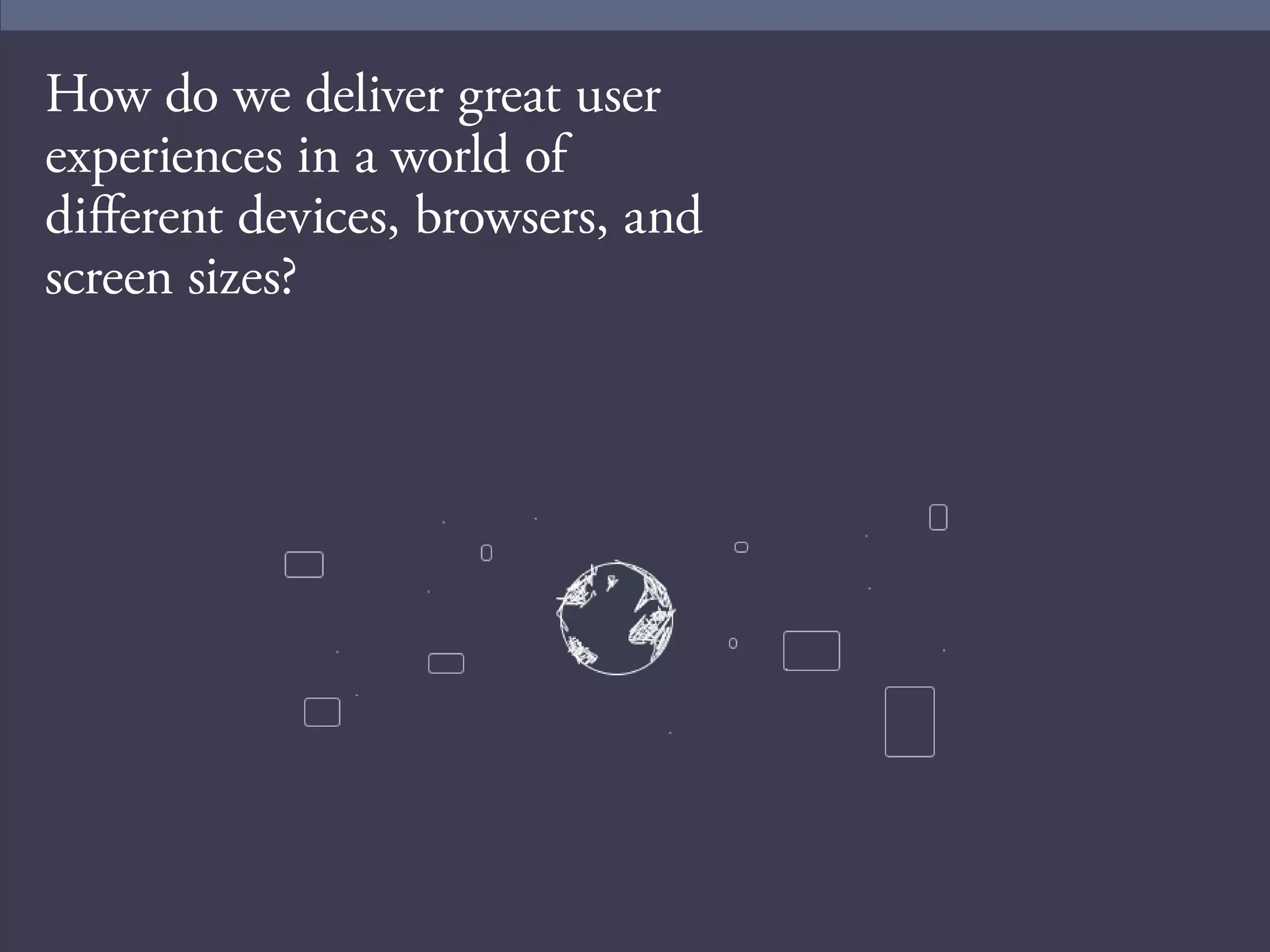
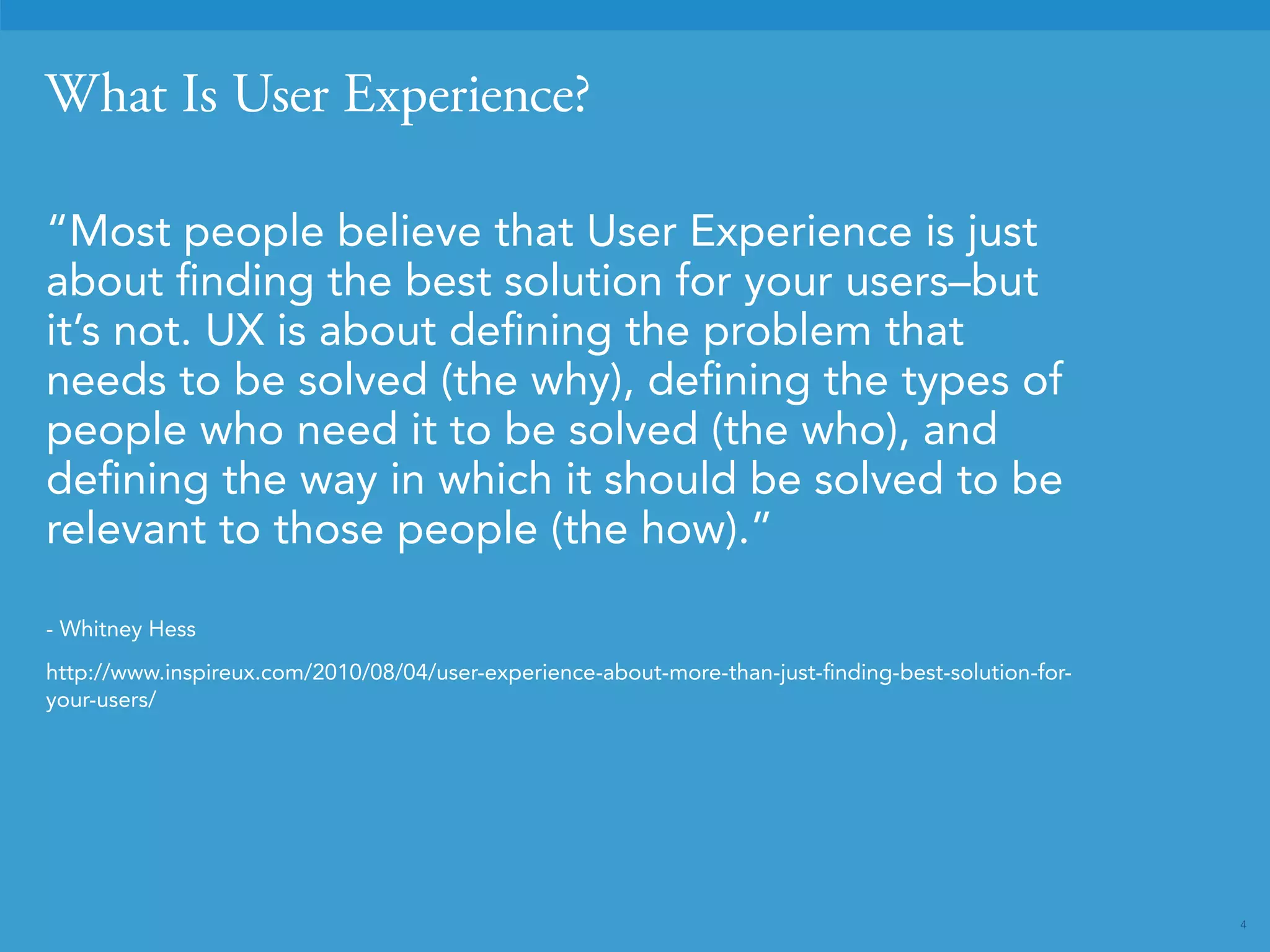

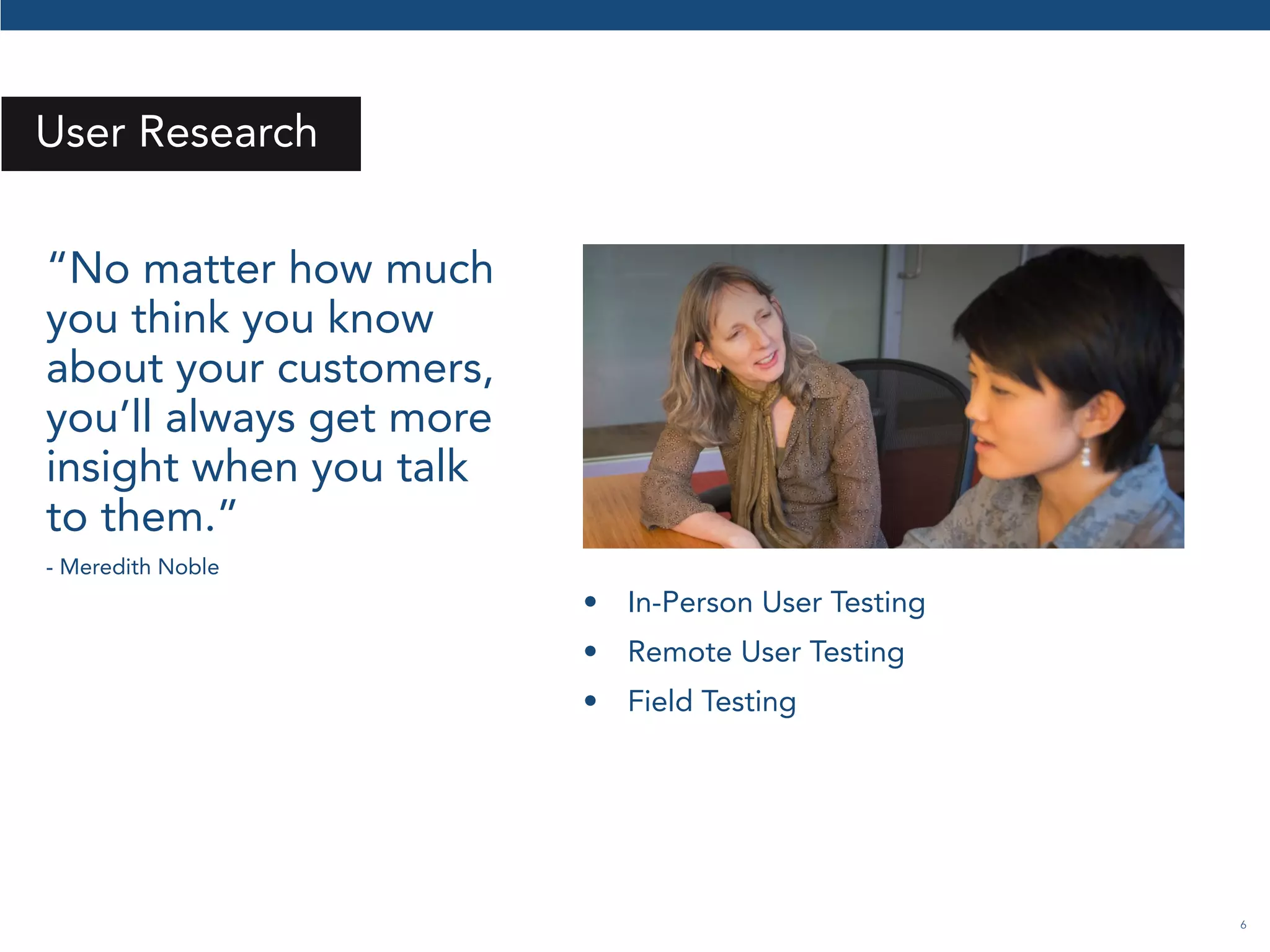
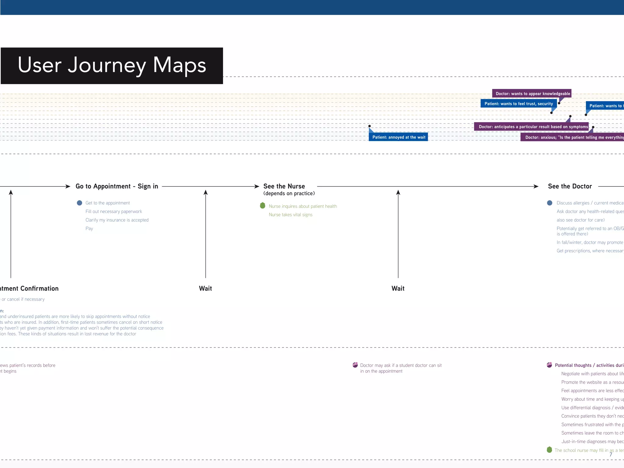
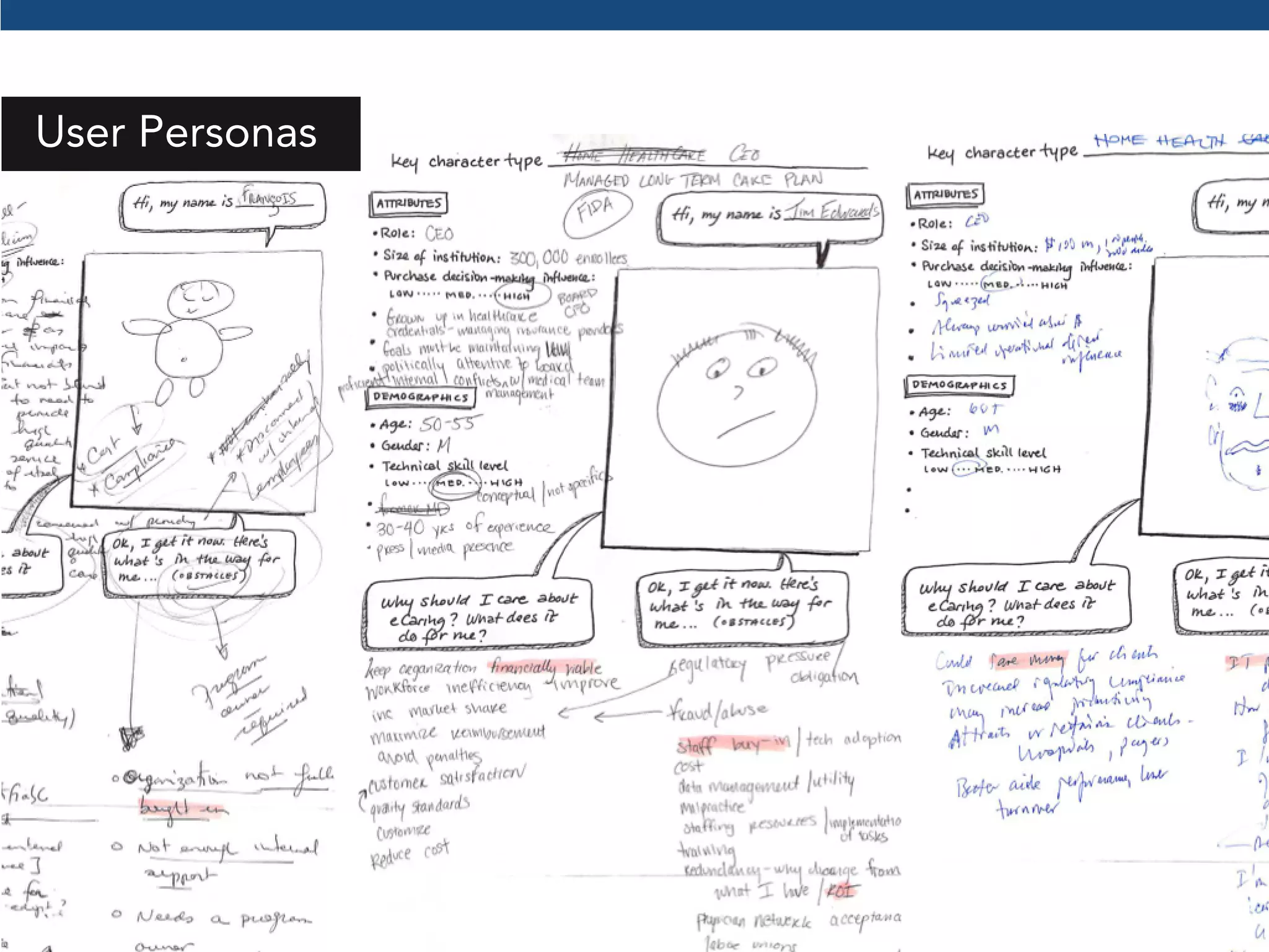
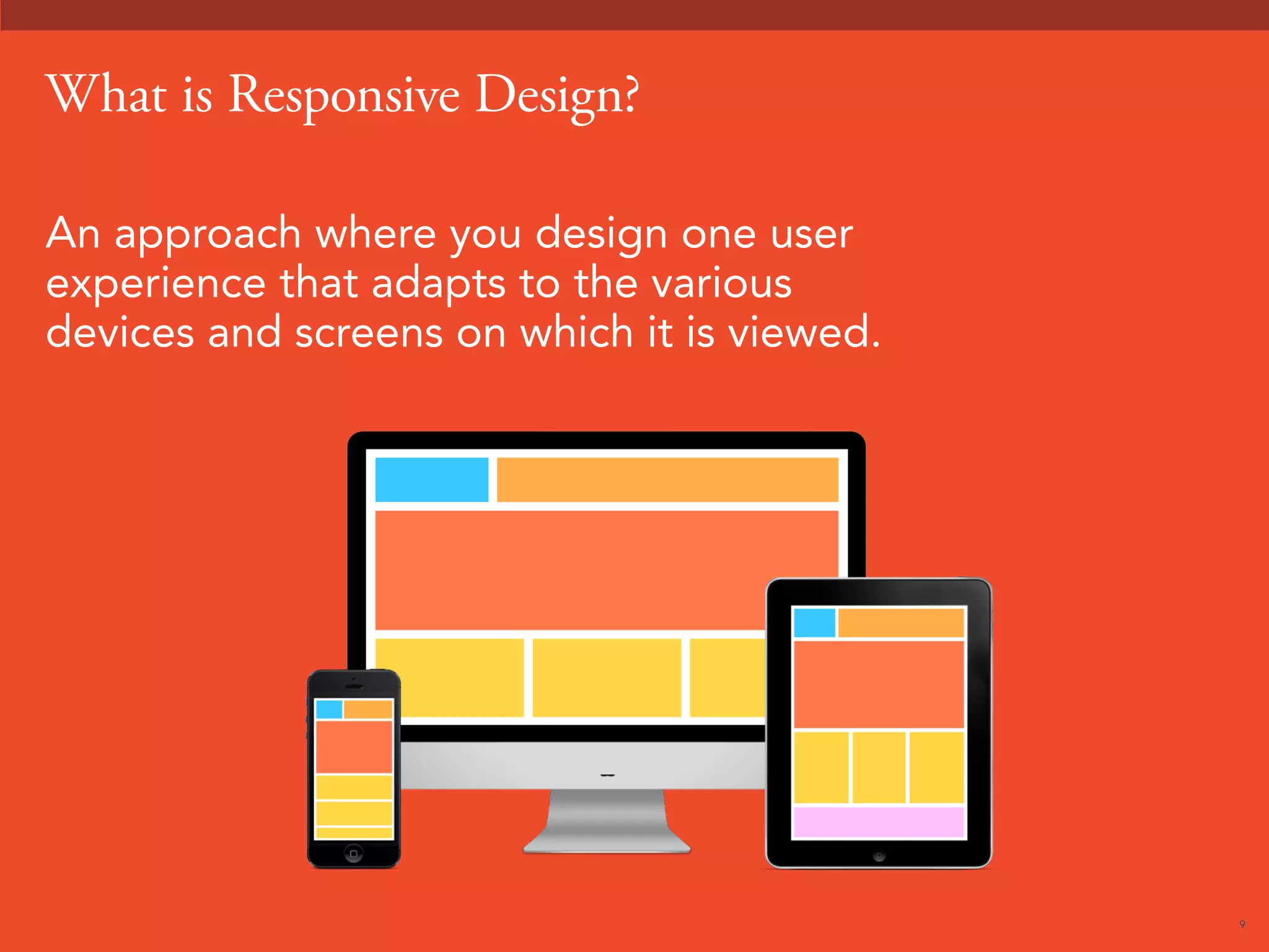
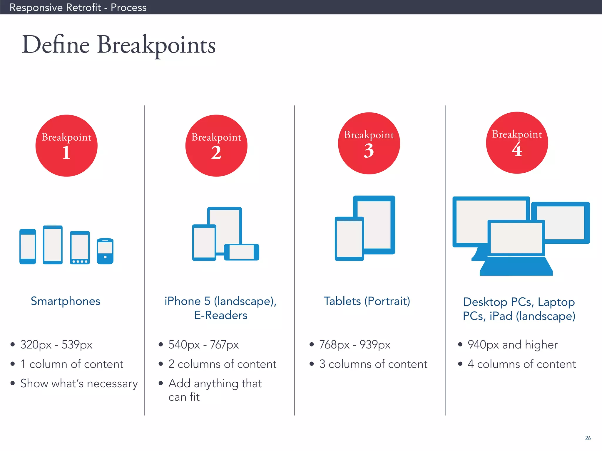
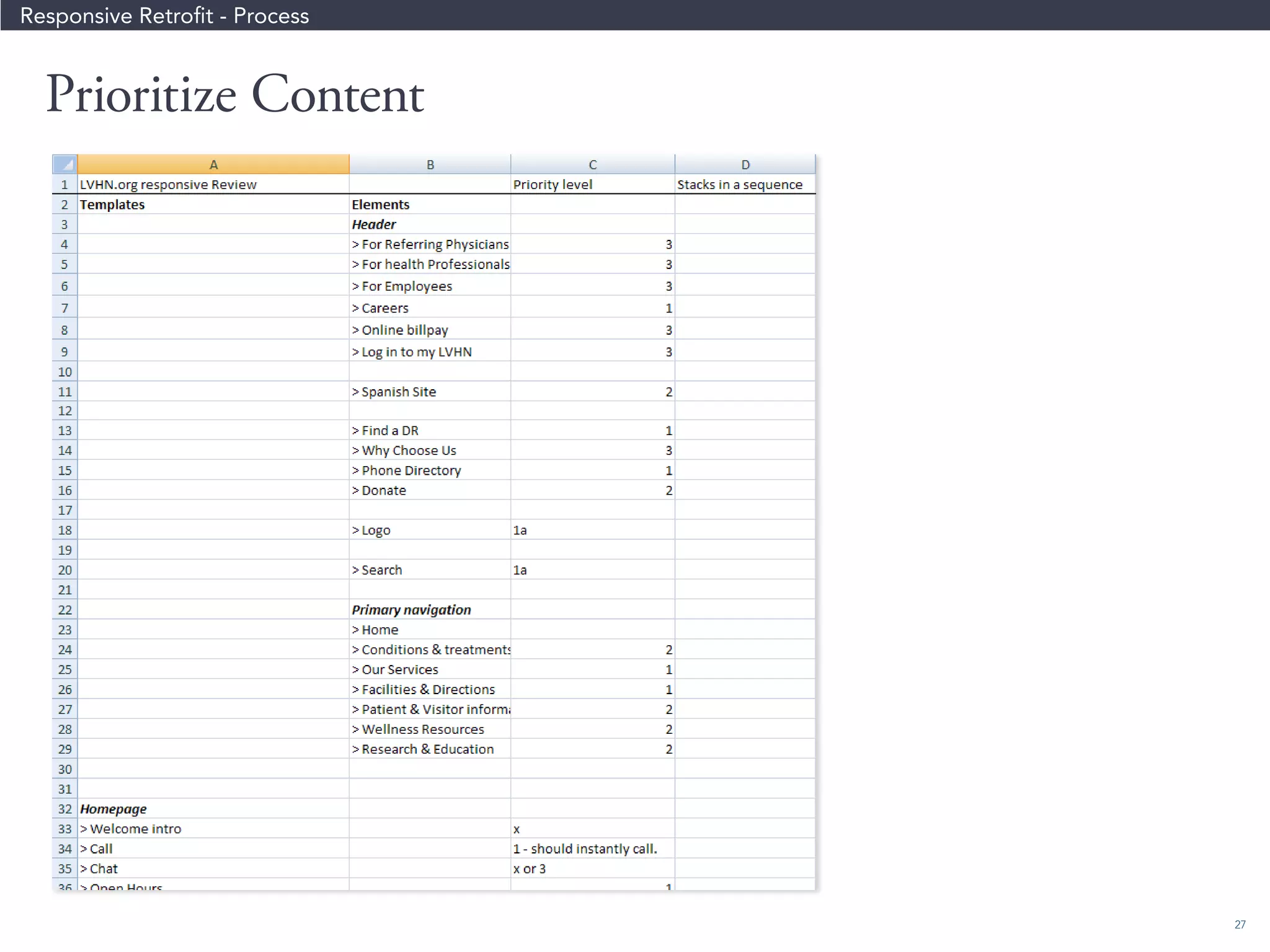
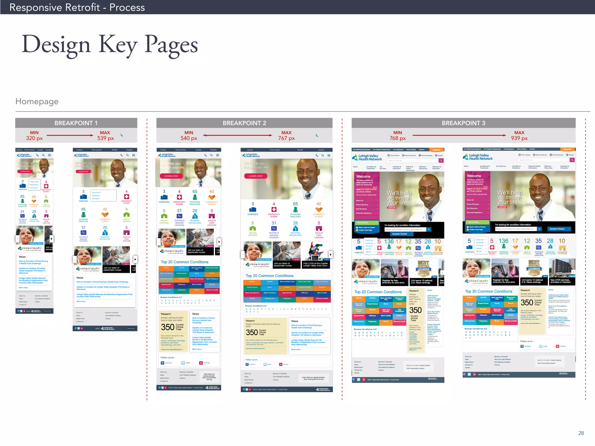
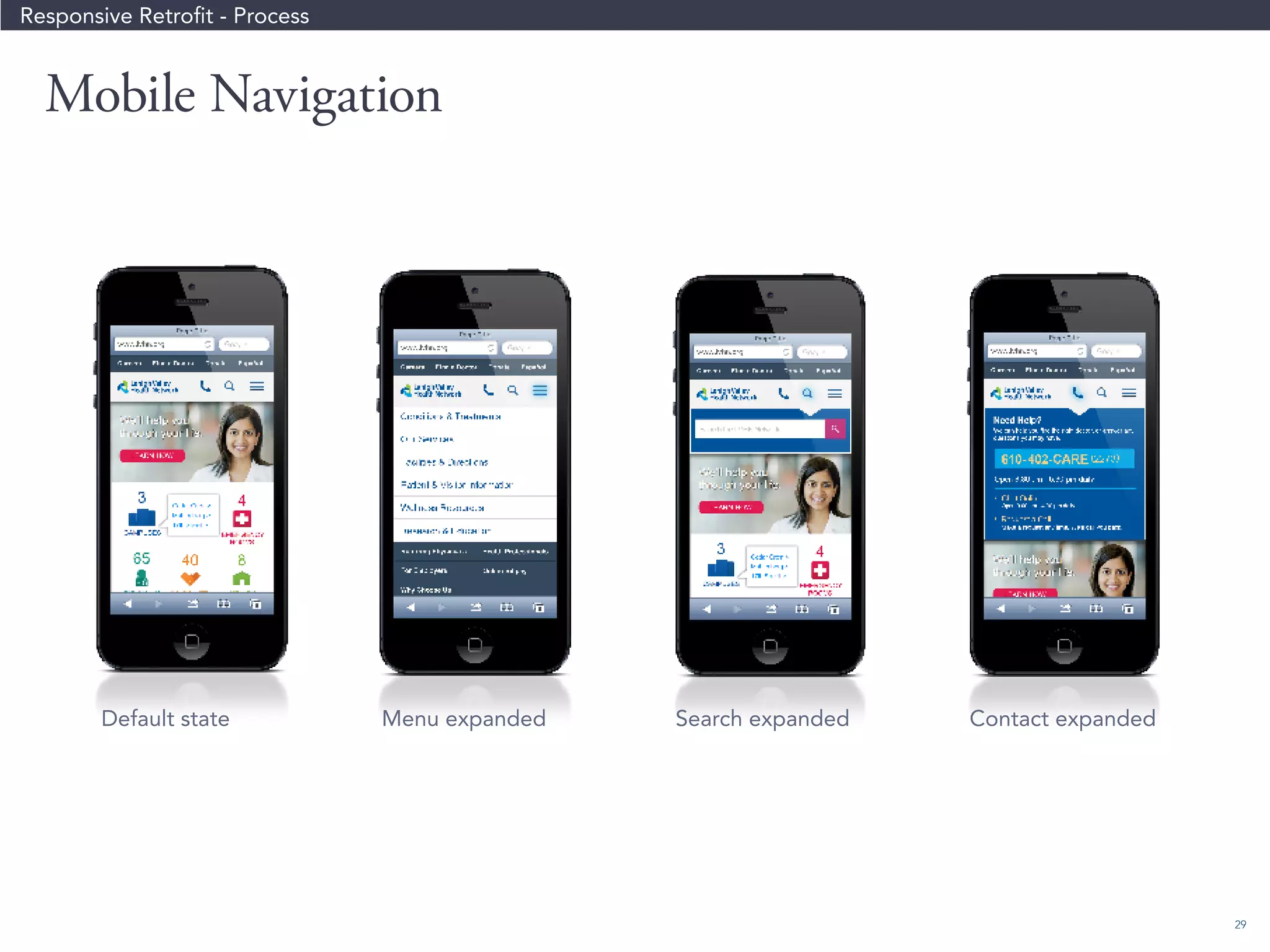


The webinar focuses on delivering effective user experiences across multiple devices by defining user experience beyond aesthetics, emphasizing the importance of user research and responsive design. Key topics include the benefits and challenges of responsive design, practical tips for achieving it, and the collaborative processes between designers and developers. The session encourages continuous improvement and user feedback to enhance digital products.


