Downloaded 14 times


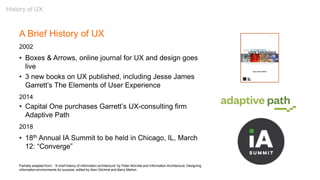


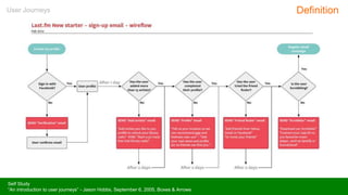


![“[I]n a delicate inquiry like this, little is to be gained by
distributing circulars. A single patient with the right sort
of lesion and a scientific mind, carefully cross-
examined, is more likely to deepen our knowledge than
a thousand circulars answered as the average patient
answers them, even though the answers be never so
thoroughly collated by the investigator.”
- William James, “The Consciousness of Lost Limbs,” 1887
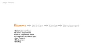
Discovery: User Research](https://image.slidesharecdn.com/introtouxdesign021718-180218032752/85/Introduction-to-User-Experience-Design-02-17-18-76-320.jpg)


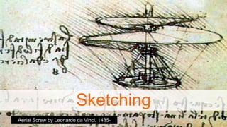
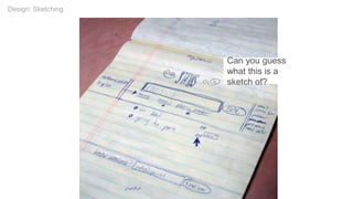
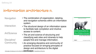
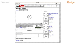
![Twitter
Design: Sketching
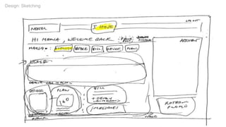
[This sketch] has very special significance – it's hanging in the office
somewhere with one other page. Whenever I'm thinking about something, I
really like to take out the yellow notepad and get it down.
– Jack Dorsey, Twitter](https://image.slidesharecdn.com/introtouxdesign021718-180218032752/85/Introduction-to-User-Experience-Design-02-17-18-115-320.jpg)


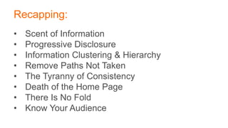
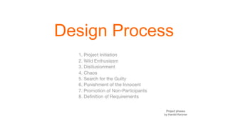
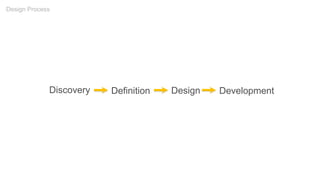
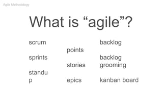
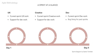
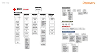
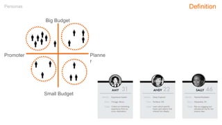
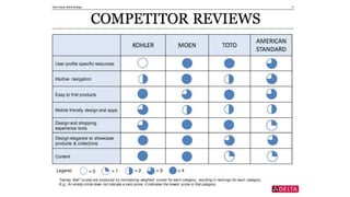
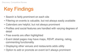
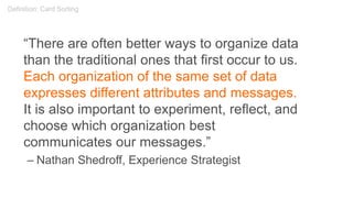
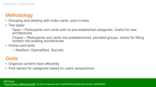
Robert Stribley gave a presentation on user experience design. He discussed the history and background of UX, key UX principles like scent of information and progressive disclosure, the design process, agile methodology, and common UX deliverables like personas and user journeys. The workshop covered user research, a competitive review, card sorting to help structure information, creating site maps and page templates, and different types of navigation. The project involved redesigning Events.com to be a better resource for finding and promoting events in various cities.


