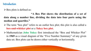
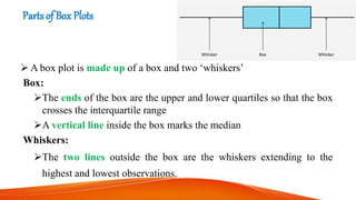
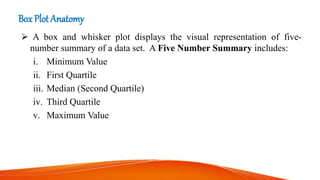
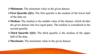
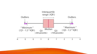
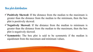
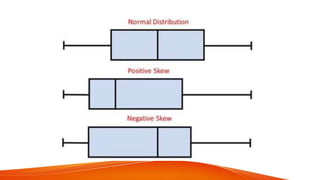
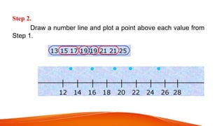
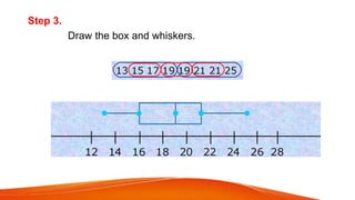
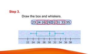
This document provides an introduction to box plots, including their anatomy, parts, and applications. It discusses the five number summary used to construct box plots, which includes the minimum, first quartile, median, third quartile, and maximum. Examples are given to demonstrate how to construct a box plot from a data set by ordering the values, finding the five number summary, and plotting the box and whiskers on a number line. Box plots can show the distribution, outliers, and skew of a data set.
Box and whisker plot is a statistical measure to show the distribution of data. It is also called as Five Number Summary box as it consists of the median, the quartiles (lower and upper) and smallest and greatest values in distribution.
Range, quartiles, and interquartile rangeswarna sudha
The IQR describes the middle 50% of values when ordered from lowest to highest. To find the interquartile range (IQR), first find the median (middle value) of the lower and upper half of the data. These values are quartile 1 (Q1) and quartile 3 (Q3). The IQR is the difference between Q3 and Q1.
Measure of dispersion has two types Absolute measure and Graphical measure. There are other different types in there.
In this slide the discussed points are:
1. Dispersion & it's types
2. Definition
3. Use
4. Merits
5. Demerits
6. Formula & math
7. Graph and pictures
8. Real life application.
What is a Box Plot ?
In descriptive statistics, a boxplot is a method for graphically depicting groups of numerical data through their quartiles. Box plots may also have lines extending from the boxes (whiskers) indicating variability outside the upper and lower quartiles, hence the terms box-and-whisker plot and box-and-whisker diagram
Box plots are non-parametric: they display variation in samples of a statistical population without making any assumptions of the underlying statistical distribution
The spacings between the different parts of the box indicate the degree of dispersion (spread) and skewness in the data, and show outliers.
Box Plot Requirement
Minimum : the lowest data point excluding any outliers.
Maximum : the largest data point excluding any outliers.
Median (Q2 / 50th percentile) : the middle value of the dataset.
First quartile (Q1 / 25th percentile) : also known as the lower quartile qn(0.25), is the median of the lower half of the dataset.
Third quartile (Q3 / 75th percentile) : also known as the upper quartile qn(0.75), is the median of the upper half of the dataset.
Interquartile range (IQR) : is the distance between the upper and lower quartiles
IQR =Q3-Q1= qn(0.75) –qn(0.25)
A boxplot is constructed of two parts, a box and a set of whiskers . The lowest point is the minimum of the data set and the highest point is the maximum of the data set. The box is drawn from Q1 to Q3 with a horizontal line drawn in the middle to denote the median.
Why Box Plot is useful ?
Box plots divide the data into sections that each contain approximately 25% of the data in that set.
When the median is in the middle of the box, and the whiskers are about the same on both sides of the box, then the distribution is symmetric
When the median is closer to the bottom of the box, and if the whisker is shorter on the lower end of the box, then the distribution is positively skewed (skewed right)
When the median is closer to the top of the box, and if the whisker is shorter on the upper end of the box, then the distribution is negatively skewed (skewed left)
How to compare box plot
How to draw box plot on Excel
Step 2: Calculate quartile differences
Next, calculate the differences between each phase. In effect, you have to calculate the differentials between the following:
First quartile and minimum value
Median and first quartile
Third quartile and median
Maximum value and third quartile
Step 3: Create a stacked column chart
The data in the third table is well suited for a box plot, and we'll start by creating a stacked column chart which we'll then modify.
Select all the data from the third table, and click Insert > Insert Column Chart > Stacked Column.
To reverse the chart axes, right-click on the chart, and click Select Data.
Click Switch Row/Column.
Click OK.
The next step is to replace the topmost and second-from-bottom (the deep blue and orange areas in the image) data series with lines, or whiskers.
Select the to
The Role of Box Plots in Comparing Multiple Data SetsCIToolkit
A box plot is a graph that shows the frequency of numeric data values. It can be drawn either horizontally or vertically. It is referred to as a Box-and-Whisker Plot.
TSTD 6251 Fall 2014SPSS Exercise and Assignment 120 PointsI.docxnanamonkton
TSTD 6251 Fall 2014
SPSS Exercise and Assignment 1
20 Points
In this class, we are going to study descriptive summary statistics and learn how to construct box plot. We are still working with univariate variable for this exercise.
Practice Example:
Admission receipts (in million of dollars) for a recent season are given below for the
n =
30 major league baseball teams:
19.4 26.6 22.9 44.5 24.4 19.0 27.5 19.9 22.8 19.0 16.9 15.2 25.7 19.0 15.5 17.1 15.6 10.6 16.2 15.6 15.4 18.2 15.5 14.2 9.5 9.9
10.7 11.9 26.7 17.5
Require:
a. Compute the mean, variance and standard deviation.
b. Find the sample median, first quartile, and third quartile.
c. Construct a boxplot and interpret the distribution of the data.
d. Discuss the distribution of this set of data by examining kurtosis and skewness
statistics, such as if the distribution is skewed to one side of the distribution, and if the
distribution shows a peaked/skinny curve or a spread out/flat curve.
SPSS Procedures for Computing Summary Statistics
:
Enter the 30 data values in the first column of SPSS
Data View
Tab
Variable View
and name this variable
receipts
Adjust
Decimals
to 3 decimal points
Type
Admission Receipts
($ mn)
in the
Label
column for output viewer
Return to
Data View
and click
A
nalyze
on the menu bar
Click the second menu
D
e
scriptive Statistics
Click
F
requencies …
Move
Admission Receipts
to the
Variable(s)
list by clicking the arrow button
Click
S
tatistics …
button at the top of the dialog box
Now, you can select the descriptive statistics according to what the question requires. For this practice question, it requires central tendency, dispersion, percentile and distribution statistics, so we click all the boxes
except for
P
ercentile(s): and Va
l
ues are group midpoints
.
Click
Continue
to return to the
Frequencies
dialog box
Click
OK
to generate descriptive statistic output which is pasted below:
The first table provides summary statistics and the second table lists frequencies, relative frequencies and cumulative frequencies. The statistics required for solving this problem are highlighted in red.
Statistics
Admission Receipts
N
Valid
30
Missing
0
Mean
18.76333
Std. Error of Mean
1.278590
Median
17.30000
Mode
19.000
Std. Deviation
7.003127
Variance
49.043782
Skewness
1.734
Std. Error of Skewness
.427
Kurtosis
5.160
Std. Error of Kurtosis
.833
Range
35.000
Minimum
9.500
Maximum
44.500
Sum
562.900
Percentiles
10
10.61000
20
14.40000
25
15.35000
30
15.50000
40
15.84000
50
17.30000
60
19.00000
70
19.75000
75
22.82500
80
24.10000
90
26.69000
Admission Receipts
Frequency
Percent
Valid Percent
Cumulative Percent
Valid
9.500
1
3.3
3.3
3.3
9.900
1
3.3
3.3
6.7
10.600
1
3.3
3.3
10.0
10.700
1
3.3
3.3
13.3
11.900
1
3.3
3.3
16.7
14.200
1
3.3
3.3
20.0
15.2.
The French Revolution, which began in 1789, was a period of radical social and political upheaval in France. It marked the decline of absolute monarchies, the rise of secular and democratic republics, and the eventual rise of Napoleon Bonaparte. This revolutionary period is crucial in understanding the transition from feudalism to modernity in Europe.
For more information, visit-www.vavaclasses.com
Embracing GenAI - A Strategic ImperativePeter Windle
Artificial Intelligence (AI) technologies such as Generative AI, Image Generators and Large Language Models have had a dramatic impact on teaching, learning and assessment over the past 18 months. The most immediate threat AI posed was to Academic Integrity with Higher Education Institutes (HEIs) focusing their efforts on combating the use of GenAI in assessment. Guidelines were developed for staff and students, policies put in place too. Innovative educators have forged paths in the use of Generative AI for teaching, learning and assessments leading to pockets of transformation springing up across HEIs, often with little or no top-down guidance, support or direction.
This Gasta posits a strategic approach to integrating AI into HEIs to prepare staff, students and the curriculum for an evolving world and workplace. We will highlight the advantages of working with these technologies beyond the realm of teaching, learning and assessment by considering prompt engineering skills, industry impact, curriculum changes, and the need for staff upskilling. In contrast, not engaging strategically with Generative AI poses risks, including falling behind peers, missed opportunities and failing to ensure our graduates remain employable. The rapid evolution of AI technologies necessitates a proactive and strategic approach if we are to remain relevant.
2024.06.01 Introducing a competency framework for languag learning materials ...Sandy Millin
http://sandymillin.wordpress.com/iateflwebinar2024
Published classroom materials form the basis of syllabuses, drive teacher professional development, and have a potentially huge influence on learners, teachers and education systems. All teachers also create their own materials, whether a few sentences on a blackboard, a highly-structured fully-realised online course, or anything in between. Despite this, the knowledge and skills needed to create effective language learning materials are rarely part of teacher training, and are mostly learnt by trial and error.
Knowledge and skills frameworks, generally called competency frameworks, for ELT teachers, trainers and managers have existed for a few years now. However, until I created one for my MA dissertation, there wasn’t one drawing together what we need to know and do to be able to effectively produce language learning materials.
This webinar will introduce you to my framework, highlighting the key competencies I identified from my research. It will also show how anybody involved in language teaching (any language, not just English!), teacher training, managing schools or developing language learning materials can benefit from using the framework.
How to Make a Field invisible in Odoo 17Celine George
It is possible to hide or invisible some fields in odoo. Commonly using “invisible” attribute in the field definition to invisible the fields. This slide will show how to make a field invisible in odoo 17.
Operation “Blue Star” is the only event in the history of Independent India where the state went into war with its own people. Even after about 40 years it is not clear if it was culmination of states anger over people of the region, a political game of power or start of dictatorial chapter in the democratic setup.
The people of Punjab felt alienated from main stream due to denial of their just demands during a long democratic struggle since independence. As it happen all over the word, it led to militant struggle with great loss of lives of military, police and civilian personnel. Killing of Indira Gandhi and massacre of innocent Sikhs in Delhi and other India cities was also associated with this movement.
Francesca Gottschalk - How can education support child empowerment.pptxEduSkills OECD
Francesca Gottschalk from the OECD’s Centre for Educational Research and Innovation presents at the Ask an Expert Webinar: How can education support child empowerment?
Introduction to AI for Nonprofits with Tapp NetworkTechSoup
Dive into the world of AI! Experts Jon Hill and Tareq Monaur will guide you through AI's role in enhancing nonprofit websites and basic marketing strategies, making it easy to understand and apply.
Welcome to TechSoup New Member Orientation and Q&A (May 2024).pdfTechSoup
In this webinar you will learn how your organization can access TechSoup's wide variety of product discount and donation programs. From hardware to software, we'll give you a tour of the tools available to help your nonprofit with productivity, collaboration, financial management, donor tracking, security, and more.
Biological screening of herbal drugs: Introduction and Need for
Phyto-Pharmacological Screening, New Strategies for evaluating
Natural Products, In vitro evaluation techniques for Antioxidants, Antimicrobial and Anticancer drugs. In vivo evaluation techniques
for Anti-inflammatory, Antiulcer, Anticancer, Wound healing, Antidiabetic, Hepatoprotective, Cardio protective, Diuretics and
Antifertility, Toxicity studies as per OECD guidelines
Synthetic Fiber Construction in lab .pptxPavel ( NSTU)
Synthetic fiber production is a fascinating and complex field that blends chemistry, engineering, and environmental science. By understanding these aspects, students can gain a comprehensive view of synthetic fiber production, its impact on society and the environment, and the potential for future innovations. Synthetic fibers play a crucial role in modern society, impacting various aspects of daily life, industry, and the environment. ynthetic fibers are integral to modern life, offering a range of benefits from cost-effectiveness and versatility to innovative applications and performance characteristics. While they pose environmental challenges, ongoing research and development aim to create more sustainable and eco-friendly alternatives. Understanding the importance of synthetic fibers helps in appreciating their role in the economy, industry, and daily life, while also emphasizing the need for sustainable practices and innovation.
2. Table of content:
Introduction of Box Plot
Parts of Box Plot
Box Plot Anatomy
Other terms used in Box Plot
Applications
Box plot distribution
Steps in making Box Plot
Example
3. Introduction
Box plots is defined as:
“A Box Plot shows the distribution of a set of
data along a number line, dividing the data into four parts using the
median and quartiles.”
The term “box plot” refers to an outlier box plot; this plot is also called a
box-and-whisker plot or a Tukey box plot.
Mathematician John Tukey first introduced the “Box and Whisker Plot”
in 1969 as a visual diagram of the “Five Number Summary” of any given
data set. Box plots can be drawn either vertically or horizontally.
4. Parts of Box Plots
A box plot is made up of a box and two ‘whiskers’
Box:
The ends of the box are the upper and lower quartiles so that the box
crosses the interquartile range
A vertical line inside the box marks the median
Whiskers:
The two lines outside the box are the whiskers extending to the
highest and lowest observations.
5. Box Plot Anatomy
A box and whisker plot displays the visual representation of five-
number summary of a data set. A Five Number Summary includes:
i. Minimum Value
ii. First Quartile
iii. Median (Second Quartile)
iv. Third Quartile
v. Maximum Value
6. Minimum: The minimum value in the given dataset
First Quartile (Q1): The first quartile is the median of the lower half
of the data set.
Median: The median is the middle value of the dataset, which divides
the given dataset into two equal parts. The median is considered as the
second quartile.
Third Quartile (Q3): The third quartile is the median of the upper
half of the data.
Maximum: The maximum value in the given dataset.
7. OTHERTERMS IN BOX PLOT
Apart from these five terms, the other terms used in the box plot are:
Interquartile Range (IQR): The difference between the third quartile
and first quartile is known as the interquartile range.
IQR = Q3-Q1
Outlier: The data that falls on the far left or right side of the ordered
data is tested to be the outliers. Generally, the outliers fall more than
the specified distance from the first and third quartile.
Outliers are greater than Q3+(1.5 . IQR) or less than Q1-(1.5 . IQR).
8.
9. APPLICATIONS:
1. A boxplot is a graph that gives you a good indication of how the
values in the data are spread out.
2. Box plots are useful as they show the skewness of a data set.
3. Box plots are useful as they show the dispersion of a data set.
4. Box plots are useful as they show outliers within a data set.
10. Box plot distribution
Positively Skewed: If the distance from the median to the maximum is
greater than the distance from the median to the minimum, then the box
plot is positively skewed.
Negatively Skewed: If the distance from the median to minimum is
greater than the distance from the median to the maximum, then the box
plot is negatively skewed.
Symmetric: The box plot is said to be symmetric if the median is
equidistant from the maximum and minimum values.
11.
12. steps in Making a Box-and-Whisker Plot
Use the given data to make a box-and-whisker plot.
21, 25, 15, 13, 17, 19, 19, 21
Step 1.
Order the data from least to greatest. Then find the minimum, lower
quartile, median, upper quartile, and maximum.
minimum: 13 maximum: 25
lower quartile = = 16 Upper quartile = 21
Median: = 19
13. Step 2.
Draw a number line and plot a point above each value from
Step 1.
15. EXAMPLE 02
Use the given data to make a box-and-whisker plot.
31, 23, 33, 35, 26, 24, 31, 29
Step 1.
Order the data from least to greatest. Then find the minimum, lower
quartile, median, upper quartile, and maximum.
minimum: 23 maximum: 35
lower quartile: = 25 upper quartile: = 32
median: = 30
16. Step 2.
Draw a number line and plot a point above each
value.