Downloaded 12 times


![31
GPL Statement and Function Reference
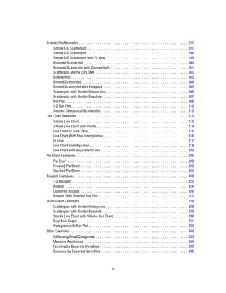
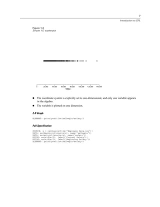
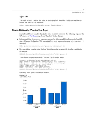
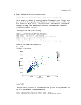
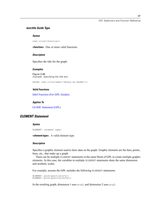
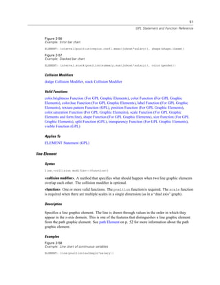
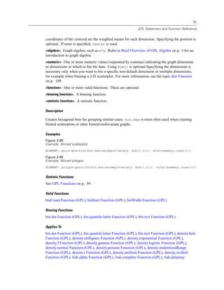
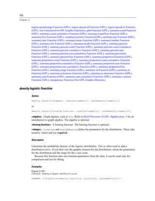
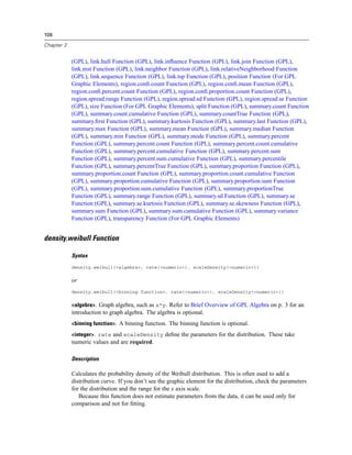
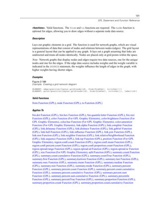
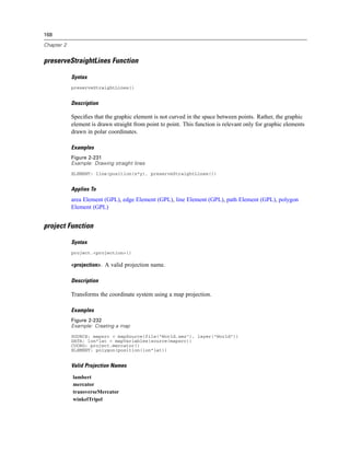
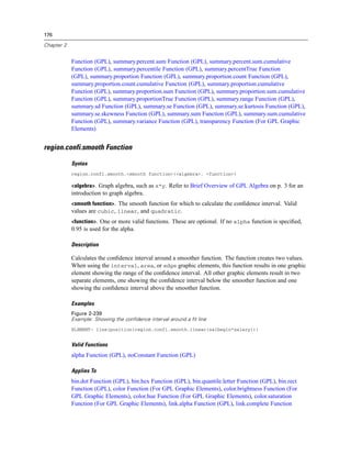
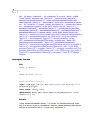
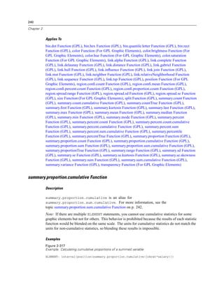
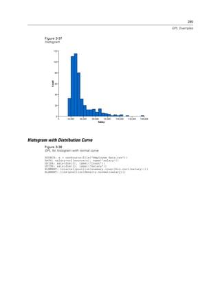
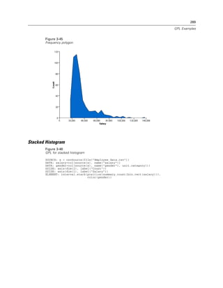
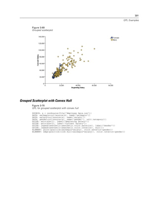
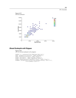
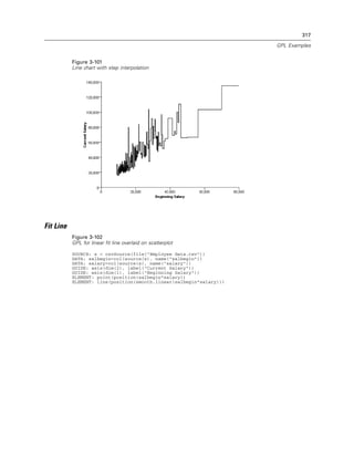
Figure 2-20
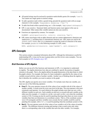
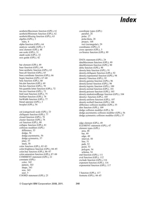
Example: Specifying a log aesthetic scale
SCALE: log(aesthetic(aesthetic.color))
ELEMENT: point(position(x*y), color(z))
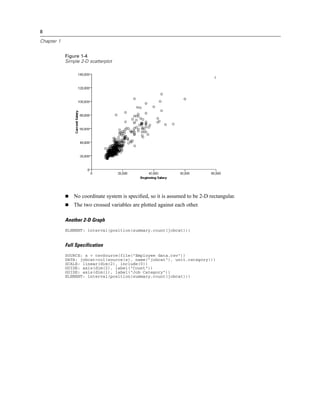
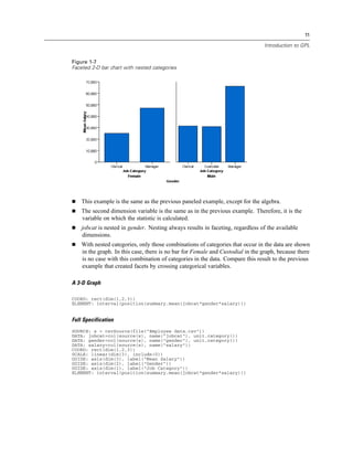
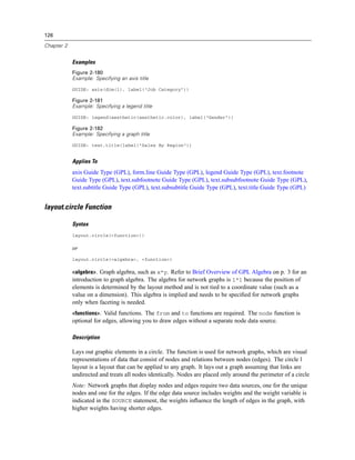
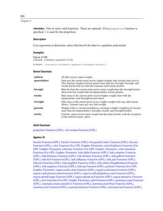
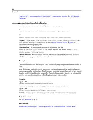
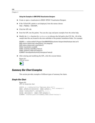
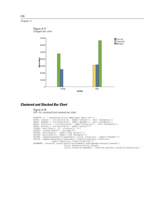
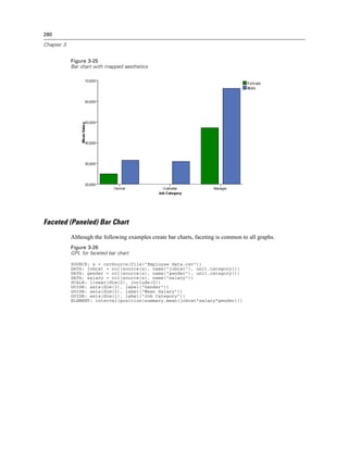
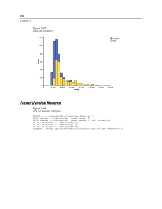
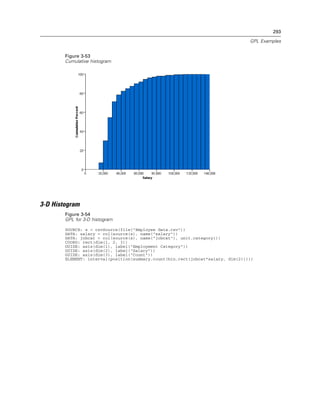
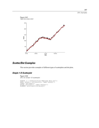
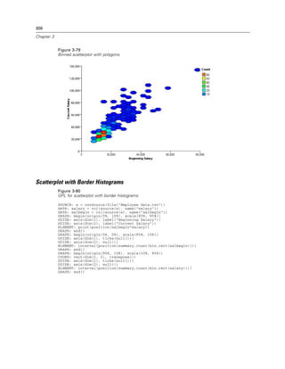
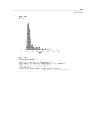
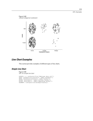
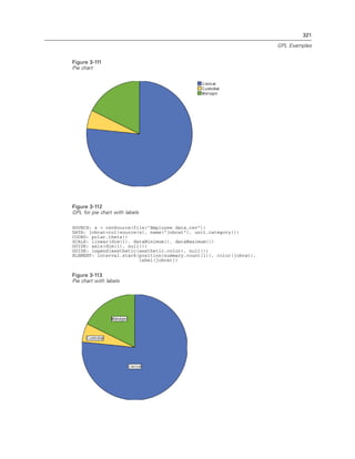
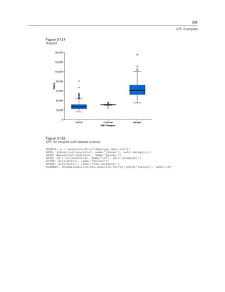
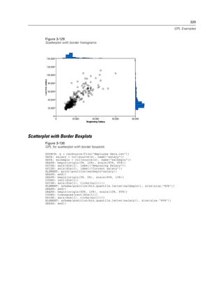
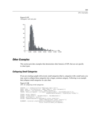
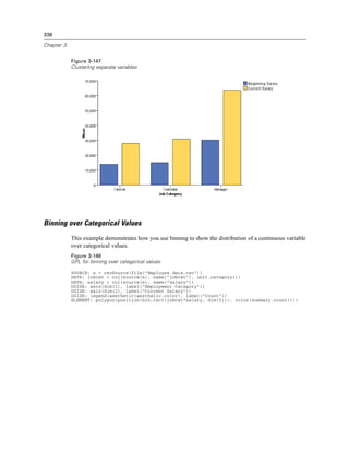
Figure 2-21
Example: Creating a graph with dual scales
SCALE: y1 = linear(dim(2))
SCALE: y2 = linear(dim(2))
GUIDE: axis(dim(1), label("Employment Category"))
GUIDE: axis(scale(y1), label("Mean Salary"))
GUIDE: axis(scale(y2), label("Count"), opposite(), color(color.red))
ELEMENT: interval(scale(y1), position(summary.mean(jobcat*salary)))
ELEMENT: line(scale(y2), position(summary.count(jobcat)), color(color.red))
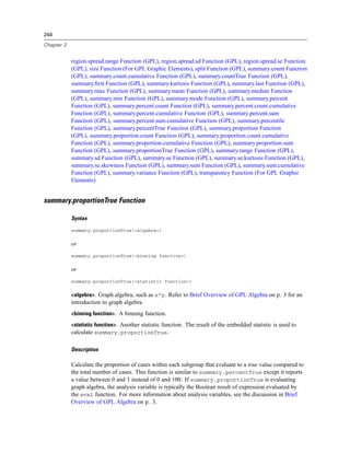
Scale Types
asn Scale (GPL), atanh Scale (GPL), cat Scale (GPL), linear Scale (GPL), log Scale (GPL), logit
Scale (GPL), pow Scale (GPL), prob Scale (GPL), probit Scale (GPL), safeLog Scale (GPL),
safePower Scale (GPL), time Scale (GPL)
GPL Scale Types
There are several scale types available in GPL.
Scale Types
asn Scale (GPL), atanh Scale (GPL), cat Scale (GPL), linear Scale (GPL), log Scale (GPL), logit
Scale (GPL), pow Scale (GPL), prob Scale (GPL), probit Scale (GPL), safeLog Scale (GPL),
safePower Scale (GPL), time Scale (GPL)
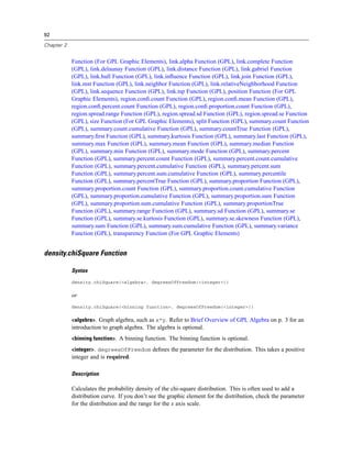
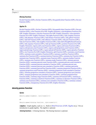
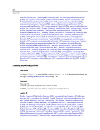
asn Scale
Syntax
asn(dim(<numeric>), <function>)
or
asn(aesthetic(aesthetic.<aesthetic type>), <function>)
<numeric>. A numeric value indicating the dimension to which the scale applies. For more
information, see the topic dim Function on p. 109.
<function>. One or more valid functions.
<aesthetic type>. An aesthetic type indicating the aesthetic to which the scale applies. This is an
aesthetic created as the result of an aesthetic function (such as size) in the ELEMENT statement.
Description
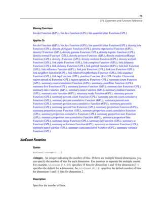
Creates an arcsine scale. Data values for this scale must fall in the closed interval [0, 1]. That
is, for any data value x, 0 ≤ x ≤ 1.](https://image.slidesharecdn.com/gplreferenceguideforibmspssstatistics-140731223452-phpapp02/85/IBM-SPSS-Statistics-41-320.jpg)

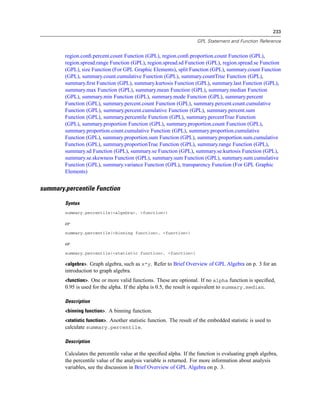
![38
Chapter 2
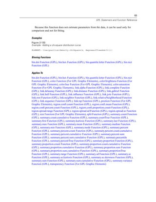
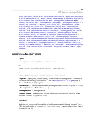
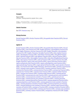
<function>. One or more valid functions.
<aesthetic type>. An aesthetic type indicating the aesthetic to which the scale applies. This is an
aesthetic created as the result of an aesthetic function (such as size) in the ELEMENT statement.
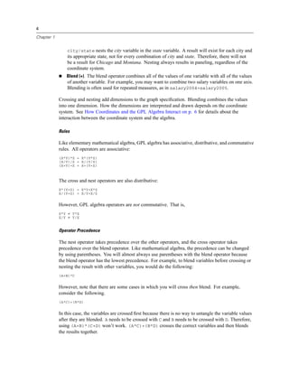
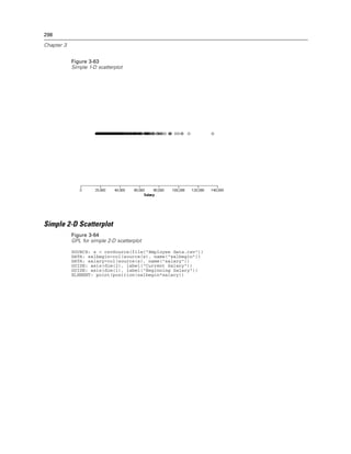
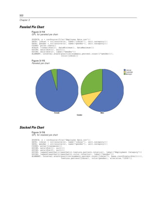
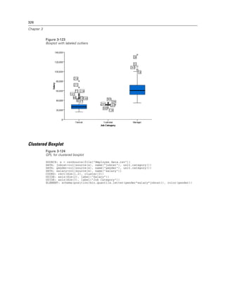
Description
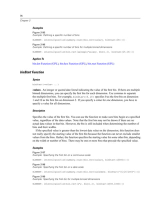
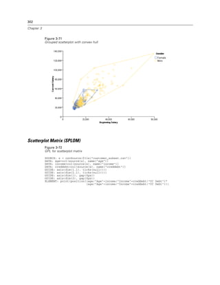
Creates a probit scale. Data values for this scale must fall in the closed interval [0, 1]. That
is, for any data value x, 0 ≤ x ≤ 1.
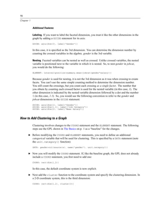
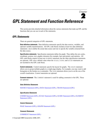
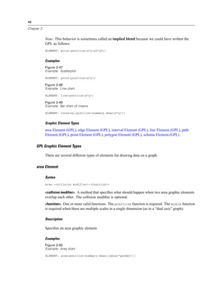
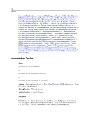
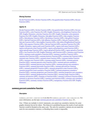
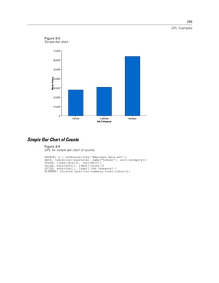
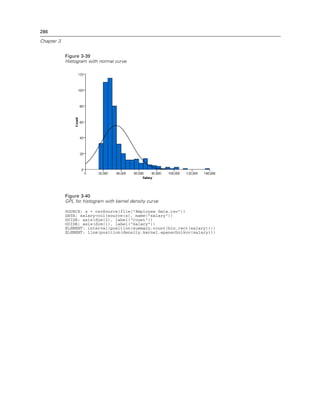
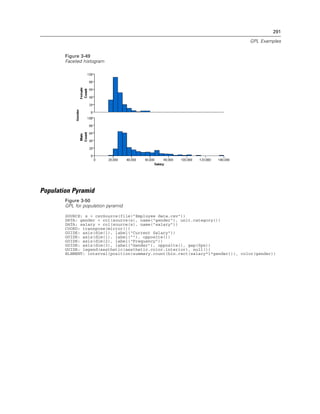
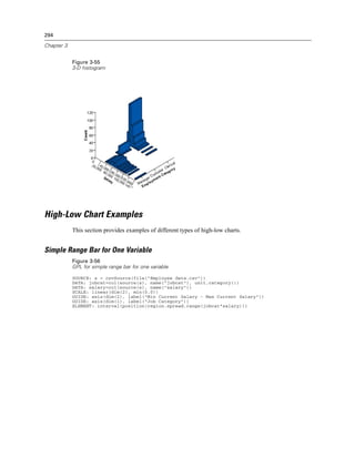
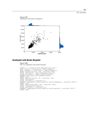
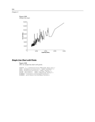
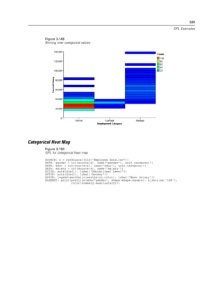
Example
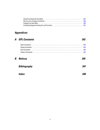
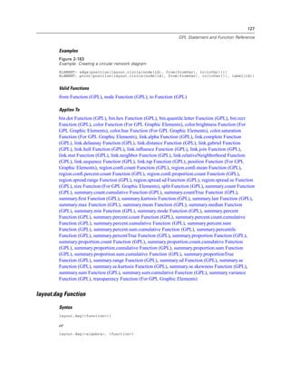
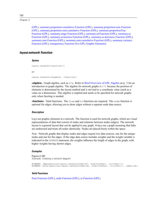
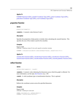
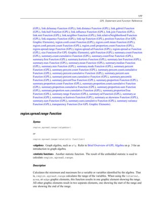
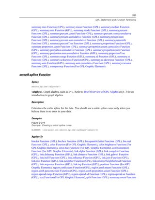
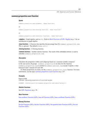
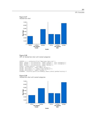
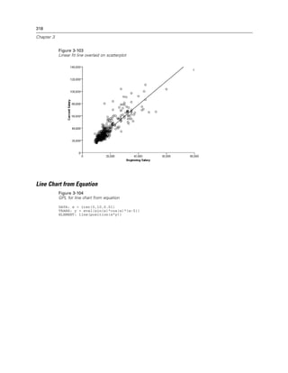
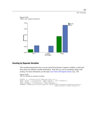
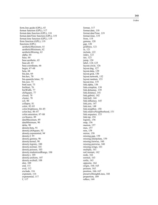
Figure 2-31
Example: Specifying a probit scale
probit(dim(2))
Valid Functions
aestheticMaximum Function (GPL), aestheticMinimum Function (GPL), aestheticMissing
Function (GPL)
Applies To
SCALE Statement (GPL)
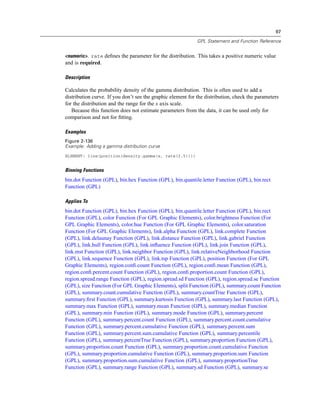
safeLog Scale
Syntax
safeLog(dim(<numeric>), <function>)
or
safeLog(aesthetic(aesthetic.<aesthetic type>), <function>)
<numeric>. A numeric value indicating the dimension to which the scale applies. For more
information, see the topic dim Function on p. 109.
<function>. One or more valid functions. These are optional.
<aesthetic type>. An aesthetic type indicating the aesthetic to which the scale applies. This is an
aesthetic created as the result of an aesthetic function (such as size) in the ELEMENT statement.
Description
Creates a “safe” logarithmic scale. Unlike a regular log scale, the safe log scale uses a modified
function to handle 0 and negative values. If a base is not explicitly specified, the default is base 10.
The safe log formula is:
sign(x) * log(1 + abs(x))](https://image.slidesharecdn.com/gplreferenceguideforibmspssstatistics-140731223452-phpapp02/85/IBM-SPSS-Statistics-48-320.jpg)
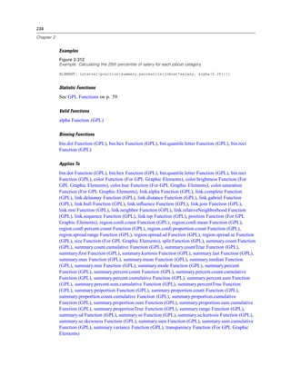
![91
GPL Statement and Function Reference
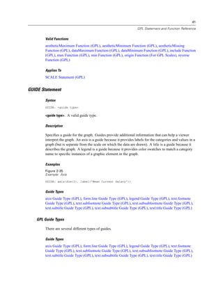
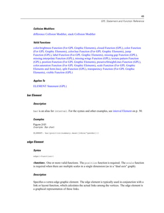
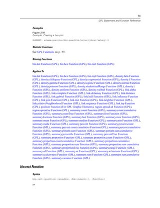
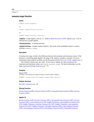
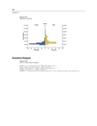
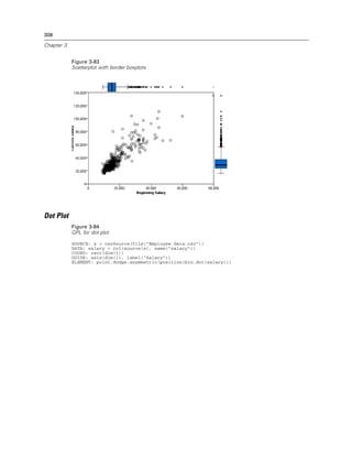
Examples
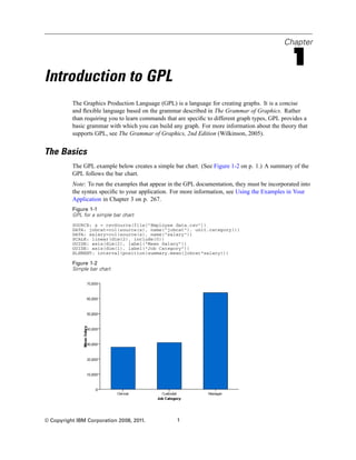
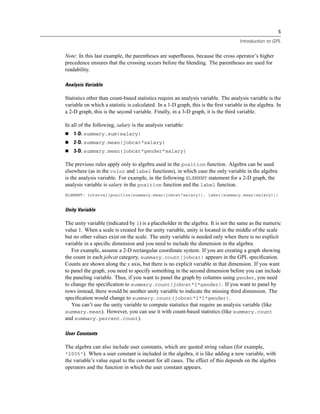
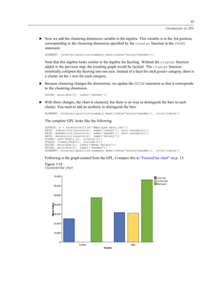
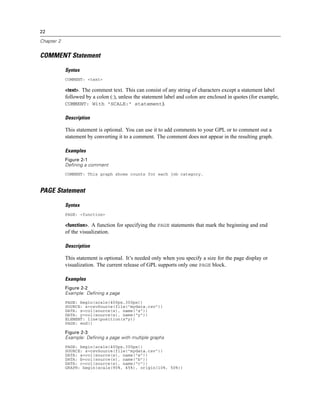
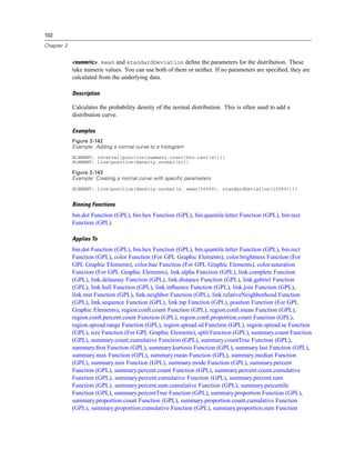
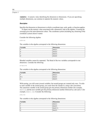
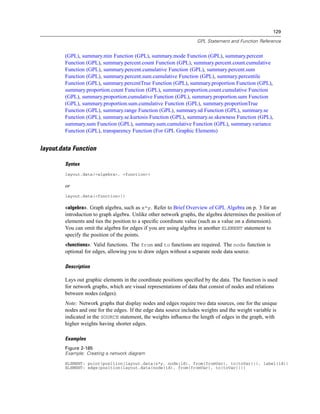
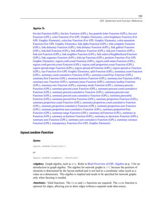
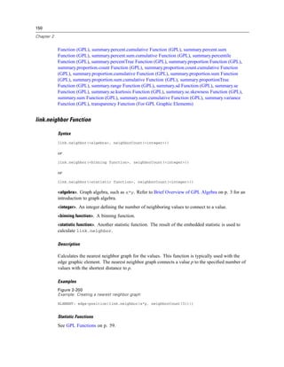
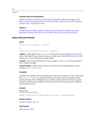
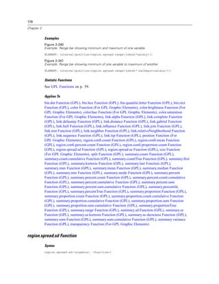
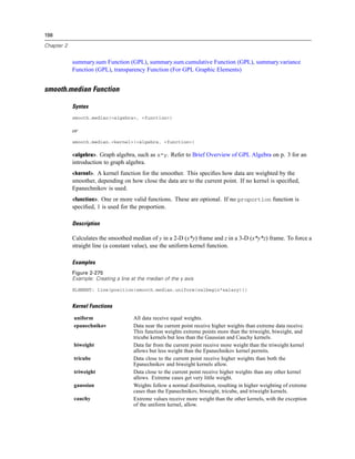
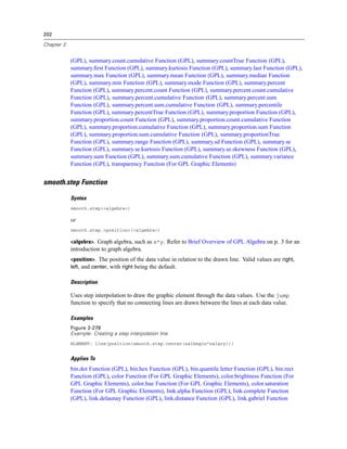
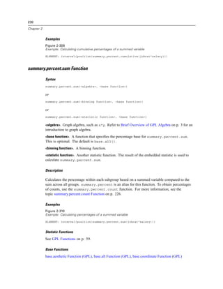
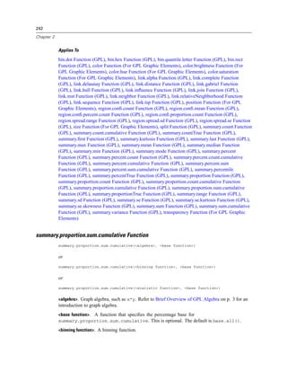
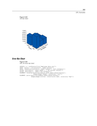
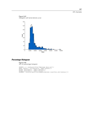
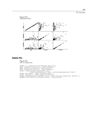
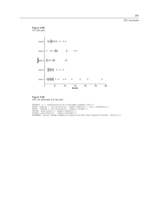
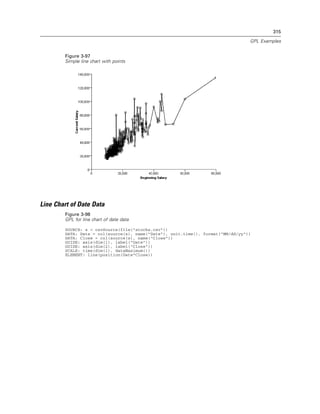
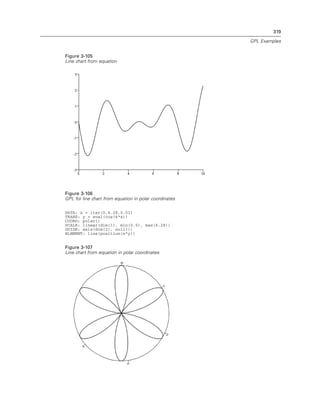
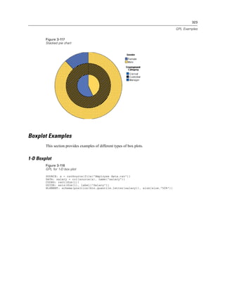
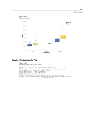
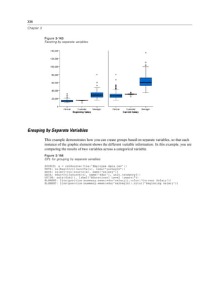
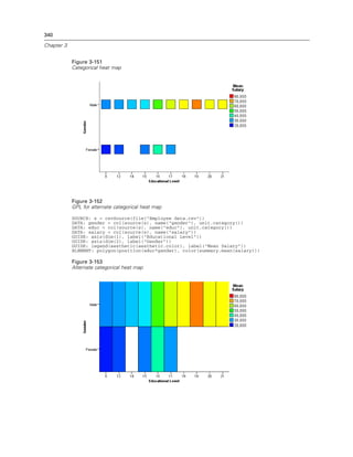
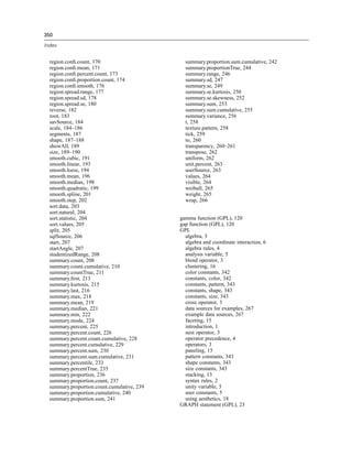
Figure 2-131
Example: Specifying the distance between major ticks
GUIDE: axis(dim(1), delta(1000))
Applies To
axis Guide Type (GPL)
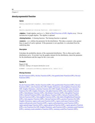
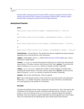
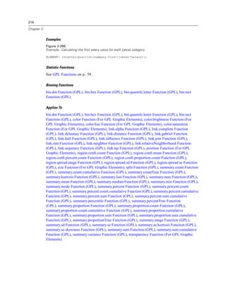
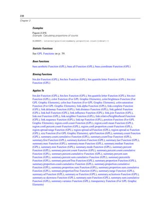
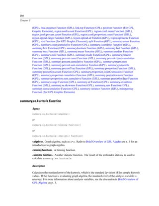
density.beta Function
Syntax
density.beta(<algebra>, shape1(<numeric>), shape2(<numeric>))
or
density.beta(<binning function>, shape1(<numeric>), shape2(<numeric>))
<algebra>. Graph algebra, such as x*y. Refer to Brief Overview of GPL Algebra on p. 3 for an
introduction to graph algebra. The algebra is optional.
<binning function>. A binning function. The binning function is optional.
<numeric>. shape1 and shape2 define the parameters for the distribution. These take numeric
values and are required.
Description
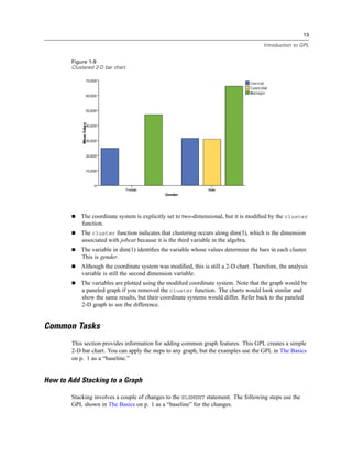
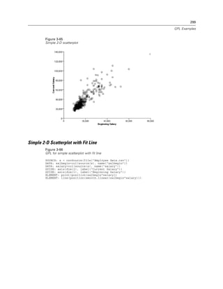
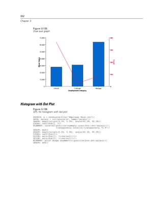
Calculates the probability density for the beta distribution. This is often used to add a distribution
curve. The distribution is defined on the closed interval [0, 1]. If you don’t see the graphic element
for the distribution, check the parameters for the distribution and the range for the x axis scale.
Because this function does not estimate parameters from the data, it can be used only for
comparison and not for fitting.
Examples
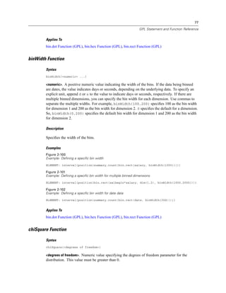
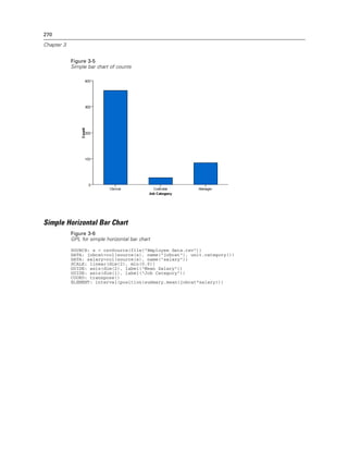
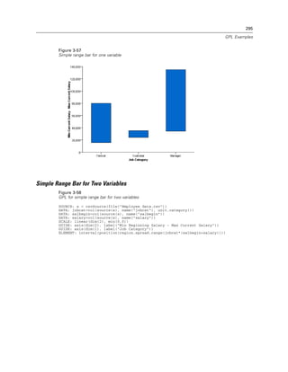
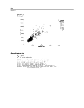
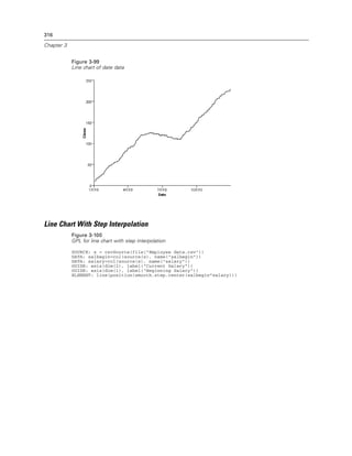
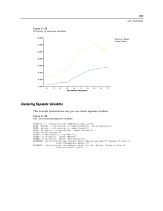
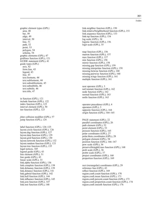
Figure 2-132
Example: Adding a beta distribution curve
ELEMENT: line(position(density.beta(x, shape1(2), shape2(5))))
Binning Functions
bin.dot Function (GPL), bin.hex Function (GPL), bin.quantile.letter Function (GPL), bin.rect
Function (GPL)
Applies To
bin.dot Function (GPL), bin.hex Function (GPL), bin.quantile.letter Function (GPL), bin.rect
Function (GPL), color Function (For GPL Graphic Elements), color.brightness Function (For
GPL Graphic Elements), color.hue Function (For GPL Graphic Elements), color.saturation](https://image.slidesharecdn.com/gplreferenceguideforibmspssstatistics-140731223452-phpapp02/85/IBM-SPSS-Statistics-101-320.jpg)
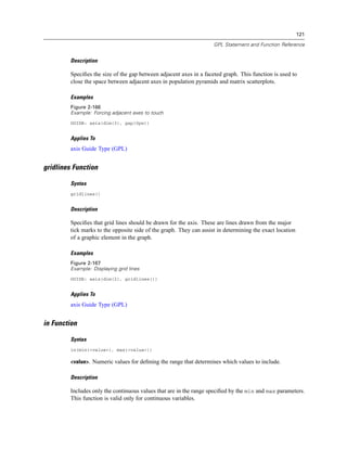
![114
Chapter 2
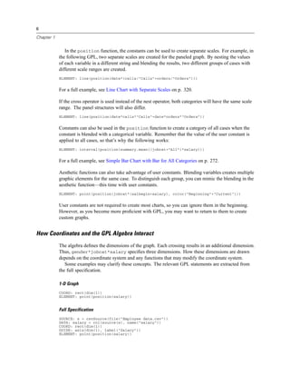
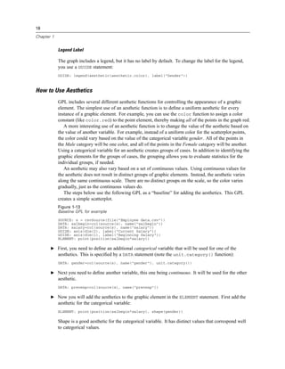
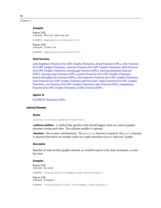
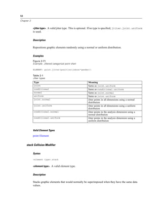
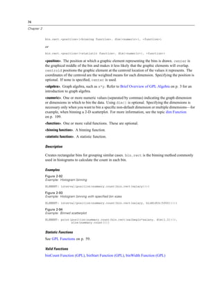
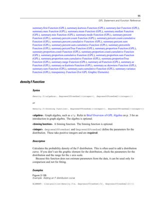
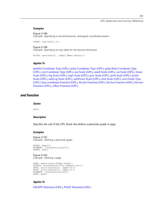
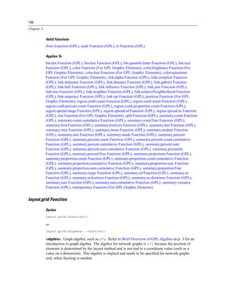
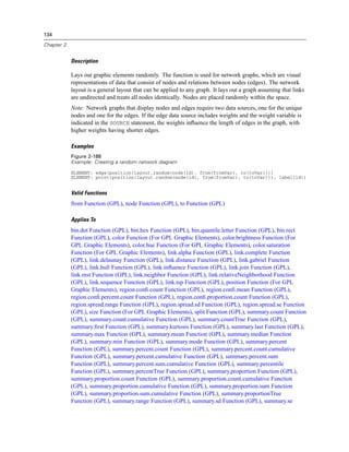
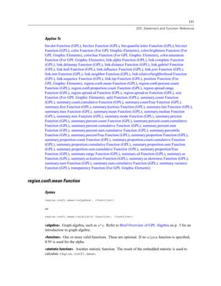
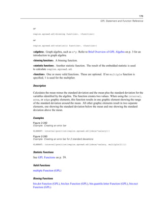
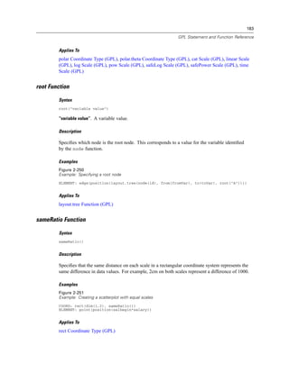
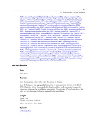
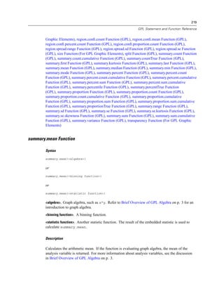
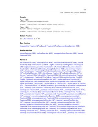
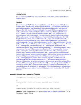
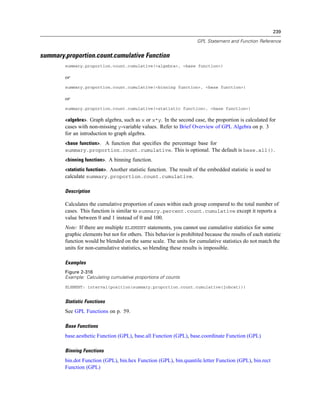
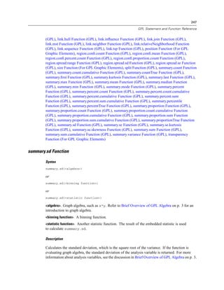
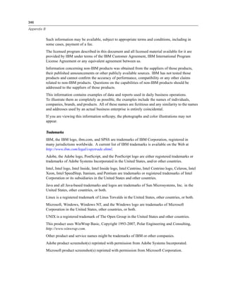
Function Result Notes
log2(n) The base-2 logarithm of n
log10(n) The base-10 logarithm of n
mod(n, modulus) The remainder when n is divided
by modulus
pow(n, power) The value of n raised to the power
of power
round(n) The integer that results from
rounding the absolute value of
n and then reaffixing the sign.
Numbers ending in 0.5 exactly
are rounded away from 0. For
example, round(-4.5) rounds
to -5.
sin(n) The sine of n
sinh(n) The hyperbolic sine of n
sqrt(n) The positive square root of n
tan(n) The tangent of n
tanh(n) The hyperbolic tangent of n
String Functions
Function Result Notes
concatenate(string1, string2) A string that is the concatenation
of string1 and string2
datetostring(date) The string that results when date
is converted to a string
indexof(haystack,needle[,divisor]) A number that indicates the
position of the first occurrence
of needle in haystack. The
optional third argument, divisor,
is a number of characters used
to divide needle into separate
strings. Each substring is used
for searching and the function
returns the first occurrence of any
of the substrings. For example,
indexof(x, “abcd”) will return
the value of the starting position
of the complete string “abcd” in
the string variable x; indexof(x,
“abcd”, 1) will return the value of
the position of the first occurrence
of any of the values in the string;
and indexof(x, “abcd”, 2) will
return the value of the first
occurrence of either “ab” or “cd”.
Divisor must be a positive integer
and must divide evenly into the
length of needle. Returns 0 if
needle does not occur within
haystack.
length(string) A number indicating the length of
string](https://image.slidesharecdn.com/gplreferenceguideforibmspssstatistics-140731223452-phpapp02/85/IBM-SPSS-Statistics-124-320.jpg)
![115
GPL Statement and Function Reference
Function Result Notes
lowercase(string) string with uppercase letters
changed to lowercase and other
characters unchanged
ltrim(string[, char]) string with any leading instances
of char removed. If char is not
specified, leading blanks are
removed. Char must resolve to a
single character.
midstring(string , start, end) The substring beginning at
position start of string and ending
at end
numbertostring(n) The string that results when n is
converted to a string
replace(target, old, new) In target, instances of old are
replaced with new. All arguments
are strings.
rtrim(string[, char]) string with any trailing instances
of char removed. If char is not
specified, trailing blanks are
removed. Char must resolve to a
single character.
stringtodate(string) The value of the string expression
string as a date
stringtonumber(string) The value of the string expression
string as a number
substring(string, start, length) The substring beginning at
position start of string and
running for length length
trim(string) string with any leading and
trailing blanks removed
uppercase(string) string with lowercase letters
changed to uppercase and other
characters unchanged
Date and Time Functions
Function Result Notes
date() The current date
time() The current time
Constants
Constant Meaning Notes
true True
false False
pi pi
e Euler’s number or the base of the
natural logarithm](https://image.slidesharecdn.com/gplreferenceguideforibmspssstatistics-140731223452-phpapp02/85/IBM-SPSS-Statistics-125-320.jpg)


This document provides a reference guide for using GPL (Graphics Programming Language) in IBM SPSS Visualization Designer. It includes an introduction to GPL concepts and syntax rules, descriptions of common GPL statements and functions, and examples of how to perform tasks like adding stacking, faceting, clustering, and aesthetics to graphs. The guide covers the basics of the GPL algebraic language and how it interacts with graph coordinates.