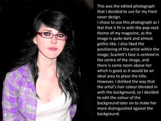
This was the edited photograph
that I decided to use for my front
cover design.
I chose to use this photograph as I
feel that it fit in with the pop-rock
theme of my magazine, as the
image is quite dark and almost
gothic-like. I also liked the
positioning of the artist within the
image; Scarlett’s face is centred in
the centre of the image, and
there is some room above her
which is good as It would be an
ideal area to place the title.
However, I disliked the way that
the artist’s hair colour blended in
with the background, so I decided
to edit the colour of the
background later on to make her
more distinguished against the
background.
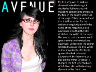
My first step was to add my
chosen title to the image. I
decided to follow standard
magazine conventions and place
the title in the centre at the top
of the page. This is because I feel
that it will be easier for the
audience to quickly identify the
name of the magazine. I also
positioned it so that the title
stretched the width of the cover.
This was so that the cover would
appear more symmetrical and
organised. Concerning the colour,
I decided to make the title white
so that it contrasts effectively
against the dark coloured
background. Furthermore, as a
play on the words ‘A Venue’, I
changed the first letter to blue,
which I feel also added a design
element to the front cover.
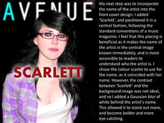
My next step was to incorporate
the name of the artist into the
front cover design. I added
‘Scarlett’, and positioned it in a
central fashion, following the
standard conventions of a music
magazine. I feel that this placing is
beneficial as it makes the name of
the artist in the central image
known immediately, and is more
accessible to readers to
understand who the artist is. I
chose the colour scarlet to use for
the name, as it coincided with her
name. However, the contrast
between ‘Scarlett’ and the
background image was not ideal,
and so I added a Gaussian blur of
white behind the artist’s name.
This allowed it to stand out more,
and become bolder and more
eye-catching.
My next step in creating the
design for my front cover was to
incorporate some sort of story
and reason as to why the artist is
featured on the cover. For this, I
decided to base it with the artist
releasing an upcoming debut
single. I chose the title ‘Violet
Sky’, as it is an inspiration from
the lyrics from the band ‘In This
Moment’. I chose the colour
purple for the single title, as it
collaborated effectively with the
artist’s clothing and matched the
word ‘Violet’. I decided to add a
white band behind the writing to
increase contrast between the
writing and the background, as
they are of similar colours. I felt
that this also made the writing
more distinct and noticeable.
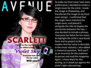
To make my front cover look more
professional, I decided to create a
single cover for the artist. I made
the image in Photoshop, and
transferred the image to my front
cover design. I confirmed that
the single name matched the
single cover, and placed it
alongside the title to display the
connection between the two. I
also decided to include a phrase;
‘Everyone has fallen for her voice’,
to highlight the artist’s new found
fame and to project to the
readers that her voice is desirable
in the music industry. I also added
a rhetorical question, ‘Will you?’,
as an incentive for the audience
to pursue and read the magazine.
Again, I chose black for this
writing, as it stood out against the
artist’s light coloured top.
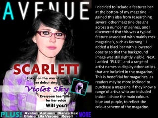
I decided to include a features bar
at the bottom of my magazine. I
gained this idea from researching
several other magazine designs
across a number of genres, and I
discovered that this was a typical
feature associated with mainly rock
magazine’s, such as Kerrang!. I
added a black bar with a lowered
opacity so that the background
image was still slightly visible. Next,
I added ‘PLUS!’ and a range of
artist names to display other artists
that are included in the magazine.
This is beneficial for magazines, as
readers may be more inclined to
purchase a magazine if they know a
range of artists who are included
inside. I chose the main colours
blue and purple, to reflect the
colour scheme of the magazine.
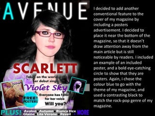
I decided to add another
conventional feature to the
cover of my magazine by
including a posters
advertisement. I decided to
place it near the bottom of the
magazine, so that it doesn’t
draw attention away from the
main article but is still
noticeable by readers. I included
an example of an included
poster, and a bold eye-catching
circle to show that they are
posters. Again, i chose the
colour blue to go with the
theme of my magazine, and
used a contrasting black to
match the rock-pop genre of my
magazine.
Next, I included a barcode.
Barcode’s are essential on the
cover of a magazine, as readers
and potential customers will be
interested in the price as it may
determine whether or not they
purchase the magazine. I decided
to include the price of the
magazine and the issue number,
as I found that this information is
usually included on the barcode
of a magazine. I also situated it at
the bottom of the magazine, as
this is a standard convention of
music magazines, and by
following the conventions, the
audience will most likely know
where to look to find out the
price.
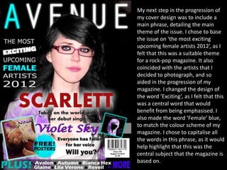
My next step in the progression of
my cover design was to include a
main phrase, detailing the main
theme of the issue. I chose to base
the issue on ‘the most exciting
upcoming female artists 2012’, as I
felt that this was a suitable theme
for a rock-pop magazine. It also
coincided with the artists that I
decided to photograph, and so
aided in the progression of my
magazine. I changed the design of
the word ‘Exciting’, as I felt that this
was a central word that would
benefit from being emphasised. I
also made the word ‘Female’ blue,
to match the colour scheme of my
magazine. I chose to capitalise all
the words in this phrase, as it would
help highlight that this was the
central subject that the magazine is
based on.
Next, I added some minor articles
onto the front of my magazine. I
chose to base these articles on
some bands and artists that are
featured within the magazine. I
chose the colour scheme of blue
and white, to follow the spectrum
of my cover design, and to
effectively contrast them against
the dark coloured background. I
capitalised the titles of each of
the articles, to further distinguish
them against the sub-text. Also, I
situated them to the right of my
magazine to balance out the
symmetrical pattern of my cover
design.
I decided that the background of
my front cover design was too
dark and plain for a stereotypical
rock-pop magazine. However, I
liked the contrast between the
background and the artist’s face,
as I feel that her features were
highlighted against the dark back-
drop. Therefore, I added a
photograph of a nebula to the
background of my cover in
Photoshop. I added an overlay
layer of blue to the image, to
blend the colours in a more
sophisticated fashion to
collaborate with my magazine. I
felt that the use of the nebula
added an interesting design to
the background, and it also fit in
with the theme of the artist’s
single – Violet sky.
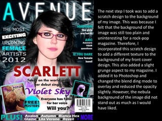
The next step I took was to add a
scratch design to the background
of my image. This was because I
felt that the background of the
image was still too plain and
uninteresting for a rock-pop
magazine. Therefore, I
incorporated this scratch design
to add a different texture to the
background of my front cover
design. This also added a slight
grunge aspect to my magazine. I
added it to Photoshop and
changed the blend ding mode to
overlay and reduced the opacity
slightly. However, the nebula
background of the image did not
stand out as much as I would
have liked.
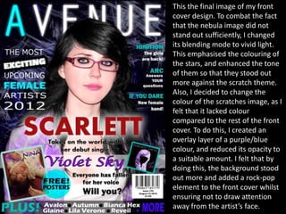
This the final image of my front
cover design. To combat the fact
that the nebula image did not
stand out sufficiently, I changed
its blending mode to vivid light.
This emphasised the colouring of
the stars, and enhanced the tone
of them so that they stood out
more against the scratch theme.
Also, I decided to change the
colour of the scratches image, as I
felt that it lacked colour
compared to the rest of the front
cover. To do this, I created an
overlay layer of a purple/blue
colour, and reduced its opacity to
a suitable amount. I felt that by
doing this, the background stood
out more and added a rock-pop
element to the front cover whilst
ensuring not to draw attention
away from the artist’s face.

Cover progression

  • 2.
    This was theedited photograph that I decided to use for my front cover design. I chose to use this photograph as I feel that it fit in with the pop-rock theme of my magazine, as the image is quite dark and almost gothic-like. I also liked the positioning of the artist within the image; Scarlett’s face is centred in the centre of the image, and there is some room above her which is good as It would be an ideal area to place the title. However, I disliked the way that the artist’s hair colour blended in with the background, so I decided to edit the colour of the background later on to make her more distinguished against the background.
  • 3.
    My first stepwas to add my chosen title to the image. I decided to follow standard magazine conventions and place the title in the centre at the top of the page. This is because I feel that it will be easier for the audience to quickly identify the name of the magazine. I also positioned it so that the title stretched the width of the cover. This was so that the cover would appear more symmetrical and organised. Concerning the colour, I decided to make the title white so that it contrasts effectively against the dark coloured background. Furthermore, as a play on the words ‘A Venue’, I changed the first letter to blue, which I feel also added a design element to the front cover.
  • 4.
    My next stepwas to incorporate the name of the artist into the front cover design. I added ‘Scarlett’, and positioned it in a central fashion, following the standard conventions of a music magazine. I feel that this placing is beneficial as it makes the name of the artist in the central image known immediately, and is more accessible to readers to understand who the artist is. I chose the colour scarlet to use for the name, as it coincided with her name. However, the contrast between ‘Scarlett’ and the background image was not ideal, and so I added a Gaussian blur of white behind the artist’s name. This allowed it to stand out more, and become bolder and more eye-catching.
  • 5.
    My next stepin creating the design for my front cover was to incorporate some sort of story and reason as to why the artist is featured on the cover. For this, I decided to base it with the artist releasing an upcoming debut single. I chose the title ‘Violet Sky’, as it is an inspiration from the lyrics from the band ‘In This Moment’. I chose the colour purple for the single title, as it collaborated effectively with the artist’s clothing and matched the word ‘Violet’. I decided to add a white band behind the writing to increase contrast between the writing and the background, as they are of similar colours. I felt that this also made the writing more distinct and noticeable.
  • 6.
    To make myfront cover look more professional, I decided to create a single cover for the artist. I made the image in Photoshop, and transferred the image to my front cover design. I confirmed that the single name matched the single cover, and placed it alongside the title to display the connection between the two. I also decided to include a phrase; ‘Everyone has fallen for her voice’, to highlight the artist’s new found fame and to project to the readers that her voice is desirable in the music industry. I also added a rhetorical question, ‘Will you?’, as an incentive for the audience to pursue and read the magazine. Again, I chose black for this writing, as it stood out against the artist’s light coloured top.
  • 7.
    I decided toinclude a features bar at the bottom of my magazine. I gained this idea from researching several other magazine designs across a number of genres, and I discovered that this was a typical feature associated with mainly rock magazine’s, such as Kerrang!. I added a black bar with a lowered opacity so that the background image was still slightly visible. Next, I added ‘PLUS!’ and a range of artist names to display other artists that are included in the magazine. This is beneficial for magazines, as readers may be more inclined to purchase a magazine if they know a range of artists who are included inside. I chose the main colours blue and purple, to reflect the colour scheme of the magazine.
  • 8.
    I decided toadd another conventional feature to the cover of my magazine by including a posters advertisement. I decided to place it near the bottom of the magazine, so that it doesn’t draw attention away from the main article but is still noticeable by readers. I included an example of an included poster, and a bold eye-catching circle to show that they are posters. Again, i chose the colour blue to go with the theme of my magazine, and used a contrasting black to match the rock-pop genre of my magazine.
  • 9.
    Next, I includeda barcode. Barcode’s are essential on the cover of a magazine, as readers and potential customers will be interested in the price as it may determine whether or not they purchase the magazine. I decided to include the price of the magazine and the issue number, as I found that this information is usually included on the barcode of a magazine. I also situated it at the bottom of the magazine, as this is a standard convention of music magazines, and by following the conventions, the audience will most likely know where to look to find out the price.
  • 10.
    My next stepin the progression of my cover design was to include a main phrase, detailing the main theme of the issue. I chose to base the issue on ‘the most exciting upcoming female artists 2012’, as I felt that this was a suitable theme for a rock-pop magazine. It also coincided with the artists that I decided to photograph, and so aided in the progression of my magazine. I changed the design of the word ‘Exciting’, as I felt that this was a central word that would benefit from being emphasised. I also made the word ‘Female’ blue, to match the colour scheme of my magazine. I chose to capitalise all the words in this phrase, as it would help highlight that this was the central subject that the magazine is based on.
  • 11.
    Next, I addedsome minor articles onto the front of my magazine. I chose to base these articles on some bands and artists that are featured within the magazine. I chose the colour scheme of blue and white, to follow the spectrum of my cover design, and to effectively contrast them against the dark coloured background. I capitalised the titles of each of the articles, to further distinguish them against the sub-text. Also, I situated them to the right of my magazine to balance out the symmetrical pattern of my cover design.
  • 12.
    I decided thatthe background of my front cover design was too dark and plain for a stereotypical rock-pop magazine. However, I liked the contrast between the background and the artist’s face, as I feel that her features were highlighted against the dark back- drop. Therefore, I added a photograph of a nebula to the background of my cover in Photoshop. I added an overlay layer of blue to the image, to blend the colours in a more sophisticated fashion to collaborate with my magazine. I felt that the use of the nebula added an interesting design to the background, and it also fit in with the theme of the artist’s single – Violet sky.
  • 13.
    The next stepI took was to add a scratch design to the background of my image. This was because I felt that the background of the image was still too plain and uninteresting for a rock-pop magazine. Therefore, I incorporated this scratch design to add a different texture to the background of my front cover design. This also added a slight grunge aspect to my magazine. I added it to Photoshop and changed the blend ding mode to overlay and reduced the opacity slightly. However, the nebula background of the image did not stand out as much as I would have liked.
  • 14.
    This the finalimage of my front cover design. To combat the fact that the nebula image did not stand out sufficiently, I changed its blending mode to vivid light. This emphasised the colouring of the stars, and enhanced the tone of them so that they stood out more against the scratch theme. Also, I decided to change the colour of the scratches image, as I felt that it lacked colour compared to the rest of the front cover. To do this, I created an overlay layer of a purple/blue colour, and reduced its opacity to a suitable amount. I felt that by doing this, the background stood out more and added a rock-pop element to the front cover whilst ensuring not to draw attention away from the artist’s face.