Download to read offline


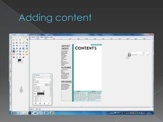
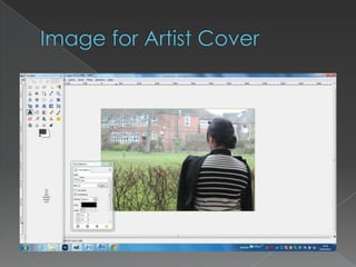


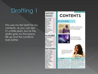

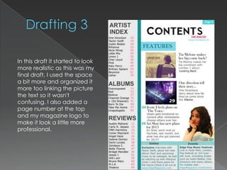
This document describes the progression of drafts for a magazine contents page. The first draft was plain but filled out more over subsequent drafts. Feedback on the second draft recommended removing 'pg.' from page numbers and shrinking a feature box to use space better. The final draft looked most realistic by using space well and linking a picture to text for clarity, while also adding a page number and logo.


