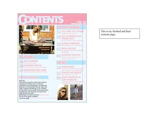
The document describes the process of creating a contents page for a music magazine. The creator started with a blue background and pink header, and added the date and a website link. Section headings were then added but the pink did not stand out enough, so a darker background color may be used. An image of an artist was also included, and background colors were added to make headings stand out more. Text and page numbers were added to complete the simple but effective contents page.