The document describes the design process for the front cover of a magazine called Development Diary Front Cover. Specifically, it discusses:
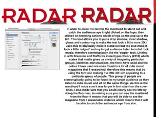
1) Using blending options to add a drop shadow and glow to the masthead text to make it stand out and appeal to the target indie/rock music audience.
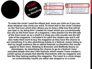
2) Creating a circular insert with contest text to catch readers' eyes and incentivize them to buy the magazine, advertising tickets to a music festival that the target audience would enjoy.
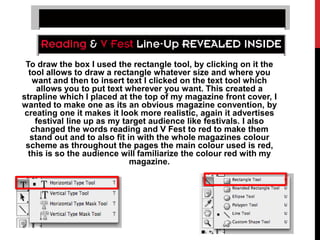
3) Drawing a rectangle box to contain a strapline at the top of the cover also advertising an upcoming music festival lineup, in red to match the magazine's color scheme.