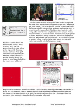
1. I already took the photo of my supposed artist but the background
was plain white, which I found boring and thought that if the picture
had more of a dark and mysterious background the audience would
find it more suitable and appealing, relating to maslows hierarchy of
needs, the audience may also feel that they can relate to the artist
seeing as the majority of my target audience are teenagers I’m sure
they’ve sat under an underpass before. Therefore using my magazine
to esteem their needs as they can feel like they belong reading this
magazine. By using the magnetic lasso tool I went around the image
to separate it from the white background, once it was selected I
copied and pasted it onto the background image.
I wanted a border around the
second image so that it would
stand out more and look
professional; I chose the colour
red as it goes with the colour
scheme and house style. I just
drew a box using the rectangle
tool and changed the colour to
red and then just moved the
image on top of it so it looked like
the picture has a red border.
I again wanted a border for my editors word but I also still wanted the background on the actual text to be
white, this is so the text is easier to read and because black and white contrast well together and stand
out. I used the rectangle tool to draw to boxes, coloured one white and one red. I then moved the white
one on top of the red one to create a border effect using the select tool.
Development diary of contents page Sam Gallacher-Bright