9953330565 Low Rate Call Girls In Rohini Delhi NCR
Analysis of advert 2
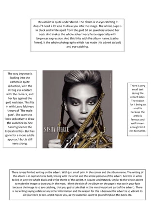
1. This advert is quite understated. The photo is so eye catching it
doesn’t need a lot else to draw you into the image. The whole page is
in black and white apart from the gold bit on jewellery around her
neck. And makes the whole advert very fierce especially with
beyonces expression. And this links with the album name. (sasha
fierce). It the whole photography which has made this advert so bold
and eye catching.
There is very limited writing on the advert. With just small print in the corner and the album name. The writing of
the album is in capitals to be bold, linking with the artist and the whole persona of the advert. And it is in while
to link in with the whole black and white theme of the advert. It is quite understated, similar to the whole advert
to make the image to draw you in the most. I think the title of the album on the page is not too in your face
because the image is so eye catching, that you get to take that in (the most important part of the advert). There
is no writing saying a date or any other information and the reason for this is because the advert is so vibrant its
all your need to see, and it makes you, as the audience, want to go and find out the dates etc.
There is very
small text
saying the
record label.
The reason
for it being so
small is
because the
artist is
famous and
well known
enough for it
not to matter.
The way beyonce is
looking into the
camera is quite
seduction, with the
strong eye contact
with the camera, and
her lips against the
gold necklace. This fits
in with Laura Mulveys
theory of ‘The male
gaze’. She wants to
look seductive to draw
the audience in. She
hasn’t gone for the
typical red lips. But has
gone for a more subtle
approach but is still
very strong.