VIP Kolkata Call Girl Kasba 👉 8250192130 Available With Room
Analysis of digipak 1
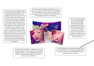
1. The way in which this digipak has been laid out is very
clever. The reason for this is because the back three pages
of the layout digipak, all link to make one image, while
each section also work individually. Creating more depth
into the digipak and makes it all flow nicely.
The colour scheme for the digipak makes
the whole thing connect together. The first
page out would see if the close up of
rihanna with her red hair showing. The red
of her hair brings to mind red, love, roses
etc. And I think the editor has expanded
this to make it all link together. While also
showing dominance and power of the
artist. This links with Laura Mulveys theory
of the Male Gaze which shows the curves
of the female body, sexuality etc. And I
think this is exactly what is trying to be
shown. It can link to her male and female
audience. Where the men think she is sexy
an good ‘perfect’ where the women would
also say the same thing, but look at it in a
slightly different way, wishing to be her.
And this is definitely shown through the
red throughout the image, and the images
of herself too.
There is very limited writing
on this, making the digipak
very simple but effective. I
think the images are bold
enough for it to stand out.
And by having the writing not
too bold, it doesn’t make it
too in your face. And by
having an album with an artist
as famous as Rihanna you do
not need the writing to tell the
audience who she it.
The pattern on the two CD’s is a different colour to the
rest of the digipak. I think the reason for this is to make it
stand out. However, it has still kept with the theme, of
flowers etc. But by making it slightly more different it
draws you, as the audience, in.
The whole digipak has been designed to appeal to the
correct target audience. For example, young females. The
colours, and rose theme are all something which this
target audience can relate too.