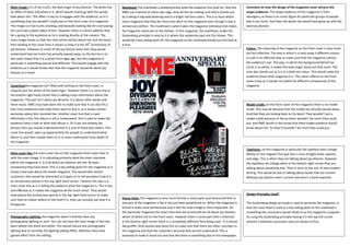
1. Main image: it is of Ian Curtis, the lead singer of joy division. The photo has Masthead: The masthead is predominantly what the audience first look for. And this Comment on how the design of the magazine cover attracts the
an effect of black and white in it, which would mainly go with the quirky NME use it almost as there own logo, they do this by making sure that it stands out target audience: The target audience of this magazine is from
look about him. This effect is key as it engages with the audience, as it is by it being in big bold lettering and in a bright red font colour. This is a ritual within teenagers; as there is an iconic figure for particular groups of people
something that you wouldn’t really see on the front cover of a magazine. every magazine that they do; they even did it on this magazine even though it was a that is Ian Curtis. And then the adults hat would have grew up with the
The image is of Ian Curtis smoking, and basically looking like he’s not posing anniversary edition. The masthead is what makes the magazine individual and makes band joy division.
he’s just had a photo taken of him. However there is a direct address that the magazine stand out on the shelves. In this magazine, the masthead, under the
he is giving to the audience as he is looking directly at the camera. The Guttenberg principle Is used as it is where the audiences eyes are first drawn. This
main image shows us that the main article will be about him and the band, would be a key selling point for the magazine as the masthead stands out and look at
then looking at the cover lines it shows us how it is the 30th anniversary of it first.
joy division. However to some of the joy division keen fans they would Colour: The colouring of the magazine on the front cover is very much
understand how ian Curtis has actually passed away, so the fact he is on dull but effective. The way in which it is only using 3 different colours
the cover shows that it is a photo from ages ago, but this magazine in is used in an effective way to make sure that the magazine catches
particular is something special and different. This would engage with the the audience’s eye. The way, in which the background behind Ian
audience as it would shows that how the magazine would be about joy Curtis is so white, it makes the lead singer stand out that more. The
division as a band. nme also stands out as it is in a bold red colour. This would make the
audience know what magazine it is. The colour effects on the front
cover is key as it stands out within he different components of the
Coverlinesthe magazine isn’t filled with writing on the front cover, is magazine
majority just the photo of the lead singer. However there is a cover line in
the bottom right hand corner that is adding more information about the
magazine. This part isn’t about joy decision, it is about other bands and
there music. NME may have done this to make sure that it can also hit a Model credit: on the front cover of this magazine there is no model
few more audiences and make them want to buy it, as it shows certain credit. This may be because that the model has actually passed away.
exclusives about blur reunited live. Another cover line that is used And that they are looking back on his band. They wouldn’t put a
effectively is the ‘this album is still a masterpiece’ this is used to make the model credit because of this as there wouldn’t be much they could
audience have a look at what that album is. Or if you are already joy put, and NME would in fact know that there target audience would
division fans you would understand that it is one of there best sellers. This know about him. So they’re wouldn’t be much they could put.
cover line would open up opportunities for people to understand what
album is, and then maybe listen to it; or even understand more depth of
the magazine.
Typefaces: on this magazine in particular the typeface does change.
Main cover line: the main cover line on this magazine front cover links in Mainly on the magzien the type face is very straight lined, capitals,
with the main image. It is indicating primarily what the main interview and edgy. This is when they are talking about joy division. However
within the magazine is. It is all about joy Davison and the 30 years the typefaces do change when in the bottom right corner they are
anniversary they have done. This is a key selling point for the magazine as it talking about something else. Then it turns to the sort of new modern
shows a key look about the whole magazine. This would then attract writing. This would be due to talking about bands that are current.
customers who would be interested as it goes on to tell youabout how it is Whereas joy division aren’t current and aren’t a band anymore.
an anniversary special in the top right hand corner. I believe this also is a
main cover line as it is telling the audience what the magazine is. This is key
and effective as it makes the magazine all the much richer. They would
have places the anniversary special in the top right hand corner to make Design Principles Used?
sure that no matter where on the shelf it is, they can actually see how it is House Style: The magazine is very much formal in some parts and structured then in
one part of the magazine is like it has just been graphitised on. When the magazine is The Guttenberg design principle is used to promote the magazine, in
thisspecial.
formal it looks more professional and is like the main image is more important. On that the mast head is used as a key selling point as the masthead is
this particular magazine the cover lines that are structured are all about joy Davison, something the consumers would relate to as the magazine is popular.
Photography Lighting: the magazine doesn’t entirely have any whom of which are on the front cover. However there is some part that is informal, So using the Guttenberg principle having it in the top left corner
photography lighting as such. You can see how the main image in fact has in the bottom right corner there is a completely different font being used. Ti is almost whereit is believed consumers eyes are drawn to first.
been edited into black and white. This would reduce any photography like graffiti. Nme would have done this to make sure that there are other concepts to
lighting due to normally the lighting adding effect. Whereas they have the magazine and that the customers do know that and do understand. This is
gained effect from the editing. essential to make it stand out and look like there is something else in the newspaper.