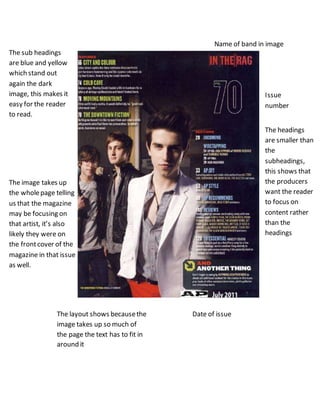
1. Name of band in image
Issue
number
The sub headings
are blue and yellow
which stand out
again the dark
image, this makes it
easy for the reader
to read.
The headings
are smaller than
the
subheadings,
this shows that
the producers
want the reader
to focus on
content rather
than the
headings
The image takes up
the wholepage telling
us that the magazine
may be focusing on
that artist, it’s also
likely they were on
the frontcover of the
magazine in that issue
as well.
Date of issueThe layout shows becausethe
image takes up so much of
the page the text has to fit in
around it