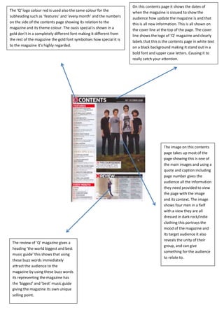
The Q Magazine Contents Page - An SEO-Optimized Title
1. On this contents page it shows the dates of
The ‘Q’ logo colour red is used also the same colour for the when the magazine is sissued to show the
subheading such as ‘features’ and ‘every month’ and the numbers audience how update the magazine is and that
on the side of the contents page showing its relation to the this is all new information. This is all shown on
magazine and its theme colour. The oasis special is shown in a the cover line at the top of the page. The cover
gold don’t in a completely different font making it different from line shows the logo of ‘Q’ magazine and clearly
the rest of the magazine the gold font symbolises how special it is labels that this is the contents page in white text
to the magazine it’s highly regarded. on a black background making it stand out in a
bold font and upper case letters. Causing it to
really catch your attention.
The image on this contents
page takes up most of the
page showing this is one of
the main images and using a
quote and caption including
page number gives the
audience all the information
they need provided to view
the page with the image
and its context. The image
shows four men in a fielf
with a view they are all
dressed in dark rock/indie
clothing this portrays the
mood of the magazine and
its target audience it also
reveals the unity of their
The review of ‘Q’ magazine gives a
group, and can give
heading ‘the world biggest and best
something for the audience
music guide’ this shows that using
to relate to.
these buzz words immediately
attract the audience to the
magazine by using these buzz words
its representing the magazine has
the ‘biggest’ and ‘best’ music guide
giving the magazine its own unique
selling point.