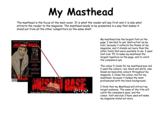
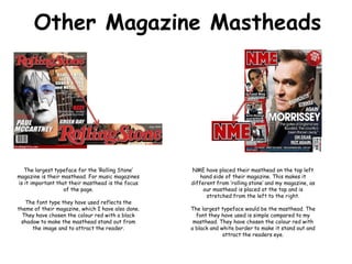
The document discusses the masthead design of a magazine. It explains that the masthead needs to be the largest element on the cover page to attract readers. The author used a dramatic "destruction" font in size 70 that is red to make their masthead stand out. They also chose red, black, and white colors throughout for their target audience. Examples of other magazine mastheads like Rolling Stone and NME are provided that also use large fonts, colors like red, and placement strategies to draw attention to their titles.