Ancillary Double Page
     Spread Research
           By Tesfah Watkins-Scott
Introduction
 The silent comedy that Marcus & I will be producing will need to
  have some sort of film review which will actually give feedback
  about our particular film with some sort of rating. The double page
  spread review will need to be viewed as appealing by our target
  audience as they would be the audience that would allow our short
  film to become successful when seen. As I decided to research into
  film posters for the first ancillary product, I think that it would be
  wise to do some research on the second ancillary task also which is
  the review or double page spread.

 For the double page spread review I will be presenting some
  research that I have done to help me create a successful review
  page whilst involving professional skills and conventions that have
  been used in other magazine reviews.
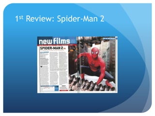
1st Review: Spider-Man 2
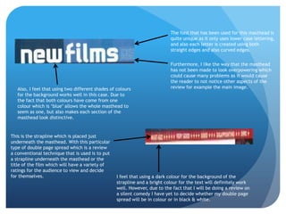
The font that has been used for this masthead is
                                                                            quite unique as it only uses lower case lettering,
                                                                            and also each letter is created using both
                                                                            straight edges and also curved edges.


                                                                            Furthermore, I like the way that the masthead
                                                                            has not been made to look overpowering which
                                                                            could cause many problems as it would cause
                                                                            the reader to not notice other aspects of the
   Also, I feel that using two different shades of colours                  review for example the main image.
   for the background works well in this case. Due to
   the fact that both colours have come from one
   colour which is ‘blue’ allows the whole masthead to
   seem as one, but also makes each section of the
   masthead look distinctive.


This is the strapline which is placed just
underneath the masthead. With this particular
type of double page spread which is a review
a conventional technique that is used is to put
a strapline underneath the masthead or the
title of the film which will have a variety of
ratings for the audience to view and decide
for themselves.                                    I feel that using a dark colour for the background of the
                                                   strapline and a bright colour for the text will definitely work
                                                   well. However, due to the fact that I will be doing a review on
                                                   a silent comedy I have yet to decide whether my double page
                                                   spread will be in colour or in black & white.
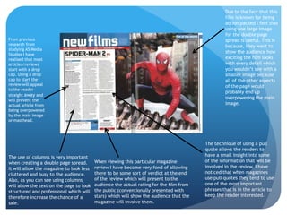
Due to the fact that this
                                                                                                  film is known for being
                                                                                                  action packed I feel that
                                                                                                  using one large image
                                                                                                  for the double page
From previous                                                                                     spread is useful. This is
research from                                                                                     because, they want to
studying AS Media
                                                                                                  show the audience how
Studies I have
realised that most                                                                                exciting the film looks
articles/reviews                                                                                  with every detail which
start with a drop                                                                                 you wouldn’t see with a
cap. Using a drop                                                                                 smaller image because
cap to start the                                                                                  all of the other aspects
review will appeal                                                                                of the page would
to the reader
                                                                                                  probably end up
straight away and
                                                                                                  overpowering the main
will prevent the
actual article from                                                                               image.
being overpowered
by the main image
or masthead.


                                                                                         The technique of using a pull
                                                                                         quote allows the readers to
The use of columns is very important                                                     have a small insight into some
when creating a double page spread.       When viewing this particular magazine          of the information that will be
It will allow the magazine to look less   review I have become very fond of allowing     involved in the review. I have
cluttered and busy to the audience.       there to be some sort of verdict at the end    noticed that when magazines
Also, as you can see using columns        of the review which will present to the        use pull quotes they tend to use
will allow the text on the page to look   audience the actual rating for the film from   one of the most important
structured and professional which will    the public (conventionally presented with      phrases that is in the article to
therefore increase the chance of a        stars) which will show the audience that the   keep the reader interested.
sale.                                     magazine will involve them.
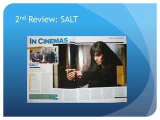
2nd Review: SALT
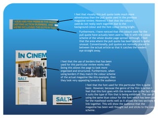
I feel that visually this pull quote looks much more
           adventurous than the pull quote used in the previous
           magazine review. However, I feel that the colours
           used do not really work together due to the
           background colour and the font colour being bright.
               Furthermore, I have noticed that the colours used for the
               pull quote have actually been used to link in with the colour
               scheme of the whole double page spread. Although, I feel
               that the area where the pull quote has been placed is quite
               unusual. Conventionally, pull quotes are normally placed in-
               between the actual article so that it catches the readers
               eye straight away.


I feel that the use of borders that has been
used for this particular review works well.
Doing this allows the page to look more
organised and structured. Furthermore, when
using borders if they match the colour scheme
of the actual magazine like this example, then
they look very appealing towards the audience
                    I feel that the font used for this particular film is quite
                    basic. However, because the genre of the film is action I
                    feel that this font goes with the review due to the fact that
                    it suits the type of film that is being exhibited. The use of
                    using the same blue colour for the font which has been used
                    for the masthead works well as it allows the two sections to
                    link together. This will show the audience that the
                    magazine has been well thought out and sticks to the colour
                    scheme.
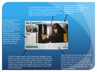
For this magazine they have
                                   The main image that has been used for this        actually put the issue date of the
                                   review will look very appealing towards the       magazine which makes the
                                   reader. This is because, from this one main       magazine look much more
                                   image the reader will be able to figure out the   professional.
                                   type of movie that is being reviewed.


I like the fact that the
article includes
promotional information
about the particular
film. This will allow the
audience to know more
about the film’s
background. Also, the
use of changing the font
colour for each section
of personal information
allows the reader to
view it much easier.


                                                                               I like the way this particular magazine film
       The use of page numbers on this particular magazine works               review makes the use of columns to
       well as it is quite small, which means that the audience will           structure the layout of the text for their
       not be distracted by the page numbers instead of reading the            review. Also, they have created columns
       review or viewing the main image. Furthermore, when the                 which actually surround the lower half of
       audience go through the magazine they will notice the page              the main image which will allow the actual
       numbers which allows the double page spread to look much                article to look more appealing to the
       more professional.                                                      magazines audience.

Ancillary double page spread research

  • 1.
    Ancillary Double Page Spread Research By Tesfah Watkins-Scott
  • 2.
    Introduction  The silentcomedy that Marcus & I will be producing will need to have some sort of film review which will actually give feedback about our particular film with some sort of rating. The double page spread review will need to be viewed as appealing by our target audience as they would be the audience that would allow our short film to become successful when seen. As I decided to research into film posters for the first ancillary product, I think that it would be wise to do some research on the second ancillary task also which is the review or double page spread.  For the double page spread review I will be presenting some research that I have done to help me create a successful review page whilst involving professional skills and conventions that have been used in other magazine reviews.
  • 3.
  • 4.
    The font thathas been used for this masthead is quite unique as it only uses lower case lettering, and also each letter is created using both straight edges and also curved edges. Furthermore, I like the way that the masthead has not been made to look overpowering which could cause many problems as it would cause the reader to not notice other aspects of the Also, I feel that using two different shades of colours review for example the main image. for the background works well in this case. Due to the fact that both colours have come from one colour which is ‘blue’ allows the whole masthead to seem as one, but also makes each section of the masthead look distinctive. This is the strapline which is placed just underneath the masthead. With this particular type of double page spread which is a review a conventional technique that is used is to put a strapline underneath the masthead or the title of the film which will have a variety of ratings for the audience to view and decide for themselves. I feel that using a dark colour for the background of the strapline and a bright colour for the text will definitely work well. However, due to the fact that I will be doing a review on a silent comedy I have yet to decide whether my double page spread will be in colour or in black & white.
  • 5.
    Due to thefact that this film is known for being action packed I feel that using one large image for the double page From previous spread is useful. This is research from because, they want to studying AS Media show the audience how Studies I have realised that most exciting the film looks articles/reviews with every detail which start with a drop you wouldn’t see with a cap. Using a drop smaller image because cap to start the all of the other aspects review will appeal of the page would to the reader probably end up straight away and overpowering the main will prevent the actual article from image. being overpowered by the main image or masthead. The technique of using a pull quote allows the readers to The use of columns is very important have a small insight into some when creating a double page spread. When viewing this particular magazine of the information that will be It will allow the magazine to look less review I have become very fond of allowing involved in the review. I have cluttered and busy to the audience. there to be some sort of verdict at the end noticed that when magazines Also, as you can see using columns of the review which will present to the use pull quotes they tend to use will allow the text on the page to look audience the actual rating for the film from one of the most important structured and professional which will the public (conventionally presented with phrases that is in the article to therefore increase the chance of a stars) which will show the audience that the keep the reader interested. sale. magazine will involve them.
  • 6.
  • 7.
    I feel thatvisually this pull quote looks much more adventurous than the pull quote used in the previous magazine review. However, I feel that the colours used do not really work together due to the background colour and the font colour being bright. Furthermore, I have noticed that the colours used for the pull quote have actually been used to link in with the colour scheme of the whole double page spread. Although, I feel that the area where the pull quote has been placed is quite unusual. Conventionally, pull quotes are normally placed in- between the actual article so that it catches the readers eye straight away. I feel that the use of borders that has been used for this particular review works well. Doing this allows the page to look more organised and structured. Furthermore, when using borders if they match the colour scheme of the actual magazine like this example, then they look very appealing towards the audience I feel that the font used for this particular film is quite basic. However, because the genre of the film is action I feel that this font goes with the review due to the fact that it suits the type of film that is being exhibited. The use of using the same blue colour for the font which has been used for the masthead works well as it allows the two sections to link together. This will show the audience that the magazine has been well thought out and sticks to the colour scheme.
  • 8.
    For this magazinethey have The main image that has been used for this actually put the issue date of the review will look very appealing towards the magazine which makes the reader. This is because, from this one main magazine look much more image the reader will be able to figure out the professional. type of movie that is being reviewed. I like the fact that the article includes promotional information about the particular film. This will allow the audience to know more about the film’s background. Also, the use of changing the font colour for each section of personal information allows the reader to view it much easier. I like the way this particular magazine film The use of page numbers on this particular magazine works review makes the use of columns to well as it is quite small, which means that the audience will structure the layout of the text for their not be distracted by the page numbers instead of reading the review. Also, they have created columns review or viewing the main image. Furthermore, when the which actually surround the lower half of audience go through the magazine they will notice the page the main image which will allow the actual numbers which allows the double page spread to look much article to look more appealing to the more professional. magazines audience.