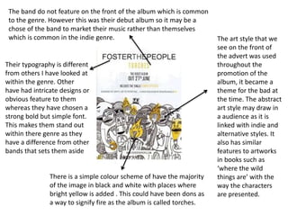
1. The art style that we
see on the front of
the advert was used
throughout the
promotion of the
album, it became a
theme for the bad at
the time. The abstract
art style may draw in
a audience as it is
linked with indie and
alternative styles. It
also has similar
features to artworks
in books such as
‘where the wild
things are’ with the
way the characters
are presented.
There is a simple colour scheme of have the majority
of the image in black and white with places where
bright yellow is added . This could have been dons as
a way to signify fire as the album is called torches.
The band do not feature on the front of the album which is common
to the genre. However this was their debut album so it may be a
chose of the band to market their music rather than themselves
which is common in the indie genre.
Their typography is different
from others I have looked at
within the genre. Other
have had intricate designs or
obvious feature to them
whereas they have chosen a
strong bold but simple font.
This makes them stand out
within there genre as they
have a difference from other
bands that sets them aside
2. Foster The People
• The advert needs to stand out as this was the bands first album, so their fan base
wasn’t yet established. This was there chance to create there image and would
have been one of the first times they marketed themselves. The advert is eye-
catching in the way that it is made to look like a sketch, where other artist have
used photographs or digitally made images to put on there adverts there style is
different. This could appeal to the audience type of explores who are looking for
things that are different
• The advert depict different types of creatures, some look as if they are monsters.
However even though this would suggest that perhaps the were villainous
characters they are instead smiling and laughing as a group so this erases the fact
that they are the villain archetypal characters.
• The general mood of the advert is uplifting and bright. This is created by its chose
of colour scheme and characters that feature on the front of the album. As this is
the first time the band has marketed themselves perhaps the monsters on the
front represented people and they are depicted in such a way to show our
differences. With acceptance we can be happy and so the band is trying to put
across this message which also links to there name ‘foster the people’