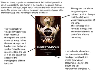
1. Throughout the album,
imagine dragons
released abstract images
that they felt were
visual representations of
the song.
These images were
released in magazines
and on social media as
part of the albums
marketing.
The typography of
‘Imagine Dragons’ has
been repetitive
throughout the bands
career as a way to link
there work together. It
has become the bands
symbol (how they are
recognised) so the use
of it on the advert will
appeal to the
demographic of their
fan base.
There is a binary opposite in the way that the dark red background is a
direct contrast to the pale human in the middle of the advert. Red has
connotations of danger, anger, hell; it contrasts the white which connotes
purity. The general expression of the person also connotes heaven with
them looking up and a halo shaped around their head.
It includes details such as
the release date and the
bands personal website
where they would
presumable market the
album and sell
merchandise alongside it.
2. Imagine Dragons
• The album that his advert is promoting is ‘Smokes + Mirrors’ which is the
second album released by the band. We could place character theory's with
the album as each song represented a different person. (E.g. ‘gold’
represented the corrupted rich and the character portrayed in the artwork for
that album was villainous.)
• The advert itself is aimed at an audience who perhaps would want to read into
the artwork as there is a lot of focus around it. The obvious demographic
would be there original audience as they have been creating music since 2008.
There audience would now older the album has also seemingly matured.
• From the content on the album it could appeal to strugglers as it includes
songs such as ‘dream’ which speaks about wanting to escaping the struggles in
society and fall into dreams. However this specific advert connotes hope and
freedom with the imagery of the bird In flight and there person who seems to
be ‘praying.’ Perhaps this would appeal more to reformers who search for new
ways to find freedom and enlightenment.