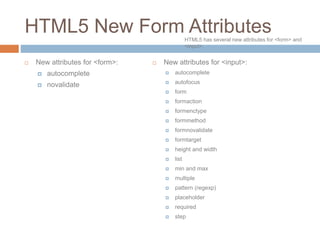
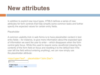
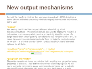
HTML5 includes many new features for forms that make them easier to create and more powerful. It introduces new form controls like number, range, date, time, color pickers as well as new attributes for validation and user experience improvements. While support is still limited, as browsers implement these new standards forms will work more consistently across devices and enable more semantic data collection.
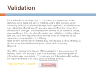
In this slide I described all control which is used by the Html Form Controls such as checkbox , radio , text , drop down list / select , file upload and html output controls.
This paper’s aim is to point out the RAD ( Rapid application development) elements present in the Microsoft’s MVC 3 and WCF 4.0 using Microsoft Visual Studio 2010. It will describe why creating a new web application using MVC 3 and WCF 4.0 is a easy and fast and also present simple ways to develop such applications.
Maximize Your Content with Beautiful Assets : Content & Asset for Landing Page pmgdscunsri
Figma is a cloud-based design tool widely used by designers for prototyping, UI/UX design, and real-time collaboration. With features such as precision pen tools, grid system, and reusable components, Figma makes it easy for teams to work together on design projects. Its flexibility and accessibility make Figma a top choice in the digital age.
Between Filth and Fortune- Urban Cattle Foraging Realities by Devi S Nair, An...Mansi Shah
This study examines cattle rearing in urban and rural settings, focusing on milk production and consumption. By exploring a case in Ahmedabad, it highlights the challenges and processes in dairy farming across different environments, emphasising the need for sustainable practices and the essential role of milk in daily consumption.
PDF SubmissionDigital Marketing Institute in NoidaPoojaSaini954651
https://www.safalta.com/online-digital-marketing/advance-digital-marketing-training-in-noidaTop Digital Marketing Institute in Noida: Boost Your Career Fast
[3:29 am, 30/05/2024] +91 83818 43552: Safalta Digital Marketing Institute in Noida also provides advanced classes for individuals seeking to develop their expertise and skills in this field. These classes, led by industry experts with vast experience, focus on specific aspects of digital marketing such as advanced SEO strategies, sophisticated content creation techniques, and data-driven analytics.
Book Formatting: Quality Control Checks for DesignersConfidence Ago
This presentation was made to help designers who work in publishing houses or format books for printing ensure quality.
Quality control is vital to every industry. This is why every department in a company need create a method they use in ensuring quality. This, perhaps, will not only improve the quality of products and bring errors to the barest minimum, but take it to a near perfect finish.
It is beyond a moot point that a good book will somewhat be judged by its cover, but the content of the book remains king. No matter how beautiful the cover, if the quality of writing or presentation is off, that will be a reason for readers not to come back to the book or recommend it.
So, this presentation points designers to some important things that may be missed by an editor that they could eventually discover and call the attention of the editor.
White wonder, Work developed by Eva TschoppMansi Shah
White Wonder by Eva Tschopp
A tale about our culture around the use of fertilizers and pesticides visiting small farms around Ahmedabad in Matar and Shilaj.
Hello everyone! I am thrilled to present my latest portfolio on LinkedIn, marking the culmination of my architectural journey thus far. Over the span of five years, I've been fortunate to acquire a wealth of knowledge under the guidance of esteemed professors and industry mentors. From rigorous academic pursuits to practical engagements, each experience has contributed to my growth and refinement as an architecture student. This portfolio not only showcases my projects but also underscores my attention to detail and to innovative architecture as a profession.
2. HTML5 includes many new features to
make web forms a lot easier to write, and a
lot more powerful and consistent across the
Web. This article gives a brief overview of
some of the new form controls and
functionalities that have been introduced.
Introduction
HTML5 form new tags are still not supported by many
browsers
3. HTML5 New Form Attributes
New attributes for <form>:
autocomplete
novalidate
New attributes for <input>:
autocomplete
autofocus
form
formaction
formenctype
formmethod
formnovalidate
formtarget
height and width
list
min and max
multiple
pattern (regexp)
placeholder
required
step
HTML5 has several new attributes for <form> and
<input>.
4. New form controls
As forms are the main tool for data input in Web applications, and the data we want
to collect has become more complex, it has been necessary to create an input
element with more capabilities, to collect this data with more semantics and better
definition, and allow for easier, more effective error management and validation.
<input type="number">
The first new input type we'll discuss is type="number":
This creates a special kind of input field for number entry – in most supporting
browsers this appears as a text entry field with a spinner control, which allows you to
increment and decrement its value.
<input type="number" … >
5. <input type="range">
Creating a slider control to allow you to choose between a range of values used to be a
complicated, semantically dubious proposition, but with HTML5 it is easy — you just use
the rangeinput type:
<input type="range" … >
A range input type.
Note that, by default, this input does not generally show the currently selected value, or
even the range of values it covers. Authors will need to provide these through other
means – for instance, to display the current value, we could use an <output> element
together with some JavaScript to update its display whenever the user has interacted
with the form:
<output onforminput="value=weight.value"></output>
6. <input type="date"> and other date/time controls
HTML5 has a number of different input types for creating complicated date/time pickers,
for example the kind of date picker you see featured on pretty much every flight/train
booking site out there. These used to be created using unsemantic kludges, so it is great
that we now have standardized easy ways to do this. For example:
<input type="date" … >
<input type="time" … >
Respectively, these create a fully functioning date picker, and a text input containing a
separator for hours, minutes and seconds (depending on the step attribute specified)
that only allows you to input a time value.
date and time input types.
But it doesn't end here — there are a number of other related input types
available:
datetime: combines the functionality of two we have looked at above,
allowing you to choose a date and a time.
month: allows you to choose a month, stored internally as a number
between 1-12, although different browsers may provide you with more
elaborate choosing mechanisms, like a scrolling list of the month names.
week: allows you to choose a week, stored internally in the format 2010-
W37 (week 37 of the year 2010), and chosen using a similar datepicker to
the ones we have seen already.
7. <input type="color">
This input type brings up a color picker. Opera's implementation allows the
user to pick from a
selection of colors, enter hexadecimal values directly in a text field, or to
invoke the OS's native color picker.
a color input, and the native color pickers on Windows and OS X.
8. <input type="search">
The search input type is arguably nothing more than a differently-styled text
input. Browsers are meant to style these inputs the same way as any OS-
specific search functionality. Beyond this purely aesthetic consideration,
though, it's still important to note that marking up search fields explicitly
opens up the possibility for browsers, assistive technologies or automated
crawlers to do something clever with these inputs in the future – for instance,
a browser could conceivably offer the user a choice to automatically create a
custom search for a specific site.
The <datalist> element and list attribute
Up until now we have been used to using <select> and <option> elements to
create dropdown lists of options for our users to choose from. But what if we
wanted to create a list that allowed users to choose from a list of suggested
options, as well as being able to type in their own? That used to require fiddly
scripting – but now you can simply use the list attribute to connect an
ordinary input to a list of options, defined inside a <datalist> element.
<input type="text" list="mydata" … >
<datalist id="mydata">
<option label="Mr" value="Mister">
<option label="Mrs" value="Mistress">
<option label="Ms" value="Miss">
</datalist>
9. <input type="tel">, <input type="email"> and <input type="url">
As their names imply, these new input types relate to telephone numbers,
email addresses and URLs. Browsers will render these as normal text inputs,
but explicitly stating what kind of text we're expecting in these fields plays an
important role in client-side form validation. Additionally, on certain mobile
devices the browser will switch from its regular text entry on-screen keyboard
to the more context-relevant variants. Again, it's conceivable that in the future
browsers will take further advantage of these explicitly marked-up inputs to
offer additional functionality, such as autocompleting email addresses and
telephone numbers based on the user's contacts list or address book.
10. New attributes
In addition to explicit new input types, HTML5 defines a series of new
attributes for form controls that help simplify some common tasks and further
specify the expected values for certain entry fields.
Placeholder
A common usability trick in web forms is to have placeholder content in text
entry fields – for instance, to give more information about the expected type
of information we want the user to enter – which disappears when the form
control gets focus. While this used to require some JavaScript (clearing the
contents of the form field on focus and resetting it to the default text if the
user left the field without entering anything), we can now simply use
the placeholder attribute:
<input type="text"… placeholder="John Doe">
A text input
with placeholder text.
11. Autofocus
Another common feature that previously had to rely on scripting is having a
form field automatically focused when a page is loaded. This can now be
achieved with the autofocusattribute:
<input type="text" autofocus … >
Keep in mind that you shouldn't have more than one autofocus form control
on a single page. You should also use this sort of functionality with caution, in
situations where a form represents the main area of interest in a page. A
search page is a good example – provided that there isn't a lot of content and
explanatory text, it makes sense to set the focus automatically to the text
input of the search form.
Min and Max
As their name suggests, this pair of attributes allows you to set a lower and
upper bound for the values that can be entered into a numerical form field, for
example number, range, time or date input types (yes, you can even use it to
set upper and lower bounds for dates – for instance, on a travel booking form
you could limit the datepicker to only allow the user to select future dates).
For range inputs, min and max are actually necessary to define what values
are returned when the form is submitted. The code is pretty simple and self-
explanatory:
<input type="number" … min="1" max="10">
12. Step
The step attribute can be used with a numerical input value to dictate how
granular the values you can input are. For example, you might want users to
enter a particular time, but only in 30 minute increments. In this case, we can
use the step attribute, keeping in mind that for time inputs the value of the
attribute is in seconds:
<input type="time" … step="1800">
13. New output mechanisms
Beyond the new form controls that users can interact with, HTML5 defines a
series of new elements specifically meant to display and visualise information
to the user.
<output>
We already mentioned the <output> element when talking about
the range input type – this element serves as a way to display the result of a
calculation, or more generally to provide an explicitly identified output of a
script (rather than simply pushing some text into in a random span or div). To
make it even more explicit what particular form controls the <output>relates
to, we can – in a similar way to <label> – pass a list of IDs in the element's
optional for attribute.
<input type="range" id="rangeexample" … > <output
onforminput="value=rangeexample.value" for="rangeexample"></output>
<progress> and <meter>
These two new elements are very similar, both resulting in a gauge/bar being
presented to the user. Their distinction is in their intended purpose. As the
name suggests, progress is meant to represent a progress bar, to indicate
14. Validation
Form validation is very important on both client- and server-side, to help
legitimate users avoid and correct mistakes, and to stop malicious users
submitting data that could cause damage to our application. As browsers can
now get an idea of what type of values are expected from the various form
controls (be it their type, or any upper/lower bounds set on numerical values,
dates and times), they can also offer native form validation – another tedious
task that, up to now, required authors to write reams of JavaScript or use
some ready-made validation script/library.
Note: for form controls to be validated, they need to have a name attribute, as
without it they wouldn't be submitted as part of the form anyway.
Required
One of the most common aspects of form validation is the enforcement of
required fields – not allowing a form to be submitted until certain pieces of
information have been entered. This can now simply be achieved by adding
the required attribute to an input, select or textarea element.
<input type="text" … required>
15. Type and pattern
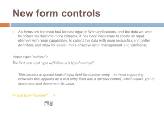
As we've seen, authors can now specify the kinds of entries they expect from
their form fields – rather than simply defining text inputs, authors can
explicitly create inputs for things like numbers, email addresses and URLs. As
part of their client-side validation, browsers can now check that what the user
entered in these more specific fields matches the expected structure – in
essence, browsers evaluate the input values against a built-in pattern that
defines what valid entires in those types of inputs look like, and will warn a
user when their entry didn't match the criteria.
For other text entry fields that nonetheless need to follow a certain structure
(for instance, login forms where the usernames can only contain a specific
sequence of lowercase letters and numbers), authors can use
the pattern attribute to specify their own custom regular expression.
<input type="text" … pattern="[a-z]{3}[0-9]{3}">
16. On the desktop, Opera currently has the most
complete implementation of new input types and
native client-side validation, but support is on the
roadmap for all other major browsers as well, so it
won't be long before we can take advantage of
these new powerful tools in our projects. But what
about older browser versions?
By design, browsers that don't understand the new
input types (like date or number) will simply fall
back to treating them as standard text inputs – not
as user-friendly as their advanced HTML5
counterparts, but at the very least they allow for a
Browser support