1. WEB INPUT FORMS
SUBMITTED BY
MRS.R.CHINTHAMANI,
ASSISTANT PROFESSOR,
DEPARTMENT OF COMPUTER SCIENCE
E.M.G.YADAVA WOMEN’S COLLEGE
2. THE INPUT (FORM INPUT)
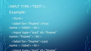
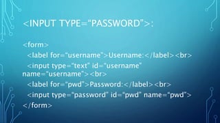
The <input> HTML element is used to create
interactive controls for web-based forms in order to
accept data from the user; a wide variety of types of
input data and control widgets are available,
depending on the device and user agent. The
<input> element is one of the most powerful and
complex in all of HTML due to the sheer number of
combinations of input types and attributes.
3. <INPUT> TYPES
How an <input> works varies considerably
depending on the value of its type attribute,
hence the different types are covered in their
own separate reference pages. If this attribute is
not specified, the default type adopted is text.
4. THE AVAILABLE TYPES ARE AS
FOLLOWS:
Button:
A push button with no default behavior displaying the value of the value
attribute, empty by default.
Check box:
A check box allowing single values to be selected/deselected
Color:
A control for specifying a color; opening a color when active in
supporting browsers.
5. Date:
A control for entering a date (year, month, and day, with
no time). Opens a date picker or numeric wheels for year,
month, day when active in supporting browsers.
Datetime-local:
A control for entering a date and time, with no time zone.
Opens a date picker or numeric wheels for date- and
time-components when active in supporting browsers.
Reset:
A button that resets the contents of the form to default
values. Not recommended.
6. Email:
A field for editing an email address. Looks like a text input, but has
validation parameters and relevant keyboard in supporting browsers
and devices with dynamic keyboards
File:
A control that lets the user select a file. Use the accept attribute to
define the types of files that the control can select.
Range:
A control for entering a number whose exact value is not
important. Displays as a range widget defaulting to the middle
value. Used in conjunction min and max to define the range of
acceptable values.
7. Hidden:
A control that is not displayed but whose value is
submitted to the server. There is an example in the next
column, but it’s hidden!
Image:
A graphical submit button. Displays an image defined by
the src attribute. The alt attribute displays if the image src
is missing.
Radio:
A radio button, allowing a single value to be selected out
of multiple choices with the same name value.
8. Month:
A control for entering a month and year, with no time
zone.
Number:
A control for entering a number. Displays a spinner and
adds default validation. Displays a numeric keypad in
some devices with dynamic keypads
Password:
A single-line text field whose value is obscured. Will alert
user if site is not secure.
9. Search:
A single-line text field for entering search strings.
Line-breaks are automatically removed from the
input value
Submit:
A button that submits the form.
Tel:
A control for entering a telephone number. Displays
a telephone keypad in some devices with dynamic
keypads
10. Time:
entering a time value with no time zone.
URL:
A field for entering a URL. Looks like a text input,
but has validation parameters and relevant
keyboard in supporting browsers and devices with
dynamic keyboards
Week:
A control for entering a date consisting of a week-
year number and a week number with no time zone.
16. Output:
This is how the HTML code above will be displayed in
a browser:
HTML
CSS
JavaScript
17. <INPUT TYPE CHECK BOX>
<form>
<input type=“checkbox” id=“vehicle1” name=“vehicle1” value=“Bike”>
<label for=“vehicle1”> I have a bike</label><br>
<input type=“checkbox” id=“vehicle2” name=“vehicle2” value=“Car”>
<label for=“vehicle2”> I have a car</label><br>
<input type=“checkbox” id=“vehicle3” name=“vehicle3” value=“Boat”>
<label for=“vehicle3”> I have a boat</label>
</form>
18. Output:
This is how the HTML code above will be displayed in a browser:
I have a bike
I have a car
I have a boat