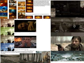
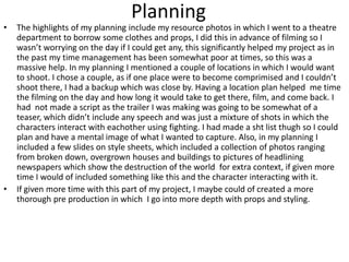
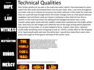
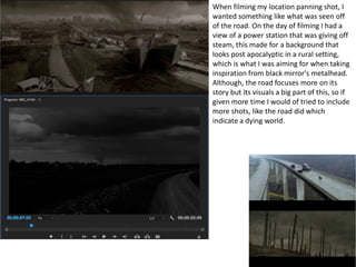
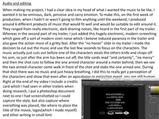
5. To demonstrate the difficulties of not living with healthcare, shops and anything we take for
granted in life, I wanted to use influence from two of the most popular survival movies that have
ever been created to really focus on the horrible things like operating on yourself, dealing with
extreme hunger, to keep up moral in the dire situation and a will to live. In the end, the only
inclination of survival was fighting to the death, but if I had more time I believe I could
demonstrate this aspect of life really well.
6. Planning
• The highlights of my planning include my resource photos in which I went to a theatre
department to borrow some clothes and props, I did this in advance of filming so I
wasn’t worrying on the day if I could get any, this significantly helped my project as in
the past my time management has been somewhat poor at times, so this was a
massive help. In my planning I mentioned a couple of locations in which I would want
to shoot. I chose a couple, as if one place were to become comprimised and I couldn’t
shoot there, I had a backup which was close by. Having a location plan helped me time
the filming on the day and how long it would take to get there, film, and come back. I
had not made a script as the trailer I was making was going to be somewhat of a
teaser, which didn’t include any speech and was just a mixture of shots in which the
characters interact with eachother using fighting. I had made a sht list thugh so I could
plan and have a mental image of what I wanted to capture. Also, in my planning I
included a few slides on style sheets, which included a collection of photos ranging
from broken down, overgrown houses and buildings to pictures of headlining
newspapers which show the destruction of the world for extra context, if given more
time I would of included something like this and the character interacting with it.
• If given more time with this part of my project, I maybe could of created a more
thorough pre production in which I go into more depth with props and styling.
7.
8. Time Management
In this project I believe I managed my time quite well, everything has been
completed on time and I have been mostly happy with the outcome. I think that if I
were given more time I could of created a significantly better project. The fact that
were making a trailer in the space of four weeks is a bit unrealistic from a film
management perspective, so obviously its going to be hard to get right. So If I were to
redo this year, I'd be thinking about what I want to do for my FMP at the start of the
year, then you'd be a few steps ahead and it would run more smoothly. If I had more
time to produce my fmp though, I could include a lot more shots of the character
interacting with his environment to show more context and make the whole thing a
bit less confusing.
9. Technical Qualities
One similar product to my own is the mad max trailer, which I have borrowed to some
extent the title cards and evolved them into my own style. Also, I use mine throughout
my trailer and use it a device to structure my trailer, whereas in the trailer for mad max
they are used half way through where the trailer changes tone to a fast paced classical
song(dies irae) and these cards are shown in-between a few shots for less than a
second. In the mad max trailer the editing of the background which was a rusty
maroon colour goes nicely with the reddish smoke that is pasted over the bright yellow
text. And mine are still images and I liked the fact of the large writing which explained
the premise of my trailer, or at least helped to do so. If given more time, I believe I
could make something more intriguing to look at, I think a smoke effect or like dripping
oil or liquid would work well over the white text. I would also make them seem more
gritty and rough to fit the genre and style of the trailer more.
10. When filming my location panning shot, I
wanted something like what was seen off
of the road. On the day of filming I had a
view of a power station that was giving off
steam, this made for a background that
looks post apocalyptic in a rural setting,
which is what I was aiming for when taking
inspiration from black mirror's metalhead.
Although, the road focuses more on its
story but its visuals a big part of this, so if
given more time I would of tried to include
more shots, like the road did which
indicate a dying world.
11. Audio and editing
When making my project, I had a clear idea in my head of what I wanted the music to be like, I
wanted it to be ominous, dark, perceive and carry emotion. To make this, on the first week of
production, when I hadn't or wasn’t going to film anything until the weekend, I produced
around 6 different products of music that would fit well and would be suitable to edit around it.
They ranged from really electronic, dark droning noises, like heard in the first part of my trailer.
Whereas in the second part of my trailer, I just added this hugely electronic, modern screeching
which gave off a sort of modern siren noise which I believe induced paranoia in the trailer and
also gave the action more of a gritty feel. After the "no honor" slide in my trailer I made the
decision to cut out the music and use the last few seconds to focus on the characters. The
music actually just cuts out before one of the characters steals the others knife and chops off
his arm, so just after the arm has been cut off, the title cards read ''and certainly'', ''no mercy''
and then the shot cuts to follow the one armed character around a meter behind, then we see
the two armed character come walk in front of the shot and stabs the one armed one. During
that shot there was no music and just heavy breathing, I did this to really get a perception of
the characters and show that even after an apocalypse or extinction event, you are still human.
Right at the end of my video I include a credits
card which I had seen in other trailers when
doing research, I put a photoshop document
next to one I had screenshotted so I could
capture the style, but also capture where
everything was placed, like where to place the
title of the movie, logos(which I made myself)
and other writing in small font
12. Aesthetic Qualities
As I'm taking a large amount of my inspiration from the black mirror episode metalhead, and
one of the aspects of that inspiration is the noir style, which I think looks really good in my
project. I have used inspiration from both the black mirror episode and the road, this mixture
has produced a look which is lacking any colour, it has little light and it has smoke in the
background which will immerse the audience in the world even more. Another thing I think
looked authentic was the three brands right at the start, these were made by me and I had just
used inspiration from things I had seen in the past. The first shot with the characters in includes
two flintlock pistols, which have a strong steampunk/human ingenuity look. Like they were
homemade in the apocalypse. I liked the styling of the characters, although they look suited to
something more like the purge than the full scale apocalypse, if given more time and if I had
found a better setting where it was closer and I could bring more things I would of made the
costumes more thoroughly and taken into account my mood boards more. I think the fight
scene worked quite well, and when shooting I made sure that part of the trailer will have had
some sort of continuity, to some extent, which it does have, as you can see when watching the
trailer there are a few opposite shots which show the fighting in a realistic way. One more thing
I think worked well was the arm chopping scene, I believe if any other amateur were to make
this it may have been less realistic, but as I used my own sound effects and different shots
during the scene it flowed really well. Obviously it could have been done to a higher
standard with a better camera rig, better lighting, better practical effects, better vfx and a
better understaning of film, angles, mm of lense, zoom, exposure ratio, but when you are
making this on no budget, you have to make what you can with what you have, so I did
exactly that and the end result looks quite good in my opinion.
13.
14. I made this poster in style of not an official
poster, but ones that are done in a certain
art style that are made to look good and
give inks to big parts of the film. So I used
two silouettes of skulls and I edited them in
photoshop so that they're looking away
from eachother. I like this simplistic style as
you can interpirate it as the two characters
looking away from eachother, or you could
look for a deeper meaning and realise the
theme of black and white, which could link
to the ying and yang where that shows that
there cannot be good without evil, but its
also symbolic as the only picture on the
poster is the two skulls on a plain white
background(excluding words)which could
represent that the remaining humans on
the plannet are given a huge playground,
but the skulls also sybolize the death that is
happening, but they are looking away from
eachother, so you can interpritate that it
would be hard to trust new people you
meet, which in the trailer shows you clearly
cant.
15. Audience Appeal
One thing that I know I have appealed to my target audience is the style, as I am part of my
audince, I know that the trench coat, hats, masks, run down and ripped clothes present a
certain atmosphere an style that can be linked with other apocolyptic media that is out there.
Audiences of the movie the road, who are anyone that is 18+ because it is a story about a man
and his son, but also presents a lot if ethical, and phlisofical questions. If given more time I
believe I could incorportate these sorts of ideas trailer, however the thing that will appeal to
the audience of the movie will be the first panning shot, where it looks baron and dark, the
smoke from a powerplant in the background also imerses the audience more into what is
happening in the world. People who are fans of the mad max trailer could recognise that the
font and size of the title cards in my trailer are somewhat similar to the ones seen in the
mad max trailer. The audience of the black mirror episode ''metalhead'' would be pleased to
see a black and white post apococlyptic trailer, the lack of context and the way you as the
watcher are just thrown into this conflict between these two wastelanders will be intriging as
throughout you ask the questions about why they are there and what has happened, which I
wanted to show and use influence from the black mirror episode.
17. Feedback 1
• What did you like about the product?
– I really like the title cards at the start of the trailer and the billing block
at the end of the trailer look really good and fit well with the genre of
film.
– I like the noir colour grading in the trailer it gives a nice and gritty feel
to it all and I think this works really well with the genre.
– I like how it goes more silent at the end of the trailer also I think this
works well.
• What improvements could have been made to the product?
• I feel as though the shot of the two men holding the guns is held a
bit too long and could have maybe been cut a bit earlier I feel as
though it is just held a bit too long.
• I think you could maybe fade the music in a bit slower or have it get
louder as the trailer goes on to build the tension throughout.
18. Feedback 2
• What did you like about the product?
– I do like the font used and the logos and I think they were used very well. However some of
the titles could have maybe used a little movement or a grunge to make them seem more
battered and worn.
– I do like the cinematography, it is done very well.
– Great image quality.
– Great location choice
• What improvements could have been made to the product?
– The music choice was a little poor It just didn’t seem to fit the visuals
– It is a little confusing why they put down the guns. Maybe a voice over could have made it
better to understand what was happening. They put down the guns which at first makes you
think maybe they are standing down but then the one who is standing down first pulls out a
knife and the other character just stands there as he pulls it out
– The colour filters are a little strong. I do get what they were going for but it just feels like it
could have been turned down a little. Also makes it hard to distinguish characters and maybe a
light brown or a grey filter would have been a better choice. Maybe something as simple as
removing green would have been better.
– I don’t really understand what it is supposed to be. I think maybe it’s a trailer but there is
nothing to indicate that it is. The only indication is the beginning and the end when it has the
logos and the release date
– The editing is weirdly done, It can be hard to follow as it can cut to one of them in a bush or it
can cut away from them fighting to cut back to them at the start. It is hard to understand what
is happening
19. Feedback 3
• What did you like about the product?
• I like how you have used heavy breathing instead of music at one point of your
trailer because it helps to make the trailer more dramatic and have a bigger
impact on the person watching.
• I liked the range of different shots that you used in your product because it
makes the trailer more interesting and helps to show the audience a range of
different things from the type of environment they're in, type of clothes
they're wearing and what might happen to the characters.
• What improvements could have been made to
the product?
• I think your product could have been improved if It was slightly slower paced
because it feels rushed and I feel like if the trailer was slightly slower it would
go better with the music that you used.
20. Peer Feedback Summary
• What do you agree with from your peer feedback?
• I agree that the basis of the trailer lacks some context, which is what I was going
for, but I can understand it is quite confusing.
• Some of the shots drag on a bit and the feeling I tried to convey isn't really seen
and I understand that first time viewing with no context would be confusing.
• I agree I could've done more with the audio, changing the volume and pacing
more could've made for a better trailer.
• I also agree that the title cards could've had movement and if I had more time I
would of done this.
• What do you disagree with from your peer feedback?
• I disagree that the only thing indicating it was a trailer was the starting and ending
cards as there is cards all the way through, although I agree that the editing is
done weirdly and I didn’t get as much shots as I wanted.
• I also disagree that you cant make out the characters and get them mixed up as if
you just pay attention you can see the different clothes they both wear like one
has a trench coat, hat, rag mask and the other has a winter hat, mask and leather
jacket.
Editor's Notes
What were the strengths of your research? How did your research help your product?
What were the weaknesses of your research? What could you have done better/improve? What effect would this have had on your product?
What were the strengths of your planning? How did your planning help your product?
What were the weaknesses of your planning? What could you have done better/improve? What effect would this have had on your product?
Did you manage your time well? Did you complete your project on time or would your products have improved with additional time?
What would you have done if you had more time to produce your work?
Compare your work to similar existing products and discuss the similarities and differences
Put your final piece(s) in the centre of a page alongside an existing product
Use text boxes and arrows
Does your work look good? Was it creative? What aspects of your game’s visuals do you like? What would you improve? How would you improve it?
Discuss the strengths and weaknesses
Put your final piece(s) in the centre of a page and analyse them
Use text boxes and arrows
How have you appealed to your target audience? What specific bits of content would appeal to your target audience.
Refer to your findings from your questionnaire.
Put your final piece(s) in the centre of a page and analyse them
Use text boxes and arrows