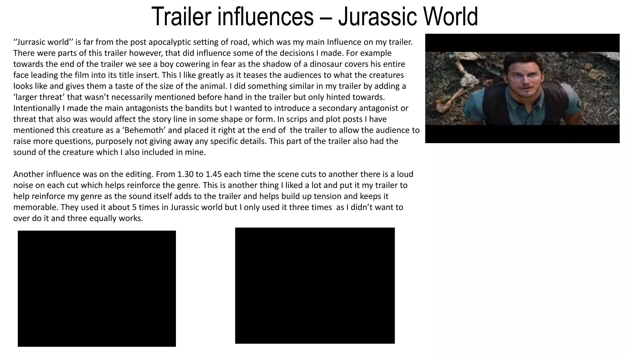
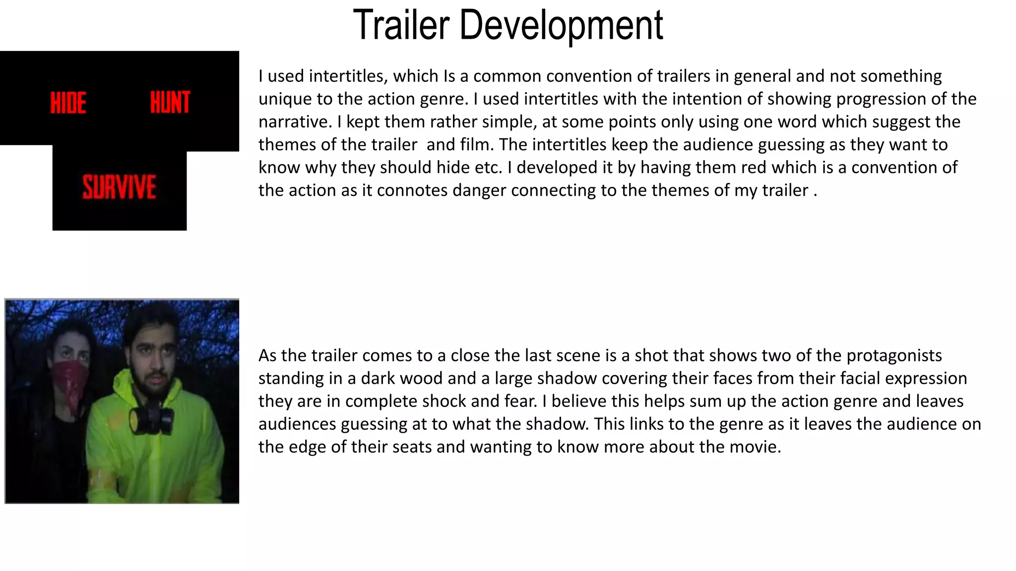
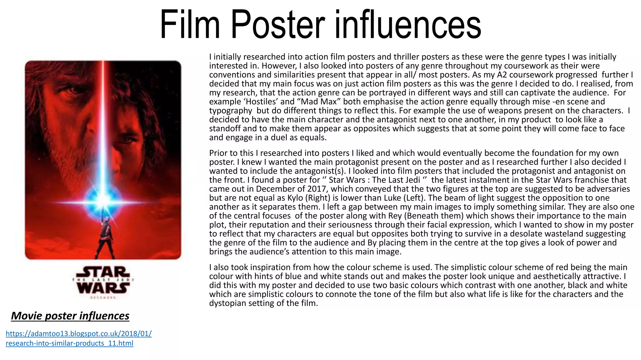
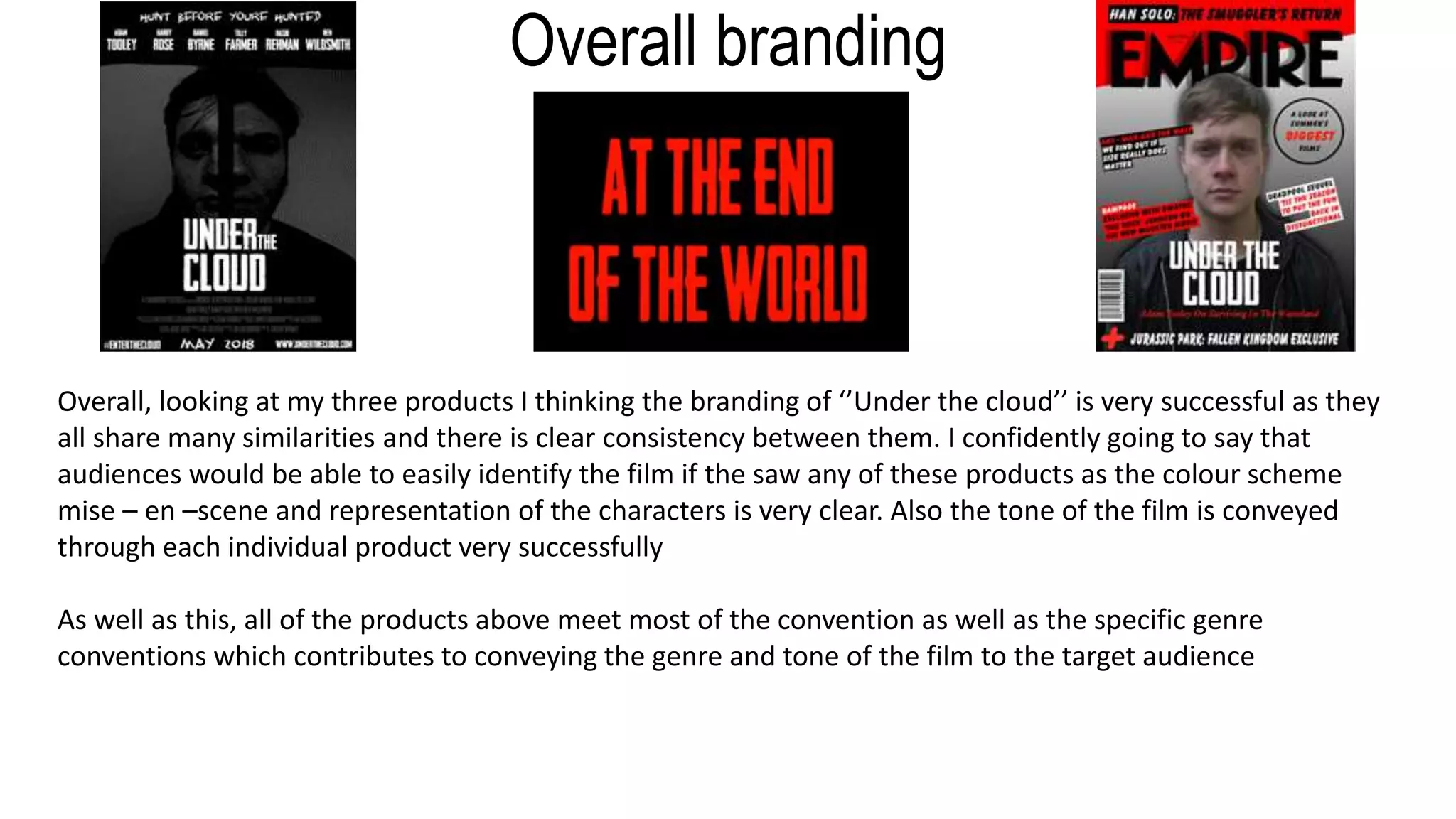
Cloud
Evaluati
on
by Adam Tooley
Question
1
In what way does your
media product use, develop
or challenge forms and
conventions of real media
products ?
First few stages of my
project.
Straight off the bat I wanted my project to be a trailer. My initial ideas for starting my project were influenced by two different genres which I felt
would be interesting to explore. Thriller, and Action. I am a really big fan of these genres and wanted to know how to portray them in a trailer. I did a
bit of research on each, however I knew that in order to progress further I had to narrow down my choices to the one that I felt the most drawn to. I
personally have a great love for these genres and decided to go further with my research looking at their sub genres also.
http://adamtoo13.blogspot.co.uk/2017/09/research-into-similar-products-initial.html
After conducting the research on the genre and looking at the conventions of each I decided to go with the action genre because I thought this would
be quite a challenging project to undertake and I had came up with a story that fitted the action genre better. Originally I wanted to include a small
amount of comedy in my trailer, like how a MARVEL trailer would do so. However comedy wouldn’t have a place in a generic thriller trailer, which is
what I would of gone for, but instead an action trailer would more likely have comedy because this would aid in selling the film to the audience. As I
progressed however I didn’t include comedy. The scenes I had filmed and planned, which were comedic, didn’t really fit the other serious scenes of
the trailer therefore I opted to cut them out of the final product. I pitched My genre, ideas and narrative to a focus group of my target audience which
was well received by them and further inspired me to create a film I titled, at the time ‘’Underneath The Mushroom Cloud’’
The plot essentially revolves around two brothers, living in a post – nuclear world. When his younger brother is taken by a group of bandits, Grey
Westmoreland must trust a group of complete strangers, all of whom are vastly different from one another, to form a team and rescue his brother.
However living in a radiated wasteland is unpredictable and there are many threats that may alternate our protagonist’s path.
A more detailed Synopsis below
http://adamtoo13.blogspot.co.uk/2017/10/drafting-and-planningchoice-of-genre.html
Genre Conventions – Action
Beginning my project I looked at film trailers conventions in a generic context without including conventions of genre. All trailers have similar
conventions and all follow similar structures throughout. This was important for me to know as this research allowed me to make my trailer
appear to realistic and conventional as possible.
Characteristics of a Film Trailer : http://adamtoo13.blogspot.co.uk/2017/09/research-into-similar-products.html
However, I went further then just looking at the generic conventions of a trailer. In order for my trailer follow the conventions of an action
trailer I had to look at the specific convention of the action genre. This would then allow me to appeal more directly to my target audience as I
applied these conventions to my trailer and ancillaries. For example fast paced action sequences are a common convention of an action trailer
as this gives audiences more knowledge on the type of film they are watching and creates anticipation and excitement for the film. Another
convention common of an action trailer is the we’re introduced to the antagonist but not much is said about them.
https://adamtoo13.blogspot.co.uk/2017/10/research-into-similar-products-genre.html
I also analysed existing Action Trailers and posters. This was to ensure that when I came to constructing these parts of my projects I had
something to compare them too and make them look as realistic as possible. For example I look at poster such as the justice league poster and
Star Wars the Last Jedi, which are action films, and trailers like Jurassic world and Tomb raider.
https://adamtoo13.blogspot.co.uk/2017/12/research-
into-similar-products_30.html
https://adamtoo13.blogspot.co.uk/2018/01/
research-into-similar-products_11.html
https://adamtoo13.blogspot.co.uk/2017/09/research-
into-similar-products-film_19.html
https://adamtoo13.blogspot.co.uk/2017/09/research-
into-similar-products-trailer.html
Tomb Raider
Jurassic world
Trailer influences – The Road‘The Road’ has been the main influence for my as it follows a ‘boy’ and a ‘man’ in a post apocalyptic world
trying to find a utopia amongst there dystopian world. This was a concept similar to my own and It was
suggested to me that I take a look at this trailer. The way this trailer is presented involves harsh colours,
themes of hope, desperation and survival and the overall tone is something similar to what I wanted to
replicate in my own product.
‘The Road’ influenced the narrative of my story as both my concept and the concept of ‘The Road’ are
similar and by looking at this allowed me to create new ideas for my trailer. I took inspiration from certain
scenes from the trailer and adapted them to my own story. The themes also allowed me to create and
develop the characters further and to emphasise a struggle within the trailer which the characters face.
I also like the constant battle in this trailer which is shown throughout which is also present in my trailer
and both give an ideal of hope in the trailer itself.
The intertitles from this trailer also influenced my own intertitles. The intertitles, especially towards the
end, used only one word, such as ‘love, hope and survive’. I incorporated this into my own work by having
Intertitles that say ‘Hide, Hunt and Survive. I used this to connote the seriousness and danger in the film
and gives an insight to the protagonist’s lives.
The trailer also influenced Mise en scene such as clothing and location. I gave all my characters survival gear
and torn clothes which would be present in a post apocalyptic film just like ‘ The Road’. Setting majority of it
in a forest was also an influence and makes sense in terms of story as survivors would tend to move away
from urban environments .
https://adamtoo13.blogspot.co.uk/2017/11/research-into-
similar-products-road.html
https://adamtoo13.blogspot.co.uk/2018/03/organisa
tion-intertitles.html
Trailer influences – Jurassic World
‘’Jurrasic world’’ is far from the post apocalyptic setting of road, which was my main Influence on my trailer.
There were parts of this trailer however, that did influence some of the decisions I made. For example
towards the end of the trailer we see a boy cowering in fear as the shadow of a dinosaur covers his entire
face leading the film into its title insert. This I like greatly as it teases the audiences to what the creatures
looks like and gives them a taste of the size of the animal. I did something similar in my trailer by adding a
‘larger threat’ that wasn’t necessarily mentioned before hand in the trailer but only hinted towards.
Intentionally I made the main antagonists the bandits but I wanted to introduce a secondary antagonist or
threat that also was would affect the story line in some shape or form. In scrips and plot posts I have
mentioned this creature as a ‘Behemoth’ and placed it right at the end of the trailer to allow the audience to
raise more questions, purposely not giving away any specific details. This part of the trailer also had the
sound of the creature which I also included in mine.
Another influence was on the editing. From 1.30 to 1.45 each time the scene cuts to another there is a loud
noise on each cut which helps reinforce the genre. This is another thing I liked a lot and put it my trailer to
help reinforce my genre as the sound itself adds to the trailer and helps build up tension and keeps it
memorable. They used it about 5 times in Jurassic world but I only used it three times as I didn’t want to
over do it and three equally works.
Film trailer Development
I started my trailer on a black screen to create mystery and intrigue. I used a black image to create a sinister tone
immediately and to make the narrative more significant as there is nothing for the eyes to view at this moment. A soon as
the narrative ‘I have know a true freedom’ finished a shot of a burning pile appears. This contrasts to what is being said
and creates a sense of irony whilst grabbing the attention of the audience more as this suddenly appears making it more
shocking and unexpected. The use of harsh colours set a serious tone for the film and introduces audiences to the world
of ‘’Under The Cloud’’
I carried on with this for the opening of the trailer to create a clear contrast to what the protagonist is saying whilst
suggesting that he has lost this ‘true freedom’. It also suggests someone or something has taken it away from him. Still
using the black screen to create a creepy and eerie vibe he then goes onto say ‘I have know a world of undeniable peace
and tranquillity’ further emphasising the life he once knew. This also implicates that the world itself is in turmoil, as he no
longer knows this world and further suggests the post apocalyptic / action genre. It also makes the audience wonder who
he is talking to. To accompany this scene I have used a shot of someone being taken by someone else . This is fast paced
which is a convention of the action genre, immediately suggesting the type of film the audience is watching.
The final shot of this part of the trailer is a quick fight scene when the audience is least expecting accompanied by the
line of dialogue ‘a world … that was taken from me’. I love this shot personally as it is conventional to the action genre,
immerses the audience into the type of film they are watching and they would least a fight scene at the beginning of the
trailer. The antagonist In this shot has a bandana covering their face so the audience can’t create a connection with them.
This is consistent throughout the trailer. To create an even more intense shot edited the shot to blink when the sound
effects used would hit a beat making the scene more effective by creating more suspense and anticipation. This shot is an
over the shoulder shot which I like as it creates the suggestion of a leader or a hero but also a mystery as the audience
are unaware to who this individual is or to what they look like. The dialogue ‘a world … that was taken from me’ has a
double meaning as audiences will find out that both the world he knew is gone but also his brother creating sympathy for
him but also the other characters.
Film Trailer Development
We find out who the individual is and who he was talking too. Now the main protagonist has been introduced to the audience, the
action genre is built upon as we see one of the other main characters looking out through a destroyed glass pane. It suggests a fight
may of taken place here. This is conventional of the action genre as this makes connections with death, war etc. This scene not only
highlights the one of many settings of the film but also the tone of the film and establishes the dystopian society. The mise – en –
scene used, through the use of costume, would strike intrigue into the audience. It is unusual for a man to wear a gas mask, bandana
and torn clothes for a normal civilian and would allow the audience to fill in the gaps and understand the type of world being
portrayed. However, this would also creates a sense of mystery to what has happened in this world. The line of dialogue for this
scene ‘’ the world’s not the same anymore. The wasteland is all that remains … and its ruthless.’’ confirms to the audience the wider
plot and devastation that has occurred and that this is a post apocalyptic trailer. Multiple shots were used for this scene such as over
the shoulder, medium close up and close up and allows audiences to establish a connection with this character as they are essential
to the plot. The weather suggests the turmoil and conflict.
The next shot I like a lot as it is a low angle shot which further emphasise the authority of this character as he is someone to look up to. This scene is
important and is one of the most pivotal as we learn the main plot of the film and the main protagonist’s motives. Audiences will also be able to link
this scene to the ones that opened the trailer as the are in the same setting and were action scenes creating continuity between them. ‘They took him
right in front of me’ Also gives an insight to the antagonist’s motives but not directly giving them an answer. this creates mystery around them due to
them being referred to them as ‘they’ which doesn’t give much away. However, we learn that this group abducts people suggesting an evil group of
people therefore making the audience route for the protagonist. This scene leads to the main protagonist holding a bottle which belongs to his
brother. The audience will be able to link the two as it appears whilst he talks about his brother. This creates sympathy as the bottles appears to be
one from their childhood that their mother has wrote on so they can differentiate between their bottles when they were younger. This also creates a
deeper commitment to the plot as now there is a suggestion to their deeper relationship and the bottle being the only thing he has left of him … for
now !
The scenes following allows the audience to see how the plot revolves around the wider synopsis of the story. This scene reflects the character of jack
Sinclair (The guy with hat) as a morally good individual who seems to decide to help Grey in finding his brother when he says ‘’Lets hope your brother is
one of them’’ when he refers to how many people he thinks are still alive. This medium close-up shot is important as it suggests their growing
relationship and trust but also doubt in Sinclair’s mind as he looks away with concern whether he can save grey’s brother.
Trailer Development
I used intertitles, which Is a common convention of trailers in general and not something
unique to the action genre. I used intertitles with the intention of showing progression of the
narrative. I kept them rather simple, at some points only using one word which suggest the
themes of the trailer and film. The intertitles keep the audience guessing as they want to
know why they should hide etc. I developed it by having them red which is a convention of
the action as it connotes danger connecting to the themes of my trailer .
As the trailer comes to a close the last scene is a shot that shows two of the protagonists
standing in a dark wood and a large shadow covering their faces from their facial expression
they are in complete shock and fear. I believe this helps sum up the action genre and leaves
audiences guessing at to what the shadow. This links to the genre as it leaves the audience on
the edge of their seats and wanting to know more about the movie.
Film Poster influences
I initially researched into action film posters and thriller posters as these were the genre types I was initially
interested in. However, I also looked into posters of any genre throughout my coursework as their were
conventions and similarities present that appear in all/ most posters. As my A2 coursework progressed further I
decided that my main focus was on just action film posters as this was the genre I decided to do. I realised, from
my research, that the action genre can be portrayed in different ways and still can captivate the audience. For
example ‘Hostiles’ and “Mad Max” both emphasise the action genre equally through mise -en scene and
typography but do different things to reflect this. For example the use of weapons present on the characters. I
decided to have the main character and the antagonist next to one another, in my product to look like a
standoff and to make them appear as opposites which suggests that at some point they will come face to face
and engage in a duel as equals.
Prior to this I researched into posters I liked and which would eventually become the foundation for my own
poster. I knew I wanted the main protagonist present on the poster and as I researched further I also decided I
wanted to include the antagonist(s). I looked into film posters that included the protagonist and antagonist on
the front. I found a poster for ‘’ Star Wars : The Last Jedi ‘’ the latest instalment in the Star Wars franchise that
came out in December of 2017, which conveyed that the two figures at the top are suggested to be adversaries
but are not equal as Kylo (Right) is lower than Luke (Left). The beam of light suggest the opposition to one
another as it separates them. I left a gap between my main images to imply something similar. They are also one
of the central focuses of the poster along with Rey (Beneath them) which shows their importance to the main
plot, their reputation and their seriousness through their facial expression, which I wanted to show in my poster
to reflect that my characters are equal but opposites both trying to survive in a desolate wasteland suggesting
the genre of the film to the audience and By placing them in the centre at the top gives a look of power and
brings the audience’s attention to this main image.
I also took inspiration from how the colour scheme is used. The simplistic colour scheme of red being the main
colour with hints of blue and white stands out and makes the poster look unique and aesthetically attractive. I
did this with my poster and decided to use two basic colours which contrast with one another, black and white
which are simplistic colours to connote the tone of the film but also what life is like for the characters and the
dystopian setting of the film.
Movie poster influences
https://adamtoo13.blogspot.co.uk/2018/01/
research-into-similar-products_11.html
Film Poster influencesThis poster is more complex then the last as it takes advantage of more general conventions expected to see on a
conventional poster such as , poster credits, date of release, name of actors etc. the positioning of the characters is
central but what really attracted me to this poster is how mise – en – scene is used to portray action which is does
effectively by showing two individuals fighting alongside one another with guns and a motor bike. The main image
itself really implicates the genre of the film and the setting of a post apocalyptic desert. The main images gives the
audience and insight into both characters as we see them in their entirety and their costume / mise – en scene. The
also have concentrated and calm facial expressions which makes them look quite cool but also skilful in fighting and
that they mean business and emphasises a lot of fighting may be taking place. However I researched into this poster
I found that the most influential part of this poster was the typography used and the layout.
I started to think about typography and what would be appropriate for my poster. I liked how two different fonts are
used for the tagline and the title which adds variation to the poster and creates the action/post apocalyptic
atmosphere. The main title used a font that made the lettering appear as broken or stained which I draw inspiration
from and found Headliner No. 45 which made the letters look like they were decaying as chunks were missing out of
them. This reflected the dystopian setting and would give an insight to the themes of the film. The MAD MAX
poster also used a font for the tagline which made it looked like it had been spray painted on by someone and
vandalised suggesting that there are no laws and everyone is free to do what they desire. For this I Found the font
Jangly walk. This font utilises a similar look to the font used and highlights the freedom of individuals in
this film. The layout was also a direct influence from this poster as I decided to lay it out in a similar fashion as it
looks professional and organised. I included the actor’s names and the credits making it realistic looking. I put the
tagline at the top of my poster because I felt this was effective as it draw the audience’s attention but does block or
inter with the main focus but gives it its own uniqueness I draw more minor influence from posters such as The Dark
knight which had a further influence on my colour scheme due to the dark colours used, direct address from Thor’s
poster and also the use of splitting characters in half like the last Jedi from the hostiles poster. Other posters I used
were to look at general conventions.
http://adamtoo13.blogspot.co.uk/2018/02/r
esearch-into-similar-products-mad-max.html
Movie Poster Influences
http://adamtoo13.blogspot.co.uk/2018/01/r
esearch-into-similar-products-movie.html
http://adamtoo13.blogspot.co.uk/20
18/01/research-into-similar-
products-dark.html
http://adamtoo13.blogspot.co.uk/2018/01/
research-into-similar-products.html
Poster Development
When I decided to develop my poster I
decided that the portrait poster would be
better as I hadn’t researched any
landscape posters and meant that their
wouldn’t be any negative space on the
poster. I draw a rough draft including the
main conventions : tagline , main image
date etc. This allowed me a rough idea
on how everything would be drafted. The
main title would be bold and slightly
below the main image.
After creating my draft I researched into
typography for my main title which was
‘’Headliner No.45’’ which I used on all three
products to create synergy and a clear brand
Using the Mad Max poster as
one of my main inspirations I
laid out my poster similar to it
and used the typography I
researched into. Despite not
adding in the photos straight
away I used all of the
necessary convention to get a
feel for the layout such as
tagline, actor’s names, title,
poster credits and date. I could
also get an idea how my photos
would look. My target feedback
for the typography was very
useful and I received positive
feedback as it successfully
conveyed the genre of the film.
The layout also is well
organised and doesn’t clutter
the poster
The Last Jedi was the main
influence for my image that
would be used. I photographed
the two actors separately and
edited them to appear like equal
opposites of one another. This
was to convey that they are
adversaries. The shot on the right
is the antagonist and I made his
photo darker so his eye was
blacked out more the protagonist
(Left) therefore they have less of
a connection with him. To also
emphasise the difference
between these men I left a gap
between to suggest the
opposition and that they are not
allies.
I was happy with my previous
draft but then I realised I could
add more to it like a hashtag
and website. This allows
audiences to seek out more
information and market the
film. It also immerse the
audience into the film more as
the hashtag is #enterthecloud
which may create intrigue to
what's in the cloud. I used a
hashtag on my poster and my
film creating synergy between
the products.
http://adamtoo13.blogspot.co.uk/2018/03/drafting-and-planning-poster.html
http://adamtoo13.blogspot.co.uk/2018/03/drafting-and-planningorganisation.html
The tagline is another convention
used on posters which gives the
audience a basic idea of the narrative
but also helps audience remember the
film. Sticking with the action genre I
used ‘Hunt or be Hunted’ which
connotes danger and ‘survival of the
fittest’. It is quick and memorable and
effectively works .
I also added the names of the
actors onto the poster being
another one of the conventions
used. Although only two people
are present on the poster itself I
included everyone’s names which
isn’t unheard of as the dark knight
did the exact same which inspired
me to use the main actors.
The colour scheme uses dark
colours and is used intentional
to make the title stand out
more but to also tell the
audience that this is a dark
movie. Even though it is action
I used these dark colours to
show the tone of this action
movie is serious.
I also gave a release date for the film as
this would create anticipation for the
movie and also a hashtag and a website
so the film can be promoted by the fans
and they can find more information
from the website
The right side of the image is slightly
darker. This was to show him as being
more evil but to also show that the
left figure is not entirely innocent and
that they are just doing what they can
to survive even if it is grotesque and
sinister.
Film magazine influences
After researching into a few different magazines I decided that Empire was
going to be my choice as the magazine I want to use for my magazine
ancillary. I looked at previous Empire covers that influenced my final product.
But the one issue that influenced my final product the most was summer
2017’s issue ‘’ Spiderman – Homecoming ’’.
In terms of narrative these two films are not similar but the design of the
magazine was what drew me to this cover. For example the Cover lines have
their own unique background giving them a chance to standout and the
empire logo has also one. The layout is very organised and the colour
scheme works well. I replicated this and I feel this worked really well. I used
the same typography as my poster for the main cover line to create synergy
across all three products and the colour scheme of red reinforces the action
genre but also links to the red intertitles titles creating more synergy.
The next two covers both show the protagonist on their
own on the covers and is what I wanted to replicate this
in my final product as this would give more insight to
the character themselves and the narrative of the film.
It would also make them appear to be strong and heroic
which I also wanted to convey. With these covers I also
noticed other conventions such as puffs/pugs and other
common conventions found in movie magazines and I
made sure I attempted to include all of them all when it
came to construction
http://adamtoo13.blogspot.co.uk/2018/02/research-
into-similar-products.html
http://adamtoo13.blogspot.co.uk/2018/02/draftin
g-and-planning-initial-magazine.html
http://adamtoo13.blogspot.co.uk/2018/02/dr
afting-and-planning-empire-magazine.html
When creating my magazine I knew I wanted to create
synergy between my products by using the same
typography and a colour scheme present in my trailer
intertitles, as this created clear branding between my
products.
I then added the most important conventions such as
the cover line, masthead and main image etc The
masthead is partly covered by the cover star as I have
seen this done in other magazine covers. I left most of it
visible so audiences were able to still recognise the
magazine brand. I final added al of the other
conventions I needed.
http://adamtoo13.blogspot.co.uk
/2018/03/drafting-and-planning-
magazine.html
Magazine development
I used cover lines to show there was a lot more content within the
magazine for the audiences to read on and not just the main cover line
encouraging the audience to buy the issue.
The main cover-line is a selling point for the magazine therefore it is the
largest cover line on the page. ''Adam Tooley On Surviving In The
Wasteland'' Is written underneath to give the readers an insight to what
the article is about. It implies an interview
I also used a pug and plug in my work to also give reader a look at
exclusive content with in the magazine which may interest the reader. U
sing two of these would show to the audience that there is a lot of
exclusive content for the audience to get their hands on.
I used a skyline that was quite vague but would create excitement as Han
Solo is a film icon and much anticipation is around the new Solo Movie.
Challenging representation
I decided that on of my main protagonist would be a female however, I decided to portray her as more
masculine and as a ‘look after herself’ type which isn’t conventional of a movie as women as usually portrayed
as a damsel in distress. I did this through her mise – en – scene and costume. She wears a bandana and a black
leather jacket not something worn by women usually and gives her a tough persona. This challenges the male
gaze theory as she is not sexualised here. There is also a scene where she is talked about by an antagonist and
she steps forward to sort him out but is then stop by Sinclair as he felt he should deal with him. In recent years
however women having been giving larger roles that exceed the idea of just a damsel in distress. For example
dead pool has females who have super human abilities in them and are portrayed as being tough and ‘brute’
like.
Age Rating
After looking at the BBFC age rating I spent some time to think what would be the best for my film and decided that it should be rated a 15 as this means it
will be aimed for more mature audiences. Whilst researching further into my genre 15 seemed to be the rating for most good action movies as this appeals to
audiences more.
A 15 Rated film could potentially include :
• Drug taking can be shown, however it must not be promoted or encouraged.
• There may be racist, homophobic or other discriminatory themes and language. It must not be endorsed by the film as a whole.
• There may be strong language. Very strong language may be permitted given the context and circumstances.
• There are no constraints on nudity in a non-sexual or educational context. Sexual activity may be portrayed, but usually without strong detail.
• Violence may be strong but should not dwell on the infliction of pain or injury.
There would most likely by strong language and strong violence in my film which couldn’t be really explored in a 12 rated film. Those under the age of 15
may not understand the themes of the movie that are being portrayed therefore may not be suitable for them. I do not think however that this is a movie is
too explicit and shouldn’t be an 18 rated film
http://adamtoo13.blogspot.co.uk/2018/02/research-into-target-audience-age-rating.html
I have picked paramount pictures as my film is a Hollywood blockbuster and Paramount have done films similar too my own like Terminator and World
War Z which makes me feel that my film would have a place somewhere amongst Paramount pictures. A large budget would be needed, in my opinion
to create the setting therefore paramount would be a suitable option as they are know for these types of films and can fund them
http://adamtoo13.blogspot.co.uk/2018/02/drafting-and-planning-final-distributor.html
Question
2
How effective is the
combination of your main
product and ancillary texts?
Branding – Character representation
There is a clear consistency between my trailer and the two ancillary products I have produced. The protagonist is the central focus of my story and I have
branded him as an important character to the plot as it does centre around him and his journey to find his brother. Therefore I have included him on all three of
my products I haven’t included the main antagonist much in my trailer or my ancillaries but only hinted towards them through narrative. I purposely did this to
create mystery around the antagonist. At one part of my trailer one of the antagonist’s men does appear and threaten the group creating a hostile relationship
but also letting the audience know that they are present.
I found it hard to create branding In my ancillaries that represented the characters the same way the trailer does. Grey is clearly the protagonist and to emphasise
this I have placed him on both my ancillaries to display his importance. However, the narrative of the story revolves around the protagonist and antagonist and
the battle between good and evil. I have included the antagonist on the poster with the protagonist to represent this as they are split from one another but are
also equals whilst being opposites as they both have the same mount of space but mirror one another . Grey is also represented as a determined individual who
doesn’t want to give up. In my magazine I showed this through the main image and the characters stance as he is alone to represent independence and
heroicness.
In my trailer however, I didn’t include many scenes of the protagonist and antagonist together so it was hard to create the good vs evil look. However, the
narrative of the story conveys this as it is described in the trailer throughout and therefore audiences will know of the story and will be able to see on the poster
the good vs evil.
Branding – Mise – en - scene
The main costume worn by the protagonist is a leather jacket with a hoodie which is consistent
throughout and appears in both ancillaries to show that the products are linked, whilst making
them easily recognisable. Featuring dark costume represented the dark themes of the film and
also death and war. The main inspiration for this was the road as it used similar clothing which
was dark and connoted the themes of desperation and survival to the audience.
Across all three products I included the same typography for intertitles and cover lines etc as I feel this highlights
the post apocalyptic themes and links all three products together. The colour scheme also is another link as the
intertitles ae red and the colour scheme for the magazine uses red throughout with a white title like the poster.
Applying theory
Active audience theory
I believe that many audiences are active and make sense of the messages received. With my film the plot revolves around a
kidnapping in a post nuclear wasteland. I believe that audiences would be able to actively realise the messages of the film
and the real threat of nuclear warfare in current times between ‘North Korea’ and America for example which was in fact an
inspiration for my project. This is another reason why I am rating it a 15 also as it links to the real life threat of a nuclear crisis
in today’s modern era and I feel the film would be a fraction of what the world would look like if something like this occurred
an d younger audiences may not understand what is being portrayed .
As well as this the synergy I created between my three products would make the branding more recognisable to active
audiences who are paying full attention to the products
Uses and gratifications
I also believe that people watching my film would watch it for their own personal escapism and enjoyment as something like
my film has exaggerated points which couldn’t occur in a a real life situation for example mutated creatures but instead
watch to relax and enjoy and not be influenced by hat they see. However audiences may leave the cinema feeling they have
discovered something about them selves as the film focuses on controversial topics and the will of the human spirit not to
give up. My trailer clearly conveys the action genre, therefore I made sure my ancillaries also did this so audiences would be
intrigued by each individual part whilst they still abided the rules of conventions
Strauss binary opposites
There is many opposites in my film, which is the basic meaning for this theory. In my film there is the battle between good
and evil which I think sums up this theory perfectly and I have applied to my ancillaries and product. I have a clear
protagonist and antagonist(s) which we see in the trailer during the middle and end and on the poster with the slice between
the two characters. The right side of the poster is slightly darker to suggest the evil of this character whilst the left is lighter
suggesting good and therefore linking to the binary opposites theory.
Overall branding
Overall, looking at my three products I thinking the branding of ‘’Under the cloud’’ is very successful as they
all share many similarities and there is clear consistency between them. I confidently going to say that
audiences would be able to easily identify the film if the saw any of these products as the colour scheme
mise – en –scene and representation of the characters is very clear. Also the tone of the film is conveyed
through each individual product very successfully
As well as this, all of the products above meet most of the convention as well as the specific genre
conventions which contributes to conveying the genre and tone of the film to the target audience
Question
3
What have you learned
from audience feedback
Audiences Response throughout
• Through the processes of making my three products I consistently received target audience feedback on
different social media websites so I could reach I wider range of people and make improvements to those areas
they have talked about. The final products were designed with these pieces of feedback in mind .
• In the early stages of my project I had to think about narrative and the genre of the film and once I had done
this I had to pitch this idea to a focus group in a class full of my target audience, I had received a lot of feedback
that was positive. I was told it was a good idea but the only problem would have been the location, due to us
not living in a dystopian world. However, I persevered and found suitable location to create a good looking final
piece. I was also told to look at the road by Cormac McCarthy as this help and influence my final piece .
http://adamtoo13.blogspot.co.uk/2017/11/research-into-target-audience-focus.html
Another time I received feedback when I was choosing music for my trailer. I wasn’t sure what music I wanted to
use to portray the action genre appropriately I asked my audience what song they thought would work best an I
eventually came to the conclusion the ‘I can’t go on without you’ – Kaleo was perfect for a fighting action scene
and linked to my plot line.
http://adamtoo13.blogspot.co.uk/2018/01/research-into-target-audience-feedback.htmlI
also I received a lot of target audience feedback when deciding to choose my name for my final piece title. I had
came up with a variety of different names I felt would be the best choices and asked my audience to see what they
thought would fit the best. Social media and instant messaging made this faster and easier. When I came up with
the title my teacher said to shorten it after I submitted my first draft as it was too long.
Trailer feedback and changes
• at the beginning I have an inter-title for ''from the creators of
...''
• Also inter-titles on the whole are used
• Underneath the Mushroom cloud doesn't roll of the tongue so I
changed it to Under The cloud?
• Made music only 14 seconds long maximum
• Added in the credits at the end of the trailer.
• finished shooting
http://adamtoo13.blogspot.co.uk/2018/02/drafting-and-planning-first-draft-of.html
I was rather happy with the first draft of my trailer. Although I had a lot of filming to do still I was
able to make the story clear and thought about my own personal improvements. My main piece of
feedback I received was to finish filming from my target audience and I thought I would wait until I
received more constructive improvements from the teacher and my feedback. The improvements I
made were :
As a result of the helpful and
constructive feedback, I am much
happier with my final trailer. The
narrative is much clearer and it flows
better with intertitles
Feedback on final trailer
Using social media, I asked members of my target audience for feedback on my final trailer so that I can
understand the overall response and measure the success rate of it.
They are all similar group of my target audience which is age ranged from 15 – 20. I thought it could be interesting to
also ask a older demographic what they thought so I asked my family what they think of my trailer. This could show
whether my trailer will appeal to an older demographic, I told them to be completely honest.
The overall feedback was very positive from my family. As this is a much older demographic from 25 – 50 they all
appeared to enjoy the trailer and said they would watch the film if it was released. The target audience is 15 and over
so they all fit into this category I am pleased that the feedback from both male and female target audience was
generally positive and I felt they were all engaged with the project. Even though my cast was mainly male it didn’t put
anyone off and they all found the story effective
Poster feedback and changes
The first piece of feedback I had for my audience was for the typography of the tagline
as I had two different taglines I wasn’t sure about to use. I asked them and they felt
jangly walk was a better option for my project
http://adamtoo13.blogspot.co.uk/2018/03/research-into-
target-audience-poster.html
Feedback on final ancillaries
I also thought it would be effective to see how my final products looked. I decided to ask my target audience what they
thought on my final ancillaries.
The feedback I received for both of my final ancillaries was very positive. The colour scheme for my poster was praised as it is very
simplistic and effective and creates mystery around the film. They also said it gives an insight to the narrative of the film from the
tagline. This was a very pleasing comment as it meant that what I wanted to portray in my poster has paid off . The magazine
feedback was also very positive and my audiences feels like it is a real magazine and my magazine linked to my other products. The
conventions were effective and included the appropriate conventions such as a bar code.
So overall I believe the feedback on my ancillary's were very positive and showed me that overall my final products were successful
and appealing to my audience. From the various different people I asked like family and friends I found that a wide range of
demographics enjoyed my final products and it appealed to them. I also had both genders give me feedback and It still appealed to
both sexes. Overall I am very happy with how my product was received
Question
4
How did you use media
technologies in the
construction and research
planning and evaluation
stages
Research and planning - blogger
A piece of technology I used right from the beginning was blogger. Blogger
was a very useful tool for me to have at my disposal whilst my trailer and
both ancillaries were developing. It allowed me to effectively keep all of my
research and planning on show in a blog style format and was used as
evidence and influence for my products. I used multi media tools like
embedding trailers, hyperlinks and gifs for example. Having blogger also
made life easier and more organised as all of my research and planning is in
one location for me to see any time. Therefore I was able to come back and
refer to it whilst my trailer and ancillaries were in development so I could
ensure that they were well informed from the research I had done prior. For
example I looked at genre conventions of action to make sure I was doing
the same to them.
I also spent time in the settings of blogger and found the archive tool which
was also very useful as it saved a lot of time and allowed me to find older
posts more quickly and efficiently as it listed all of my blog posts
chronologically. I was able to navigate the site much better whilst being
able to view and display m y progress over time and throughout the project.
Research and planning : Editing Software
Before I started filming my trailer I needed to sort out video editing software so when I came to post –
production I had suitable software to use in post production.
Movie plus
I decided to use movie plus for my editing software as I have had previous experience with it before
and found it an easy software to get to grips with. I also used if for when I edited a short film which
help remind me of how to use it. I could edit my own trailer now much easily and efficiently. Movie
plus also had a wide variety of editing tools that I used to edit my trailer especially when it came to
making the intertitles for it.
I could also add transition effects between scenes and trim down scenes to make them more
effective. Movie plus meant I could reimagine the story of the short film and play with the editing to
reinvent the entire story. Due to Movie plus being an easy to use software with advanced tools my
trailer looks as realistic as possible.
Short movie
http://adamtoo13.blogspot.co.uk/2017/09/drafting-and-planning-editing-task.html
Development of
trailer
During the filming process I
decided to use a canon
powershot camera for my
filming. This camera gave me
good quality shooting which
made my trailer look
professional but it was a small
camera which meant that I could
movie it with ease I also used a
tripod which was effective as it
meant that the camera shot look
realistic as it is conventional of
the action genre to not have a
shaky cam etc.
Development of Ancillaries
Once I had shot all of my photos form my ancillary products I had two different software so that my ancillaries
could look the best they could . I used paint.net on my phots so I could easily edit the photos like cropping,
getting rid of the background and rendering them . It also allowed me to put two different photos in different
layers and experiment with this and edit them easier, I could also change the opacity of the photo to give them
a more professional look
I also used page plus as a editing tool as it allowed me to clean up any of my photos from after I had cropped
them or used the magic want tool to remove the background so my ancillaries could look as professional as
possible. For example cut out studio was a tool that helped cut out my main cover star for the magazine and so I
could make him look as professional as possible by having him over the Empire logo. I even but a shadow
around him using a shadow tool so he would blend in with the background more and make the magazine look
more realistic
Target Audience Research
Social networking
When I was deciding to do surveys to find out what was best for my products I used social network
sites to do this as they are quick and reliable. For example Instagram is a social network that allows
me to interact with my followers by posting and sending my work to them. I could then receive
feedback from them and improve upon it. Another is snapchat, which became the source for a few
of my target audience research down to the easy accessibility of it and how I could easily send work
to other people. My main reasoning for using these websites and apps is because they are so
popular today that it meant I would instantly receive feedback from them.
Messaging
I also used text messaging and Facebook messenger. I own an iPhone so I had access to these apps
easily meaning I could send and receive feedback easily and quickly which would enable me to
make the appropriate improvements needed based on what I was told by my target audience. Text
messaging didn’t require internet connection therefore I could do it anywhere.
Evaluation – PowerPoint
For my evaluation I decided to use PowerPoint as it is easy to but also because of the non-internet connection
needed and that I have used it a lot in the past 8 years for school projects meaning I have a lot of experience with it. I
know pretty much all the tools and how to use them for my projects. It offers a wide range of templates which can
be used to make your presentation look a certain way. I decided to use a white background but for my titles I used
the same typography I used for my project to also make a dystopian looking presentation
I also added in multimedia elements such as hyperlinks and photos which can be easily added to enhance the feel of
the presentation whilst making it feel more enhanced and full
Due it not having to use internet it was the perfect software for me to use !
Progression from As to A2
In my opinion there has be progress from As to A2 because I have not only grown in confidence in using
the software applied for this project but I have also become more learnt how to apply a still image to a
moving image project to create and overall brand.
In my As coursework I created a music magazine called ‘ Pop Light’ which incorporate the themes of pop
music. Competing the As course showed me the importance in having good research on your product as
it can make all the difference. I needed to include the right conventions for my magazine. The
conventions helped me create a realistic magazine that gave me structure and to ensure I was on the
right track. I followed the magazine Q magazine throughout as it followed similar genres to my own and
would try to replicate what I saw there onto my product. As also gave me the opportunity to build upon
my editing skills and learn how to use new software like paint.net and page plus.
A2 was different. My skills from As continued to develop such as photography but now I had to compete
with the moving image as this was main project but the skills I learn in As would come in handy for my
ancillaries. I had to also explore new camera shots for my trailer which is the main difference from As to
A2. After I realised the importance of As and where I went wrong last year I looked more deeply into the
convention of A trailer and the genre conventions like the action genre to ensure my overall product will
be well branded and will look realistic.
Overall I am happy with my progression As to A2 and have built upon the skills needed for this course
like editing and photography etc as well as my research and planning skills. I am happy with my product
and can see that there is more progress and development in A2 than As.

The Evaluation For ''Under the Cloud'' Adam Tooley

  • 1.
  • 2.
  • 3.
    In what waydoes your media product use, develop or challenge forms and conventions of real media products ?
  • 4.
    First few stagesof my project. Straight off the bat I wanted my project to be a trailer. My initial ideas for starting my project were influenced by two different genres which I felt would be interesting to explore. Thriller, and Action. I am a really big fan of these genres and wanted to know how to portray them in a trailer. I did a bit of research on each, however I knew that in order to progress further I had to narrow down my choices to the one that I felt the most drawn to. I personally have a great love for these genres and decided to go further with my research looking at their sub genres also. http://adamtoo13.blogspot.co.uk/2017/09/research-into-similar-products-initial.html After conducting the research on the genre and looking at the conventions of each I decided to go with the action genre because I thought this would be quite a challenging project to undertake and I had came up with a story that fitted the action genre better. Originally I wanted to include a small amount of comedy in my trailer, like how a MARVEL trailer would do so. However comedy wouldn’t have a place in a generic thriller trailer, which is what I would of gone for, but instead an action trailer would more likely have comedy because this would aid in selling the film to the audience. As I progressed however I didn’t include comedy. The scenes I had filmed and planned, which were comedic, didn’t really fit the other serious scenes of the trailer therefore I opted to cut them out of the final product. I pitched My genre, ideas and narrative to a focus group of my target audience which was well received by them and further inspired me to create a film I titled, at the time ‘’Underneath The Mushroom Cloud’’ The plot essentially revolves around two brothers, living in a post – nuclear world. When his younger brother is taken by a group of bandits, Grey Westmoreland must trust a group of complete strangers, all of whom are vastly different from one another, to form a team and rescue his brother. However living in a radiated wasteland is unpredictable and there are many threats that may alternate our protagonist’s path. A more detailed Synopsis below http://adamtoo13.blogspot.co.uk/2017/10/drafting-and-planningchoice-of-genre.html
  • 5.
    Genre Conventions –Action Beginning my project I looked at film trailers conventions in a generic context without including conventions of genre. All trailers have similar conventions and all follow similar structures throughout. This was important for me to know as this research allowed me to make my trailer appear to realistic and conventional as possible. Characteristics of a Film Trailer : http://adamtoo13.blogspot.co.uk/2017/09/research-into-similar-products.html However, I went further then just looking at the generic conventions of a trailer. In order for my trailer follow the conventions of an action trailer I had to look at the specific convention of the action genre. This would then allow me to appeal more directly to my target audience as I applied these conventions to my trailer and ancillaries. For example fast paced action sequences are a common convention of an action trailer as this gives audiences more knowledge on the type of film they are watching and creates anticipation and excitement for the film. Another convention common of an action trailer is the we’re introduced to the antagonist but not much is said about them. https://adamtoo13.blogspot.co.uk/2017/10/research-into-similar-products-genre.html I also analysed existing Action Trailers and posters. This was to ensure that when I came to constructing these parts of my projects I had something to compare them too and make them look as realistic as possible. For example I look at poster such as the justice league poster and Star Wars the Last Jedi, which are action films, and trailers like Jurassic world and Tomb raider. https://adamtoo13.blogspot.co.uk/2017/12/research- into-similar-products_30.html https://adamtoo13.blogspot.co.uk/2018/01/ research-into-similar-products_11.html https://adamtoo13.blogspot.co.uk/2017/09/research- into-similar-products-film_19.html https://adamtoo13.blogspot.co.uk/2017/09/research- into-similar-products-trailer.html Tomb Raider Jurassic world
  • 6.
    Trailer influences –The Road‘The Road’ has been the main influence for my as it follows a ‘boy’ and a ‘man’ in a post apocalyptic world trying to find a utopia amongst there dystopian world. This was a concept similar to my own and It was suggested to me that I take a look at this trailer. The way this trailer is presented involves harsh colours, themes of hope, desperation and survival and the overall tone is something similar to what I wanted to replicate in my own product. ‘The Road’ influenced the narrative of my story as both my concept and the concept of ‘The Road’ are similar and by looking at this allowed me to create new ideas for my trailer. I took inspiration from certain scenes from the trailer and adapted them to my own story. The themes also allowed me to create and develop the characters further and to emphasise a struggle within the trailer which the characters face. I also like the constant battle in this trailer which is shown throughout which is also present in my trailer and both give an ideal of hope in the trailer itself. The intertitles from this trailer also influenced my own intertitles. The intertitles, especially towards the end, used only one word, such as ‘love, hope and survive’. I incorporated this into my own work by having Intertitles that say ‘Hide, Hunt and Survive. I used this to connote the seriousness and danger in the film and gives an insight to the protagonist’s lives. The trailer also influenced Mise en scene such as clothing and location. I gave all my characters survival gear and torn clothes which would be present in a post apocalyptic film just like ‘ The Road’. Setting majority of it in a forest was also an influence and makes sense in terms of story as survivors would tend to move away from urban environments . https://adamtoo13.blogspot.co.uk/2017/11/research-into- similar-products-road.html https://adamtoo13.blogspot.co.uk/2018/03/organisa tion-intertitles.html
  • 7.
    Trailer influences –Jurassic World ‘’Jurrasic world’’ is far from the post apocalyptic setting of road, which was my main Influence on my trailer. There were parts of this trailer however, that did influence some of the decisions I made. For example towards the end of the trailer we see a boy cowering in fear as the shadow of a dinosaur covers his entire face leading the film into its title insert. This I like greatly as it teases the audiences to what the creatures looks like and gives them a taste of the size of the animal. I did something similar in my trailer by adding a ‘larger threat’ that wasn’t necessarily mentioned before hand in the trailer but only hinted towards. Intentionally I made the main antagonists the bandits but I wanted to introduce a secondary antagonist or threat that also was would affect the story line in some shape or form. In scrips and plot posts I have mentioned this creature as a ‘Behemoth’ and placed it right at the end of the trailer to allow the audience to raise more questions, purposely not giving away any specific details. This part of the trailer also had the sound of the creature which I also included in mine. Another influence was on the editing. From 1.30 to 1.45 each time the scene cuts to another there is a loud noise on each cut which helps reinforce the genre. This is another thing I liked a lot and put it my trailer to help reinforce my genre as the sound itself adds to the trailer and helps build up tension and keeps it memorable. They used it about 5 times in Jurassic world but I only used it three times as I didn’t want to over do it and three equally works.
  • 8.
    Film trailer Development Istarted my trailer on a black screen to create mystery and intrigue. I used a black image to create a sinister tone immediately and to make the narrative more significant as there is nothing for the eyes to view at this moment. A soon as the narrative ‘I have know a true freedom’ finished a shot of a burning pile appears. This contrasts to what is being said and creates a sense of irony whilst grabbing the attention of the audience more as this suddenly appears making it more shocking and unexpected. The use of harsh colours set a serious tone for the film and introduces audiences to the world of ‘’Under The Cloud’’ I carried on with this for the opening of the trailer to create a clear contrast to what the protagonist is saying whilst suggesting that he has lost this ‘true freedom’. It also suggests someone or something has taken it away from him. Still using the black screen to create a creepy and eerie vibe he then goes onto say ‘I have know a world of undeniable peace and tranquillity’ further emphasising the life he once knew. This also implicates that the world itself is in turmoil, as he no longer knows this world and further suggests the post apocalyptic / action genre. It also makes the audience wonder who he is talking to. To accompany this scene I have used a shot of someone being taken by someone else . This is fast paced which is a convention of the action genre, immediately suggesting the type of film the audience is watching. The final shot of this part of the trailer is a quick fight scene when the audience is least expecting accompanied by the line of dialogue ‘a world … that was taken from me’. I love this shot personally as it is conventional to the action genre, immerses the audience into the type of film they are watching and they would least a fight scene at the beginning of the trailer. The antagonist In this shot has a bandana covering their face so the audience can’t create a connection with them. This is consistent throughout the trailer. To create an even more intense shot edited the shot to blink when the sound effects used would hit a beat making the scene more effective by creating more suspense and anticipation. This shot is an over the shoulder shot which I like as it creates the suggestion of a leader or a hero but also a mystery as the audience are unaware to who this individual is or to what they look like. The dialogue ‘a world … that was taken from me’ has a double meaning as audiences will find out that both the world he knew is gone but also his brother creating sympathy for him but also the other characters.
  • 9.
    Film Trailer Development Wefind out who the individual is and who he was talking too. Now the main protagonist has been introduced to the audience, the action genre is built upon as we see one of the other main characters looking out through a destroyed glass pane. It suggests a fight may of taken place here. This is conventional of the action genre as this makes connections with death, war etc. This scene not only highlights the one of many settings of the film but also the tone of the film and establishes the dystopian society. The mise – en – scene used, through the use of costume, would strike intrigue into the audience. It is unusual for a man to wear a gas mask, bandana and torn clothes for a normal civilian and would allow the audience to fill in the gaps and understand the type of world being portrayed. However, this would also creates a sense of mystery to what has happened in this world. The line of dialogue for this scene ‘’ the world’s not the same anymore. The wasteland is all that remains … and its ruthless.’’ confirms to the audience the wider plot and devastation that has occurred and that this is a post apocalyptic trailer. Multiple shots were used for this scene such as over the shoulder, medium close up and close up and allows audiences to establish a connection with this character as they are essential to the plot. The weather suggests the turmoil and conflict. The next shot I like a lot as it is a low angle shot which further emphasise the authority of this character as he is someone to look up to. This scene is important and is one of the most pivotal as we learn the main plot of the film and the main protagonist’s motives. Audiences will also be able to link this scene to the ones that opened the trailer as the are in the same setting and were action scenes creating continuity between them. ‘They took him right in front of me’ Also gives an insight to the antagonist’s motives but not directly giving them an answer. this creates mystery around them due to them being referred to them as ‘they’ which doesn’t give much away. However, we learn that this group abducts people suggesting an evil group of people therefore making the audience route for the protagonist. This scene leads to the main protagonist holding a bottle which belongs to his brother. The audience will be able to link the two as it appears whilst he talks about his brother. This creates sympathy as the bottles appears to be one from their childhood that their mother has wrote on so they can differentiate between their bottles when they were younger. This also creates a deeper commitment to the plot as now there is a suggestion to their deeper relationship and the bottle being the only thing he has left of him … for now ! The scenes following allows the audience to see how the plot revolves around the wider synopsis of the story. This scene reflects the character of jack Sinclair (The guy with hat) as a morally good individual who seems to decide to help Grey in finding his brother when he says ‘’Lets hope your brother is one of them’’ when he refers to how many people he thinks are still alive. This medium close-up shot is important as it suggests their growing relationship and trust but also doubt in Sinclair’s mind as he looks away with concern whether he can save grey’s brother.
  • 10.
    Trailer Development I usedintertitles, which Is a common convention of trailers in general and not something unique to the action genre. I used intertitles with the intention of showing progression of the narrative. I kept them rather simple, at some points only using one word which suggest the themes of the trailer and film. The intertitles keep the audience guessing as they want to know why they should hide etc. I developed it by having them red which is a convention of the action as it connotes danger connecting to the themes of my trailer . As the trailer comes to a close the last scene is a shot that shows two of the protagonists standing in a dark wood and a large shadow covering their faces from their facial expression they are in complete shock and fear. I believe this helps sum up the action genre and leaves audiences guessing at to what the shadow. This links to the genre as it leaves the audience on the edge of their seats and wanting to know more about the movie.
  • 11.
    Film Poster influences Iinitially researched into action film posters and thriller posters as these were the genre types I was initially interested in. However, I also looked into posters of any genre throughout my coursework as their were conventions and similarities present that appear in all/ most posters. As my A2 coursework progressed further I decided that my main focus was on just action film posters as this was the genre I decided to do. I realised, from my research, that the action genre can be portrayed in different ways and still can captivate the audience. For example ‘Hostiles’ and “Mad Max” both emphasise the action genre equally through mise -en scene and typography but do different things to reflect this. For example the use of weapons present on the characters. I decided to have the main character and the antagonist next to one another, in my product to look like a standoff and to make them appear as opposites which suggests that at some point they will come face to face and engage in a duel as equals. Prior to this I researched into posters I liked and which would eventually become the foundation for my own poster. I knew I wanted the main protagonist present on the poster and as I researched further I also decided I wanted to include the antagonist(s). I looked into film posters that included the protagonist and antagonist on the front. I found a poster for ‘’ Star Wars : The Last Jedi ‘’ the latest instalment in the Star Wars franchise that came out in December of 2017, which conveyed that the two figures at the top are suggested to be adversaries but are not equal as Kylo (Right) is lower than Luke (Left). The beam of light suggest the opposition to one another as it separates them. I left a gap between my main images to imply something similar. They are also one of the central focuses of the poster along with Rey (Beneath them) which shows their importance to the main plot, their reputation and their seriousness through their facial expression, which I wanted to show in my poster to reflect that my characters are equal but opposites both trying to survive in a desolate wasteland suggesting the genre of the film to the audience and By placing them in the centre at the top gives a look of power and brings the audience’s attention to this main image. I also took inspiration from how the colour scheme is used. The simplistic colour scheme of red being the main colour with hints of blue and white stands out and makes the poster look unique and aesthetically attractive. I did this with my poster and decided to use two basic colours which contrast with one another, black and white which are simplistic colours to connote the tone of the film but also what life is like for the characters and the dystopian setting of the film. Movie poster influences https://adamtoo13.blogspot.co.uk/2018/01/ research-into-similar-products_11.html
  • 12.
    Film Poster influencesThisposter is more complex then the last as it takes advantage of more general conventions expected to see on a conventional poster such as , poster credits, date of release, name of actors etc. the positioning of the characters is central but what really attracted me to this poster is how mise – en – scene is used to portray action which is does effectively by showing two individuals fighting alongside one another with guns and a motor bike. The main image itself really implicates the genre of the film and the setting of a post apocalyptic desert. The main images gives the audience and insight into both characters as we see them in their entirety and their costume / mise – en scene. The also have concentrated and calm facial expressions which makes them look quite cool but also skilful in fighting and that they mean business and emphasises a lot of fighting may be taking place. However I researched into this poster I found that the most influential part of this poster was the typography used and the layout. I started to think about typography and what would be appropriate for my poster. I liked how two different fonts are used for the tagline and the title which adds variation to the poster and creates the action/post apocalyptic atmosphere. The main title used a font that made the lettering appear as broken or stained which I draw inspiration from and found Headliner No. 45 which made the letters look like they were decaying as chunks were missing out of them. This reflected the dystopian setting and would give an insight to the themes of the film. The MAD MAX poster also used a font for the tagline which made it looked like it had been spray painted on by someone and vandalised suggesting that there are no laws and everyone is free to do what they desire. For this I Found the font Jangly walk. This font utilises a similar look to the font used and highlights the freedom of individuals in this film. The layout was also a direct influence from this poster as I decided to lay it out in a similar fashion as it looks professional and organised. I included the actor’s names and the credits making it realistic looking. I put the tagline at the top of my poster because I felt this was effective as it draw the audience’s attention but does block or inter with the main focus but gives it its own uniqueness I draw more minor influence from posters such as The Dark knight which had a further influence on my colour scheme due to the dark colours used, direct address from Thor’s poster and also the use of splitting characters in half like the last Jedi from the hostiles poster. Other posters I used were to look at general conventions. http://adamtoo13.blogspot.co.uk/2018/02/r esearch-into-similar-products-mad-max.html Movie Poster Influences http://adamtoo13.blogspot.co.uk/2018/01/r esearch-into-similar-products-movie.html http://adamtoo13.blogspot.co.uk/20 18/01/research-into-similar- products-dark.html http://adamtoo13.blogspot.co.uk/2018/01/ research-into-similar-products.html
  • 13.
    Poster Development When Idecided to develop my poster I decided that the portrait poster would be better as I hadn’t researched any landscape posters and meant that their wouldn’t be any negative space on the poster. I draw a rough draft including the main conventions : tagline , main image date etc. This allowed me a rough idea on how everything would be drafted. The main title would be bold and slightly below the main image. After creating my draft I researched into typography for my main title which was ‘’Headliner No.45’’ which I used on all three products to create synergy and a clear brand Using the Mad Max poster as one of my main inspirations I laid out my poster similar to it and used the typography I researched into. Despite not adding in the photos straight away I used all of the necessary convention to get a feel for the layout such as tagline, actor’s names, title, poster credits and date. I could also get an idea how my photos would look. My target feedback for the typography was very useful and I received positive feedback as it successfully conveyed the genre of the film. The layout also is well organised and doesn’t clutter the poster The Last Jedi was the main influence for my image that would be used. I photographed the two actors separately and edited them to appear like equal opposites of one another. This was to convey that they are adversaries. The shot on the right is the antagonist and I made his photo darker so his eye was blacked out more the protagonist (Left) therefore they have less of a connection with him. To also emphasise the difference between these men I left a gap between to suggest the opposition and that they are not allies. I was happy with my previous draft but then I realised I could add more to it like a hashtag and website. This allows audiences to seek out more information and market the film. It also immerse the audience into the film more as the hashtag is #enterthecloud which may create intrigue to what's in the cloud. I used a hashtag on my poster and my film creating synergy between the products. http://adamtoo13.blogspot.co.uk/2018/03/drafting-and-planning-poster.html http://adamtoo13.blogspot.co.uk/2018/03/drafting-and-planningorganisation.html
  • 14.
    The tagline isanother convention used on posters which gives the audience a basic idea of the narrative but also helps audience remember the film. Sticking with the action genre I used ‘Hunt or be Hunted’ which connotes danger and ‘survival of the fittest’. It is quick and memorable and effectively works . I also added the names of the actors onto the poster being another one of the conventions used. Although only two people are present on the poster itself I included everyone’s names which isn’t unheard of as the dark knight did the exact same which inspired me to use the main actors. The colour scheme uses dark colours and is used intentional to make the title stand out more but to also tell the audience that this is a dark movie. Even though it is action I used these dark colours to show the tone of this action movie is serious. I also gave a release date for the film as this would create anticipation for the movie and also a hashtag and a website so the film can be promoted by the fans and they can find more information from the website The right side of the image is slightly darker. This was to show him as being more evil but to also show that the left figure is not entirely innocent and that they are just doing what they can to survive even if it is grotesque and sinister.
  • 15.
    Film magazine influences Afterresearching into a few different magazines I decided that Empire was going to be my choice as the magazine I want to use for my magazine ancillary. I looked at previous Empire covers that influenced my final product. But the one issue that influenced my final product the most was summer 2017’s issue ‘’ Spiderman – Homecoming ’’. In terms of narrative these two films are not similar but the design of the magazine was what drew me to this cover. For example the Cover lines have their own unique background giving them a chance to standout and the empire logo has also one. The layout is very organised and the colour scheme works well. I replicated this and I feel this worked really well. I used the same typography as my poster for the main cover line to create synergy across all three products and the colour scheme of red reinforces the action genre but also links to the red intertitles titles creating more synergy. The next two covers both show the protagonist on their own on the covers and is what I wanted to replicate this in my final product as this would give more insight to the character themselves and the narrative of the film. It would also make them appear to be strong and heroic which I also wanted to convey. With these covers I also noticed other conventions such as puffs/pugs and other common conventions found in movie magazines and I made sure I attempted to include all of them all when it came to construction http://adamtoo13.blogspot.co.uk/2018/02/research- into-similar-products.html http://adamtoo13.blogspot.co.uk/2018/02/draftin g-and-planning-initial-magazine.html http://adamtoo13.blogspot.co.uk/2018/02/dr afting-and-planning-empire-magazine.html
  • 16.
    When creating mymagazine I knew I wanted to create synergy between my products by using the same typography and a colour scheme present in my trailer intertitles, as this created clear branding between my products. I then added the most important conventions such as the cover line, masthead and main image etc The masthead is partly covered by the cover star as I have seen this done in other magazine covers. I left most of it visible so audiences were able to still recognise the magazine brand. I final added al of the other conventions I needed. http://adamtoo13.blogspot.co.uk /2018/03/drafting-and-planning- magazine.html Magazine development I used cover lines to show there was a lot more content within the magazine for the audiences to read on and not just the main cover line encouraging the audience to buy the issue. The main cover-line is a selling point for the magazine therefore it is the largest cover line on the page. ''Adam Tooley On Surviving In The Wasteland'' Is written underneath to give the readers an insight to what the article is about. It implies an interview I also used a pug and plug in my work to also give reader a look at exclusive content with in the magazine which may interest the reader. U sing two of these would show to the audience that there is a lot of exclusive content for the audience to get their hands on. I used a skyline that was quite vague but would create excitement as Han Solo is a film icon and much anticipation is around the new Solo Movie.
  • 17.
    Challenging representation I decidedthat on of my main protagonist would be a female however, I decided to portray her as more masculine and as a ‘look after herself’ type which isn’t conventional of a movie as women as usually portrayed as a damsel in distress. I did this through her mise – en – scene and costume. She wears a bandana and a black leather jacket not something worn by women usually and gives her a tough persona. This challenges the male gaze theory as she is not sexualised here. There is also a scene where she is talked about by an antagonist and she steps forward to sort him out but is then stop by Sinclair as he felt he should deal with him. In recent years however women having been giving larger roles that exceed the idea of just a damsel in distress. For example dead pool has females who have super human abilities in them and are portrayed as being tough and ‘brute’ like.
  • 18.
    Age Rating After lookingat the BBFC age rating I spent some time to think what would be the best for my film and decided that it should be rated a 15 as this means it will be aimed for more mature audiences. Whilst researching further into my genre 15 seemed to be the rating for most good action movies as this appeals to audiences more. A 15 Rated film could potentially include : • Drug taking can be shown, however it must not be promoted or encouraged. • There may be racist, homophobic or other discriminatory themes and language. It must not be endorsed by the film as a whole. • There may be strong language. Very strong language may be permitted given the context and circumstances. • There are no constraints on nudity in a non-sexual or educational context. Sexual activity may be portrayed, but usually without strong detail. • Violence may be strong but should not dwell on the infliction of pain or injury. There would most likely by strong language and strong violence in my film which couldn’t be really explored in a 12 rated film. Those under the age of 15 may not understand the themes of the movie that are being portrayed therefore may not be suitable for them. I do not think however that this is a movie is too explicit and shouldn’t be an 18 rated film http://adamtoo13.blogspot.co.uk/2018/02/research-into-target-audience-age-rating.html I have picked paramount pictures as my film is a Hollywood blockbuster and Paramount have done films similar too my own like Terminator and World War Z which makes me feel that my film would have a place somewhere amongst Paramount pictures. A large budget would be needed, in my opinion to create the setting therefore paramount would be a suitable option as they are know for these types of films and can fund them http://adamtoo13.blogspot.co.uk/2018/02/drafting-and-planning-final-distributor.html
  • 19.
  • 20.
    How effective isthe combination of your main product and ancillary texts?
  • 21.
    Branding – Characterrepresentation There is a clear consistency between my trailer and the two ancillary products I have produced. The protagonist is the central focus of my story and I have branded him as an important character to the plot as it does centre around him and his journey to find his brother. Therefore I have included him on all three of my products I haven’t included the main antagonist much in my trailer or my ancillaries but only hinted towards them through narrative. I purposely did this to create mystery around the antagonist. At one part of my trailer one of the antagonist’s men does appear and threaten the group creating a hostile relationship but also letting the audience know that they are present. I found it hard to create branding In my ancillaries that represented the characters the same way the trailer does. Grey is clearly the protagonist and to emphasise this I have placed him on both my ancillaries to display his importance. However, the narrative of the story revolves around the protagonist and antagonist and the battle between good and evil. I have included the antagonist on the poster with the protagonist to represent this as they are split from one another but are also equals whilst being opposites as they both have the same mount of space but mirror one another . Grey is also represented as a determined individual who doesn’t want to give up. In my magazine I showed this through the main image and the characters stance as he is alone to represent independence and heroicness. In my trailer however, I didn’t include many scenes of the protagonist and antagonist together so it was hard to create the good vs evil look. However, the narrative of the story conveys this as it is described in the trailer throughout and therefore audiences will know of the story and will be able to see on the poster the good vs evil.
  • 22.
    Branding – Mise– en - scene The main costume worn by the protagonist is a leather jacket with a hoodie which is consistent throughout and appears in both ancillaries to show that the products are linked, whilst making them easily recognisable. Featuring dark costume represented the dark themes of the film and also death and war. The main inspiration for this was the road as it used similar clothing which was dark and connoted the themes of desperation and survival to the audience. Across all three products I included the same typography for intertitles and cover lines etc as I feel this highlights the post apocalyptic themes and links all three products together. The colour scheme also is another link as the intertitles ae red and the colour scheme for the magazine uses red throughout with a white title like the poster.
  • 23.
    Applying theory Active audiencetheory I believe that many audiences are active and make sense of the messages received. With my film the plot revolves around a kidnapping in a post nuclear wasteland. I believe that audiences would be able to actively realise the messages of the film and the real threat of nuclear warfare in current times between ‘North Korea’ and America for example which was in fact an inspiration for my project. This is another reason why I am rating it a 15 also as it links to the real life threat of a nuclear crisis in today’s modern era and I feel the film would be a fraction of what the world would look like if something like this occurred an d younger audiences may not understand what is being portrayed . As well as this the synergy I created between my three products would make the branding more recognisable to active audiences who are paying full attention to the products Uses and gratifications I also believe that people watching my film would watch it for their own personal escapism and enjoyment as something like my film has exaggerated points which couldn’t occur in a a real life situation for example mutated creatures but instead watch to relax and enjoy and not be influenced by hat they see. However audiences may leave the cinema feeling they have discovered something about them selves as the film focuses on controversial topics and the will of the human spirit not to give up. My trailer clearly conveys the action genre, therefore I made sure my ancillaries also did this so audiences would be intrigued by each individual part whilst they still abided the rules of conventions Strauss binary opposites There is many opposites in my film, which is the basic meaning for this theory. In my film there is the battle between good and evil which I think sums up this theory perfectly and I have applied to my ancillaries and product. I have a clear protagonist and antagonist(s) which we see in the trailer during the middle and end and on the poster with the slice between the two characters. The right side of the poster is slightly darker to suggest the evil of this character whilst the left is lighter suggesting good and therefore linking to the binary opposites theory.
  • 24.
    Overall branding Overall, lookingat my three products I thinking the branding of ‘’Under the cloud’’ is very successful as they all share many similarities and there is clear consistency between them. I confidently going to say that audiences would be able to easily identify the film if the saw any of these products as the colour scheme mise – en –scene and representation of the characters is very clear. Also the tone of the film is conveyed through each individual product very successfully As well as this, all of the products above meet most of the convention as well as the specific genre conventions which contributes to conveying the genre and tone of the film to the target audience
  • 25.
  • 26.
    What have youlearned from audience feedback
  • 27.
    Audiences Response throughout •Through the processes of making my three products I consistently received target audience feedback on different social media websites so I could reach I wider range of people and make improvements to those areas they have talked about. The final products were designed with these pieces of feedback in mind . • In the early stages of my project I had to think about narrative and the genre of the film and once I had done this I had to pitch this idea to a focus group in a class full of my target audience, I had received a lot of feedback that was positive. I was told it was a good idea but the only problem would have been the location, due to us not living in a dystopian world. However, I persevered and found suitable location to create a good looking final piece. I was also told to look at the road by Cormac McCarthy as this help and influence my final piece . http://adamtoo13.blogspot.co.uk/2017/11/research-into-target-audience-focus.html Another time I received feedback when I was choosing music for my trailer. I wasn’t sure what music I wanted to use to portray the action genre appropriately I asked my audience what song they thought would work best an I eventually came to the conclusion the ‘I can’t go on without you’ – Kaleo was perfect for a fighting action scene and linked to my plot line. http://adamtoo13.blogspot.co.uk/2018/01/research-into-target-audience-feedback.htmlI also I received a lot of target audience feedback when deciding to choose my name for my final piece title. I had came up with a variety of different names I felt would be the best choices and asked my audience to see what they thought would fit the best. Social media and instant messaging made this faster and easier. When I came up with the title my teacher said to shorten it after I submitted my first draft as it was too long.
  • 28.
    Trailer feedback andchanges • at the beginning I have an inter-title for ''from the creators of ...'' • Also inter-titles on the whole are used • Underneath the Mushroom cloud doesn't roll of the tongue so I changed it to Under The cloud? • Made music only 14 seconds long maximum • Added in the credits at the end of the trailer. • finished shooting http://adamtoo13.blogspot.co.uk/2018/02/drafting-and-planning-first-draft-of.html I was rather happy with the first draft of my trailer. Although I had a lot of filming to do still I was able to make the story clear and thought about my own personal improvements. My main piece of feedback I received was to finish filming from my target audience and I thought I would wait until I received more constructive improvements from the teacher and my feedback. The improvements I made were : As a result of the helpful and constructive feedback, I am much happier with my final trailer. The narrative is much clearer and it flows better with intertitles
  • 29.
    Feedback on finaltrailer Using social media, I asked members of my target audience for feedback on my final trailer so that I can understand the overall response and measure the success rate of it. They are all similar group of my target audience which is age ranged from 15 – 20. I thought it could be interesting to also ask a older demographic what they thought so I asked my family what they think of my trailer. This could show whether my trailer will appeal to an older demographic, I told them to be completely honest. The overall feedback was very positive from my family. As this is a much older demographic from 25 – 50 they all appeared to enjoy the trailer and said they would watch the film if it was released. The target audience is 15 and over so they all fit into this category I am pleased that the feedback from both male and female target audience was generally positive and I felt they were all engaged with the project. Even though my cast was mainly male it didn’t put anyone off and they all found the story effective
  • 30.
    Poster feedback andchanges The first piece of feedback I had for my audience was for the typography of the tagline as I had two different taglines I wasn’t sure about to use. I asked them and they felt jangly walk was a better option for my project http://adamtoo13.blogspot.co.uk/2018/03/research-into- target-audience-poster.html
  • 31.
    Feedback on finalancillaries I also thought it would be effective to see how my final products looked. I decided to ask my target audience what they thought on my final ancillaries. The feedback I received for both of my final ancillaries was very positive. The colour scheme for my poster was praised as it is very simplistic and effective and creates mystery around the film. They also said it gives an insight to the narrative of the film from the tagline. This was a very pleasing comment as it meant that what I wanted to portray in my poster has paid off . The magazine feedback was also very positive and my audiences feels like it is a real magazine and my magazine linked to my other products. The conventions were effective and included the appropriate conventions such as a bar code. So overall I believe the feedback on my ancillary's were very positive and showed me that overall my final products were successful and appealing to my audience. From the various different people I asked like family and friends I found that a wide range of demographics enjoyed my final products and it appealed to them. I also had both genders give me feedback and It still appealed to both sexes. Overall I am very happy with how my product was received
  • 32.
  • 33.
    How did youuse media technologies in the construction and research planning and evaluation stages
  • 34.
    Research and planning- blogger A piece of technology I used right from the beginning was blogger. Blogger was a very useful tool for me to have at my disposal whilst my trailer and both ancillaries were developing. It allowed me to effectively keep all of my research and planning on show in a blog style format and was used as evidence and influence for my products. I used multi media tools like embedding trailers, hyperlinks and gifs for example. Having blogger also made life easier and more organised as all of my research and planning is in one location for me to see any time. Therefore I was able to come back and refer to it whilst my trailer and ancillaries were in development so I could ensure that they were well informed from the research I had done prior. For example I looked at genre conventions of action to make sure I was doing the same to them. I also spent time in the settings of blogger and found the archive tool which was also very useful as it saved a lot of time and allowed me to find older posts more quickly and efficiently as it listed all of my blog posts chronologically. I was able to navigate the site much better whilst being able to view and display m y progress over time and throughout the project.
  • 35.
    Research and planning: Editing Software Before I started filming my trailer I needed to sort out video editing software so when I came to post – production I had suitable software to use in post production. Movie plus I decided to use movie plus for my editing software as I have had previous experience with it before and found it an easy software to get to grips with. I also used if for when I edited a short film which help remind me of how to use it. I could edit my own trailer now much easily and efficiently. Movie plus also had a wide variety of editing tools that I used to edit my trailer especially when it came to making the intertitles for it. I could also add transition effects between scenes and trim down scenes to make them more effective. Movie plus meant I could reimagine the story of the short film and play with the editing to reinvent the entire story. Due to Movie plus being an easy to use software with advanced tools my trailer looks as realistic as possible. Short movie http://adamtoo13.blogspot.co.uk/2017/09/drafting-and-planning-editing-task.html
  • 36.
    Development of trailer During thefilming process I decided to use a canon powershot camera for my filming. This camera gave me good quality shooting which made my trailer look professional but it was a small camera which meant that I could movie it with ease I also used a tripod which was effective as it meant that the camera shot look realistic as it is conventional of the action genre to not have a shaky cam etc.
  • 37.
    Development of Ancillaries OnceI had shot all of my photos form my ancillary products I had two different software so that my ancillaries could look the best they could . I used paint.net on my phots so I could easily edit the photos like cropping, getting rid of the background and rendering them . It also allowed me to put two different photos in different layers and experiment with this and edit them easier, I could also change the opacity of the photo to give them a more professional look I also used page plus as a editing tool as it allowed me to clean up any of my photos from after I had cropped them or used the magic want tool to remove the background so my ancillaries could look as professional as possible. For example cut out studio was a tool that helped cut out my main cover star for the magazine and so I could make him look as professional as possible by having him over the Empire logo. I even but a shadow around him using a shadow tool so he would blend in with the background more and make the magazine look more realistic
  • 38.
    Target Audience Research Socialnetworking When I was deciding to do surveys to find out what was best for my products I used social network sites to do this as they are quick and reliable. For example Instagram is a social network that allows me to interact with my followers by posting and sending my work to them. I could then receive feedback from them and improve upon it. Another is snapchat, which became the source for a few of my target audience research down to the easy accessibility of it and how I could easily send work to other people. My main reasoning for using these websites and apps is because they are so popular today that it meant I would instantly receive feedback from them. Messaging I also used text messaging and Facebook messenger. I own an iPhone so I had access to these apps easily meaning I could send and receive feedback easily and quickly which would enable me to make the appropriate improvements needed based on what I was told by my target audience. Text messaging didn’t require internet connection therefore I could do it anywhere.
  • 39.
    Evaluation – PowerPoint Formy evaluation I decided to use PowerPoint as it is easy to but also because of the non-internet connection needed and that I have used it a lot in the past 8 years for school projects meaning I have a lot of experience with it. I know pretty much all the tools and how to use them for my projects. It offers a wide range of templates which can be used to make your presentation look a certain way. I decided to use a white background but for my titles I used the same typography I used for my project to also make a dystopian looking presentation I also added in multimedia elements such as hyperlinks and photos which can be easily added to enhance the feel of the presentation whilst making it feel more enhanced and full Due it not having to use internet it was the perfect software for me to use !
  • 40.
    Progression from Asto A2 In my opinion there has be progress from As to A2 because I have not only grown in confidence in using the software applied for this project but I have also become more learnt how to apply a still image to a moving image project to create and overall brand. In my As coursework I created a music magazine called ‘ Pop Light’ which incorporate the themes of pop music. Competing the As course showed me the importance in having good research on your product as it can make all the difference. I needed to include the right conventions for my magazine. The conventions helped me create a realistic magazine that gave me structure and to ensure I was on the right track. I followed the magazine Q magazine throughout as it followed similar genres to my own and would try to replicate what I saw there onto my product. As also gave me the opportunity to build upon my editing skills and learn how to use new software like paint.net and page plus. A2 was different. My skills from As continued to develop such as photography but now I had to compete with the moving image as this was main project but the skills I learn in As would come in handy for my ancillaries. I had to also explore new camera shots for my trailer which is the main difference from As to A2. After I realised the importance of As and where I went wrong last year I looked more deeply into the convention of A trailer and the genre conventions like the action genre to ensure my overall product will be well branded and will look realistic. Overall I am happy with my progression As to A2 and have built upon the skills needed for this course like editing and photography etc as well as my research and planning skills. I am happy with my product and can see that there is more progress and development in A2 than As.