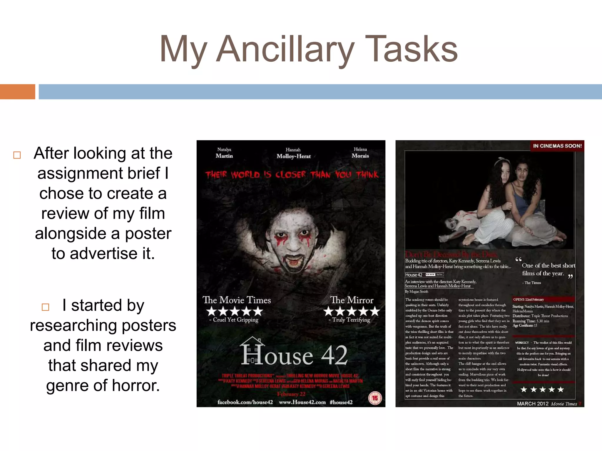
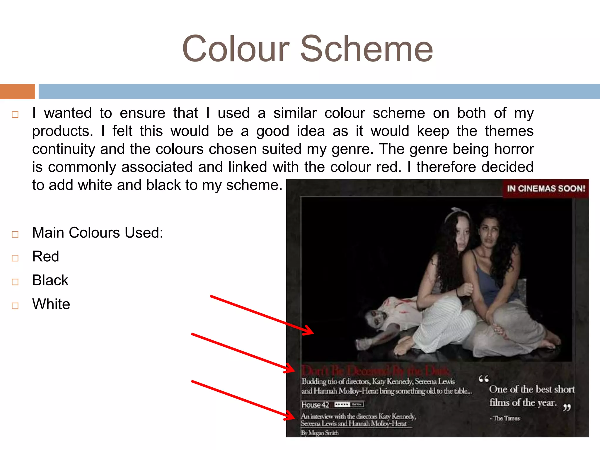
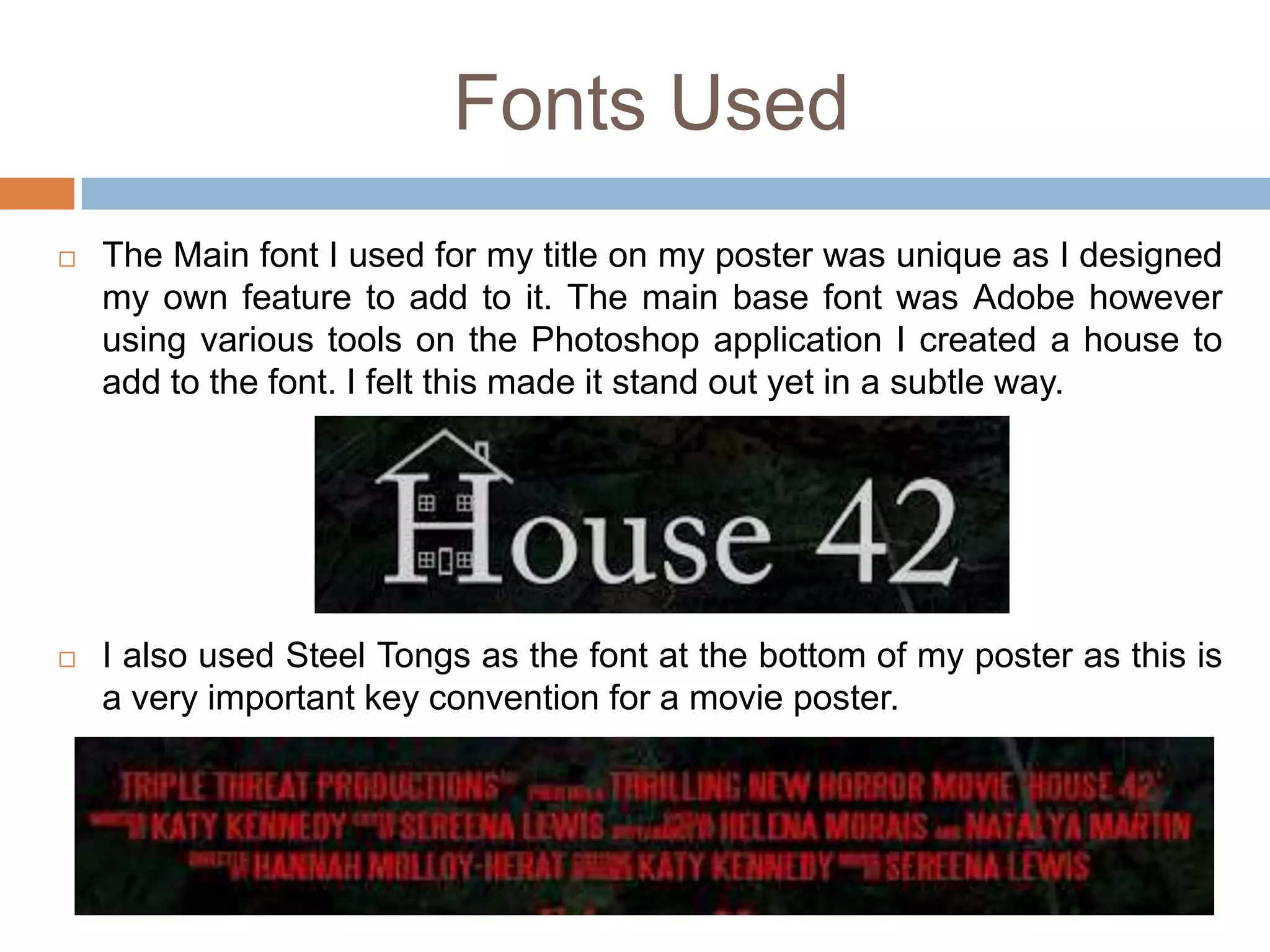
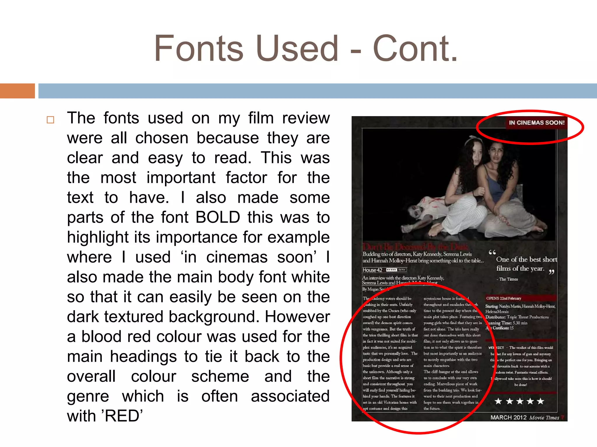
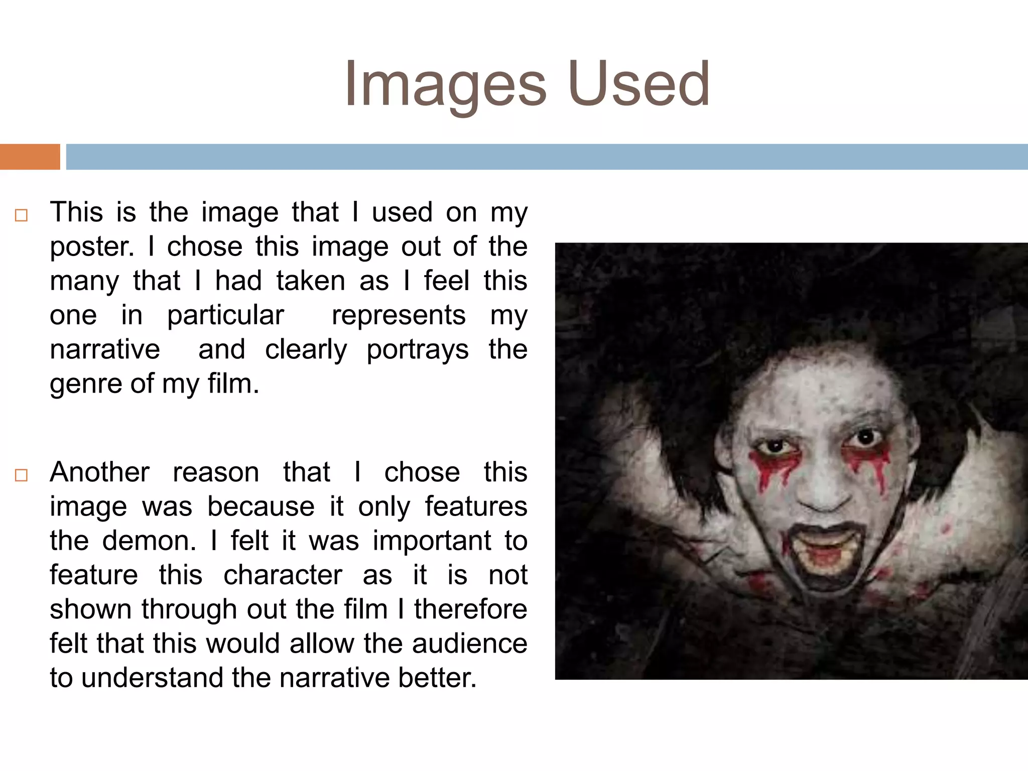
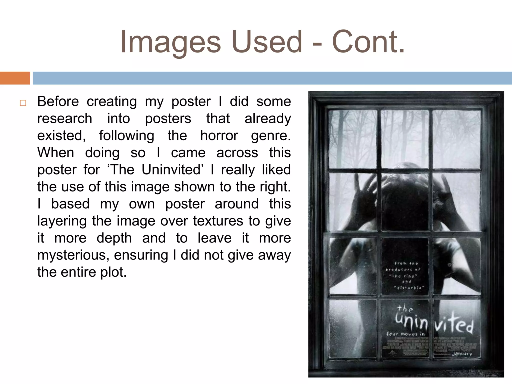
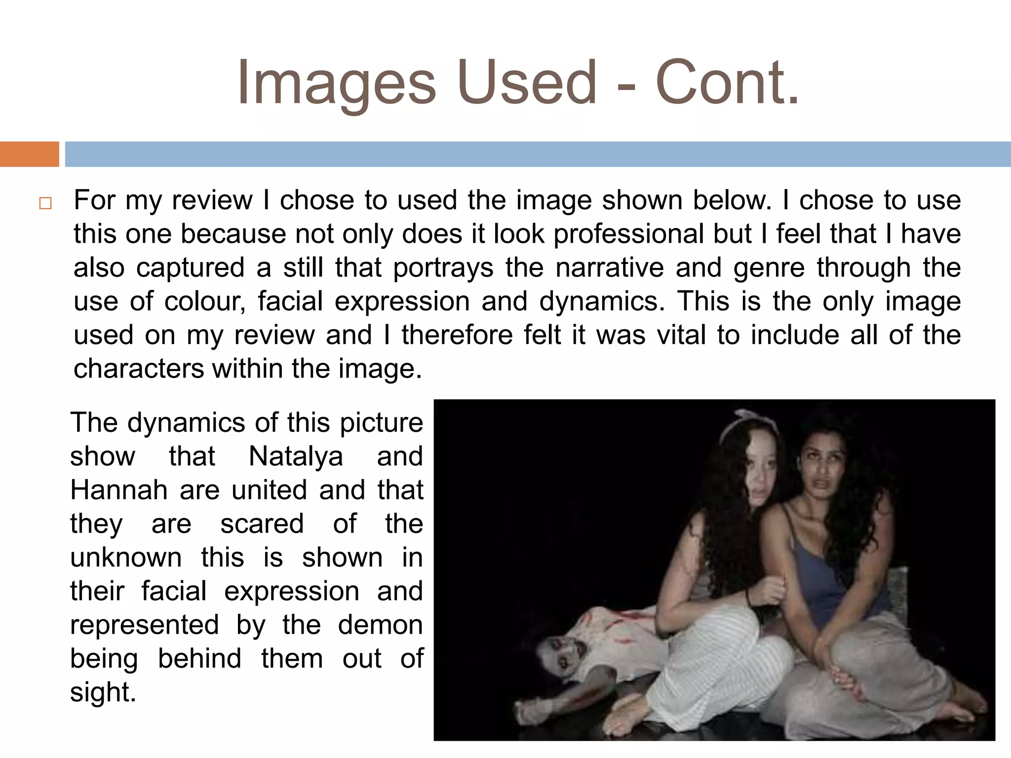
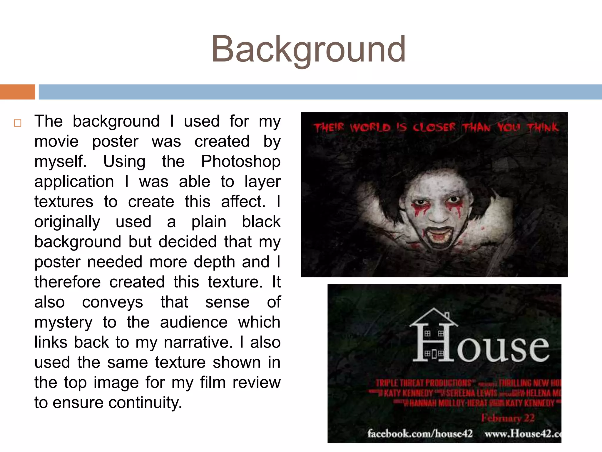
How effective is the combination of your main       By

            product and your ancillary texts?   Katy Kennedy
Brief
   For this piece of coursework, the assignment brief outlined that we
    must create a short film in its entirety, lasting approximately five
    minutes, which may be live action or animated or a combination of
    both, together with two or three of the following options
   A poster for the film
   A radio trailer for the film
   A film magazine review page featuring the film
My Ancillary Tasks

   After looking at the
    assignment brief I
     chose to create a
     review of my film
    alongside a poster
      to advertise it.


        I started by
    researching posters
      and film reviews
       that shared my
      genre of horror.
The Combination
   I believe that the combination of both my ancillary tasks and my
    main task are very effective. I feel that I have produced them to a
    high standard and feel that the connection is clear and my genre
    visible throughout. I wanted to ensure that all products could easily
    be linked back to my production ‘Triple Threat’
Colour Scheme
   I wanted to ensure that I used a similar colour scheme on both of my
    products. I felt this would be a good idea as it would keep the themes
    continuity and the colours chosen suited my genre. The genre being horror
    is commonly associated and linked with the colour red. I therefore decided
    to add white and black to my scheme.


   Main Colours Used:
   Red
   Black
   White
Fonts Used
   The Main font I used for my title on my poster was unique as I designed
    my own feature to add to it. The main base font was Adobe however
    using various tools on the Photoshop application I created a house to
    add to the font. I felt this made it stand out yet in a subtle way.


   I also used Steel Tongs as the font at the bottom of my poster as this is
    a very important key convention for a movie poster.
Fonts Used - Cont.
   The fonts used on my film review
    were all chosen because they are
    clear and easy to read. This was
    the most important factor for the
    text to have. I also made some
    parts of the font BOLD this was to
    highlight its importance for example
    where I used ‘in cinemas soon’ I
    also made the main body font white
    so that it can easily be seen on the
    dark textured background. However
    a blood red colour was used for the
    main headings to tie it back to the
    overall colour scheme and the
    genre which is often associated
    with ’RED’
Images Used
   This is the image that I used on my
    poster. I chose this image out of the
    many that I had taken as I feel this
    one in particular      represents my
    narrative and clearly portrays the
    genre of my film.


   Another reason that I chose this
    image was because it only features
    the demon. I felt it was important to
    feature this character as it is not
    shown through out the film I therefore
    felt that this would allow the audience
    to understand the narrative better.
Images Used - Cont.
   Before creating my poster I did some
    research into posters that already
    existed, following the horror genre.
    When doing so I came across this
    poster for ‘The Uninvited’ I really liked
    the use of this image shown to the right.
    I based my own poster around this
    layering the image over textures to give
    it more depth and to leave it more
    mysterious, ensuring I did not give away
    the entire plot.
Images Used - Cont.
   For my review I chose to used the image shown below. I chose to use
    this one because not only does it look professional but I feel that I have
    also captured a still that portrays the narrative and genre through the
    use of colour, facial expression and dynamics. This is the only image
    used on my review and I therefore felt it was vital to include all of the
    characters within the image.
    The dynamics of this picture
    show that Natalya and
    Hannah are united and that
    they are scared of the
    unknown this is shown in
    their facial expression and
    represented by the demon
    being behind them out of
    sight.
Background
   The background I used for my
    movie poster was created by
    myself. Using the Photoshop
    application I was able to layer
    textures to create this affect. I
    originally used a plain black
    background but decided that my
    poster needed more depth and I
    therefore created this texture. It
    also conveys that sense of
    mystery to the audience which
    links back to my narrative. I also
    used the same texture shown in
    the top image for my film review
    to ensure continuity.

FinallllHow effective is the combination of your main product and your ancillary texts?

  • 1.
    How effective isthe combination of your main By product and your ancillary texts? Katy Kennedy
  • 2.
    Brief  For this piece of coursework, the assignment brief outlined that we must create a short film in its entirety, lasting approximately five minutes, which may be live action or animated or a combination of both, together with two or three of the following options  A poster for the film  A radio trailer for the film  A film magazine review page featuring the film
  • 3.
    My Ancillary Tasks  After looking at the assignment brief I chose to create a review of my film alongside a poster to advertise it.  I started by researching posters and film reviews that shared my genre of horror.
  • 4.
    The Combination  I believe that the combination of both my ancillary tasks and my main task are very effective. I feel that I have produced them to a high standard and feel that the connection is clear and my genre visible throughout. I wanted to ensure that all products could easily be linked back to my production ‘Triple Threat’
  • 5.
    Colour Scheme  I wanted to ensure that I used a similar colour scheme on both of my products. I felt this would be a good idea as it would keep the themes continuity and the colours chosen suited my genre. The genre being horror is commonly associated and linked with the colour red. I therefore decided to add white and black to my scheme.  Main Colours Used:  Red  Black  White
  • 6.
    Fonts Used  The Main font I used for my title on my poster was unique as I designed my own feature to add to it. The main base font was Adobe however using various tools on the Photoshop application I created a house to add to the font. I felt this made it stand out yet in a subtle way.  I also used Steel Tongs as the font at the bottom of my poster as this is a very important key convention for a movie poster.
  • 7.
    Fonts Used -Cont.  The fonts used on my film review were all chosen because they are clear and easy to read. This was the most important factor for the text to have. I also made some parts of the font BOLD this was to highlight its importance for example where I used ‘in cinemas soon’ I also made the main body font white so that it can easily be seen on the dark textured background. However a blood red colour was used for the main headings to tie it back to the overall colour scheme and the genre which is often associated with ’RED’
  • 8.
    Images Used  This is the image that I used on my poster. I chose this image out of the many that I had taken as I feel this one in particular represents my narrative and clearly portrays the genre of my film.  Another reason that I chose this image was because it only features the demon. I felt it was important to feature this character as it is not shown through out the film I therefore felt that this would allow the audience to understand the narrative better.
  • 9.
    Images Used -Cont.  Before creating my poster I did some research into posters that already existed, following the horror genre. When doing so I came across this poster for ‘The Uninvited’ I really liked the use of this image shown to the right. I based my own poster around this layering the image over textures to give it more depth and to leave it more mysterious, ensuring I did not give away the entire plot.
  • 10.
    Images Used -Cont.  For my review I chose to used the image shown below. I chose to use this one because not only does it look professional but I feel that I have also captured a still that portrays the narrative and genre through the use of colour, facial expression and dynamics. This is the only image used on my review and I therefore felt it was vital to include all of the characters within the image. The dynamics of this picture show that Natalya and Hannah are united and that they are scared of the unknown this is shown in their facial expression and represented by the demon being behind them out of sight.
  • 11.
    Background  The background I used for my movie poster was created by myself. Using the Photoshop application I was able to layer textures to create this affect. I originally used a plain black background but decided that my poster needed more depth and I therefore created this texture. It also conveys that sense of mystery to the audience which links back to my narrative. I also used the same texture shown in the top image for my film review to ensure continuity.