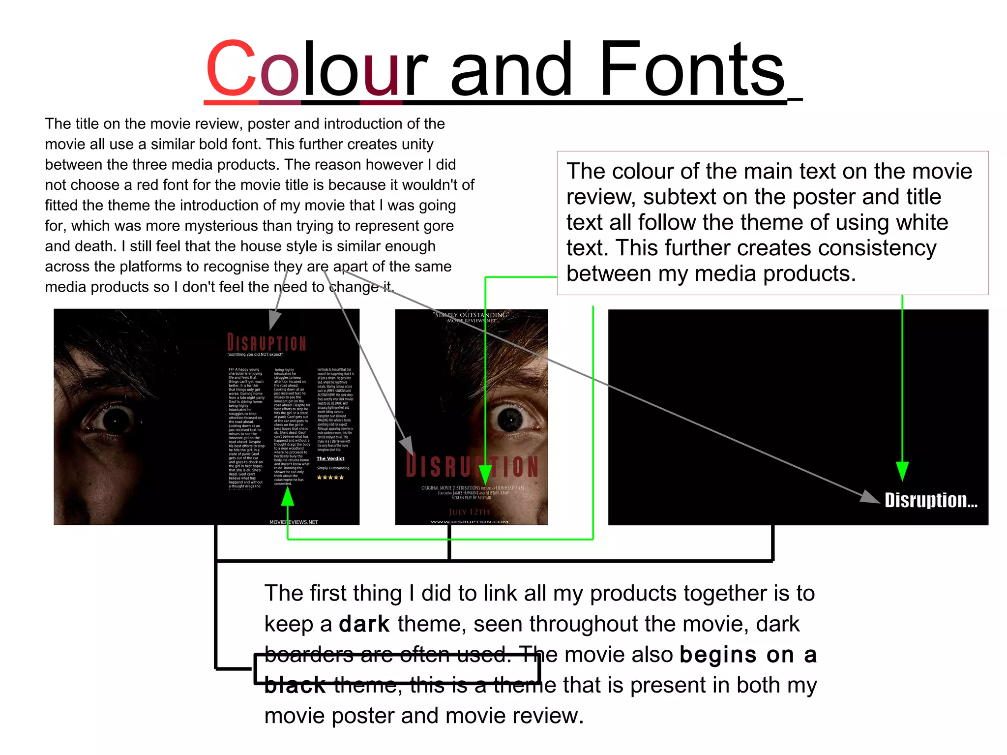
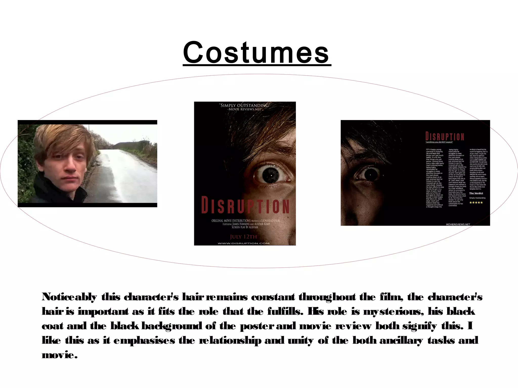
SlideShare a Scribd company logo
Colour and Fonts
The title on the movie review, poster and introduction of the
movie all use a similar bold font. This further creates unity
between the three media products. The reason however I did
not choose a red font for the movie title is because it wouldn't of
                                                                      The colour of the main text on the movie
fitted the theme the introduction of my movie that I was going        review, subtext on the poster and title
for, which was more mysterious than trying to represent gore          text all follow the theme of using white
and death. I still feel that the house style is similar enough        text. This further creates consistency
across the platforms to recognise they are apart of the same
media products so I don't feel the need to change it.
                                                                      between my media products.


                                  The first thing I did to link all my products together is to
                                  keep a dark theme, seen throughout the movie, dark
                                  boarders are often used. The movie also begins on a
                                  black theme, this is a theme that is present in both my
                                  movie poster and movie review.
Props
                  In both my poster and
                  review page, the main
                  image contains a picture
                  of an eye with a light
                  reflecting on it. This light
                  is representative of the
                  light that shines from the
                  cars headlights before it
                  makes impact. This
                  connects the narrative of
                  the movie with the
                  advertisment/review of the
                  movie.

Again, we can
see the white
theme run into
the film in the
form of a white
washed clip.
Common references.


     Here we can see
     both the poster and
     review page reference
     the same website,
     “www.moviereviews.net”

      The web address
      name was
      chosen as it fits
      the relevance of
      the quote and is
      something that
      would normally
      be referenced on
      a movie poster
      and review.
Actors


The actors in both of my ancillary
tasks related directly to the film, the
character shown in the ancillary is
the main “bad guy”. However, the
close up of the “bad guy's” eye is
representative of the protagonist's
eye in the movie showing a
relationship between the two
characters through my ancillaries
directly to my film.
Costumes


Noticeably this character's hair remains constant throughout the film, the character's
hair is important as it fits the role that the fulfills. H role is mysterious, his black
                                                          is
coat and the black background of the poster and movie review both signify this. I
like this as it emphasises the relationship and unity of the both ancillary tasks and
movie.
Conclusion
       Strengths
       Colours across the poster and review page are strong and
       easily identifiable to one another, they also tie well in with
       the movie, these being primarily red, which represent the
       style of movie, and the black and white, black
       representing the mystery of the character himself and
       white a key element of the plot.
       Weaknesses
       There was little to represent the protagonist across the
       three pieces and the review held to few refferences to
       the movie, to counter this I could of included images of
       the protagonist himself in the review along with the
       other character shown on the poster.

Looking at my strengths and weaknesses together the combination
was overall effective. The font showing the title of the movie at the
beginning of the film was enough to relate the movie to the poster
and review straight away. The connotations shown in the
ancillaries were also a strong connection between the three.

More Related Content

What's hot

Evaluation Question One
Evaluation Question OneEvaluation Question One
Evaluation Question One
freya_blount
 
Inspiration & example ideas for the poster
Inspiration & example ideas for the posterInspiration & example ideas for the poster
Inspiration & example ideas for the poster
asyia98
 
Evaluation question 2
Evaluation question 2Evaluation question 2
Evaluation question 2
Fatima B
 
Question 2
Question 2Question 2
Question 2
asyia98
 
Film posters 2
Film posters 2Film posters 2
Film posters 2
liamchapman96
 
Evaluation Q#2
Evaluation Q#2Evaluation Q#2
Evaluation Q#2Hamna Baig
 
Evaluation 2
Evaluation 2Evaluation 2
Evaluation 2
sahraahmedali
 
Textual analysis halloween
Textual analysis halloweenTextual analysis halloween
Textual analysis halloween
Sarah Batty
 
The Last Exorcism poster analysis
The Last Exorcism poster analysisThe Last Exorcism poster analysis
The Last Exorcism poster analysisfatemajohara
 
Evaluation question 2
Evaluation question 2Evaluation question 2
Evaluation question 2
kidshahid
 
Evaluation question 2
Evaluation question 2Evaluation question 2
Evaluation question 2
kidshahid
 
Evaluation question 2
Evaluation question 2Evaluation question 2
Evaluation question 2
kidshahid
 
Evaluation 2
Evaluation 2Evaluation 2
Evaluation 2
sahraahmedali
 
Evaluation question 2
Evaluation question 2Evaluation question 2
Evaluation question 2
kidshahid
 
Evaluation question 1
Evaluation question 1Evaluation question 1
Evaluation question 1bv6760
 
Evaluating Question 2
Evaluating Question 2Evaluating Question 2
Evaluating Question 2
Ryan Jamniuk
 
Question 1
Question 1Question 1
Question 1
Lucyphilllips7
 

What's hot (20)

Evaluation Question One
Evaluation Question OneEvaluation Question One
Evaluation Question One
 
Inspiration & example ideas for the poster
Inspiration & example ideas for the posterInspiration & example ideas for the poster
Inspiration & example ideas for the poster
 
Evaluation question 2
Evaluation question 2Evaluation question 2
Evaluation question 2
 
Question 2
Question 2Question 2
Question 2
 
Film posters 2
Film posters 2Film posters 2
Film posters 2
 
Evaluation Q#2
Evaluation Q#2Evaluation Q#2
Evaluation Q#2
 
Question 2
Question 2Question 2
Question 2
 
Evaluation 2
Evaluation 2Evaluation 2
Evaluation 2
 
Textual analysis halloween
Textual analysis halloweenTextual analysis halloween
Textual analysis halloween
 
The Last Exorcism poster analysis
The Last Exorcism poster analysisThe Last Exorcism poster analysis
The Last Exorcism poster analysis
 
Ev q2
Ev q2Ev q2
Ev q2
 
EV Q2
EV Q2EV Q2
EV Q2
 
Evaluation question 2
Evaluation question 2Evaluation question 2
Evaluation question 2
 
Evaluation question 2
Evaluation question 2Evaluation question 2
Evaluation question 2
 
Evaluation question 2
Evaluation question 2Evaluation question 2
Evaluation question 2
 
Evaluation 2
Evaluation 2Evaluation 2
Evaluation 2
 
Evaluation question 2
Evaluation question 2Evaluation question 2
Evaluation question 2
 
Evaluation question 1
Evaluation question 1Evaluation question 1
Evaluation question 1
 
Evaluating Question 2
Evaluating Question 2Evaluating Question 2
Evaluating Question 2
 
Question 1
Question 1Question 1
Question 1
 

Similar to Evaluation question 2

Evalution Question 2: How Effective Is The Combination Of Your Main Product A...
Evalution Question 2: How Effective Is The Combination Of Your Main Product A...Evalution Question 2: How Effective Is The Combination Of Your Main Product A...
Evalution Question 2: How Effective Is The Combination Of Your Main Product A...
mags249
 
Evalution Question 2:
Evalution Question 2: Evalution Question 2:
Evalution Question 2: mags249
 
Evaluation Question 2
Evaluation Question 2Evaluation Question 2
Evaluation Question 2mags249
 
Evaluation Question 2
Evaluation Question 2Evaluation Question 2
Evaluation Question 2mags249
 
Evaluation Question 2
Evaluation Question 2Evaluation Question 2
Evaluation Question 2
Sukhpal Singh Pawar
 
How effective is the combination of your main product and your ancillary texts?
How effective is the combination of your main product and your ancillary texts?How effective is the combination of your main product and your ancillary texts?
How effective is the combination of your main product and your ancillary texts?katykennedy123
 
FinallllHow effective is the combination of your main product and your ancill...
FinallllHow effective is the combination of your main product and your ancill...FinallllHow effective is the combination of your main product and your ancill...
FinallllHow effective is the combination of your main product and your ancill...katykennedy123
 
Question 2
Question 2Question 2
Question 2
Coey1611
 
Poster slideshare copy
Poster slideshare copyPoster slideshare copy
Poster slideshare copy06is1
 
Evaluation 2
Evaluation 2Evaluation 2
Evaluation 2
lauraak1912
 
Evaluation question 2 sharna mandil
Evaluation question 2 sharna mandilEvaluation question 2 sharna mandil
Evaluation question 2 sharna mandilSharna Mandil
 
A2 how does your media product challenge or follow
A2 how does your media product challenge or followA2 how does your media product challenge or follow
A2 how does your media product challenge or followAndyBrown100
 
Evaluation 1
Evaluation 1Evaluation 1
Evaluation 1
ryansoanes
 
Evaluation 2
Evaluation 2Evaluation 2
Evaluation 2
turiga
 

Similar to Evaluation question 2 (20)

Evalution Question 2: How Effective Is The Combination Of Your Main Product A...
Evalution Question 2: How Effective Is The Combination Of Your Main Product A...Evalution Question 2: How Effective Is The Combination Of Your Main Product A...
Evalution Question 2: How Effective Is The Combination Of Your Main Product A...
 
Evalution Question 2:
Evalution Question 2: Evalution Question 2:
Evalution Question 2:
 
Evaluation Question 2
Evaluation Question 2Evaluation Question 2
Evaluation Question 2
 
Evaluation Question 2
Evaluation Question 2Evaluation Question 2
Evaluation Question 2
 
Evaluation Question 2
Evaluation Question 2Evaluation Question 2
Evaluation Question 2
 
How effective is the combination of your main product and your ancillary texts?
How effective is the combination of your main product and your ancillary texts?How effective is the combination of your main product and your ancillary texts?
How effective is the combination of your main product and your ancillary texts?
 
FinallllHow effective is the combination of your main product and your ancill...
FinallllHow effective is the combination of your main product and your ancill...FinallllHow effective is the combination of your main product and your ancill...
FinallllHow effective is the combination of your main product and your ancill...
 
Question 2
Question 2Question 2
Question 2
 
Eval 2
Eval 2Eval 2
Eval 2
 
Evaluation question 2
Evaluation question 2Evaluation question 2
Evaluation question 2
 
Poster slideshare copy
Poster slideshare copyPoster slideshare copy
Poster slideshare copy
 
Evaluation 2
Evaluation 2Evaluation 2
Evaluation 2
 
Evaluation 1
Evaluation 1Evaluation 1
Evaluation 1
 
Evaluation question 2 sharna mandil
Evaluation question 2 sharna mandilEvaluation question 2 sharna mandil
Evaluation question 2 sharna mandil
 
Question 2
Question 2Question 2
Question 2
 
Question 2
Question 2Question 2
Question 2
 
A2 how does your media product challenge or follow
A2 how does your media product challenge or followA2 how does your media product challenge or follow
A2 how does your media product challenge or follow
 
Evaluation 1
Evaluation 1Evaluation 1
Evaluation 1
 
Question 2
Question 2Question 2
Question 2
 
Evaluation 2
Evaluation 2Evaluation 2
Evaluation 2
 

Evaluation question 2

  • 1.
  • 2. Colour and Fonts The title on the movie review, poster and introduction of the movie all use a similar bold font. This further creates unity between the three media products. The reason however I did not choose a red font for the movie title is because it wouldn't of The colour of the main text on the movie fitted the theme the introduction of my movie that I was going review, subtext on the poster and title for, which was more mysterious than trying to represent gore text all follow the theme of using white and death. I still feel that the house style is similar enough text. This further creates consistency across the platforms to recognise they are apart of the same media products so I don't feel the need to change it. between my media products. The first thing I did to link all my products together is to keep a dark theme, seen throughout the movie, dark boarders are often used. The movie also begins on a black theme, this is a theme that is present in both my movie poster and movie review.
  • 3. Props In both my poster and review page, the main image contains a picture of an eye with a light reflecting on it. This light is representative of the light that shines from the cars headlights before it makes impact. This connects the narrative of the movie with the advertisment/review of the movie. Again, we can see the white theme run into the film in the form of a white washed clip.
  • 4. Common references. Here we can see both the poster and review page reference the same website, “www.moviereviews.net” The web address name was chosen as it fits the relevance of the quote and is something that would normally be referenced on a movie poster and review.
  • 5. Actors The actors in both of my ancillary tasks related directly to the film, the character shown in the ancillary is the main “bad guy”. However, the close up of the “bad guy's” eye is representative of the protagonist's eye in the movie showing a relationship between the two characters through my ancillaries directly to my film.
  • 6. Costumes Noticeably this character's hair remains constant throughout the film, the character's hair is important as it fits the role that the fulfills. H role is mysterious, his black is coat and the black background of the poster and movie review both signify this. I like this as it emphasises the relationship and unity of the both ancillary tasks and movie.
  • 7. Conclusion Strengths Colours across the poster and review page are strong and easily identifiable to one another, they also tie well in with the movie, these being primarily red, which represent the style of movie, and the black and white, black representing the mystery of the character himself and white a key element of the plot. Weaknesses There was little to represent the protagonist across the three pieces and the review held to few refferences to the movie, to counter this I could of included images of the protagonist himself in the review along with the other character shown on the poster. Looking at my strengths and weaknesses together the combination was overall effective. The font showing the title of the movie at the beginning of the film was enough to relate the movie to the poster and review straight away. The connotations shown in the ancillaries were also a strong connection between the three.