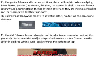
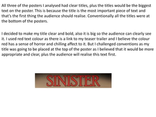
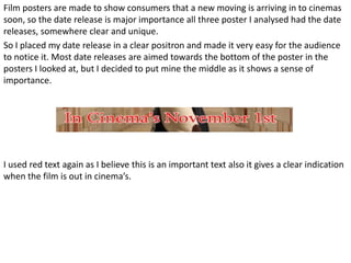
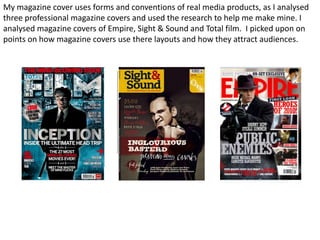
The document discusses conventions used in film posters and magazine covers. It analyzes three horror film posters and three professional magazine covers to identify commonly used design elements. For the film poster, it places the production company name at the bottom in red instead of famous actors at the top. It also puts the title in red at the top rather than the bottom. For the magazine cover, it uses a large red masthead at the top like the professional examples. It also includes the movie title in white below the main image to link it like the examples.