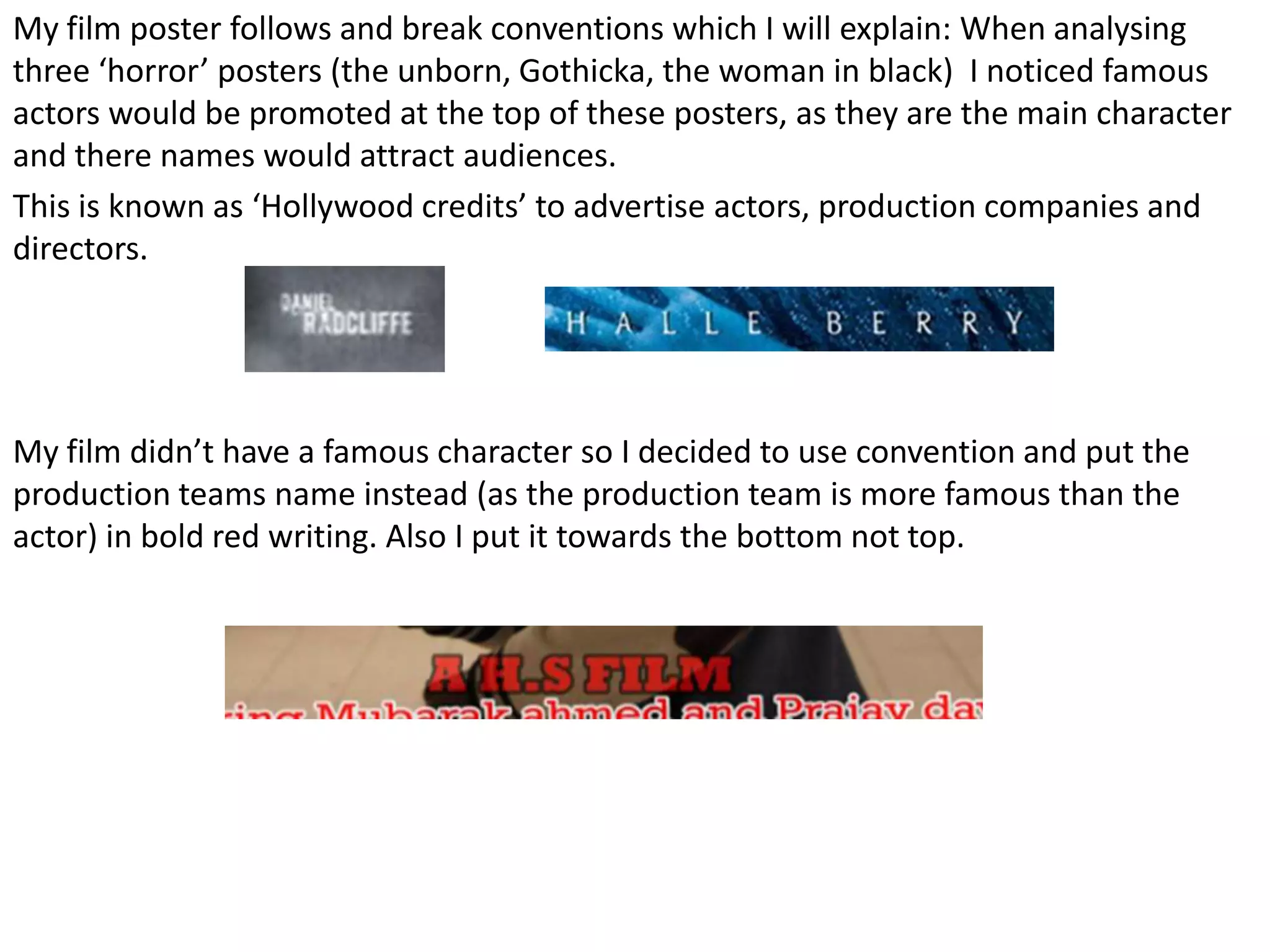
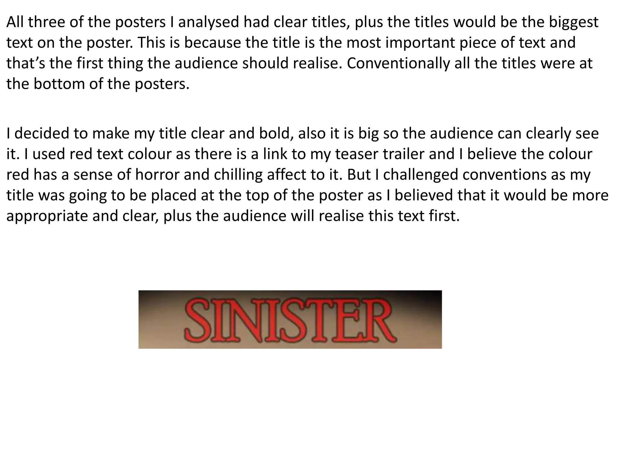
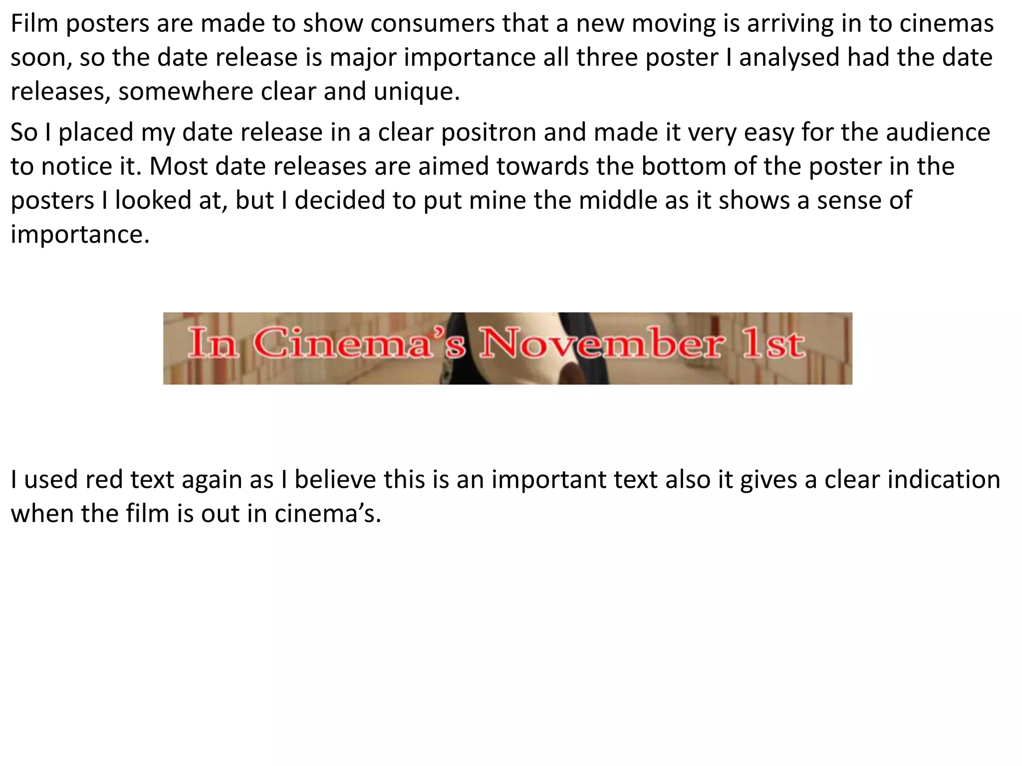
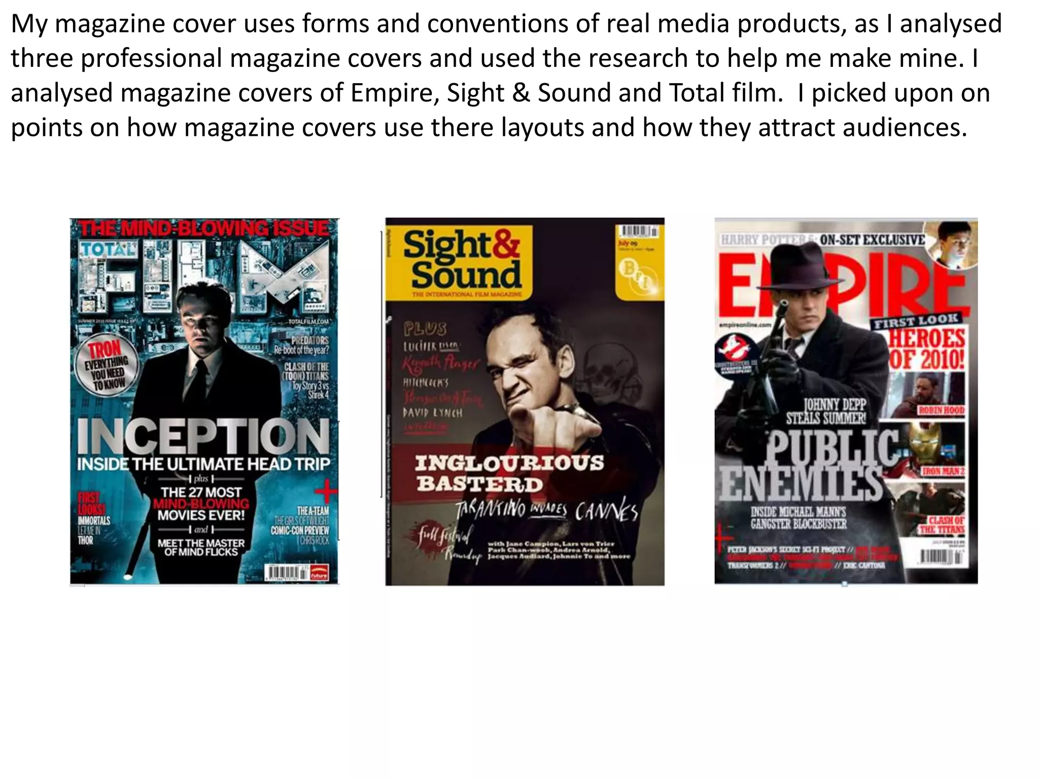
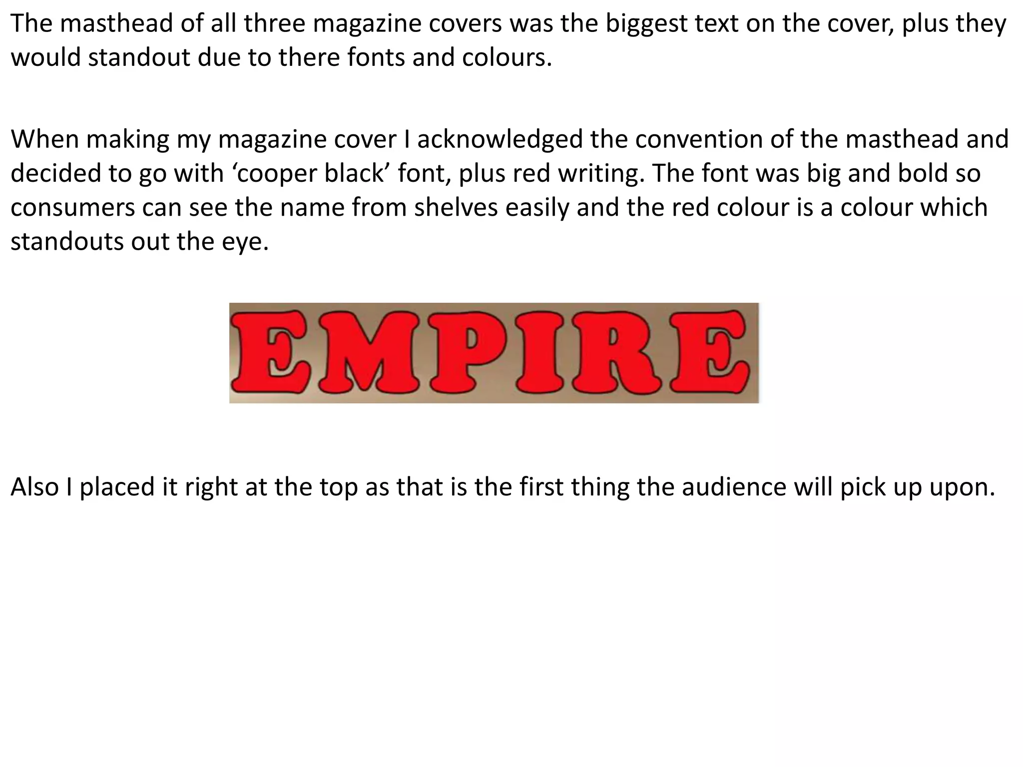
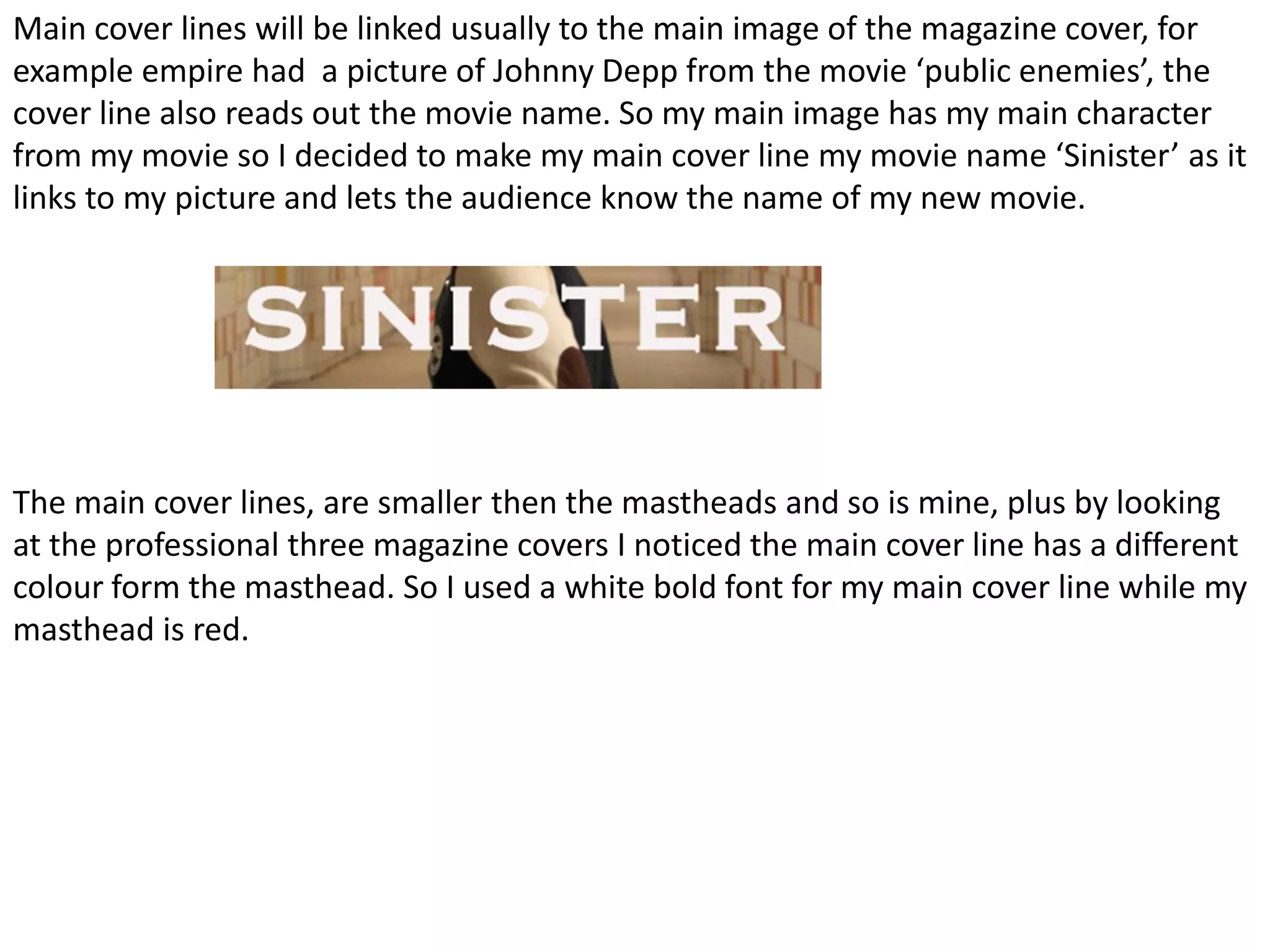
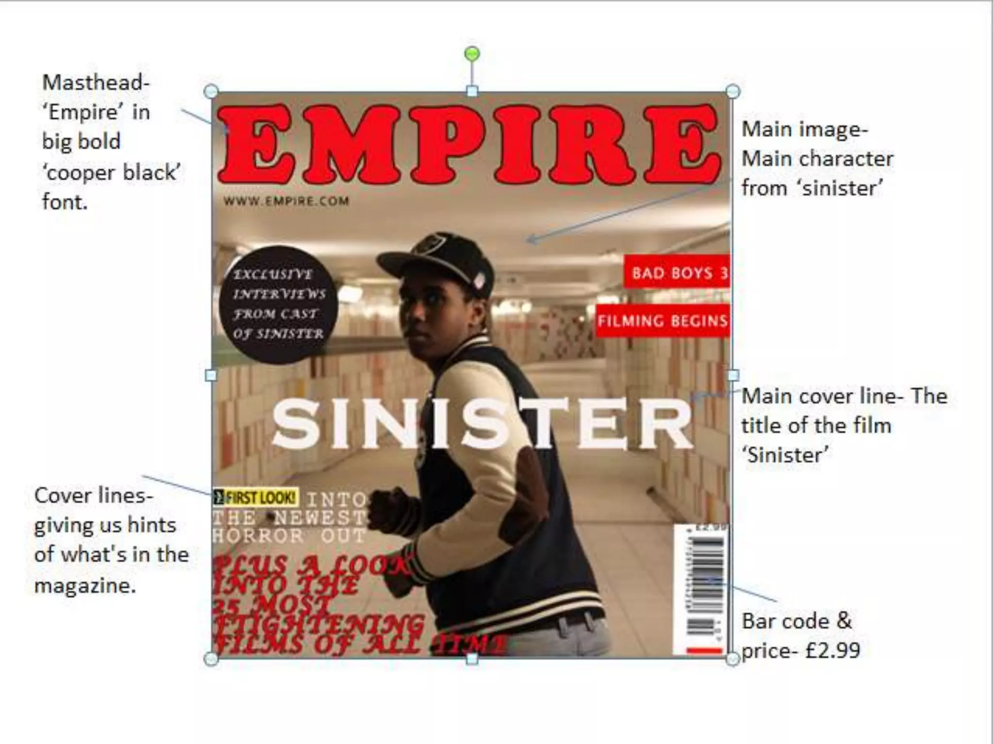
The document discusses conventions used in film posters and magazine covers. It analyzes several horror film posters and professional magazine covers to identify commonly used design elements. It then explains how the creator's own film poster and magazine cover challenge some conventions, such as placing the title at the top of the poster rather than the bottom, and positioning the release date in the middle rather than bottom. The masthead is made large and red to stand out, following conventions for magazine covers.