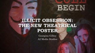
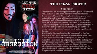
1. The document describes the process of redesigning a theatrical movie poster.
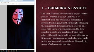
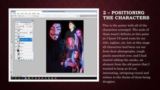
2. The new poster layout features the antagonist dominating one side and the four protagonists overlapped on the other side to establish their roles.
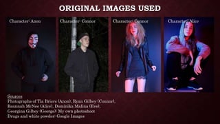
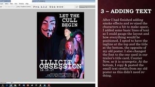
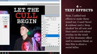
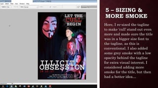
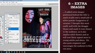
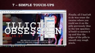
3. Additional elements were added, including smoke, text effects, pills and cocaine imagery behind the title to imply themes of addiction and intrigue audiences.


![7 [autosaved]](https://cdn.slidesharecdn.com/ss_thumbnails/7autosaved-210517143922-thumbnail.jpg?width=640&height=640&fit=bounds)
![7 [autosaved]](https://cdn.slidesharecdn.com/ss_thumbnails/7autosaved-210519130136-thumbnail.jpg?width=640&height=640&fit=bounds)


